AFTER 新经典 (NEW CLASSICS) PUBLISHING COMPANY BECAME ONE OF THE THE SHAREHOLDERS IN THE PAGEONE BOOKSTORE,
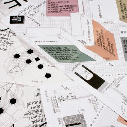
a new design was needed for the opening ceremony of the ‘New PAGEONE’ store in the Qianmen Beijing Square business district. For this to happen, typo_d, a design studio based in Beijing, stepped in to define the overall visuals by using the word ‘new’ as their main keyword. The decision may perhaps stem from the fact that the word ‘new’ could reference both their additional shareholder, as well as assertively announce the opening event of the New PAGEONE store.
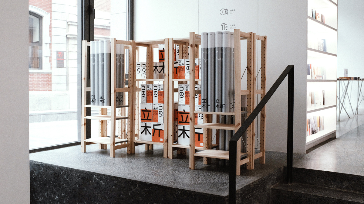
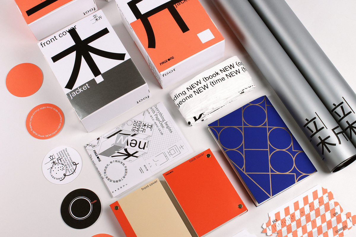
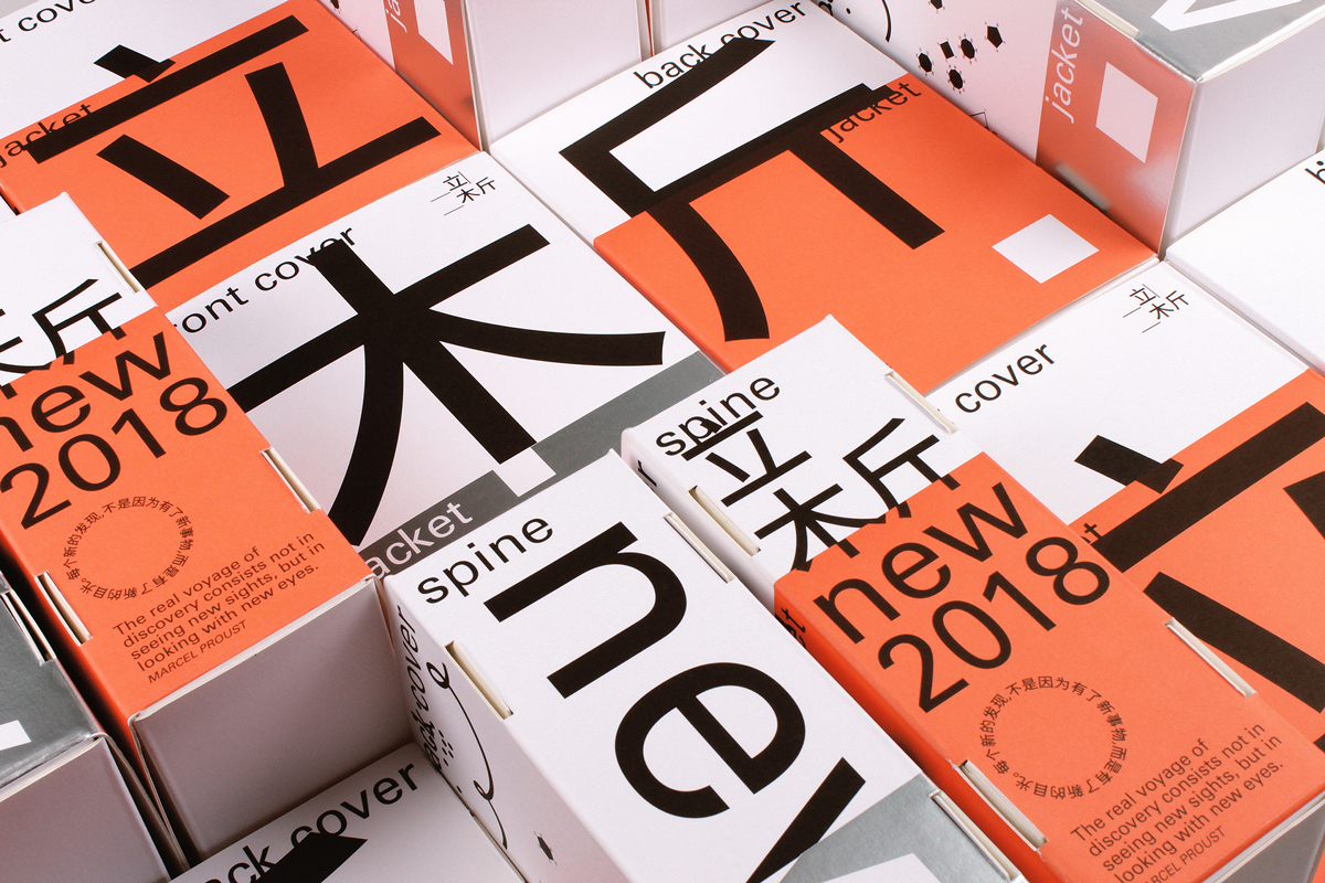
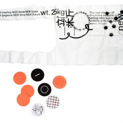
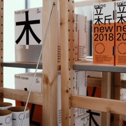
Many artifacts bestrewn with the Chinese character for ‘new,’ conceivably to further declare the ‘shared newness’ of the event, were developed for the usage of the new store. Such artifacts are cylindrical paper tubes, plastic bags, notebooks and so forth. However, the highlight of all the artifacts is surely the typographically-treated corrugated boxes designed to replicate the look of books (which eerily resemble the design trends of many Chinese book covers). Moreover, apart from serving as decorations within the excess bookshelves’ space, these carton book-boxes also act as the packaging for various souvenir products sold within the shop. Anyhow, it will be quite a sight indeed to be able to see these book-boxes juxtaposed amongst and alongside the real ones.
หลังจากที่สำนักพิมพ์ 新经典 (New Classics) เข้ามาเป็นหุ้นส่วนกับร้านหนังสือ PAGEONE ร้านหนังสือแห่งใหม่ชื่อ New PAGEONE ก็เปิดตัวขึ้นในย่านธุรกิจ Qianmen ในกรุงปักกิ่ง โดยได้ typo_d ดีไซน์สตูดิโอในปักกิ่งมาเป็นผู้ดูแลการออกแบบทั้งหมดในงานเปิดร้านใหม่ครั้งนี้ typo_d หยิบเอาคำว่า “ใหม่” มาใช้เป็นคีย์เวิร์ดในการออกแบบ ซึ่งก็คงจะเป็นเพราะคำว่า “ใหม่” ที่ว่านี้มันโยงไปถึงหุ้นส่วนคนใหม่ และเป็นการประกาศถึงการเปิดสาขาใหม่ได้ไปพร้อมๆ กัน
ไอเท็มหลายชิ้นที่เต็มไปด้วยอักษรจีนที่แปลได้ว่า “ใหม่” (อาจจะเพื่อเน้นย้ำถึงความใหม่ของอีเวนต์นี้) ถูกออกแบบเพื่อมาใช้กับร้านแห่งใหม่นี้โดยเฉพาะ อย่างเช่น กระบอก กระดาษ ถุงพลาสติก สมุดโน้ต ฯลฯ อย่างไรก็ตาม ของที่เป็นไฮไลท์ในบรรดาไอเท็มทั้งหมดคงจะเป็นกล่องกระดาษสกรีนด้วยตัวอักษรจีนที่ถูกดีไซน์ให้ดูเหมือนกับหนังสือ (ชวนให้นึกถึงเทรนด์การออกแบบปกหนังสือจีนตอนนี้) ที่นอกจากจะทำหน้าที่เป็นของตกแต่งชั้นหนังสือ กล่องหนังสือที่ว่ายังถูกใช้เป็น packaging ของที่ระลึกที่ขายในช็อปนี้ด้วย ทั้งนี้ทั้งนั้น มันคงน่าสนใจไม่น้อยถ้าได้เห็นกล่องเหล่านี้วางข้างๆ หนังสือจริง
TEXT: VIRADA BANJURTRUNGKAJORN
PHOTO COURTESY OF TYPO_D
typo-d.com