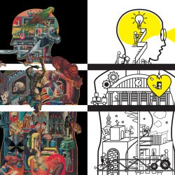
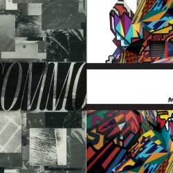
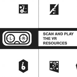
TO CELEBRATE THE OPENING OF TCDC COMMONS CO-WORKING SPACE, 32 DESIGNERS WERE INVITED TO WORK IN PAIRS TO CREATE 16 POSTERS AND LEARN WHAT THEY HAD IN COMMONS, OR NOT…
Included as a part of the Ideo Q Chula Samyan project, TCDC COMMONS, a co-working space and communication design library has officially opened its doors. The occasion also brings together a collaboration between TCDC and ThaiGa in the exhibition ‘What do you see in COMMONS?’ curated by Siam Attariya of Pink Blue Black & Orange in order to promote the new space. The poster for the exhibition was chosen for its ability to broaden the Thai audience’s perception of the media as something that is more than just a cheap printed advertisement but also a creation of legitimate artistic value. Having said that, the use of ‘space’ to express a designer’s point of view towards the exhibition’s theme ‘what do you see in commons?’ also refrains from placing the 16 works on a pedestal and causing them to become untouchable (like Thai culture, in some people’s points of view) as suggested through the presence of the question mark and the fact that what this exhibition really aims to highlight are differences of opinions.
The idea behind the pairing of the 32 design studios for the creation of its 16 posters comes from the limitations of the exhibition space. The curator invited the studios to discuss their views on the exhibition before each was asked to choose its own collaborator (except for The Uni_form Design Studio and WAWO, in which the curator made the pairing) and begin the collaborative design process. The theme “What do you see in COMMONS?” was open for an indefinite array of interpretations, from the straightforward approach of what one actually ‘sees’ in the TCDC COMMONS’ space to a deeper look into the meaning that the word ‘common’ connotes such as ‘collectivity,’ ‘fundamentals’ or ‘foundation.’ The interpretations are reflected through the works and resonate with the concept of collaboration as the designers learn to adapt and share their differences, similarities and areas of expertise before reaching a mutual agreement.
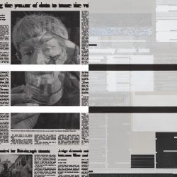
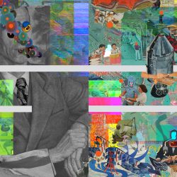
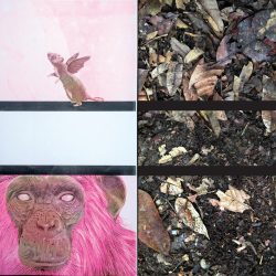
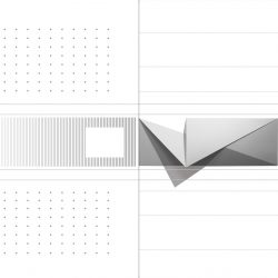
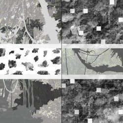
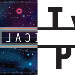
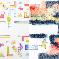
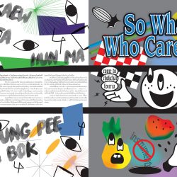
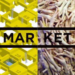
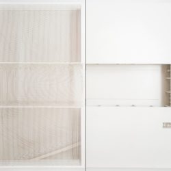
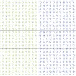
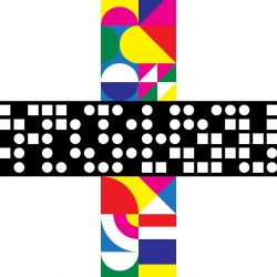
Having ‘freedom of interpretation’ as the initial concept to work with, another requirement of the project was the use of the rectangular frame of the TCDC COMMONS’ logo as a graphic element within the design. We get to see the 16 teams of designers work out the physicality of the frame differently through the use of some interesting solutions including the many attempts to blend the frame in with the designed layouts. Collectively speaking, the works can be categorized into two approaches: those that perceive the frame as a limitation and those that don’t. The confinement of space is adapted and in some cases used as a textbox such as that of CHOKECHAI 4 (Studio Dialogue x Sorasisha) whereas in the work of MORE IS MORE (Default x Workhearts), the rectangle is not exactly a box but more of a container of dots. For MARKET (TCDC x Shake & Bake Studio), the word ‘COMMONS’ in the frame is replaced with MARKET as the logo is placed above an image of chicken feet (the image could possibly imply the word ‘super’ (a famous super spicy soup dish with chicken feet as its key ingredient), as TCDC COMMONS is the supermarket of knowledge). A good number of works try to erase the boundary of the frame. One of them is GINGTHONG / BAIYOK (be>our>friend x Department of Architecture) that changes the two-dimensional graphic element into a (semi) three-dimensional paper sculpture/architectural model, reflecting the studios’ expertise while ‘COMMON FUTURE’ by Kkelvin x Manita-S makes the frame almost entirely invisible through the use of an embossing technique.
There are other works that exemplify interesting design solutions, including attempts to break limitations and express connotative interpretations of the theme. In contrast with the fairly small exhibition space, this mini poster exhibition incubates big and new possibilities in terms of the ideas, as differences are perceived from each designer’s point of view towards the theme that they had to work within. Perhaps this is the reason why the exhibition is so fun to see as the 16 teams strictly followed the given assignment and requirements without any further development or ramifications being made and, if on the other hand, the curator had left no room for creativity to work its way in, the final results would be nothing but borderline boring.
TEXT: NAPAT CHARITBUTRA
www.tcdc.or.th/tcdccommons


