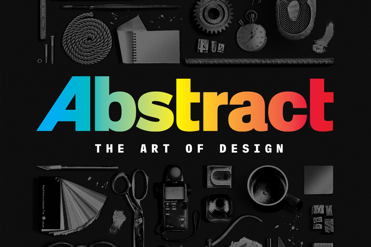
THE HUMAN SIDE OF EIGHT GLOBAL DESIGNERS IS PROJECTED INSTEAD OF THEIR SLICK LIFESTYLES IN THIS NETFLIX’S DOCUMENTARY abstract netflix
We are all familiar with the saying that goes something like “a good design is a practical design.” But in reality, practicality isn’t the only thing used to define whether a design is good or bad.
From the matter of good design to documentaries about design, one question that often arises is how good these films are per se from the aspect of design? While documentaries about design and designers often follow certain ‘traditions,’ in the words of Scott Dadich, Managing Editor of WIRED magazine, these films position themselves very much like a bunch of moving catalogues with perfectly captured works and eclectic background music complemented by designers’ interviews in a room where perfect lighting flawlessly shines on the subjects, which in Dadich’s view is mostly ‘clean, minimal, and boring as hell.’
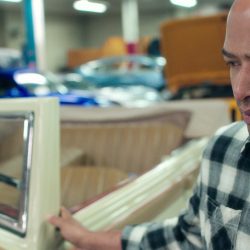
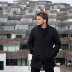
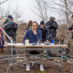
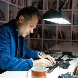
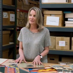
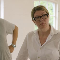
WIRED’s editor made the aforementioned comment in an article introducing a series of documentaries called Abstract: The Art of Design, Netflix’s latest documentary series that is comprised of eight episodes, each of which explores the thought processes of world-class designers from different fields of design such as Christoph Niemann (illustrator), Tinker Hatfield (a Nike shoe designer), Es Devlin (stage designer), Bjarke Ingels (architect), Ralph Gilles (automobile designer), Paula Scher (graphic designer), Platon (photographer) and Ilse Crawford (interior designer).
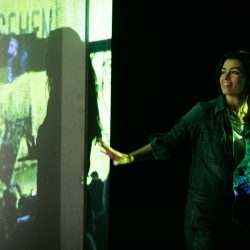
From running shoes to concert stages and the cars we drive to magazine covers, Abstract takes its viewers into the minds of brilliant designers with a playful and creative approach. On several occasions, the documentary treats its subjects as not just someone who sits in front of a camera and provides the creator with the needed information, but as one of the minds that contributes to the ‘design’ of the projected moving images and content under the documentary-style storytelling. The Christoph Niemann episode, for example, turns the illustrator’s works into life, as the animated 2D drawings serve as a tool that aids in the way that his thought and work processes are told. Es Devlin’s episode utilizes editing techniques that play with the space in the frame, which is similar to the mechanisms that can be found in her stage designs.
Abstract: The Art of Design not only tells the stories of designers for it, too, is a work of design as the film doesn’t attempt to imprison design in the form of a hard cover book whose spine we see more often than the pages inside. The documentary is very much like a rightly sized, soft cover book with images, texts and graphics that are stylishly and unexpectedly brought together without forgetting its fundamental role, which is to effectively ‘communicate’ with its audience.
-
- LAURENCE CENDROWICZ
-

- BRUCE ELY
-
- MORTEN GERMUND
-
- KASE FILM
-
- BARBARA NITKE
-
- BARBARA NITKE
เราอาจคุ้นเคยกับคำพูดทำนองว่า “การออกแบบที่ดีคือการออกแบบที่ใช้งานได้จริง” แต่เอาเข้าจริงแล้ว ถ้าลองคิดดูให้ดี ถ้ามันแค่ใช้งานได้จริงก็คงไม่ได้แปลว่ามันมีการออกแบบที่ดี
เราอาจเขยิบจากเรื่องการออกแบบที่ดีไปดูสารคดีเกี่ยวกับการออกแบบว่าแต่ว่าแล้วสารคดีพวกนี้มีการออกแบบที่ดีไหม? สารคดีที่เกี่ยวข้องกับการออกแบบและนักออกแบบมักมาในรูปลักษณ์ตาม “ขนบ” บางอย่างตามคำพูดของ Scott Dadich บรรณาธิการบริหารของนิตยสาร WIRED เขากล่าวไว้ว่าสารคดีออกแบบพวกนี้วางตัวเองเหมือนแคตตาล็อคงานออกแบบที่เคลื่อนไหวได้ ภาพถ่ายออกมาสวยปิ๊งคลอเคลียด้วยดนตรีประกอบมีสไตล์ ประกอบด้วยบทสัมภาษณ์ในห้องที่แสงกระทบลงบน subject อย่างนวลตา แต่สารคดีพวกนี้ “ส่วนใหญ่แล้วแลดูสะอาดสะอ้าน มินิมอล และน่าเบื่อฉิบหาย”* (Most of it is clean, minimal, and boring as hell.)
ในทรรศนะของ Dadich ขนบของสารคดีงานออกแบบทั่วไปติดอยู่ในกรอบของการใช้งานที่ดี มันสื่อสารประเด็น มันพาคนดูไปรู้จักกับนักออกแบบและงานของเขา มันทำหน้าที่พื้นฐานที่สุดของสารคดีนั่นคือให้ข้อมูล แต่ถ้าทำแค่นั้นมันก็เป็นสารคดีที่ทำางานของมันได้ดี แต่อาจไม่ใช่การออกแบบที่ดี
Dadich เขียนประโยคข้างต้นในบทความแนะนำสารคดีชุดที่ตัวเขาร่วมผลิตชื่อ Abstract: The Art of Design สารคดีชุดใหม่ของ Netflix ประกอบไปด้วย 8 ตอน ที่สำารวจวิธีคิดของนักออกแบบระดับโลก 8 คน ตามสายงานต่างๆ อันประกอบไปด้วย Christoph Niemann (นักวาดภาพประกอบ), Tinker Hatfield (นักออกแบบรองเท้าไนกี้), Es Devlin (นักออกแบบเวที), Bjarke Ingels (สถาปนิก), Ralph Gilles (นักออกแบบรถยนต์), Paula Scher (นักออกแบบกราฟิก), Platon (ช่างภาพ) และ Ilse Crawford (มัณฑนากร)
จากรองเท้าวิ่งไปสู่เวทีคอนเสิร์ต จากรถยนต์ที่เราขับไปสู่หน้าปก นิตยสาร Abstract พาเราไปสำรวจวิธีคิดของนักออกแบบด้วยท่าทีขี้เล่นและสร้างสรรค์ ในหลายๆ ครั้งสารคดีไม่ได้ปฏิบัติต่อ subject แค่ในฐานะบุคคลหน้ากล้องที่ผู้สร้างต้องดึงข้อมูลออกมา ตัวสารคดียังพา subject ไปอยู่หลังกล้องและเป็นส่วนหนึ่งของคนที่ “ออกแบบ” ภาพข้างหน้าและวิธีการเล่าเรื่องของสารคดีด้วย อย่างเช่นในตอนของ Christoph Niemann ที่ภาพวาดของเขาไม่ได้เป็นแค่ชิ้นงานนิ่งๆ ให้ผู้ชมดู แต่กลายเป็นเครื่องมือของหนังที่ใช้ในการเล่าเรื่องวิธีคิดและทำงานของตัวเขาเอง หรืออย่างตอน Es Devlin ที่สารคดีใช้เทคนิคทางการตัดต่อภาพหลายตอนในการเล่นกลกับพื้นที่ในเฟรม เหมือนกับกลไกที่ปรากฏในเวทีของละครเวทีที่เธอออกแบบ
Abstract: The Art of Design จึงไม่ได้ทำาหน้าที่แค่การบอกเล่าให้ข้อมูลเรื่องราวของนักออกแบบ แต่ตัวมันเองก็เป็นงานออกแบบอีกชิ้น ตัวหนังไม่ได้พยายามจะขังงานออกแบบไว้ในรูปแบบของสมุดภาพปกแข็งที่เราเห็นสันหนังสือหันออกจากชั้นมากกว่าเปิดอ่านดูข้างใน แต่เหมือนเป็นหนังสือปกอ่อนเล่มขนาดถนัดมือที่ข้างในมีทั้งรูปภาพ ตัวหนังสือ กราฟิก ที่จัดวางตัวอย่างน่าตื่นเต้น และคาดเดาไม่ได้ในหลายๆ ครั้งแต่ก็ไม่เคยละเลยหน้าที่พื้นฐานของหนังสือในการสื่อสารตัวเอง
TEXT: RACHAPOOM BOONBUNCHACHOKE
PHOTO COURTESY OF NETFLIX
EXCEPT AS NOTED
netflix.com