“JUST LIKE THE OTHERS, WE HAVE VISION TOO,” DESCRIBES THE OPENING PAGE OF KAWAWONG’S WEBSITE, A GRAPHIC AND BRAND IDENTITY DESIGN STUDIO BASED IN KL
“1. To design for the client, 2. To design for us, and 3. To make sure that the gap between the two gets closer each and every day.”
“We started our home studio in order to have more control over our own work and avoid getting stuck in traffic jams,” described Chung Ping Ong, co-founder of Kawakong along with his partner and wife, Ming Ng Ai Beng, “but mostly in order to have more control.” This control is not, however, of the ‘creative’ kind, where one molds a client’s brief into a particular theme or style, but more so a means of finding space for both the client and Kawakong’s characters to stand on level ground. “We don’t make something up that does not belong to the client,” furthered Ming. “If we fix one style it won’t suit everyone so we try to understand the background and the culture of the company first and then customize for them. It is never about style first.”
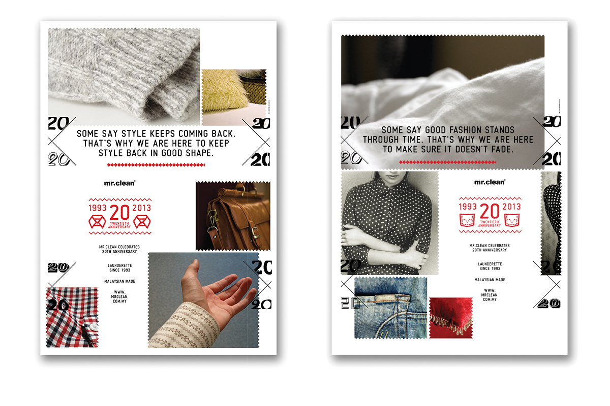
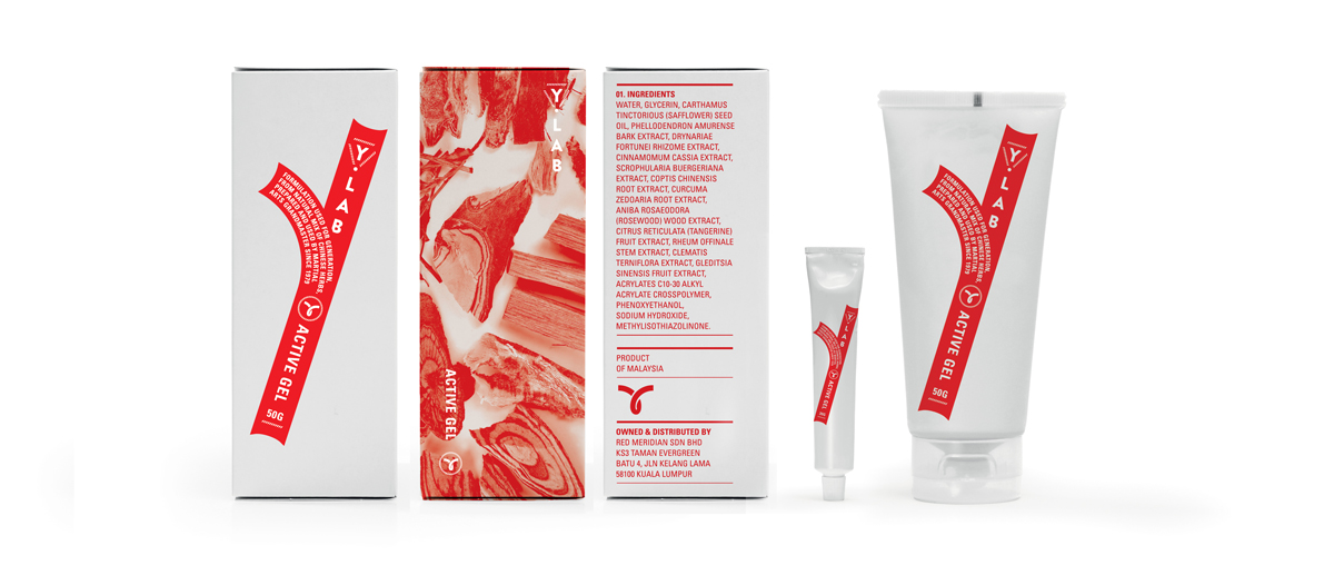
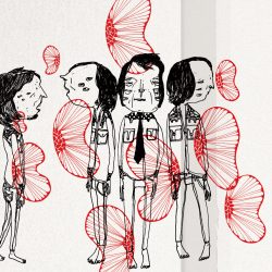
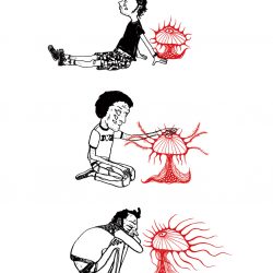
Kawakong’s studio is also not always even about putting the work first, as the duo strongly acknowledges the importance of play. “In our studio we also have what we call our bsides,” described Chung. “Self-initiated work development, stuff besides what we usually do… works we love slightly more.” Taking the form of drawings of characters requiring the donning of 3D glasses in order to be properly viewed, paintings of faces with three eyes ensuring that multiple expressions can be depicted at once and hand-sewn images of both process and form, Kawakong’s bsides often merge Chung and Ming’s visual languages into one, strengthening the character of their gestures by finding ways to work together.
“I noticed that when things don’t have a requirement, that is where we start to push ourselves, naturally. For us, the commercial work and our bsides are of the same philosophy,” furthered Chung. “The name Kawakong means ‘talk to me’ in Hokkien, a widely spoken dialect by many Chinese throughout South East Asia. The reason behind the name is that what we do is mainly about ‘communication.’ We need our client to talk to us and it also comes back to us as a designer or an artist, how we should draw or make things that connect to us, as our own work.”
“ก็เหมือนกับคนอื่นๆ เราก็มีวิสัยทัศน์เหมือนกันนะ” อธิบายอยู่ในหน้าแรกของเว็บไซต์ของ Kawakong สตูดิโอออกแบบกราฟิกและอัตลักษณ์ของแบรนด์ ตั้งอยู่ในกัวลาลัมเปอร์ “1. เพื่อออกแบบให้กับลูกค้า 2. เพื่อออกแบบให้ตัวเราเอง 3. เพื่อให้แน่ใจว่าช่องว่างระหว่างทั้งสองอย่างนี้จะน้อยลงในแต่ละวัน ทุกๆ วัน”
“เราเริ่มทำสตูดิโอที่บ้านเพื่อที่จะควบคุมงานของเราได้มากขึ้นและหลีกเลี่ยงการติดอยู่ในการจราจรที่แออัด” Chung Ping Ong ผู้ร่วมก่อตั้ง Kawakong ร่วมกับหุ้นส่วนและภรรยา Ming Ng Ai Beng อธิบาย “แต่ส่วนใหญ่เพื่อที่จะควบคุมได้มากขึ้น” การควบคุมในที่นี้ไม่ ใช่การควบคุมด้าน ‘สร้างสรรค์’ ที่จะโขกจากพิมพ์บรีฟความต้องการของลูกค้าให้อยู่ในรูปแบบหรือสไตล์แบบนั้นๆ แต่มันคือการหาพื้นที่สำหรับตัวตนของลูกค้าและ Kawakong ให้อยู่ด้วยกัน “เราไม่ทำอะไรขึ้นมาโดยไม่มีความเป็นตัวตนของลูกค้า” Ming ขยายความต่อ “ถ้าหากเรายึดอยู่กับสไตล์แบบใดแบบหนึ่งมันก็จะไม่เหมาะกับลูกค้าทุกคน เราก็เลยพยายามจะเข้าใจถึงภูมิหลังและวัฒนธรรมของบริษัทนั้นๆ เสียก่อนแล้วจึงมาทำให้เหมาะสมตรงตามความต้องการของพวกเขา มันเลยไม่ใช่เรื่องของสไตล์ที่มาก่อน”
สตูดิโอของ Kawakong ยังเป็นสตูดิโอที่ไม่ได้เอาเรื่องงานมาเป็นอันดับแรก เนื่องจากทั้งสองคนเห็นความสำคัญของการเล่น “ในสตูดโอของเรามีสิ่งที่เราเรียกว่า ‘เรื่องอื่นๆ’ (bsides)” Chung อธิบาย “การพัฒนางานจากความคิดริเริ่มของตัวเอง พวกสิ่งที่นอกเหนือจากที่เราทำเป็นประจำ… งานที่เราชอบมากกว่าหน่อย” ในการวาดภาพตัวละครที่เป็นสามมิตินั้นต้องสวมแว่นตาสามมิติเพื่อที่จะได้มองเห็นอย่างถูกต้อง วาดภาพหน้าต่างๆ ด้วยสามตาก็เพื่อให้แน่ใจว่าการแสดงออกที่หลากหลายสามารถแสดงให้เห็นได้ทันทีและร้อยเรียงภาพต่างๆ ทั้งขั้นตอนและรูปแบบด้วยมือสิ่งที่ ‘นอกเหนือ’ ของ Kawakong มักจะผสานเอาภาษาภาพของ Chung และ Ming เข้าเอาไว้เป็นหนึ่งเดียวกัน การหาวิธีที่จะทำงานร่วมกันเป็นการเสริมความเข้มแข็งให้กับบุคลิกลักษณะและทิศทางของพวกเขา
“ผมสังเกตว่าเมื่ออะไรที่ไม่มีความต้องการอันนั้นแหละ มักจะเป็นที่ที่เราเริ่มต้นที่จะผลักดันตัวเอง ซึ่งเป็นธรรมชาติสำหรับเรา งานประเภทที่เป็นการค้ากับงานนอกเหนือของเราจะมีปรัชญาเดียวกัน” Chung กล่าวเพิ่มเติม “ชื่อ Kawakong หมายถึง ‘พูดกับฉัน’ ในภาษาฮกเกี้ยนซึ่งเป็นสำเนียงที่ใช้กันอย่างแพร่หลายโดยคนจีนในตะวันออกเฉียงใต้เหตุผลเบื้องหลังชื่อนั่นก็คือสิ่งที่เราทำส่วนใหญ่เกี่ยวกับ‘การสื่อสาร’ เราต้องการให้ลูกค้าพูดคุยกับเราและมันก็กลับมาที่เราในฐานะนักออกแบบหรือศิลปิน ว่าเราจะวาดหรือทำสิ่งต่างๆ ที่เชื่อมโยงกับเรา เหมือนกับว่ามันเป็นงานของเราเอง”
TEXT: REBECCA VICKERS
PHOTO COURTESY OF KAWAWONG
kawawong.com