DESPITE FACING HEAVY SARCASM AND MOCKERY, THE NEW REDESIGN OF XIAOMI BY KENYA HARA AIMS TO ACCOMMODATE FLEXIBLE USE IN ITS IMMENSE PRODUCT CATALOG
TEXT: WEE VIRAPORN
PHOTO COURTESY OF XIAOMI EXCEPT AS NOTED
(For Thai, press here)
This past week, the news of Xiaomi’s rebranding (or a change of logo to some’s rather limited view) has been one of the heated discussions and topics of Internet drama. Apart from the fact that the rebrand is that of Xiaomi, one of the world’s biggest brands known for its minimal-looking, comparatively affordable household products (some heavily ‘inspired’ by products from many top brands) that have been highly and successfully in penetrating Thailand’s consumer market, what’s particularly interesting is how the it was done by the renowned Japanese designer known to design enthusiasts as the godfather of Minimalism, the bearer of Muji, Kenya Hara. Above all, the drama centers around how the design of the new logo is almost indistinguishable from the old one. Following are feedback from the media and the Internet community, critiquing the barely noticeable change with mockery and sarcasm.
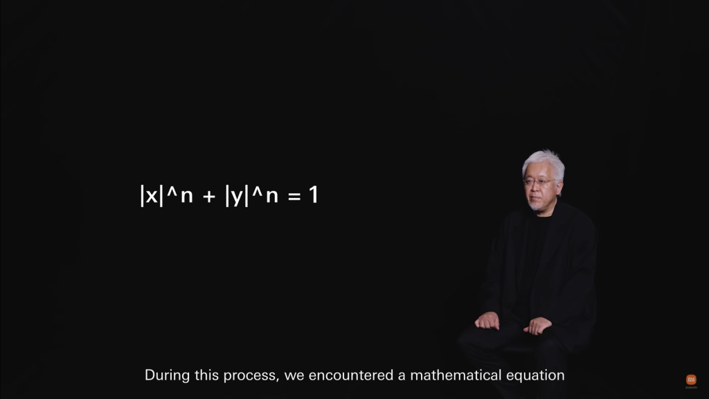
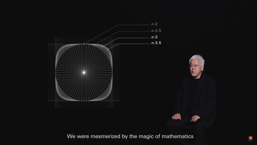
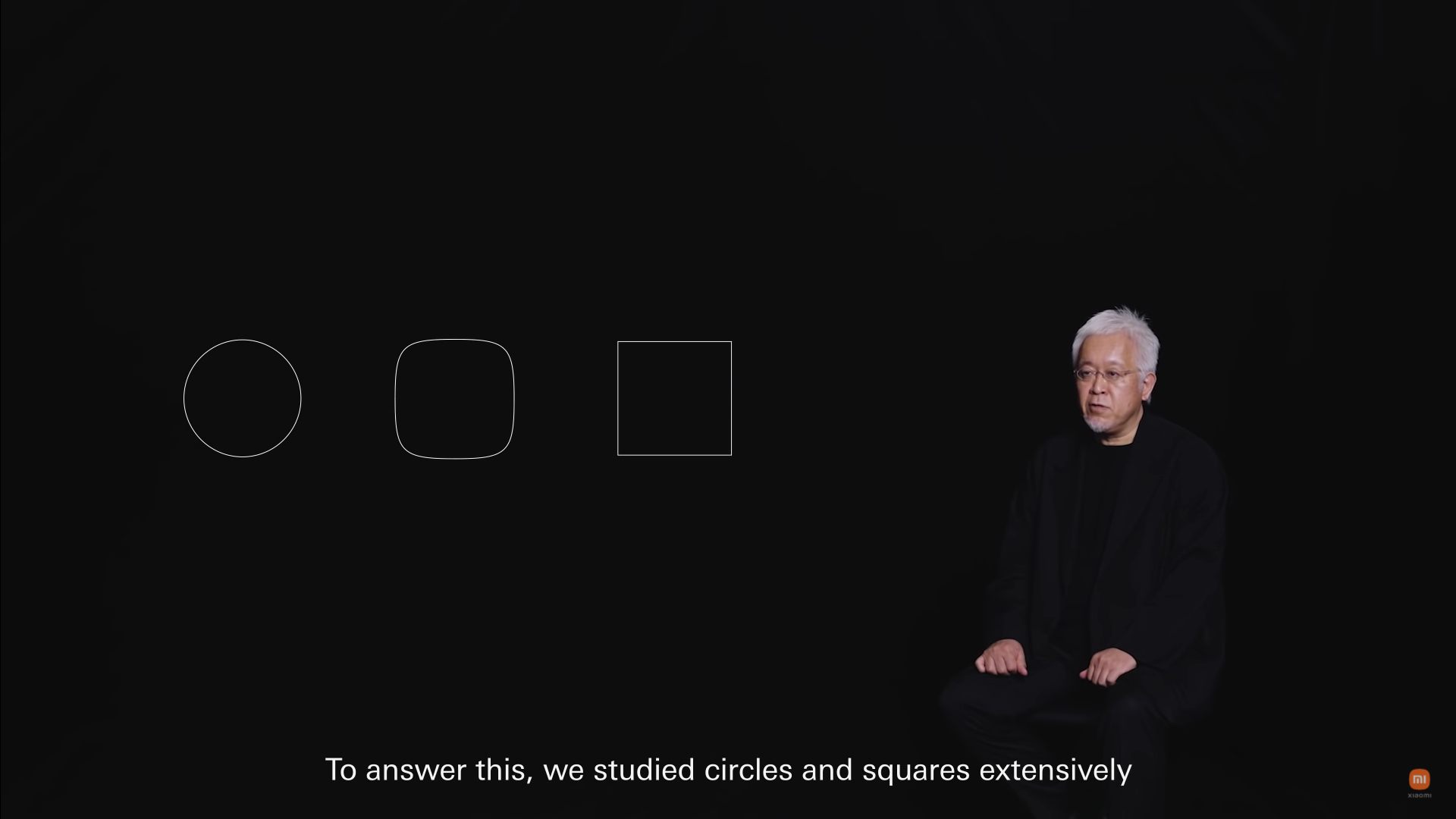
From most people’s perspective, the new logo looks nothing more than just the change of the sharp corners to round edges—a hybrid between a square and a circle. In the five-minute long video-presentation, Kenya Hara explains the ‘Alive’ concept behind the shape, which reflects the increasingly intertwined connection between human beings and technology.
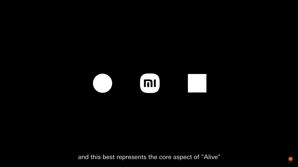
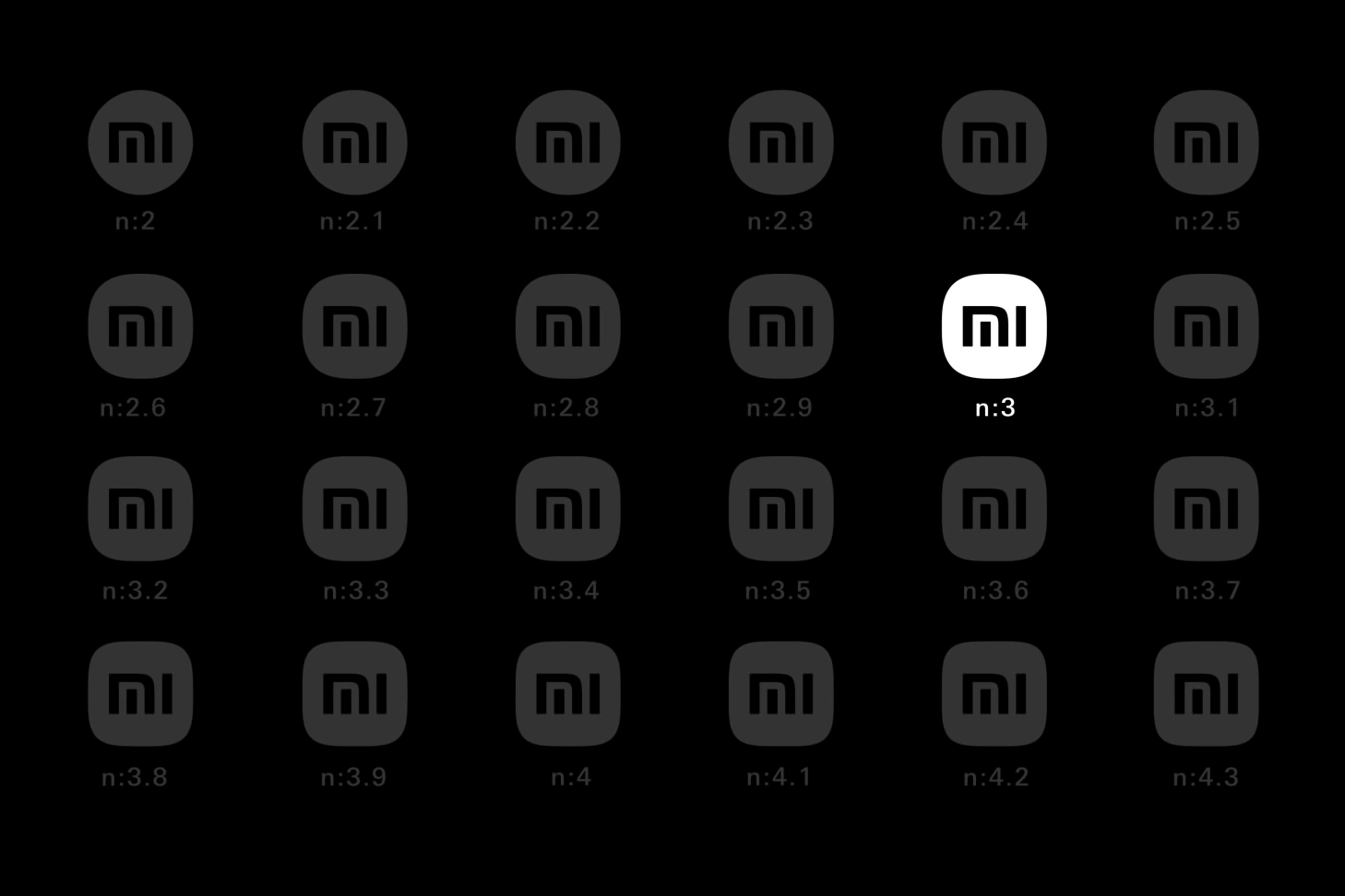
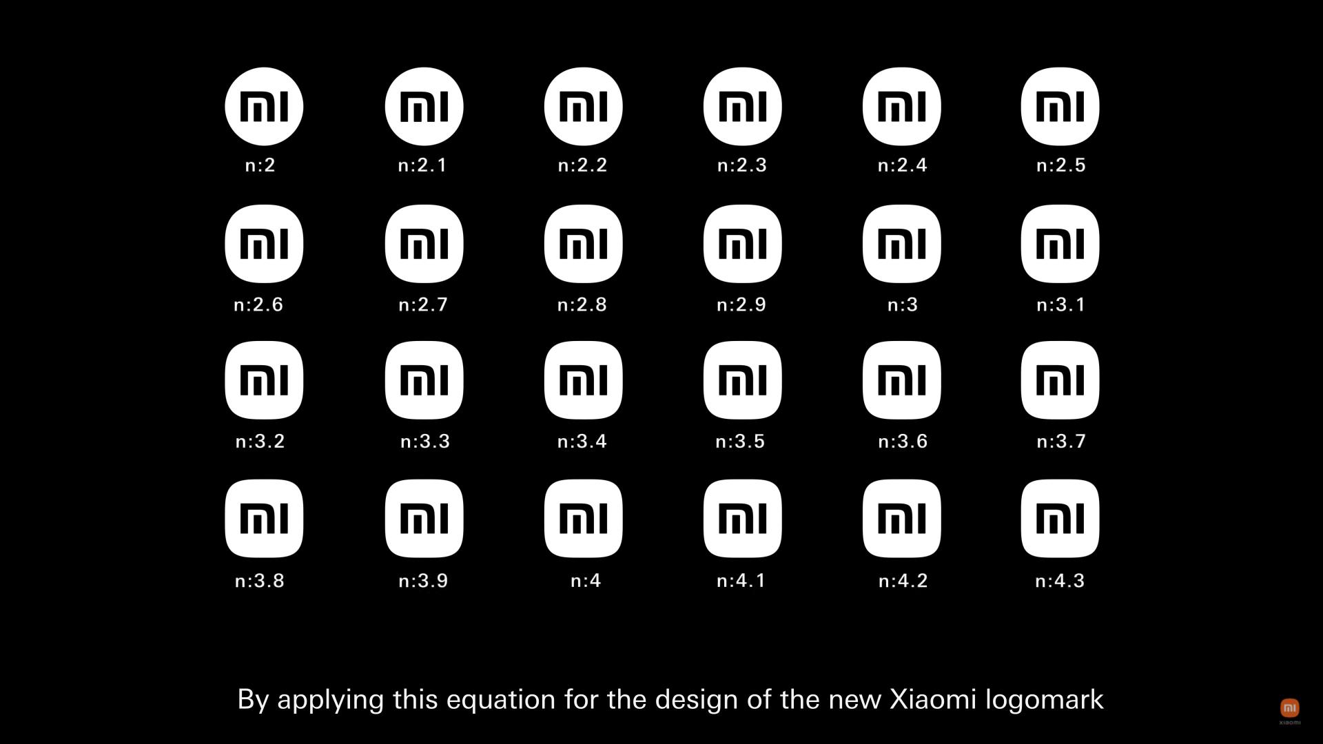
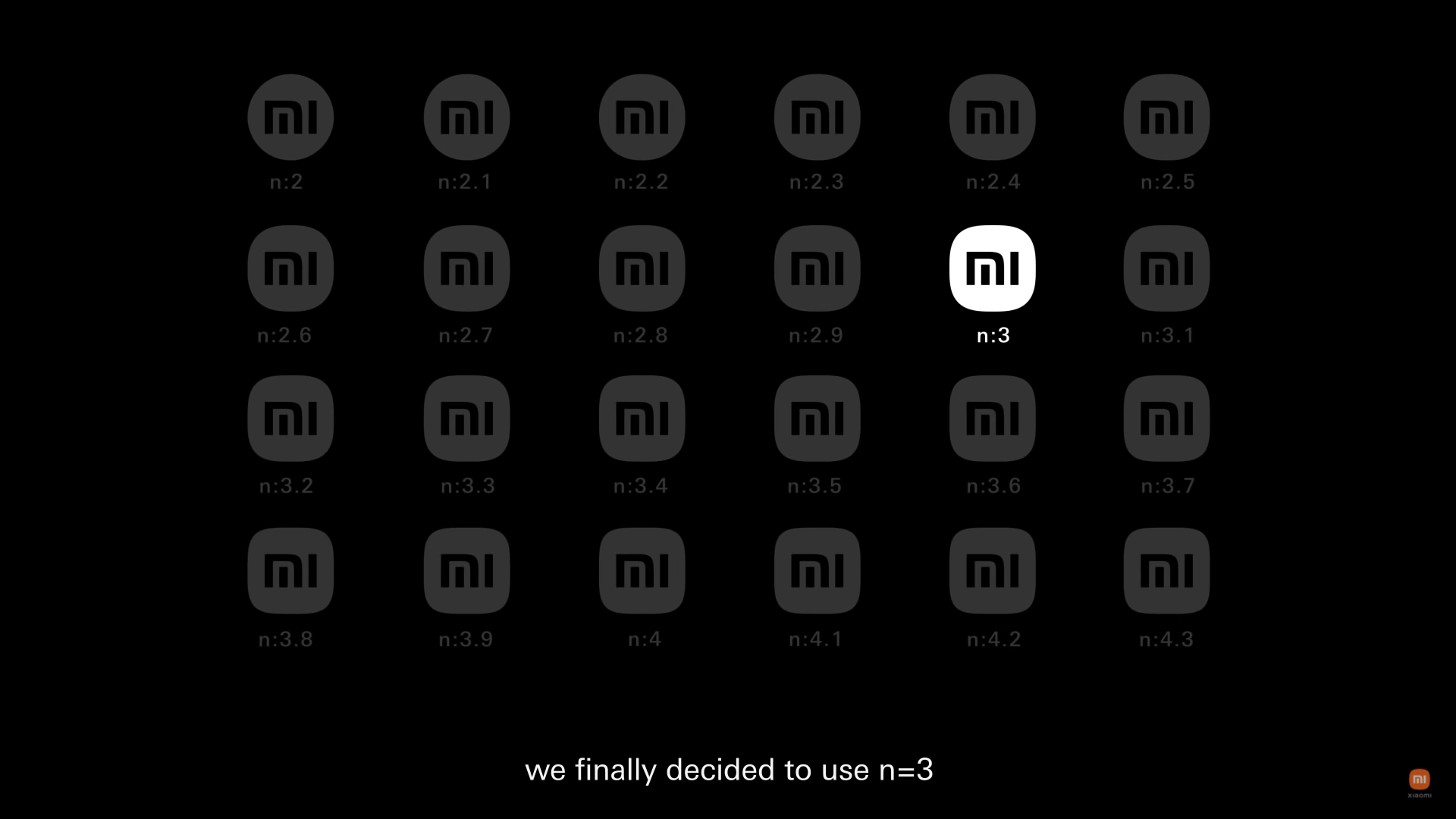
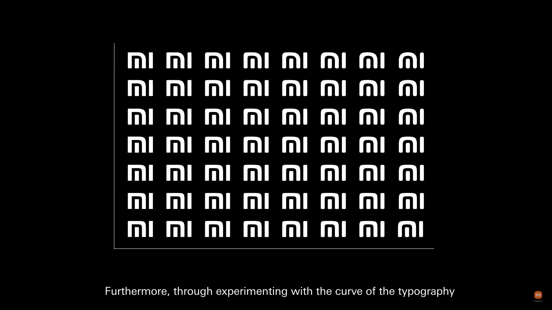
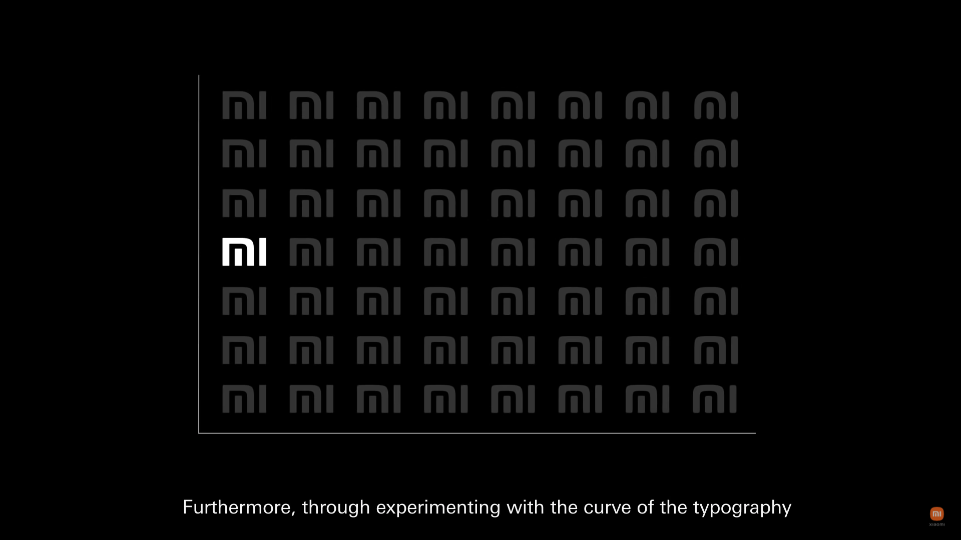
The presentation also showcases an equation. By adding different variations, it creates tens of forms, before finally generating the most balanced shape between a square and circle. The curves are also used with the ‘mi’ logomark and the ‘Xiaomi’ logotype. Three minutes into the video, I found myself nodding in agreement and after I finished watching the entire presentation, I realized that I shouldn’t rush and judge this rebrand merely from the logo!
Xiaomi’s new logo
iPhone software

App icons in One UI
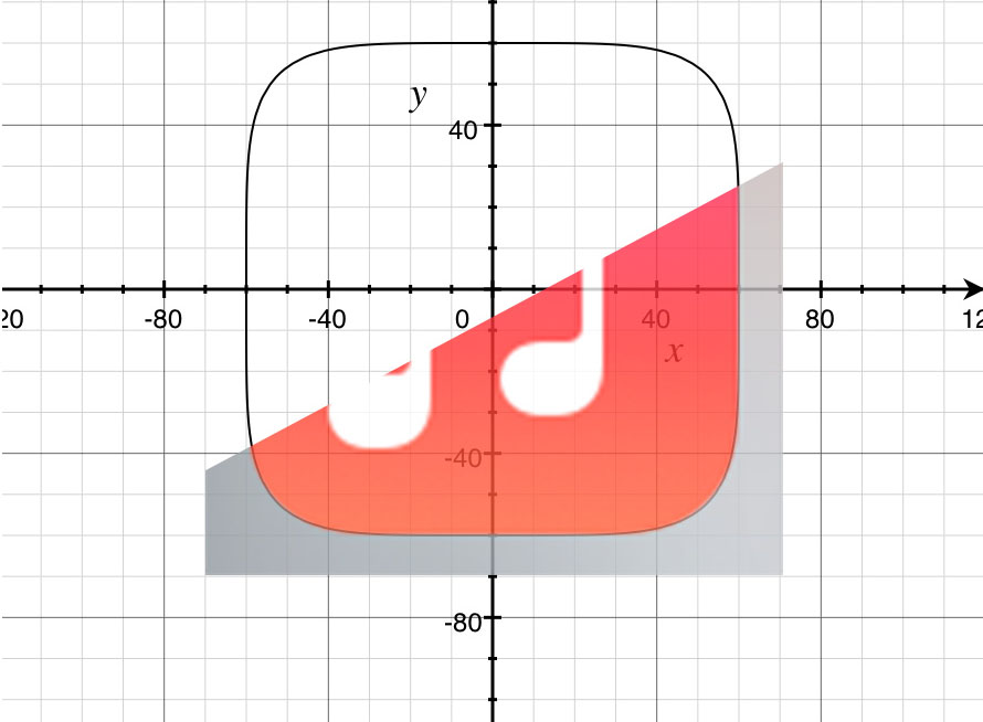
This isn’t the first time a brand has revealed its obsession with finding the right balance between a circle and a square. With Apple products, particularly the software and operating systems, there have been several adjustments made to the ‘curves’ or the ‘squircle’ (square + circle) frame. For the Android camp, there’s a case of Samsung’s One UI whose shape is quite similar to Xiaomi’s recently changed logo.
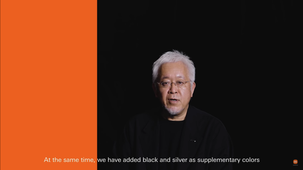
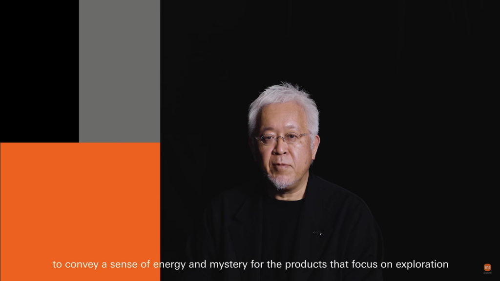
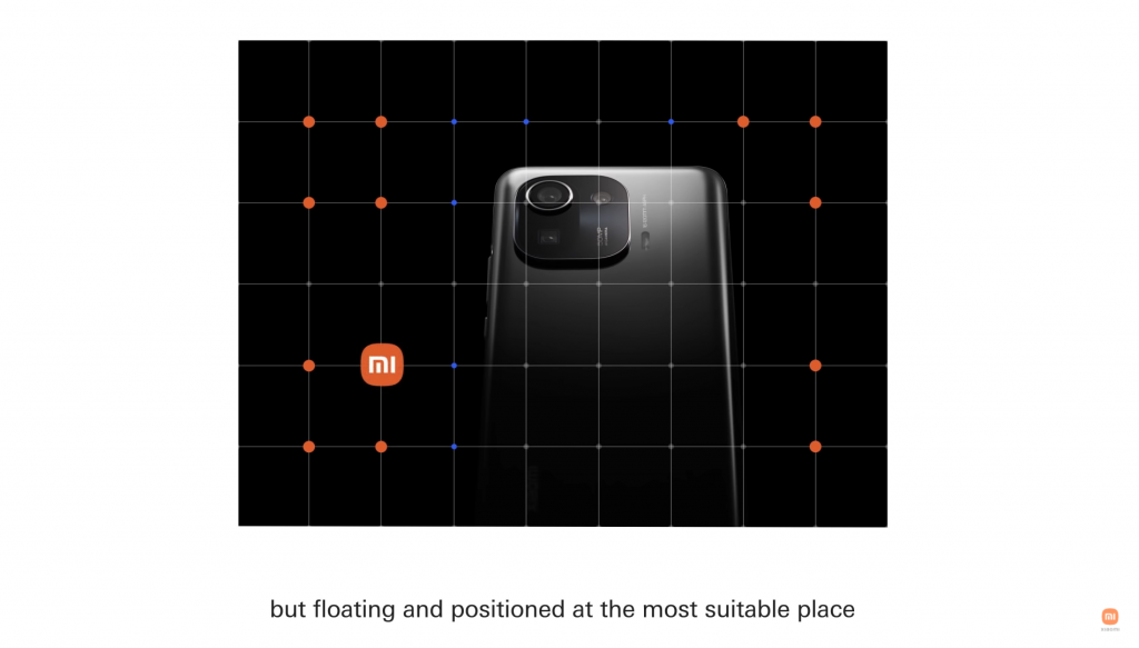
I’m sold on the entire rebranding as a carefully thought out and developed process, not because it’s a project by Kenya Hara, or due to the equation. It isn’t because of the grids and curves which reference the golden ratio, but the variations of the design’s utility itself. It’s the color palette Hara roughly presented, and how the secondary colors can be used with different types of products. It’s the flexible positioning of the logo on various sorts of mediums that isn’t fixated to a specific corner or space. There are also those moments, and the moving images of nature presented alongside peoples’ changing facial expressions. Everything works well together and it makes me want to see how the rebranded identity will be used in the media and products that Xiaomi will be releasing into the market. The issue lies in the design’s ability to be ‘neutral’ and ‘flexible’ enough to fit into Xiaomi’s incredibly immense product catalogue.
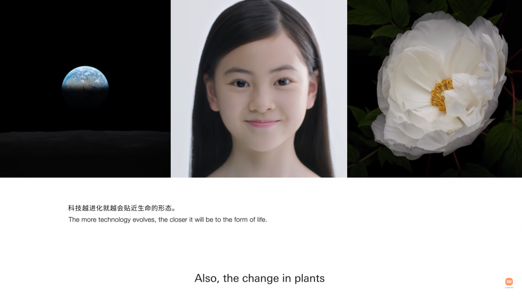
If we are to accept the fact that we’re living in the world where technology doesn’t have to be blatantly high-tech like the way it was portrayed during the 1980s and 1990s. Technology has become an integral part of our daily lives. It’s subtle but noticeable if we look close enough (and it doesn’t make us feel any different either way). The humble logo is a only a part of a concept on a larger scale, which is the brand itself. And if Kenya Hara used to create Muji, the no-brand brand that we have all fallen in love with, then the saying about Xiaomi as,’not China’s Apple but the MUJI of Tech’ isn’t just a clear prediction but a very likely reality.

