THE PILOT HISTORIC HEADQUARTERS RENOVATION IN SILOM BY EKAR ARCHITECTS OPENS A NEW CHAPTER OF THE BRAND
TEXT: PRATCHAYAPOL LERTWICHA
PHOTO: KETSIREE WONGWAN EXCEPT AS NOTED
(For Thai, press here)
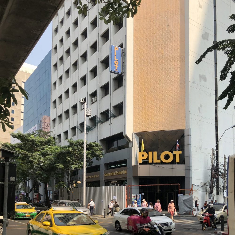
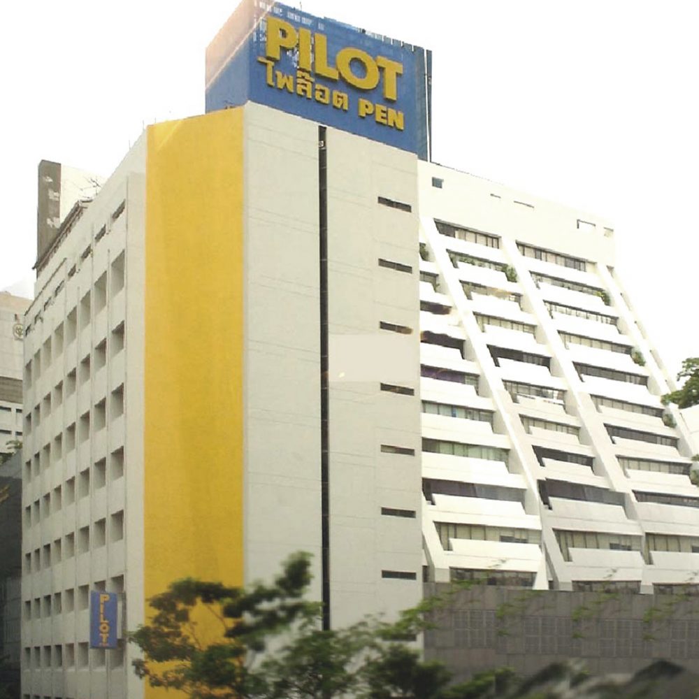
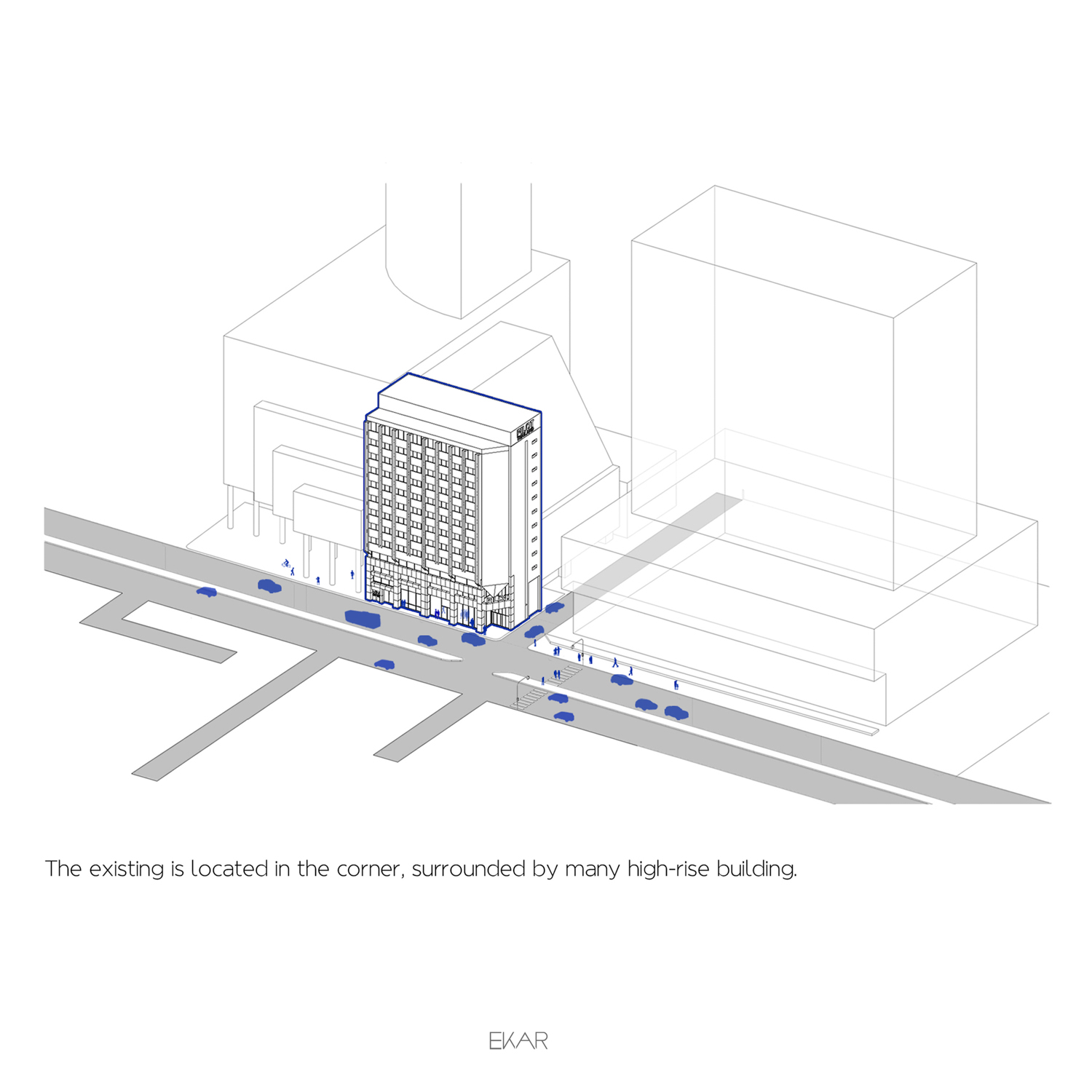
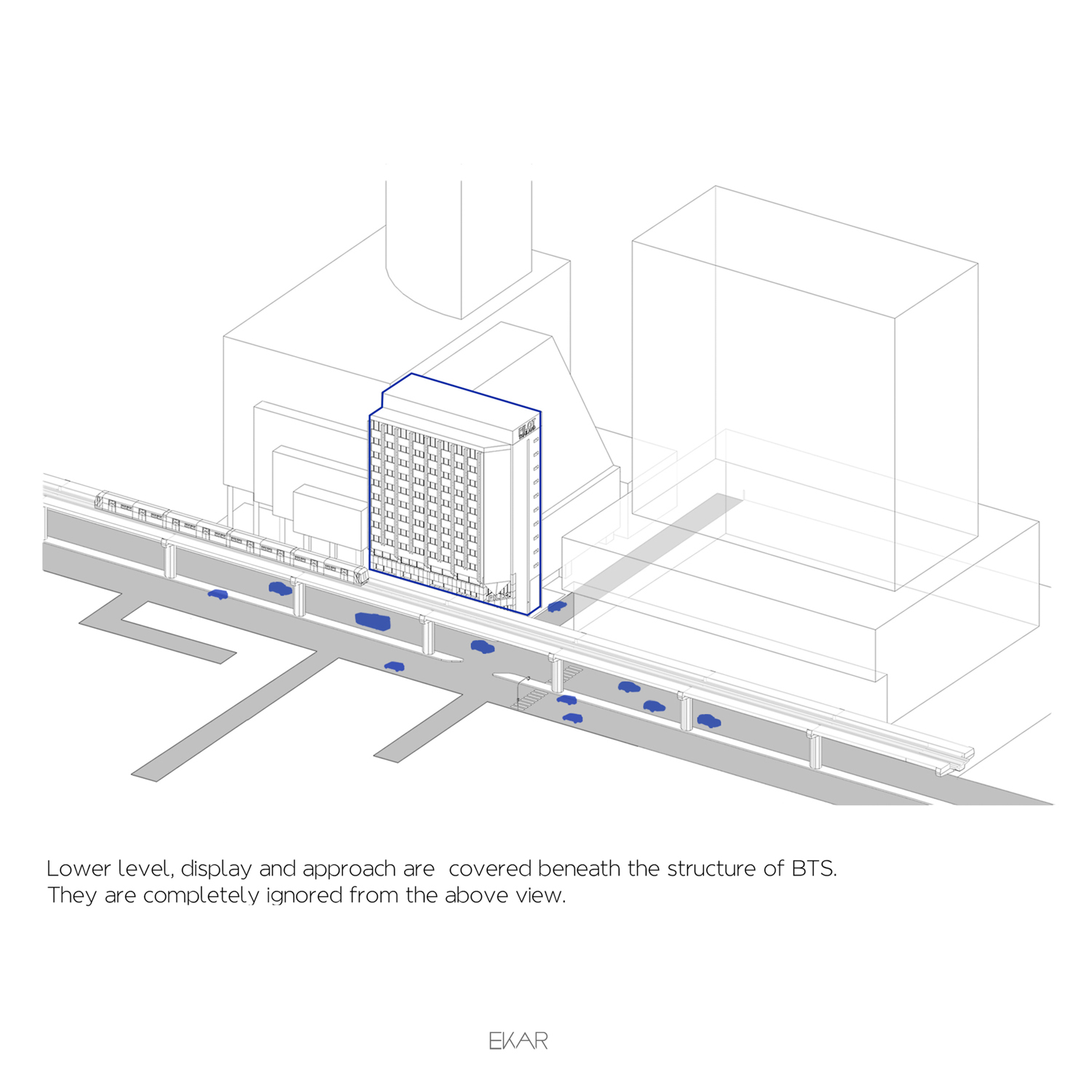
For those who aren’t frequent visitors of the Silom neighborhood, the building where the longstanding stationary brand ‘PILOT’ is headquartered on the corner of Soi Silom 3 and Silom Road is simply just a built structure of no particular significance. But for the Silom folks, it is one of the buildings that will always mean something. This is a place that once housed a store all the stationary geeks love and for those who didn’t know where to go. The building also holds historical meaning for Silom Road as one of its first high-rises. As time passed, the edifice deteriorated over time, and small tiles cladding the exterior surface were falling off. It led PILOT Thailand to ask Ekaphap Duangkaew of EKAR Architects to oversee a major renovation that would open a new chapter for both the stationary brand and the Silom quarter.
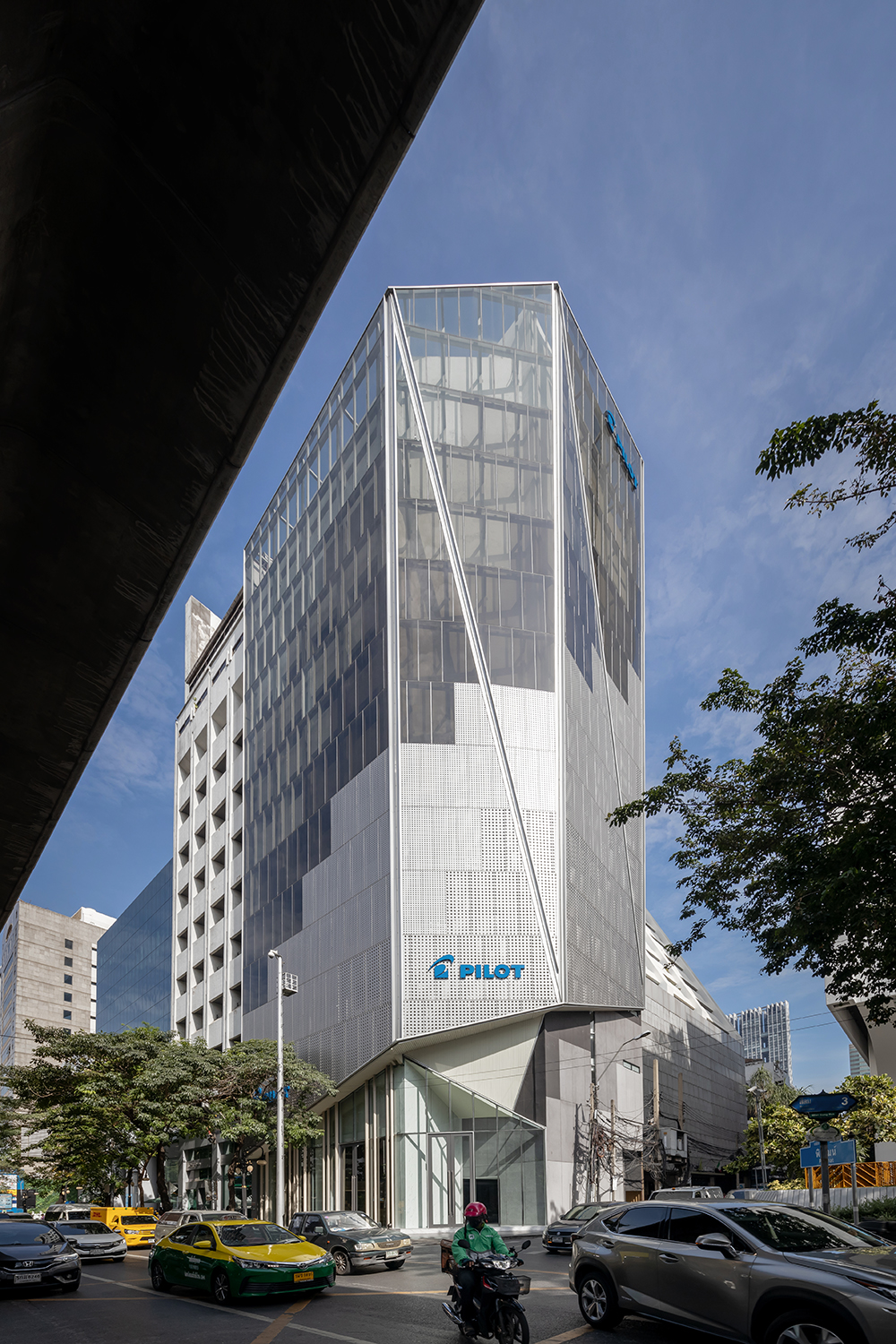
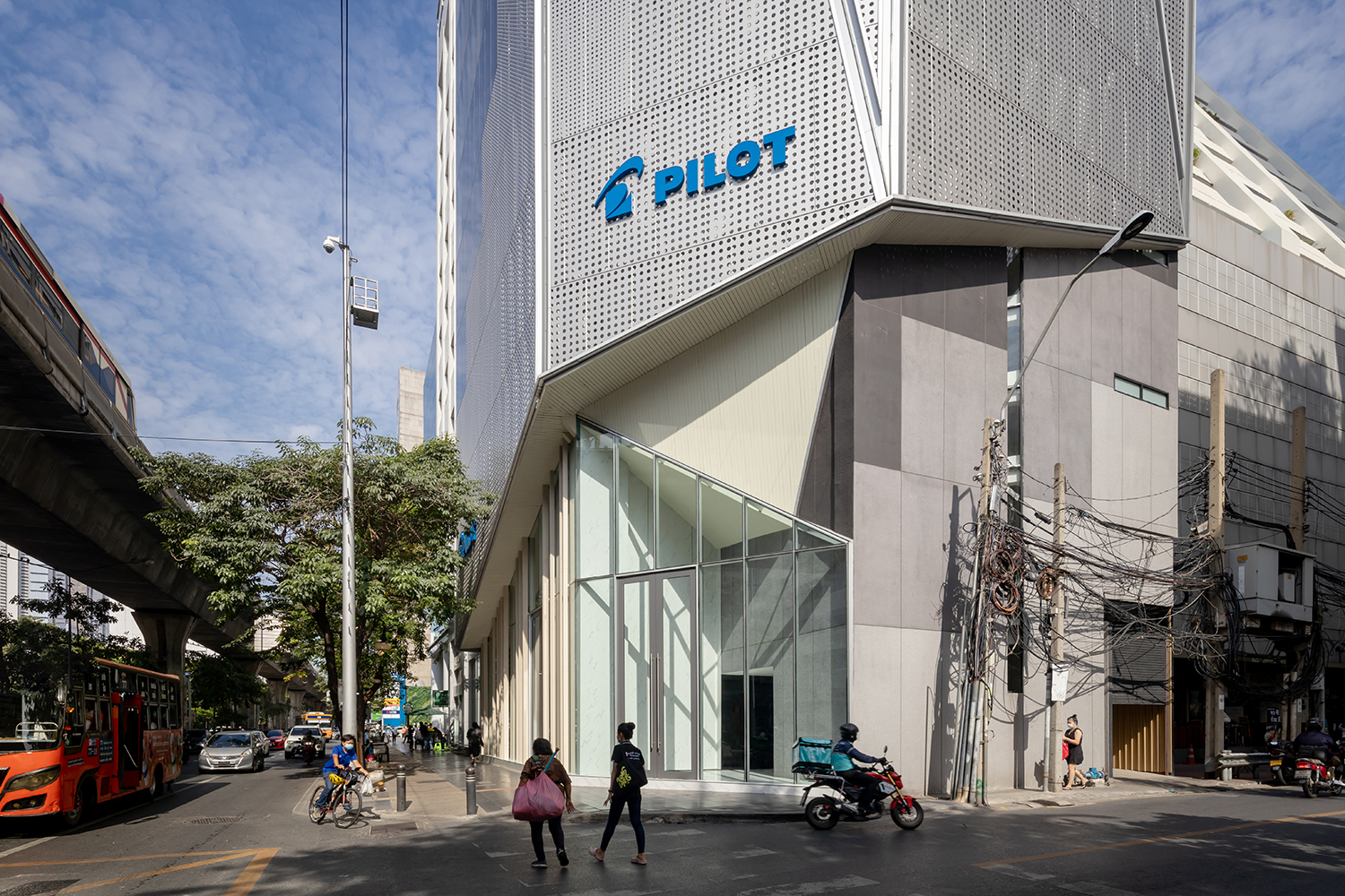
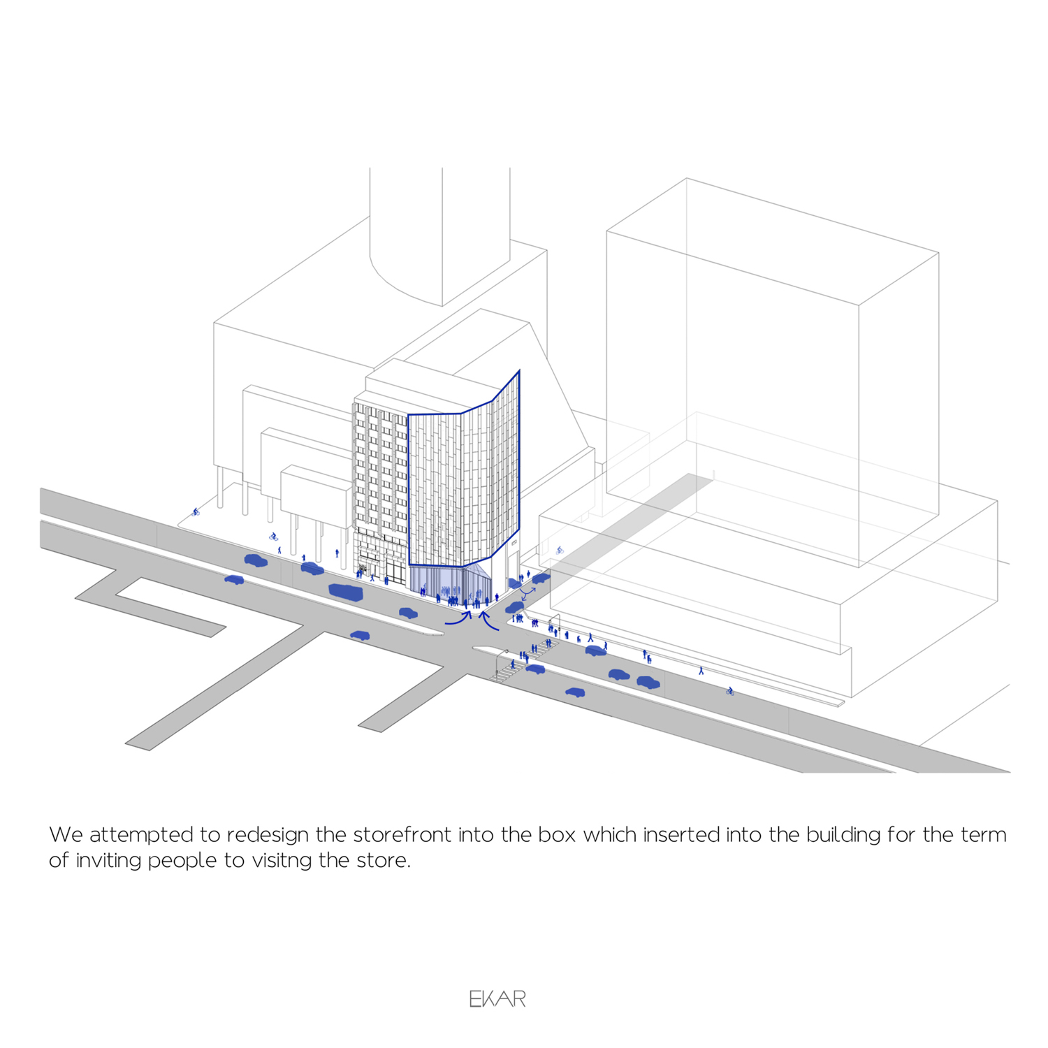
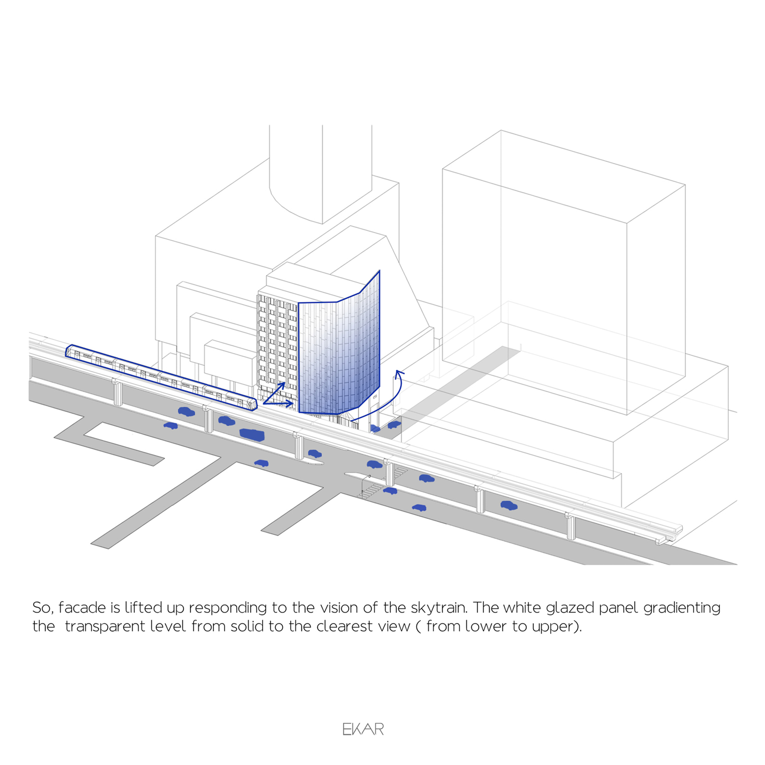
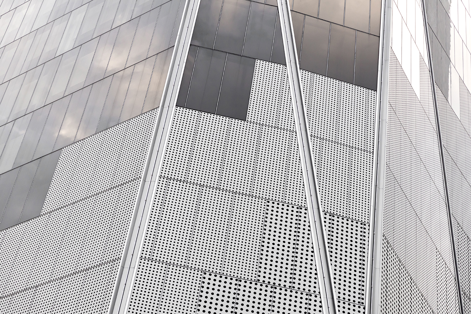
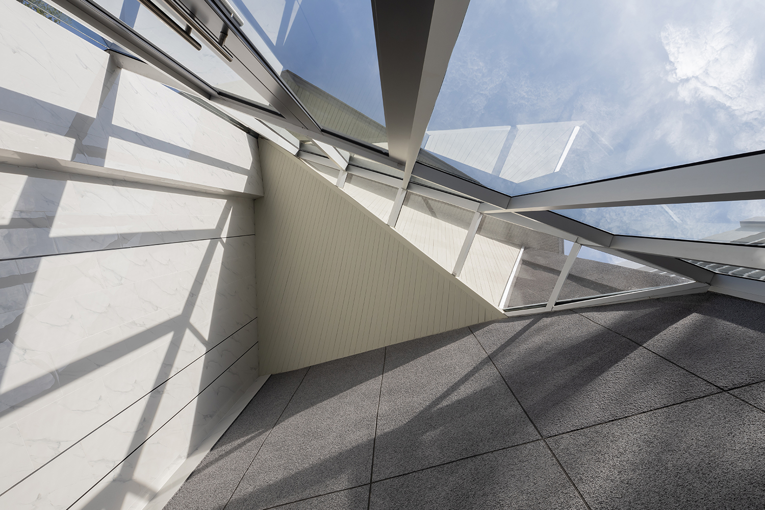
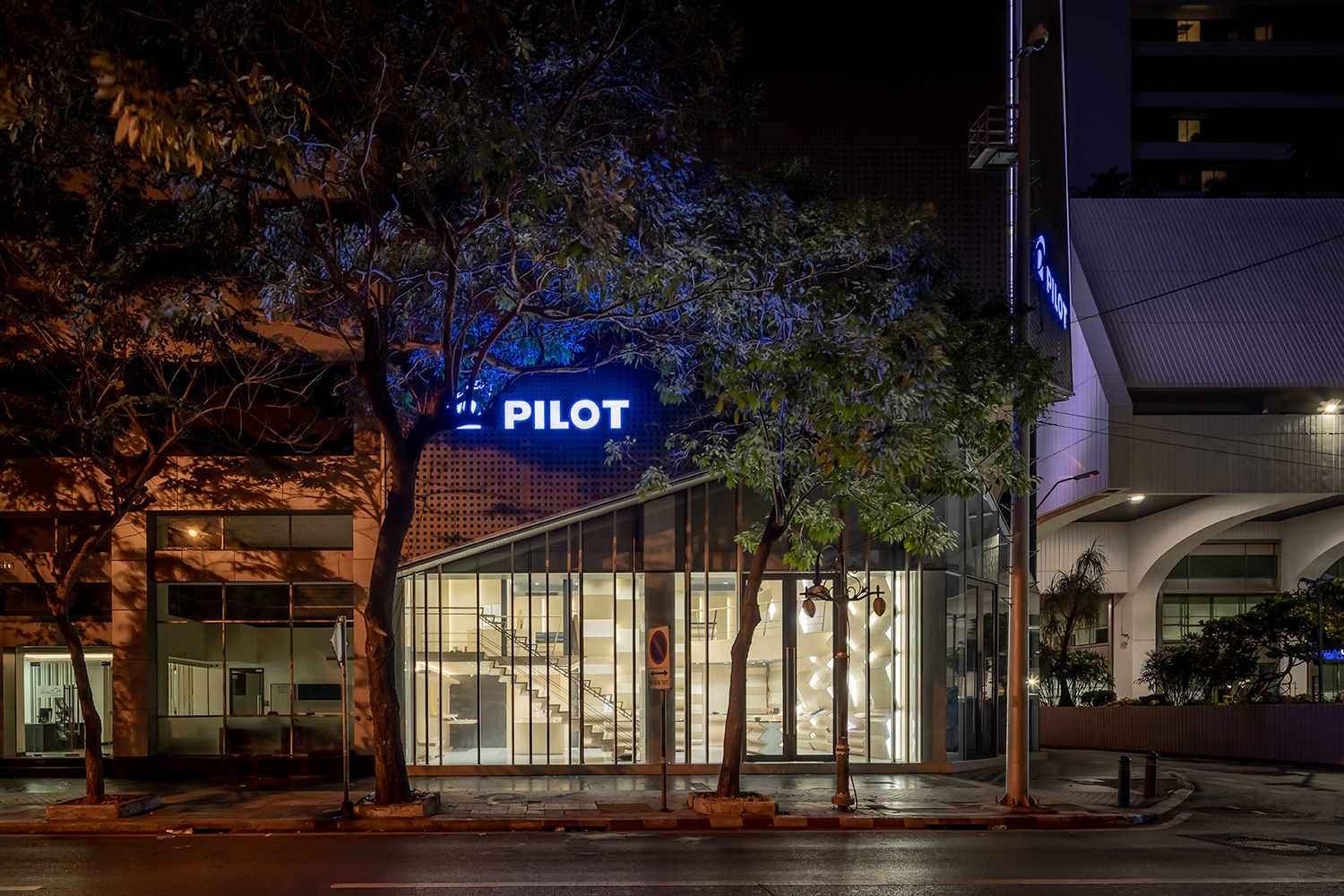
After being informed about the details the design was expected to deliver, the architect was faced with another challenge. One of the requirements was that the renovation needed to take place without disturbing the people working inside the building, for all the company’s business operations were required to continue even if there was construction going on. With this being a limitation, the architect decided to renovate the exterior by stripping off all the rundown white tiles and creating a new facade that would envelop the existing structure. The new design plays with the accessibility of the materials, enabling the facade to interact with the passerby at different floor levels. At the ground floor, the transparent glass welcomes outsiders to interact with the interior space while at the higher level of the skytrain station, perforated aluminium sheets are used to restrict but not prohibit visual accessibility. The higher the level, the more holes on the aluminium sheets gradually increase with the top part of the facade being a glass wall displayed with a gradient color that graduates from the darkest to the lightest tone. Additionally, the architect preserves the triangular concrete summit, which is the original building’s characteristic, by designing the facade to have a triangular shape that mimics the sharpness of a pointed pen.
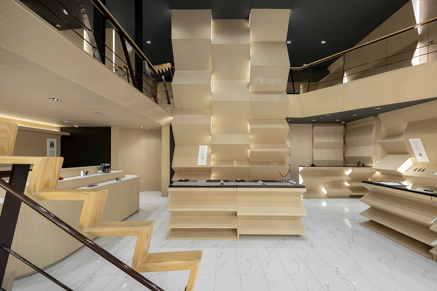
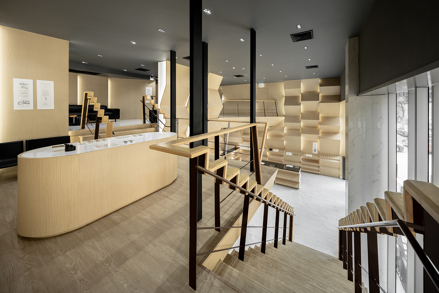
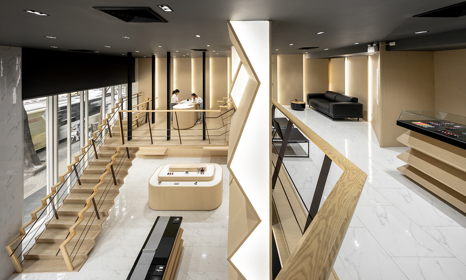
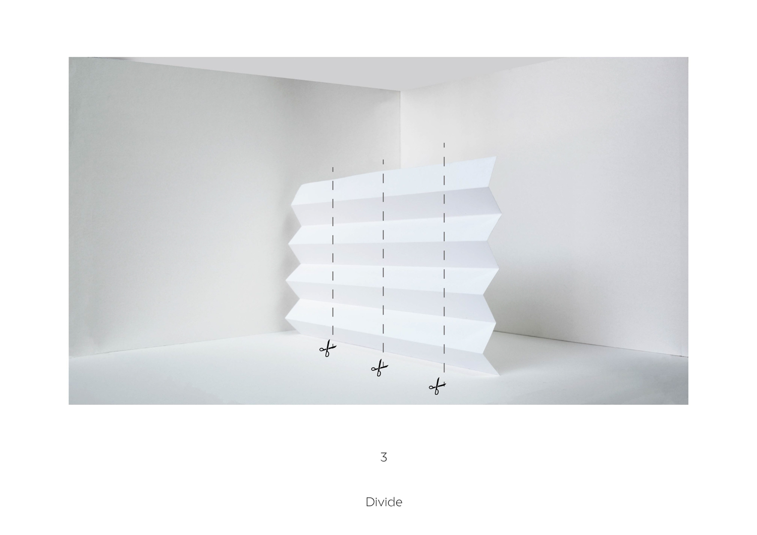
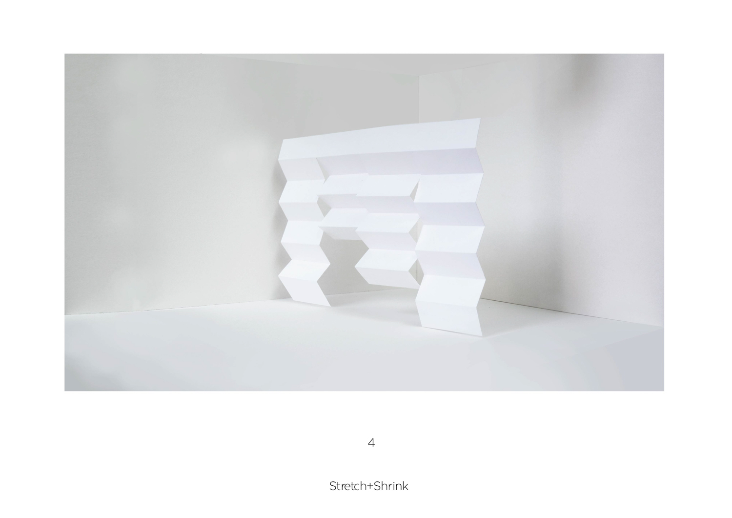
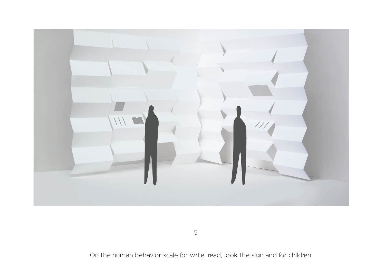
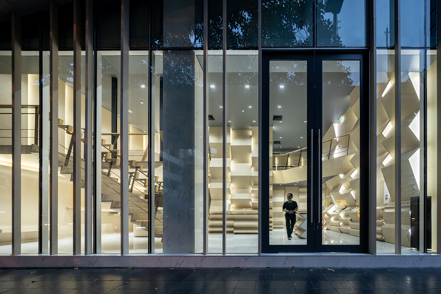
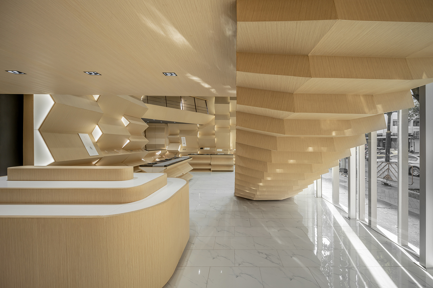
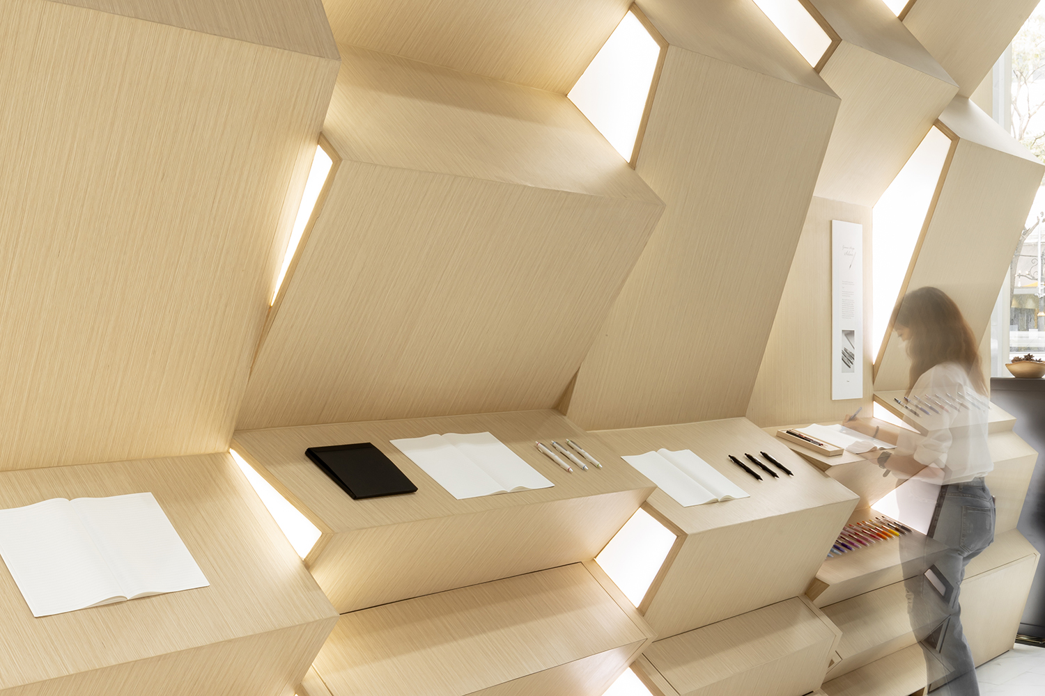
For the interior program, the architect transformed the ground floor area that used to house a stationary store into a ‘museum’. The new program welcomes visitors to personally experience different anecdotes and feelings when writing using PILOT pens. Once inside, one will come across methodologically curated display shelves whose folding and jagged rectangular form takes inspiration from the ancient Khoi notebook that Thai people used for writing and documenting notes, adding a glimpse of the Thai characteristics into the design. The varying angles of the jagged and bending parts of the shelves are the architect’s intention for users to have the experience of writing on surfaces with different levels of inclination using various types of pens. The architect also designs the shelves to have dissimilar heights to accommodate each user’s body proportion and postures.
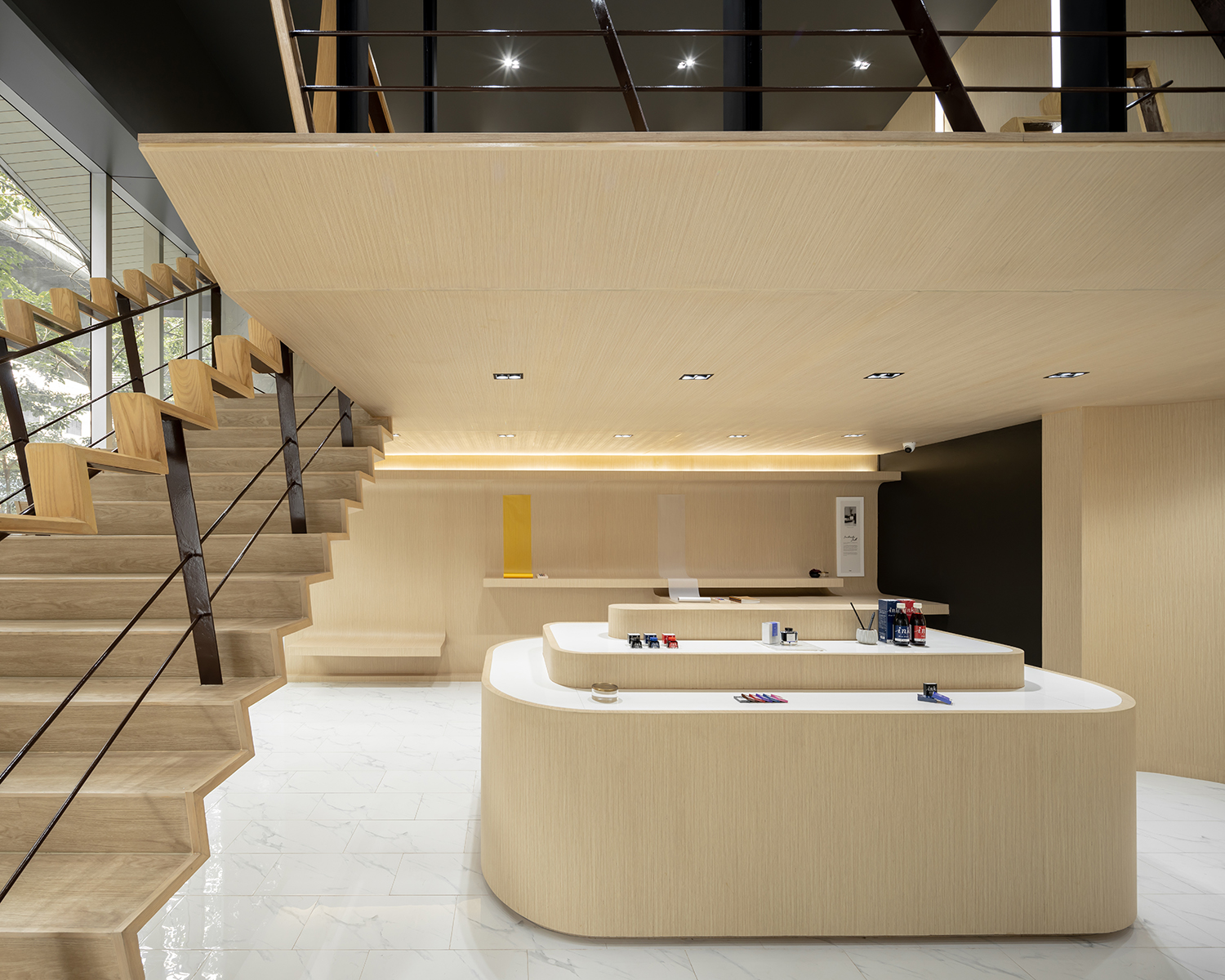
One can say that this latest refurbishment that has transformed the PILOT Thailand building marks a prominent chapter in the brand’s history. And let’s not forget how the newly-renovated structure has brought the fading memories that people of Silom have for this iconic building back to life.

