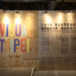
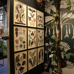
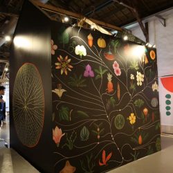
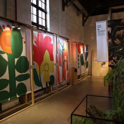
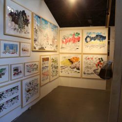
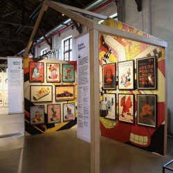
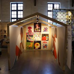
IN VISUAL TAIPEI, A PORTRAIT OF A CITY COMES TOGETHER THROUGH EXHIBITION OF VISUAL ART, ILLUSTRATION AND GRAPHIC DESIGN CELEBRATING TAIPEI’S RECOGNITION AS WORLD DESIGN CAPITAL (WDC) 2016.
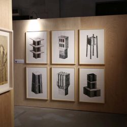
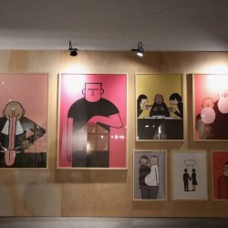
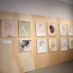
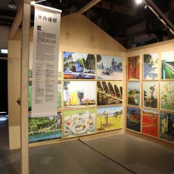
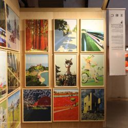
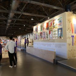
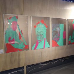
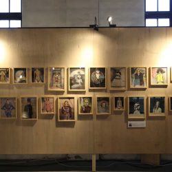
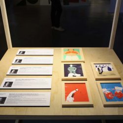
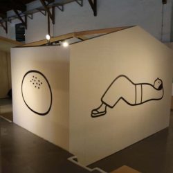
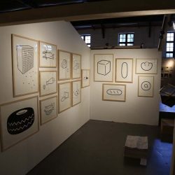
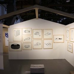
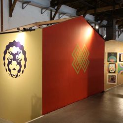
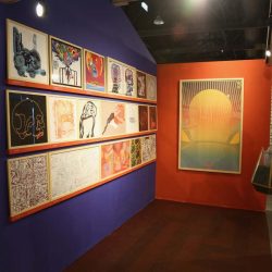
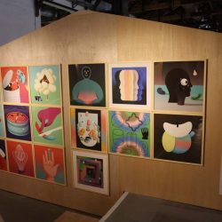
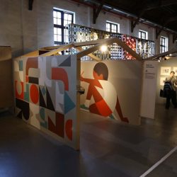
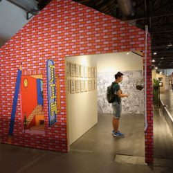
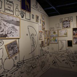
Visual Taipei, an exhibition of visual art, illustration, and graphic design curated by Page Tsou, founder of Taipei-based studio, Auspicious Design, invites renowned illustrators, graphic designers, and visual artists from around the world to create works that reflect upon their impressions of Taipei. With over 300 pieces included within the exhibition, a collaborative portrait of the city comes together in fitting fashion for the city’s recognition as World Design Capital (WDC) Taipei 2016.
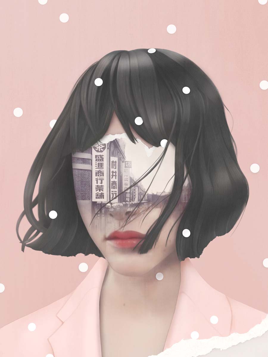
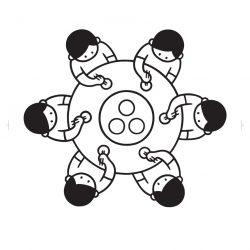
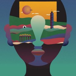
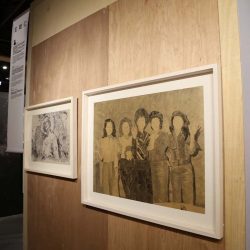
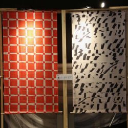
Untitled by Hsiao-Ron Cheng, Image © WDC Taipei
Several of the artworks realize the artist’s reflections on Taipei. Were there any responses that you found surprising or particularly memorable?
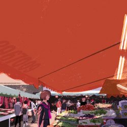
Page Tsou: For this exhibition we invited several international artists to create works as a response to Taipei. They re-interpreted this city with their different artistic expressions and unique perspectives, in the hope of giving locals a whole new way of seeing their city. I especially like the illustration of a traditional market by Tatsuro Kiuchi. The Japanese artist used bold colors and a rich contrast between light and shadow to bring a different style to a scenery with which we are very familiar.
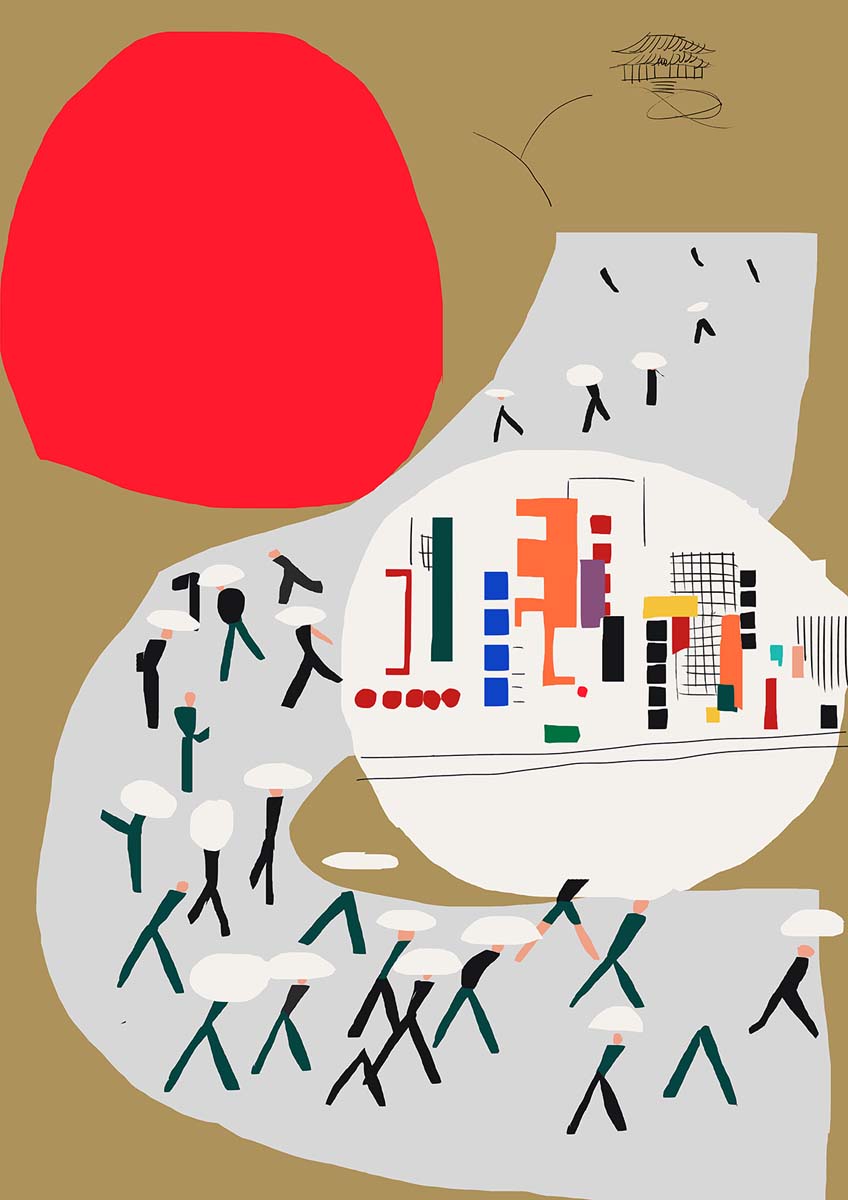
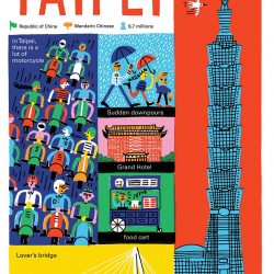
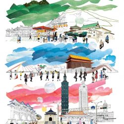
Taipei Life by Antti Kalevi, Image © WDC Taipei
In your opinion, were there any differences between the ways in which the international and locally based artists approached the exhibition?
PT: Each of the artists involved are quite outstanding and I am very glad they were willing to participate in this exhibition in Taipei. For over half of them, this was their first time exhibiting their works in Taiwan. I believe they can evoke a new, exciting response in Taiwanese people. Through their participation in this exhibition, these international artists will have a deep impression of Taipei.
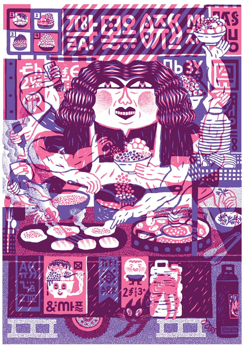
Moichi Jelly by JooHee Yoon, Image © WDC Taipei
How does the Herman Miller Eames Molded Plastic Chairs project play into the exhibition?
PT: The DSR Chairs were originally designed by Mr and Mrs Eames. The design was entered into a low budget furniture competition held by MoMA. The materials were later adjusted by Herman Miller and put into mass production, and because of its bright colors and comfortable design, the chair became a design classic that slips easily into most kinds of spaces.
This kind of design which is intimately bound with people’s daily lives really suits the spirit of my exhibition. We decided to use the chair as a form on which creatives from different fields could experiment with their art so that people could see the sparks of inspiration which arise from cross-collaborations and experimenting with different forms. The integration of creativity between the two also emphasizes the contemporary nature of this exhibition.
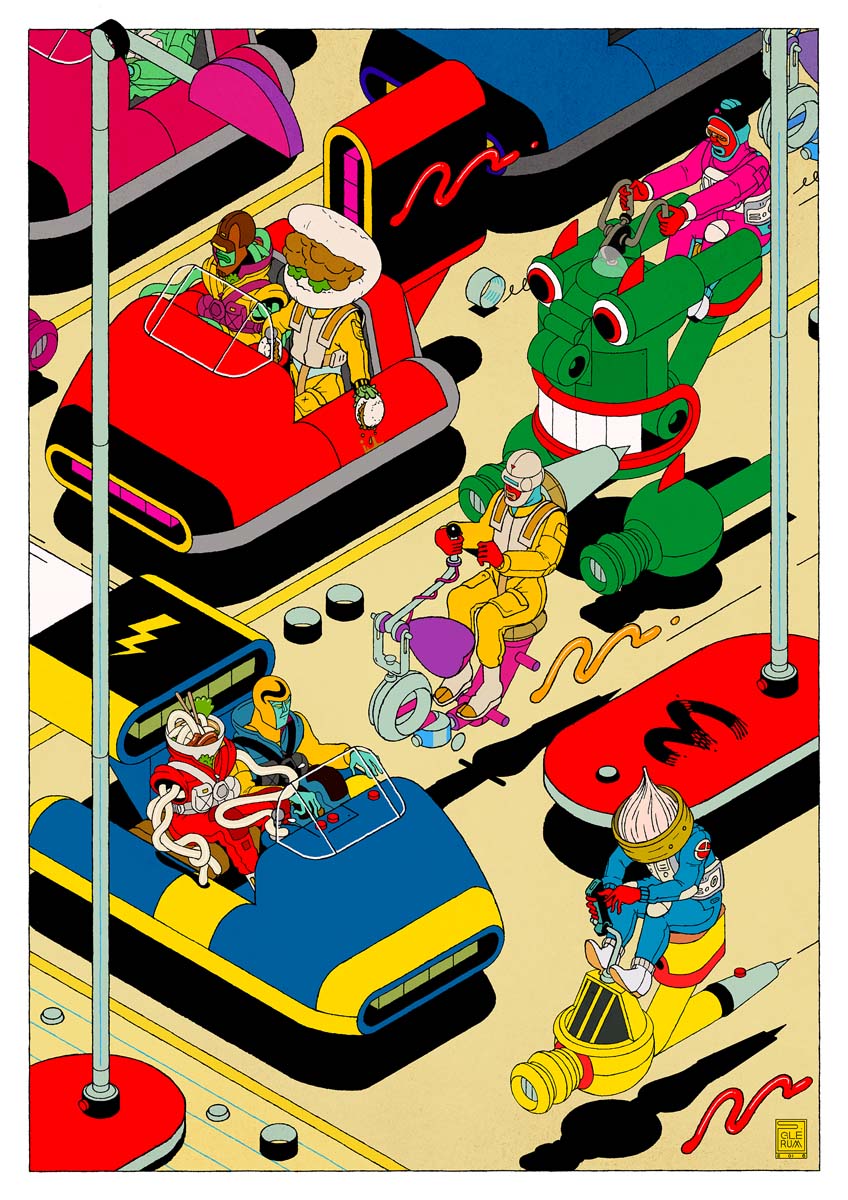
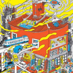
Taipei Life by Stefan Glerum, Image © WDC Taipei
How about the animated artworks portion of the exhibition?
PT: We hope to bring the audience a different experience from watching commercial animation movies at the cinema. The teams we invited are mostly small studios. Their works are very experimental, yet with smooth motion, artistic aesthetics, and the warmth of the handmade.
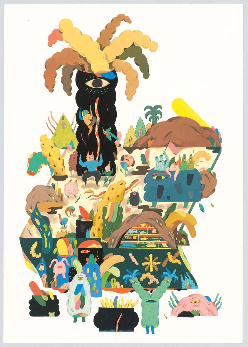
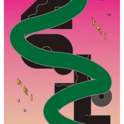
The Way of Looking by Inca Pan, Image © WDC Taipei
And last but not least and a tough question I’m sure – any personal favorites of the works included within the exhibition?
PT: I appreciate the uniqueness of each of the artists’ works. The Jim Stoten’s style reminds me of the 1960s, which was the golden era of Milton Glaser and the Push Pin Studio. It also makes me think of the lively colors from the animation, Yellow Submarine. These are all associated with happiness and joy. Zoë Taylor also exhibits her fashion illustrations for AnOther magazine. This series of works looks like a scene captured from a classic movie. It captures a quiet atmosphere which is also paradoxical. I found her artwork very attractive and it totally overturned my preconceived ideas about fashion illustration.
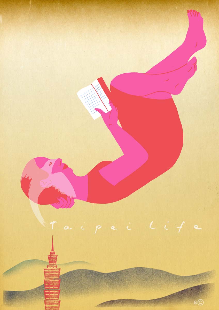
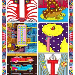
Taipei Life by Sophie Casson, Image © WDC Taipei


