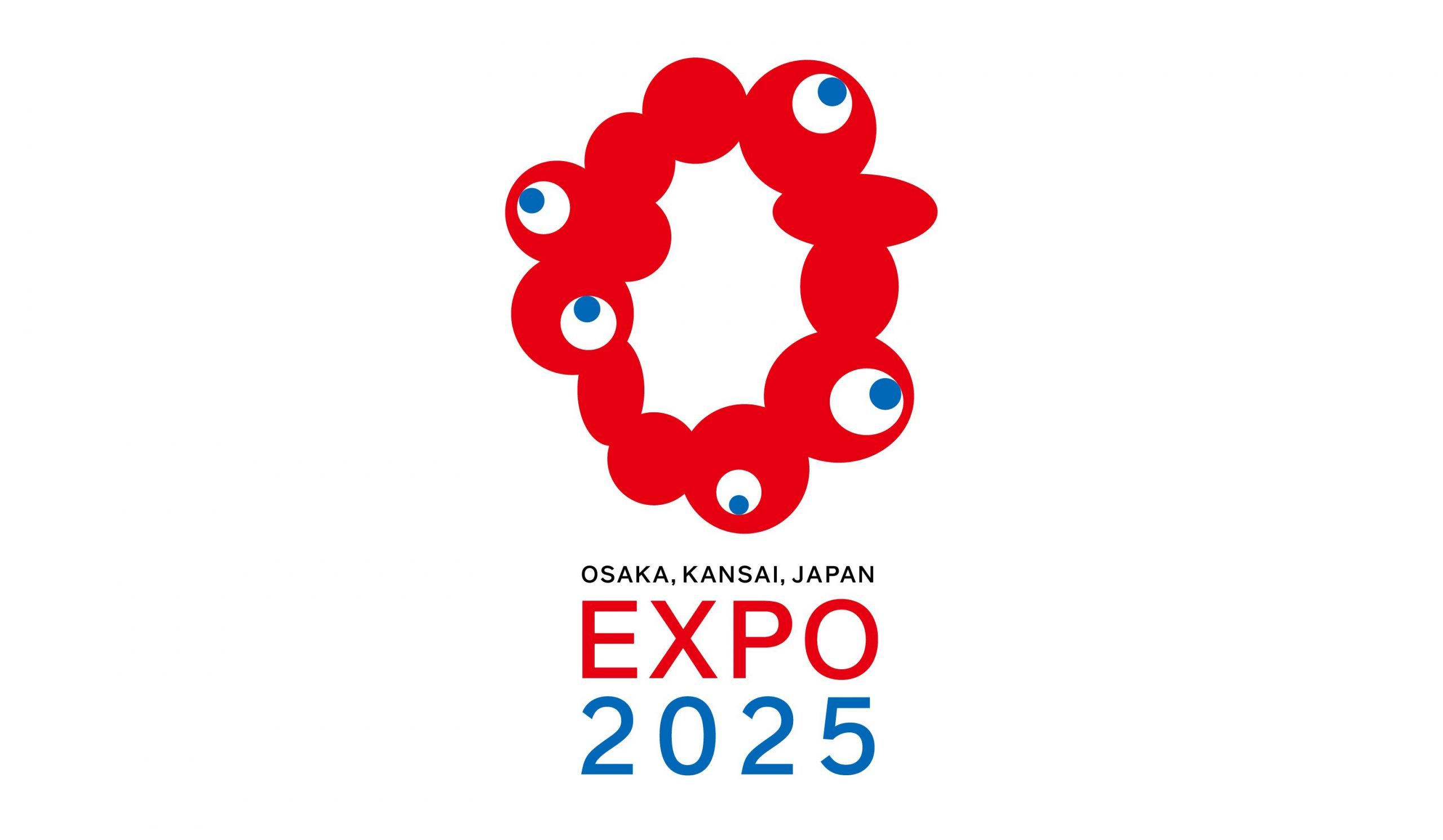
AFTER THE ANNOUNCEMENT OF THE 25 FINALISTS ON 25TH AUGUST 2020, THE SECTION COMMITTEE PICKED THE LOGO BY DESIGN FIRM, TEAM INARI, WHO DESIGNED THE MONSTER-LIKE CHARACTER AS THE EXPO 2025 OSAKA KANSAI’S LOGO
TEXT: PAKPOOM LAMOONPHAN
PHOTO CREDIT AS NOTED
(For Thai, press here)
After the controversy over the original 2020 Olympics’ logo’s plagiarism issue erupted from the other side of the world, and despite how the whole situation appeared to be more of a coincidence, the trajectory of the media coverage at the time had brought immense criticisms from both the Japanese society and the Internet community. The incident has consequently caused the process and criteria of logo design competitions, particularly of large-scale, national events, to change. Public participation has been engaged in the process, from the competition to the voting-based final selection process. Such attempts hope to lessen any possible collateral damages and criticism the winning the design may bring, as witnessed in the selection process of the new logo of the Olympics as well as the mascot, miraitowa, in which the organizer invited elementary school students across Japan to vote for the winning designs.

© The Tokyo Organising Committee of the Olympic and Paralympic Games
The Expo 2025 Osaka Kansai’s logo is no different. Osaka hosted the expo back in 1970 (although Japan has hosted a total of five expos so far), and the event’s logo was selected from 5,894 submitted works by designers and individuals. After the announcement of the 25 finalists on 25th August 2020, the section committee picked the logo by design firm, TEAM INARI (members include Himada Tamotu, Amemiya Miyuki, Omata Nobuhiko, Kamimura Shinya, Nunokawa Yuko and Fujisawa Yusuke), who designed the monster-like character, which at first sight, looks pretty much like a cell or an internal organ with multiple eyeballs. Tamotsu Shimada, the firm’s art director, explains the character’s representation of life’s enlivened spirit, ‘because it dances and bounces, it lives.’ To the question about the cell-like appearance, the team elaborates on their wish for the design to inherit the DNA of the 1970’s expo’s logo. The logo will be more than just a symbol for the moveable alphabets, and numbers will enable it to function as the event’s main character.
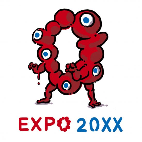
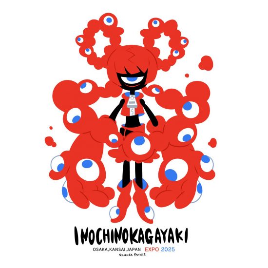
The head of the selection committee (who is also Osaka-born), Tadao Ando, talks about the winning design as it is a representative connection for life and a to hopeful future. The work stands out from other minimalistic designs submitted for its unique characters and intention to walk towards a different direction, which perfectly embodies Osaka’s spirit and energy. The online community’s feedback were very varied, with gazillion fan arts created out of mockery and dislike and creativity that brings some cute, amusing details to the design. At the end of the day, it seems like the logo does its job in igniting a memorable and festive impression, which encapsulates what Osaka is all about. Do not forget that this is the city that is home to Tarō Okamoto’s The Tower of the Sun, the iconic symbol of Expo ’70 that Osaka and its people love and preserve until this very day.

Courtesy of @rowpolyco (Twitter)
Themed “Designing Future Society for Our Lives,” Expo 2025 Osaka Kansai will’ call on each and every individual to think about their own aspirations and empower them to realize their full potential, pushing forward the worldwide effort to create a shared vision of a sustainable society in the world’. The EXPO 2025 Osaka, Kansai, is set to take place between April and October of 2025.

