 Photo courtesy of International Olympic Committee, 2023
 BREAKING DOWN THE DESIGN PRINCIPLE OF PARIS 2024 SUMMER OLYMPICS’ PICTOGRAM AND EXAMINING ITS ADVANTAGES AND DRAWBACKS COMPARED TO THOSE OF PREVIOUS OLYMPIC GAMES
TEXT: WEE VIRAPORN
PHOTO CREDIT AS NOTED
(For Thai, press here)
Humans learned to communicate through body language long before the existence of letters and writing systems, as evidenced by prehistoric wall paintings. Despite the development of written languages and alphabets, pictorial representations continue to have a place in today’s communication system. Pictograms have the potential and ability to help people from different linguistic backgrounds to understand each other. It produces endless sets of standard symbolic visuals for all kinds of activities, such as symbols for building safety regulations, washing care for garments, and even machinery and automobiles.
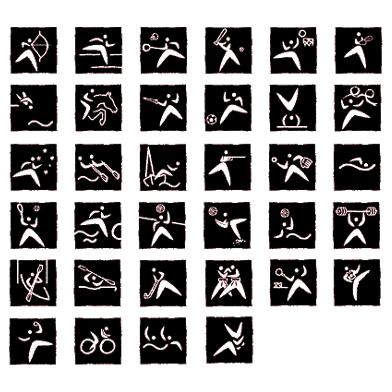
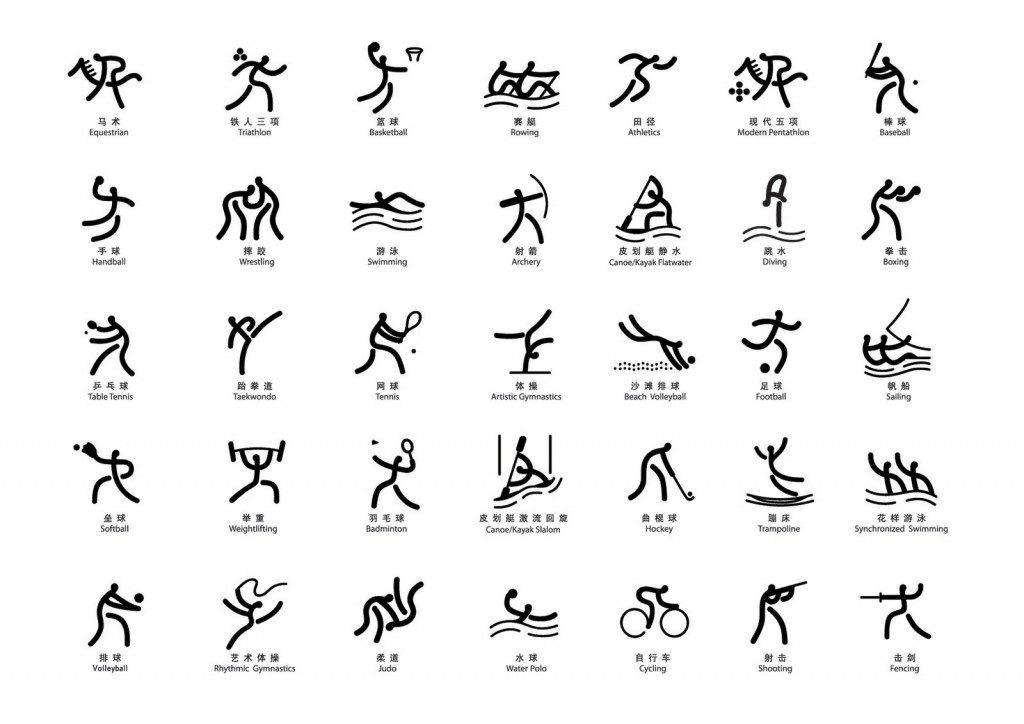
For an event that draws people from all over the world, such as the Olympics, sports pictograms have always been something that graphic design aficionados look forward to, just as much as the event’s logos and mascots. The easily recognizable sports pictogram was designed and used for the first time at the 1964 Tokyo Olympics. Other noteworthy pictogram designs that followed include the ones that Lance Wyman created for the 1968 Mexico City Olympics and the 1972 Munich Olympics.
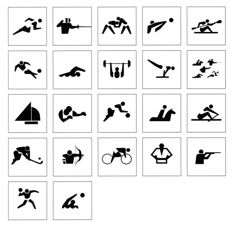
Pictogram for 1964 Summer Olympics in Tokyo | Photo courtesy of the Organizing Committee for the Games of the XVIII Olympiad
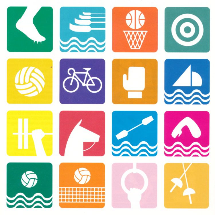
Pictogram for 1968 Summer Olympics in Mexico City | Photo courtesy of Organizing Committee of the Games of the XIX Olympiad, MEXICO 68
Pictogram for 1972 Summer Olympics in Munich | Photo courtesy of ERCO GmbH Lüdenscheid
A pictogram is typically constructed using the grid system and other features that serve to form continuity while also possessing an identity that corresponds with other visual aspects as well as the cultural identity of the host country. One prominent example is Sydney 2000’s pictogram, in which boomerangs, one of the weapons of the Aboriginal people, Australia’s indigenous tribe, were shaped into the form of a human body. Another interesting example is the Beijing 2008 pictogram, with its details and lines that took inspiration from the inscriptions on ancient Chinese utensils.
Pictogram for 2000 Summer Olympics in Sydney | Photo courtesy of SYDNEY 2000, ORGANISING COMMITTEE FOR THE GAMES
Pictogram for 2008 Summer Olympics in Beijing | Photo courtesy of the Beijing Olympic Organizing Committee
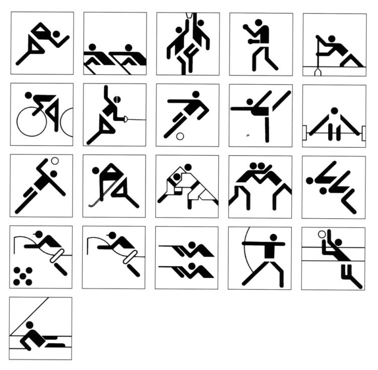
It is undoubtedly difficult for a visual design for such a large-scale event to please everyone, be it the design enthusiasts or the general public. The London 2012 Olympics logo has faced criticism since its debut due to its unconventional typographic style. However, the pictogram took a rather realistic approach, while the Tokyo 2020 Olympics logo had to be revised due to a plagiarism allegation. The criticism leveled against these pictograms is that they are “unoriginal.” I had the same impression about Tokyo 2021’s pictogram, which is clearly an intentional attempt to modernize the design used for the Tokyo 1964 Olympics, until I attended the opening ceremony, in which real human performers were choreographed into the symbols in the most ingenious way.
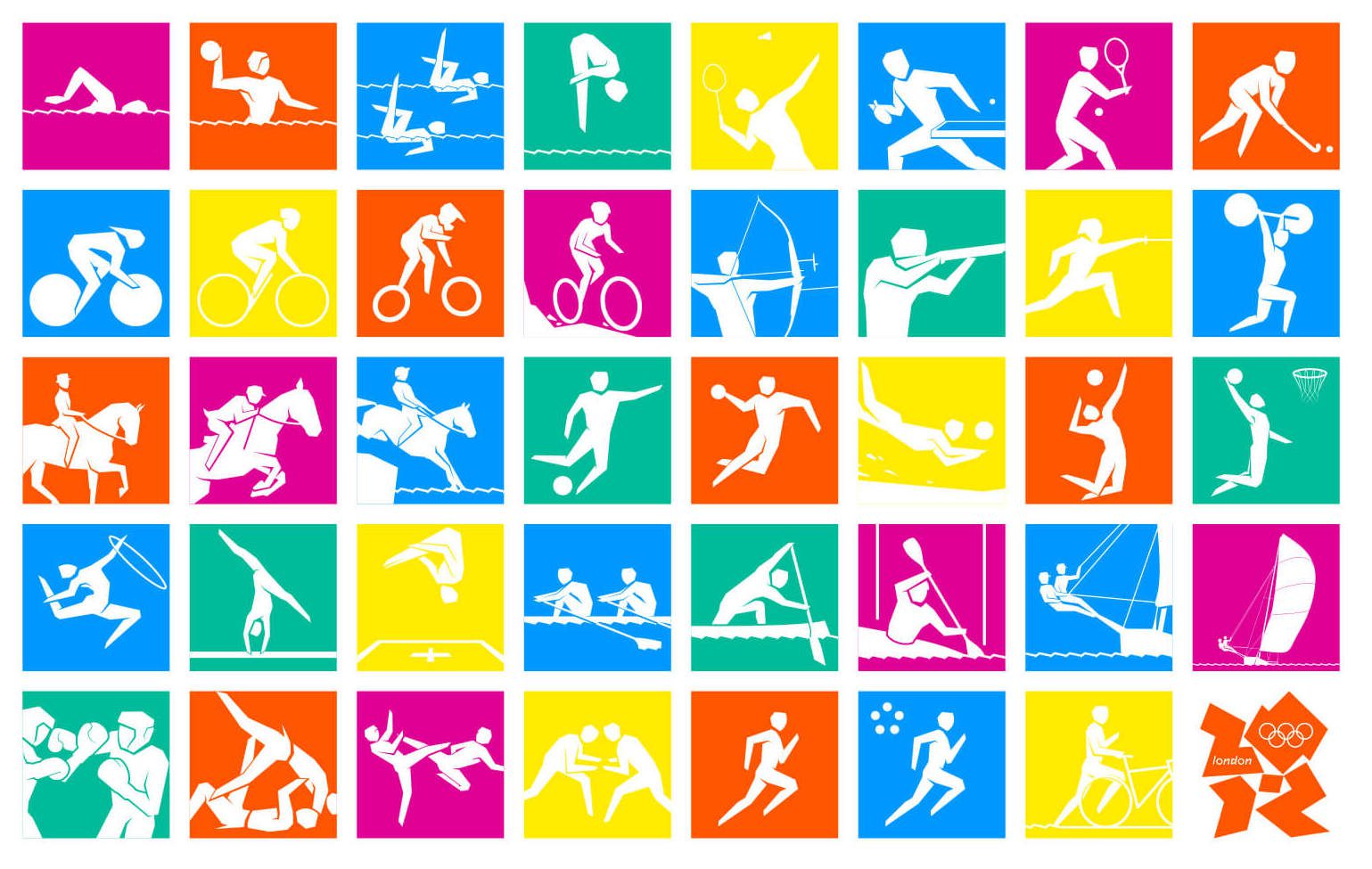
Pictogram for 2012 Summer Olympics in London | Photo courtesy of The London Organising Committee of the Olympic Games and Paralympic Games Limited
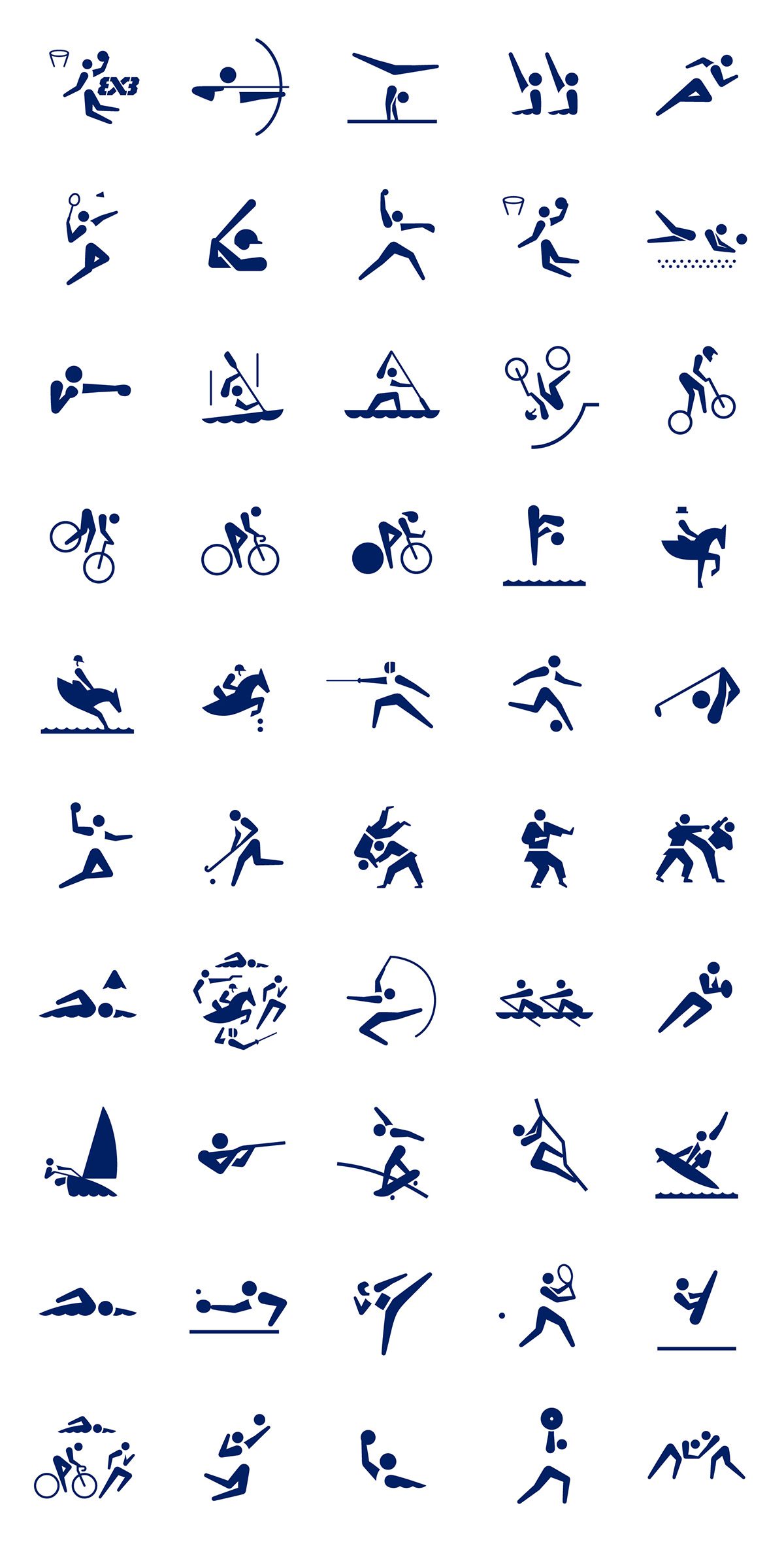
Pictogram for 2021 Summer Olympics in Tokyo | Photo courtesy of Tokyo Olympic Organizing Committee
When the introductory video for the 2024 Paris Olympics was first shown at the closing ceremony of the 2020 Tokyo Olympics, audiences were captivated by a variety of novel concepts. New sports, such as skateboarding and breakdancing, were added while competition sites were held at major landmarks in the city. Certainly, the design of the event’s visual identity is equally impressive, from the logo, which combines different elements of the flaming torch, gold medal, and the face of Marianne, the woman who symbolizes the French Revolution, to the use of a vibrant color palette that reflects the host country and the city’s rich culture. Everything perfectly fits the overall mood and tone of the other media created for the event.
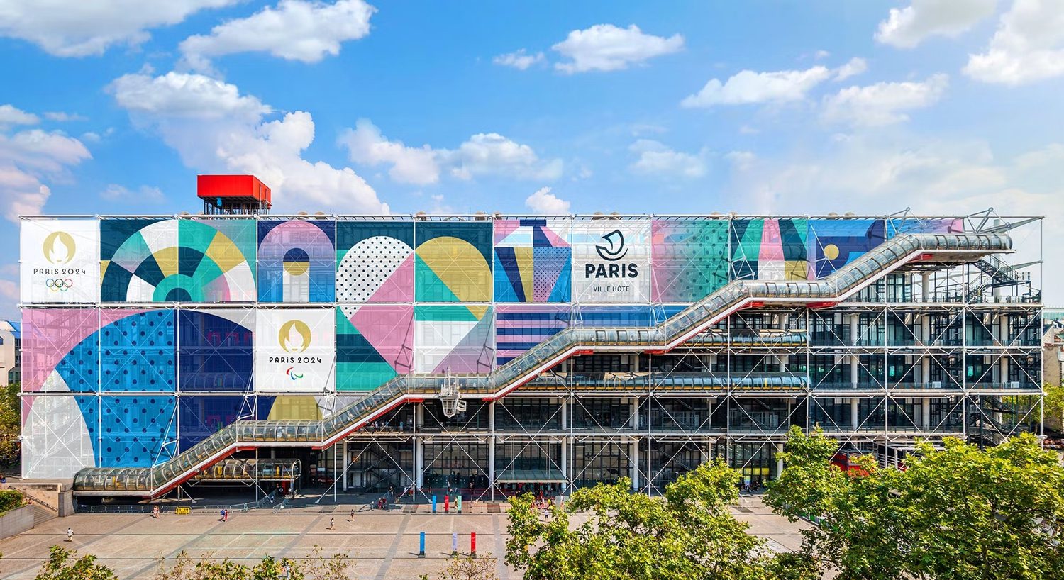
Photo courtesy of International Olympic Committee, 2023
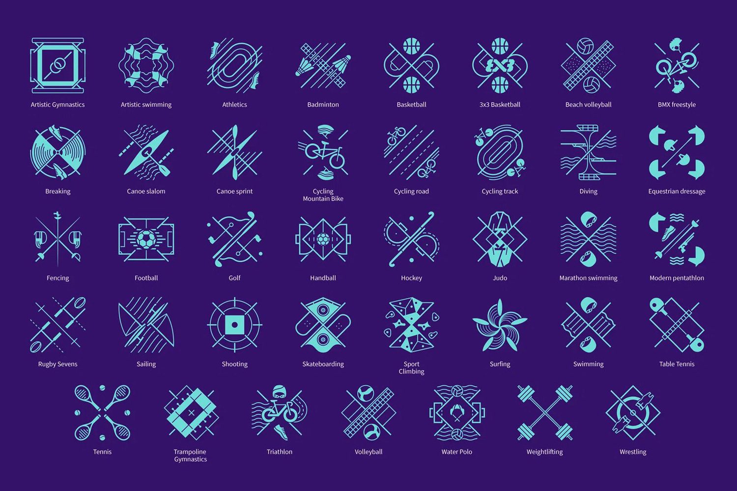
The recently unveiled sports pictogram for the 2024 Paris Olympics upends many people’s expectations to the point that it feels uncertain if the design can be termed a pictogram at all. There are no human elements found in the symbols representing various sports categories. Instead, each symbol incorporates sporting equipment as well as features of competition grounds and venues, all of which are placed in a rectangular space divided by diagonal lines. The finished design looks like an emblem of a European family or city, with details and nuances that must be carefully explored, as opposed to most graphic symbols, which allow viewers to comprehend concepts and meanings in a brief period of time.
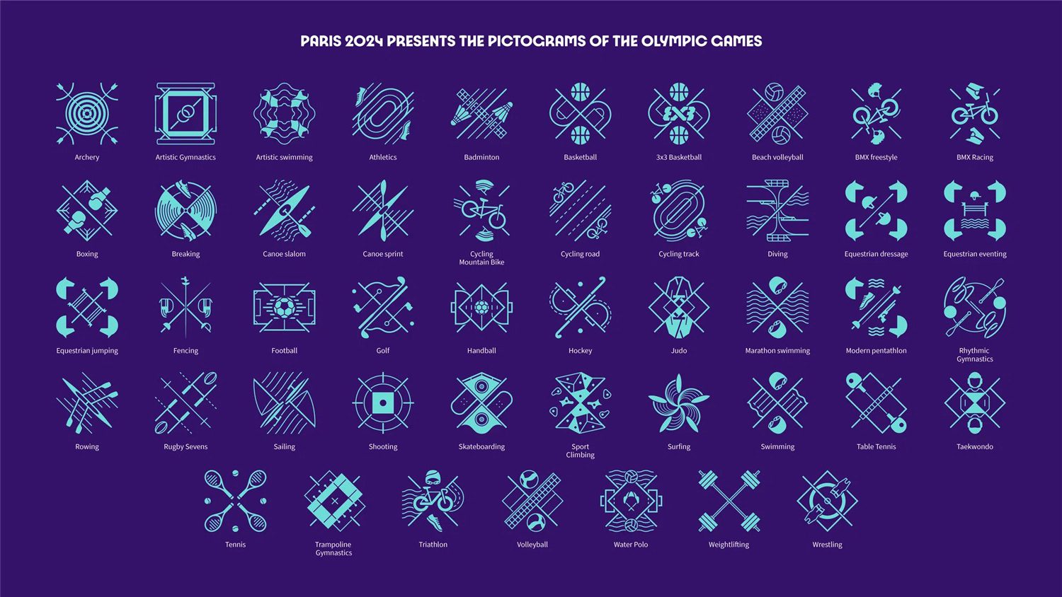
Photo courtesy of International Olympic Committee, 2023
I’m not sure how well this pictogram (?) will work. The first shortcoming and issue is how difficult it will be to notice when these symbols are employed in a smaller size compared to previous designs. The lines do not exactly correlate with the 2024 Paris Olympics’ logo, but rather with the 1924 Olympics’ logo, which was also held in Paris. Everything, I believe, is a purposeful endeavor to impart the inherent creativity of the past to the present. Every symbol in this pictogram is intended to present itself as an adaptable logo (a type of logo that varies its form and elements based on the scale of the space it’s in), which will be especially interesting when used in animated and interactive media formats.
Paris 1924 Olympic logo
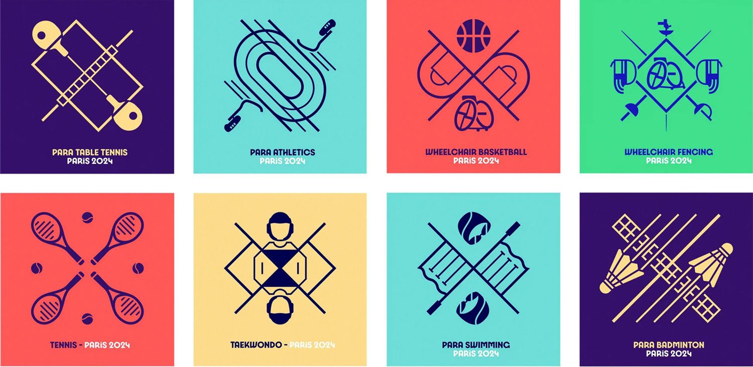
Photo courtesy of International Olympic Committee, 2023