EXPLORE THE “FRAGMENTATION” SHOPPING EXPERIENCE AT THE NEW SIAM DISCOVERY, THE LARGEST-SCALE DESIGN TO DATE BY NENDO
Looking back to the year when Siam Discovery first opened in 1997, one would remember its simplistic rectangular and rather dense form and metallic surface. The main entrance of the shopping mall was twisted to facilitate a visual and physical connection with the adjacent Rama 1 Road. Despite such attempt, the density of the architectural mass still created a great divide between the interior and exterior. Two years later, the BTS Skytrain began its operations, offering commuters a new transportation alternative. Its arrival gradually contributed to the change of the urban fabric of the shopping hub and areas surrounding it. Brought together with the birth of Siam Paragon in 2002 was a massive platform that linked the space directly to the skytrain network, while a large plaza connecting two major shopping malls, Siam Paragon and Siam Center, together prior to Siam Square One being located across the street emerged as the latest addition to this expansive public space.
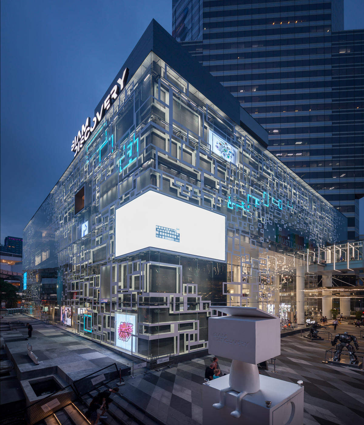
Photo by Ketsiree Wongwan
- Photo by Ketsiree Wongwan
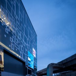
This particular platform was extended to other shopping venues in the Ratchaprasong area in the form of an interconnected skywalk with nearly one kilometer of distance functioning as another layer of circulation underneath the skytrain’s structure, uniting all commercial spaces into one connected urban sphere. It is estimated that 450,000 people commute in and out of Siam every day. The flow of the spaces of these shopping malls and walkways conceive a complicated and unique interior/exterior program. In the future, there are plans for additional access to Platinum Fashion Mall to be constructed as a part of an elevated shopping route where shoppers can walk on the skywalk from one mall to the other.
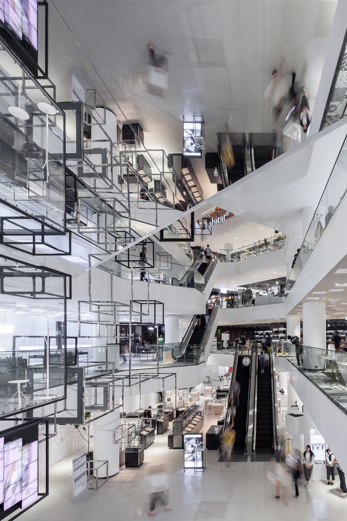
Photo by Ketsiree Wongwan
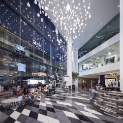
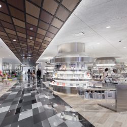
It is possible that such axis of circulation is what made the design team of Nendo and its founder/ director Oki Sato, decide to adjust the shopping mall’s main entrance, by relocating the front of the mall to face the plaza. This new spatial configuration links the main entrance with its spacious 15-meter-high foyer to Siam Center, creating a new orientation that is more physically relatable to the surrounding circulation. Installed is a striking piece of sculpture/chandelier piece that draws attention to the space. The exterior wall of this particular part of the building is designed to be of a transparent glass that allows for the massive volume of the interior space to be visually accessible from the outside, while the open plan space leads the users’ perception towards the large atrium located further inside the mall.
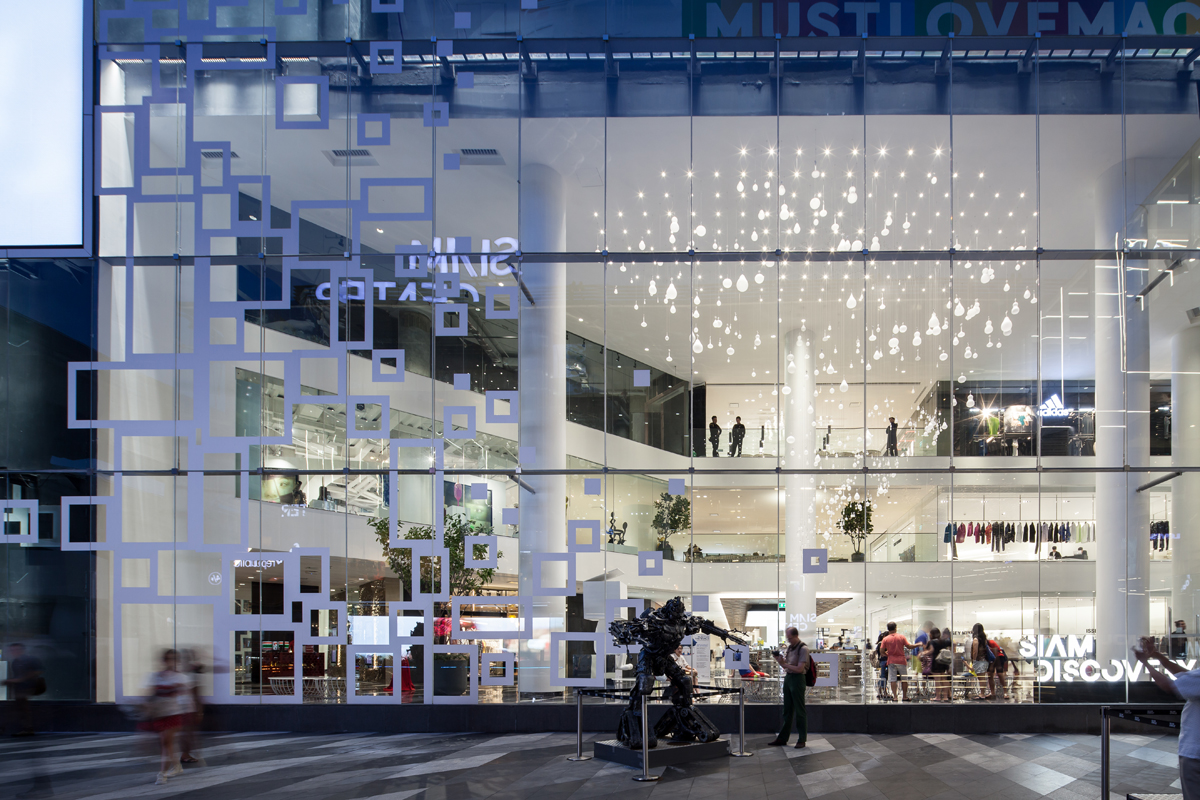
Photo by Ketsiree Wongwan
Chadathip Jootrakul, the CEO of Siam Piwat Company Limited who owns Siam Discovery once discussed the project in a televised interview where he described that, “We don’t want to be just a shopping mall or a place where you walk in and see the sight of the same shops and stores you can find somewhere else. It’s the kind of program that obstructs the identity of the space. But in the meantime, you have these amazing retailers who design brilliant retail spaces that steal the attention from the shopping mall, which is something you have to think about. So our intention with the rather small space, 40,000 square meters to be exact, that we have is, if we decide to be the kind of shopping mall we used to be, we might be able to accommodate 50 shops tops. So the task is how to maximize the space’s capabilities, which later led to the decision that we wouldn’t try to be the same kind of shopping mall we once were.”
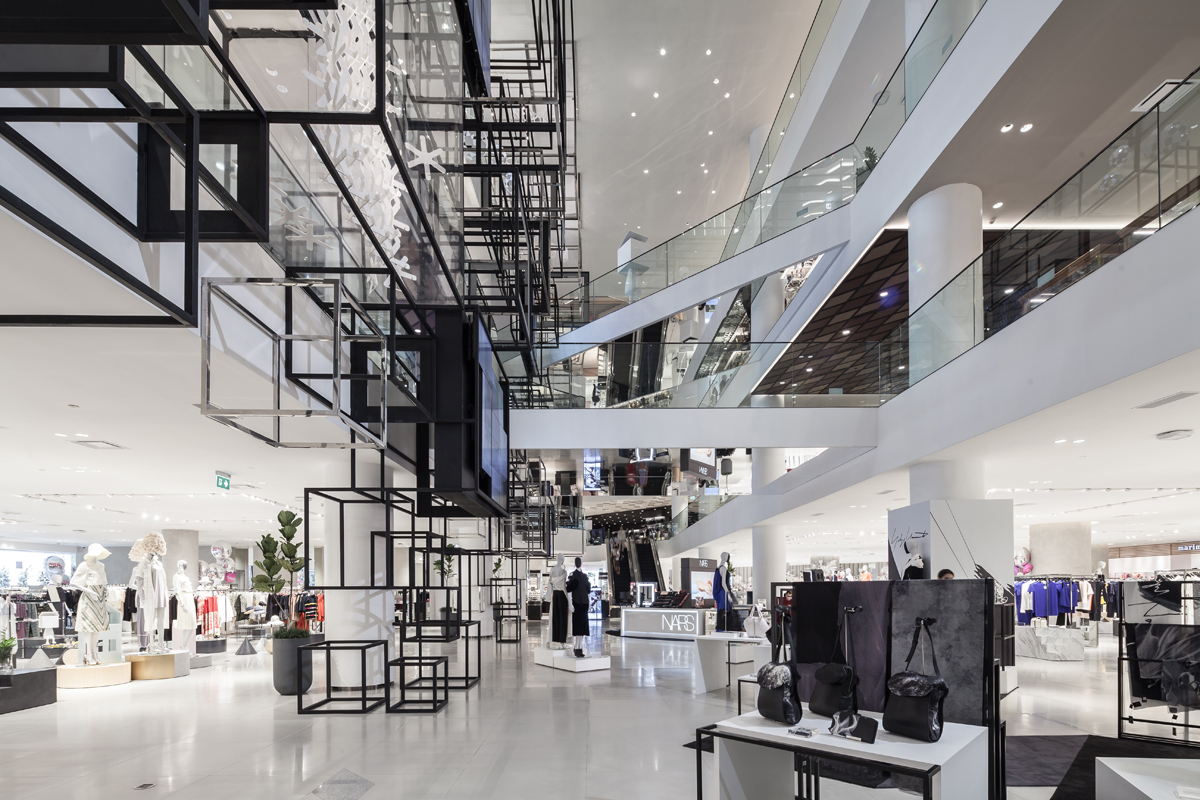
Photo by Ketsiree Wongwan
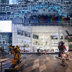
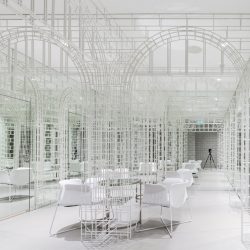
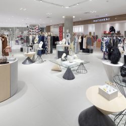
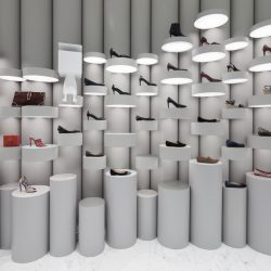
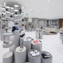
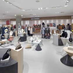
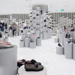
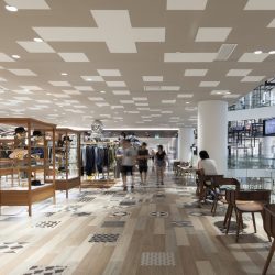
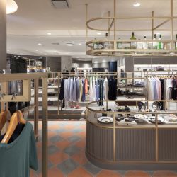
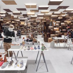
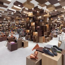
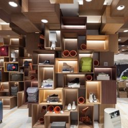
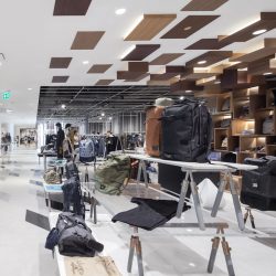
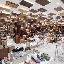
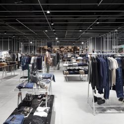
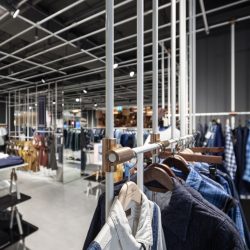
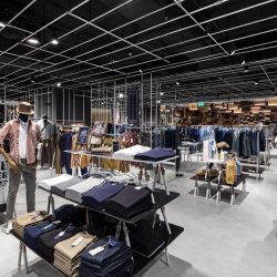
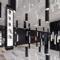
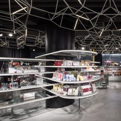
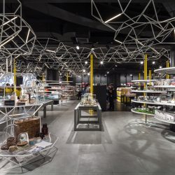
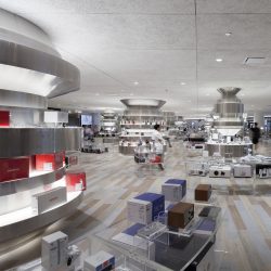
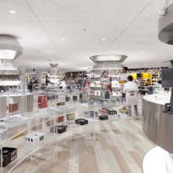
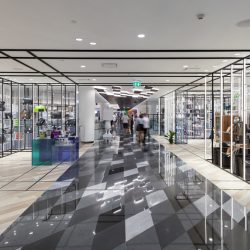
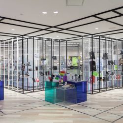
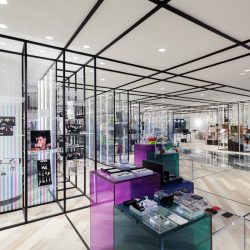
Perhaps it was this intention that caused the design team of Nendo to eliminate the boundary between different brands by merging their visuals and elements into one collective presentation. Nendo’s design language is made up of structure and grammar that vary across different spaces. Everything is expressed in the details of the floor’s patterns, ceiling and product display areas. The design puts together different products under one structure where brand identity is toned down to accentuate the space’s collective identity. If we were to choose one word to define the visual elements contributing to Siam Discovery’s reimagined identity that has ‘The Exploratorium’ as addition to its name, ‘fragmentation’ would be it.
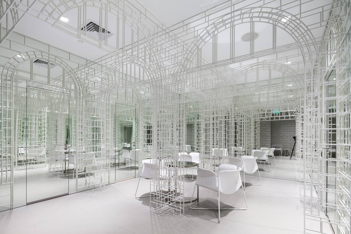
Photo by Ketsiree Wongwan
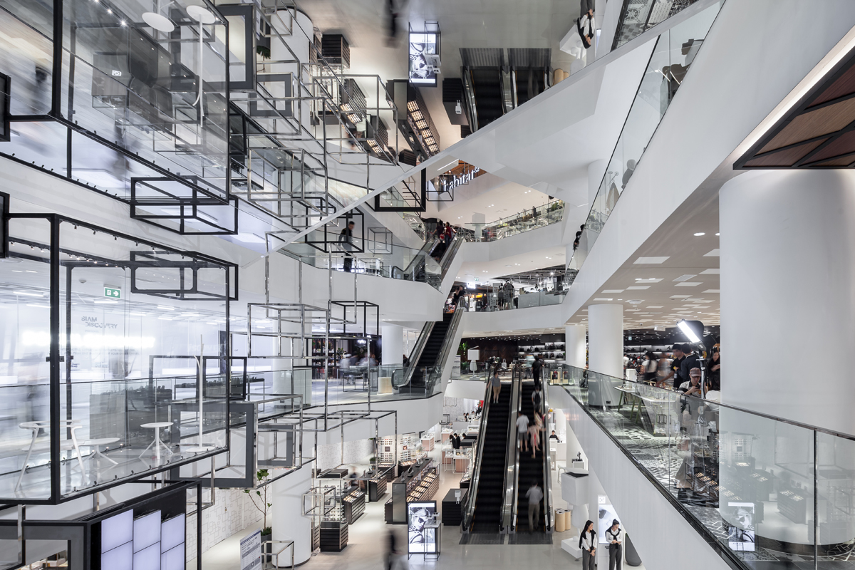
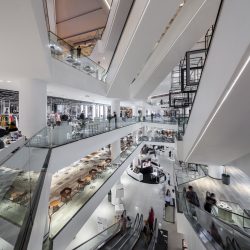
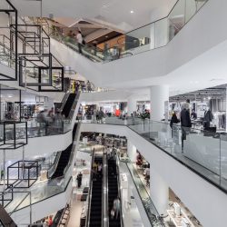
The original floor plan of Siam Discovery prior to the redesign was a shopping mall whose circulation consisted primarily of two sets of escalators located on both ends of the atrium (which offered greater flexibility and more alternatives to the program than the current design). Nendo changed the primary circulations of the interior by situating the main escalator on the G floor to the furthest end of the atrium. This forces users who enter the mall from the main entrance on the G floor to walk past the entire atrium in order to access the upper floors. The escalators are located separately on both sides of the atrium, forming a complete circulation for the shopping space of each floor. A parallel configuration of the escalator is used at the second floor with connected walkways to Siam Center as well as the third and fourth floors of the mall.
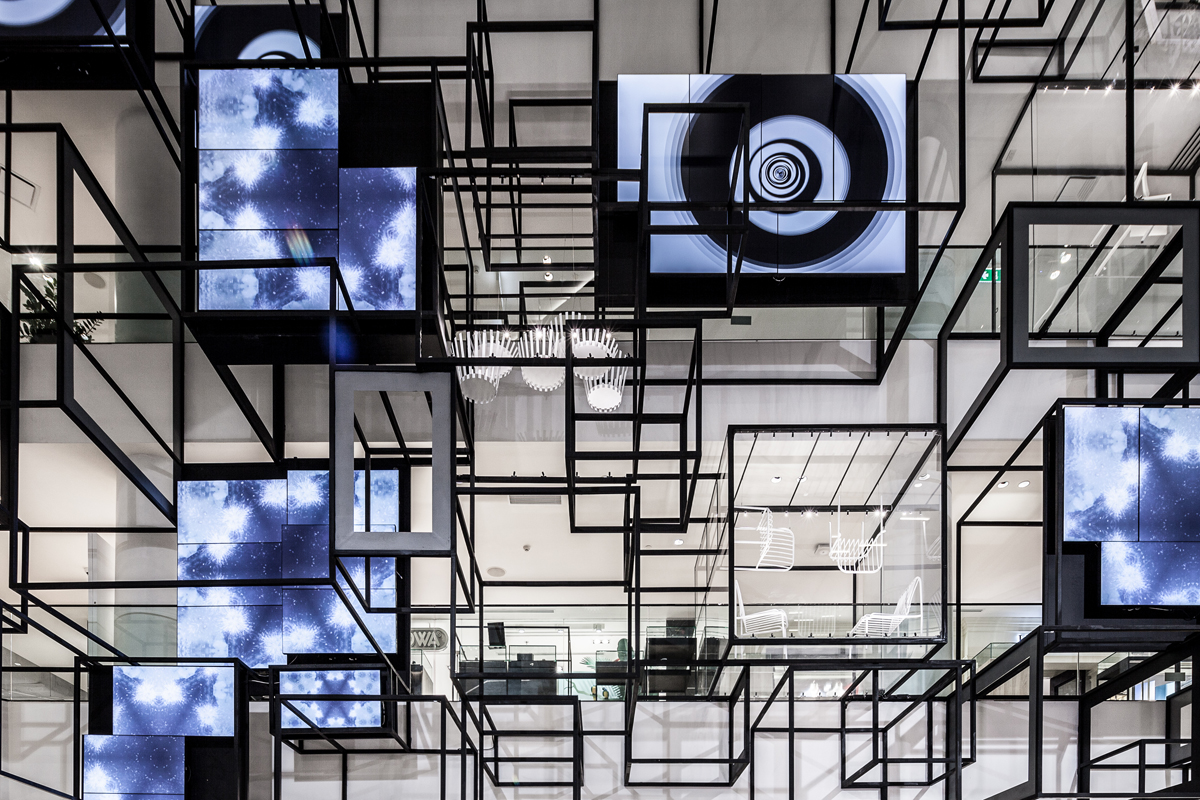
Photo by Ketsiree Wongwan
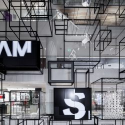
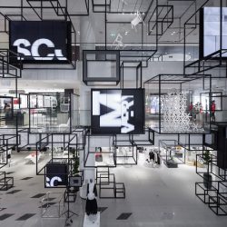
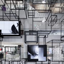
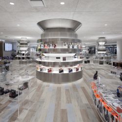
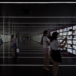
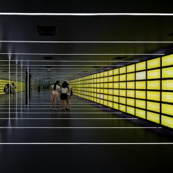
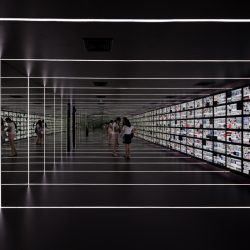
Nendo designed a series of 200 frame-shaped boxes that rest along the entire atrium, functioning as window displays and containers of LED screens showing moving images of products and motion graphics. With this fairly large scale, the structure can be seen from other floors and becomes a gimmick of the space, playfully engaging the exterior façade of the mall to the interior program. The shape and use of these frame-shaped boxes somewhat reminds us of “City of Space” (Raumstadt) exhibition by Frederick Kiesler, one of the members of the De Stijl movement back in 1925.
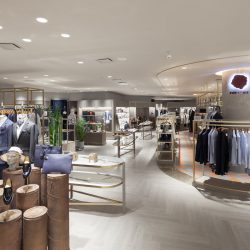
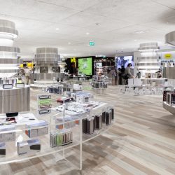
The redesign also brings about new changes to the functional space of each floor. The majority of the space was brought back under Siam Discovery’s management, allowing for the retail spaces next to the façade to appear more visually open while the connection between the interior/exterior is enhanced. Such manipulation of space also results in the airiness of the exterior façade. The change in the main concept of the product categorization actually goes back to the floor plan and program of a conventional department store. The women’s clothing section is given a more upbeat name of ‘Her Lab’ while the menswear is designated as ‘His Lab.’ ‘Street Lab’ refers to the shoes and sporting goods section with the electrical equipment and gadgets zone being the ‘Digital Lab.’ The ‘Creative Lab’ is where home decoration shops and products are located while the last one, ‘Play Lab,’ encompasses a wide range of entertainment products. Every floor is provided with resting areas, small cafés and bistros for users to enjoy as nice hangout areas. These spaces are scattered and presented as parts of the product display area, creating a unique and different identity for Siam Discovery as well as the shopping experience it has to offer.
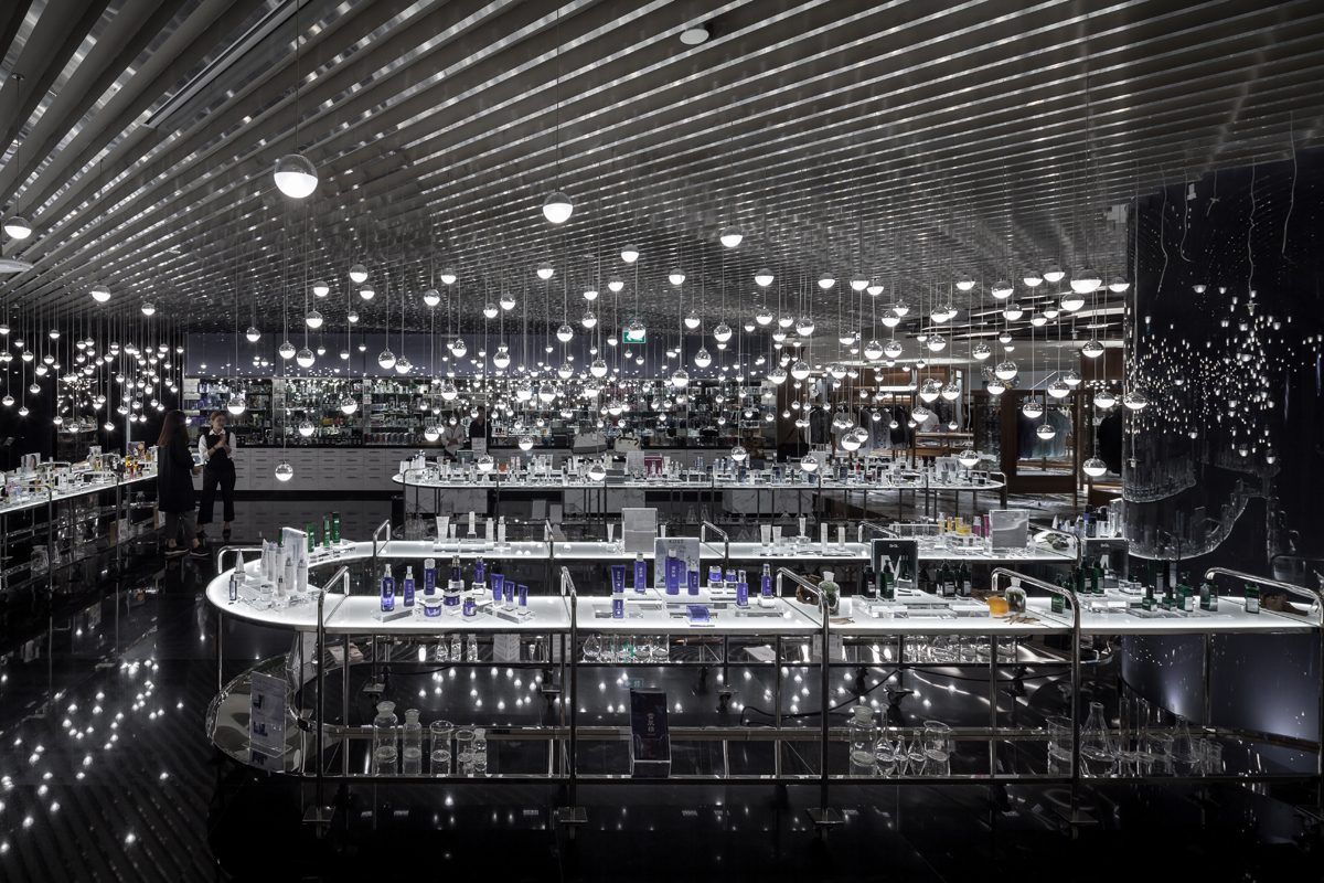
Photo by Ketsiree Wongwan
Harun Farocki’s documentary, The Creators of Shopping Worlds (2001), talks about the techniques, experiments and research conducted regarding how these spaces lure shoppers to walk in and make a purchase, which involves the design of a mall’s program that maximizes visual access to the products. Scientific experiments reveal how our eyes look and focus with the findings applied to the display and hierarchy of products to help stimulate buyer motivation. A style of decoration is chosen and executed to communicate with buyers using symbols people in the capitalistic society familiarize themselves with. The space is curated to facilitate a seemingly natural process in which customers make a purchase thinking that it is something based on their own decisions, acknowledgement and understanding, not because they are led to believe so by psychological knowledge and techniques manipulated by designers and a team of experts.
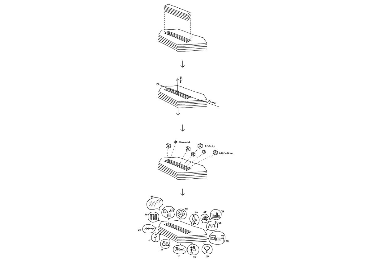
Illustration © Nendo
It seems like Nendo’s approach to the redesign of Siam Discovery is entirely different from the techniques mentioned in Harun Farocki’s documentary. To choose between the old experience that effectively boosts buyer motivation and sales by simply letting each brand design its own retail space, and to design an entirely new identity that collectively represents the entire space of the mall, it is clear that Siam Discovery and the design team of Nendo have gone with the latter.
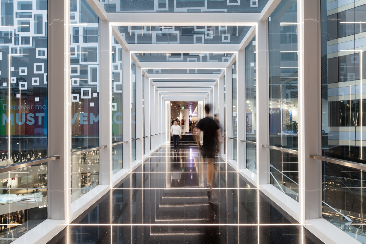
Photo by Ketsiree Wongwan
From the shoppers-users’ points of view, some of the information we came across online criticized how the space lessens the distinctiveness of the products, which seem to be scattered in the open display area, making the shopping experience more complicated. Nevertheless, whether the decision Siam Discovery and Nendo have made for this redesign is successful or not, only time and the actual users will tell.
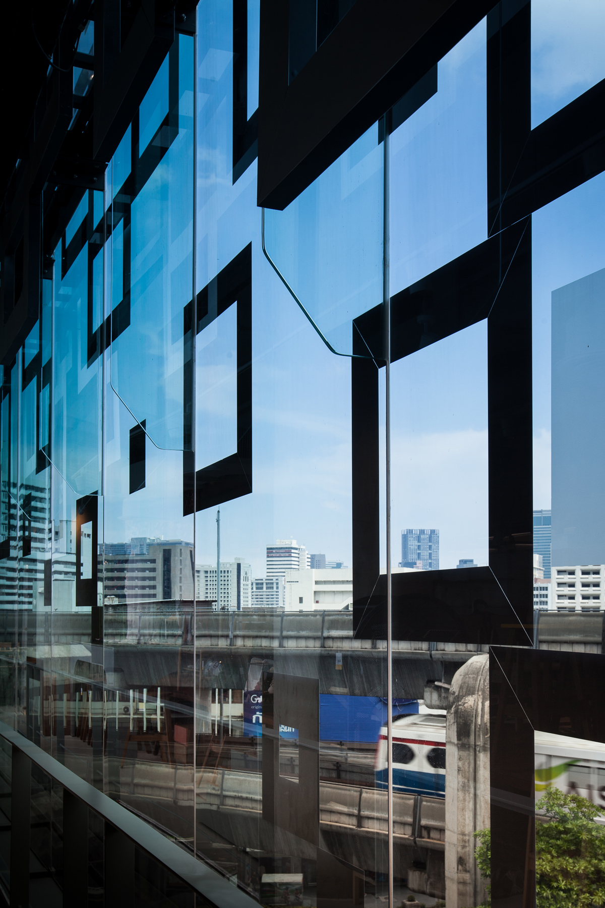
Photo by Ketsiree Wongwan

