A TRANSPARENT PROJECT, FROM A SMALL OFFICE, FOR A BIG CLIENT
In 1992, ‘Thai Rath,’ the biggest newspaper in Thailand, was looking for an architect to design the building for its new printing press. A competition was set up for five small firms, because the tabloid was not interested in hiring a big firm, as they were of the opinion that a smaller company would put more effort into the project. Clearly, their attitude was much different from most companies during the construction boom. Ongsa Architects came out on top in the competition.
Originally published in art4d November, 1998
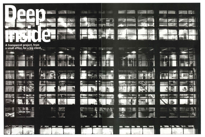
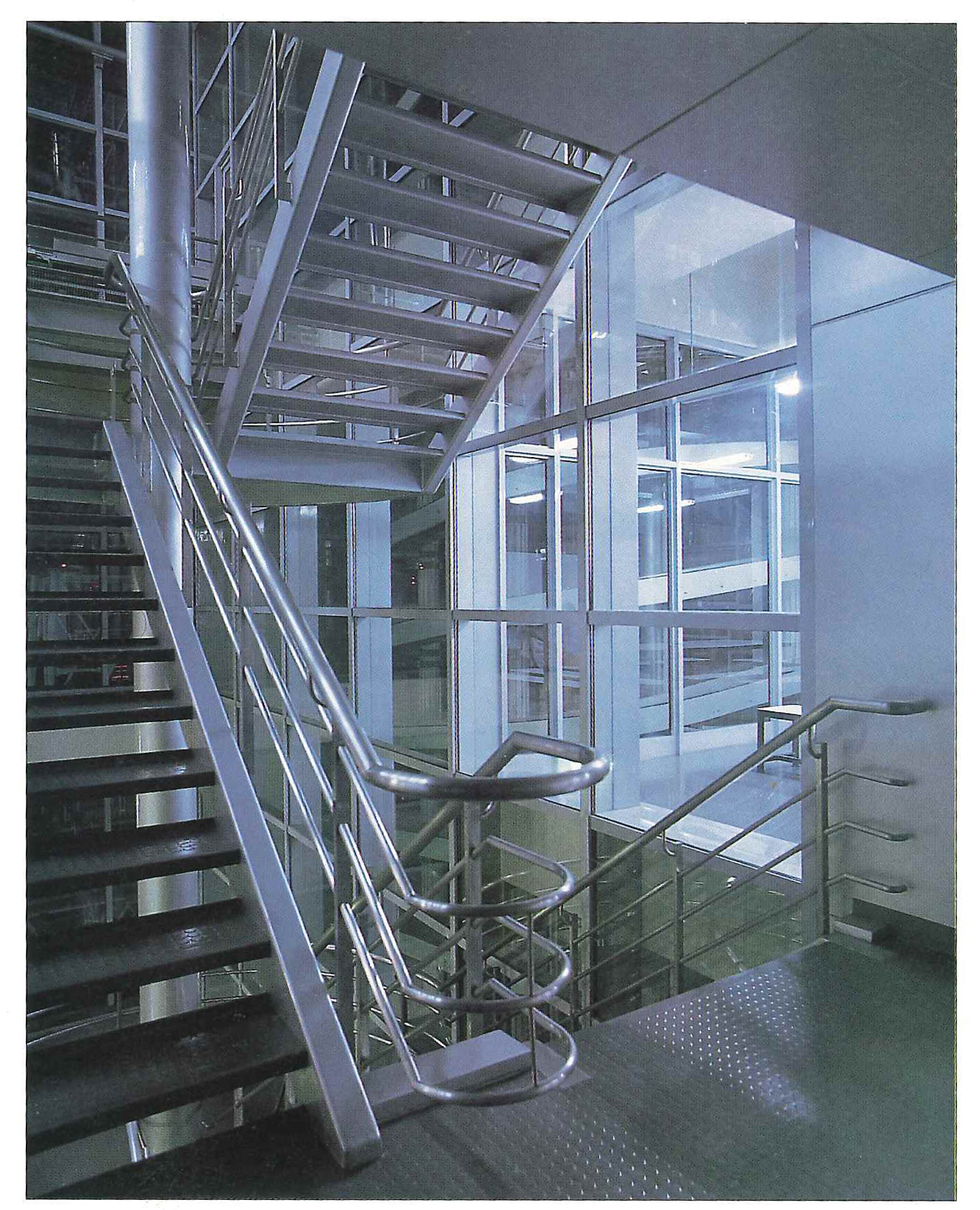
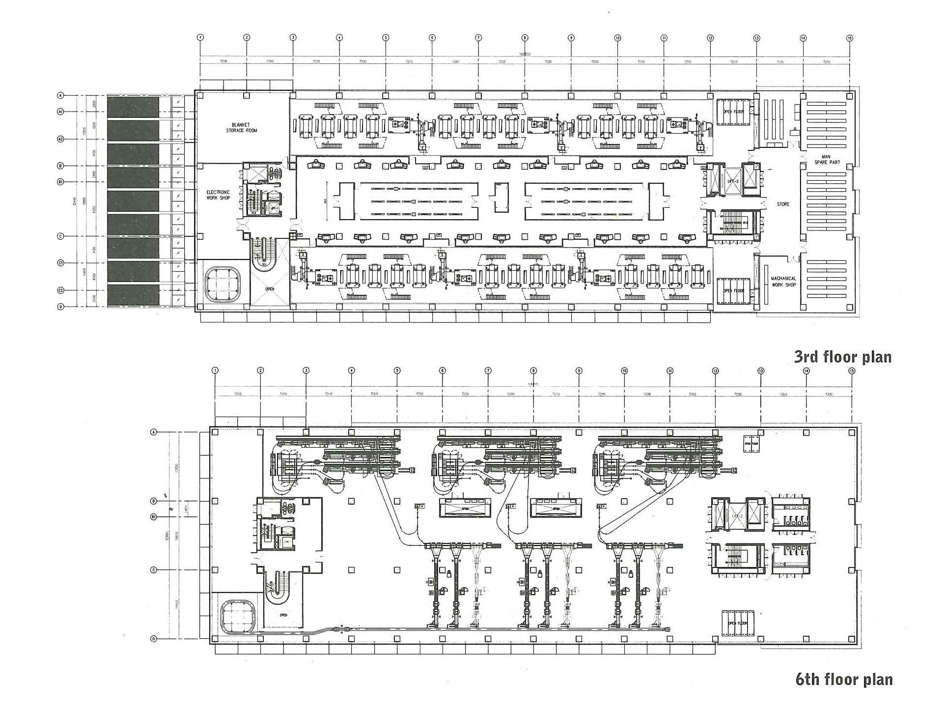
The building was finally finished early this year. The schematic design was changed five times to fit the changing concepts of the printing press. One demand was that Thai Rath wanted the printing press to be near the editorial office for administrative reasons. This ensured that the production line overlapped vertically, instead of horizontally. Tons of paper is stacked on the ground floor of the building, while the printing press is on the third, fourth and fifth floors. When the printing is finished, the newspaper will be sent to the top floor to be put together and then the ground floor, where it will be loaded into trucks for distribution.
Originally published in art4d November, 1998
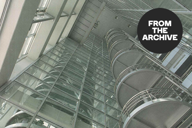
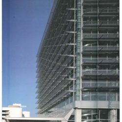
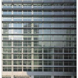
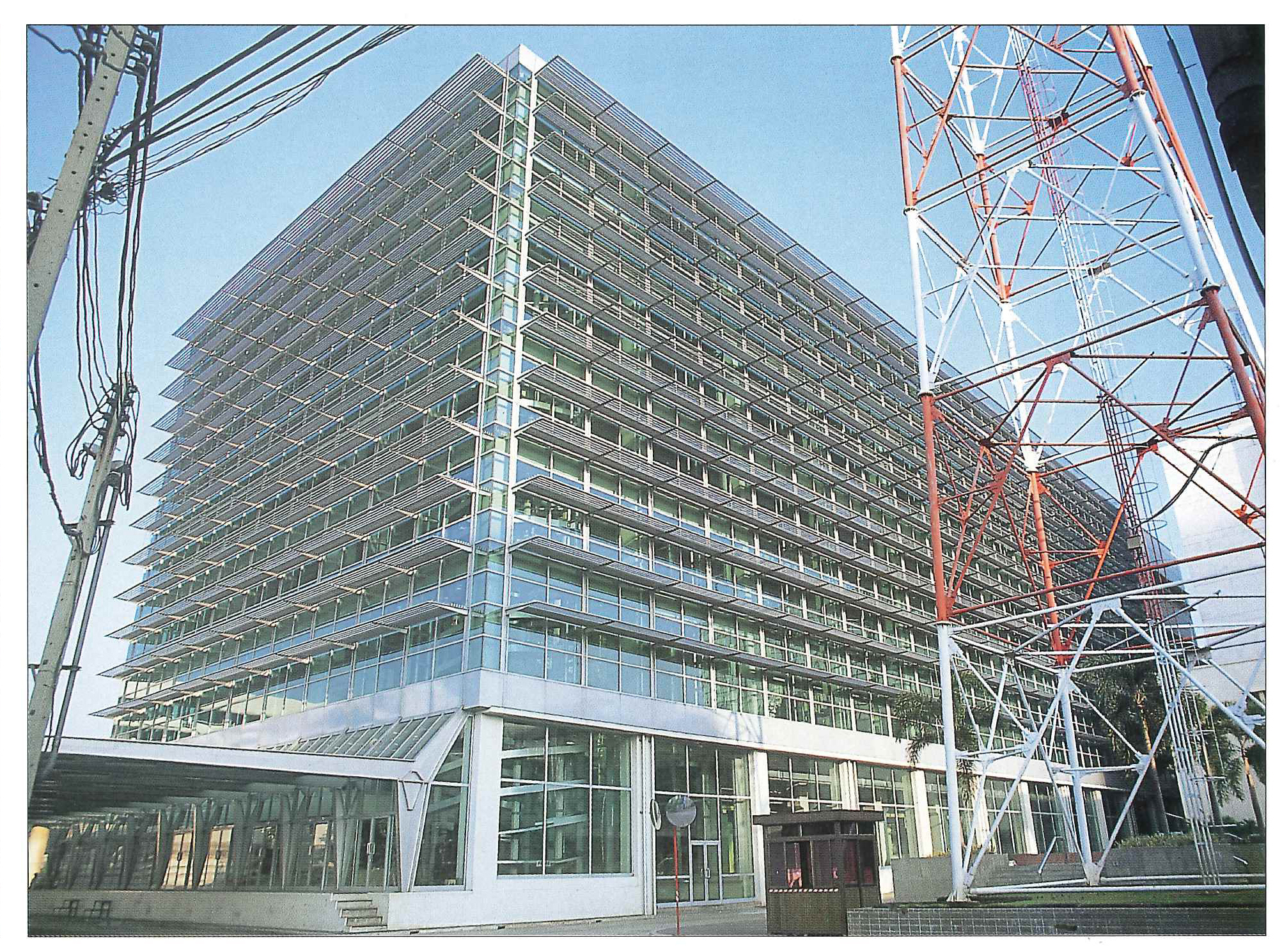
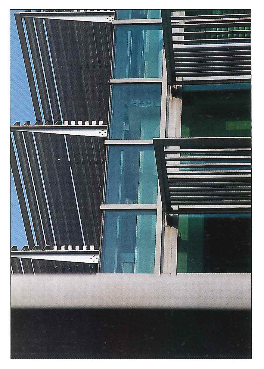
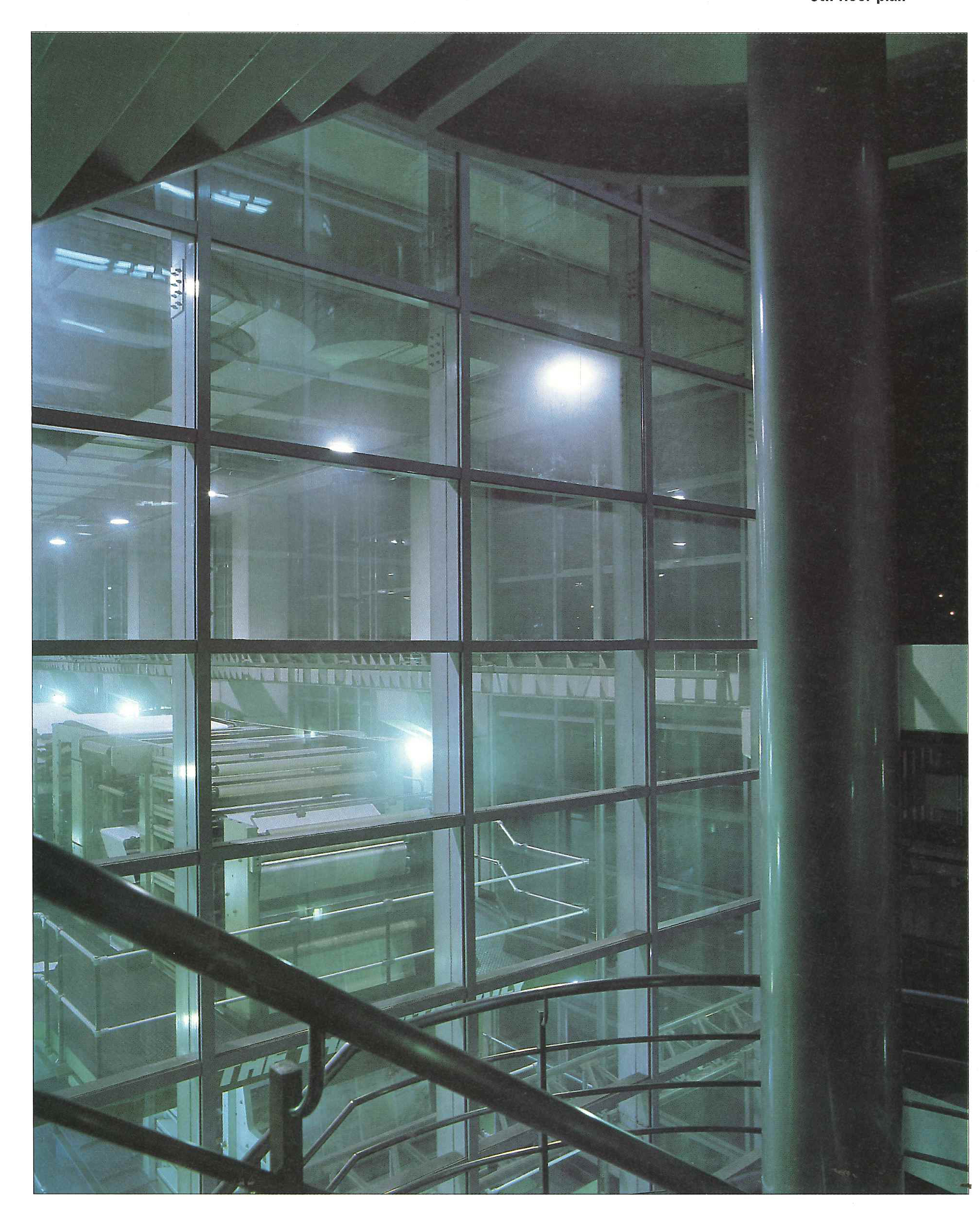
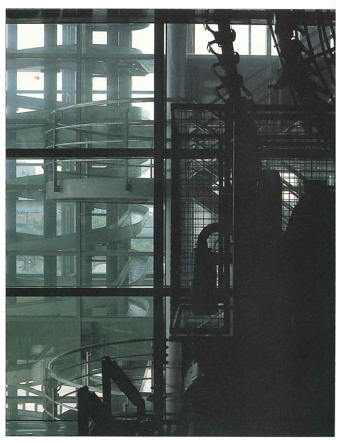
Transparency was the major concept agreed on by both the owner and the architect. Thai Rath’s objective was to express its philosophy and style of management, while the architect was impressed by the elegant form of the printing press. The outcome was the use of a green transparent, double glazing to keep the building cool. It also makes the building, which is huge, look lighter.
Originally published in art4d November, 1998
The green tinted glass not only suits contemporary tastes, but also utilizes the owner’s corporate color to striking effect. At first, the architect intended to leave the concrete surface exposed but, unfortunately, this plan had to be scrapped because the performance of the Thai workers was not up to scratch. Consequently, they had to paint the surface.
Originally published in art4d November, 1998
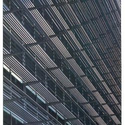
What is the philosophy behind the building? The clearest influences seem to be functionalism and modernism. Moreover, the plain, Euclidean form of the giant factory designed around the printing press seems highly appropriate. Even more interesting are the details such as the window patterns, the sun shader’s texture, and hues and shape of the big canopy. All of these elements are integrated together into a harmonious whole.
Originally published in art4d November, 1998
One lesson to be learned from this collaboration between a big publisher and a small architectural firm is that interesting architecture is not necessarily generated only by form. The surface itself can also change a simple form into a remarkable one. Another lesson to be learned is that tiny firms can often do colossal work.
Originally published in art4d November, 1998

