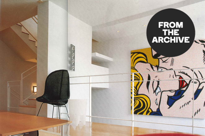
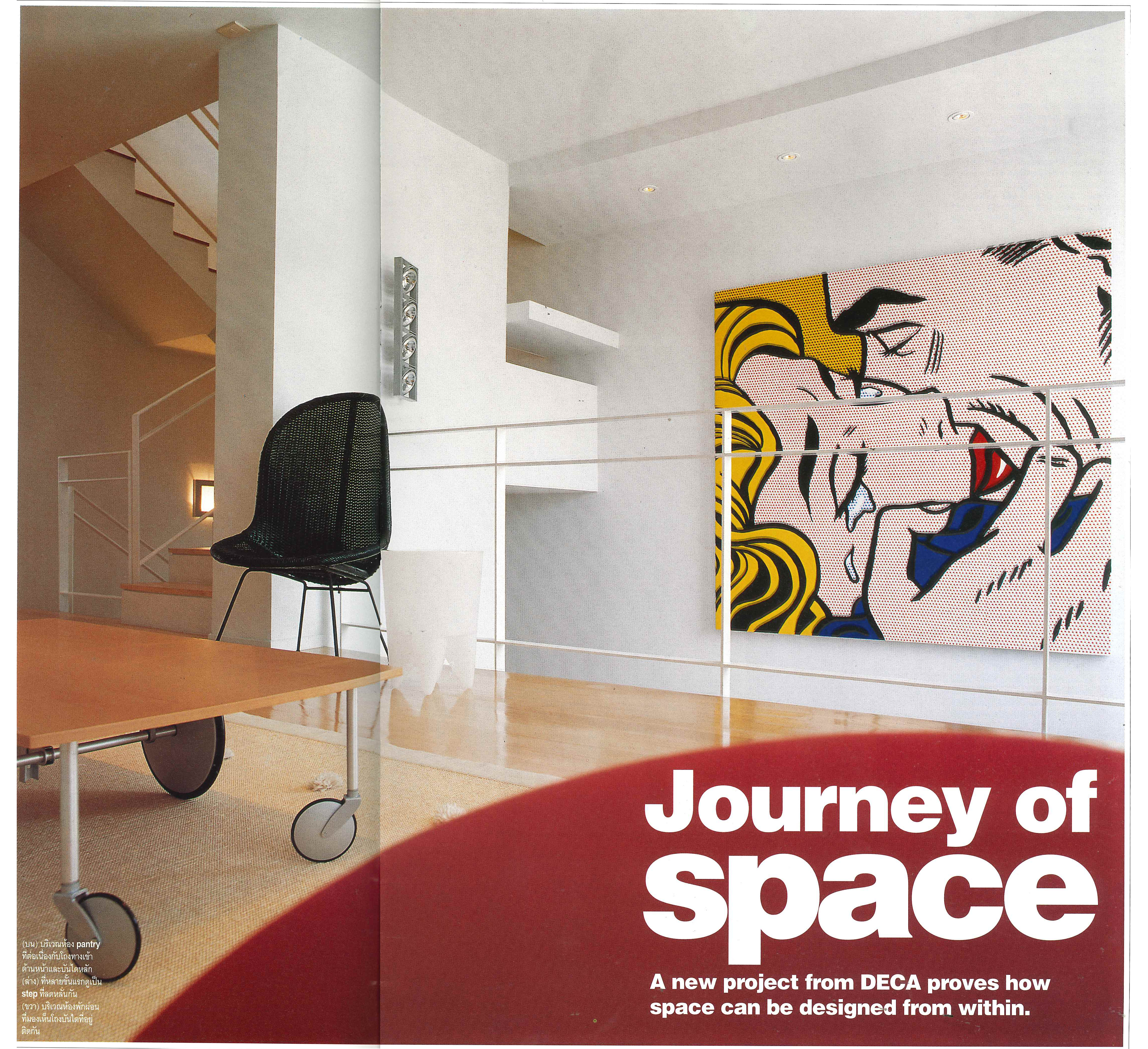
A NEW PROJECT FROM DECA PROVES HOW SPACE CAN BE DESIGNED FROM WITHIN
An interesting aspect of recent interior designs is that they are not only concerned with superficial decorations, but are also seeking to redefine our sense of space as well. Thus a new synthesis is being made between interior decorations and architecture, making it difficult to separate one from the other.
Originally published in art4d No.41, Aug 1998
Originally published in art4d No.41, Aug 1998
Somchai Jongsaeng of DECA Company is one such interior designer. Anyone who has followed his work can see that he has tried to concentrate more on working with the space than merely decorating it. Thus he tries to pare unnecessary components down to a minimum. The latest project undertaken by DECA at townhouse in the Zenith Town shows the way he has tried to rework the spatial aspects of the place in order to create a sense of continuity between the ground and the third floor. This sense of spaciousness must strike a balance, however, between the utility and privacy of the residence, as well as the fixed structure of the building. Careful thought in selecting materials and designing the details may be the most important aspects when it comes to achieving the desired results.
Originally published in art4d No.41, Aug 1998
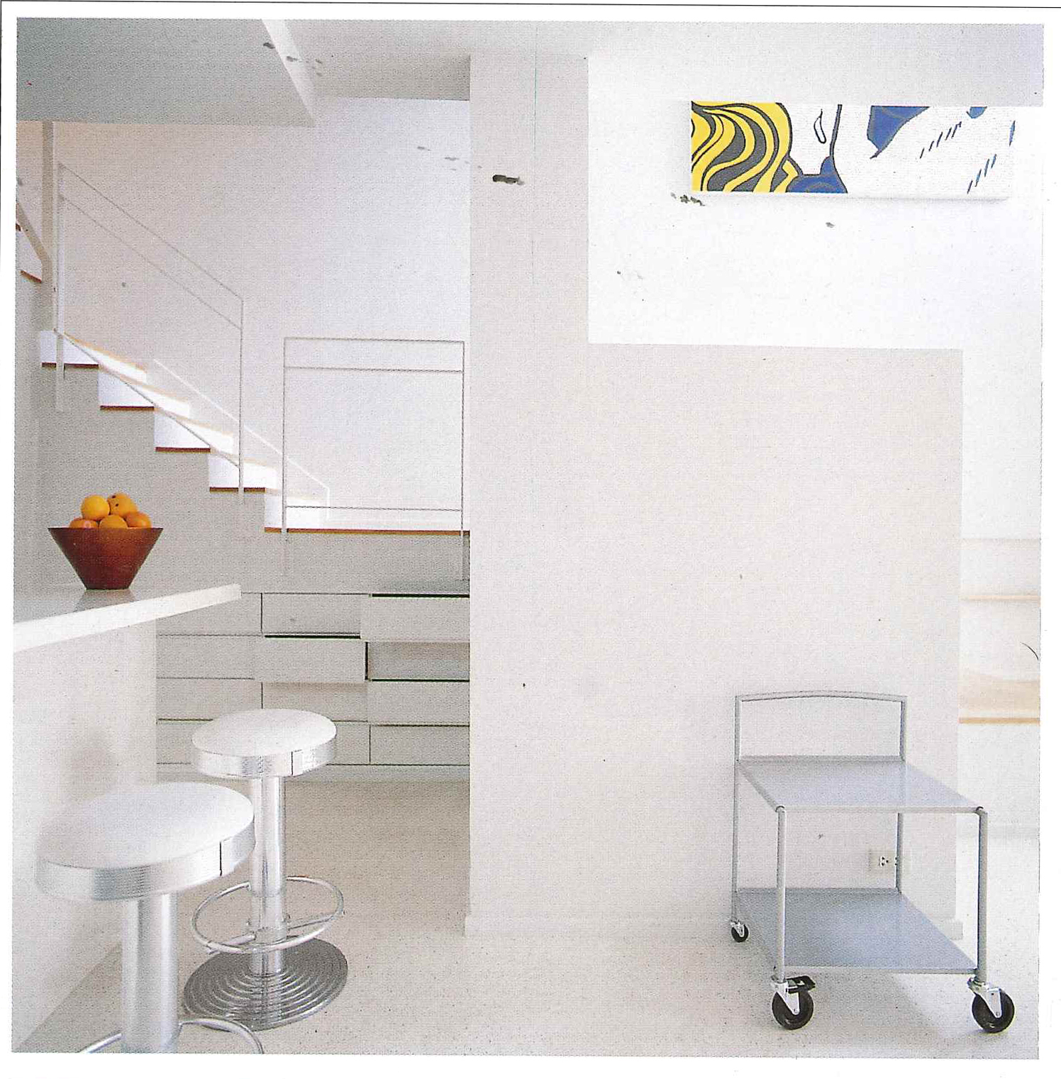
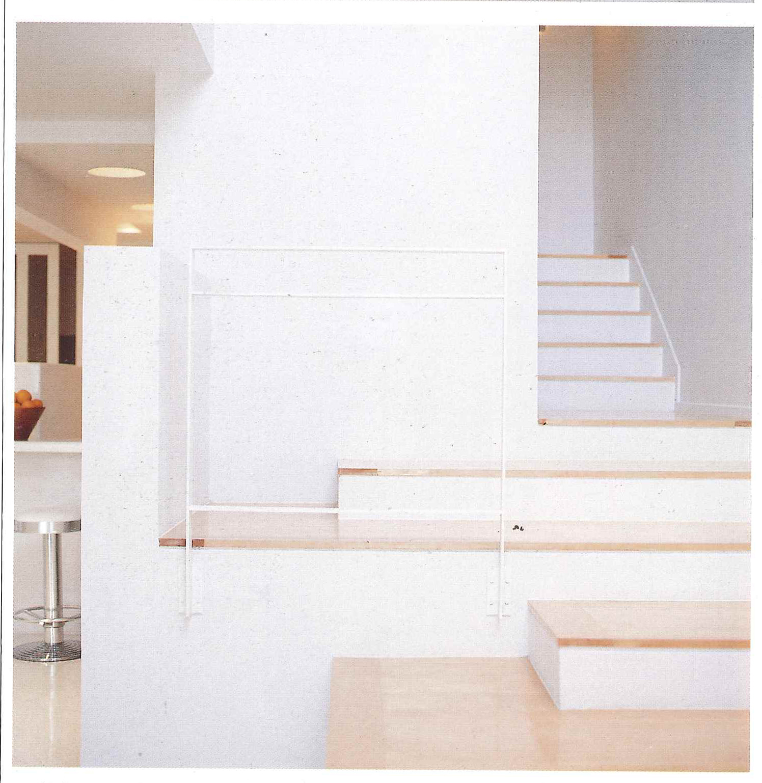
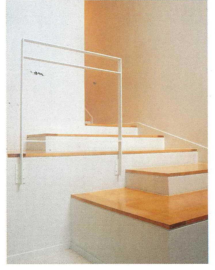
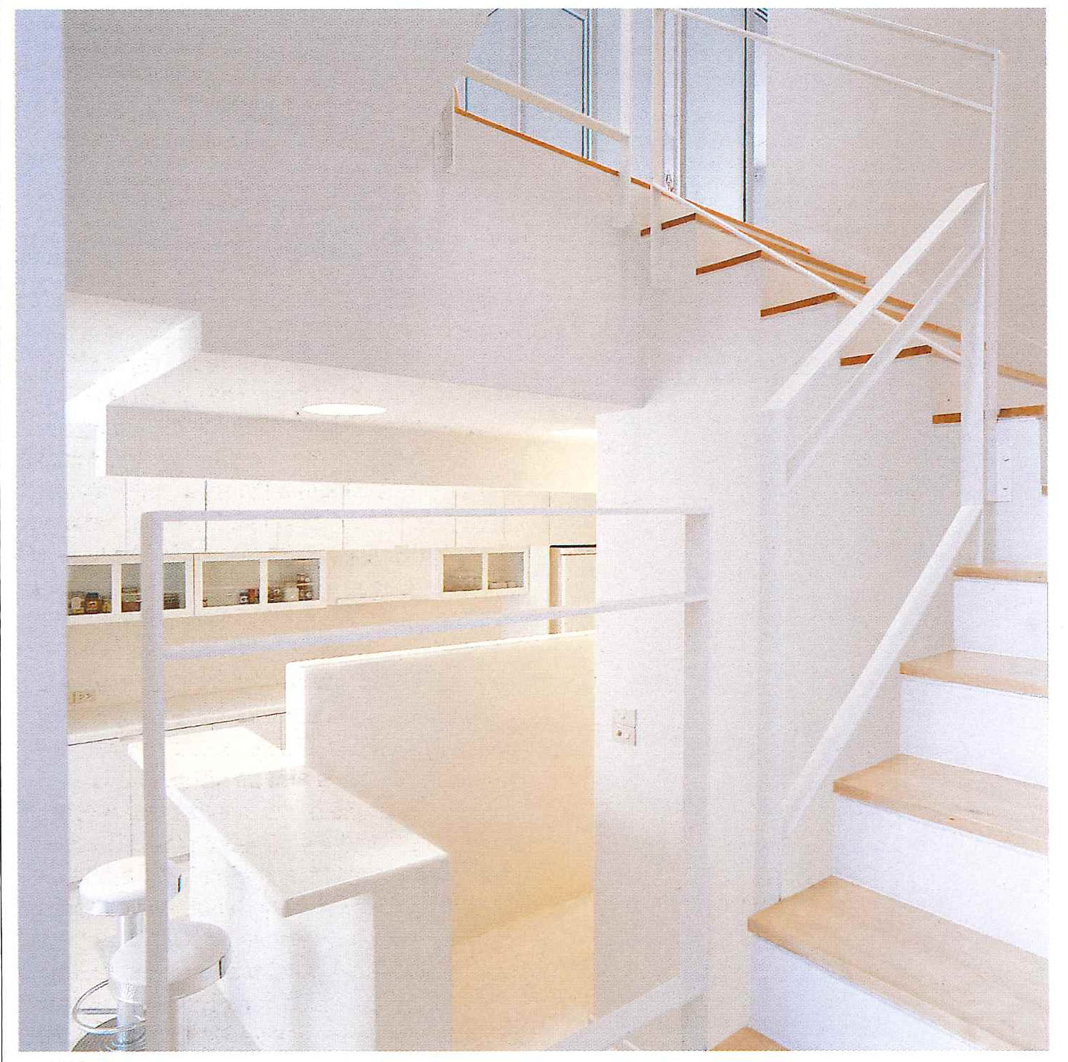
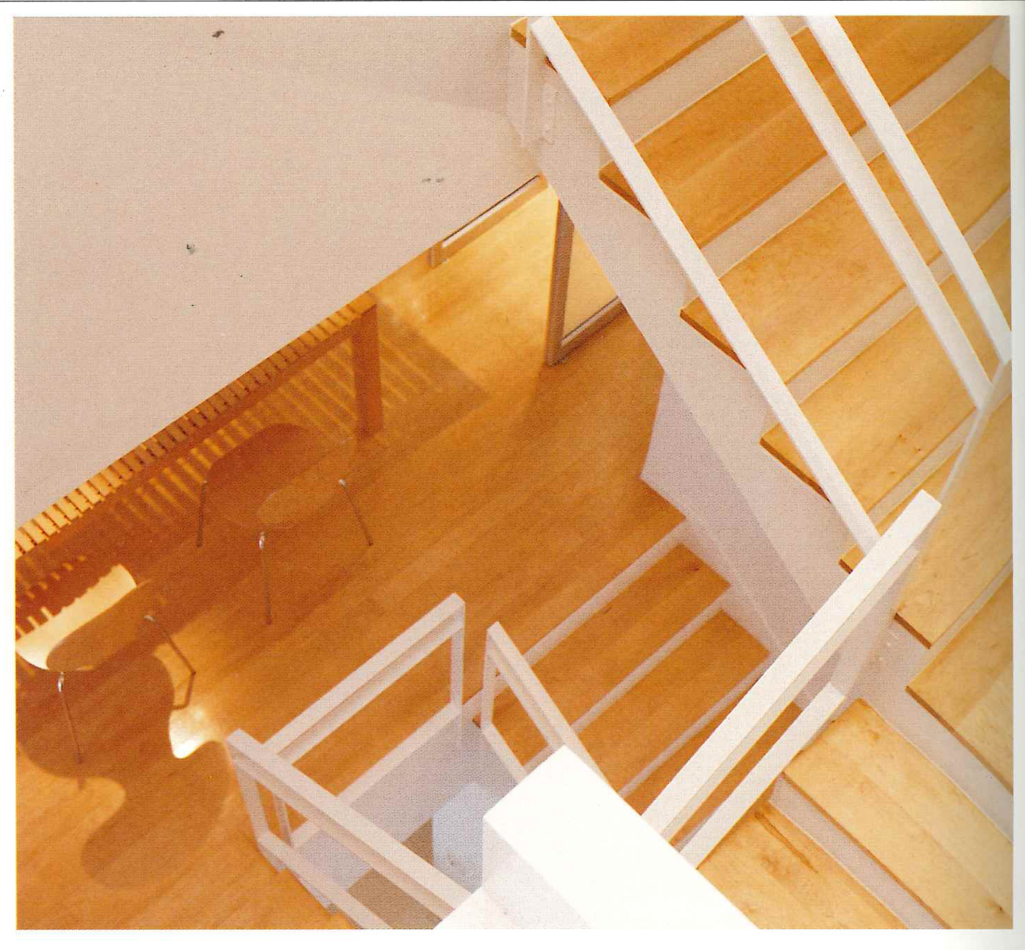
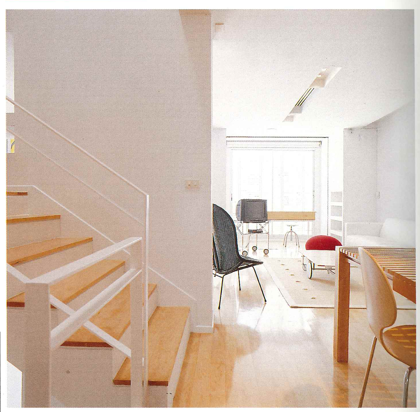
Walking from the parking lot into the building, you can see where the foyer and the pantry are located and how they connect to the service part of the house. The front part of the pantry is equipped with a small dining area that seats two people. Off to the right, stairs lead up to the next floor. The reason why the first stairs are bigger than the next ones, is because the designer wants to invoke a sense of continuity between the floor and the base of the stairs, and provide a transition between the two levels as well. Looking at the base of the stairs leading up to the upper floor, you can observe that this sense of continuity is still present. The porch outside has also been designed with this kind of continuity in mind.
Originally published in art4d No.41, Aug 1998
Originally published in art4d No.41, Aug 1998
Originally published in art4d No.41, Aug 1998
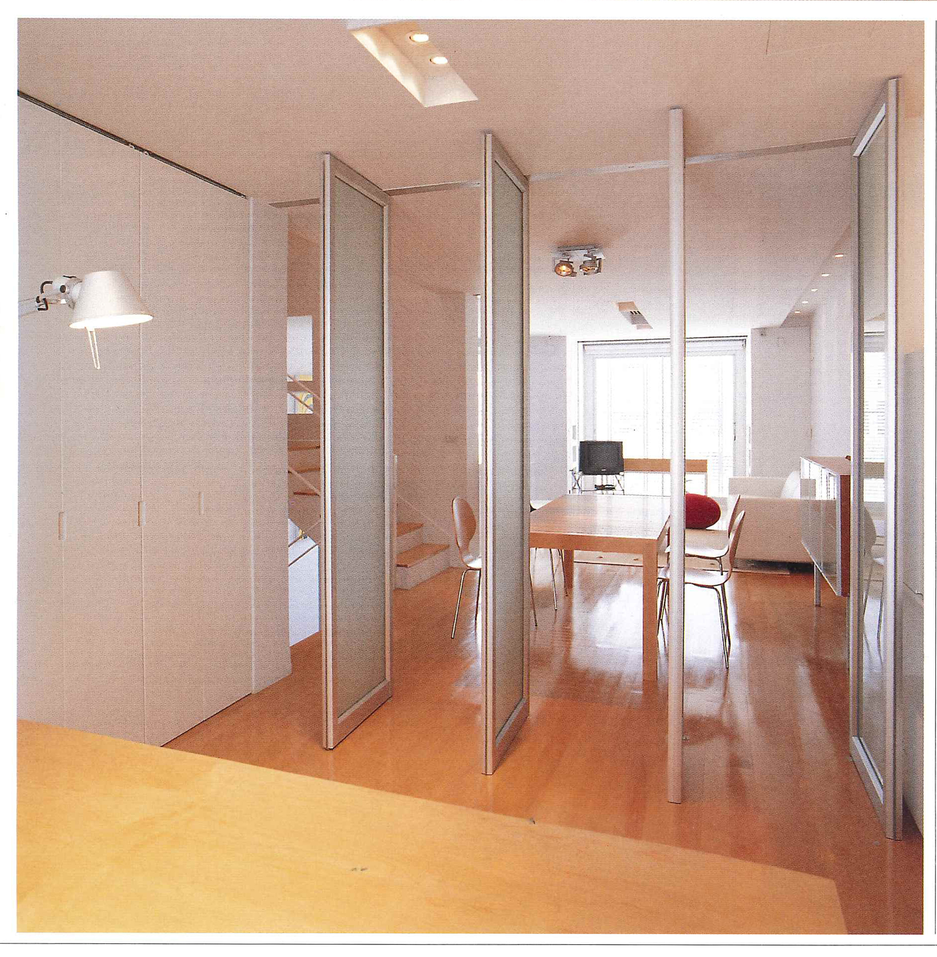
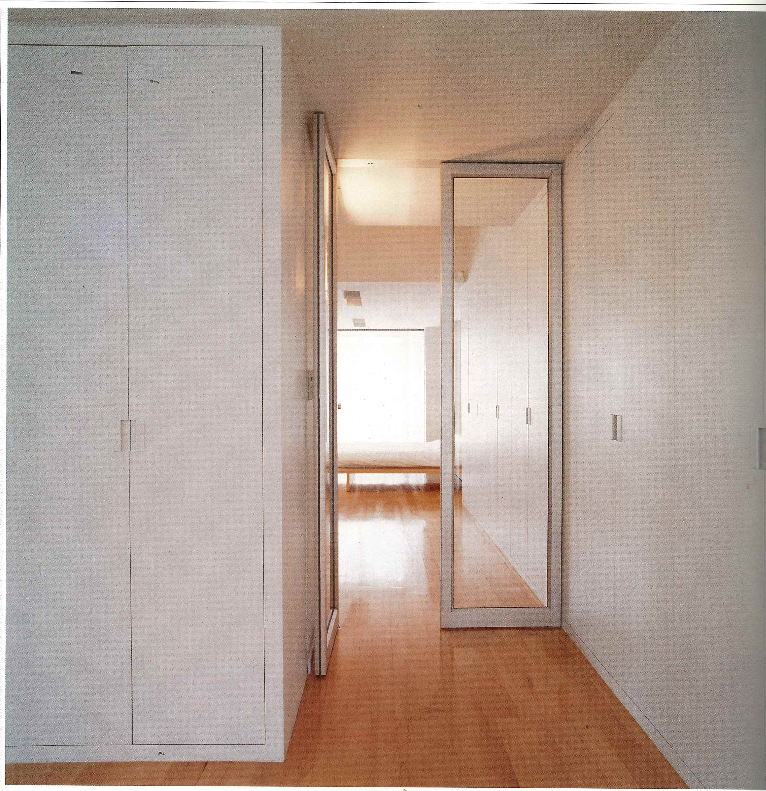
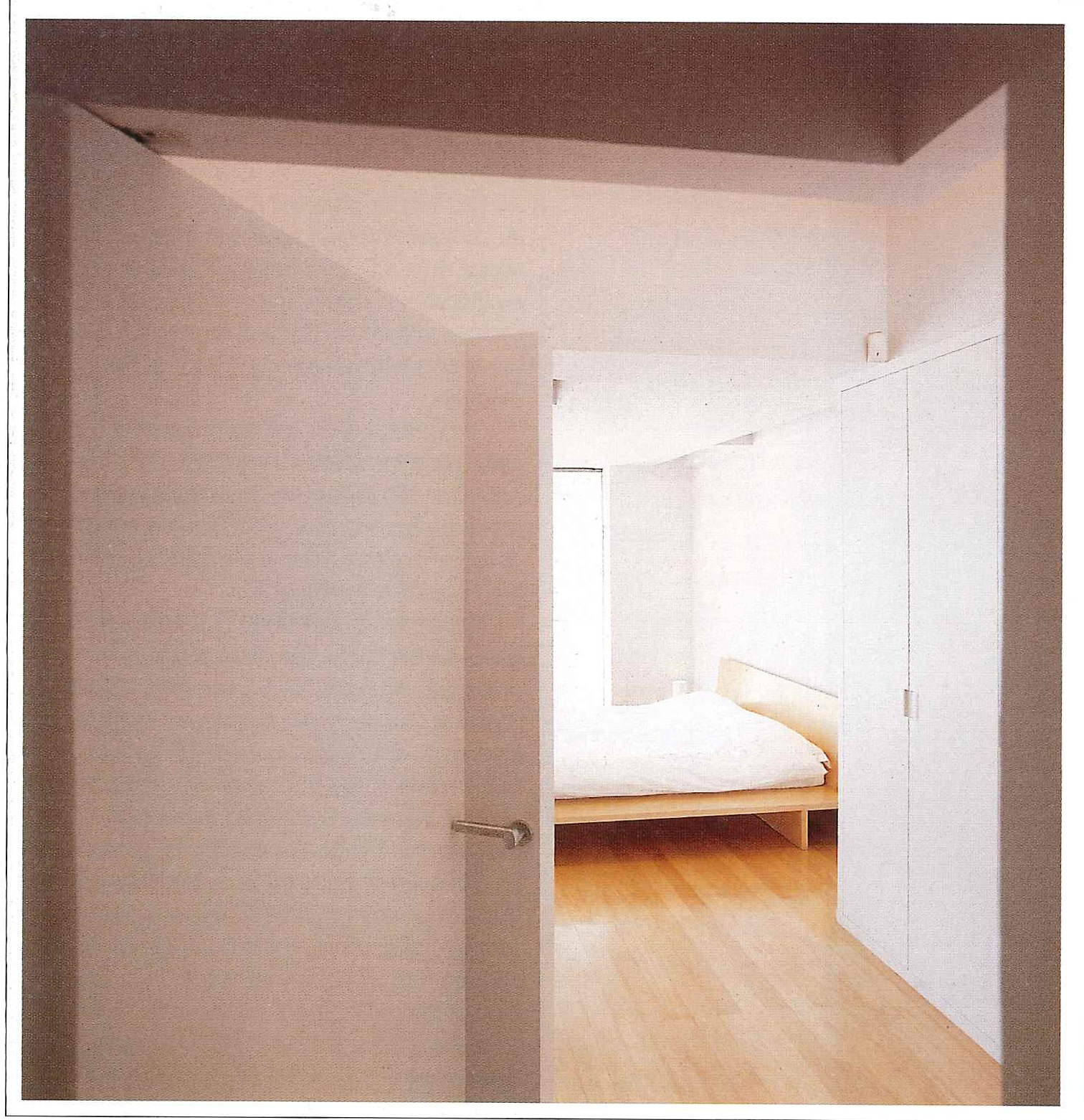
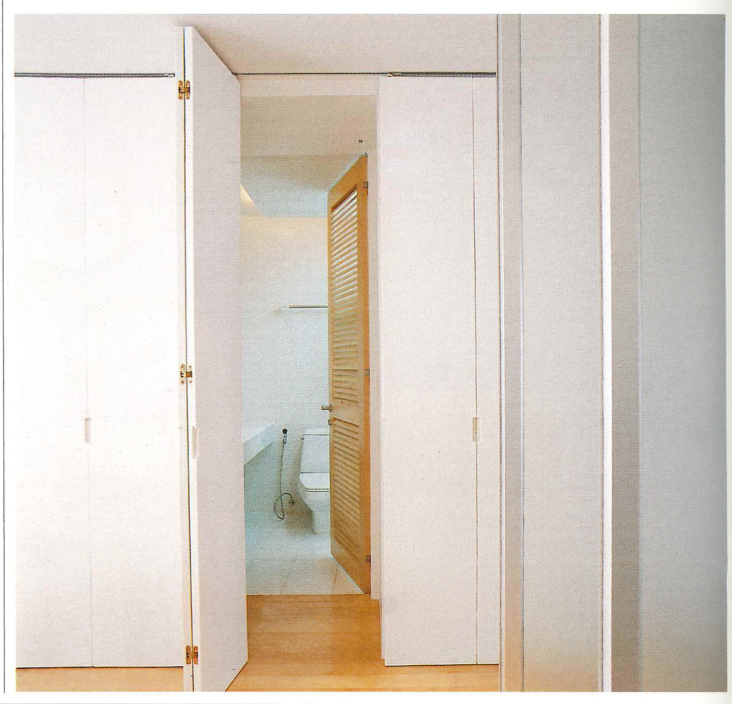
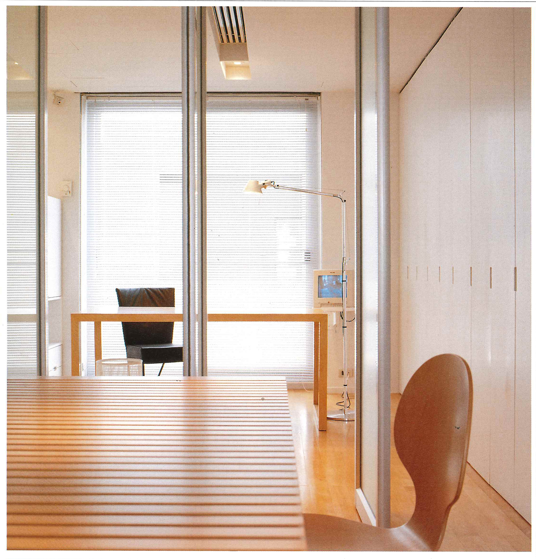
On the second floor, there is an open-plan living room with a dining table and five windows. There is also an office that is connected to the living room by four revolving doors decorated with frosted glass. These doors can control the continuity of the space and also ensure privacy. The big door of a cabinet, furthermore, hides a bathroom attached to the office. Another particular feature of this project, which Somchai has paid strict attention to is the way he has delineated the utilization of each space without using doors or frames. The advantage of taking such an approach is that the continuity of space, in both visual and psychological ways, is created so that the boundary of each room can’t be strictly defined. This idea can also be glimpsed on the third floor, where the bedroom is located. The door of the bedroom, for instance, is a part of the wall, which can be opened.
This kind of concept is usually employed by architects facing severe limitations of space. It is also interesting to note that most architects avoid having the stairs and a door facing each other. But just look and see what happens when you open the door of the bedroom.
Originally published in art4d No.41, Aug 1998
Originally published in art4d No.41, Aug 1998
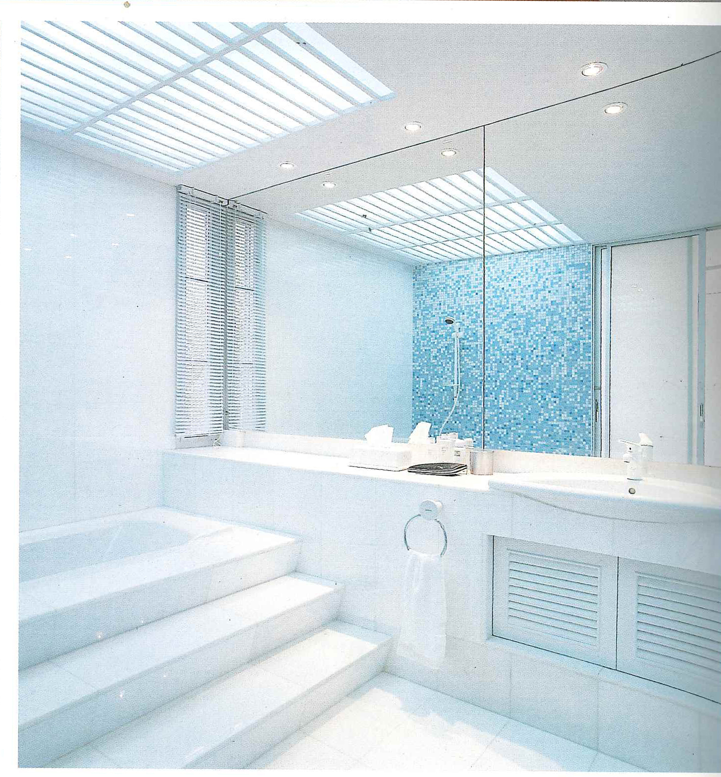
The frosted glass makes it seem as if a continuum has been formed with the dressing room and the toilet. Because the bathroom receives less natural light from the outside, a skylight-like lamp above the bathtub provides the necessary illumination.
Originally published in art4d No.41, Aug 1998
Originally published in art4d No.41, Aug 1998
Many people think that doing such work, which obeys the “less is more” principle, must also be easier. This is hardly the case, for there are many space-related concerns, which also must be taken into consideration. Space, seemingly an abstract idea, is normally defined by figurative components like walls, doors and open areas. So these elements must be incorporated into the design with great care and an artist’s sense of proportion, if the final results are to contain this continuity of space. In conclusion, it looks like architects are not the only ones worrying about spatial relationships these days.
Originally published in art4d No.41, Aug 1998
Originally published in art4d No.41, Aug 1998
Originally published in art4d No.41, August 1998

