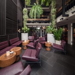
art4d TALKED WITH KEVIN LIM FROM LUMP COMPANY LIMITED, THE TEAM BEHIND THE DESIGN OF EAT ME RESTAURANT AND THE RECENTLY LAUNCHED AND SUCCESSFUL BUNKER.
For Eat Me Restaurant, having been named one of ‘Asia’s 50 Best Restaurants’ for multiple years is testament enough to the quality of this 16-year-old renowned eatery. Apart from the masterful management of its founder, Darren Hausler, and the menus in the hands of Head Chef, Tim Butler, coming into play as ingredients for success, the restaurant’s unique ambience is an equally important element that has led to its long-standing reputation. art4d talked with Kevin Lim of Lump Co.,Ltd., the team behind the design of Eat Me and the recently launched and highly successful Bunker that has received nothing but raving feedback from the media and urban Bangkok foodies alike. Lump’s design repertoire combines interests in both the old and the new. It’s the spectacular binary of unpolished rawness and idiosyncratic luxury that is fresh and exciting. Our conversation with Kevin Lim goes beyond design into his experiences with and insights into Bangkok’s restaurant industry.
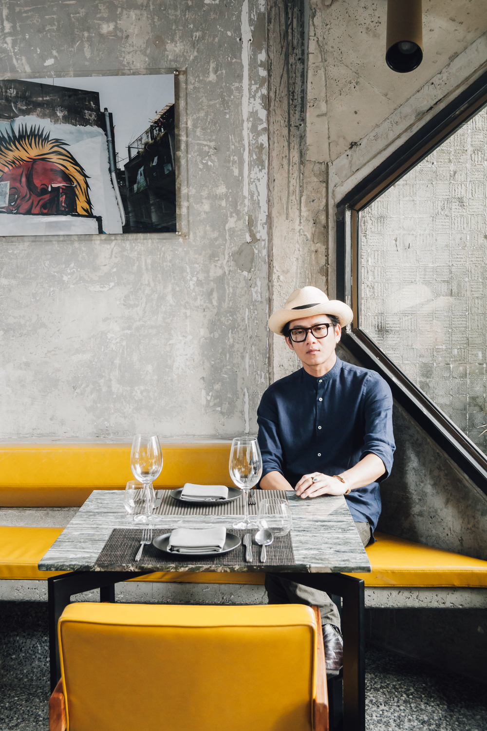
Kevin Lim, portrait by Ketsiree Wongwan
art4d: Could you tell us a bit about the beginnings of Lump?
Kevin Lim: 11 years ago I met with a customer who was our first client in the Silom-Sathorn neighborhood, Mr. Darren Hausler, the owner of Eat Me Restaurant in Soi Convent. He wanted to expand the space with the addition of the second story’s terrace because the building was originally a two-story building. The third and fourth floors came way later. I was the first designer who did the renovation for the restaurant and I was responsible for the entire design direction, from the interior to every single piece of furniture including the chairs and bar stools. The condition we had to work with was that the renovation had to take place while allowing for the restaurant to continue its operations. So we had to work every day from 8 a.m. to 1.30 p.m., which was why the progress was quite slow and we ended up spending a lot of time gradually opening one new space after another. Let’s just say that it took four years to expand the restaurant from 70 square meters to 400 square meters. We did the third floor, the new terrace, and then in the third year we redid the first floor before moving up to the fourth and fifth floors that are now used as Eat Me’s office.
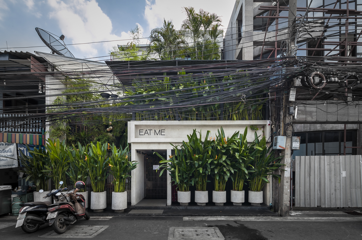
Eat Me Restaurant, photo by Ketsiree Wongwan
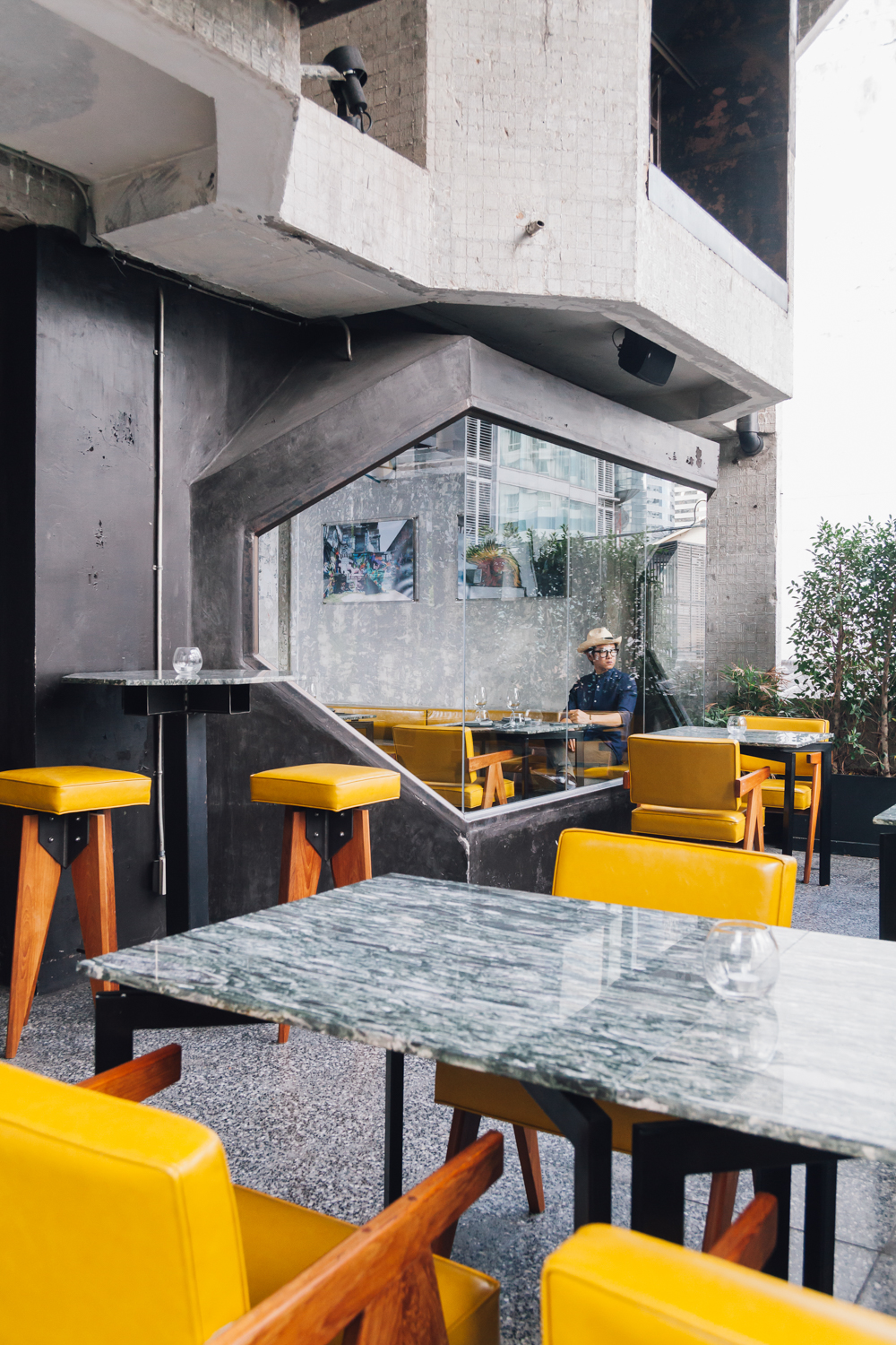
But this project made me understand and know the group of clients who came to the space that we designed and created. Their satisfaction lies in the whole experience Eat Me has to offer with the truth to, and use of, materials where the real textures reveal the materials’ characteristics. If it were someone’s everyday life, they wouldn’t be noticing the wood finishes or what kind of feelings they contribute to the space. With different types of granite, say flamed, polished or a simple finish, most people don’t understand the differences when they feel the surfaces with their hands. But within one big picture, all the materials fall in the same direction. They are materialized from the truth-to-material concept and what we do isn’t something they see in average, everyday life. These are things they wouldn’t use in real life. You look at the tables and you think, with such an upscale place selling 1000-4000 baht-dishes, why is there all this unpolished rawness when it comes to the details? But once the food is served, the smoothness and the touch of the risotto on you tongue can make you momentarily forget about the texture of the table. From the taste of the risotto to the plate, then to the table, it’s sequentially overlapping. The place is scented with Malibu, which is a coconut-scented rum, and it makes you kind of realize that risotto is not actually seafood but it’s created to appear to look like seafood. The table was like this rock by the sea and the dish is an off-white plate I ordered from Lampang. The result is that the risotto stands out in the middle of this obscure white tone. The reason I chose to cover the table with a cloth of such a rough texture is because it goes well with the materials used with the walls, which is this large washed gravel that no one has been using for the past 30 years. And there’s a reason for that because the quality of the cement made the wall crack but with a higher quality cement, the gravel-packed wall can be constructed much more neatly and beautifully.
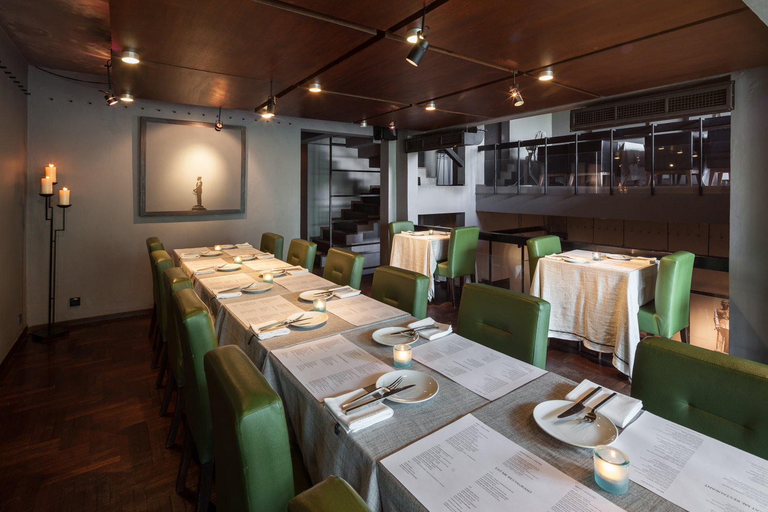
Eat Me Restaurant, photo by Ketsiree Wongwan
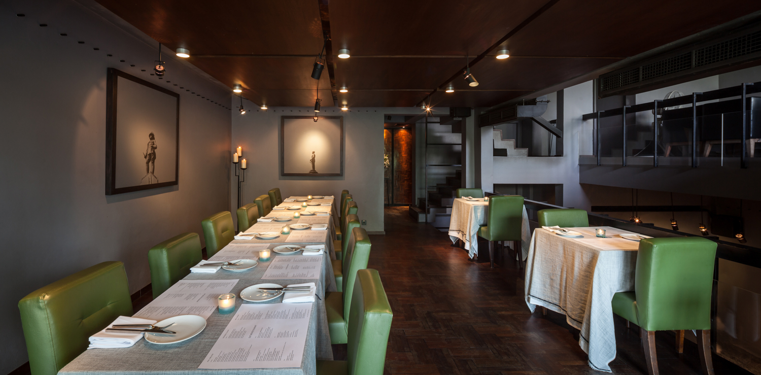
Eat Me Restaurant, photo by Ketsiree Wongwan
art4d: How is the new concept different from the original design concept of Eat Me ?
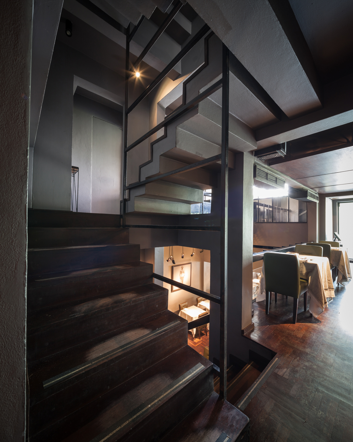
KL: I understood only certain ideas of the owner because the space was pretty much like a normal restaurant with two units of shophouses, so I decided to work with the original space, which was basically a 30-40 year-old shouphouse in Soi Convent. I remember thinking that it had this sense of old Bangkok with a parquet floor, terraces with wooden and steel rails or this very rectangular, thick handrail covered with red rubber, which bespeak the characteristics of the city back in the day. You could see these elements in 80% of the old shophouses, terrazzo for the ground floor and parquet for the upper floors linked together with a set of stairs. The original openings were shoddy aluminum and rusty steel so we copied that but while focusing on creating a different perception by borrowing their forms and looks. The original use of a 3/4” round bar was replaced with the rather large square steel tubes for the handrails. That is why the difference is so obvious but the same sense of space is still preserved. We understand that time has changed and now stainless steel has been more popularly used but we didn’t want to use that. We wanted to use the materials that bespeak the Bangkok of the past. We changed its size, and that was all we did. The doors and windows were all V-cut steel angles imported from China. They don’t make those now. They were T and L –shaped cast iron, which were used to support those windows like you would see at public vocational schools or Hualamphong Station. We got them from shops in the Rama IV area such as Wat Doung Khae, Hualamphong, Mahapruektharam – Bangkok’s old neighborhoods. We went to the old, original stores in Bangkok looking for stones we could use. We searched and researched to see where the areas in Bangkok were that flourished during the 40s-60s, the time when bank buildings were designed and constructed with exposed concrete structures and mosaics, the kind of architecture Krisda Arunvongse na Ayudhya did for the Bangkok Bank Headquarters. Most of my works converse with the contexts of these areas of Bangkok and most of my projects are in Silom. The farthest areas I’ve ever worked in are Thonglor and Ekamai.
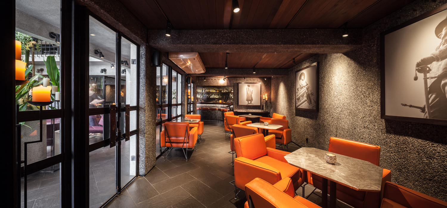
Eat Me Restaurant, photo by Ketsiree Wongwan
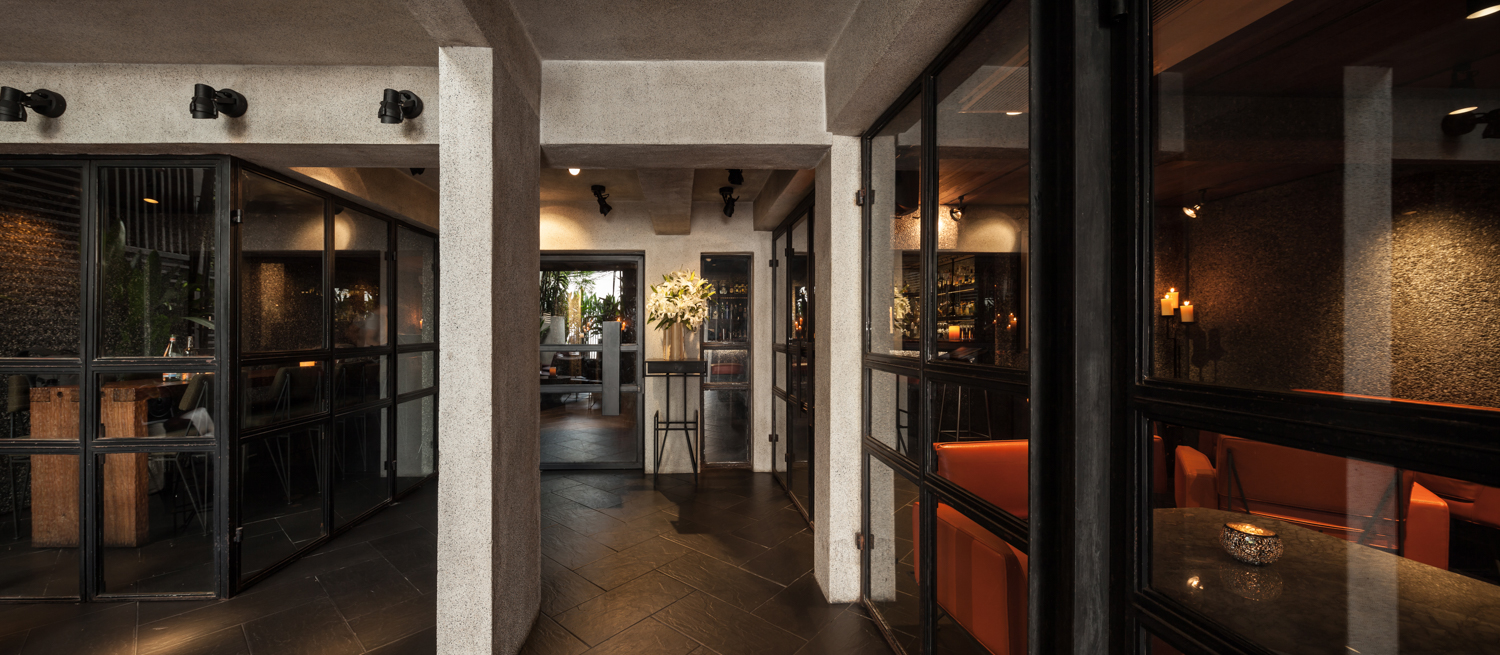
Eat Me Restaurant, photo by Ketsiree Wongwan
art4d: Could we back up a little and ask how you ended up working with Eat Me?
KL: Well, one of the staff members of the restaurant was decorating a condominium and he saw that I was working on a small house opposite to his building. He worked as the assistant manager at Eat Me. One day, he saw the unusual form of concrete that was being cast on the site, so he came up to me and told me that he would bring his boss to see me because Darren Hausler, the owner, was looking for a contractor who could design. He already had the design team that he chose from the United States and my job was to make the design buildable. But in the end, I ended up redoing the whole design and overseeing the entire project. The thing is that they were a California-based design firm so they were trying to turn Thai food into Californian food, like turning Japanese food into a California roll, and that wasn’t the real taste that the Silom and Sathorn expats would want. They want something that is the real Bangkok, circa the 1940s-1960s. I remember asking Darren Hausler, “don’t you feel bored living in this brand new apartment?” as I suggested to him to try moving into the concrete-roofed apartment near Sathorn Soi 9. I told him that by being in that place he would understand what his restaurant would be like. Go see and you would find four 70-something westerners and three 60-something Chinese residents living there. These people have been living in Bangkok forever and they have been renting the apartment for 30 years. This building was at least 70 years of age back then, which means that these people had been renting the place since they were in their 30s, meaning the space had to be pretty damn cool. One single wooden panel was used as the railing system with a small piece of steel pierced through, jointing everything together and that was it. And that’s Bangkok. The city back then was filled with gable houses and governmental buildings whereas pricy apartment buildings in Sukhumvit, Sathorn, Silom and Phaholyothin, primarily Sanam Pao and Ari, were all these gable-roof buildings with rectangular, minimal forms. Sukhumvit neighborhoods like Asoke or Nana, these areas are where Bangkok was born. I think Thailand has never experienced the Modern Movement because the developmental period has still been too short for the original Thai-ness to actually substantiate. Personally, I think it never existed anyway. Thai-ness is comprised of Khmer culture and so many different things; so don’t try to think that there is this Thai characteristic that can be developed into Modernism, because the root has never existed. What we have is a combination of things and we call this thing Thai, but the origin wasn’t there. Don’t try to find modern Thai architecture. It may exist but by today you should enjoy the Thai-ness that you have as it is because no one does. Everyone tries to be something else but the period of progress is way too short. You didn’t get to really embrace it and now you want to change it. Let me give you an example, you see Mount Meru-inspired architecture but that’s not Thai, that’s Khmer, India. You just try to change it and say that this should be that.
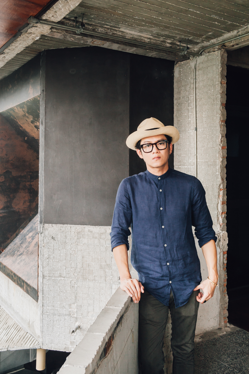
Kevin Lim, portrait by Ketsiree Wongwan
art4d: We heard that you have been interested in shophouses since you were a student studying architecture, could you tell us about your master’s degree thesis?
KL: The research I did for my thesis was about shophouses in the reign of King Rama 5. The truth is that the shophouses in the Silom area were a form of slum. It was practically the same word. The birth of shophouses usually obstructed the original waterways, which were a part of the local orchards. Take the area near Chulalongkorn University for example, the shophouses were built along different blocks of orchards so the water that used to flow through the original waterways couldn’t get through, and that was how swamps were created. Some of the small agricultural lands were still there. But one day, every side of the blocks was closed with shophouses, and they have been with Thailand since the reign of King Rama V until 2500 B.E., and the development continued. We began to build shophouses around entertainment and communal spaces like Cineplexes and markets. That was when shophouses destroyed everything. Condominiums then started to replace shophouses through expanding urban development. Bangkok began to grow from the left side to the right side of the river, and the growth continues endlessly. It has been over 50 years since 2500 B.E. and we still can’t go anywhere and don’t know how it is going to end. Nevertheless, the whole history of shophouses started at the area by the Chao Praya River. King Rama IV constructed the Kwang Canal that ran from Klong Toey all the way to Bangna and it became Narathiwas Road that we know today. If the foreigners wanted to come into the city they would have to ride carriages but the road was very hard to travel, so they requested for the construction of new roads such as Charoenkrung. With the newfound convenience, the westerners didn’t want to go back to the area they used to live in, so they relocated to Sathorn because it was close to Charoenkrung road and it wasn’t far from the river, which had a connected waterway for them to commute to Bangrak. King Rama IV stopped the construction of shophouses there for a purpose and it was because if the armed ships sailed in, they could fire at the Grand Palace. That is the reason why the growth of shophouses stopped at Charoenkrung road at that particular period of time. The date of the construction of these buildings goes way back and it lasted until the reign of King Rama V. Then came the modern shophouses first seen around the 2475 B.E. period. Shophouses had a strong reference with the elites because they were the ones who built and owned these buildings. The commoners didn’t have the money to build so the elites rented out their lands to westerners and new structures were constructed. The western-style buildings we see today were a result of western design that the elites picked up. We see a lot of these types of shophouses at Sanamchai. The very original ones were the one-story type that the Chinese built but they were demolished when the Grand Palace was constructed. Surely, Thai people didn’t come up with this form of architecture.
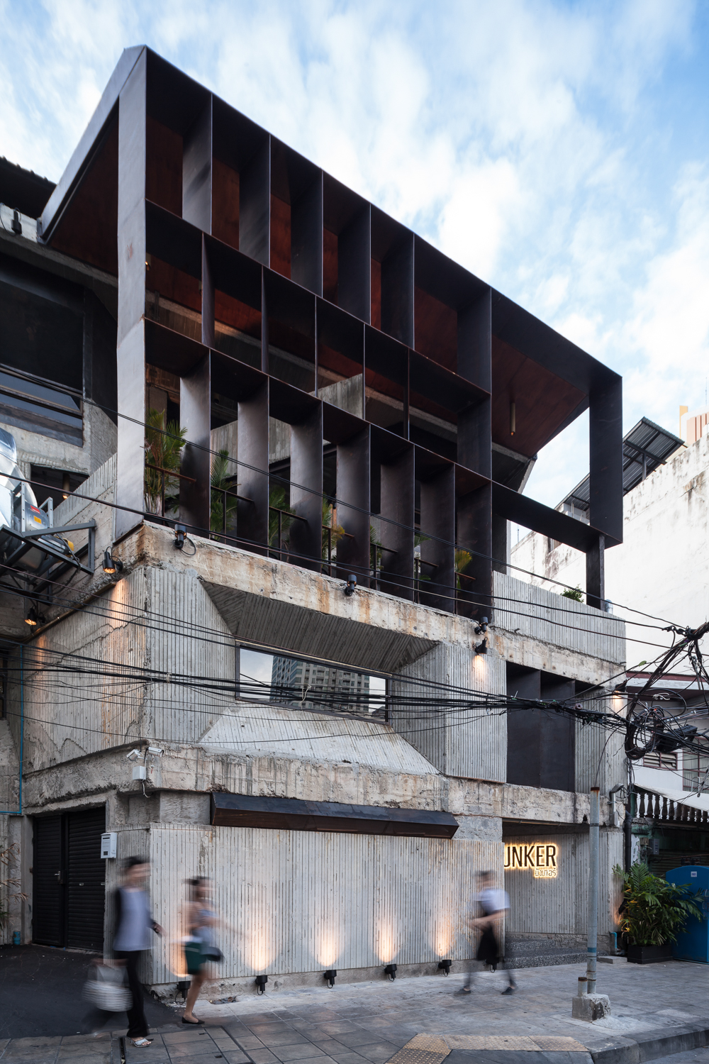
Bunker Restaurant, photo by Ketsiree Wongwan
art4d: What are other projects you have done since Eat Me?
KL: I did a renovation of Thang Long Bar & Restaurant at Lang Suan, Bangkok. It’s a Vietnamese restaurant that has this tropical style and the materials I use range from granite to black slate and the color scheme is all black, which is quite a change from the original red color tone. We use black stones with Thai wood. We didn’t use Vietnamese wood. It’s like the food. It’s Vietnamese but the people who cook it are Thais. We use primarily teak wood. Vietnam doesn’t have teak because of the cold climate, so its local woods are mostly pine and beech.
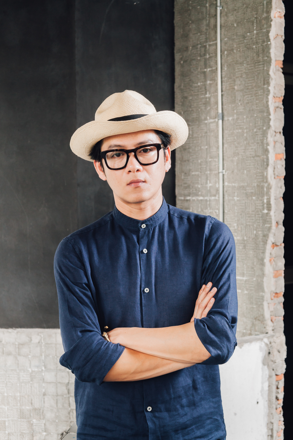
Kevin Lim, portrait by Ketsiree Wongwan
art4d: You want the materials to have their own stories.
KL: Absolutely. They should have their own stories because they are not just objects that are put there. We’re talking about perception and Mentalism. The discipline in the realm of Mentalism is different from that of materialism. We researched what and how things should be used, where they should be placed, but what should and shouldn’t won’t always give you the right answer. Everything is changeable. The renovation changes the minimal white space created 20 years ago into a serene and peaceful space, which is the combination of Zen’s individualism and a true understanding of the nature of food and tastes. That was the brief but we couldn’t pull it off because the budget was quite limited.
art4d: You have obviously used concrete in many of your projects, do you have a personal or particular interest in the material?
KL: Concrete is just the word that is used as the representation. “Concrete” in the sense of one’s experience is actually the physical form of dharma (the word concrete in Thai is รูปธรรม or ‘image of dharma’). It’s creating an order of “suchness” that is conceived and made to appear in the forms of the five senses. You see something concrete, it’s the representation of what you see that is real. That’s why human beings use concrete to build physicality. Concrete is the word we use to explain when something is real. What you are able to see and touch.
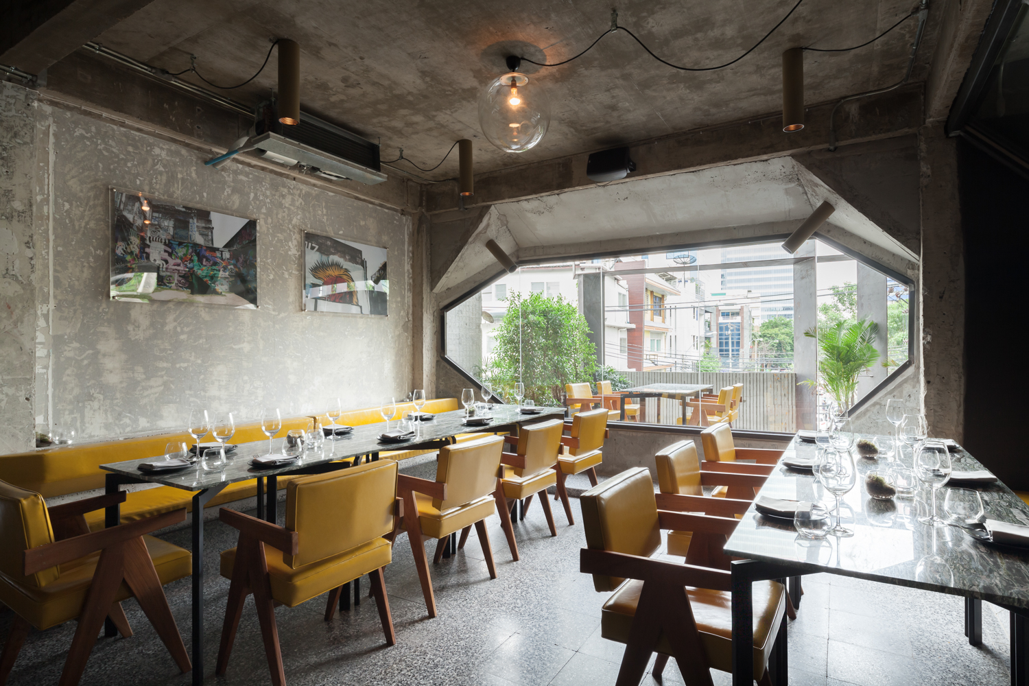
Bunker Restaurant, photo by Ketsiree Wongwan
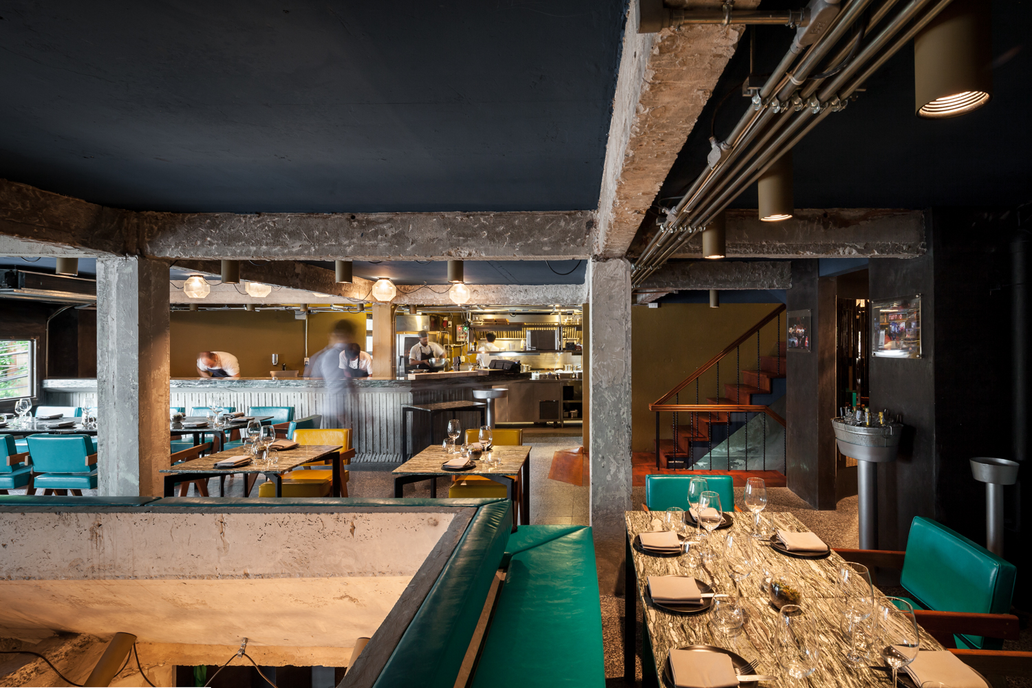
Bunker Restaurant, photo by Ketsiree Wongwan
art4d: So that’s your interpretation.
KL: That’s right. We don’t use concrete the way Tadao Ando or Le Corbusier used it. We think of it as a philosophy and we call it “concrete.” Philosophically speaking, this is the essence. It has been on this earth since 4,000 years ago. The word “concrete” in its very own sense is subject to change its form, like water. It’s a solid mass today and it can turn into liquid any day. Concrete is liquid before it becomes solid, so it’s natural that its solidity can become fluid.
art4d: On Lump’s Facebook page, you seem to be particularly interested in Brutalism Architecture, why?
KL: Go back to concrete. I know the only thing we understand and others understand, too, but I know there are two things that we understand better than others and they’re Brutalism and concrete. I feel like they’re something I understand and am good at. I’ve been studying Brutalism for a long time, since before there was any Thai word for it.
art4d: What would be the Thai word for Brutalism?
KL: “กักขฬะ” (Gak-ka-la). It’s ‘rudeness’ in the sense that is beyond the physicality of the material. It’s the rudeness and rawness of the spirit. It’s unpolished. And that’s brutality in the sense of architecture. It’s beauty in a barely polished form.
art4d: How does Lump deal with concrete as a construction material?
KL: Working with concrete is like putting the hands of an architect and the hands of an artisan together. For each project, we work with different teams of artisans. With Bunker, that’s a whole new team.
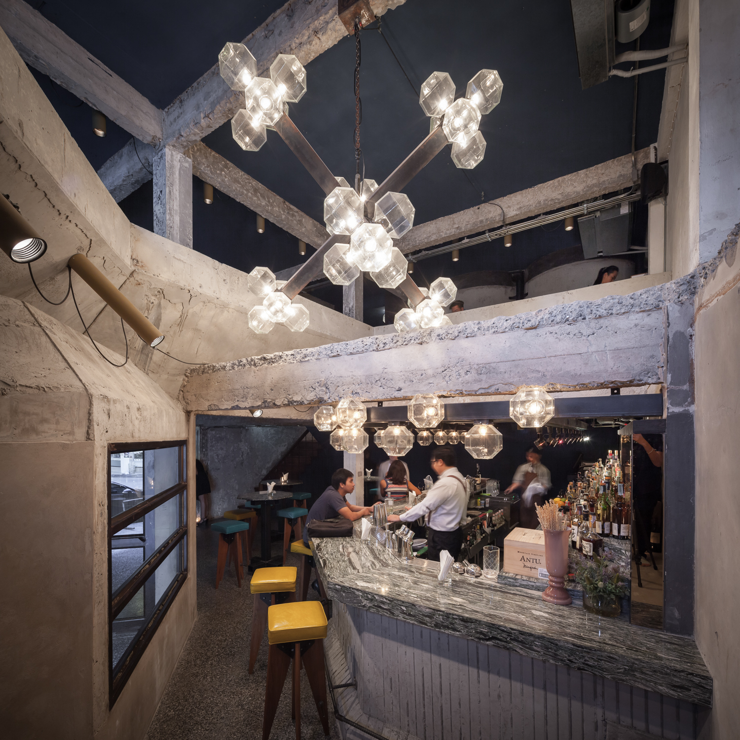
Bunker Restaurant, photo by Ketsiree Wongwan
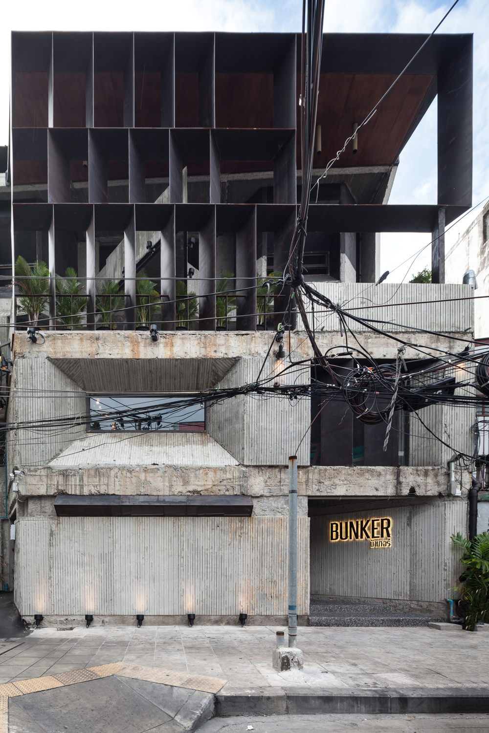
Bunker Restaurant, photo by Ketsiree Wongwan
art4d: How do you choose your contractor?
KL: Someone I’m happy with. There are three teams of contractors that I constantly work with and they specialize in wood, steel and concrete. I have another team who is my marble supplier. When these people come together, they call themselves the Architects Society. They met through our projects and the more they work together, the tighter the group becomes.
art4d: You mentioned that there are five people working at Lump, what are each member’s responsibilities?
KL: We have a person who scouts for chefs for our clients. Bunker’s chef is a guy we know from New York. We have a steel specialist who is a German engineer and you can see some of his works such as the chairs at Eat Me. His job is to provide advice for steel contractors who work with us. Then we have a linguist who is a multilingual. He’s the stream that keeps our operation running. The diversity of our connections are created from his linguistic knowledge. We have an American manager who fought in the Vietnam War so he’s able to handle the Asian business really well. He takes care of the legal matters, accounting, and every operation related to our clients. Then there is me; I oversee the overall aspects of the design. Our team is made from a very unusual structure and that’s why we call ourselves Lump. It’s something that pokes out from your original body parts. Lump was also the name of Pablo Picasso’s dog and Picasso is an artist we all admire.
art4d: Do you do other types of projects besides restaurants?
KL: I am now working on three houses. One is under renovation and one is in the middle of the design process but the construction is scheduled to begin next year. The owner is Apiramon Ourairat, Dr. Arthit Ourairat’s daughter. The working drawing is done and it’s still the kind of project we want to do because the owner gave us creative control. Nobody renovates a gable house into another gable house with a reference that can be dated back to 700 years ago. This project is special because it’s the renovation of a 26×27-meter gable house into a gable house but with the roof inverted.
We also have a shophouse renovation project for TMB’s FAI-FAH. About 6-7 years ago we were responsible for the branch on Chan Road. The owner of that building is Paradai Theerathada, one of the regulars at Eat Me so he was familiar with my work. I think almost 100% of my clients are Eat Me’s patrons. FAI-FAH School is TMB’s CSR project. The spiral staircase at the front is one of the most striking compositions of the design but the reality is that it’s rather dispensable in terms of usage but I want to keep it because I want it to be used as a fire escape. The range of the fire escape for most buildings is 11-15 meters from the main building and with the structure that we work with, this is not a problem. But for the building’s users who are 6-12 year old kids, they don’t know for sure what a fire escape really is. If something happens, what they are told to do is walk together in a certain direction. Walking together along the escape route is one of human’s perceptions towards the incident, so it’s important that you provide a definite location of the staircase so that it’s a part of their awareness. They become intuitive about the location of the fire escape stairs because we put it right out in front of the façade. They see that from the very first day and the stairs remind them all the time of their functionality. It’s in their subconscious that this is where they go to escape the fire despite the fact that they may never have to use it at all. But this spiral staircase is always at the back of their minds so if one day there was a fire, they could understand and use it naturally without having to be provided an excessive explanation.
The functionality of the ground floor is the large foyer and we designed the staircase to function as an inclined auditorium that ascends towards the mezzanine. This area will accommodate all users. It’s the space where they can express ideas, abilities. It will offer them a democratic environment and experiences as they gain a better understanding of being with others. The decoration is in an industrial style, and everything is authentic. Some of the details are real vintage items that we found at different places in Bangkok. The sinks we use come from the very same supplier who handled the sanitary ware when Lerdsin Hospital was constructed. Before the shops in Mahapruettaram were demolished, we bought everything usable and we’re talking about new, 30-40 year old stocks. We didn’t adapt them that much. Most of the time, we use them as they are. If they’re broken, that’s fine because when we know something is broken, then maybe it’s time we use some new stuff. You don’t have to be 100% original because it would be too dry and less alive. Leave everything be. It’s like the teaching about dependent origination in Buddhism, which goes back to the idea about concrete—the truth of the material is something we acknowledge with our five senses. Concrete is, therefore, the representation of everything that we do.
Kevin Lim, portrait by Ketsiree Wongwan
art4d: Lump’s design track record is comprised of a lot of restaurant projects, could you share with us you experience or point of view working in this industry?
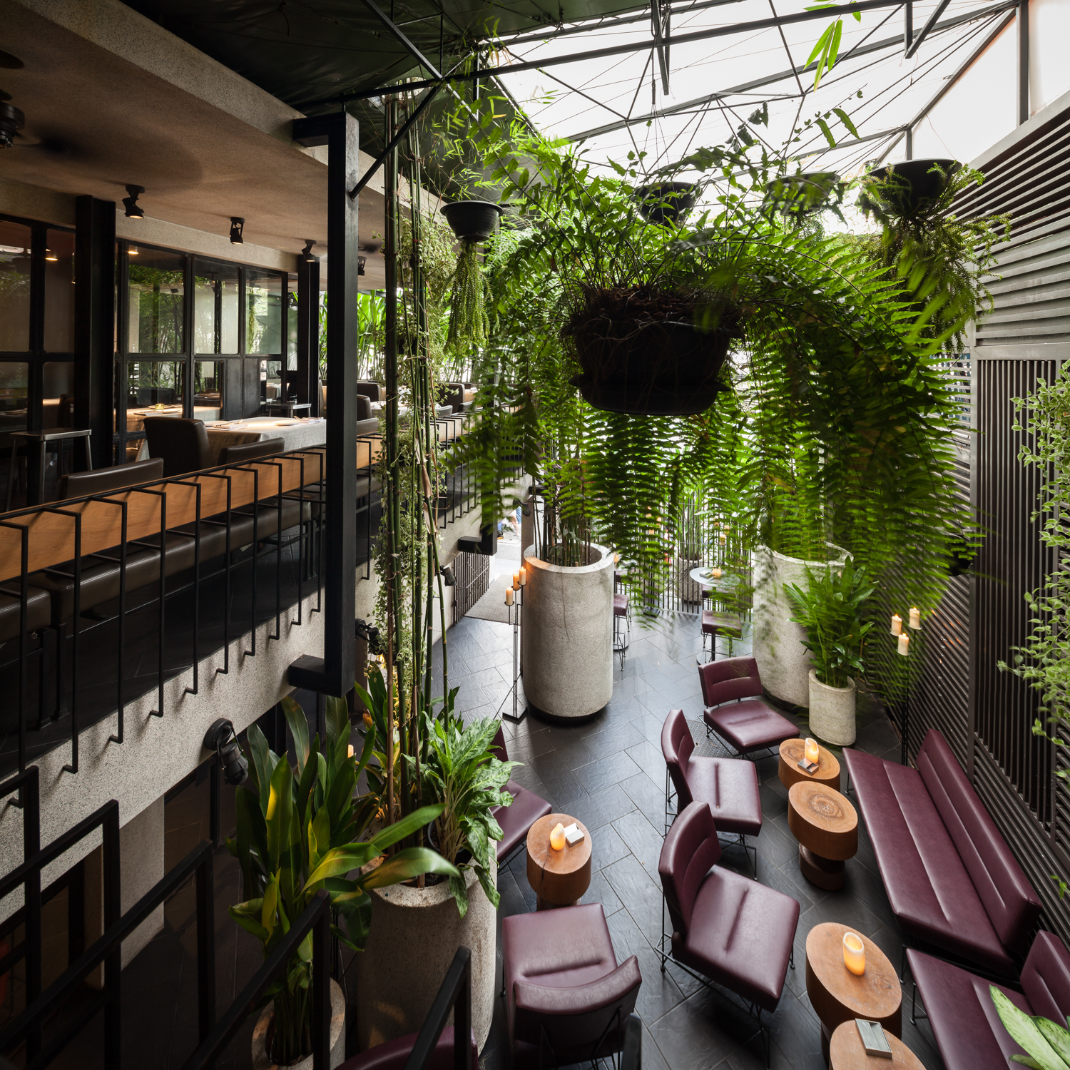
KL: Let me give you an example with Bunker, which is one of the recent projects that we did. The original 7.5-meter depth of the site is very narrow and we couldn’t do anything much about it. You put a table there and the whole floor would be full. So what I did was change the original axis, which was a simple straight line. So when the axis is twisted, we get nine meters of extra depth within the space and we adapted it into a bar. The ground floor hosts the area for the bar and drinking and the 2nd and 3rd floors accommodate all the seats for dining patrons. From my experience designing restaurants, Thais and foreigners who hang out in the Sathorn and Silom neighborhoods don’t like sitting on the upper floors. Westerners, in particular, don’t like to sit on the ground floor, next to the street like you would see at Khaosarn or Soi Cowboy. They’re embassy officials, corporate executives, living in serviced apartments with 100,000-400,000-THB-per-month rent. They don’t want to be seen by passersby. They have drivers dropping them off when they come to the restaurant. They get out of the car and walk up to the second floor. It’s entirely different from what you see in Thonglor. Most customers in Thonglor walk from their condominiums and go into different alleyways to different hot spots in the area.
art4d: So most of the customers at the bar are Thais.
KL: Thai customers usually come on weekends, but the majority of our patrons are foreigners. Thai customers come in for a couple of beers and they leave, but they’re not regulars. The expats who are regulars come 3-5 times a month, or 25-30 times a year. The more often they come, the more we become familiar. The projects that fall into my hands come from this group of clients. There are also young celebs who live in condominiums nearby. They used to buy beers from convenience stores but since Bunker opened, they stop by for a couple of beers, hang out for a few hours and then leave. The beers we sell are so much more expensive than the ones sold at 7/11 but they love the vibe here and the fact that most of the customers don’t know who they are.
Eat Me Restaurant, photo by Ketsiree Wongwan
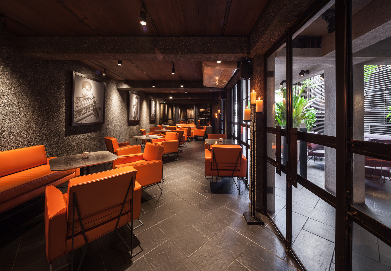
Eat Me Restaurant, photo by Ketsiree Wongwan
art4d: Why are the prices of the beers sold in restaurants way more expensive than the market price?
KL: Does price matter when it comes to craft beer? Yes. There are only three companies that import craft beer so every restaurant and bar in Bangkok buys products from the same companies and they sell them for different prices. Sathorn is one price, Thonglor is another price, Sukhumvit has its own price range. This is because restaurants use price to filter their clientele. Restaurants in Thonglor are not all like that, but still, filtering your clientele is important because if you target a group of customers who share a similar taste for drinks, food or ambience, your place will attract the kind of people you want to attract. And this crowd attracts a similar kind of people. People who like Bunker are mostly designers, food critics or executive officers who work in the Sathorn-Silom area. Our clientele rotate. 90% of Eat Me’s patrons are Australians and Americans, not many Italians or French because the menus are not authentic Italian or French cuisine while only 0.1% are Thais. They come because it’s named ‘The Best of Asia’ but they probably will come 3-4 times and then will never come back again because it’s not their type of flavor.
To run a restaurant, you have to be clear about what you want. In Thonglor, it is very hard to indicate your target group because the clientele can be very diverse. So restaurants, pubs, or bars in Thonglor and Ekamai have to struggle to survive unless they keep changing their brands every year or so because these are neighborhoods for the young, 16-20 years old. They get bored easily and they change their minds overnight. If this group of people goes into a pub a couple of times and sees the same faces, they will want to go somewhere else and they will take their friends with them. They hang out in groups. They’re school friends. I think these are the areas that make it very difficult for a restaurant business to be successful in the long run.
Do you believe that less than 5% of the people who work in offices or live in condominiums in the area eat at restaurants in Thonglor? Most of the clients come from someplace else and are not residents in the neighborhood. The restaurants in Thonglor that can really survive are the southern style Thai food restaurants because there is this sense of a regionalism of southerners. Northeastern or Isaan food isn’t like that because Isaan taste is adaptable. But southerners are very specific about the taste of the food and they won’t eat it if it isn’t cooked right. That’s why these southern cuisine places can continue their business. If it were western restaurants, it would be closed within 2-3 years. Some closed down the old venue and reopened across the street. It might reemerge as the exact same buffet joint but the second branch, or the same restaurant but with a different name. Some rent a place next door, opening a western bar next to a Japanese place, and both are run by the same owner.
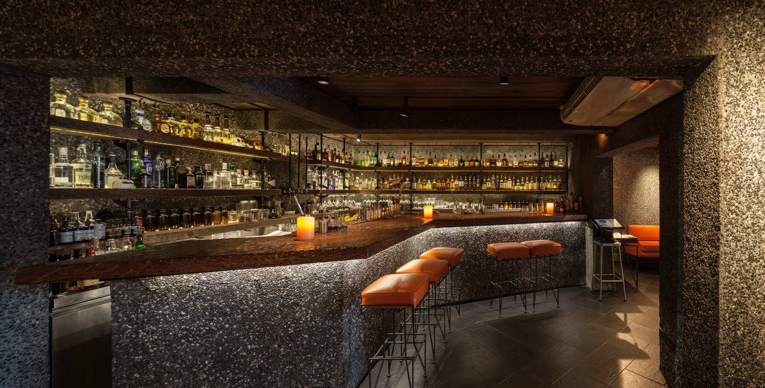
Eat Me Restaurant, photo by Ketsiree Wongwan
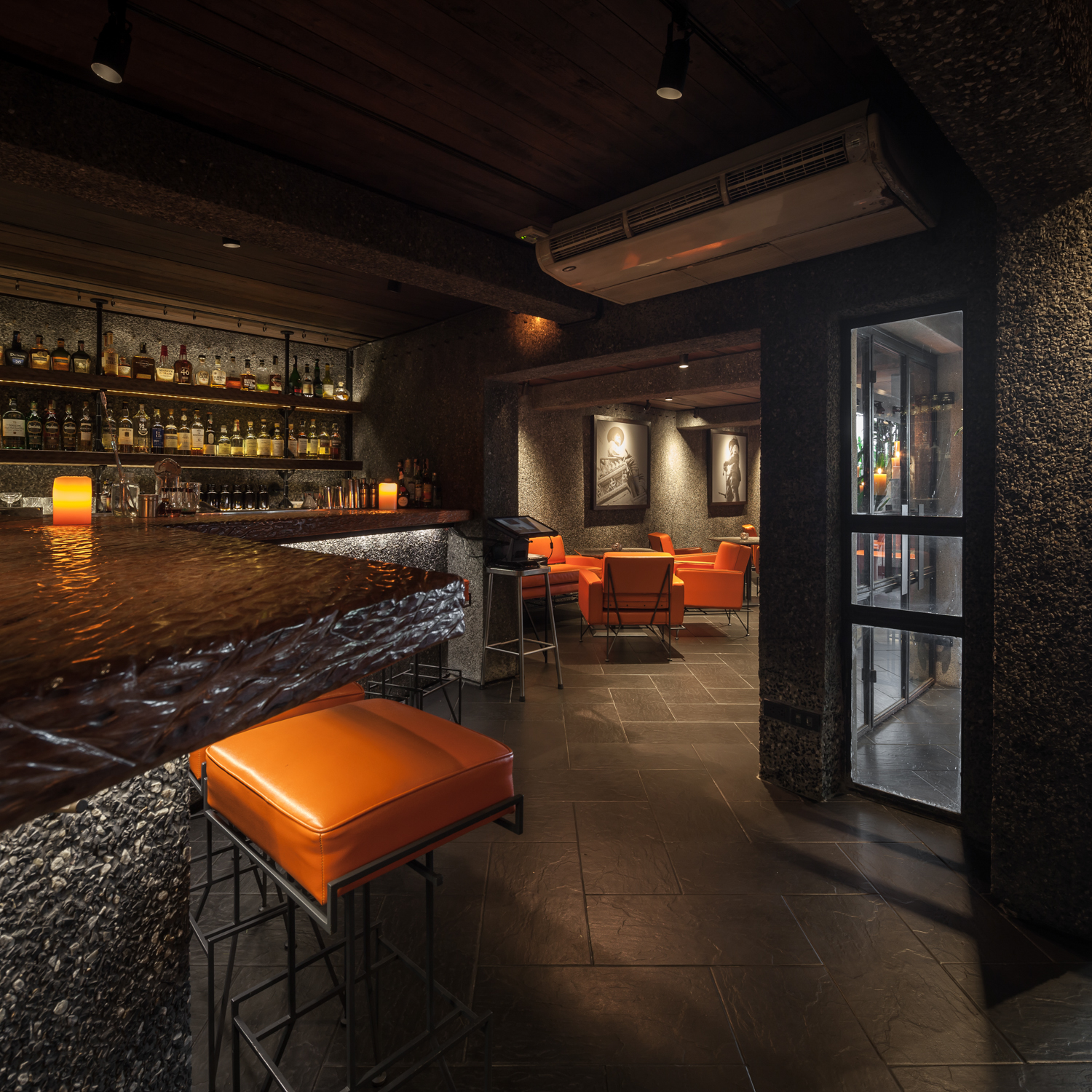
Eat Me Restaurant, photo by Ketsiree Wongwan
art4d: So the type of restaurant that you design could not survive in other locations except Silom or Sathorn.
KL: That’s right. Take Convent Street, the area where Eat Me is located, I guarantee you that you won’t see any skyscrapers on that street for at least 30 years. It’s a very original street. The first hospital in Sathorn is BNH and then St. Louise followed. BNH is one of the first hospitals that the elites came to for receiving medical services. This area has a long history of its own. With Eat Me, the patrons are mostly embassy officers and upper class consumers and they bring their guests with them when they come. If you design a space where the Thonglor young crowd likes to go, these patrons will not want to come back to your restaurant again. Like I said earlier, we can’t sell 120 THB cocktails, so the price range has to be 400-500 THB so the younger crowd can’t come. You have to think about your regulars who could be spending 10,000 to 100,000 THB per meal. It’s about understanding. Anybody can design. An architect who can design a house can design a restaurant but these details are beyond design. To me, architecture is the science of long history but it hasn’t progressed that far. From Greek to Roman, what we are able to develop is perhaps the forms and styles but also the very essence of the soul, I don’t think we can develop any further. That’s why my focus is on contemporariness. What is contemporariness, you ask? It’s being in the middle between two opposite things, the death and the unborn. It’s how to bring back the death and make the unborn more visible. It’s bridging the gap between the young and the old, the future and the past.
art4: Apart from contemporariness, what else do you think is important when it comes to designing a restaurant?
KL: If you sit on the second floor terrace at Eat Me, there’s a branch of teak wood whose bark is so rough that you don’t want to even touch it, or the leather that is so stiff and the lighting that makes you feel a bit blue but once you eat the risotto in front of you, you can completely forget about the atmosphere. In the meantime, this kind of ambience accentuates the taste of the food in a way. If everything is all neat and perfect, well, let me give you an example of one of the places I renovated from an old embassy on Sathorn road where the ambience is amazing but the overall experience is not at all memorable. I mean the food and the place are flawless but the taste of the food doesn’t stand out in people’s perceptions because it is distracted by so many things. Everything was so over the top that its entire being is lost. The cuisine is not the cuisine anymore because everything is so overdone. Like, the counter, for me, is very pretentious. The counter overclouds the dish and the surrounding ambience takes away all the attention.
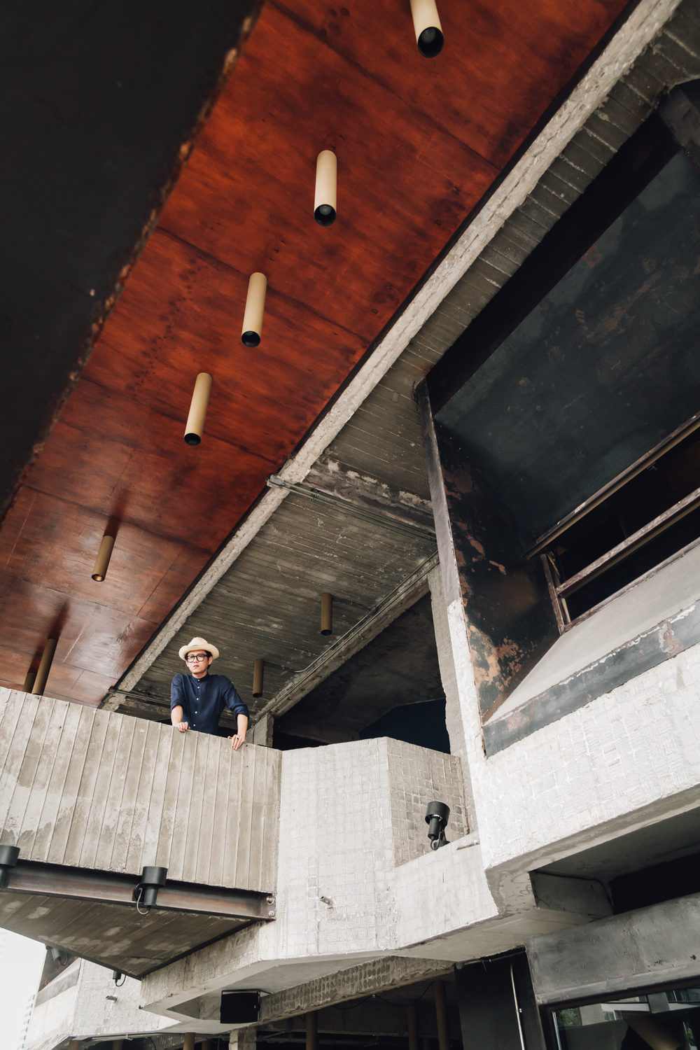
Kevin Lim, portrait by Ketsiree Wongwan
art4d: Having lived in China, Singapore and Thailand, how has architecture and food, in particular, as well as other experiences affected your design thinking, especially in terms of restaurant design?
KL: To me, the essence of life is living the life itself. The whole experience you get from living your life may not be included in the design. The process of design can be the last resort for you to put everything together before the actual work is conceived. It’s your way of life. There can be steps or order or systems or not. Before entering the design process, you have to understand the basis of how life progresses and exists.
It’s important and it’s something you have to consider before beginning the design process. It’s like food. When I was in Shanghai, the food had one-inch-thick oil floating on the surface but I had to eat it in order to survive the cold weather. And I hate oily food but I had to eat it because it was an 8-14 degree climate that I had to live in. So what I did was I redesigned my mindset. I changed my idea about hating oil to eating oil. So if I want to design something that has never existed before and make it real, I have to create a reference with the idea that no longer exists or is forgotten. It might exist in a certain point in time, but it’s not here now. We can design by revisiting it. It’s like you contemplate it the way you contemplate your life, what has changed and why. I don’t like this bitter vegetable but I have to eat it because it makes my health better and I can’t eat other types of vegetables, so it’s the only solution that can help me avoid constipation. Fruits don’t help. It has to be this type of vegetable. So I look for the key factors that can lead to new designs; things that won’t lead me toward the mainstream trend that is everywhere and that everyone is doing. I try to search for the things that surpass the ideas that already exist. We have to design from factors of ideas. If there was a cause that led to an existence of something, your job is to think about how well it can live on. We fix that and design from that. It’s similar to Buddhist philosophy in a way, like we talked earlier about dependent origination. It’s the fundamental way of the world that all things are three marks of existence. Everything is there but we never see it. We look at something as it is and we forget about it. It’s like we’re living with this thing that we thought we understood but it might not be like that at all. People from other parts of the world travel here and see things they have never seen and that are new to them. That’s the basis for us to surpass. We don’t have to design what we think is new for us, but design something that looks really old or even obsolete, but it could be something entirely new in the eyes of others. It’s very hard to explain this succinctly. In psychology, it’s called intuition practice, which is practicing to achieve a certain goal at a certain moment. And at this very moment, you can imagine it. It’s extremely hard to achieve such thing without any help from some factors. If you were too disturbed or distracted by the factors, you wouldn’t be able to do it, too. It’s like you don’t have to look too much at contexts but design from within. It makes us do things that don’t always have to be appropriate or convenient; there are good things, there are flaws and perhaps they’re not the answers to the final stage of the design. The final stage of design, a successful one, isn’t always about the design or working drawing but how people relate to it, how a person relates to others, to animals, plants, and everything surrounding. If everything works together, completes each other, it’s better than coming up with a theory and designing something out of it. To me, this is the right theory, for now. I don’t reference my work to a context, so it can end up being something entirely out of context. People might never understand that the true context isn’t what we make it to be. The true context, ultimately, can just be about feelings.
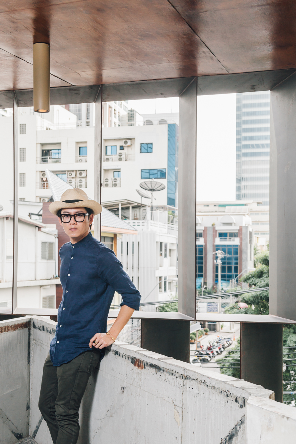
Kevin Lim, portrait by Ketsiree Wongwan
Footnote
The levels of smoothness of stone finishes are determined by different production techniques. Flamed Granite has the roughest surface, Granite is less rough and Polished Granite has the smoothest and glossiest surface.
Dependent Origination (ปะติดจะสะหฺมุบบาด) (Bali: Paticcasamuppāda; Sanskrit: Pratītyasamutpāda) is one of the teachings in Buddhism which states that all dharma (“things”) arise in dependence upon other dharma: “If this exists, that exists; if this ceases to exist, that also ceases to exist.”
INTERVIEWED BY: WICHIT HORYINGSAWAD
www.lumpcompany.com


