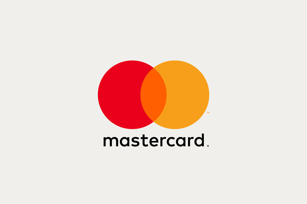
THE IMAGE OF TWO OVERLAPPING CIRCLES, ONE RED, ONE YELLOW, AND THE COLOR OVERLAY THEY CREATE IS PROBABLY THE MOST DISTINCTIVE FEATURE OF MASTERCARD’S LOGO
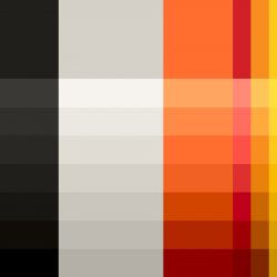
The image of two overlapping circles, one red, one yellow, and the color overlay they create is probably the most distinctive feature of MasterCard’s logo. The logo has been used since 1968, before the name was changed from master charge to MasterCard in 1979. The italic font was later used with incorporation of a series of stripes over the overlapped space in 1990, with a little bit more shadow added under the font in 1996. Twenty years later, MasterCard’s logo has been refreshed alongside the redesign of the brand’s entire corporate identity that now better resonates with the company’s wider range of services such as an online payment system, Masterpass.
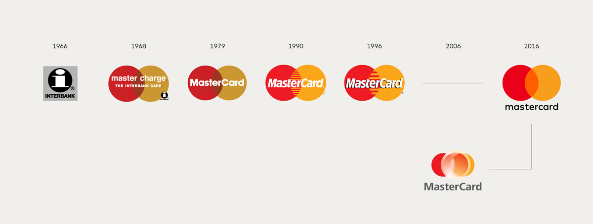
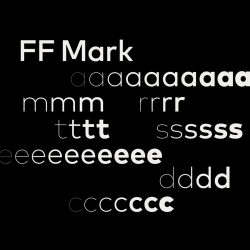
Michael Beirut and Luke Hayman of Pentagram were assigned the task and, while keeping the red and yellow circles, the two designers chose orange for the common area and changed the name into a lowercase sans serif logotype. The name of the brand is located underneath and to the side instead of on the logo. The use of FF mark, the font designed by Hannes von Döhren and Christoph Koeberlin of Font-Font Type Department, and white, grey, and black as the main background colors contribute to the formation of a system of graphic elements that are derived from circles of different sizes and circumferences. The result is a clean, simplified logo and CI system that will give the brand a fresher, newer, simplistically sophisticated and recognizable look as demanded by mastercard’s executive. The next question is, how many years will it take for the company to change all of its logos on the ATMs around the world, not to mention the credit cards that we’re using now. Will we be receiving a new card with logo designed by Pentagram any time soon?
วงกลมสองวงสีแดงและสีเหลืองตุ่นๆ ที่มาซ้อนทับกันแล้วมีส่วนที่ซ้อนกันเป็นสีแบบ overlay คือลักษณะเด่นที่สุดของโลโก้ MasterCard พวกเขาใช้โลโก้นี้มาตั้งแต่ปี 1968 เปลี่ยนชื่อจากคำว่า master charge มาเป็น MasterCard เมื่อปี 1979 มาเปลี่ยนฟอนต์ ให้เป็นตัวเอียงและเพิ่มดีเทลตรงพื้นที่ทับซ้อนของวงกลม 2 วง ให้เป็นซี่ๆ สลับสีอีกที เมื่อปี 1990 ใส่เงาเพิ่มเข้าไปใต้ชื่อแบรนด์อีกนิดเมื่อปี 1996 และล่าสุด หลังจากผ่านไป 20 ปี พวกเขาก็รีเฟรชโลโก้ตัวเองอีกครั้ง โดยคราวนี้ไม่ได้ทำแค่โลโก้ แต่เป็นการออกแบบ ระบบ Corporate Identity (CI) ทั้งหมดขึ้นมาใหม่เพื่อให้สอดคล้องกับรูปแบบธุรกิจที่ตอนนี้ไม่ได้มีแค่บัตรเครดิต แต่ยังมีบริการใหม่ เช่น ระบบการจ่ายเงินออนไลน์ที่ชื่อ Masterpass เป็นต้น
ผู้ที่รับผิดชอบการรีดีไซน์ครั้งนี้คือ Michael Beirut และ Luke Hayman แห่ง Pentagram โดยพวกเขาเลือกที่จะเก็บวงกลมสีแดงและเหลืองไว้จัดการ เปลี่ยนพื้นที่ที่ทับกันของวงกลมให้เป็นสีส้ม เปลี่ยนวิธีเขียนชื่อแบรนด์มาเป็นตัวเล็กทั้งหมด ย้ายชื่อแบรนด์ลงมาไว้ข้างล่างหรือเอามาไว้ด้านข้างแทนที่จะทับสัญลักษณ์เหมือนของเดิม เลือกใช้ฟอนต์ FF mark ของ Hannes von Döhren และ Christoph Koeberlin จาก FontFont Type Department เป็นฟอนต์ประจำ สีที่เลือกใช้เป็นสีหลักของพื้นหลังคือ สีขาว เทา ดำ เซ็ทอัพระบบการใช้องค์ประกอบกราฟิกที่มาจากวงกลม และเส้นรอบวงขนาดต่างกันให้ลงตัวกับมีเดียประเภทต่างๆ หน้าตาที่หมดจดของโลโก้ และระบบ CI ใหม่นี้น่าจะช่วยให้แบรนด์ดูสด ใหม่ แพง และเป็นที่จดจำได้อย่างที่ผู้บริหารของ mastercard ตั้งใจไว้ไม่ยาก ปัญหาที่น่าคิดตามต่อไปก็คือพวกเขาต้องใช้เวลากี่ปีถึงจะเปลี่ยนโลโก้ตามตู้ ATM ทั่วโลกให้เป็นของใหม่ได้หมด แล้วบัตรเครดิตที่เรามีตอนนี้ล่ะ จะมีคนส่งบัตรใบใหม่ที่มีโลโก้ที่ Pentagram ออกแบบอยู่บนบัตรมาเปลี่ยนให้เมื่อไรกัน
TEXT: PIYAPONG BHUMICHITRA
PHOTO COURTESY OF PENTAGRAM
pentagram.com