THE CRAFTED HOME OF EXCEPTIONAL INDIVIDUALITY BY MOOOF THAT EMBRACES THE ‘SPACE WITHIN A SPACE’ CONCEPT; THIS DESIGN ALLOWS THE HOMEOWNERS TO ADAPT TO WHATEVER ARCHITECTURAL FORM EMERGES
TEXT: XAROJ PHRAWONG
PHOTO: KETSIREE WONGWAN EXCEPT AS NOTED
(For Thai, press here)
Approaching a plot of land along Phutthamonthon Sai 2, one might initially perceive it as nothing remarkable. The surroundings are modest; the air familiar and unassuming with housing estates that have quietly stood for decades, emblematic of a bygone era of suburban development. But the owner of this particular plot of land had a different vision: to build a house here with one simple directive to the architect—no predefined style. The architect was given complete creative freedom, with the assurance that the homeowner would adapt to whatever architectural form emerged.
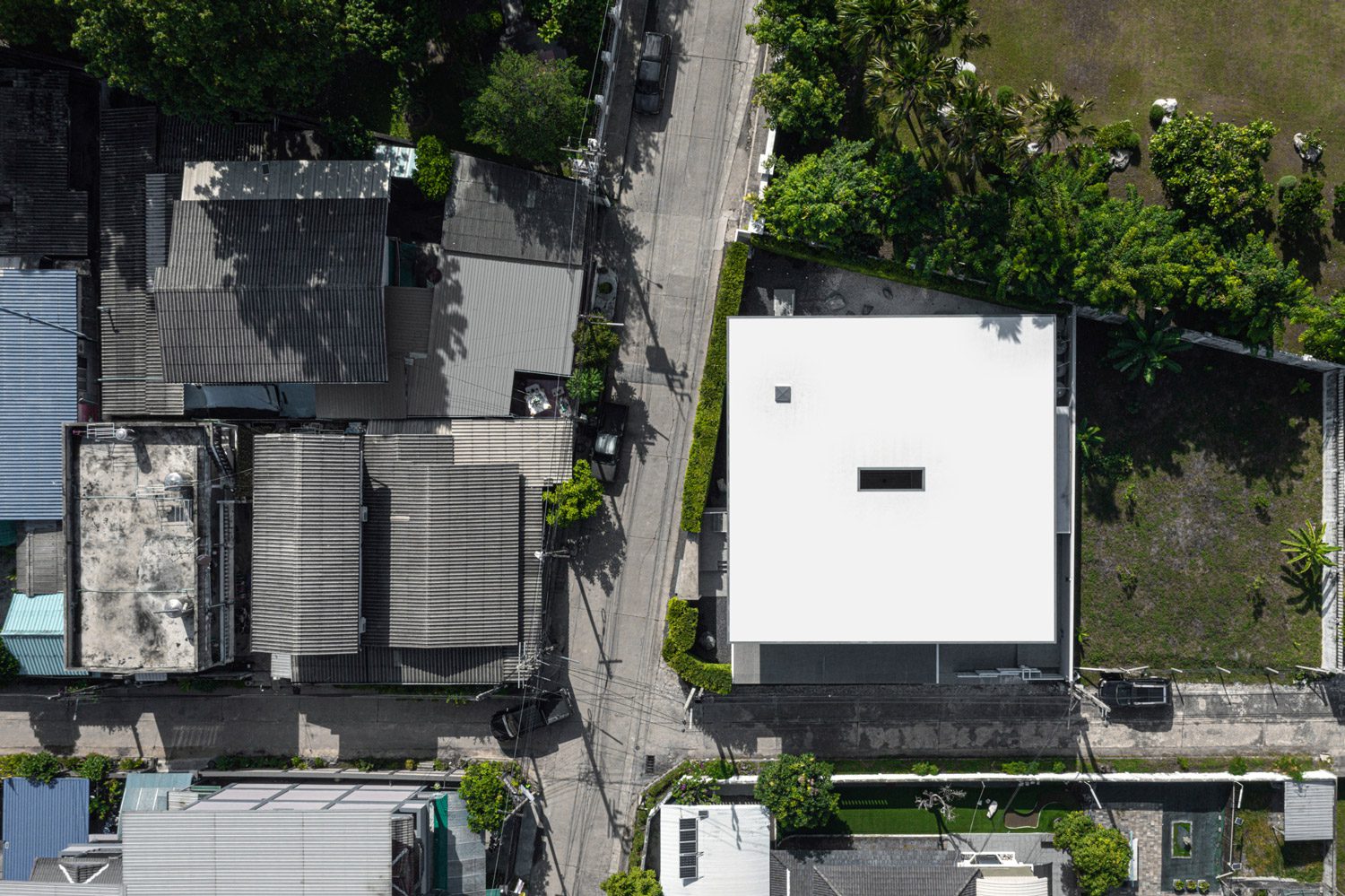
Photo: Spaceshift Studio
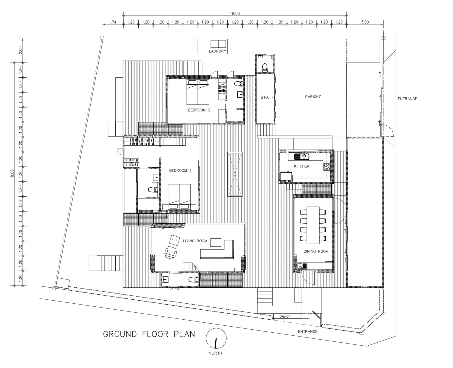
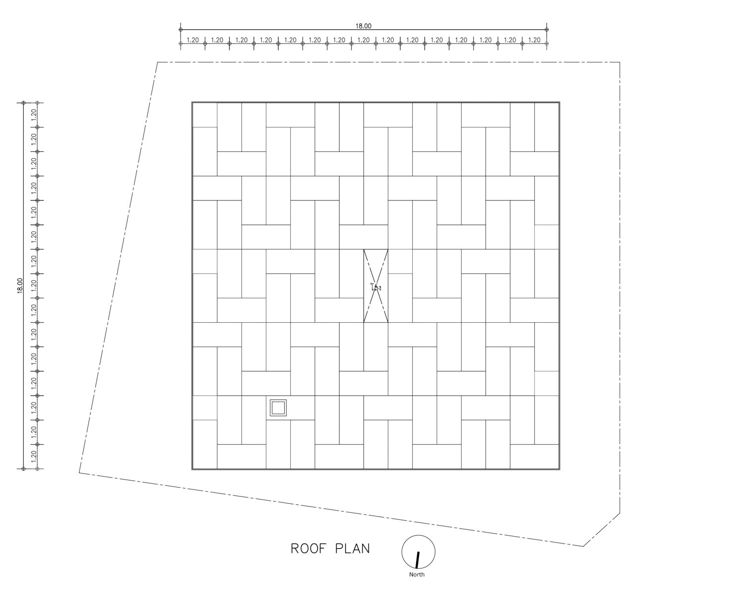
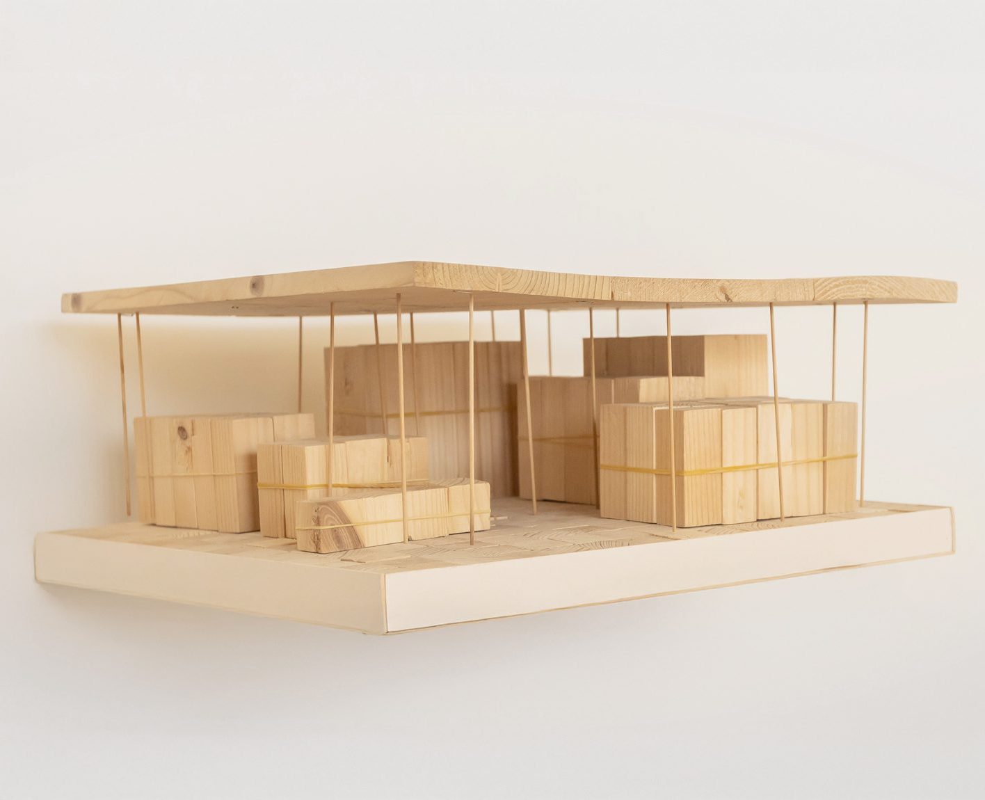
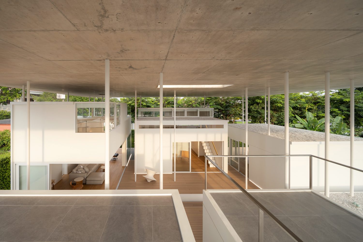
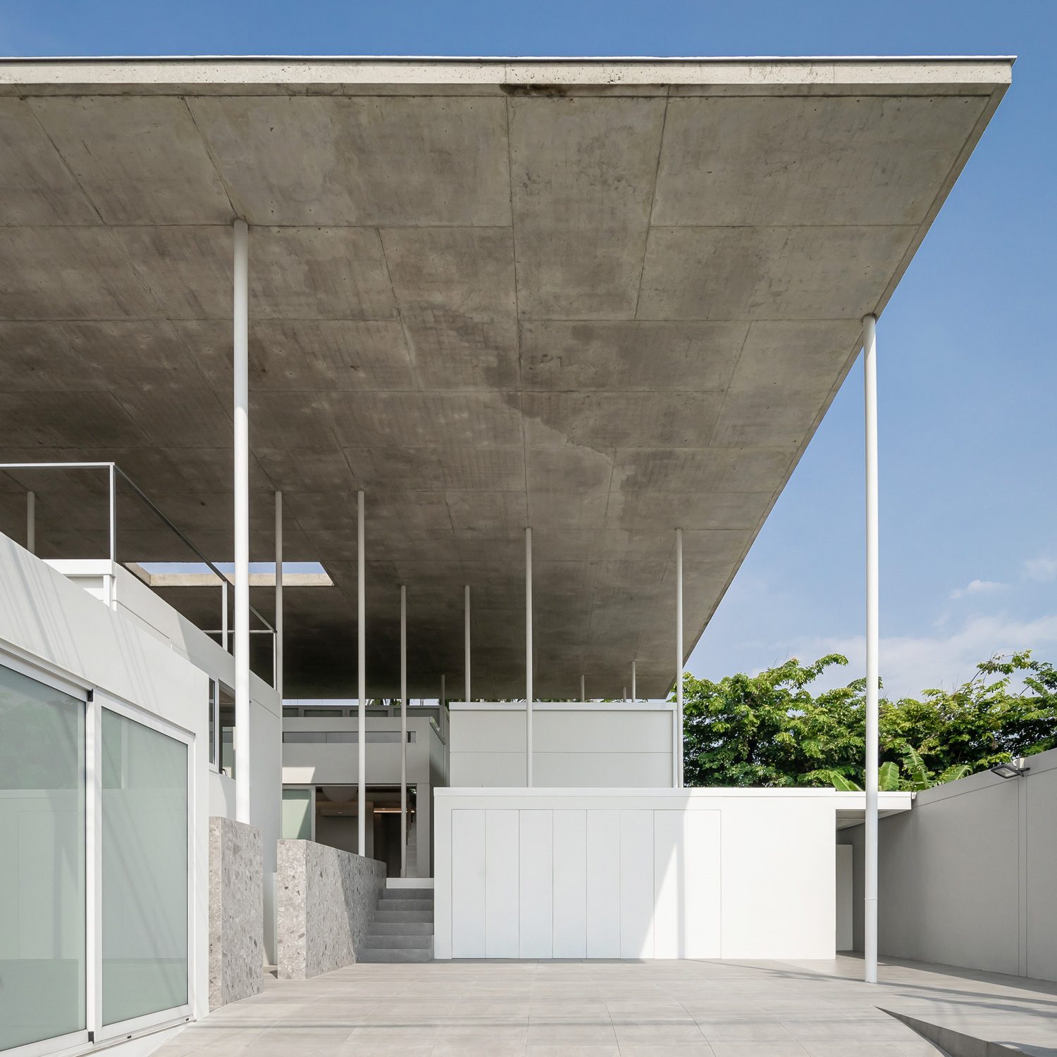
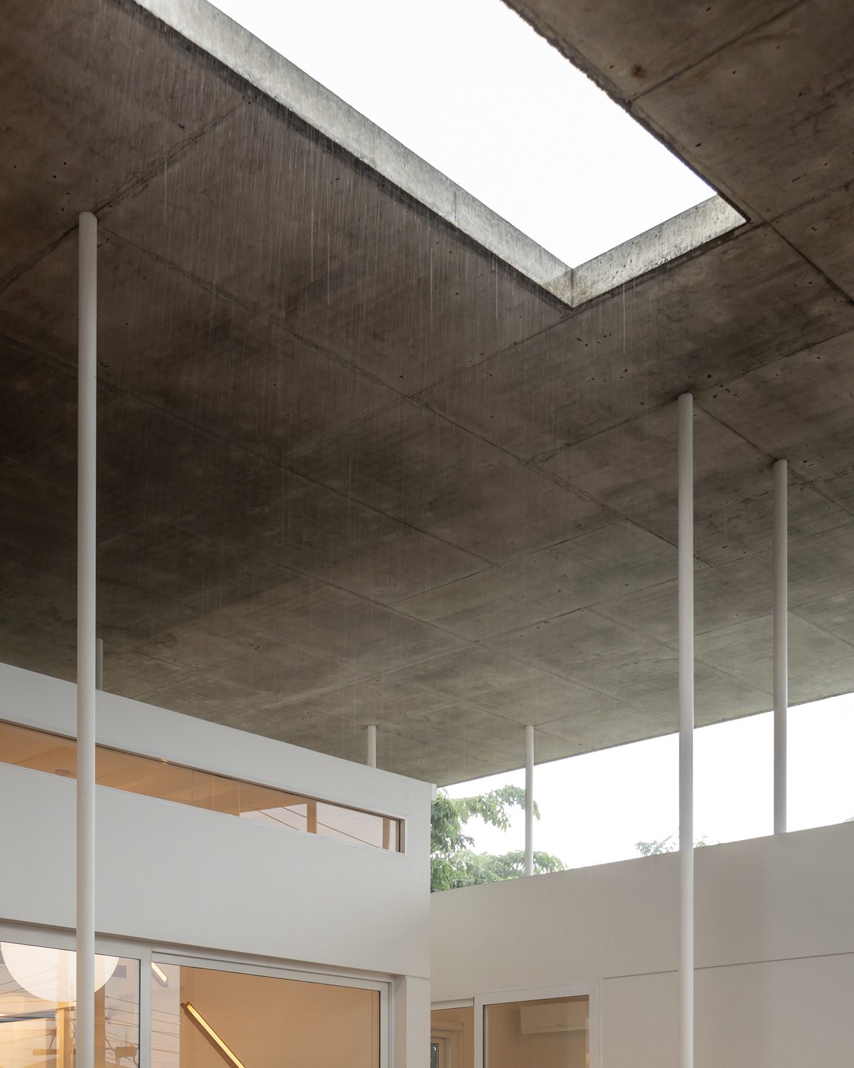
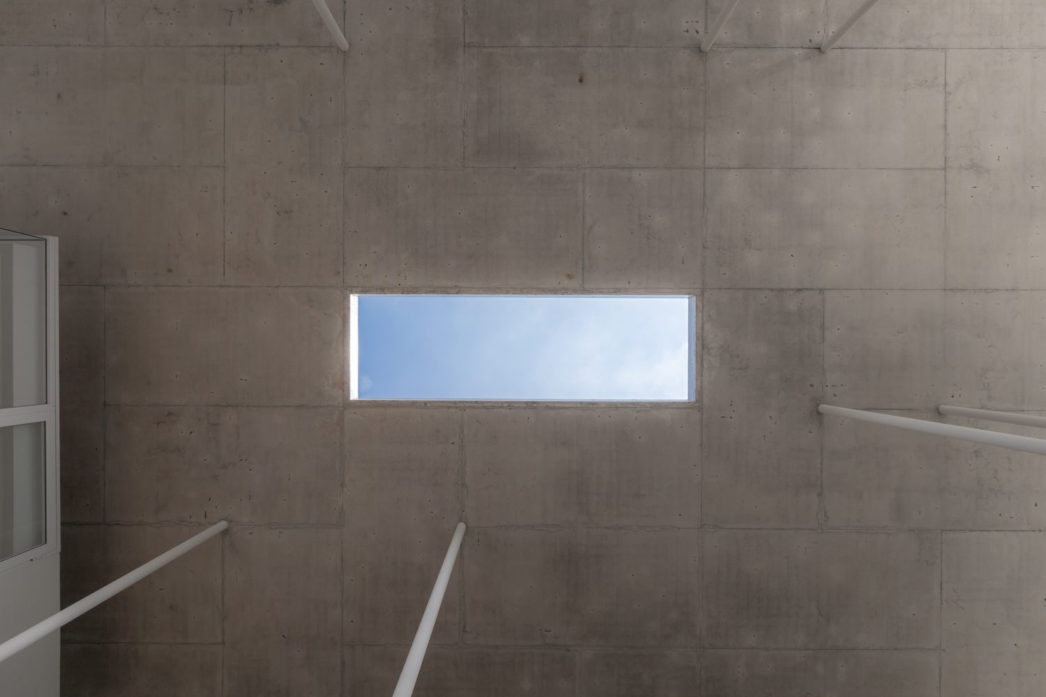
Seizing this open-ended brief, the architect crafted a home of exceptional individuality, akin to a bespoke suit tailored exclusively for its wearer. The architectural firm, mooof, began the design process with a collaborative dialogue with the homeowner before arranging functional spaces using wooden models sized to match the dimensions of the proposed rooms. These models were methodically organized to develop the floor plan. Every area was meticulously designed on a grid measuring 1.20 by 1.20 meters, inspired by the standard dimensions of plywood panels used for concrete formwork—specifically 1.20 by 2.40 meters. The precision of this approach becomes evident upon visiting the house. Looking upward at the sky, the exposed concrete ceilings reveal the imprints of the wooden formwork—the grain and joints of the plywood left intentionally visible.
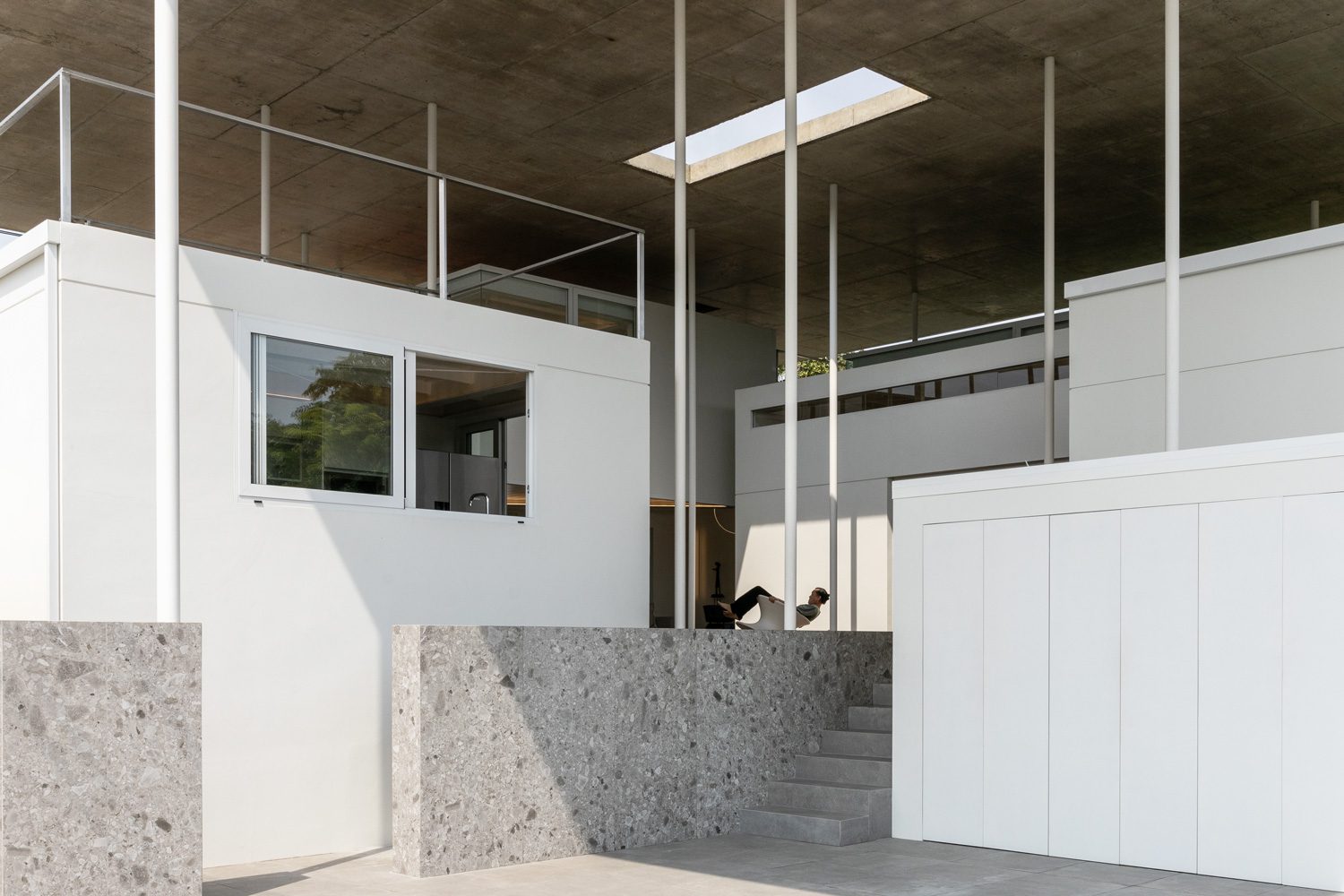
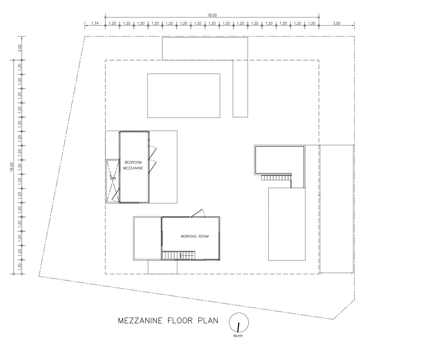
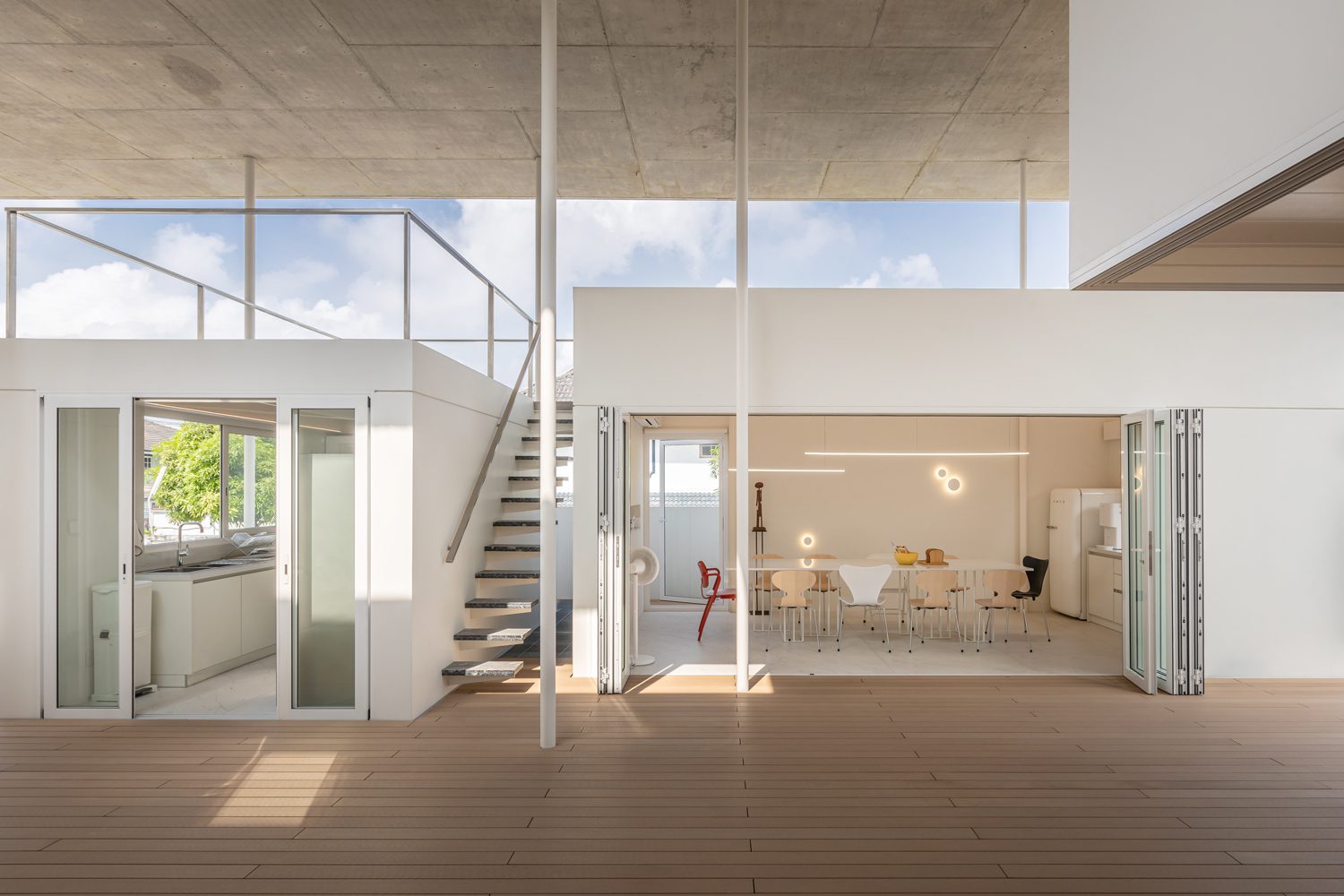
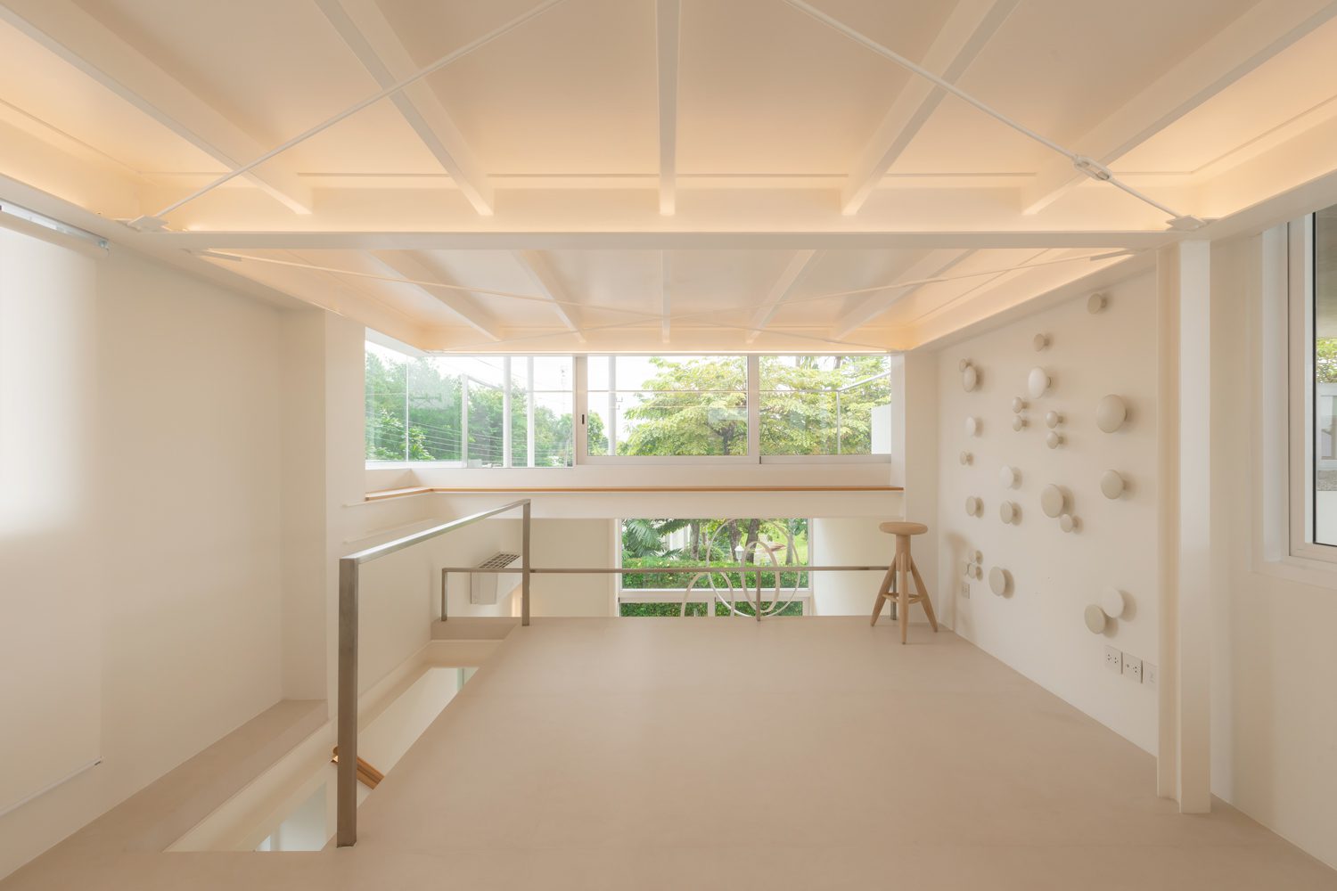
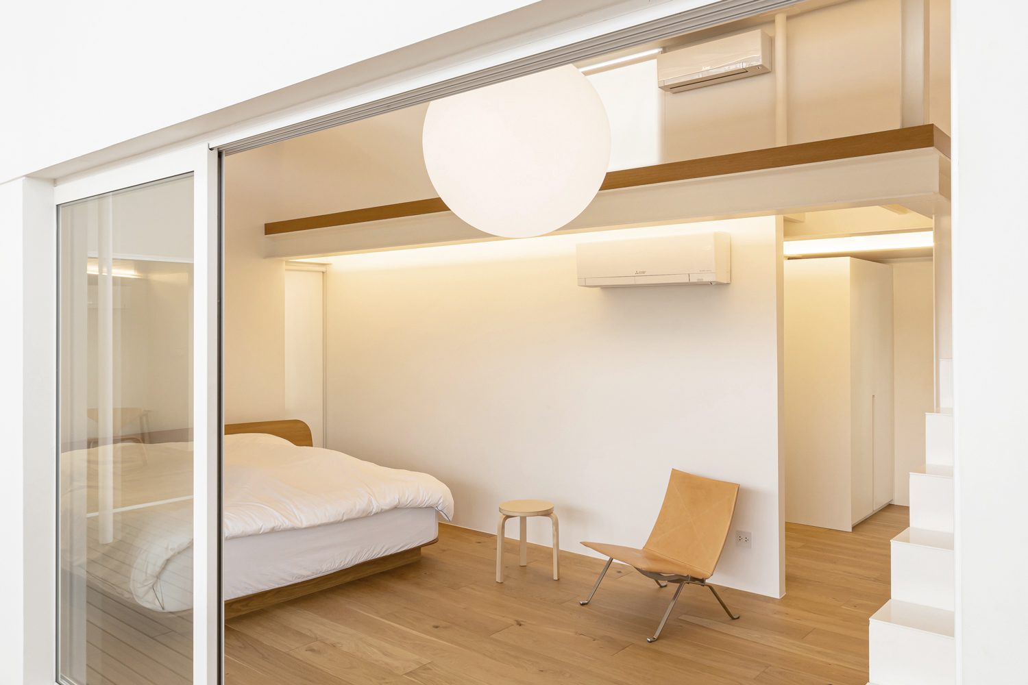
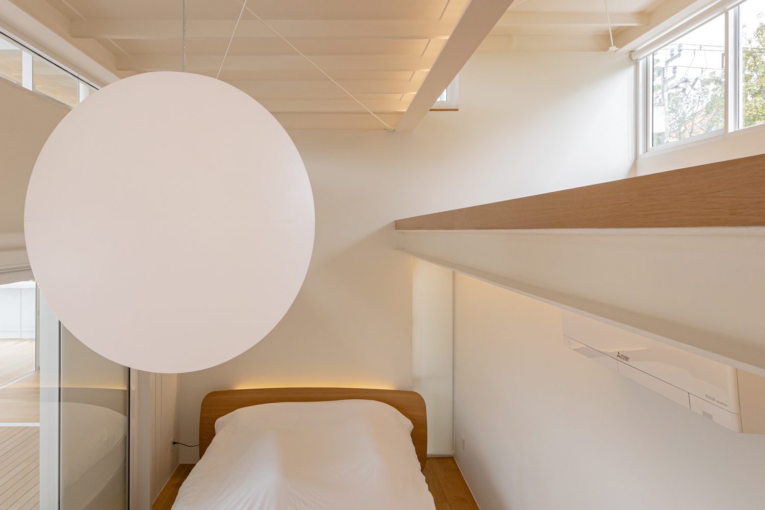
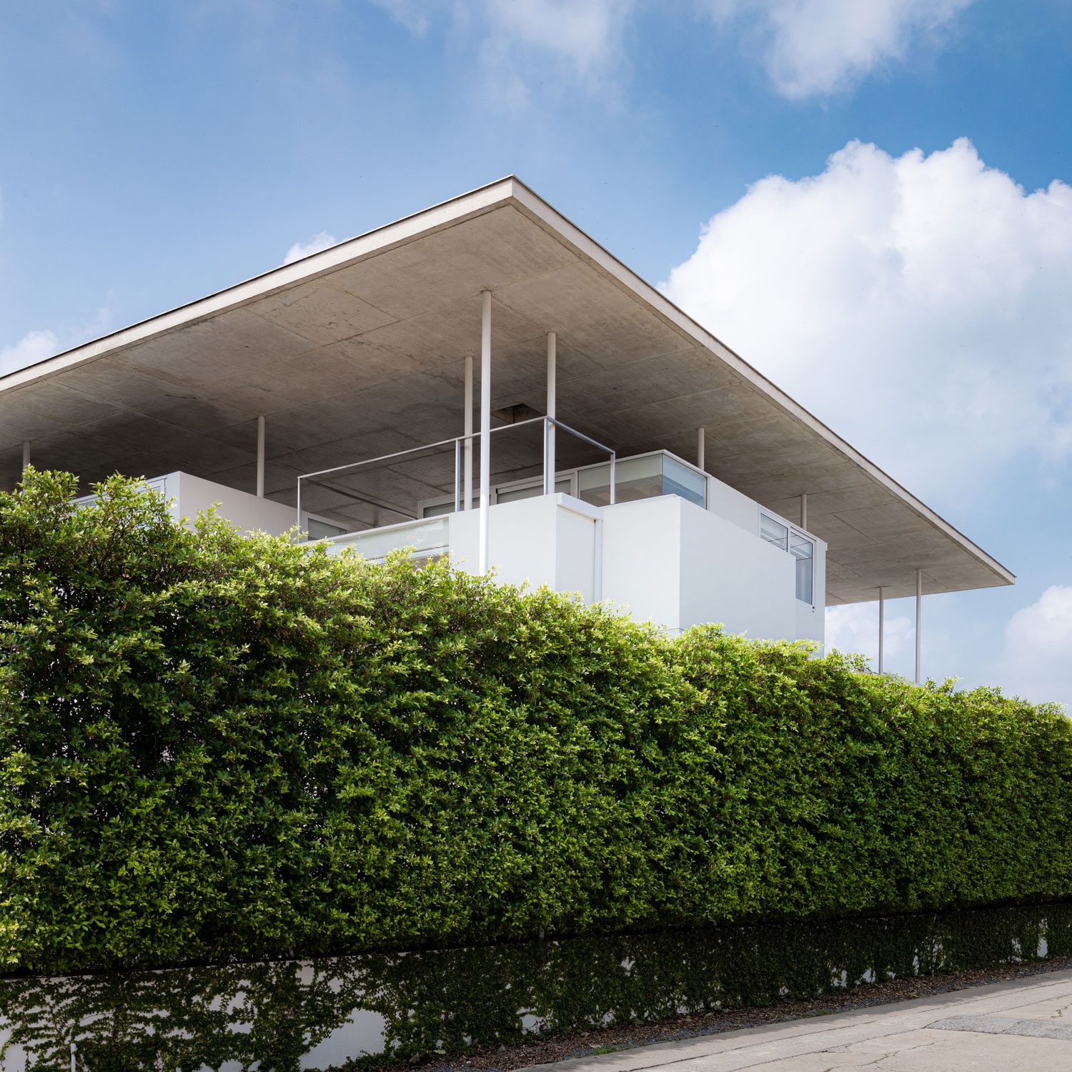
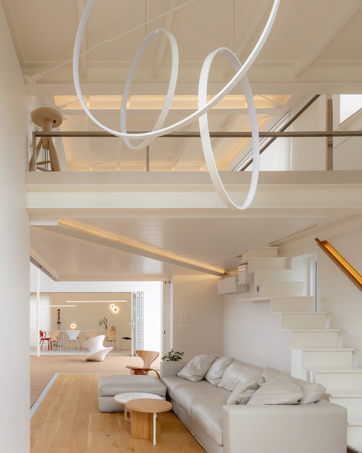
The spatial arrangement of this house is deliberately ambiguous, challenging traditional perceptions of space. Instead of the typical exterior envelope that encloses most homes, boundaries here are defined by the first-floor plane and a roof plane sharing the same frame, leaving the spaces without conventional outer walls. Functional areas—the living room, dining room, kitchen, and bedrooms—are dispersed in clusters that might seem randomly placed at first glance. Yet, there’s a calculated order behind this seemingly random arrangement for the architect has systematically placed every element on a precise grid measuring 1.20 by 1.20 meters. Each functional space is conceived as a white box with varying heights according to its use. For example, the kitchen and dining areas are contained within single-story volumes, while the living room and bedrooms extend into taller spaces due to the mezzanines, designed to accommodate future activities.
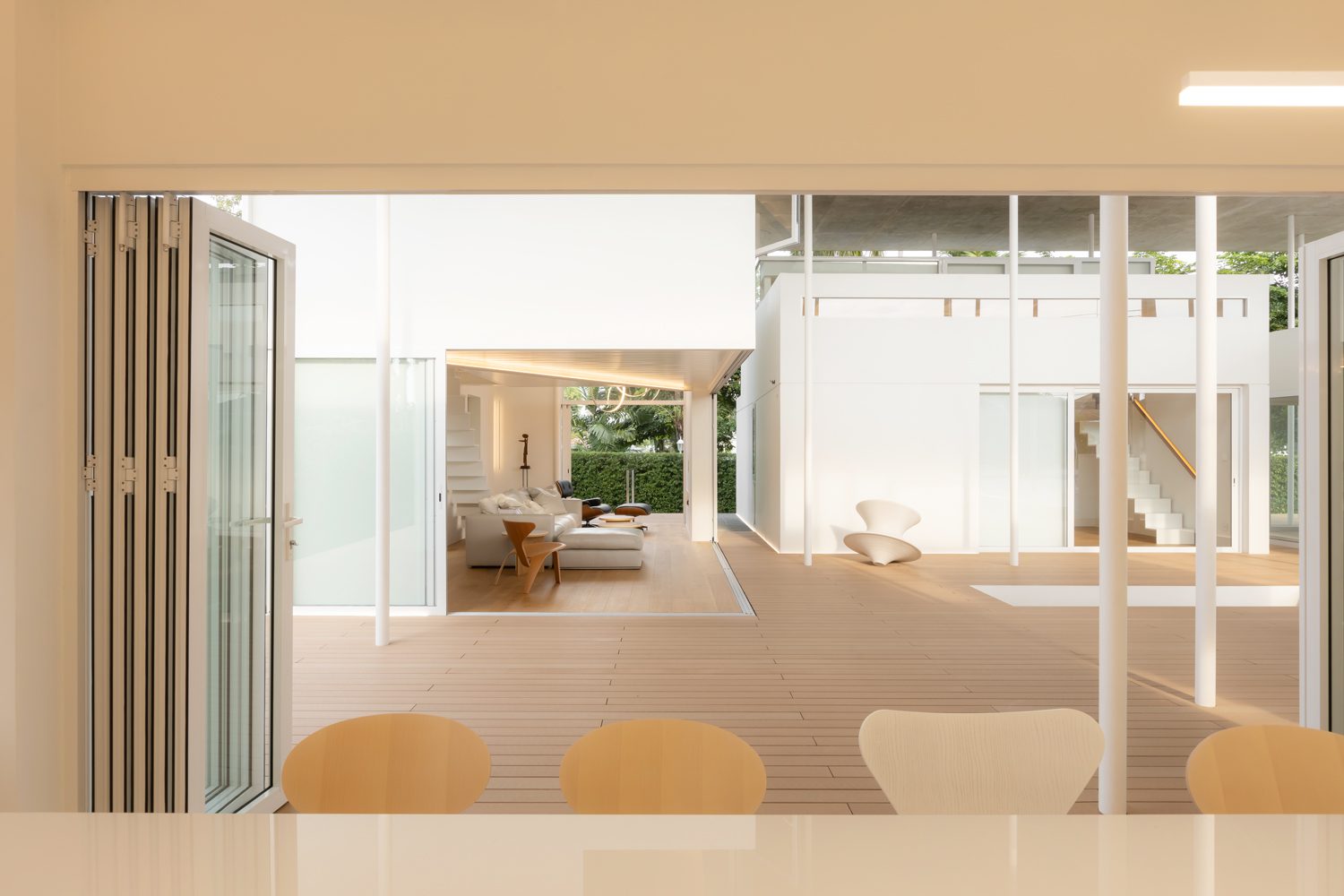
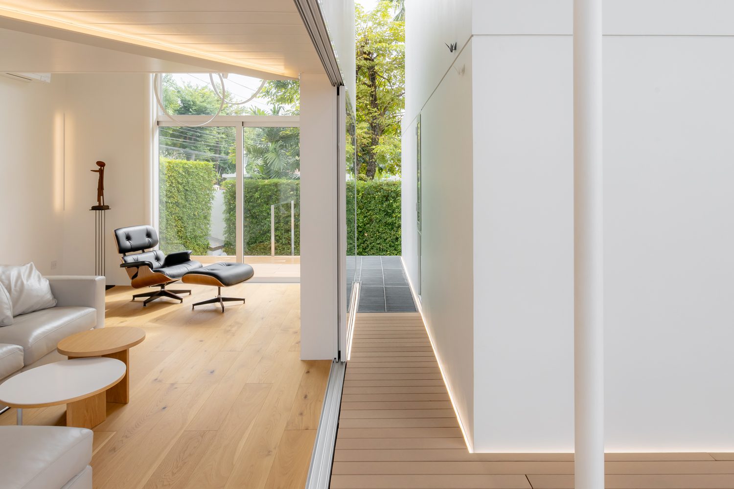
Embracing the ‘space within a space’ concept, the spatial configuration births a large area covered by a concrete roof under which smaller nested spaces—the individual functional units—reside. Each unit features doors that can open wide, whether sliding or folding, blurring the line between interior and exterior throughout the house. This design fully welcomes natural elements such as sunlight, wind, and rain. When the doors of each unit are closed, the perception of interior space becomes more defined but only within that specific module.
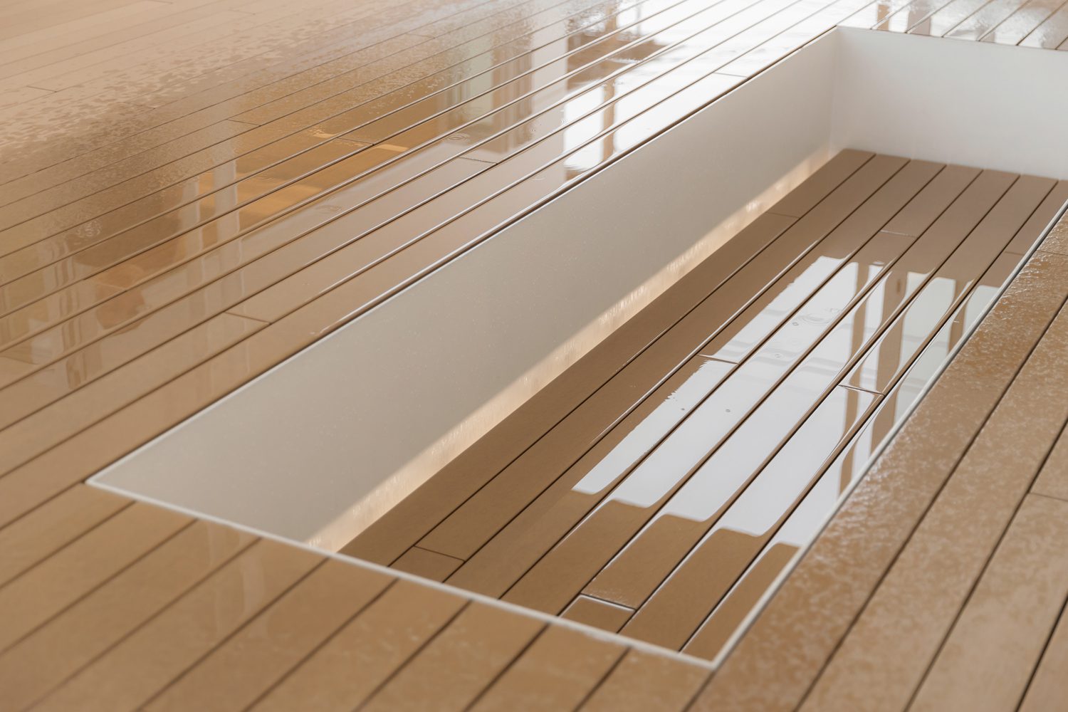
The dispersed arrangement facilitates excellent airflow where wind can enter the central areas from all directions. The floor plan gradually encloses a central courtyard, with wall planes of varying heights creating a sense of privacy. Every functional area intersects with this courtyard, which features a sunken space measuring 1.20 by 3.60 meters. This sunken area naturally becomes a seating spot for guests, inviting them to settle comfortably and engage with the space in an unforced, spontaneous manner.
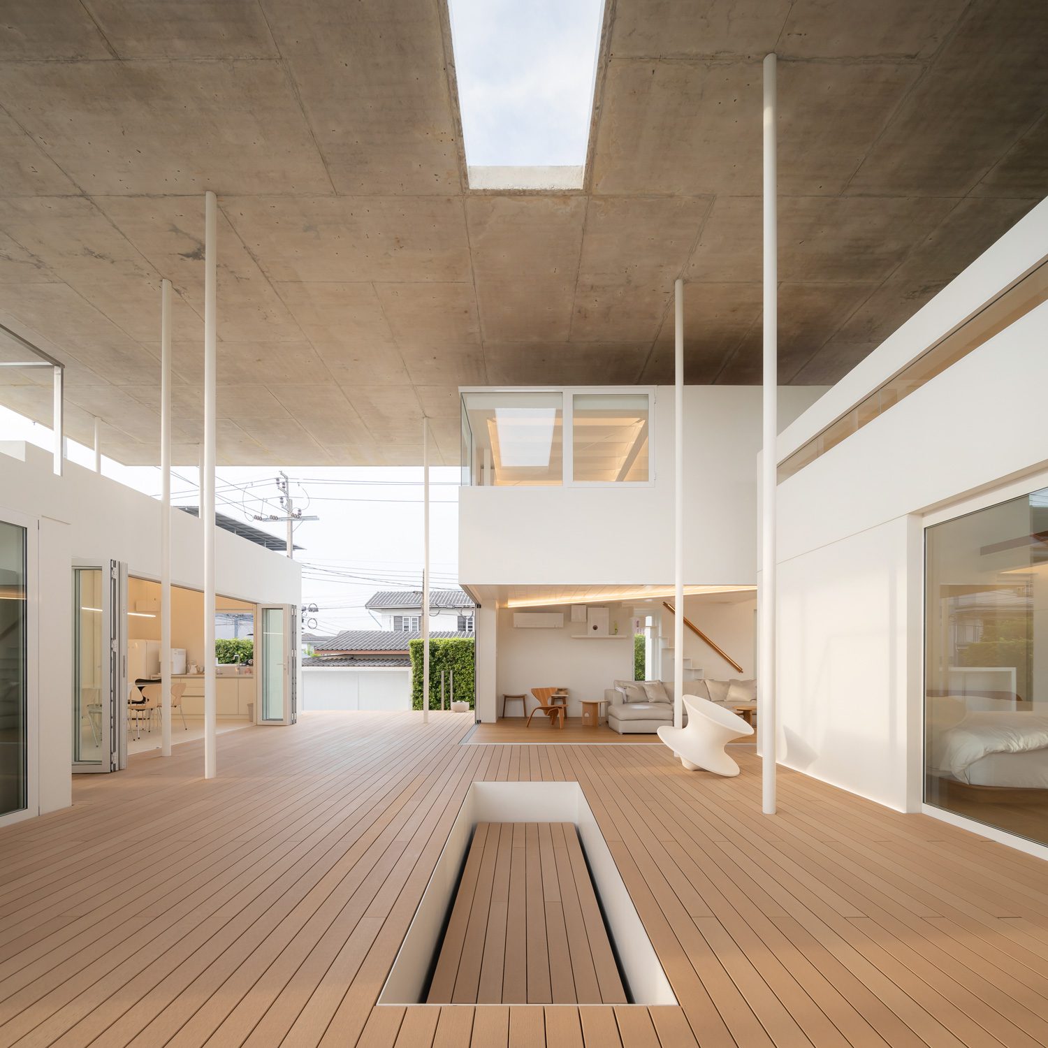
The architect drew inspiration from the homeowner’s background as an architectural photographer to materialize the design of the house. Photography, which is essentially painting with light, is interpreted within the architectural space, transforming each plane of the house into a canvas designed to capture light. Opting for an all-white palette, the architect skillfully manipulates the building’s varying depths to create dynamic backdrops that exhibit the shifting play of natural light throughout the day.
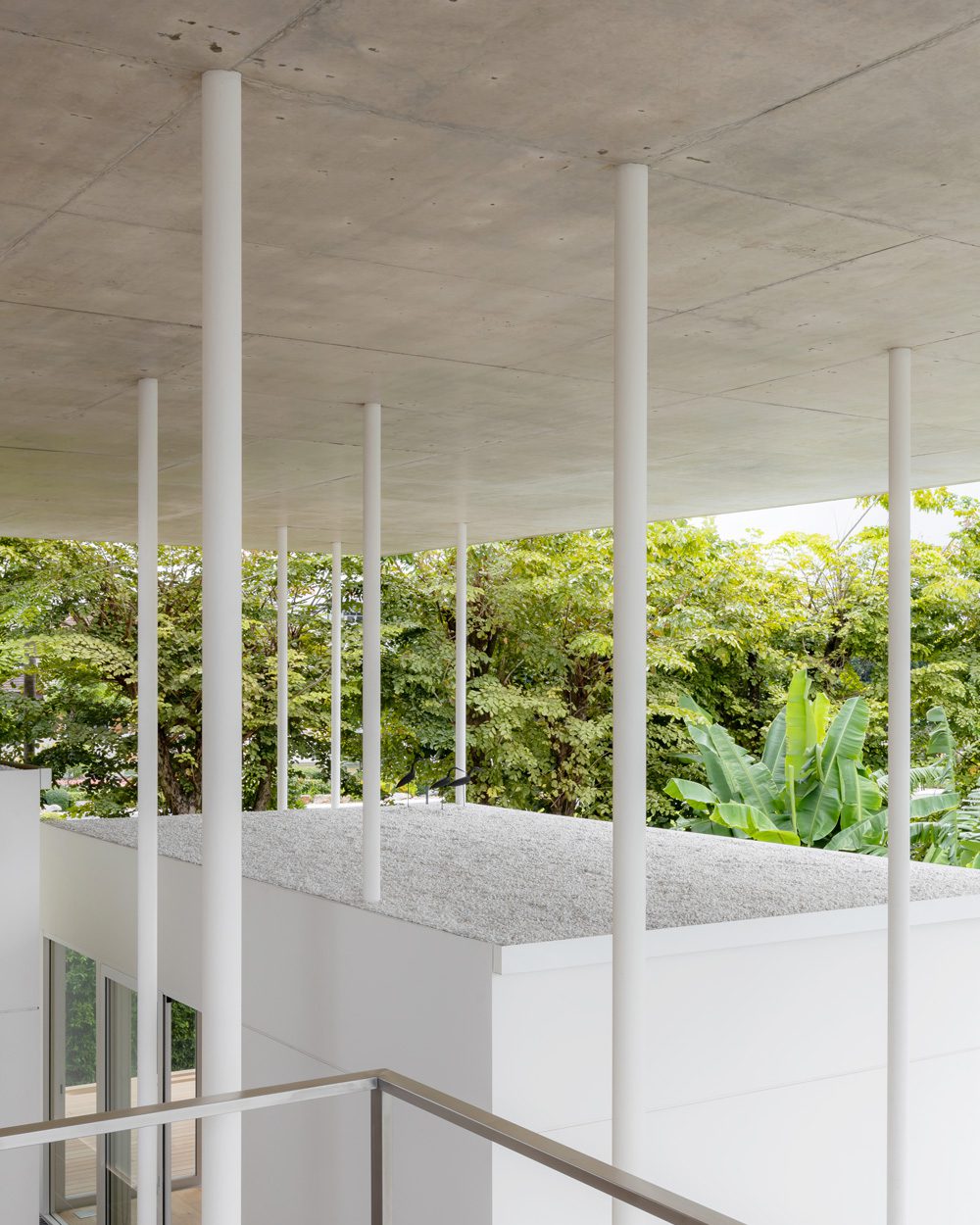
Upon entering the house, visitors are immediately struck by the visually arresting 25-centimeter-thick concrete roof. Set within the overall visual context of the house, this structure achieves an almost ethereal floating appearance. This effect is ingeniously accomplished with slender, 3-inch diameter steel columns. These columns, round in shape, appear a visual light and more refined than their square counterparts of the same cross-sectional area, allowing them to seamlessly recede into the backdrop under the changing light of day. The roof is supported by steel columns that extend up to six meters. Crafted as Concrete-Filled Tube (CFT) columns, they are filled with a high-strength, non-shrink epoxy that can bear loads exceeding 600 kilograms per square centimeter, ensuring exceptional structural integrity from base to tip.
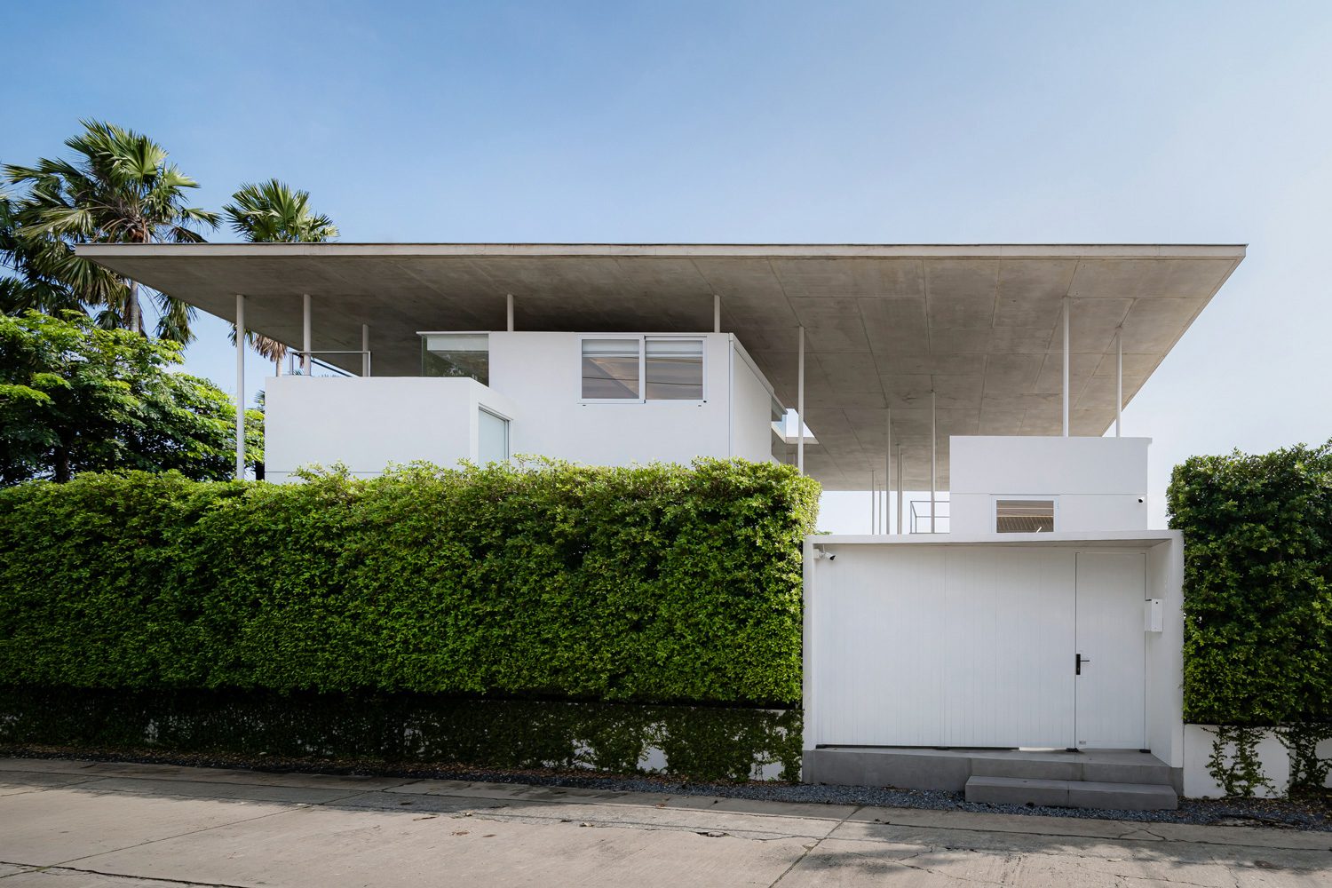
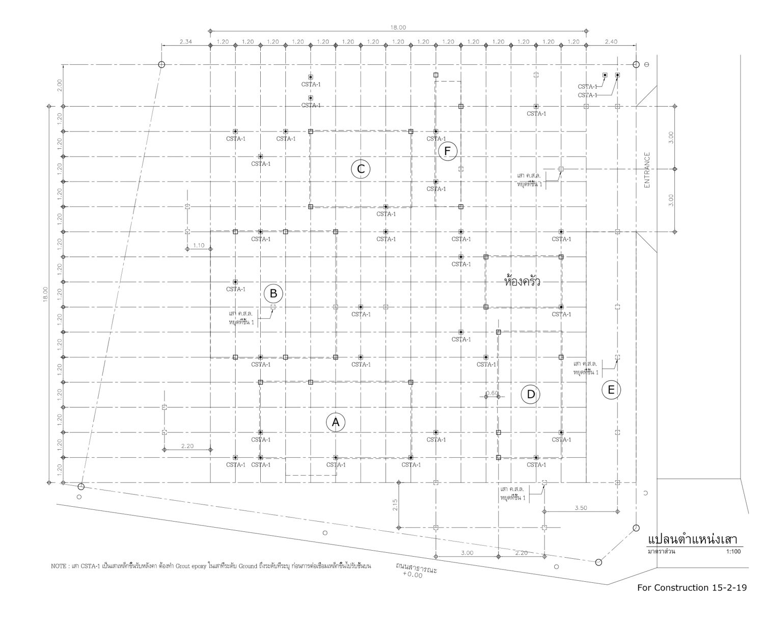
In a departure from conventional alignments, the architectural and engineering teams have strategically arranged these columns in a staggered pattern. This layout not only enhances the visual intrigue of the space but also provides increased resistance to lateral forces, thereby supporting the concrete roof with greater efficiency. The roof structure comprises a flat slab equipped with shear heads, securely anchored to Concrete-Filled Tube (CFT) columns via a steel base plate at each support point. I-beams are employed dualistically as shear heads and as reinforcement for the flat slab. These beams are strategically interspersed among the reinforcing bars at each column head, effectively managing the shear forces and bending moments across the entire roof slab. From a structural standpoint, the columns are mounted on a frame-based ground structure at the first-floor level, where these frames act as crucial bracing elements, robustly supporting the roof’s weight.
Fullstop House stands as a testament to the notion that engineering can stand independently of architecture, yet architecture inherently relies on engineering.
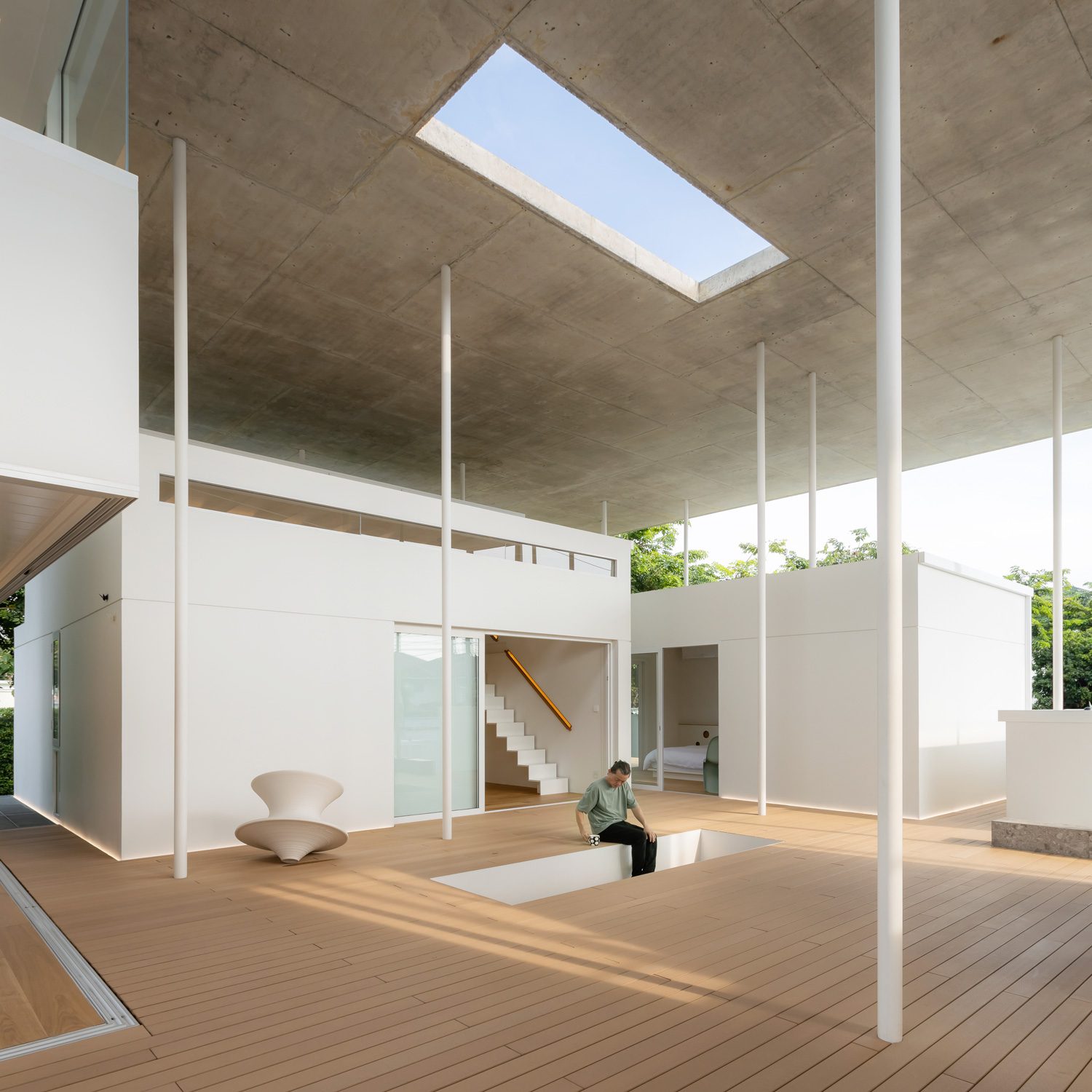
Visiting the residence is like entering a space that awaits completion. Each functional area is poised for the homeowner’s personal touch to truly come alive. The mezzanine floor is still waiting in anticipation of stairs that will connect it to the balcony above. Throughout the dwelling, spaces are set to welcome the addition of designer chairs, personally collected from around the globe by the owner. According to mooof, the architects responsible for the design, the house’s unique character is well-suited for its inhabitant: “This house may not be for everyone, but it is ideal for its owner. He finds joy in using a squeegee to remove water from the floor, revels in the play of light and shadows, appreciates the ability to move freely, and enjoys the simple act of walking from room to room.”
