PBM COMPLETES WHERE’S HOUSE WAREHOUSE UNDER THE CHALLENGES OF INTEGRATING ALL FUNCTIONS AND CONVEYING THE ORGANIZATION’S IMAGE OF TRANSPARENCY WITH THE GLASS BLOCKS
TEXT: KARN PONKIRD
PHOTO: SPACESHIFT STUDIO
(For Thai, press here)
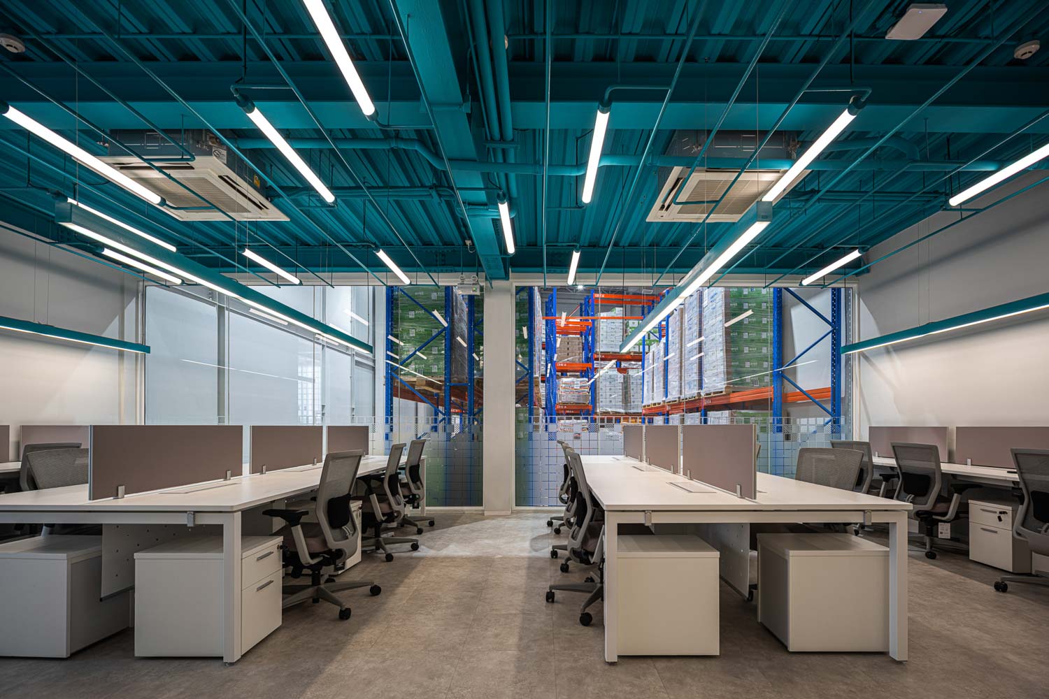
The construction of this building originated from a multitude of different needs and requirements. The project’s multiple purposes include a warehouse for storing medicines and vaccines for the economic animals, the company’s office space, and a recreational and living space for the owners when they visit the facility. Seamless integration of all these functions was required in order to connect the warehouse, office space, and living areas, creating a cohesive space where professional and private zones intertwine. All of the aforementioned is the brief that the design team at pbm needed to figure out as they worked to arrange the functional spaces that form the architecture of ‘Where’s House Warehouse.’ The design team at pbm has designed the functional program to fit the 1-rai parcel of land, encompassing approximately 2,000 square meters of functional spaces. The architecture was designed to be more than just a warehouse building but also a representation of the organization’s image and identity. At the same time, it has to incorporate the required features in order to support the diverse activities and demands of the users.
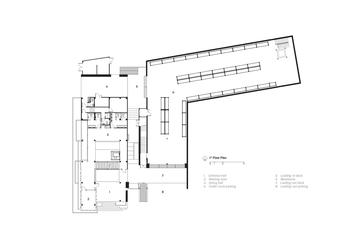
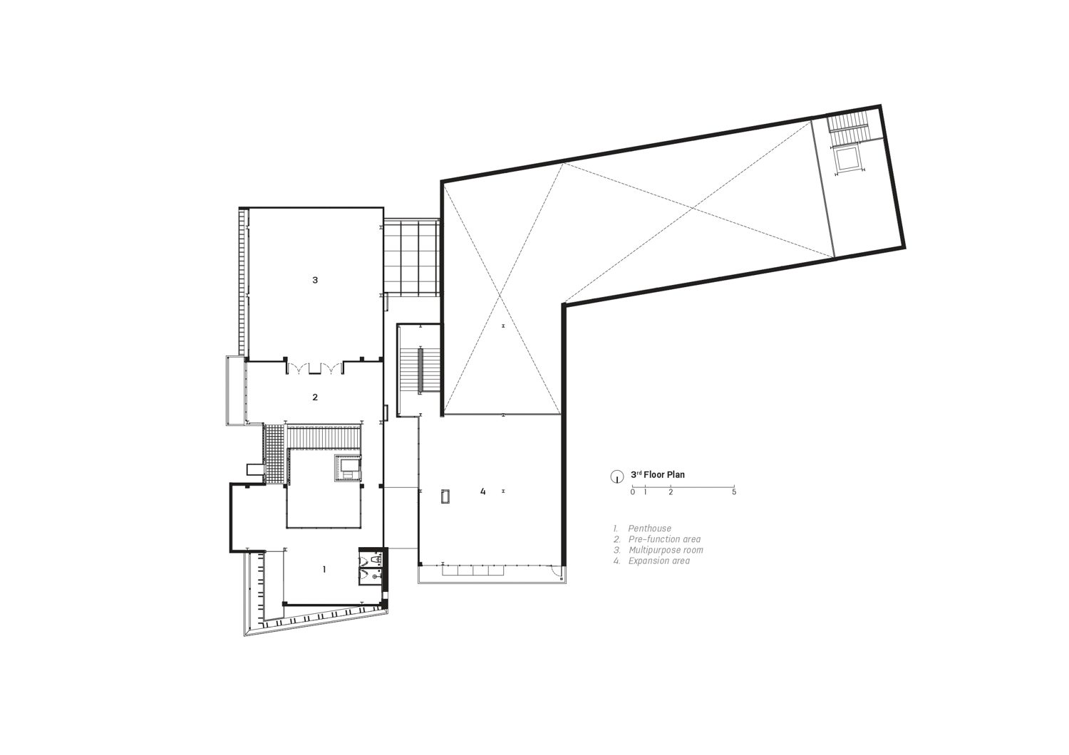
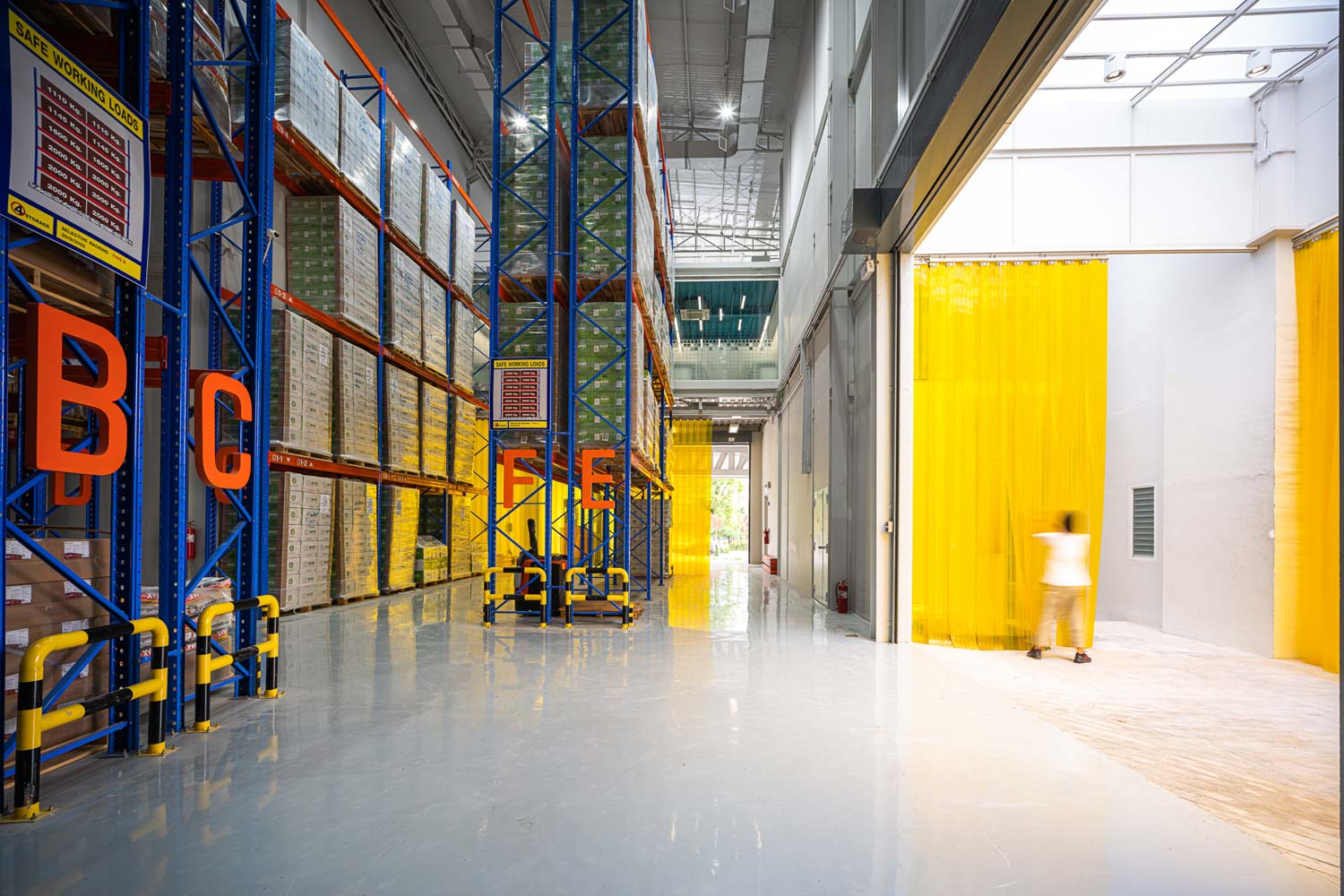
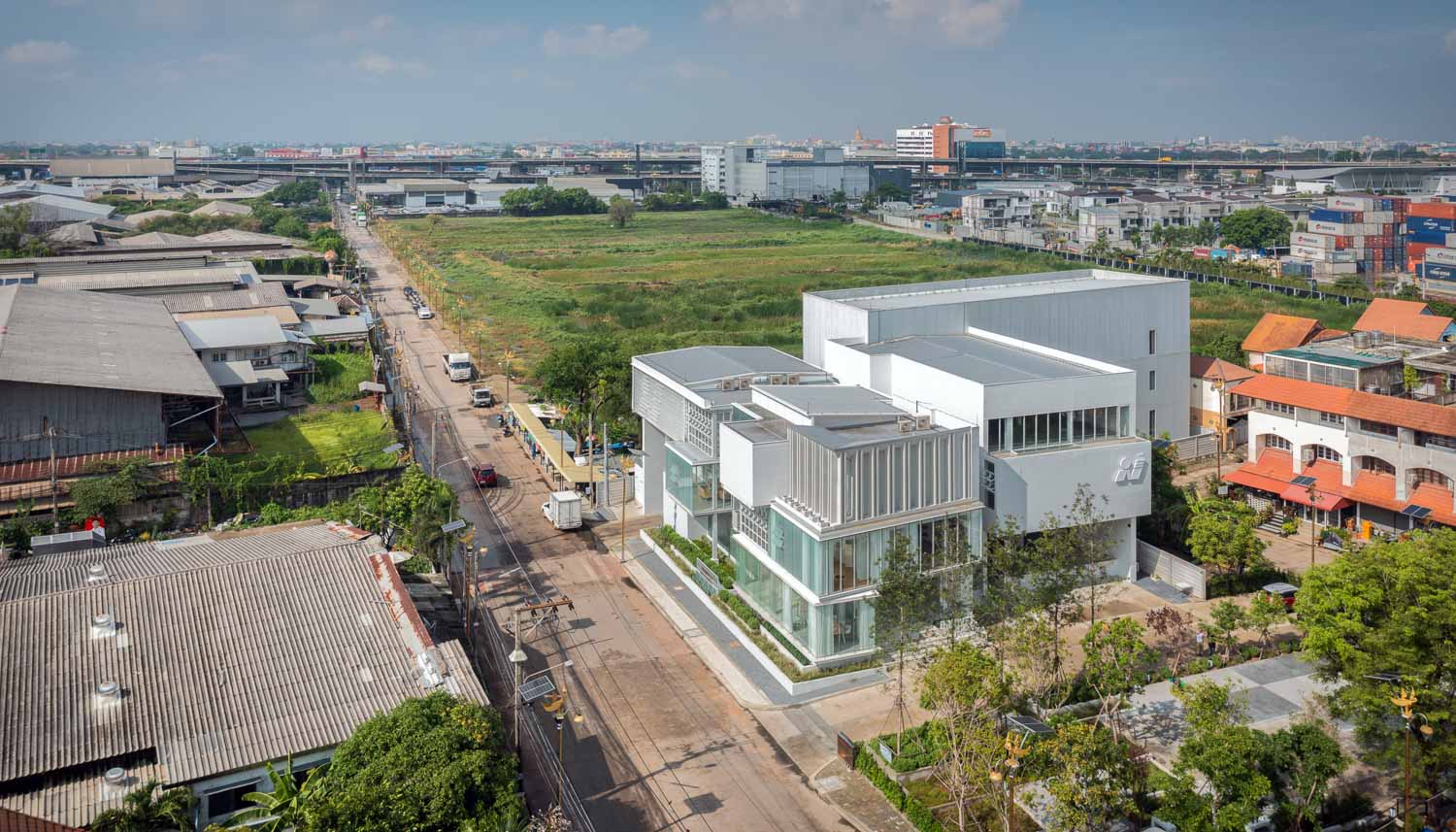
The architecture team initiated the development of the warehouse design, recognizing its significance as the primary focus of the project. The design takes into consideration both the inventory management system and the logistics, as well as the sufficiency and sequence of each space to effectively facilitate the flow of transport vehicles coming in and going out of the facility. The entry and exit points of the loading area are clearly marked and separated. The increased efficacy will enable faster and more systematic product identification, inspection, and inventory management. The warehouse building’s L-shaped layout corresponds to the shape of the site, with the traffic routes for incoming and outgoing vehicles located on opposite sides of the land. The left side serves as the entry point, while the right side serves as the exit, enabling smooth circulation as the routes do not intersect or obstruct each other.
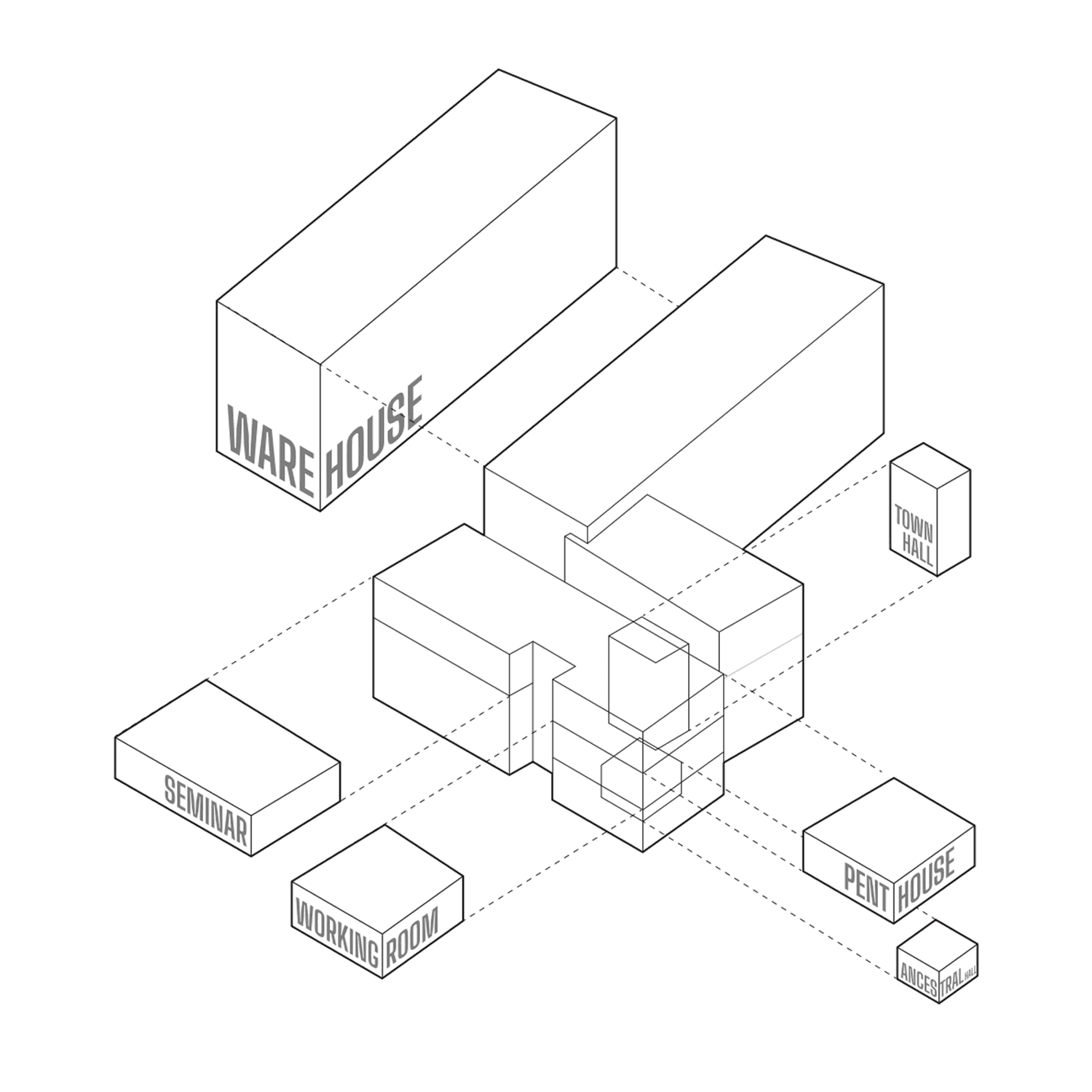
Functional diagram
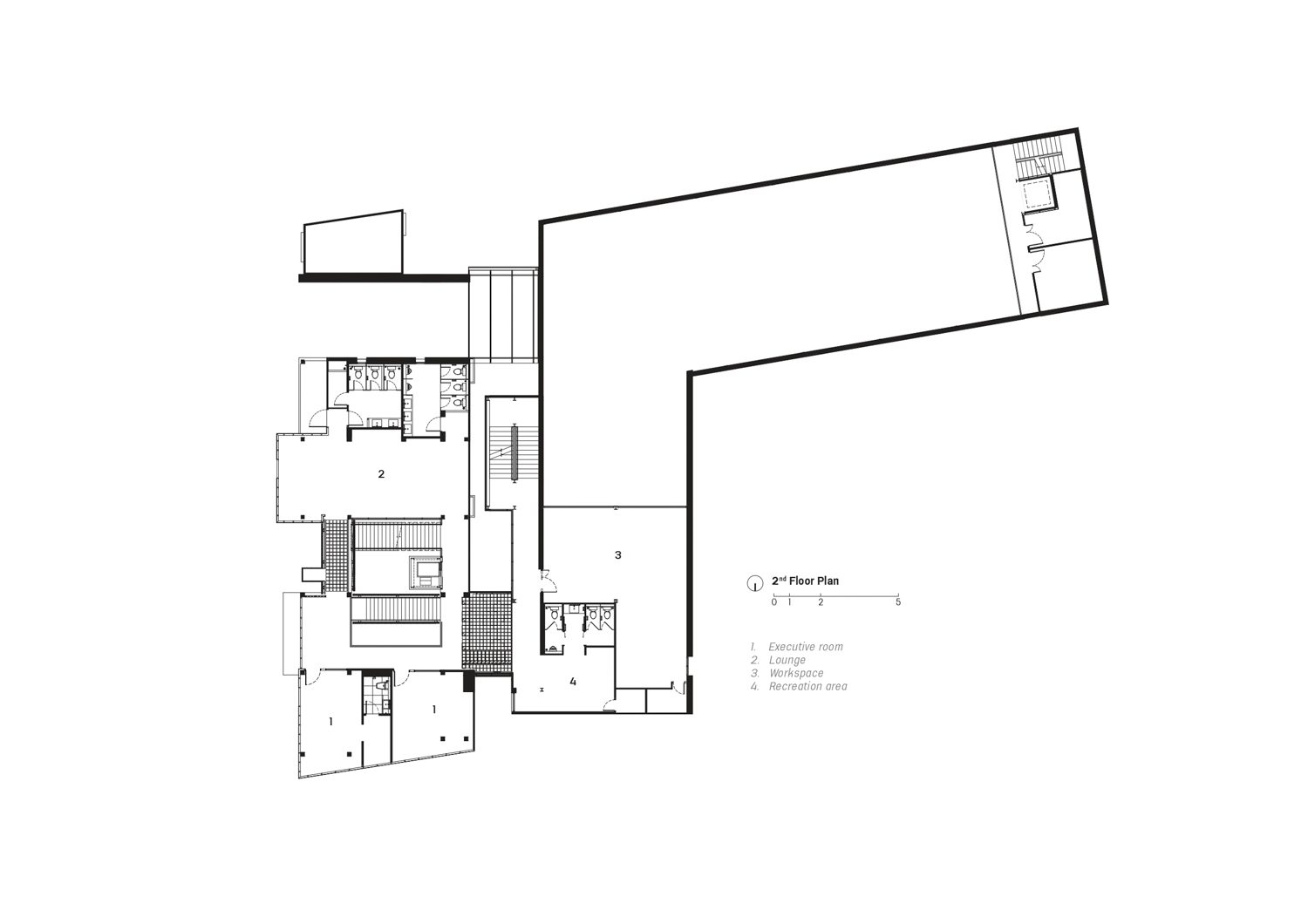
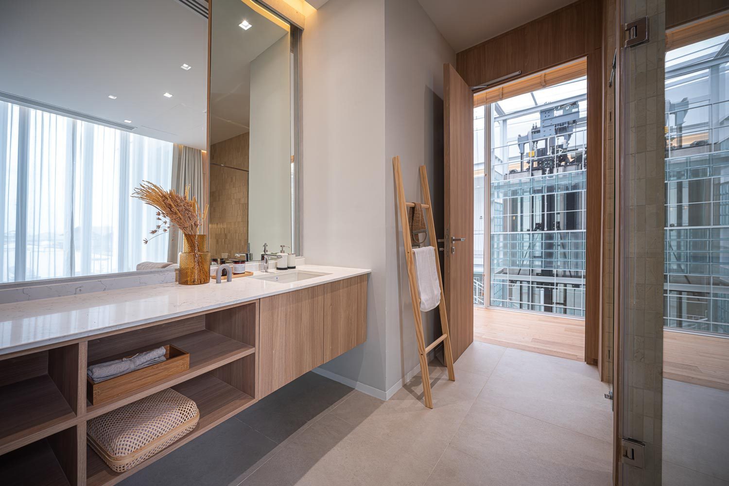
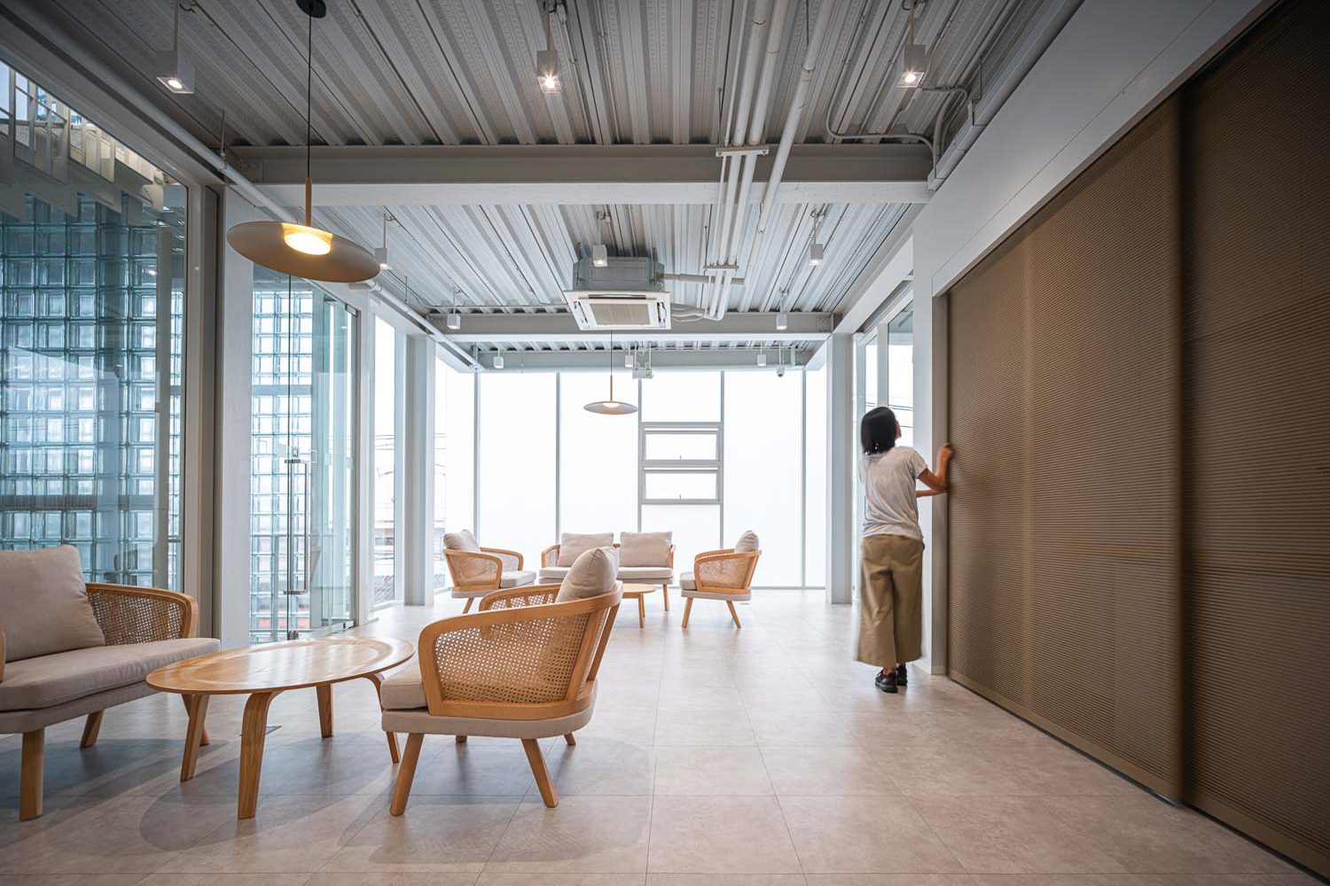
What sets this project apart is the dynamic activity that takes place within the building, encompassing a wide range of functions, including executives’ offices and living areas, dining space for employees, and a multifunctional space. The architecture team has defined the spatial allocation as ‘user-exclusive and oriented’ because of the interconnectedness of different spaces and to meet the specific demands and requirements of users.
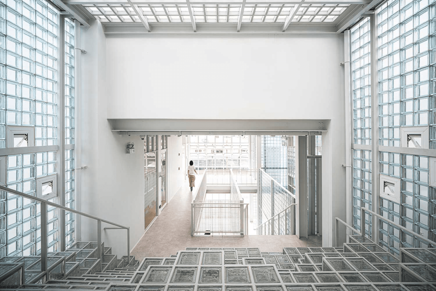
For example, the design connects the executive offices with the office in the warehouse. Not only are the two spaces located near each other, but they also share the same circulation routes. The architecture team incorporates a number of gimmicks into the design of the space. One such element is the use of level changes, which create an interesting visual dynamic. Additionally, they have included interfaces with steps that not only serve a functional purpose but also create a unique amphitheater-like space with details of randomized glass blocks. The design of the space encourages users to walk at a slower pace, which in turn provides more privacy for the executive office while still maintaining a connection between the two spaces at all times.
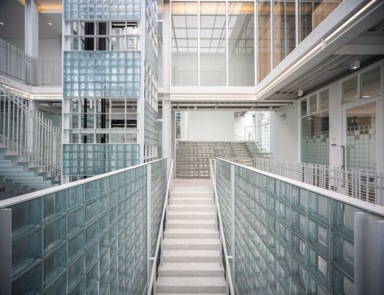
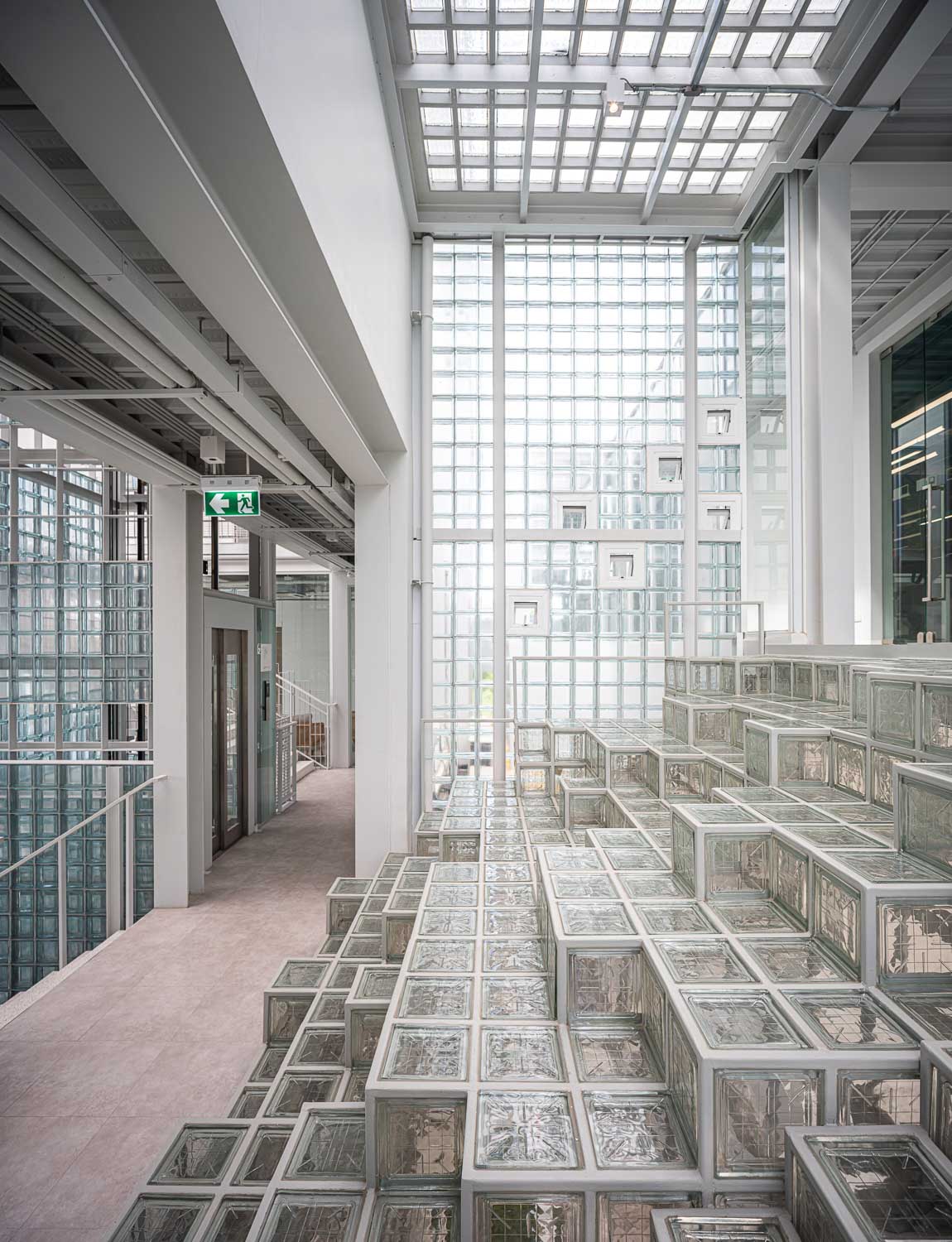
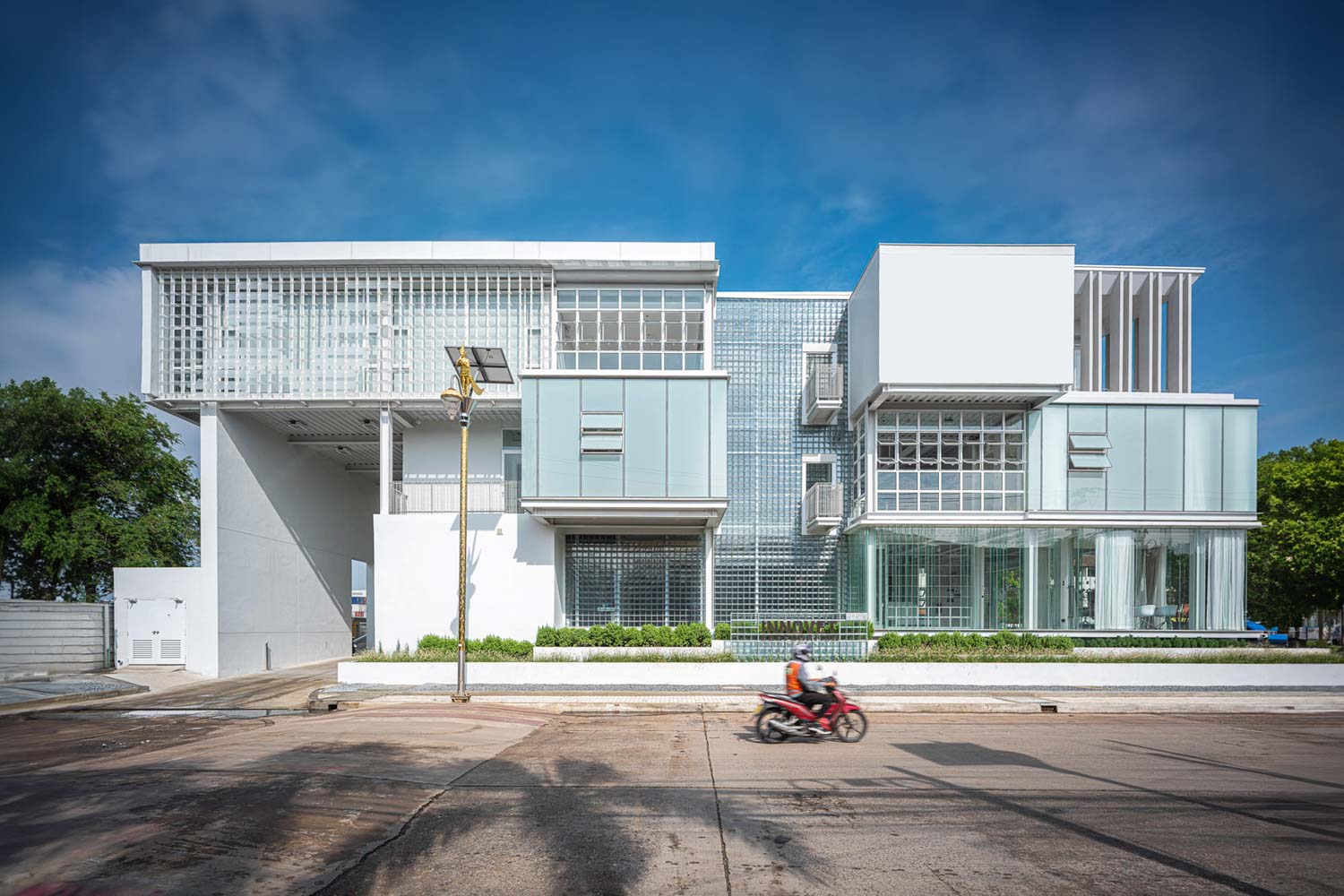
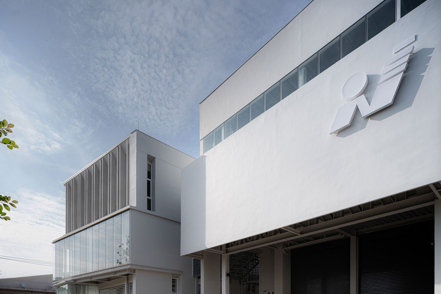
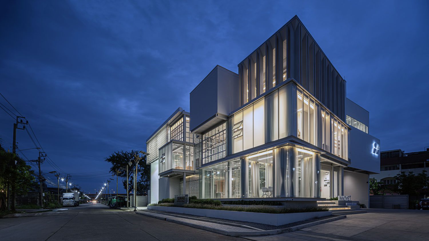
One noticeable feature that stands out is the unique-looking façade. Different materials, such as glass blocks, mirrors, and translucent acrylic panels, provide different levels of opacity and translucency. Transparency and cleanliness are the concepts realized to represent the organization’s business and image as a provider of medicines and vaccines for economic animals. The interpretation of the building’s functional space blurs the distinction between the interior and exterior spaces, creating a residential building or office space that exudes a calming and relaxing vibe.

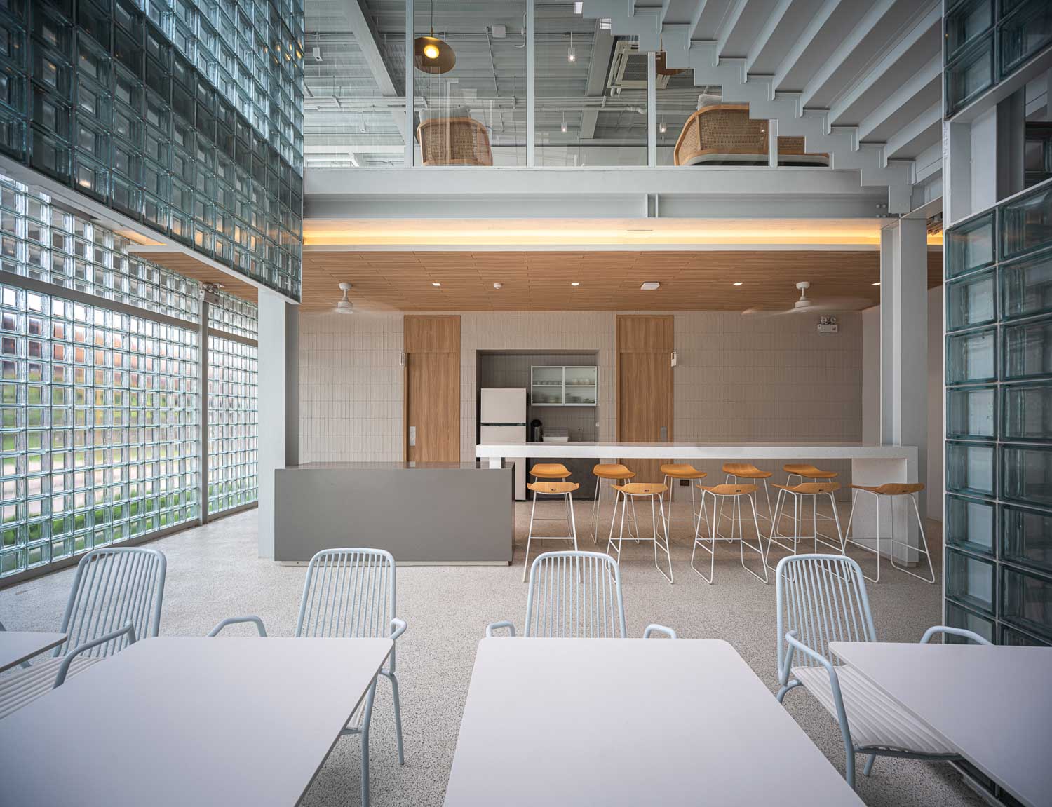
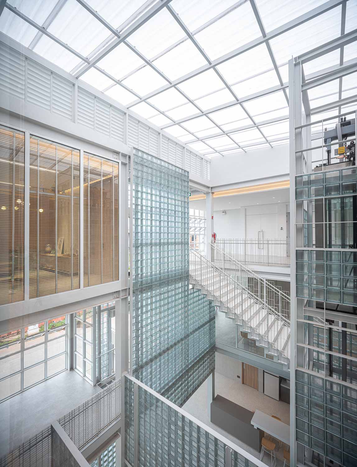
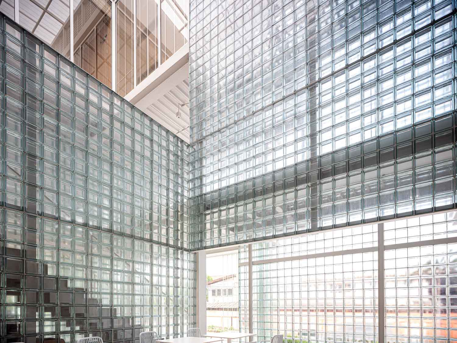
The architects chose glass blocks as the primary material for the building’s interior and architectural design. These blocks offer translucency while also providing effective heat insulation, thanks to their hollow centers. The use of the material with such transparent and translucent properties in the interior design creates a distinctive user experience that is exclusive to the space. In the elevator lobby, the blocks are constructed into partitions, creating an intriguing effect of moving shadows. This design choice adds dynamism and liveliness to the space as it captures the movement of people walking by.
For the construction of the façade and the multifunctional room, acrylic panels provide a translucent effect that not only allows natural light to brighten up the space but also enhances the overall aesthetic of the structure. The material’s translucency allows natural light to brighten up the space while enhancing the overall aesthetic of the façade. The arrangement of translucent and transparent panels, strategically placed at varying angles, forms the company’s logo, effectively communicating the company’s identity to the public rather than relying on a conventional letter sign.
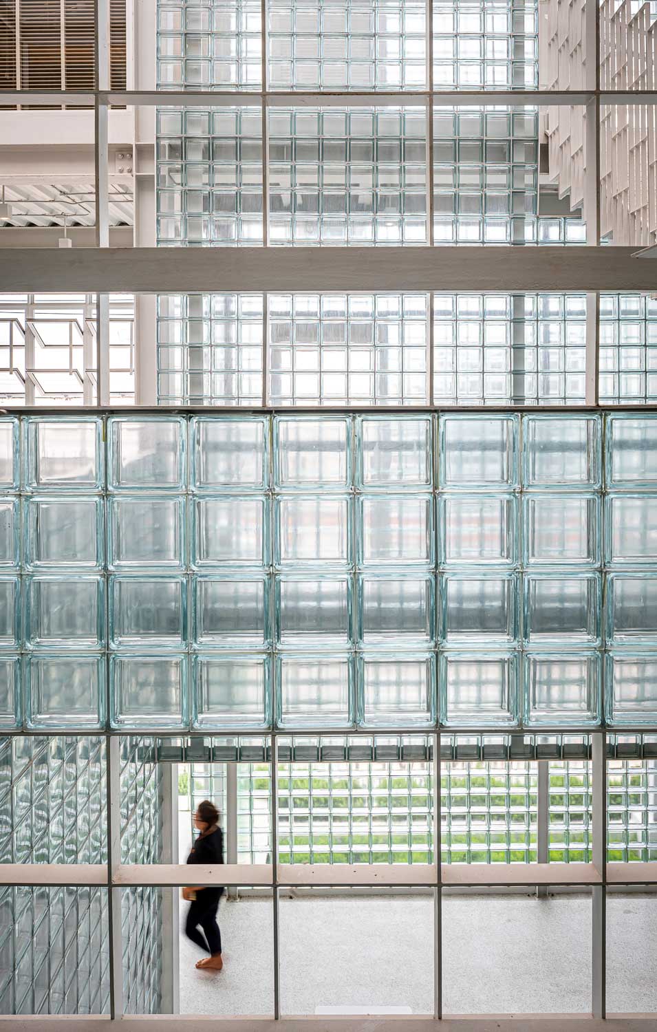
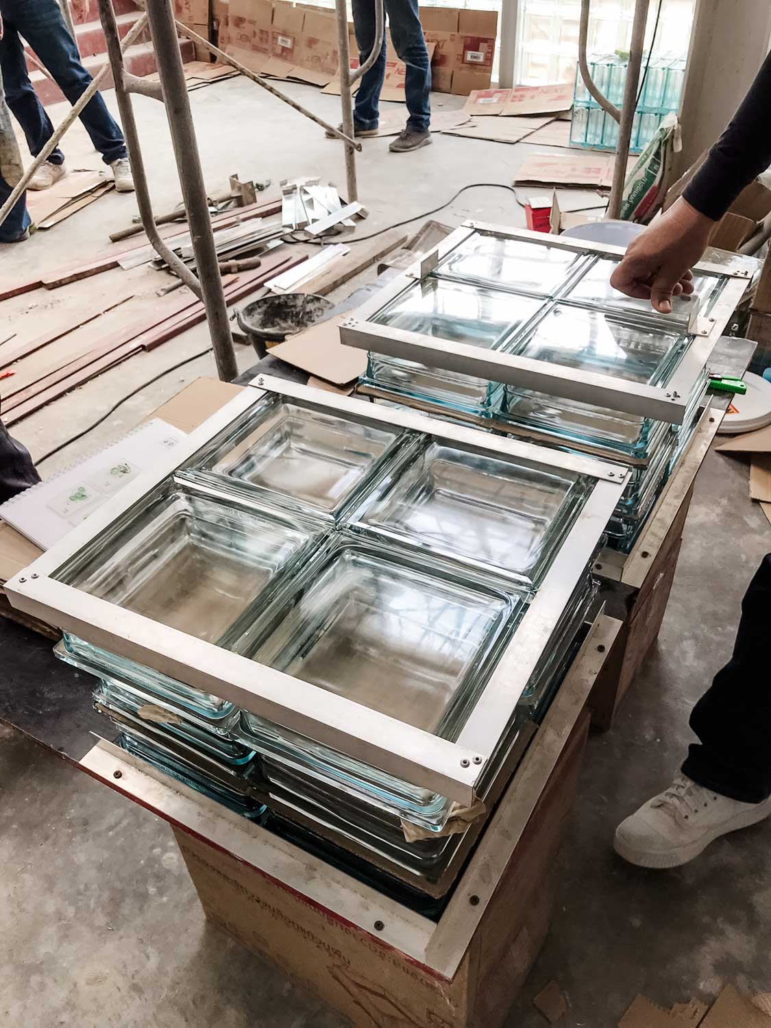
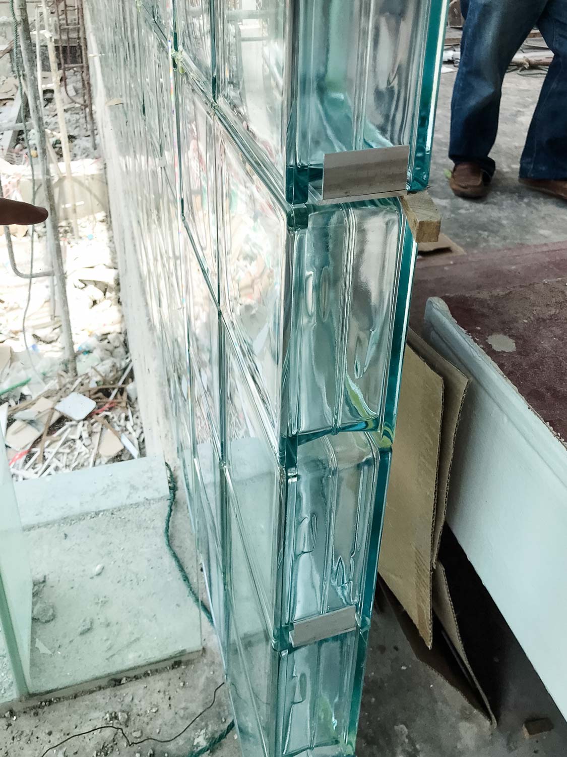
The glass block façade was developed through a collaborative process where the architecture team and the manufacturer worked together to ensure that the grout width was minimized to render the intended aesthetics. Instead of using steel reinforcement bars and mortar, which result in opaque grout lines that allow limited light to pass through, they opted for a different approach. By reducing the grout width with the use of epoxy adhesive and aluminum flat bars, they were able to reinforce the strength of four-block sets, which were later assembled into the complete façade structure.
