ART4D INVITES ONION TO TAKE US AROUND THE ‘NATIONAL CONVENTION CENTER’ AND LEARN ABOUT THE DESIGN WHICH IS SET TO BE REMARKABLE, HIGHLY FUNCTIONAL, AND CONVEY A SENSE OF MODERN THAI-NESS
TEXT: PRATCHAYAPOL LERTWICHA
PHOTO: KETSIREE WONGWAN EXCEPT AS NOTED
(For Thai, press here)
“See you in three years.”
The official announcement from Queen Sirikit National Convention Center (QSNCC) stating their three year closure for the building’s major revamp that flocked almost every local media outlets back in 2019. When the news broke, many were anticipating how the center would look after the renovation and whether the new design would be able to successfully cross over the iconic building that demonstrated the perfect combination of the quintessential Thai characteristics and universal architectural elements. The fact that Queen Sirikit National Convention Center is Thailand’s first international convention center with the ‘national convention center’ added to the title, the eyes of the public were on the project, and expectations were high.
“I felt the pressure when the opening was approaching. But after everything was finished and out in the open for everyone to see, the feedback was really rewarding,” Arisara Chaktranon, architect of onion, the architecture firm responsible with overseeing the interior design part of the renovation, stated after the project was completed.
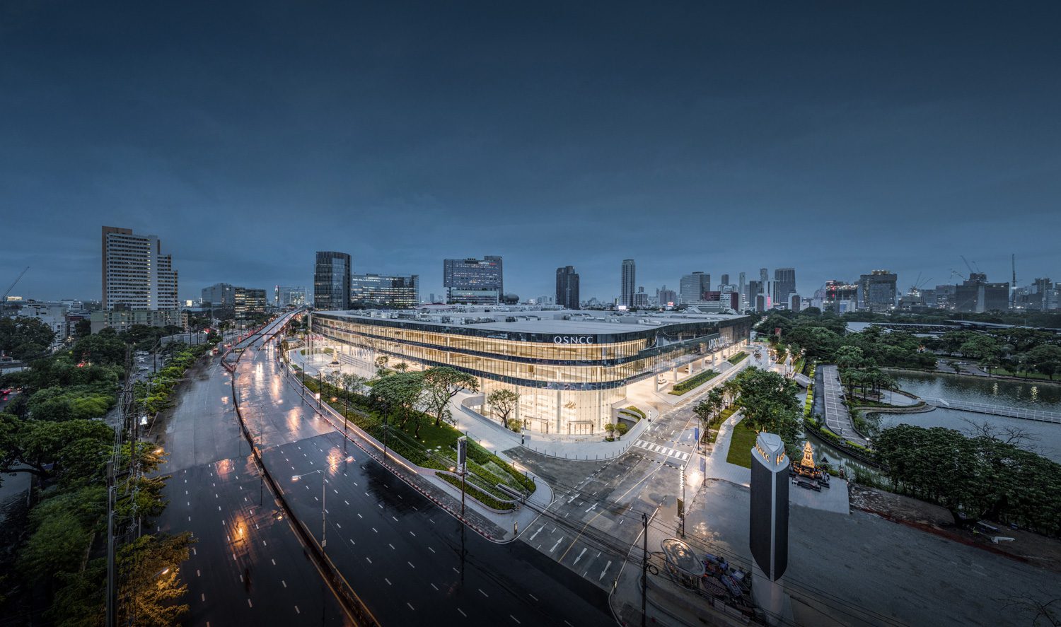
Photo courtesy of QSNCC
The new building, which replaces the 30-year-old structure, is the result of a collaborative effort mainly between three design firms. The project’s architectural direction was led by Design 103 International, the same team that created the old Queen Sirikit National Convention Center with Shma Company Limited and onion in charge of the landscape architecture and interior architecture, respectively.
The public has heaped praise over the interior architecture, notably its ability to convey the center’s majesty alongside a contemporary and visually spectacular interpretation and presentation of Thai-ness. Evidence of this can be seen by the number of influencers and bloggers who visit the center daily to create their content.
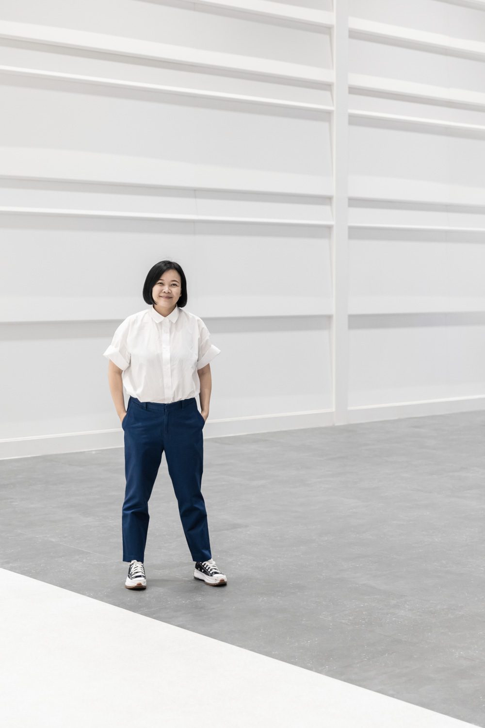
So, what is the idea behind such a visual spectacle? To answer the question, Arisara takes us on a personal walking tour of the new Queen Sirikit National Convention Center and discusses the design concepts that were incorporated into its creation.
“We sought to create a design that is inherently Thai while still including modern features that would make people feel at ease within the spaces. We also concentrated on the project’s main role as a highly functional convention center,” noted Arisara regarding the core of the design, which is centered on the depiction of modern Thai characteristics and excellent functionality. Despite the enormous scale of the interior program, the center must allow visitors to navigate between different sections without becoming disoriented. In the meantime, the Thai spirit must be accurately portrayed. The center serves as a representation of the country, since it is one of the locations used to accommodate important foreign guests. The integrated Thai characteristics is a way of sending a positive impression and telling visitors what Thailand is as a nation. But the Thai-ness that onion was looking for was never going to be something exceedingly traditional or intimidatingly ancient, nor did they intend to interpret typical aspects of Thai gable roof or patterns in a straightforward manner. They were looking to create a welcoming Thai personality with elements that can be universally experienced and appreciated.
Before meeting Arisara, we took a quick tour of each floor, noting how each component of the program has its own personality. It inspired us to inquire about the designer’s reasoning behind the distinct aesthetics of the zones.
“The interior design is influenced by traditional Thai clothes and textiles, so the design of each zone is based on a style of traditional Thai costume.” Arisara goes on to say that traditional Thai textiles and dresses were chosen as inspirations since they are crafts that H.M. Queen Sirikit The Queen Mother has loved throughout her life. The Queen Mother has been supporting and wearing them, resulting in their growing popularity and continued inclusion in current fashion. Given that the facility is named after her, Thai textiles and costumes seemed like an appropriate choice for the project’s context.”
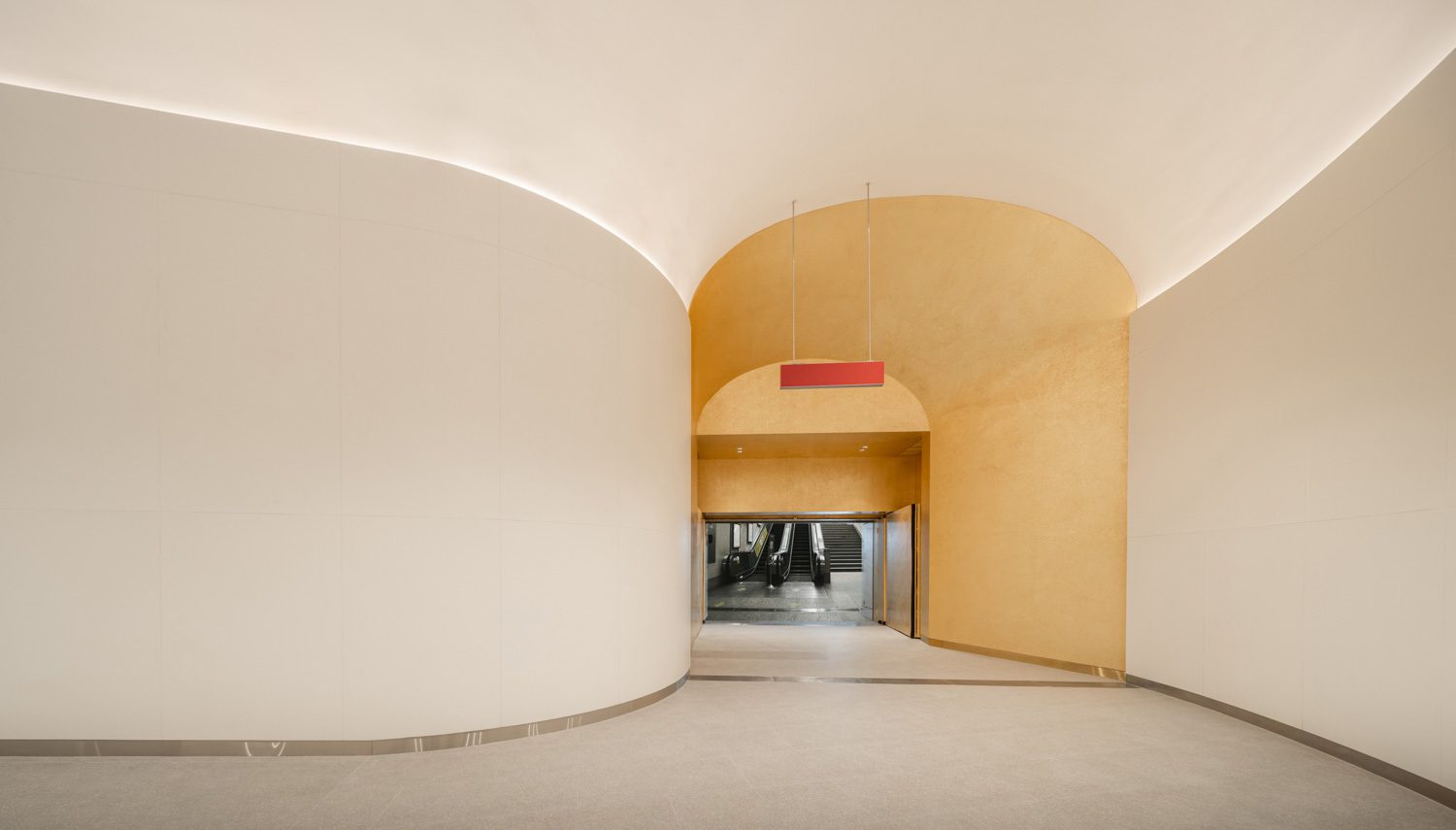
Photo courtesy of QSNCC
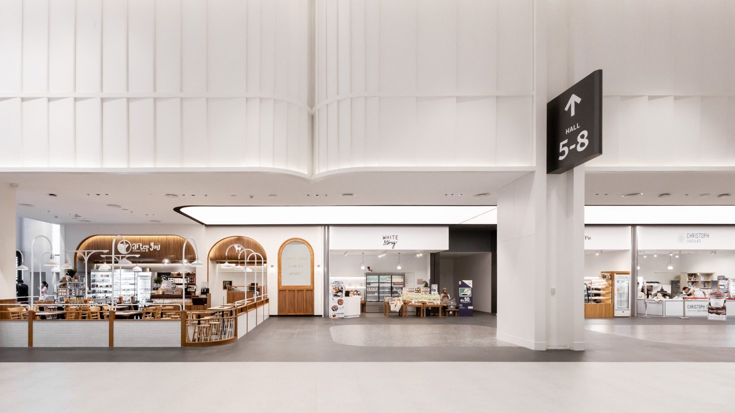
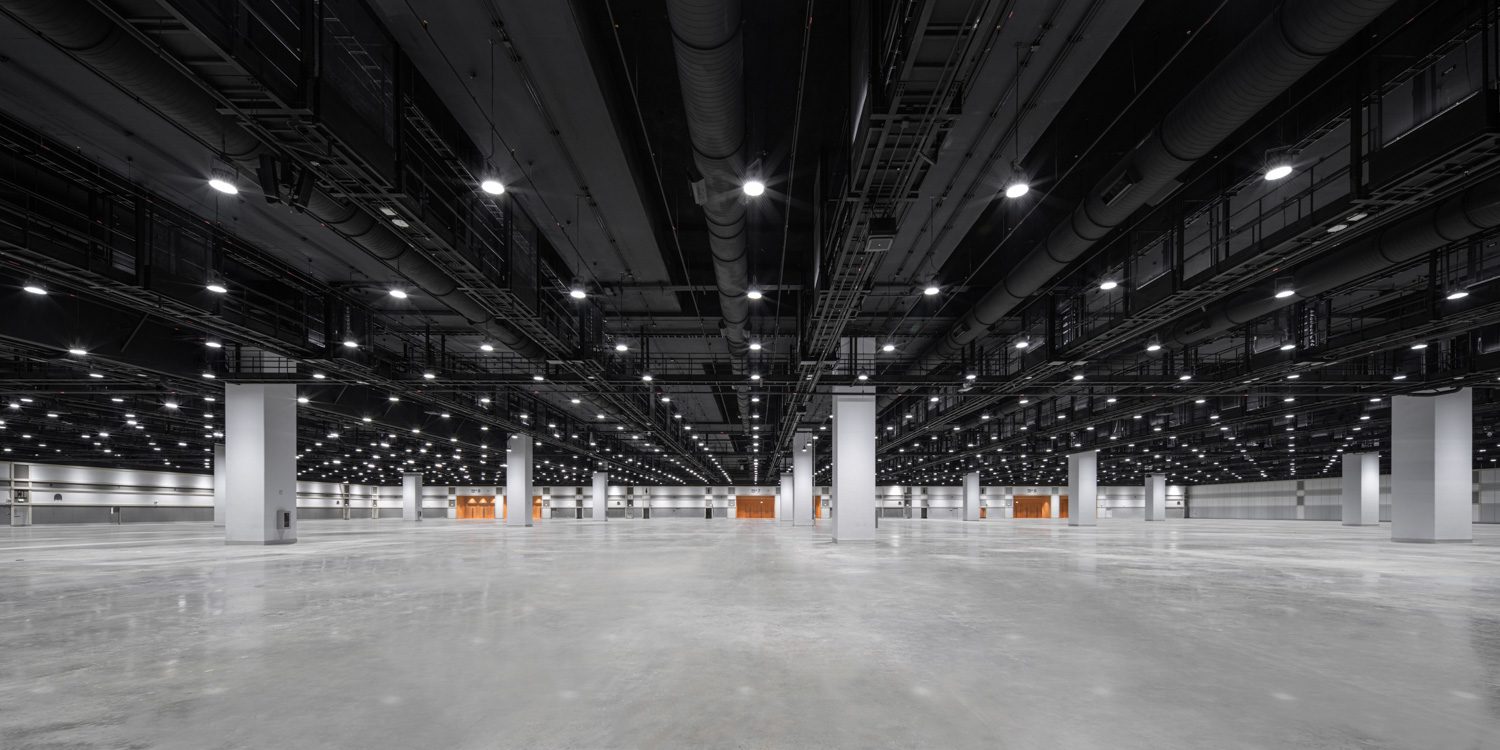
Photo courtesy of QSNCC
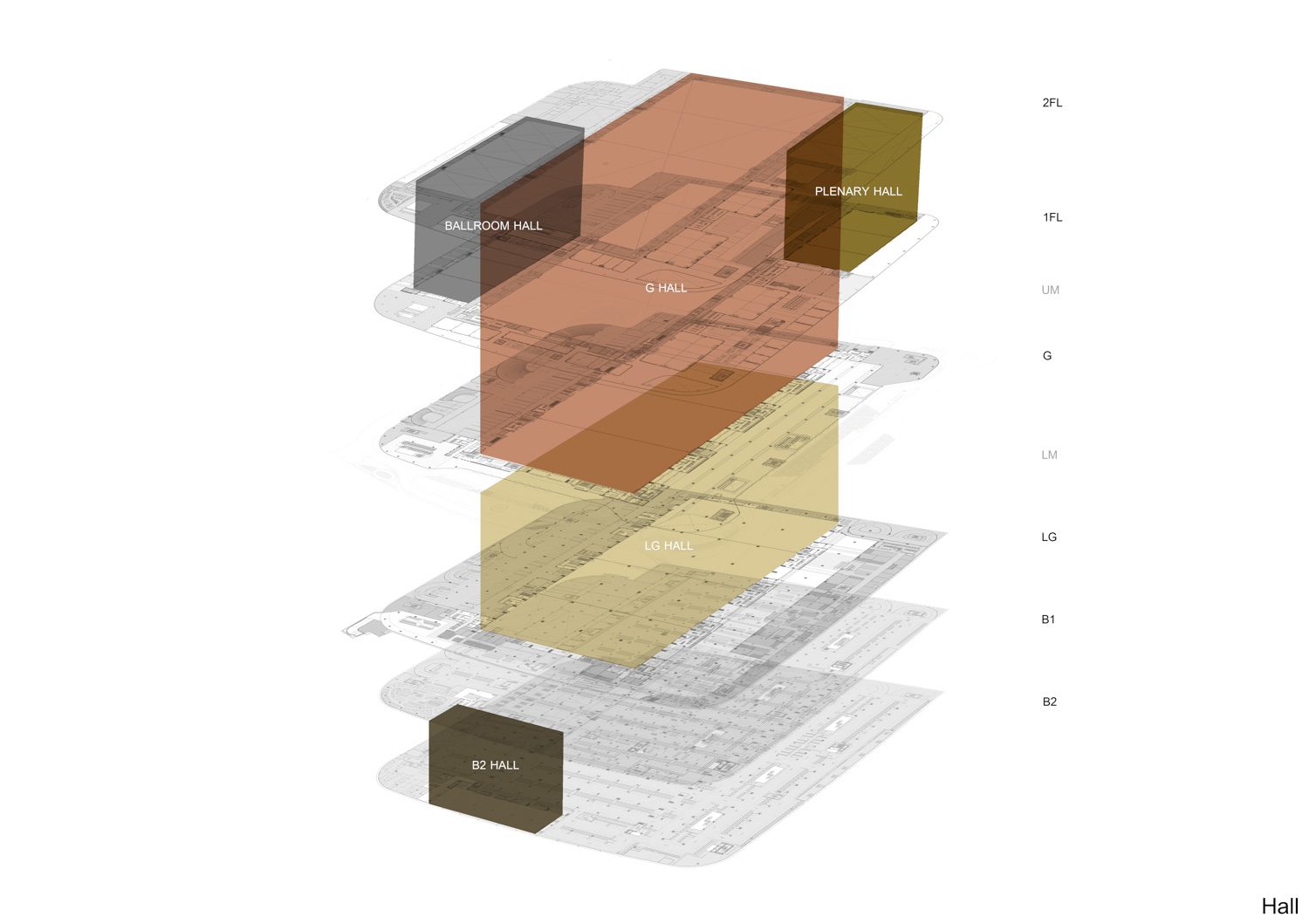
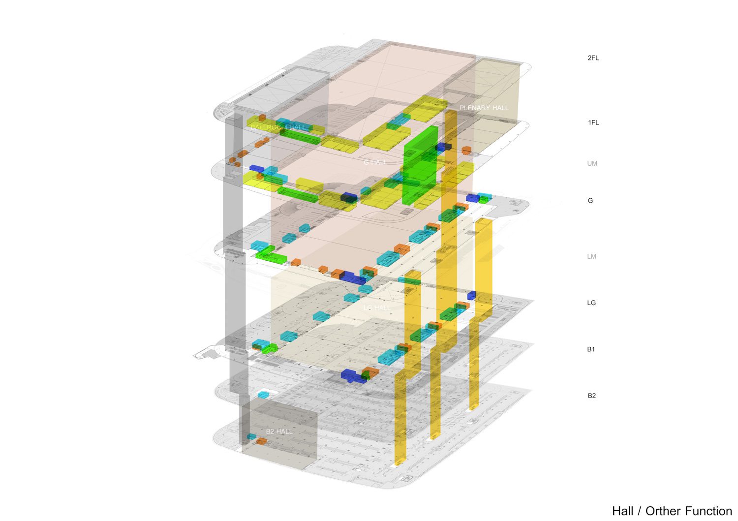
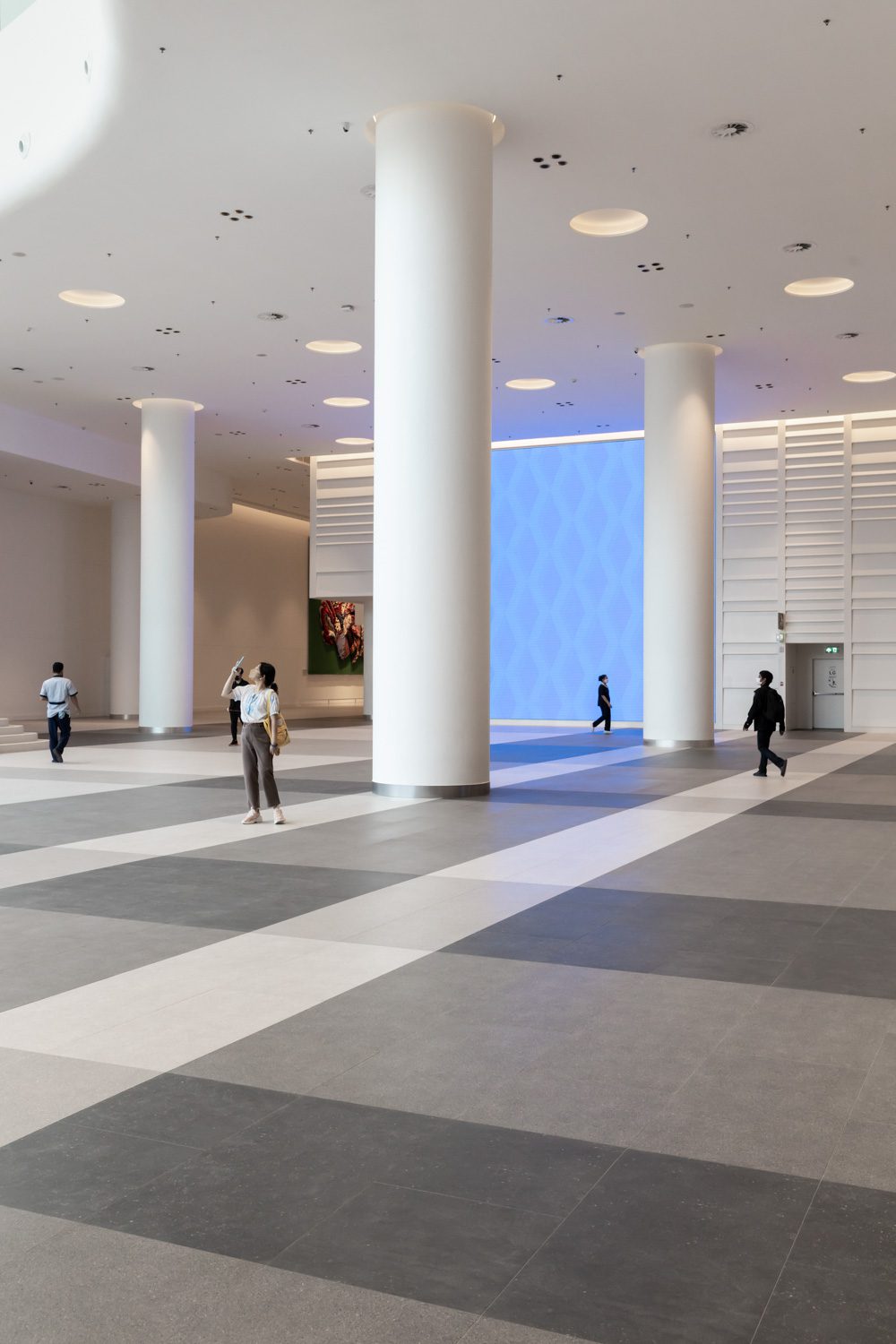
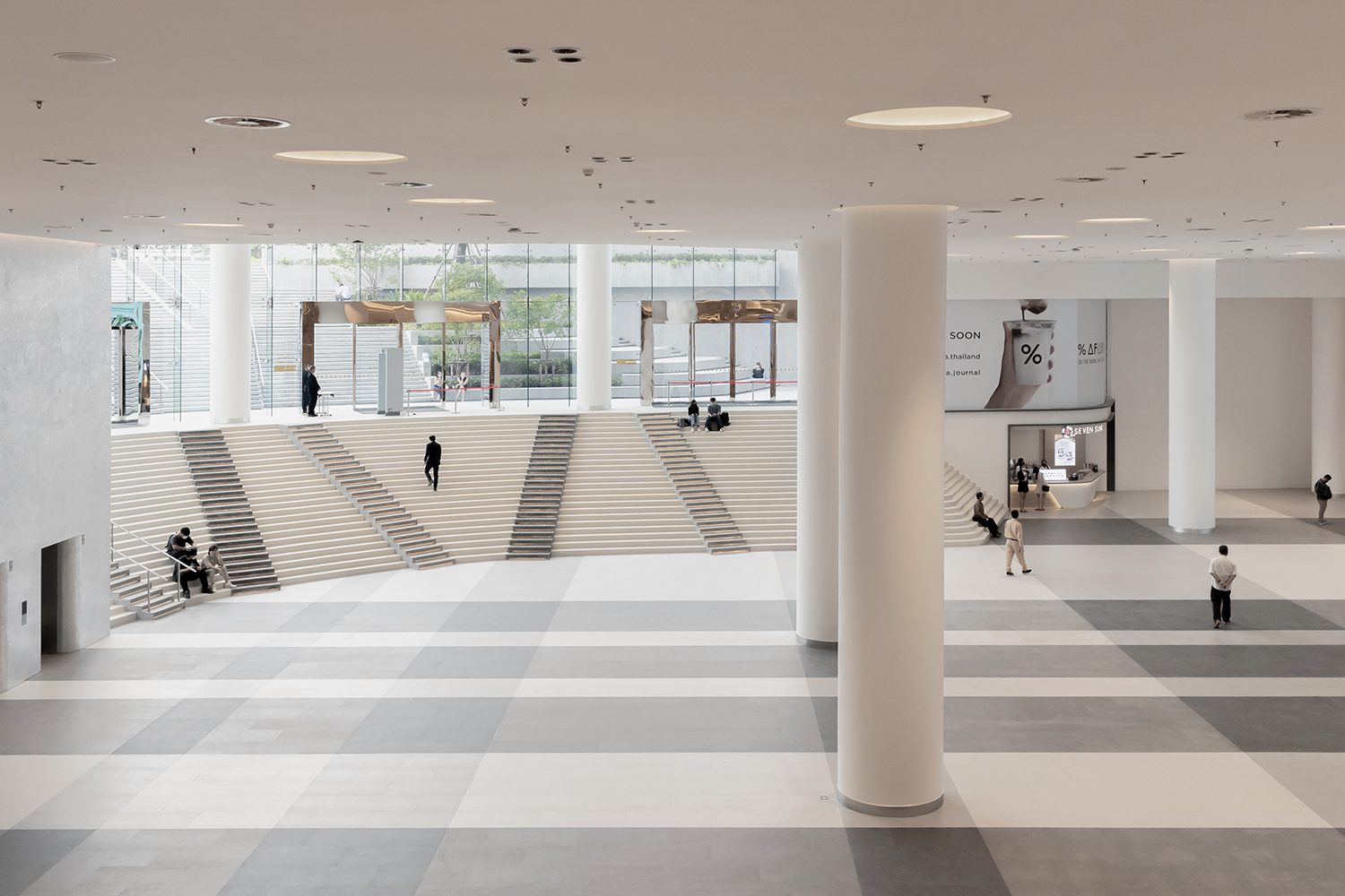
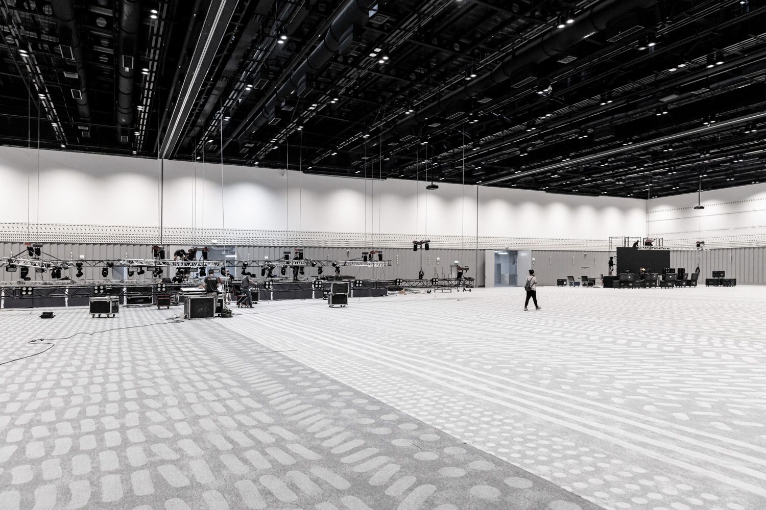
The new structure has four levels designed to accommodate exhibitions and conventions. Arisara and I met on LG, the underground floor that connects to the underground MRT station. A vast exhibition hall reveals itself with no columns in sight. The area looks and feels like a shopping mall, with a variety of shops and retail spaces. “Because this floor has the most bustling and casual vibe, we used the loincloth theme.”
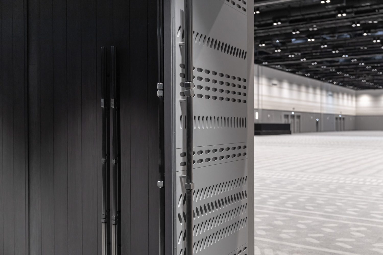
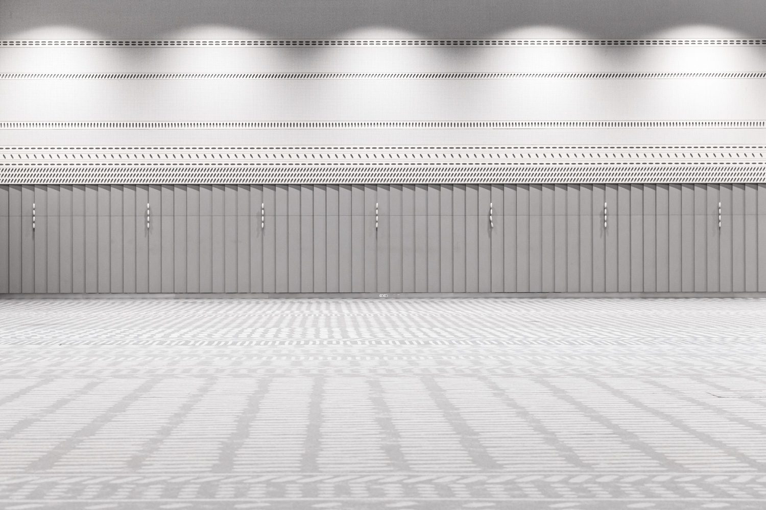
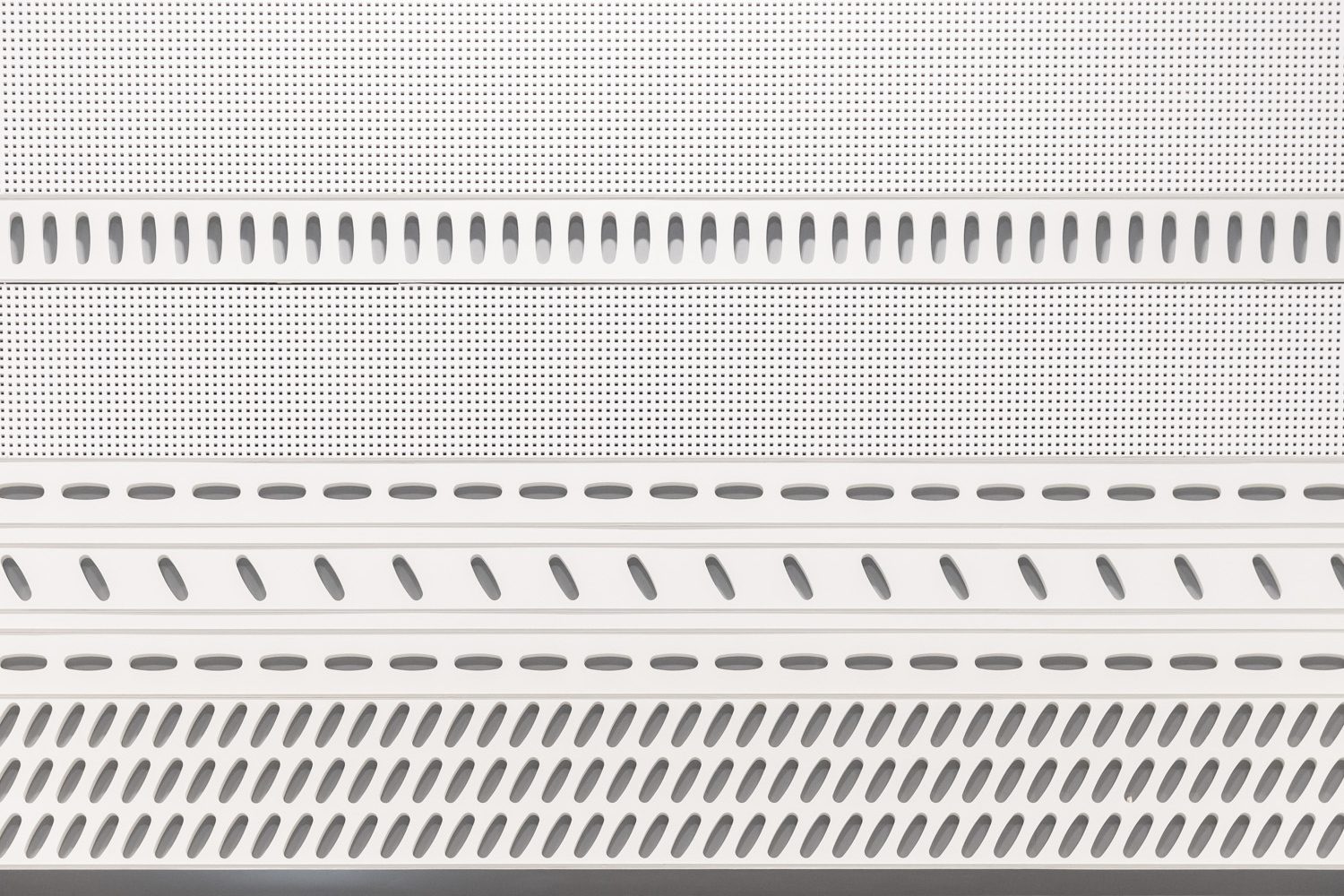
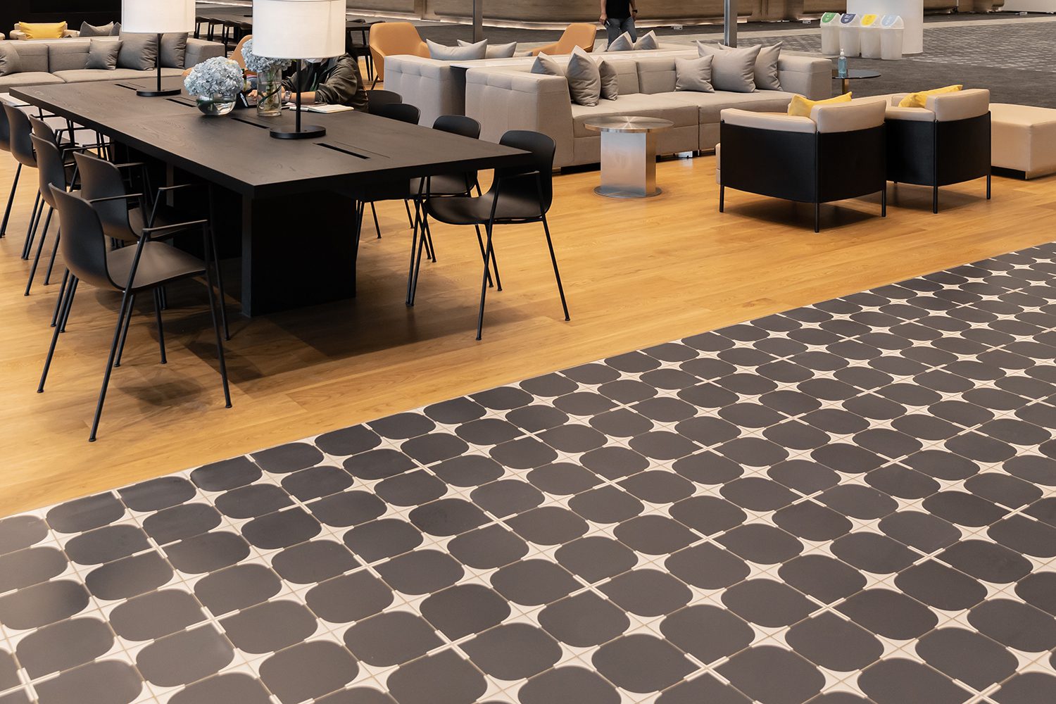
The plaid patterns of loincloths are translated into vertical and horizontal lines visible on the exhibition hall’s interior walls, as well as the pattern of tiles covering the floor outside of the exhibition hall. In addition to the pattern, the design incorporates the casualness that the loincloth implies. Outside the exhibition hall, the walls are clad in white wooden planks arranged in a superimposed method, in a superimposed configuration commonly found in Thai houses. The component creates a friendlier atmosphere for the space, while the planks are built of prefabricated laminate postform that has smoothened edges to produce a softer lighting effect when touched by light. The edge is intended to be particularly wide so that people can notice the intricacy even from a distance.
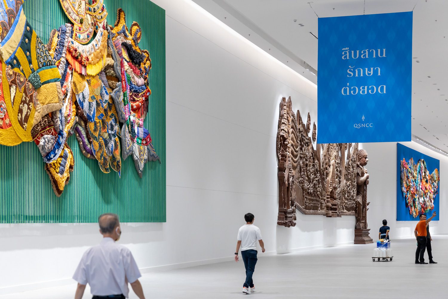
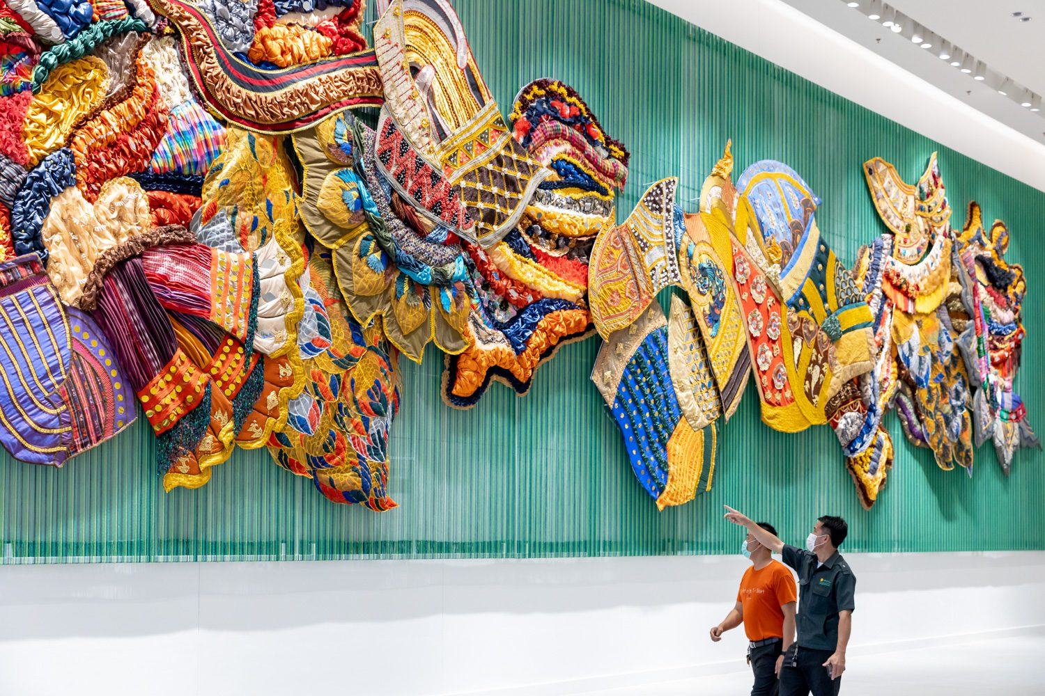
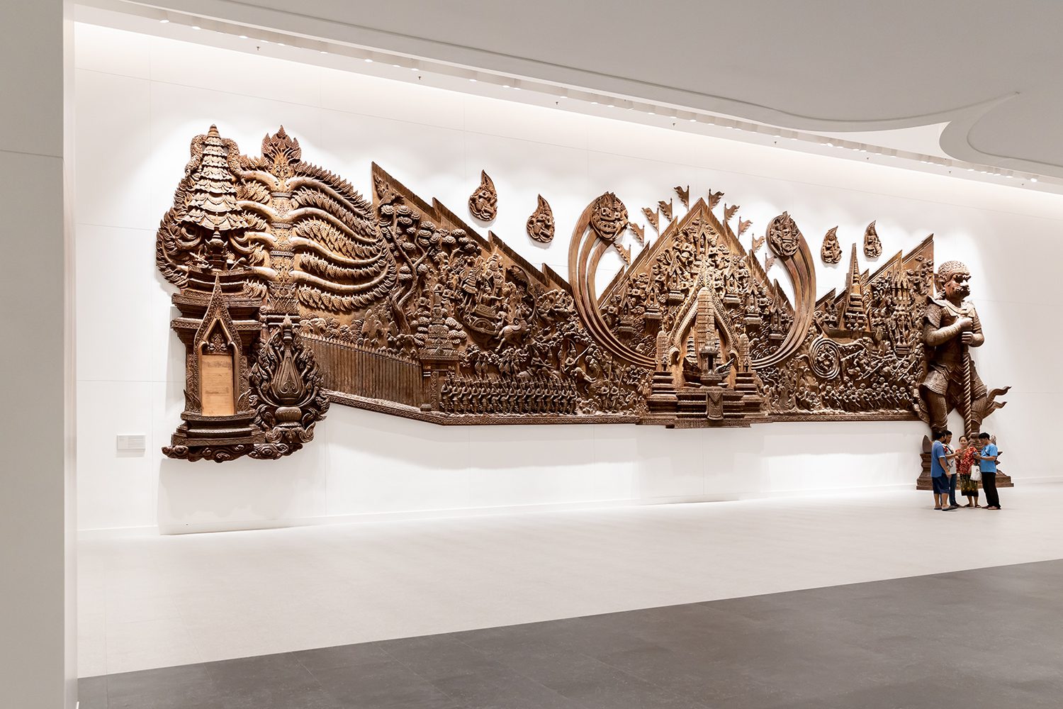
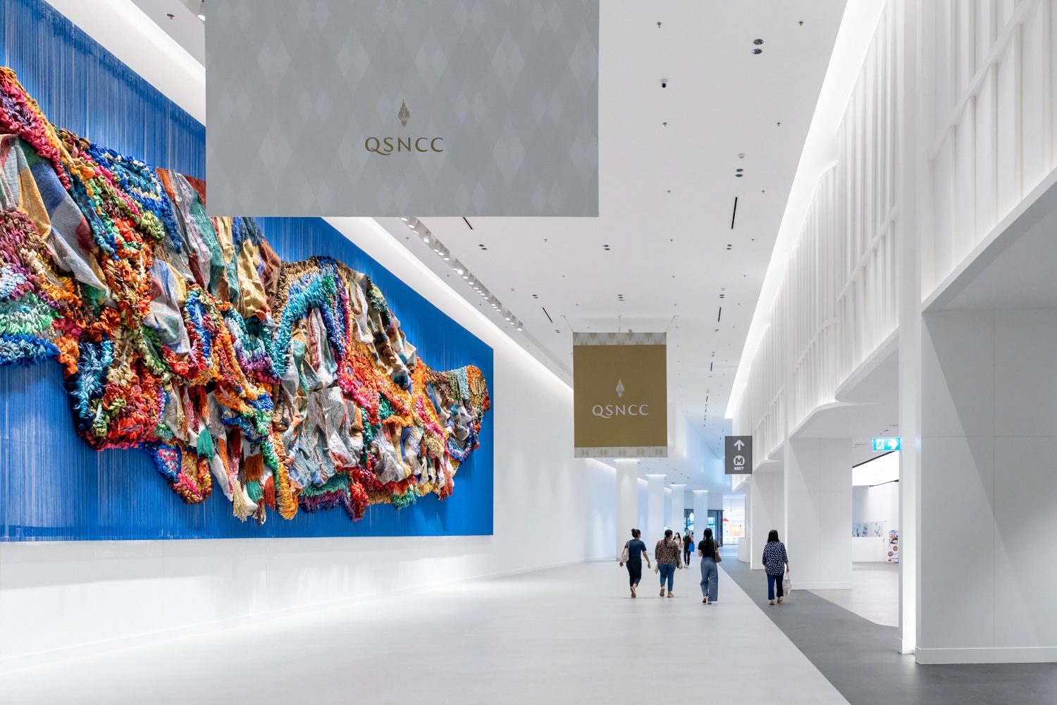
The wing at the other end of the building connects to a long walkway that leads to the Queen Sirikit Convention Center MRT Station. Arisara styled the room to resemble an art gallery, with large-scale artworks displayed on both sides to make the trip feel less strenuous. The pieces are both new, such as the textile piece by Pleonchan Winyarat, and old, such as the wooden sculpture by Jaroon Mathanom, which was removed from an old building. The chosen works not only make the walk more enjoyable, but they also demonstrate a magnificent coexistence of the old and the new.
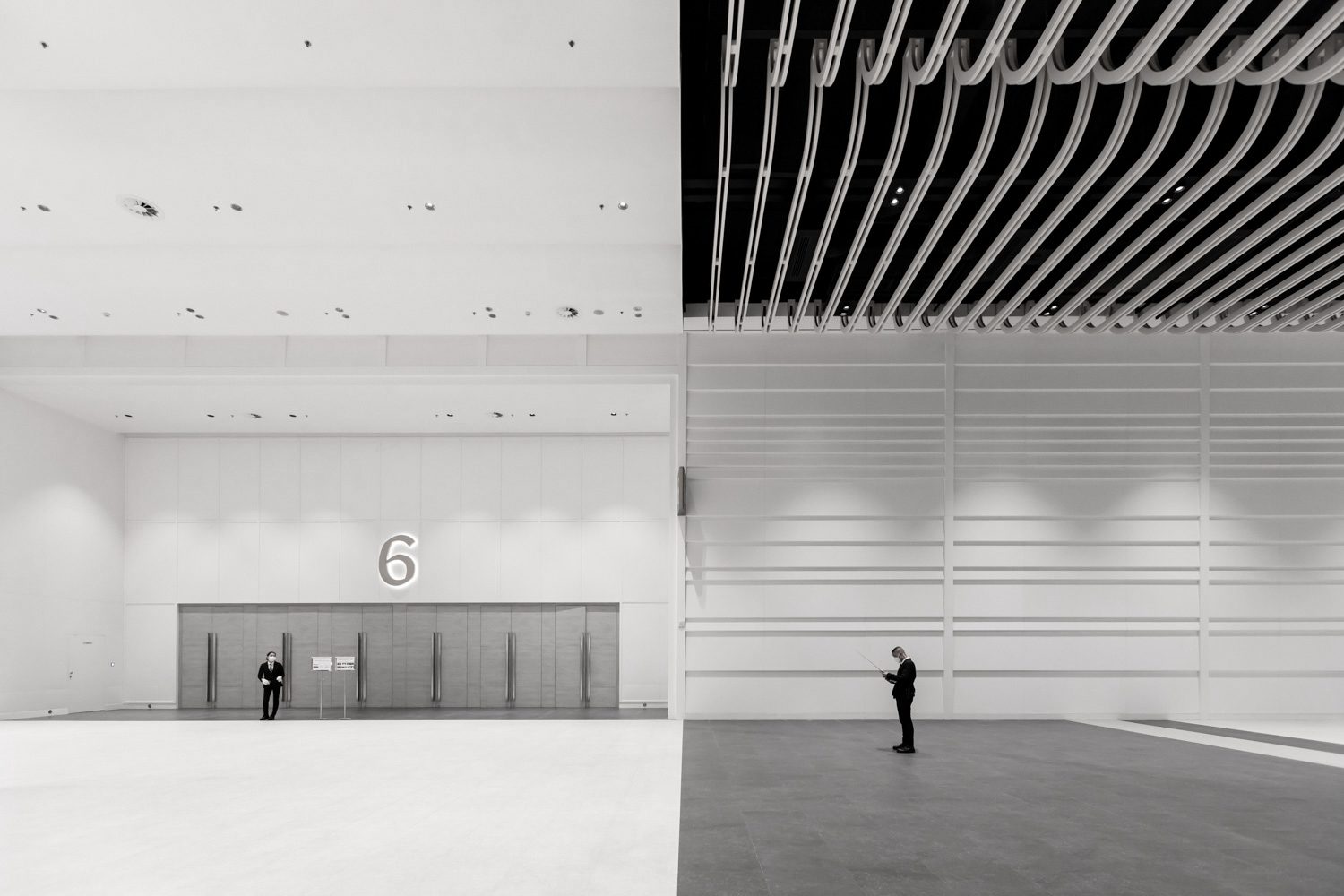
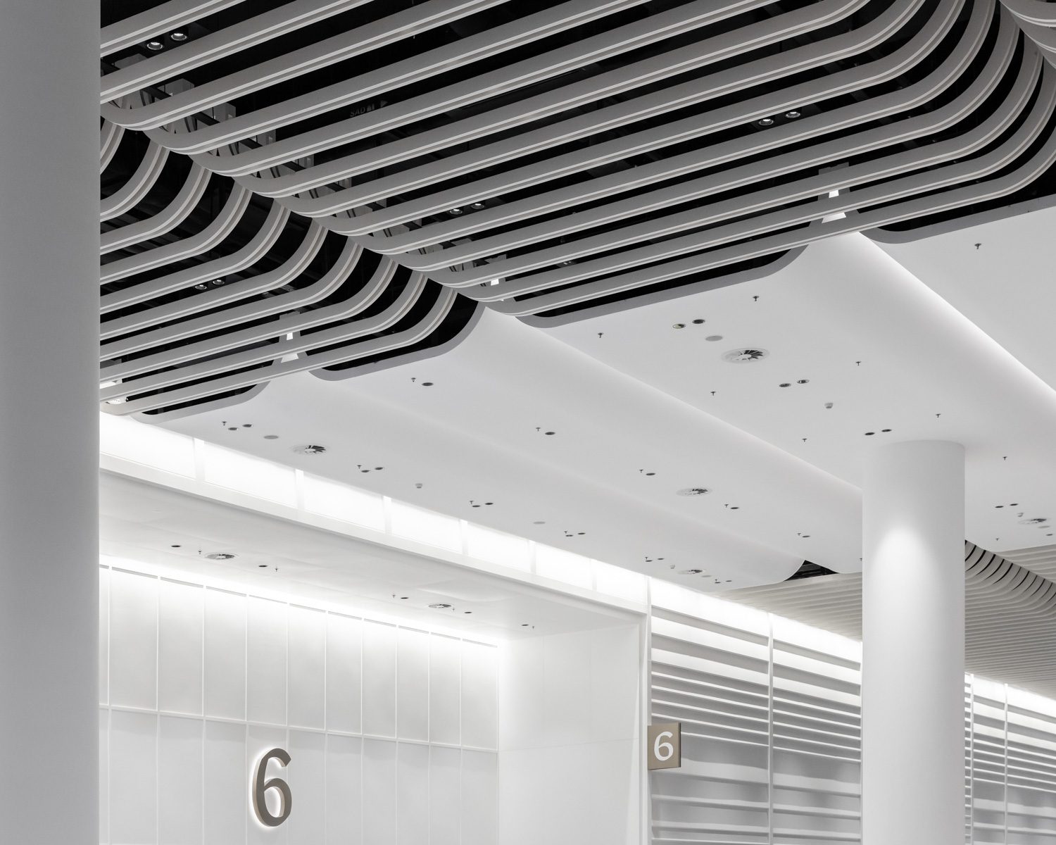
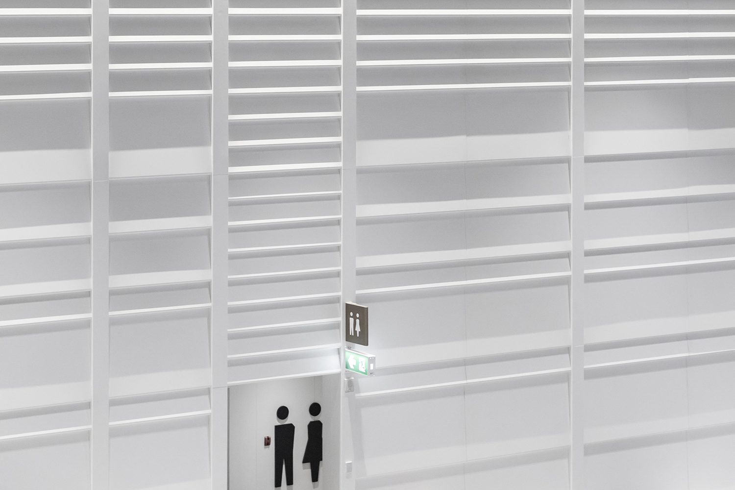
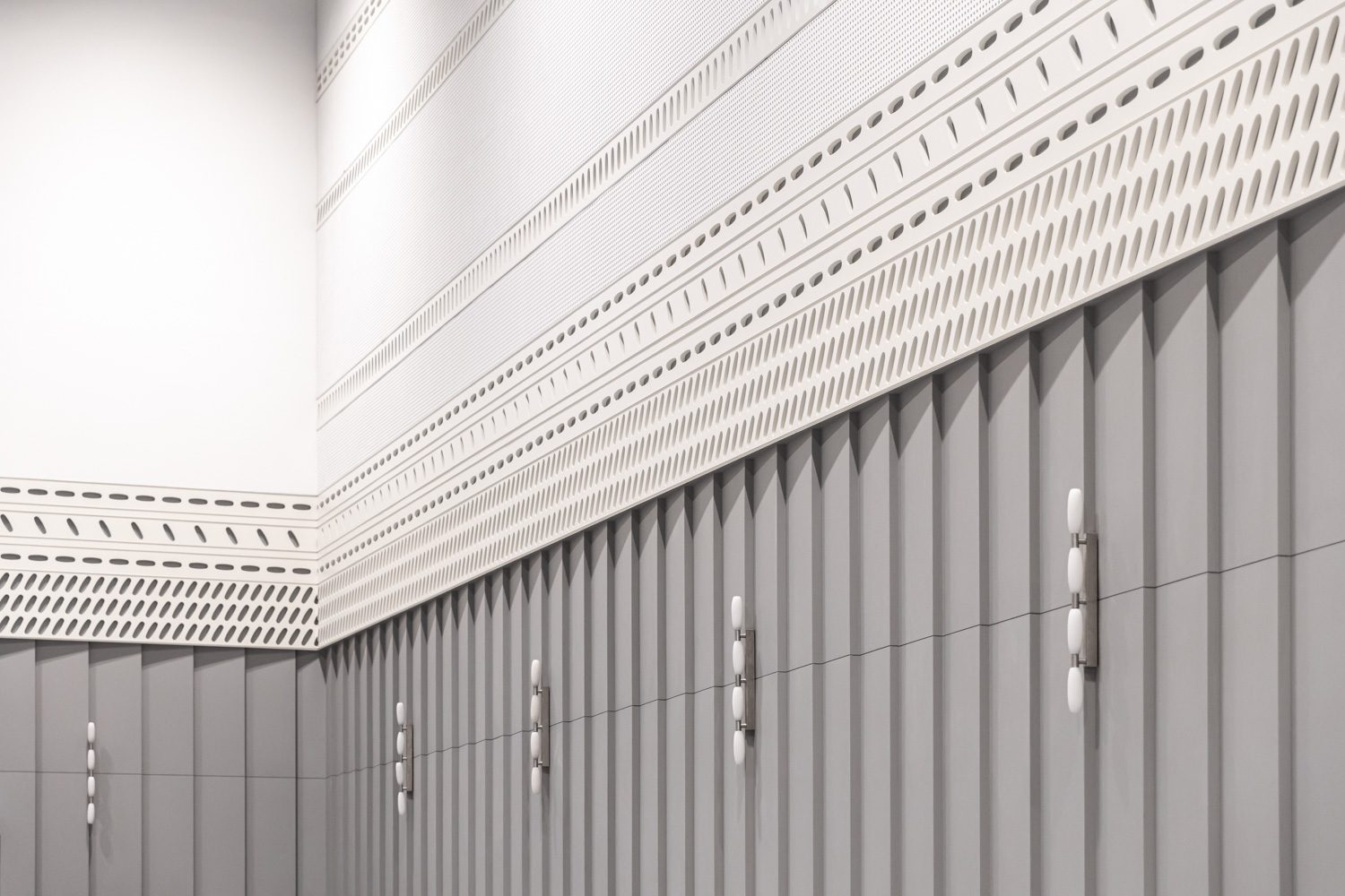
onion’s focus on function, as previously mentioned, is evident on the ceiling, where Arisara points out two distinct design languages of the enclosed and open ceiling. The enclosed part of the ceiling is above the hall’s entrance, guiding users directions in addition to being merely a decorative element. The hall’s interior and exterior walls reveal how the different parts of the walls from the one near the doorways leading to the toilets, fire exits to other rooms of the program are designed to have various patterns.
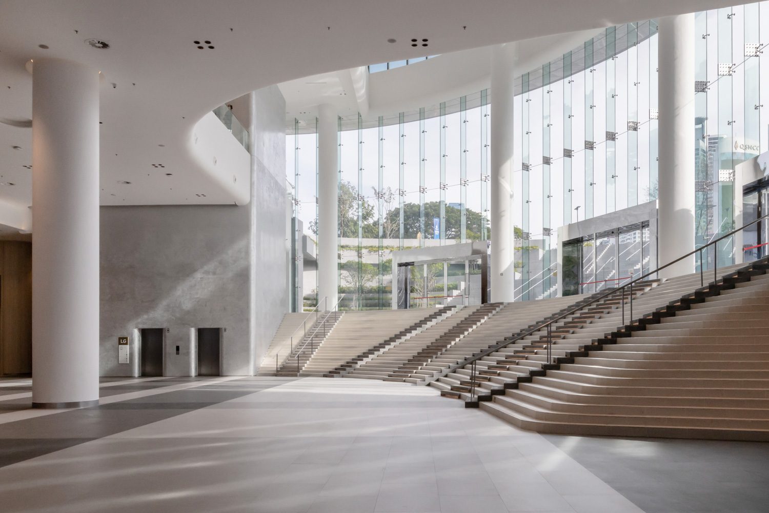
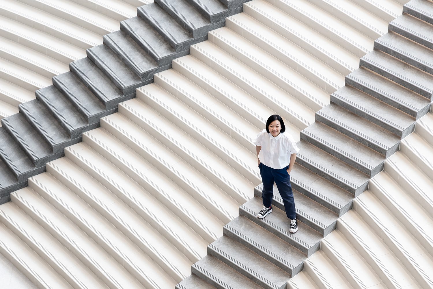
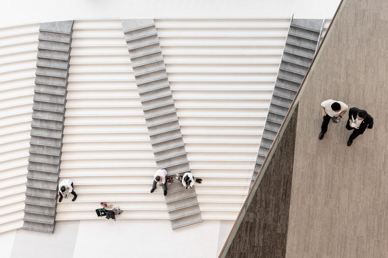
The 50-meter-wide stairway with details of overlapped sets of black and white steps is another distinguishing feature on the LG level. The area also links to the building’s upper levels and an exit that leads visitors out of the center. According to Arisara, the stairwell was created for the convention center to meet the international standard for conventional center fire exits. The particularly long stairway allows a large number of people to safely evacuate in the event of a fire. The white and black components separate the area where traffic occurs (the black) from the area where users can take a seat and rest to ease off the muscle pain caused by a long walk (the white). The black element freely paints itself on the white steps, bringing a playful atmosphere to the space.
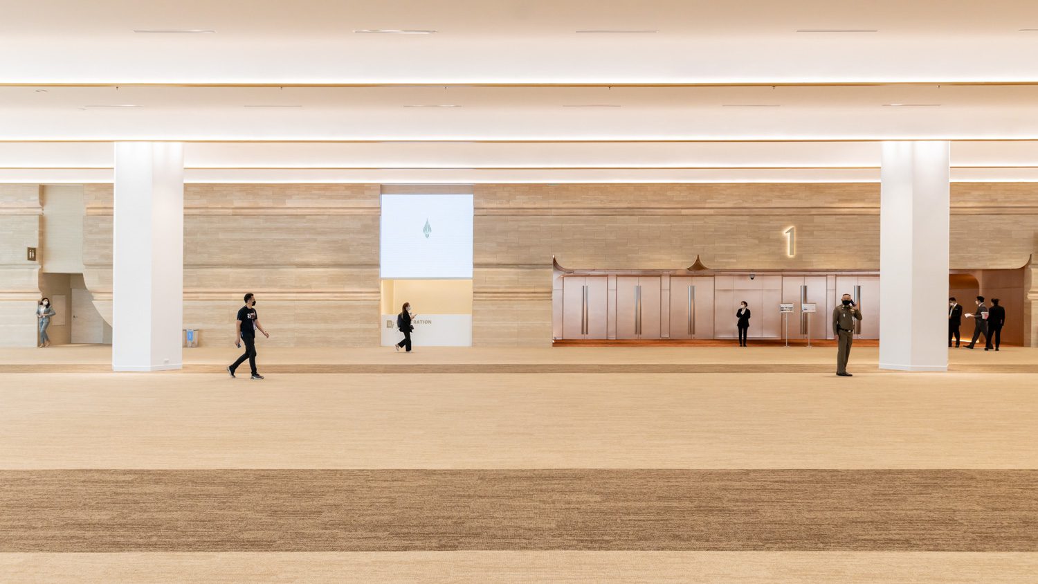
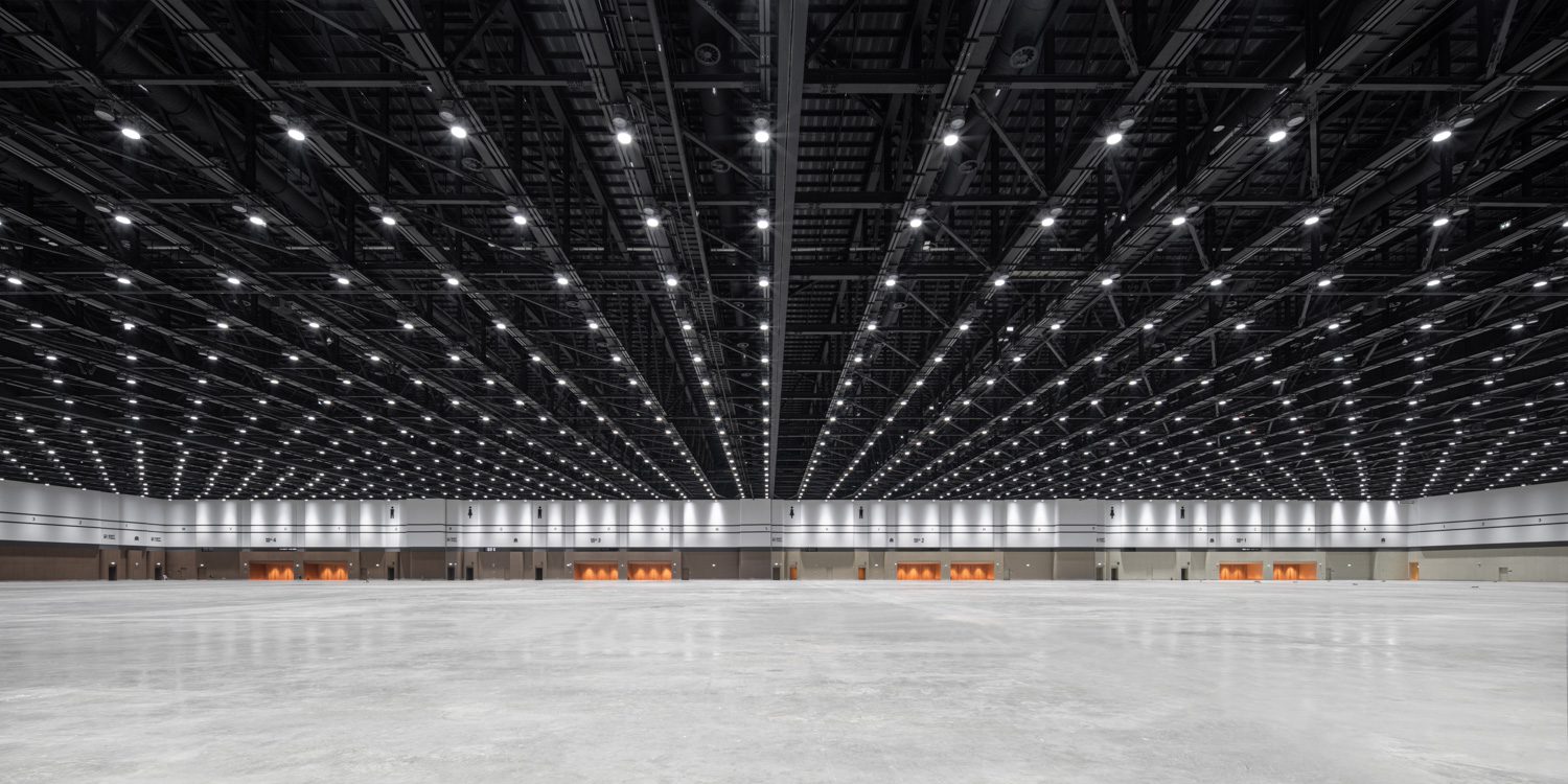
Photo courtesy of QSNCC
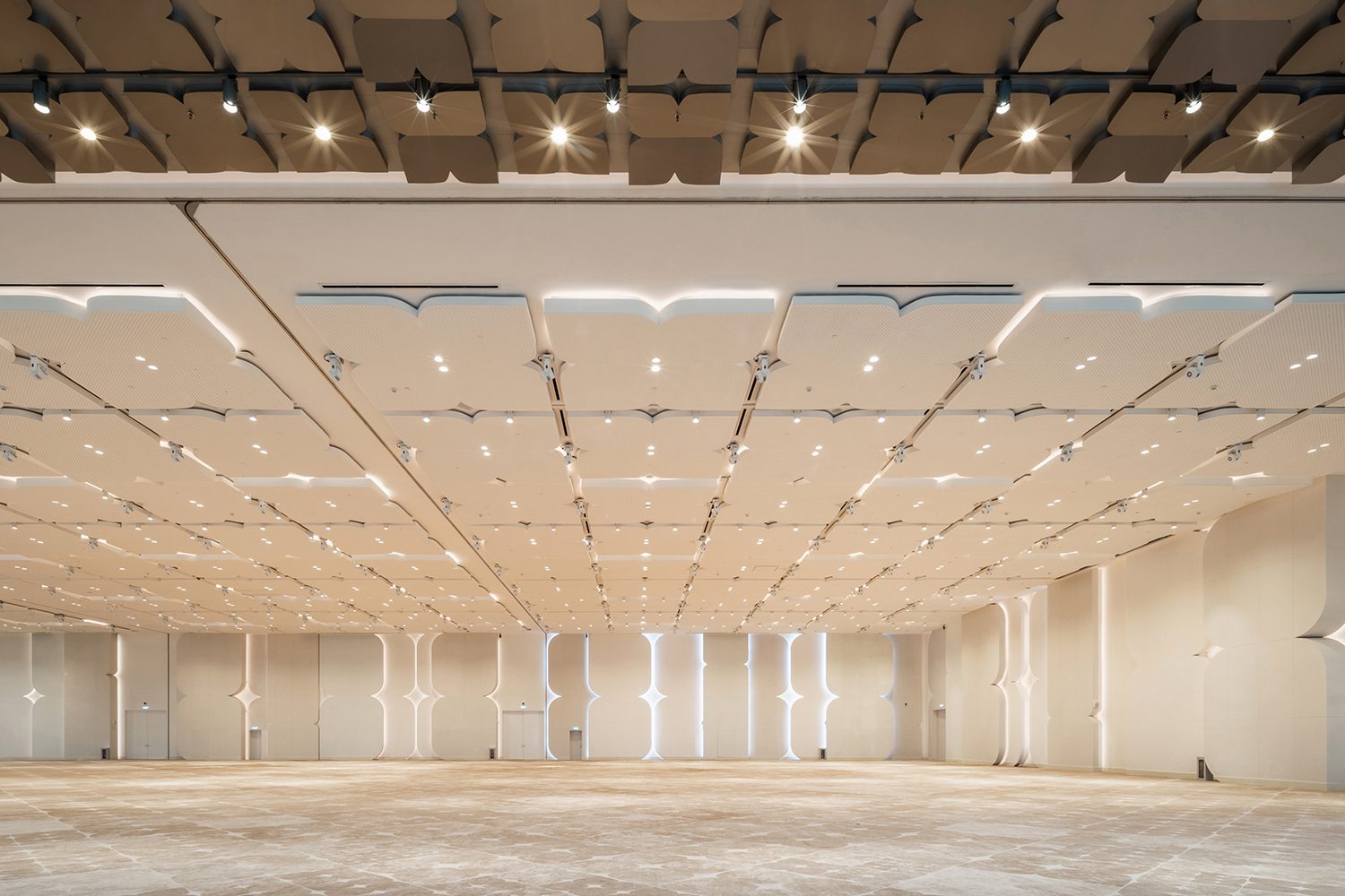
Arisara walked us up the escalator from the underground floor to the G floor. The zone feels more formal as this is the floor where the drop off area for VIP guests is located. The interior decoration of the zone is inspired by the attributes of Jong Kra Ben, a rolled loincloth worn as the bottom piece of traditional Thai costumes. This floor features the main convention hall, which has a spectacular 13.5 meter high ceiling constructed with no columns visible.
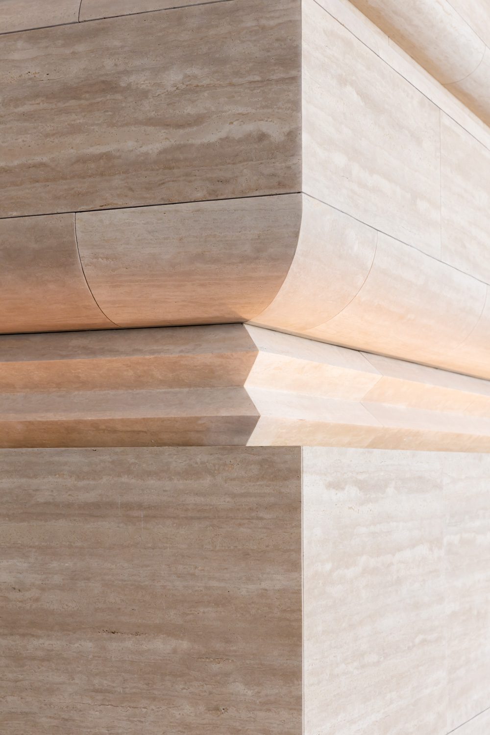
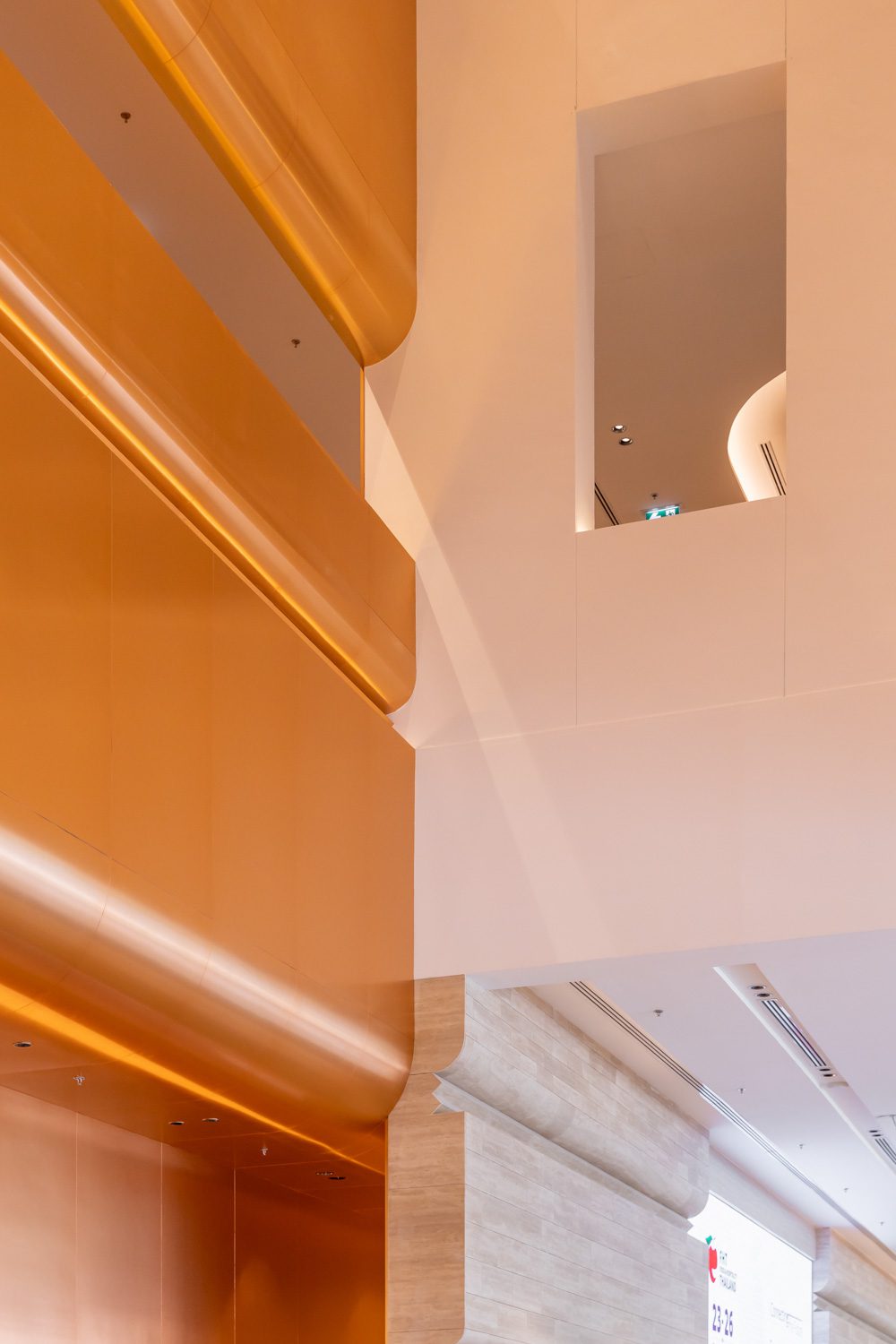
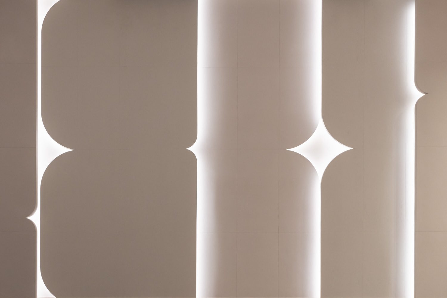
Arisara took us to see the light brown stone wall with undulating surface that wraps around the convention hall as soon as we arrived on this floor. The wall’s design takes inspiration from the creases on a folded loincloth, and the designer’s goal to combine characteristics of ancient constructions’ walls is also apparent. “We wanted this wall to have the look of ancient Thai brick walls, so we chose travertine stone imported from Turkey since it has the blond tint that is quite similar to a brick, yet it radiates this really universal aesthetic.”
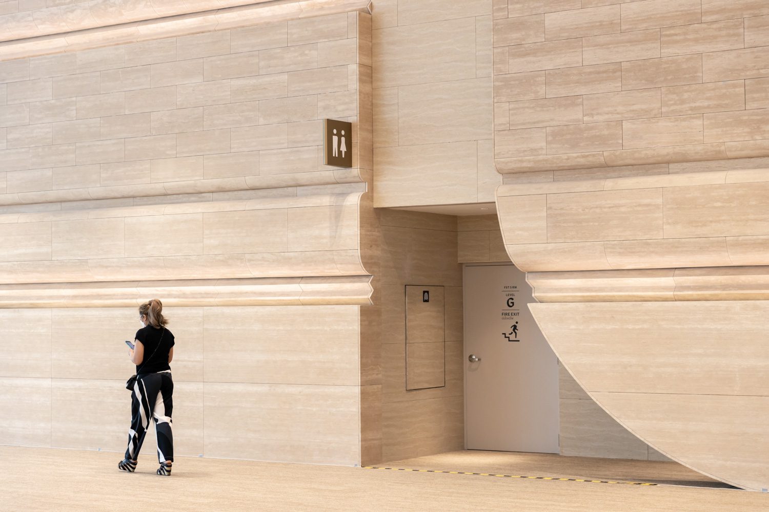

The enormous stone slabs were cut to the specified sizes before being encased on the steel frame. The pattern is the culmination of Arisara and the design team’s intuition, which results in an overall look and feel that is distinctly Thai. The pattern is similar to the curvature and undulating patterns found at the footing of traditional Thai architecture, but it is expressed as a more simplified version. The configuration of the large slabs at the bottom and the smaller ones at the top creates a sturdy looking structure, which is how the foundation of Thai architecture is designed and intended to function.
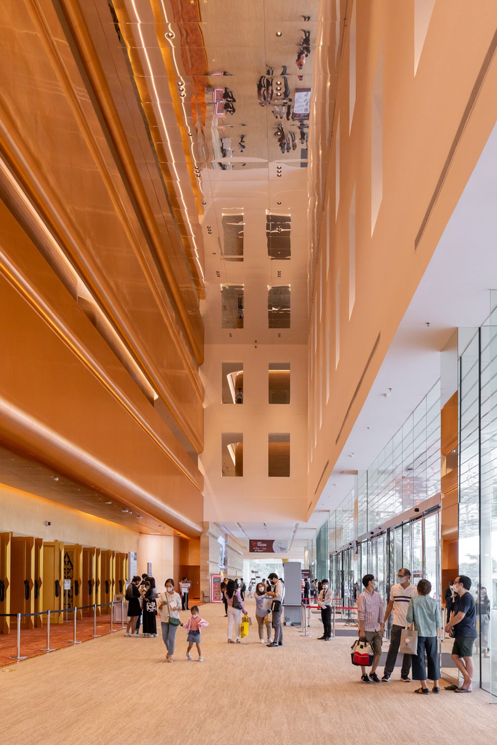
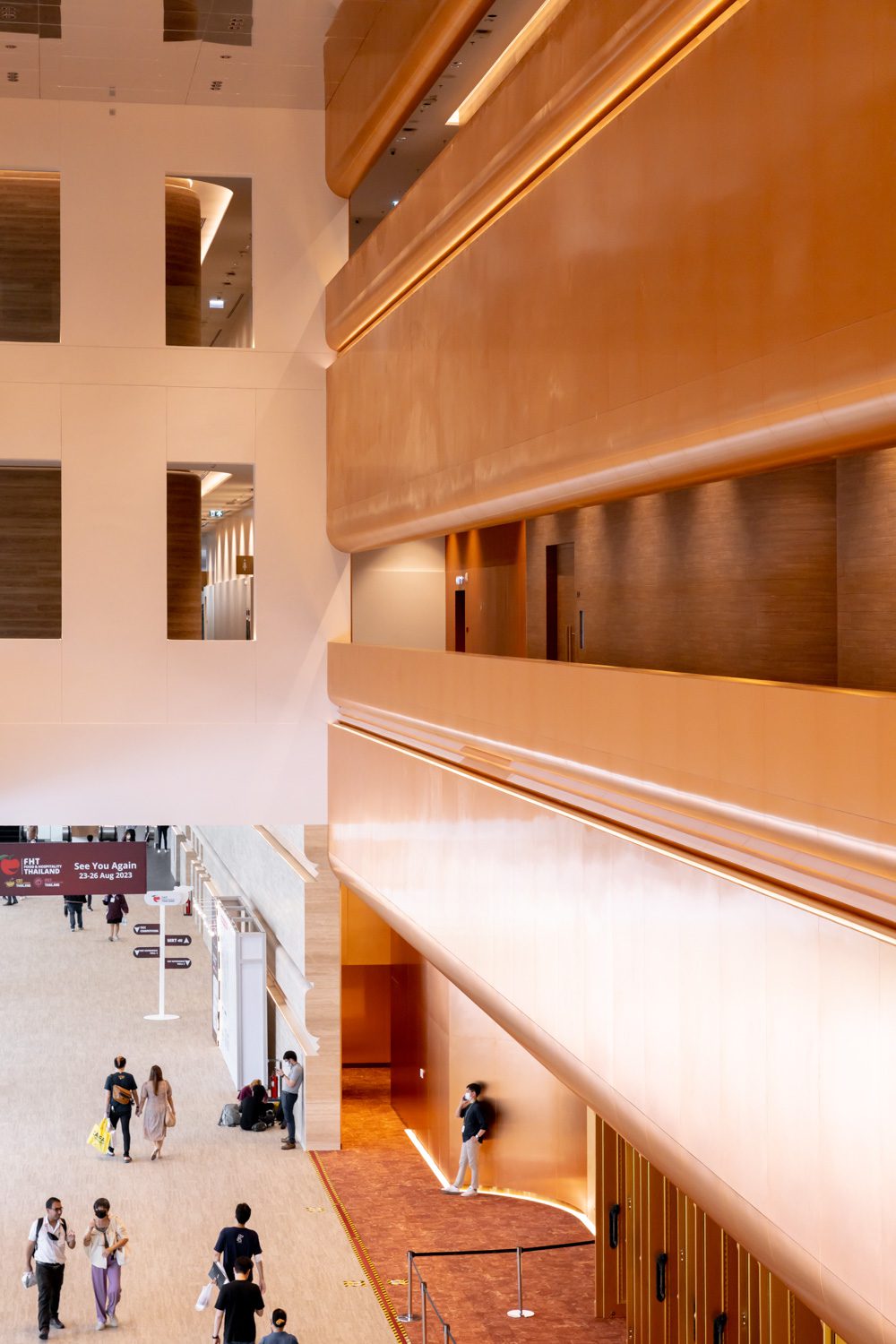
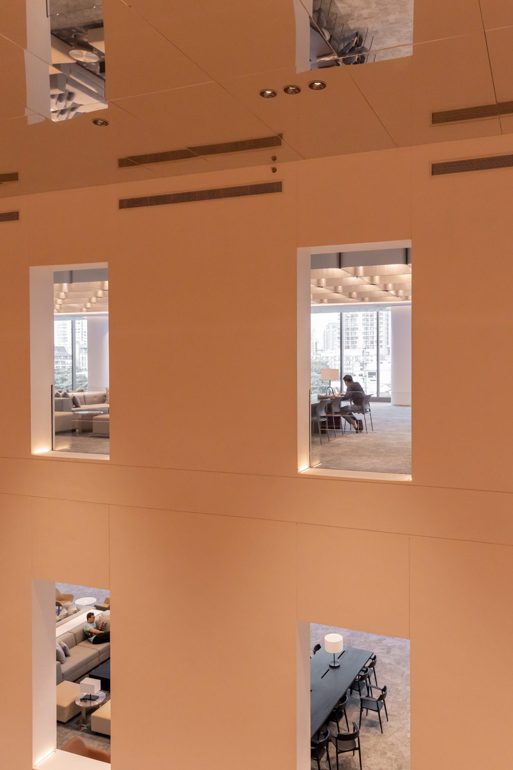
Another highlight Arisara enthusiastically showed us was the main entry hall facing Ratchada Road. Despite the fact that the size of the entrance hall is far from majestic, the reflective mirror film sheet covered on the ceiling helps make the area appear several times larger than it is. The upper frame of the wall is encircled by strong white walls and an array of rectangular openings. Arisara stated that the location was given the nickname “Buddhist Hall” by the contractor because of the mood and tone, which resemble that of the interior of a temple.
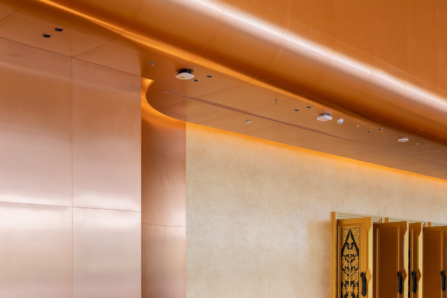
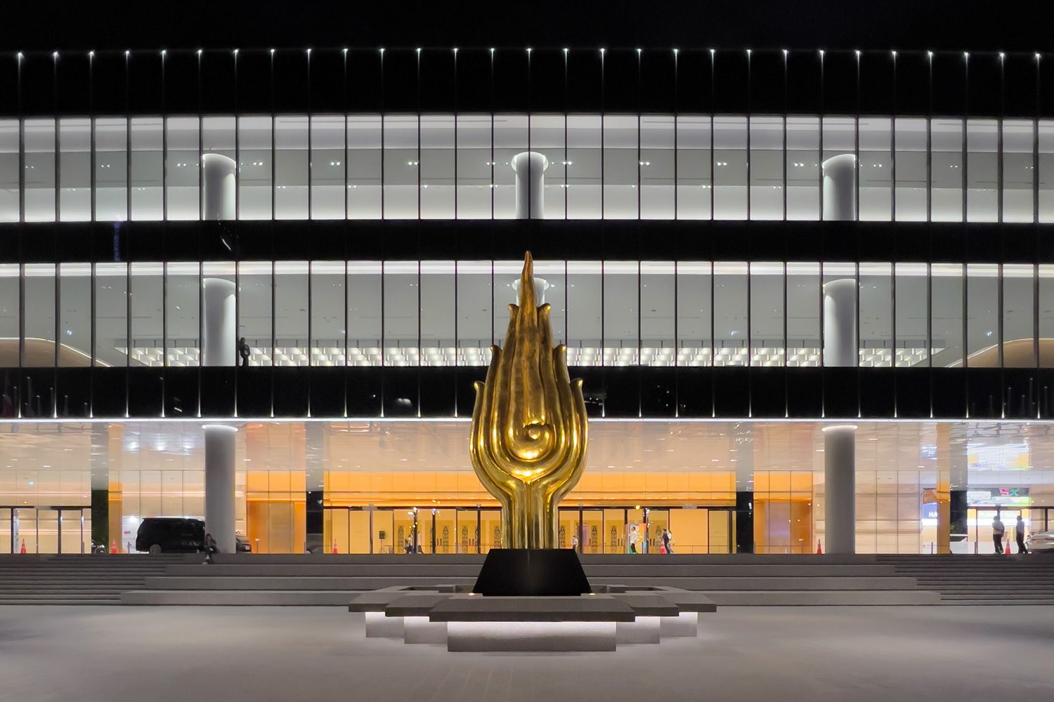
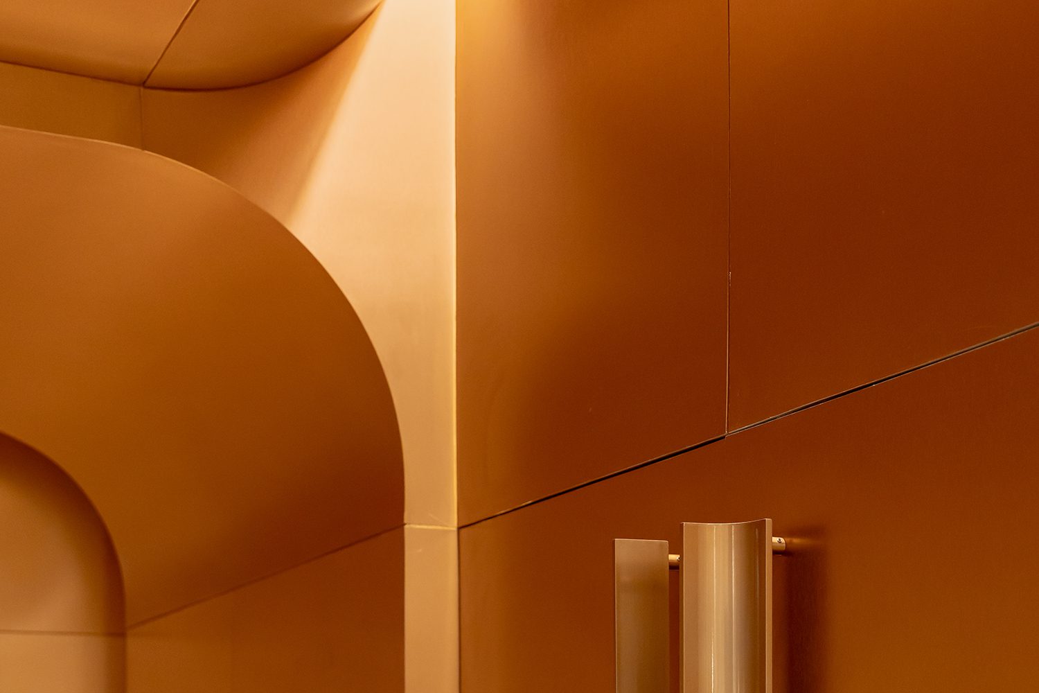
When Arisara urged us to lower our gaze, we were met with the door panels adorned with the exquisite wishing tree pattern that had been removed from the old structure. The one-of-a-kind component coexists in glorious majesty with the arch above the main entrance, which is encased in laminate with a dazzling copper finish. The entrance serves as a stunning backdrop for the otherworldly artworks erected on the building’s exterior. This is yet another place where newly created pieces and artistic elements from the old building have been mixed in with the new in such a brilliant way.
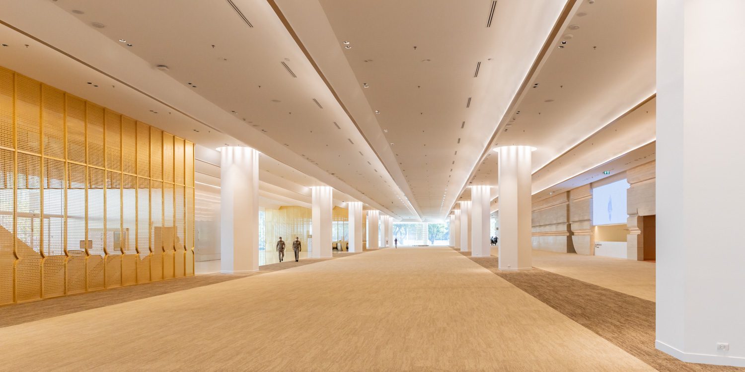
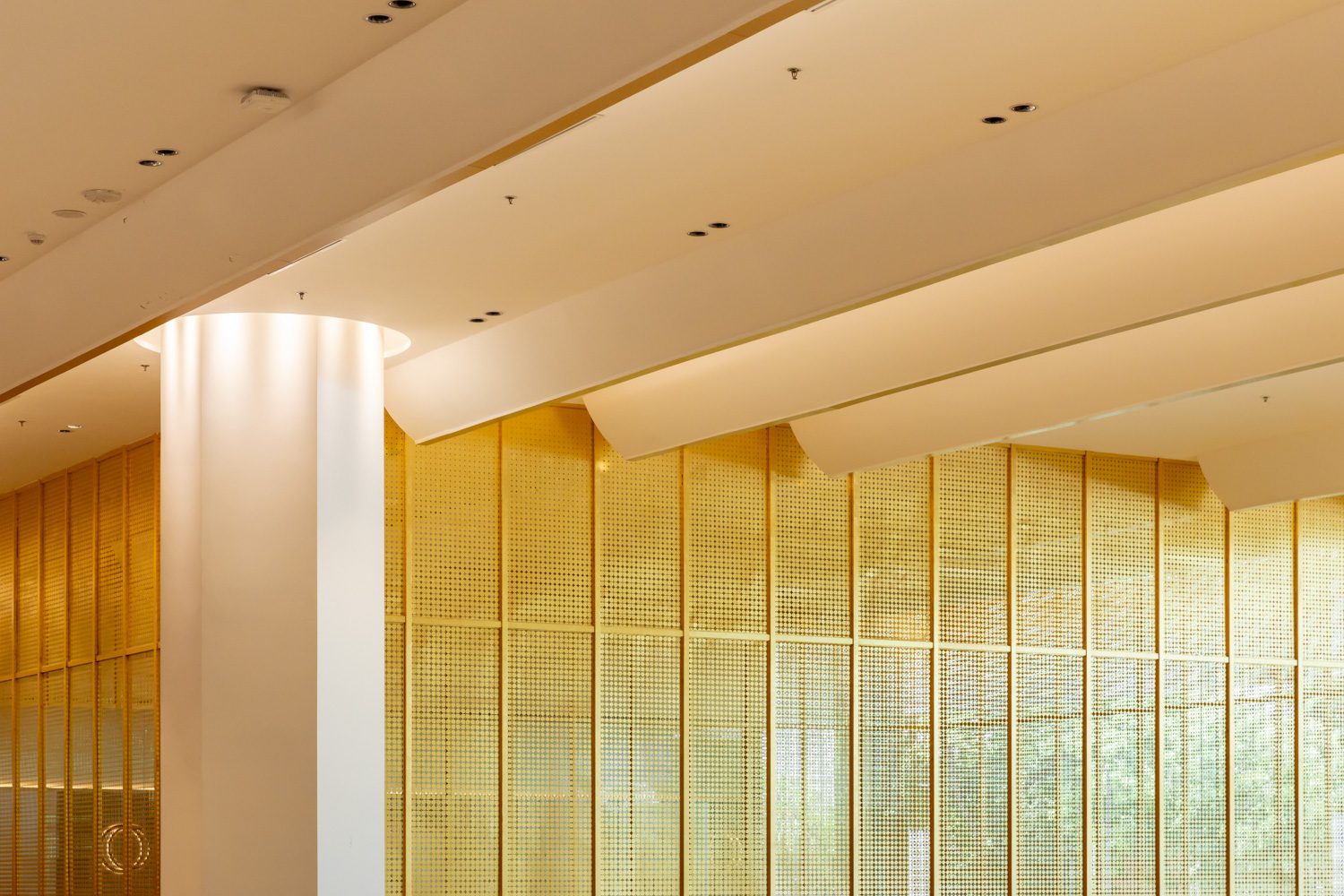
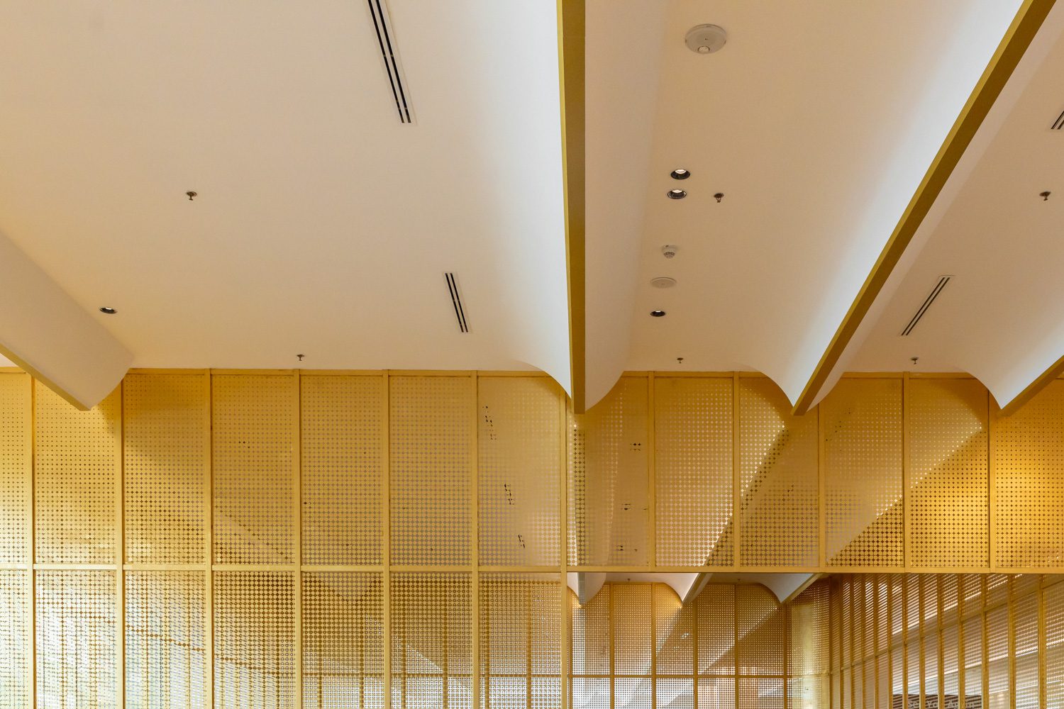
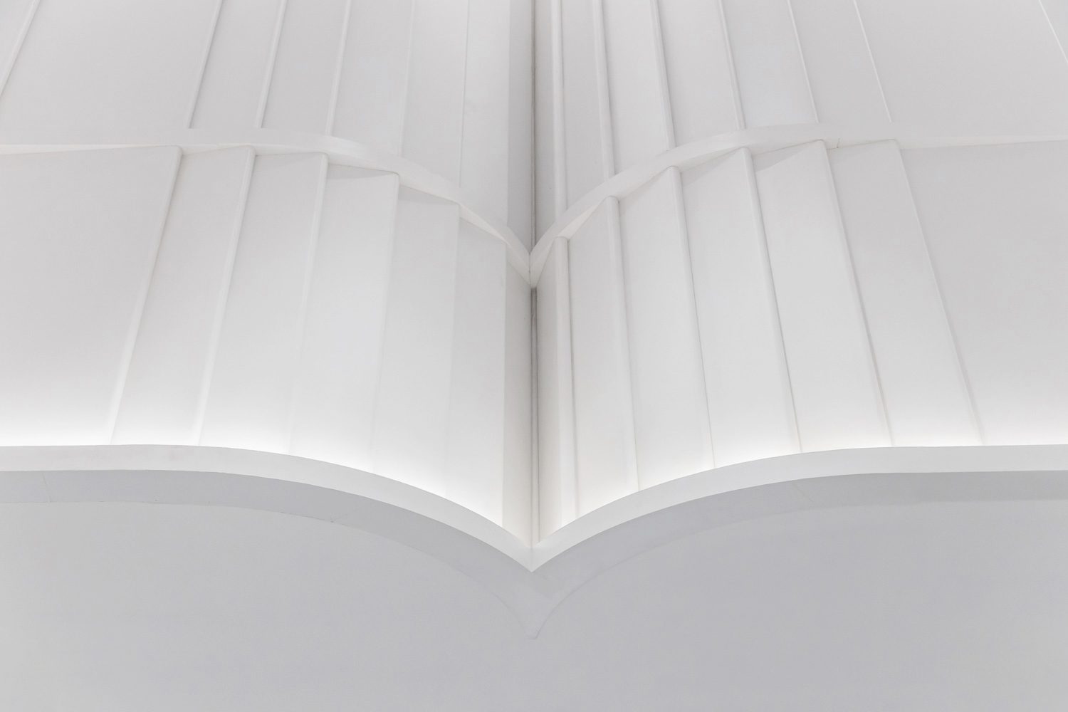
The designer led us to the foyer in front of the convention hall next to Benjakitti Park. The ceiling shows features of creases inspired by a folded loincloth with a gold trimmed edge. The creases also make their way to the hexagonal columns, emphasizing a collective visual language that is already prominent. The crease details appear to make the area more open and lighter, and share some similarities with the recessed corners found in traditional Thai architecture, which make a built structure seem less stiff and monolithic while still providing the necessary structural integrity.
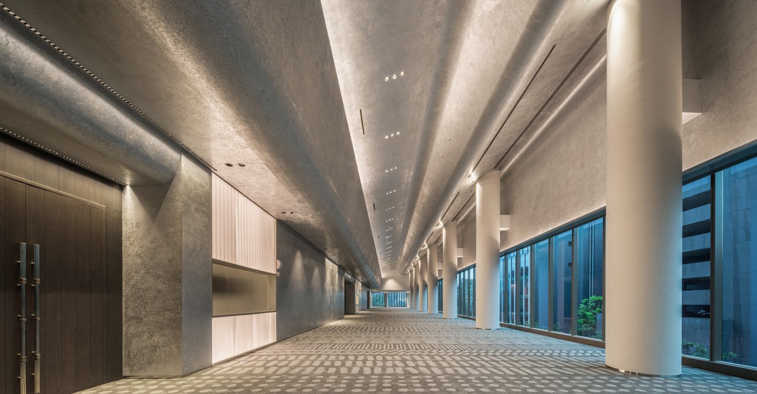
Photo courtesy of QSNCC
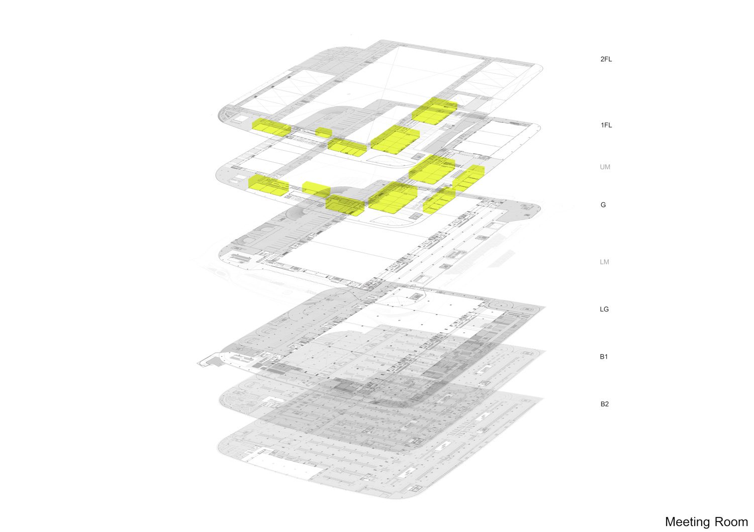
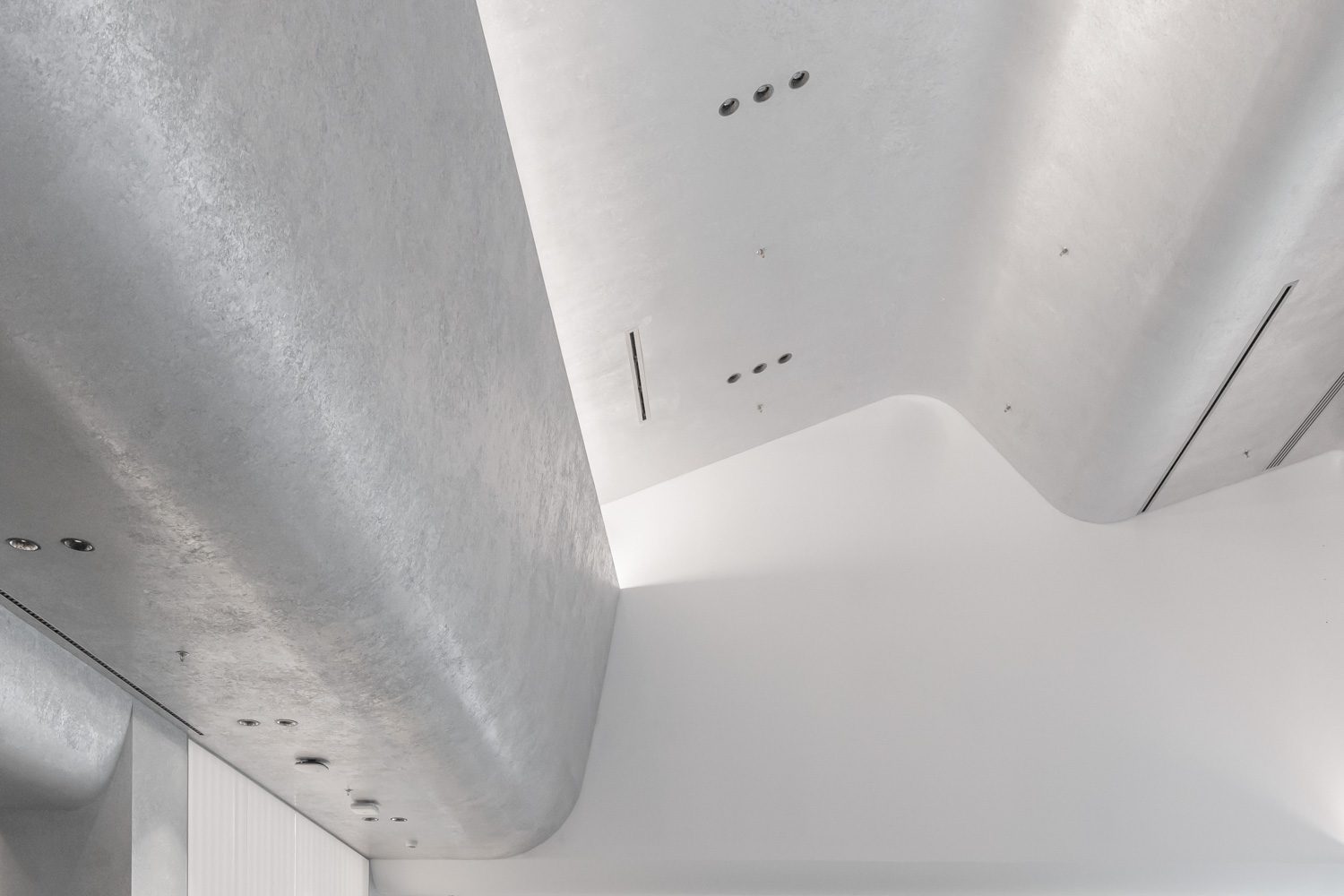
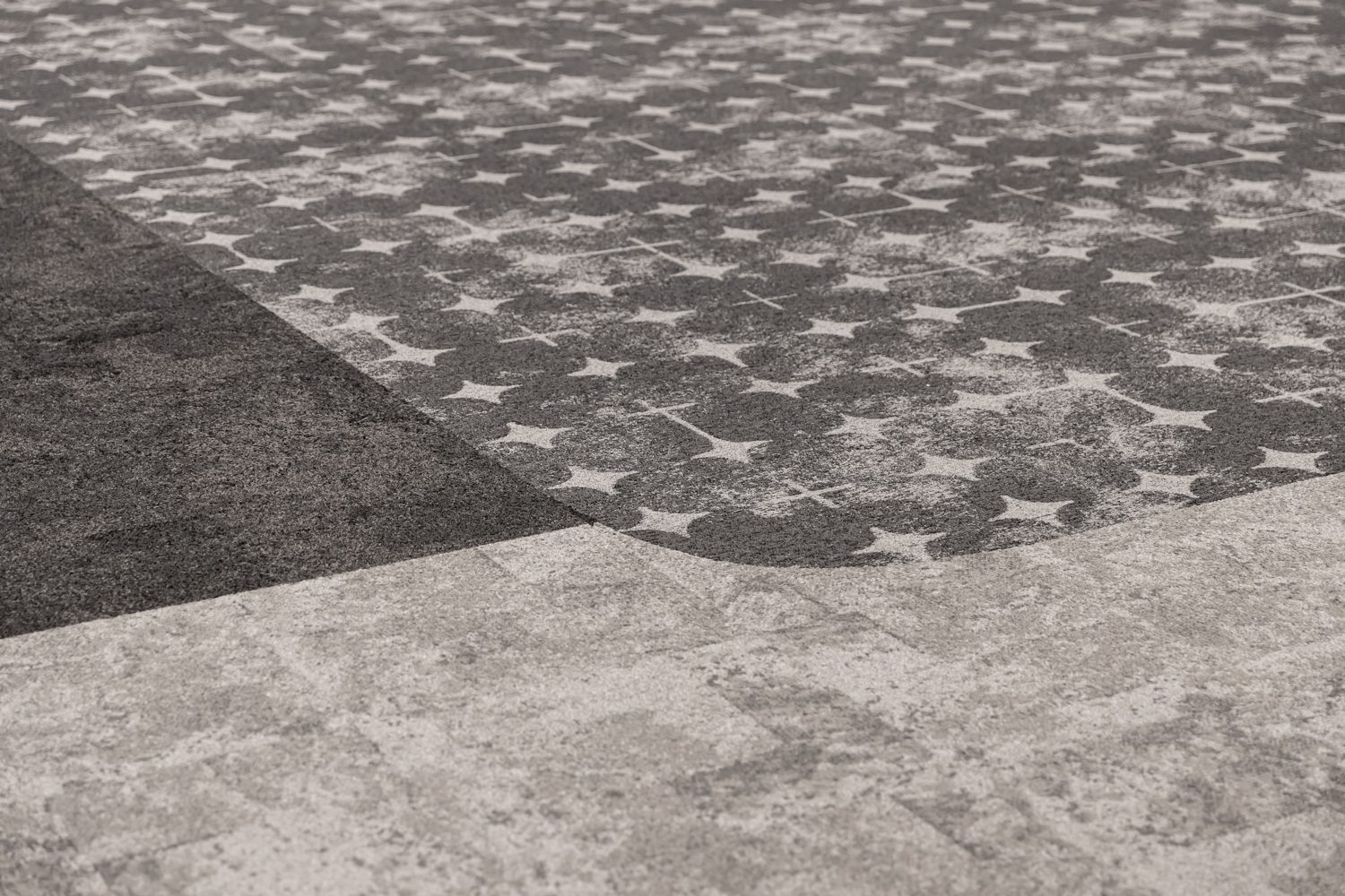
Aside from exhibition halls, the convention center also houses smaller areas on the first and second floors for smaller events and conventions. Arisara walked us to the Ballroom on the first floor, near the north wing, which provides access to the MRT station. The decoration is inspired by the clothing and accessories of the tribal people of northern Thailand, one of the heritages that H.M. Queen Sirikit the Queen Mother has consistently supported as part of her mission to preserve local crafts and textiles. The geometric form of the beads embodied on tribal garments is transformed by the onion team into the pattern of the carpet and carved wooden walls, as well as the shape of the door handles and lamp shades. The design incorporates the traditional silver accessories used by tribal people in the form of dark grey and gold leaves embellishing the fantasy-looking concaved ceiling. “This hall is a little cooler and more fun than other zones,” Arisara remarked.
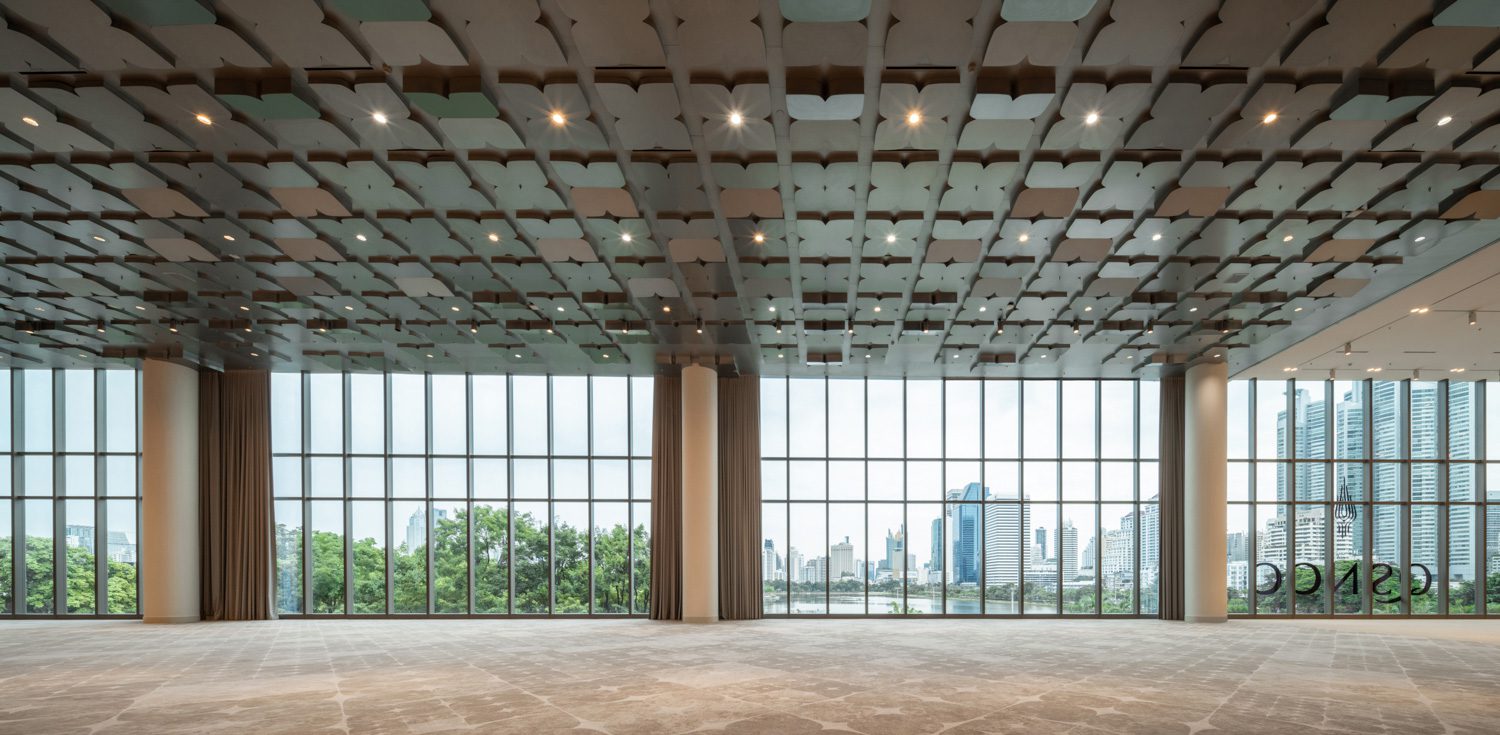
Photo courtesy of QSNCC
The Plenery Hall is positioned in the opposite wing, surrounded by a panoramic view of Benjakitti Park’s verdant landscape. “Because of the view of the pond and garden, this hall is the most special,” Arisara stated. “That is why we designed the hall using inspiration from the Thai Chakri costume for the exquisite, intricate, and elegant elements that perfectly complement the space’s characteristics.”
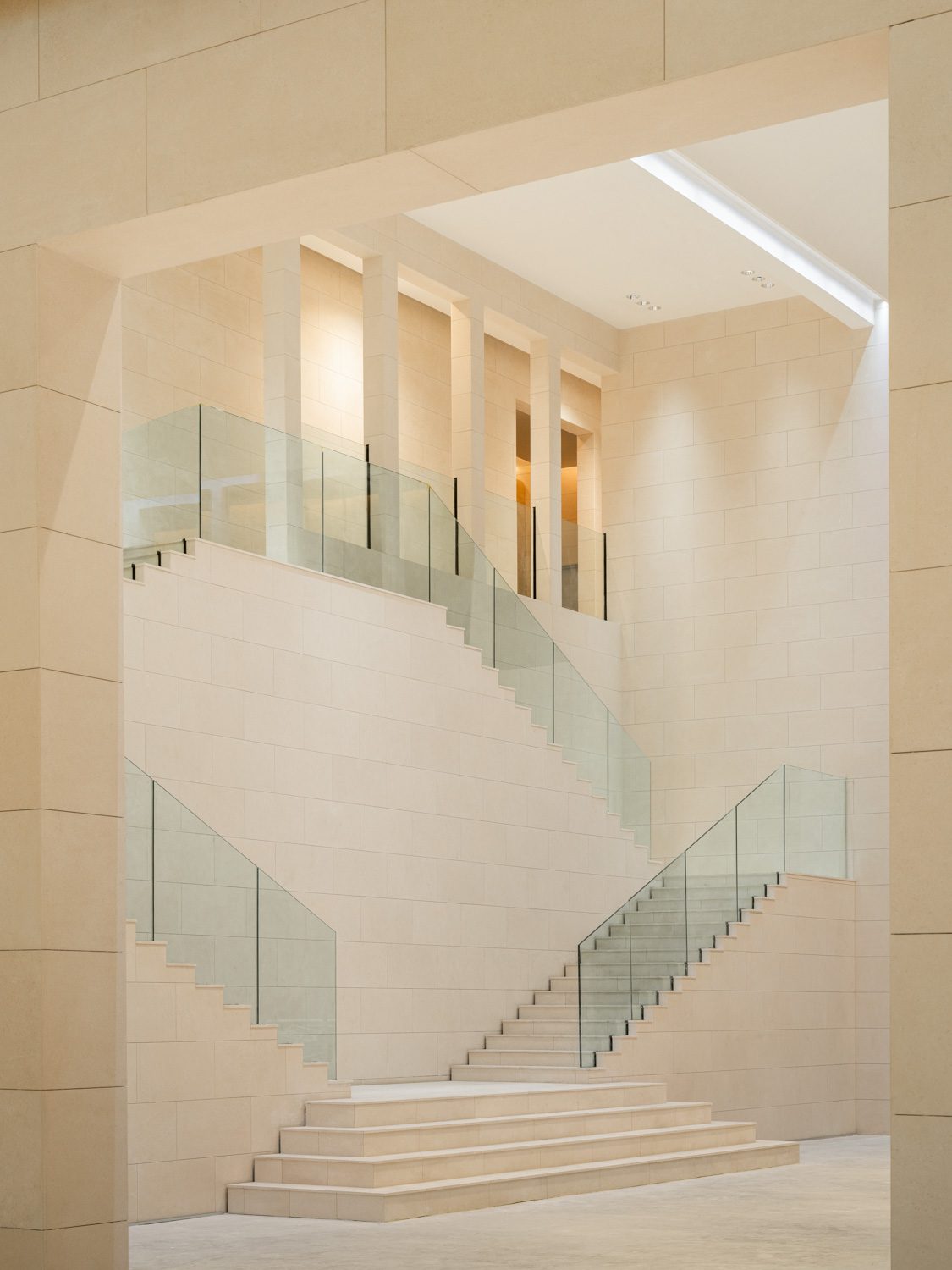
Photo courtesy of QSNCC
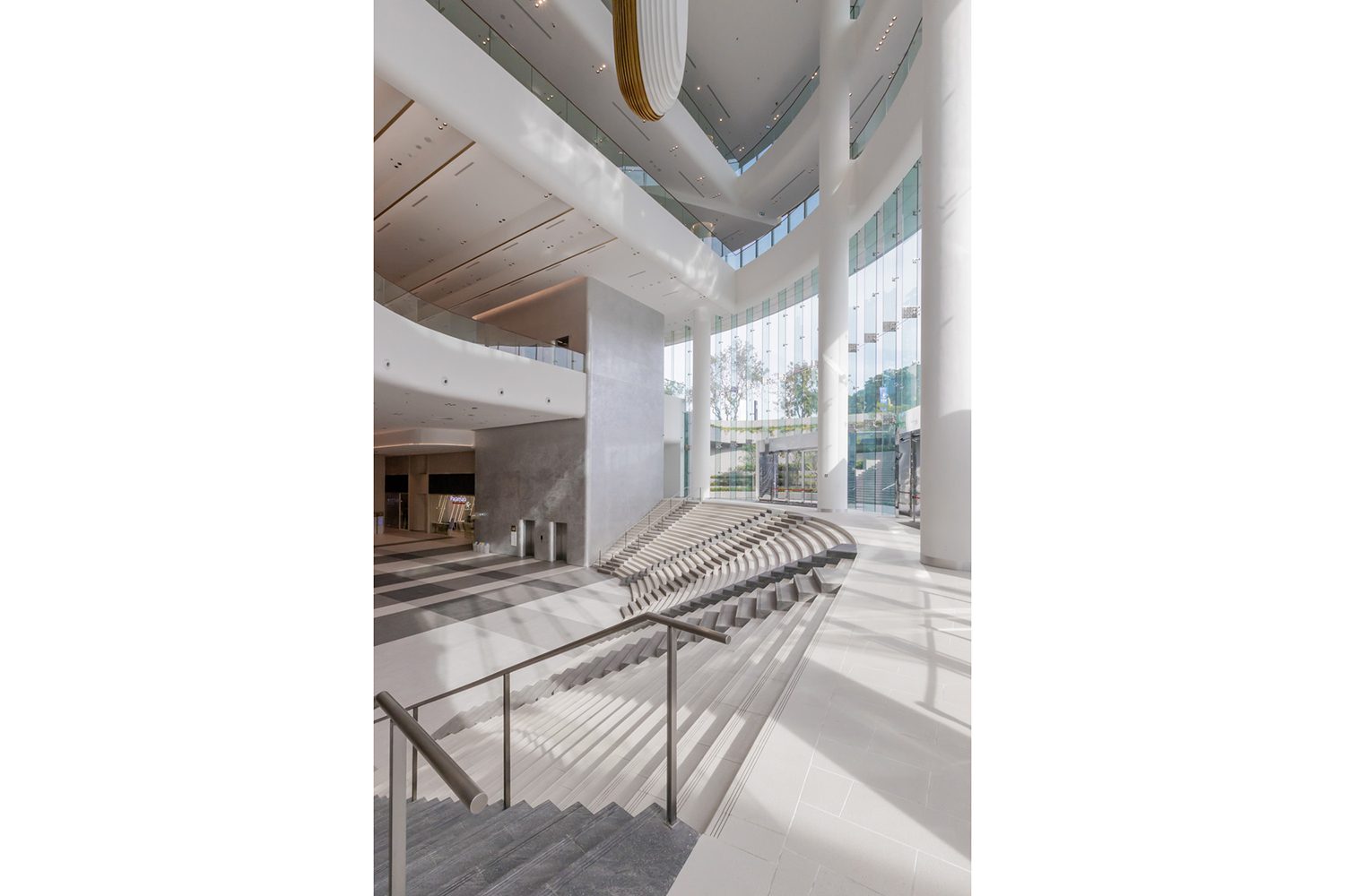
Before entering the hall, one is met with the pre-function area, where sandstone, with its lovely soft color, takes center stage for the decoration. The stairwell, on the other hand, steals the show, having been dubbed the Nopnapa steps by Netizens due to parallels with the stairway in an iconic scene from a popular Thai soap opera drama.
“We never planned for the stairwell to serve as a reminder of the scene,” Arisara laughed. “The area was planned to be merely a one-story high entrance hall, but we thought it was too bland, so we proposed making it a double space.” The stairwell was added because it can serve several purposes. It might be the spot when a bride and groom walk down and meet. The stair has distinct ends because it is the most space-efficient design.”
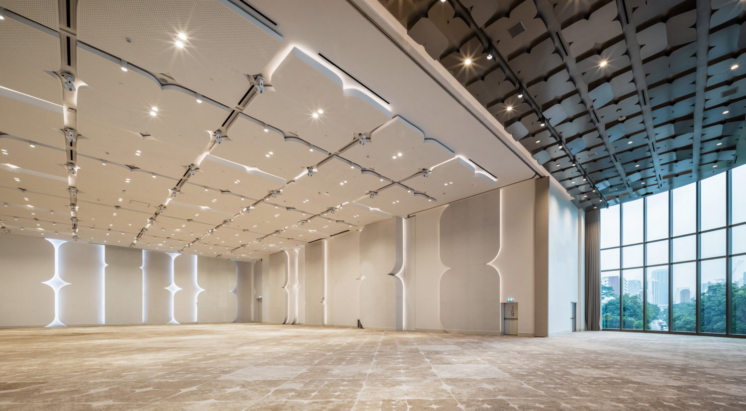
Photo courtesy of QSNCC
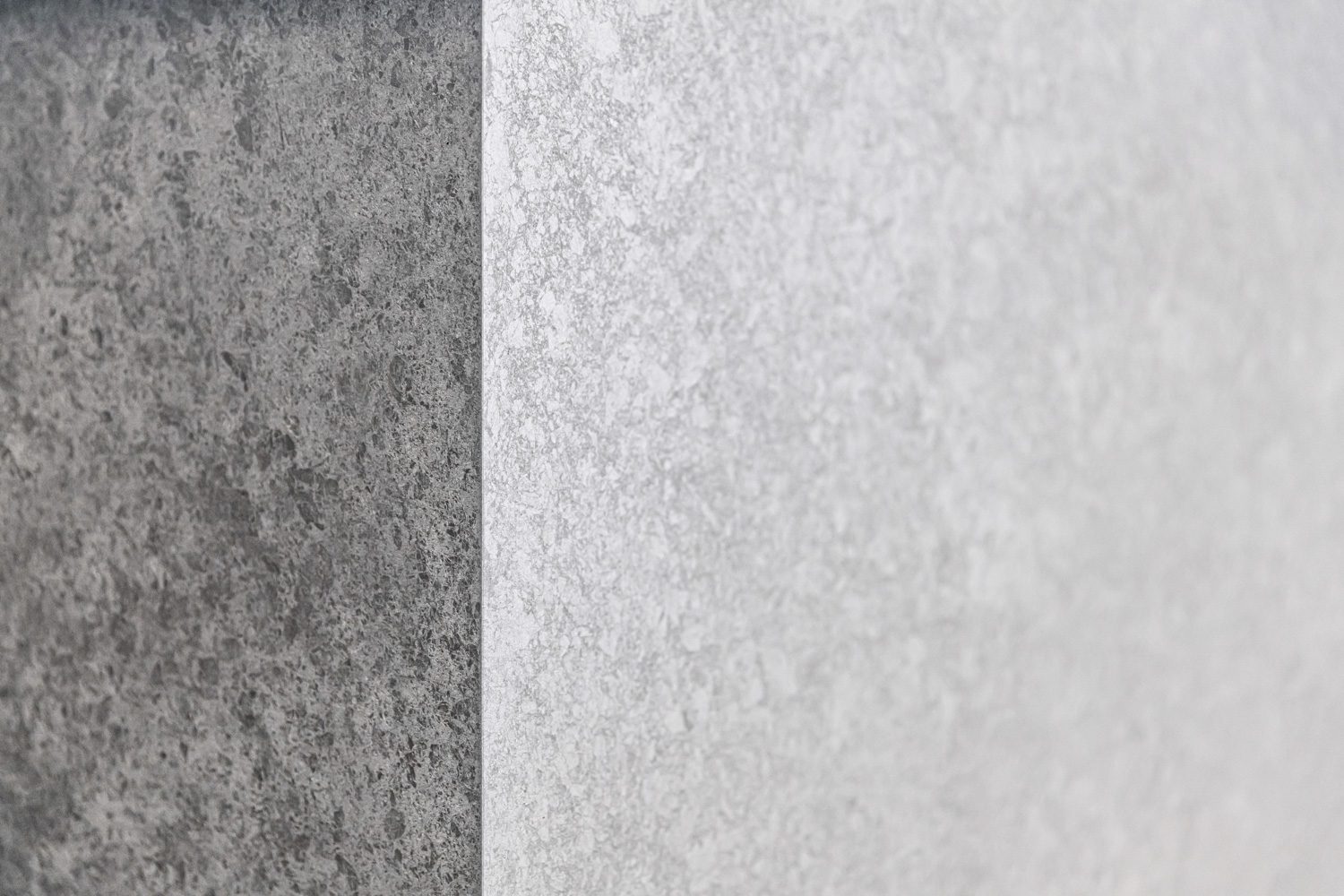
As we entered the hall, we came across a spacious chamber. One of the walls can also be removed to create a larger space and completely appreciate the view of Benjakitti Park. Thai Chakri clothing features were converted into a simplified form of traditional Thai patterns that found their way into the carpet, walls, and ceiling. Arisara compares the patterned-filled area to a complex weaving pattern, where minute details added together to create a stunning visual. The silvery laminate contains the design with the detail of slightly folded wings, creating a shimmering effect similar to when the textile pattern catches the light.
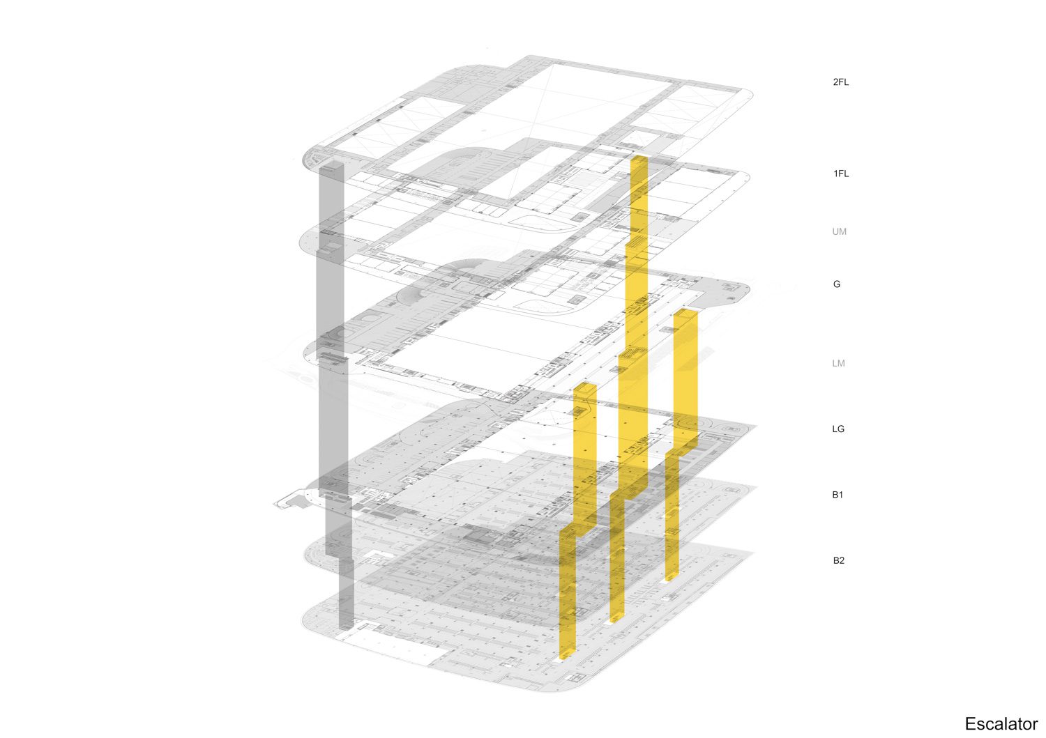
After walking through practically all of the key zones, Arisara mentions one of her favorite aspects of the design, the ‘escalators.’
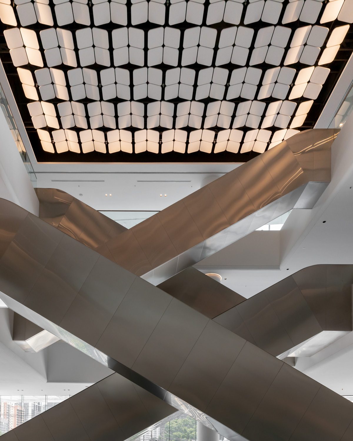
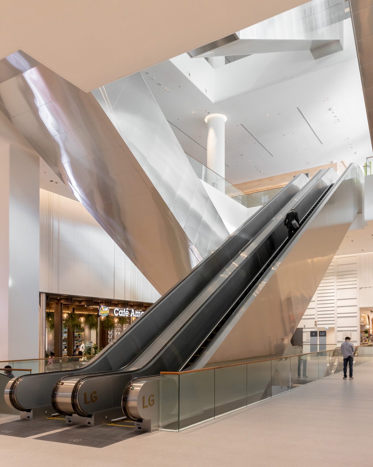
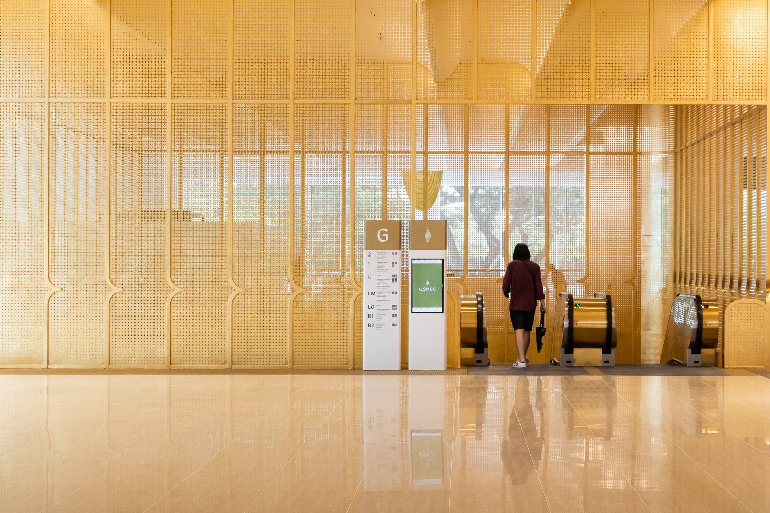
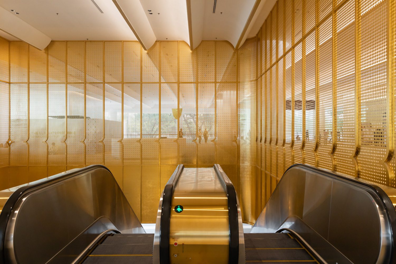
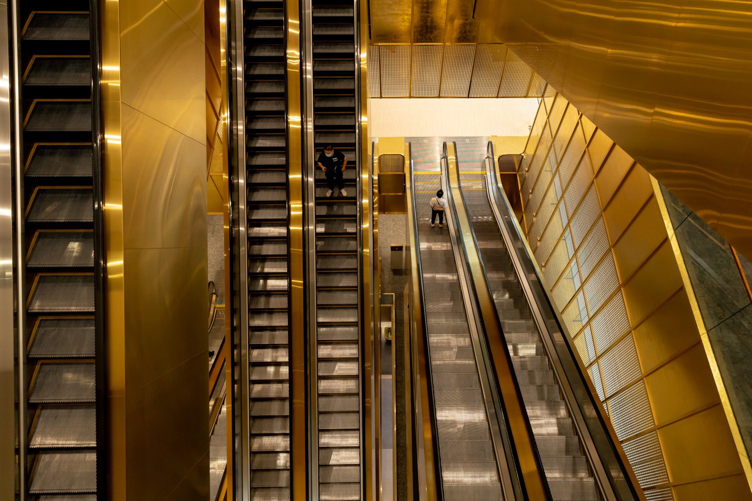
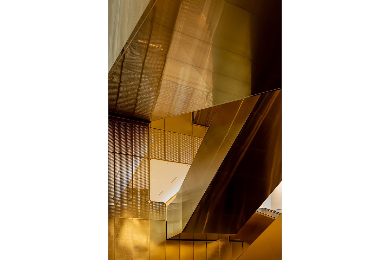
“The escalators in the Benjakitti Park and MRT Station wings have distinct colors, gold and silver, respectively. We utilized different colors to keep people from becoming lost or confused about where they are in the center,” Arisara explains.
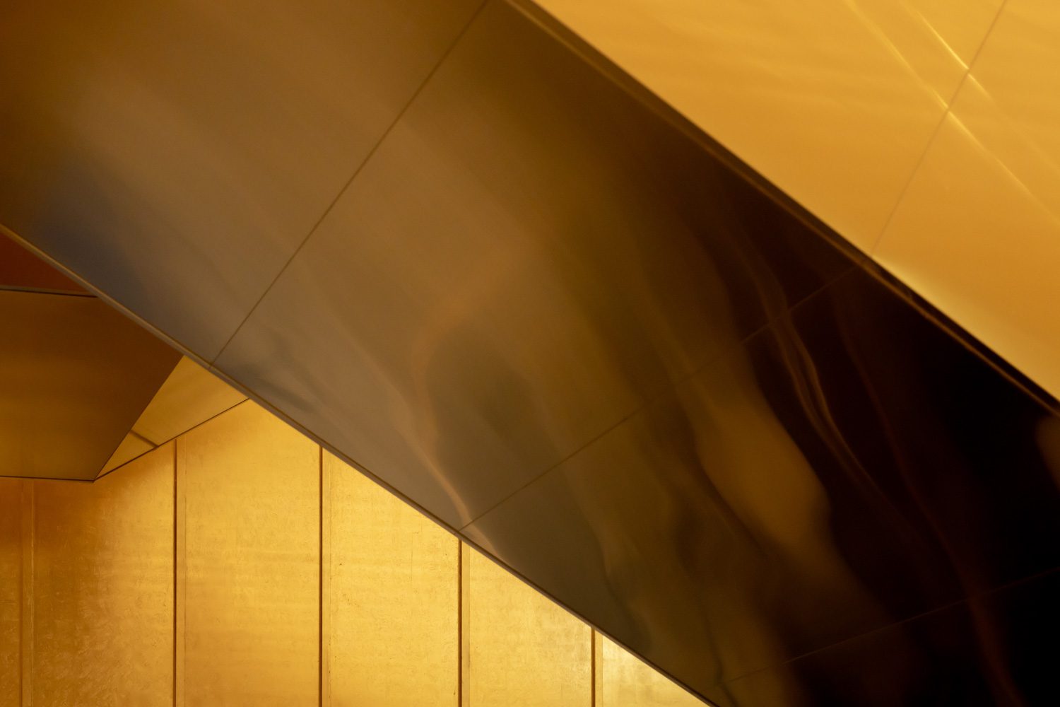
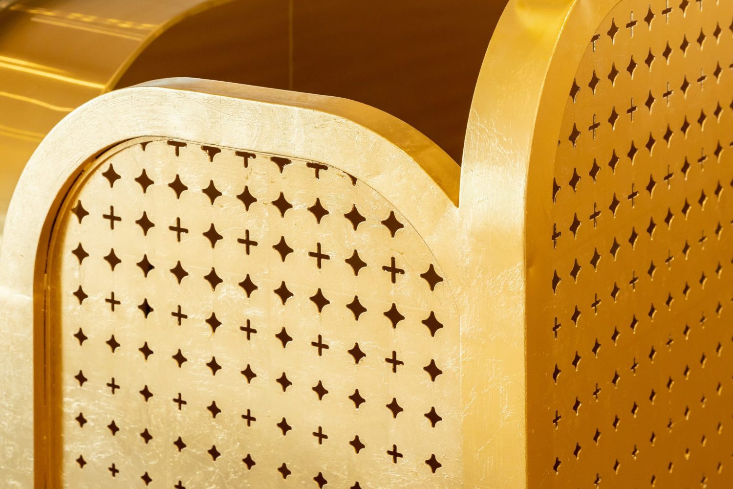
The escalators also feature some intriguing design elements. The steel mesh covered with bright gold leaves encases the escalator at the Benjakitti Park wing. Behind the mesh, a simplified traditional Thai pattern appears in various sizes ranging from small to large. Even from a distance, the gold frame clearly indicates the location of the escalator, allowing visitors to quickly locate it.
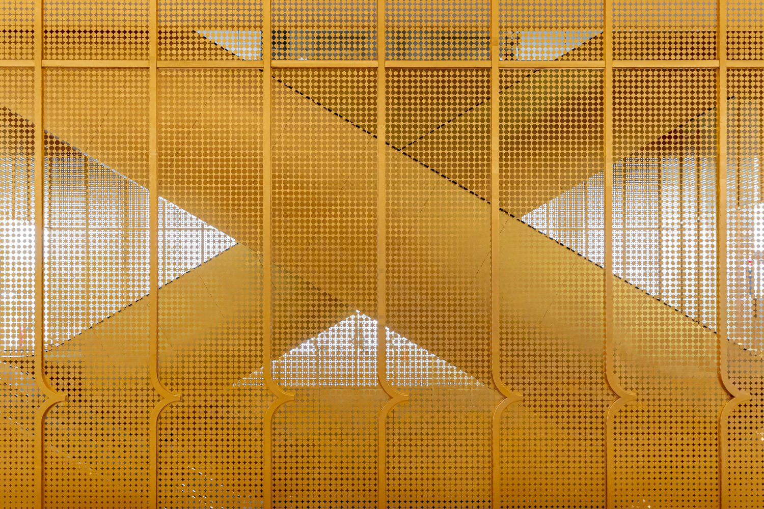
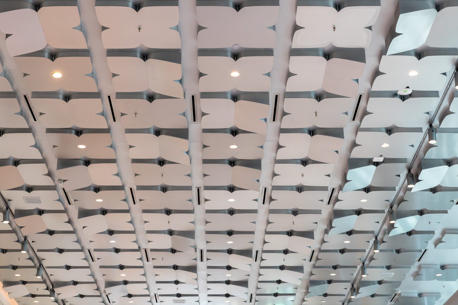
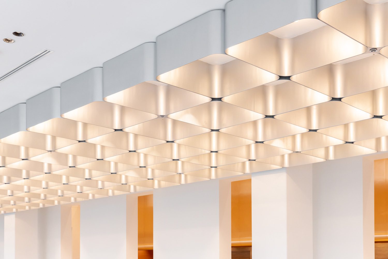
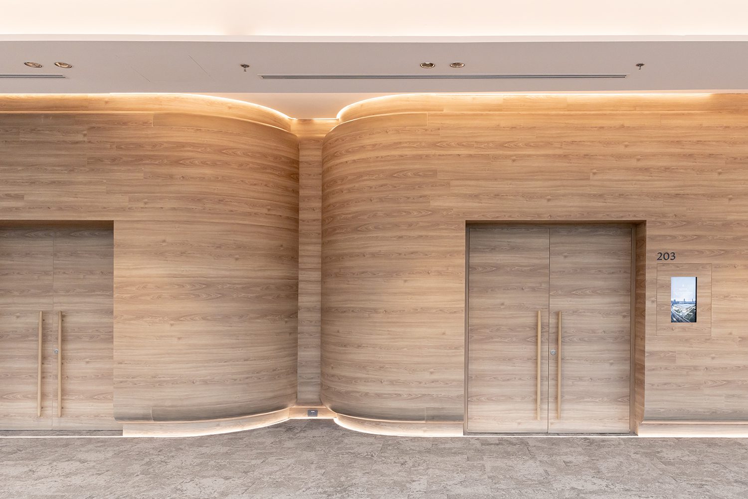
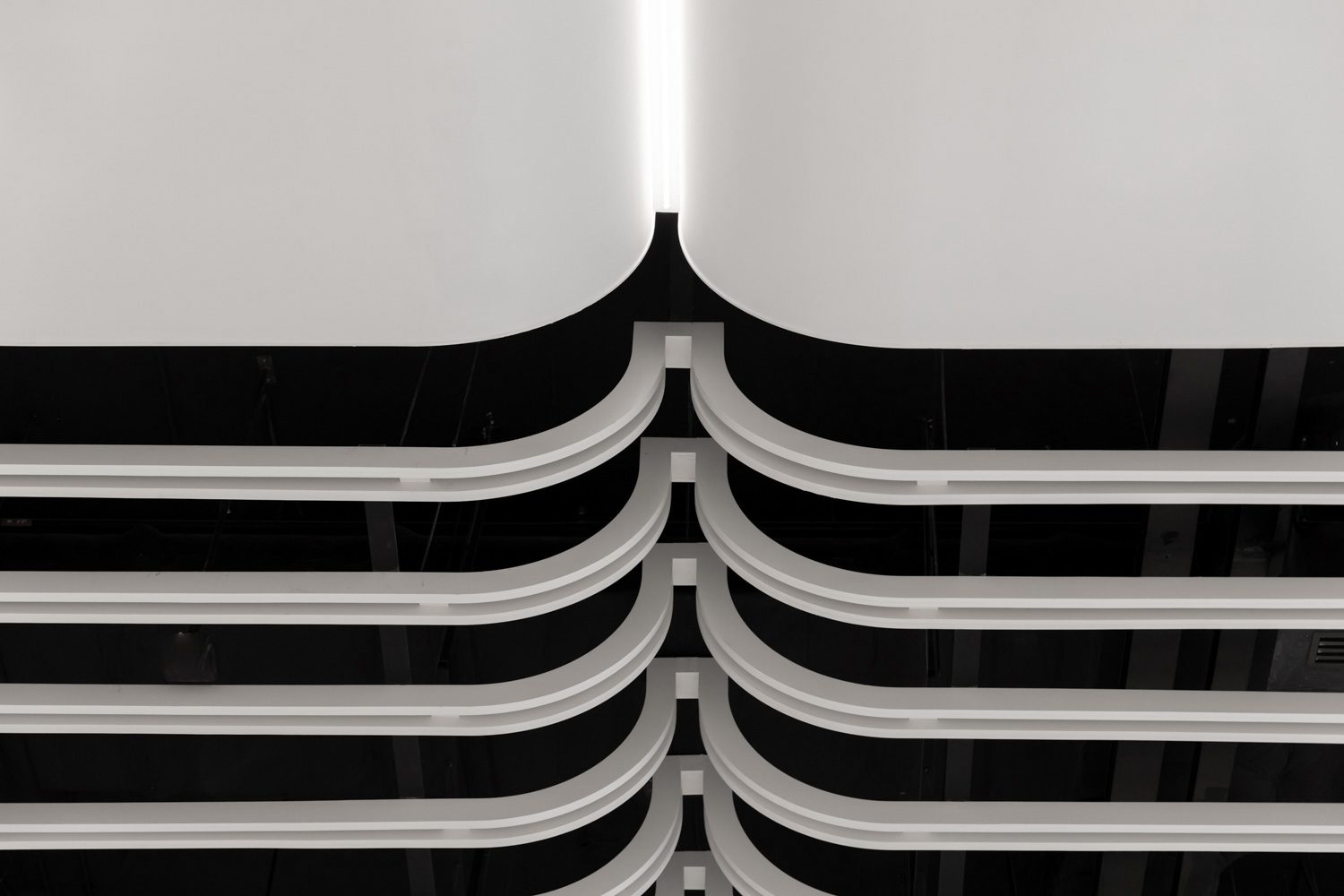
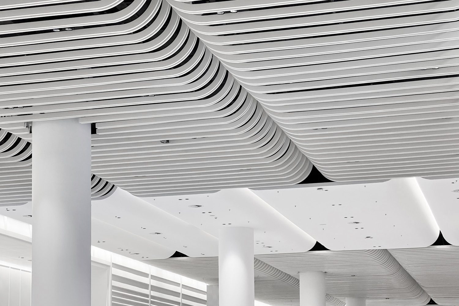
The traditional Thai patterns can be found throughout the walkway, from the Plenary Hall to the escalator encasement, to other components such as the pattern of the tiles at the lounge in front of the conference hall on the first floor. Traditional Thai patterns, according to Arisara, were simplified into various shapes and forms, such as the curved lines on the escalator case or the detail of the pleated ceiling of the LG level, which is also reconciled from traditional Thai patterns. The curvature and smoothness of the frame of the walls of the conference rooms on the first and second floors are the consequence of these patterns being streamlined and incorporated into the plan and section planes. “The employment of Thai motifs in different zones gives each zone its own unique identity, but everything is still a part of the same aesthetic union,” Arisara reasoned.
We completed the walkthrough and parted ways at the gold escalator. We were exhausted, nearly panting, from the distance of the walk we had just completed. But Arisara was still full of energy, stating she was going to check out the event that was going on at the time of our visit. Before saying goodbye, we asked her how her approach to design was different for this project compared to other works onion had done. The reason behind this question stems from the fact that this project is massive and will be used by such broad groups of individuals, in comparison to their previous endeavors, which were relatively smaller in scope and targeted certain groups of clientele.
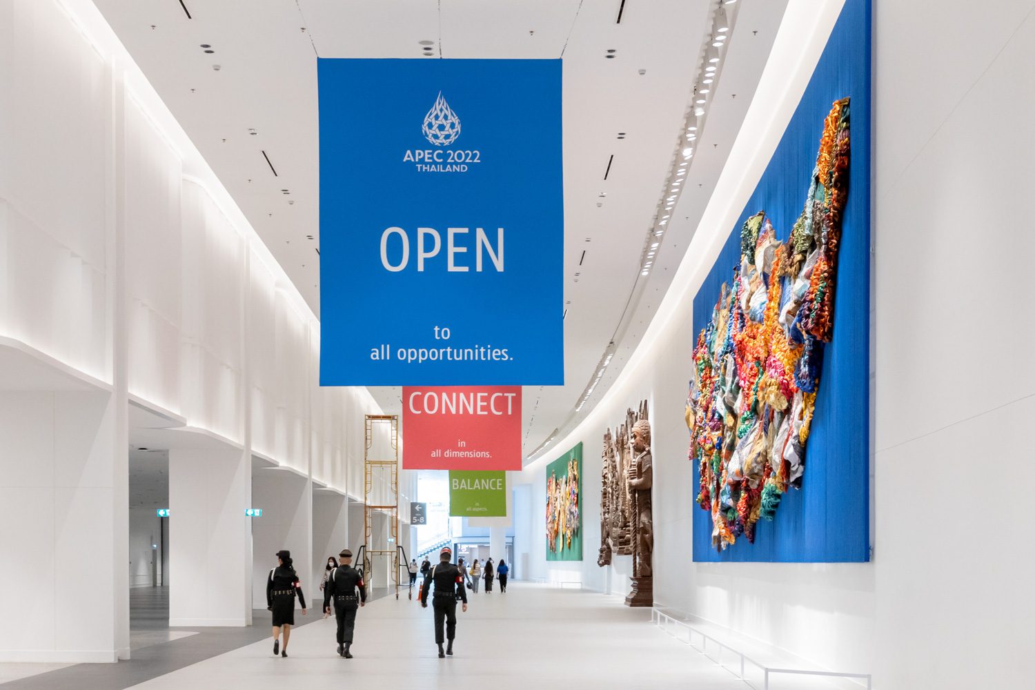
“With our past works, we may not have had to worry as much about whether people would appreciate our designs or not because they targeted consumers or audiences who already liked our design identity. However, the diversity of people who will see and use the center is so enormous with this project because they come from various backgrounds and have different perspectives. We had to adopt a new approach in terms of how we envision and develop the design because we have to consider such broad groups of users,” Arisara explained. The use of neutral colors, such as the black and white of the LG floor, or the travertine stone walls at the G floor, with their curved feature and light brown tone, provide the perfect backdrop for exhibitors to present their booths and products without fear of being overshadowed by excessive decoration of vivid colors. Not only that, but the design creates a visually appealing environment that all visitors will easily like.
While this is onion’s first large-scale public project, their design demonstrates the studio’s ability to create something that will impress and be appreciated by the general public. Their interpretation of Thai-ness is unique, modern, and unquestionably fresh. While the work isn’t perfect, with users complaining about insufficient resting areas forcing them to sit on the floor, especially on days of big events with a large number of visitors, the design is regarded as a beautiful and monumental first step for the new Queen Sirikit Convention Center, and the end result is well worth the wait.

