RAD STUDIOS INCORPORATES ‘TIN CANS’ AS A PRIMARY INSPIRATION IN THE DESIGN TO ADDRESS THE LIMITATIONS OF THE LAND AND UNSIGHTLY SURROUNDING ENVIRONMENT WHILE PROVIDING A PLEASANT VISUAL EXPERIENCE FOR THE RESIDENTS
TEXT: KORRAKOT LORDKAM
PHOTO: SOFOGRAPHY
(For Thai, press here)
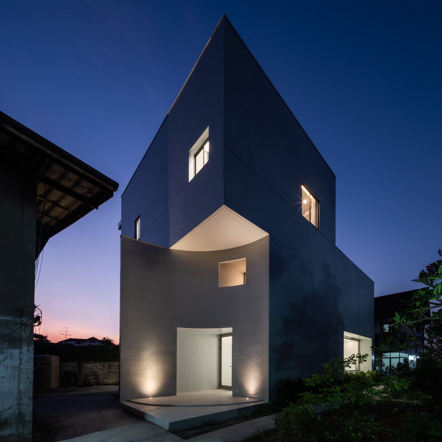
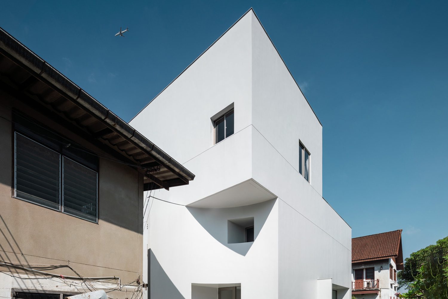
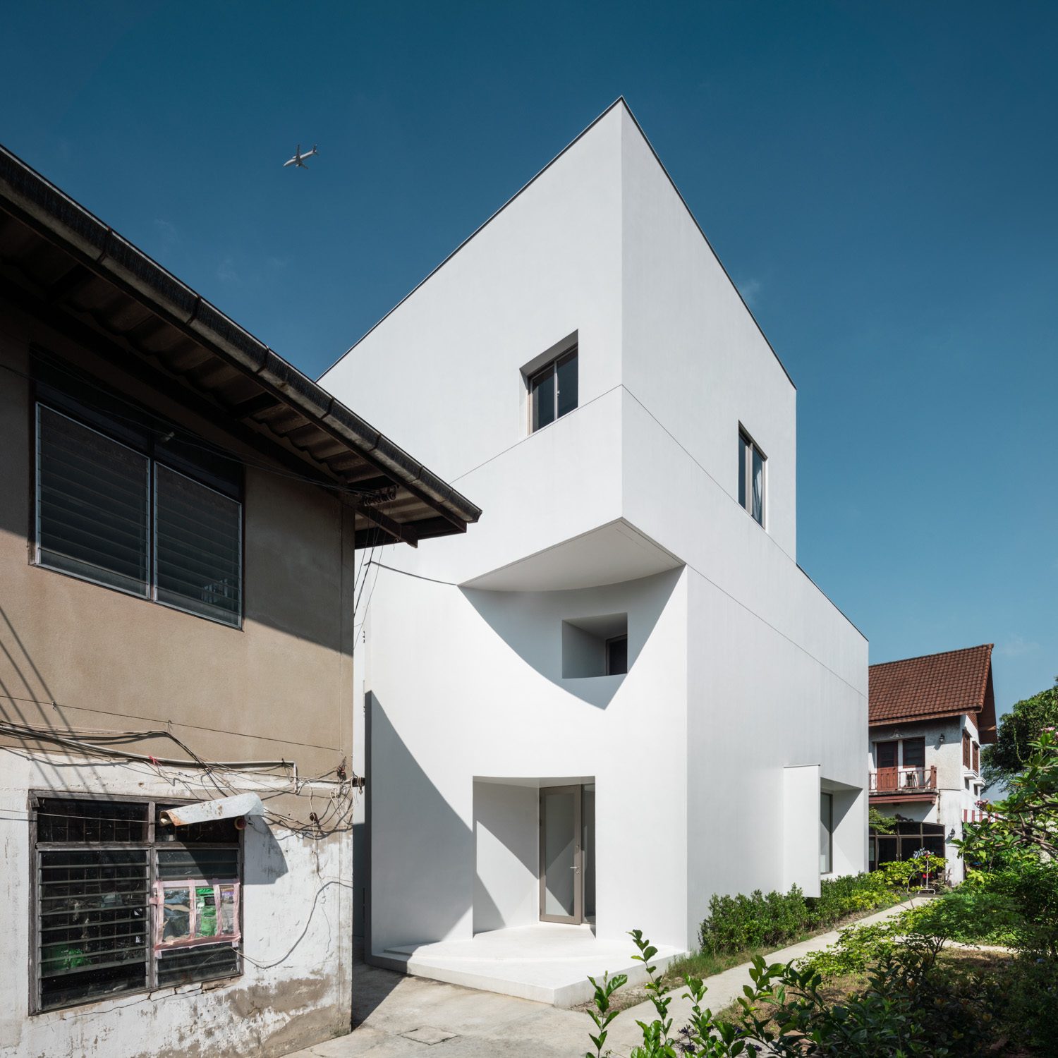
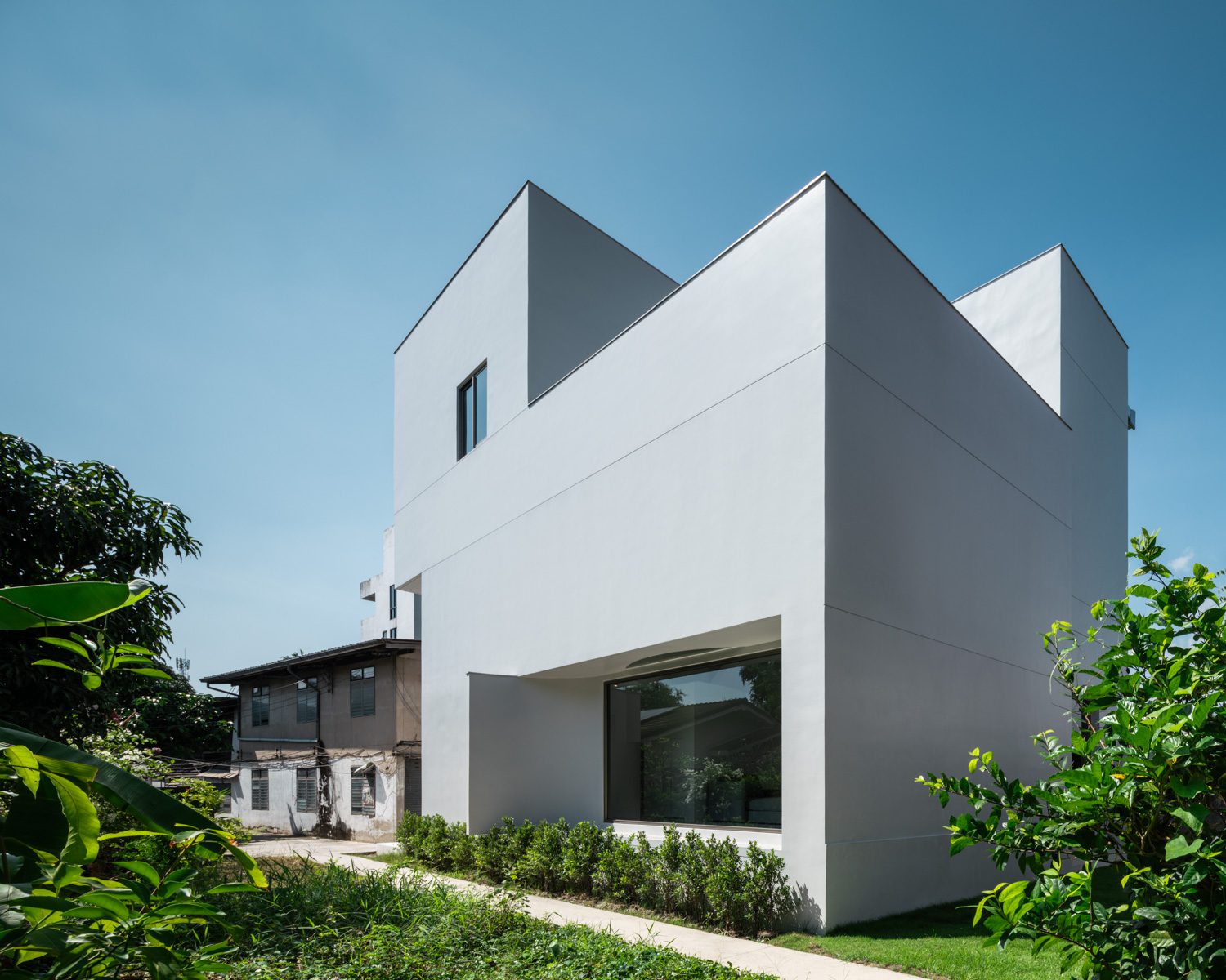
A clean, white house stands out among the complicated web of side streets and alleyways of a residential neighborhood in the Thung Song Hong sub-district of Bangkok’s Lak Si district. On the same large parcel of land is a group of older-looking houses, indicating that the property is a residential complex housing a large family with multigenerational members. Instead of moving away, the owner decided to build a new house with the same perimeter as his family home due to a personal connection he has with this piece of land. The context of such a decision presented several challenges, including the limited space and run-down condition of the surrounding environment because of a lack of maintenance, resulting in stark differences between the old and new structures, making it more difficult to curate a pleasurable living experience.
Tiny Tin House is named after the owner’s nickname and the design concept that Pawan Ritipong, architect of RAD studios, came up with. Pawan, the project’s architect, compares the location and arrival of the new house to a tin can, which he finds to have appealing visuals and functions as a form of container.
“We were looking for a variety of different things to see what could hold a wide range of functions within a relatively small space. One image that came to mind was a tin can used as a food container. When you open a can, the content that is stored inside often turns out to be much larger than we expected when we only see the outside of the can. That piqued my interest, and it became the main inspiration for the project’s design concept because it has so many different elements that can be used and played with in architecture.
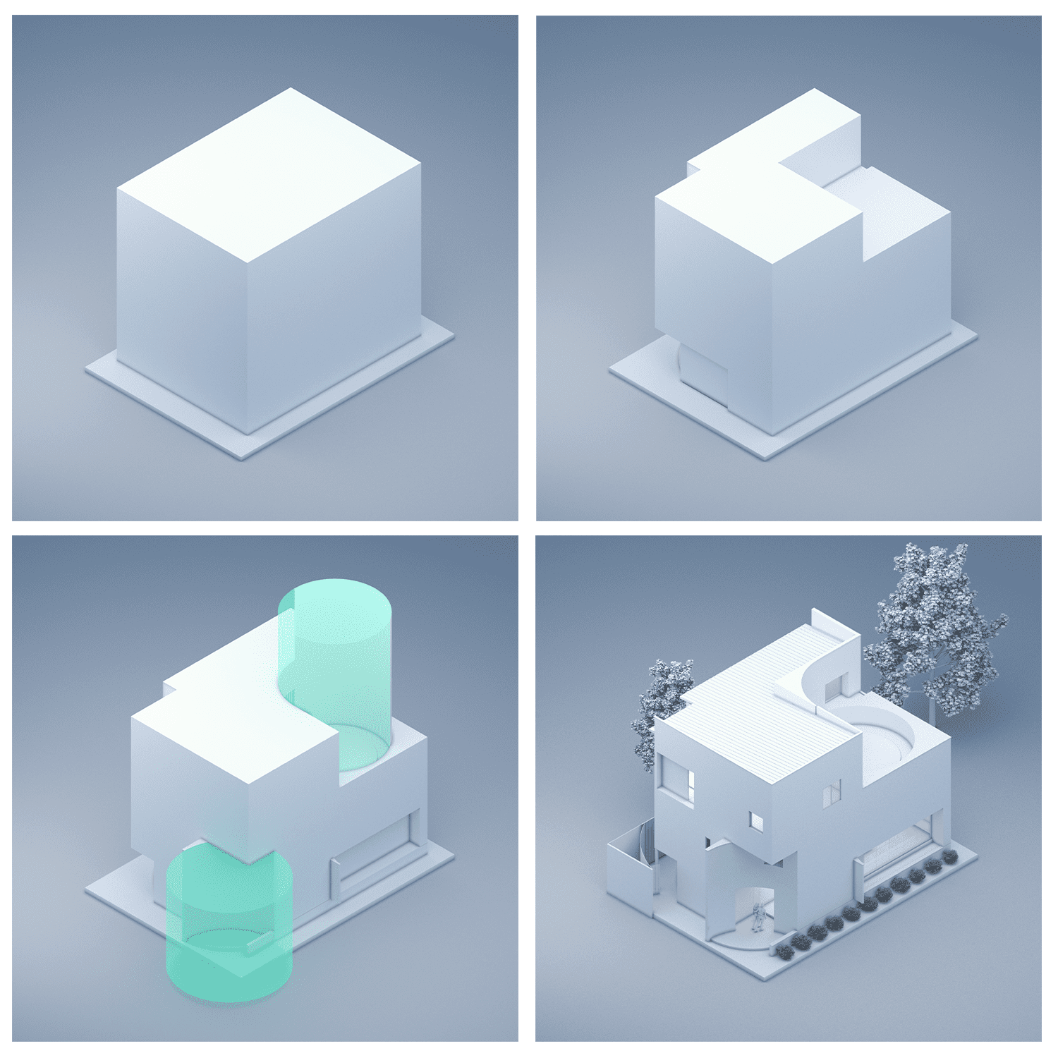


According to Pawan, the small 10×13-meter plot of land became the first challenge of the design as they searched for ways to fit different functional spaces required by the new family into such a confinement while still maintaining the quality equivalent to that of a large house. In this sense, a ‘tin can’ serves as the concept that influences the physical appearance and interior functional program of the house. The physical characteristics of an enclosed ‘can’ are treated as the architectural identity of the house, which also corresponds to how the design deals with the unsightly surrounding environment. However, due to its residential nature, the house must strike a balance between being open to the environment and being enclosed in order to obstruct unpleasant things. As the architect explained, opening up and connecting the living spaces to certain parts of the outside environment while blocking access to the unappealing view for some parts of the house was a major contextual challenge that impacted the overall design.
“From the very small land to the not-so-pleasant-looking environment, the context had a significant impact. But we saw them as challenges to work out and create something decent out of. I would say that these challenges inspired us to consider how we could design a house with a certain level of enclosure while still providing the best possible quality of living, in the same way that a house built on a larger piece of land or in a better location and context would.”
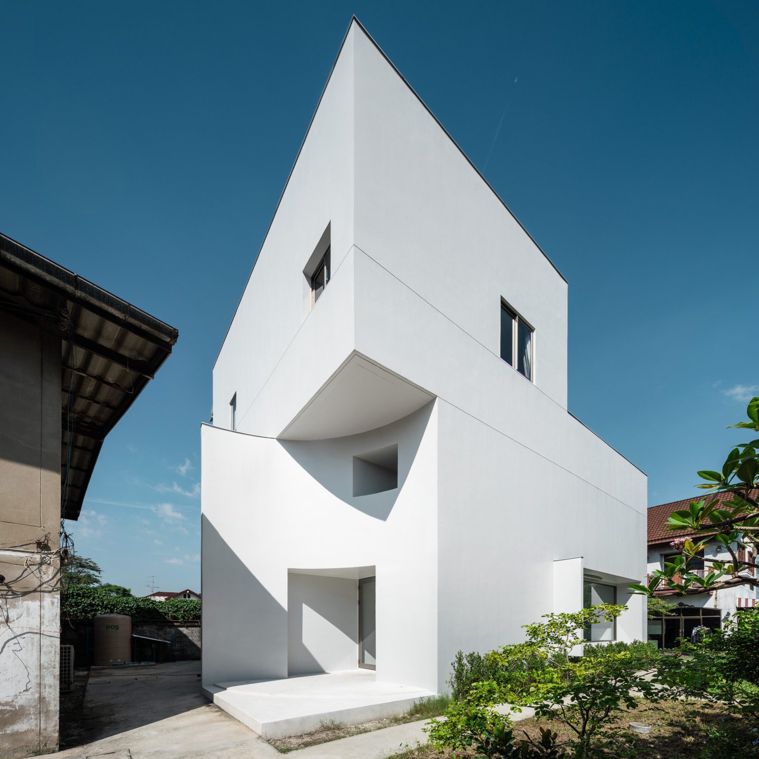
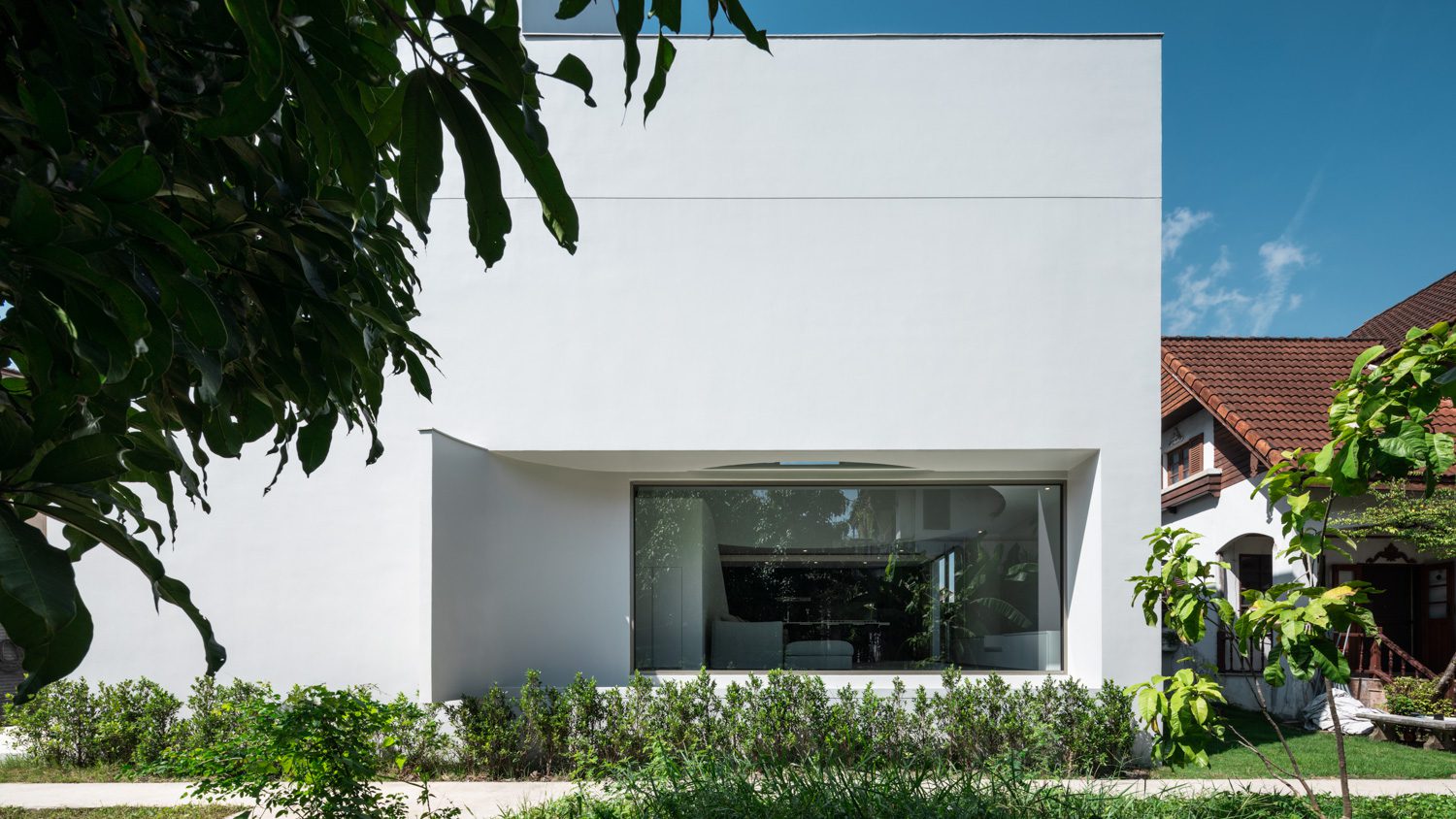
The curved exterior wall of the living area that helps block the unsightly view.
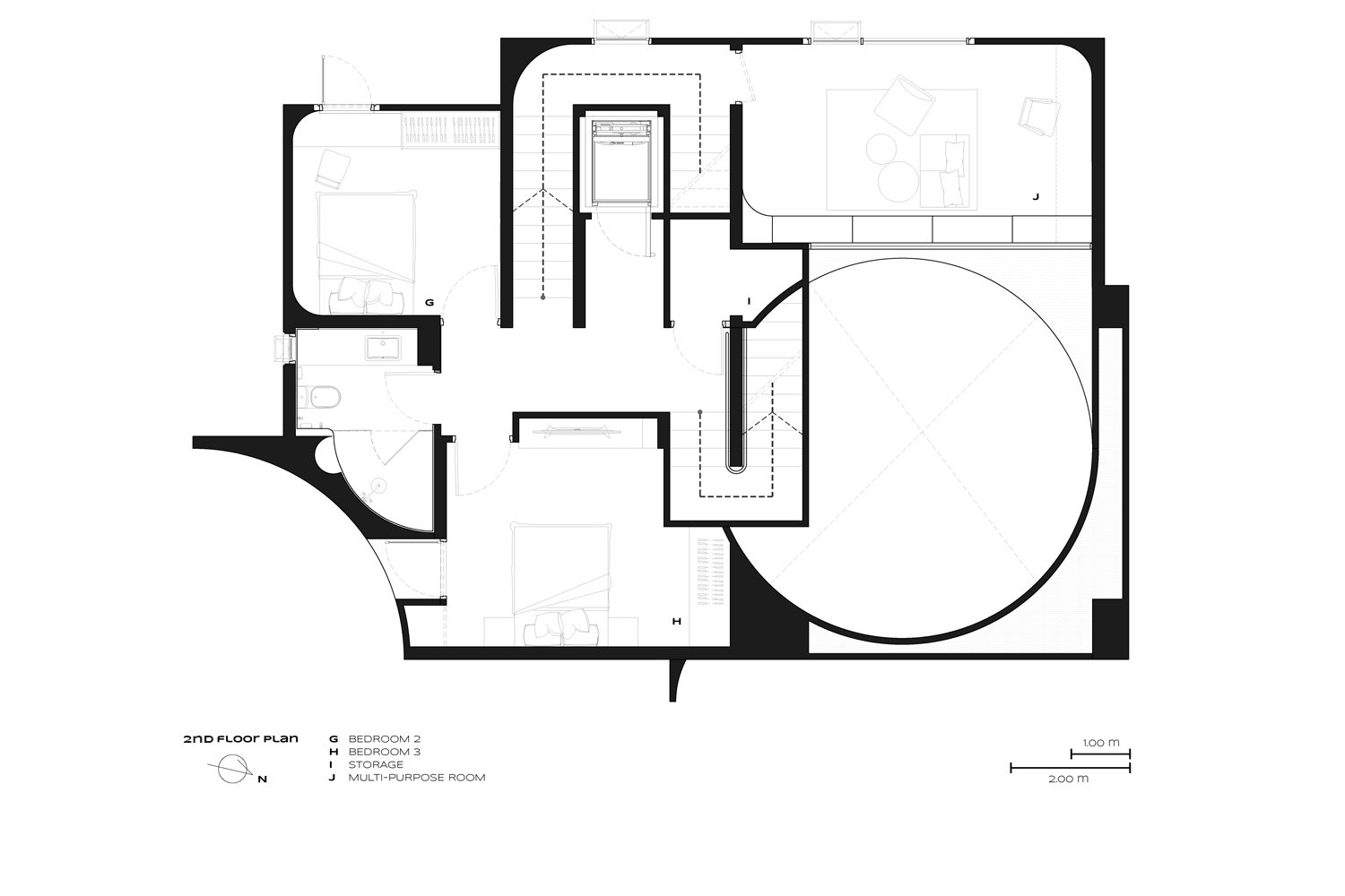
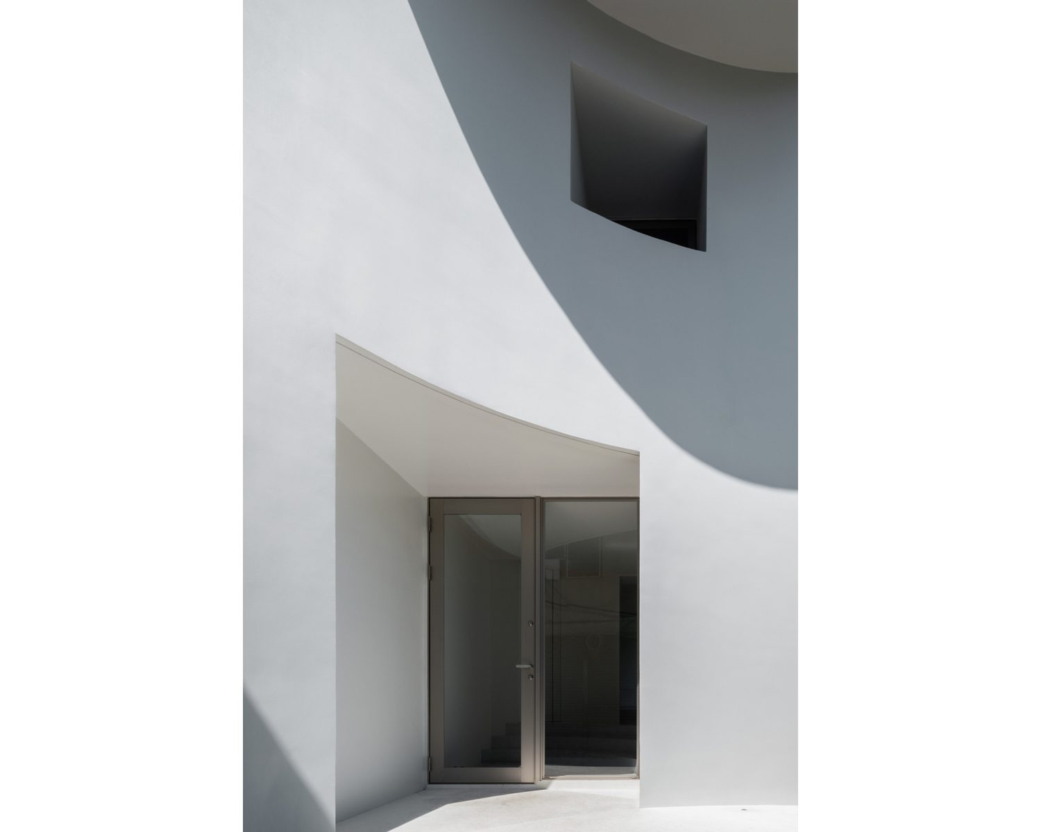
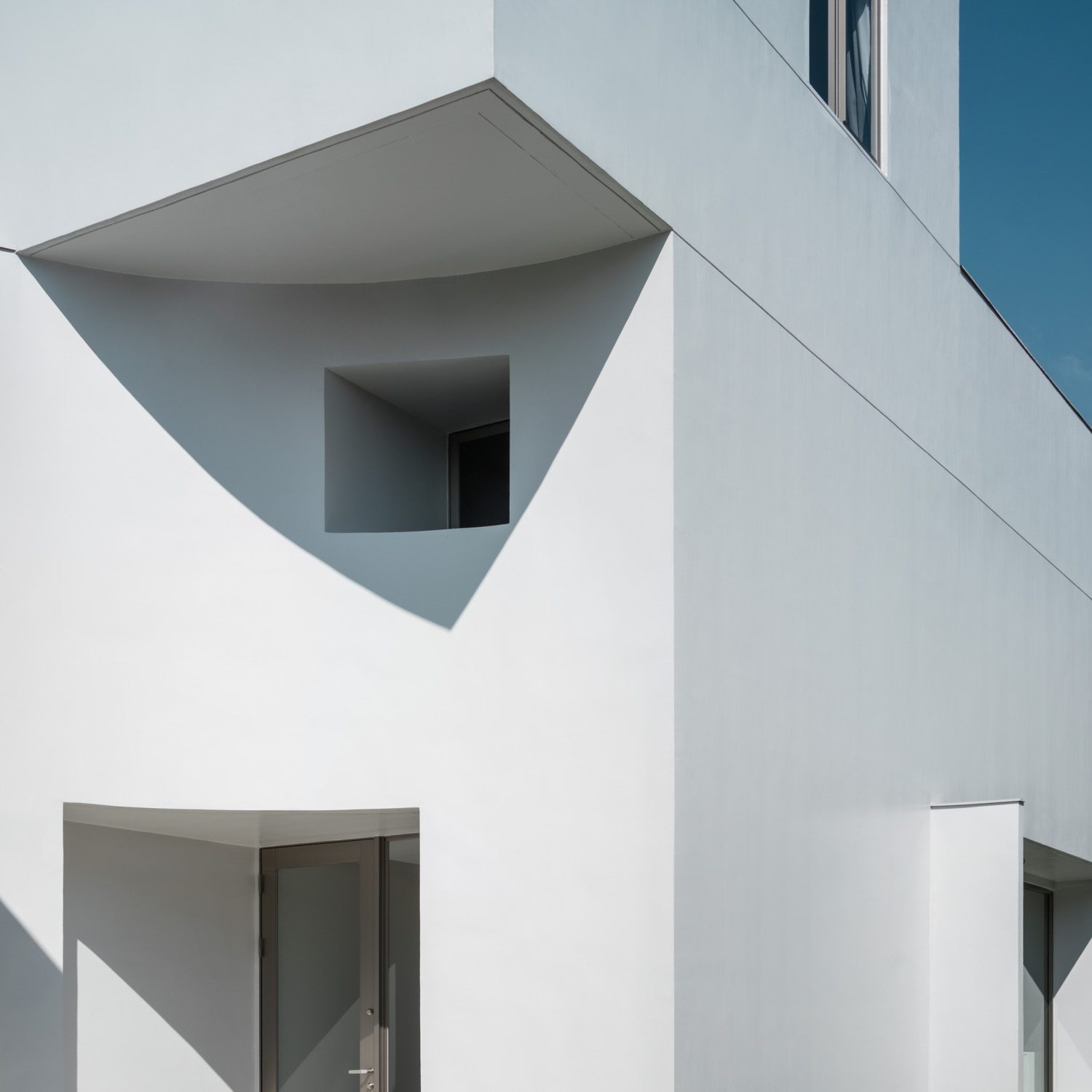
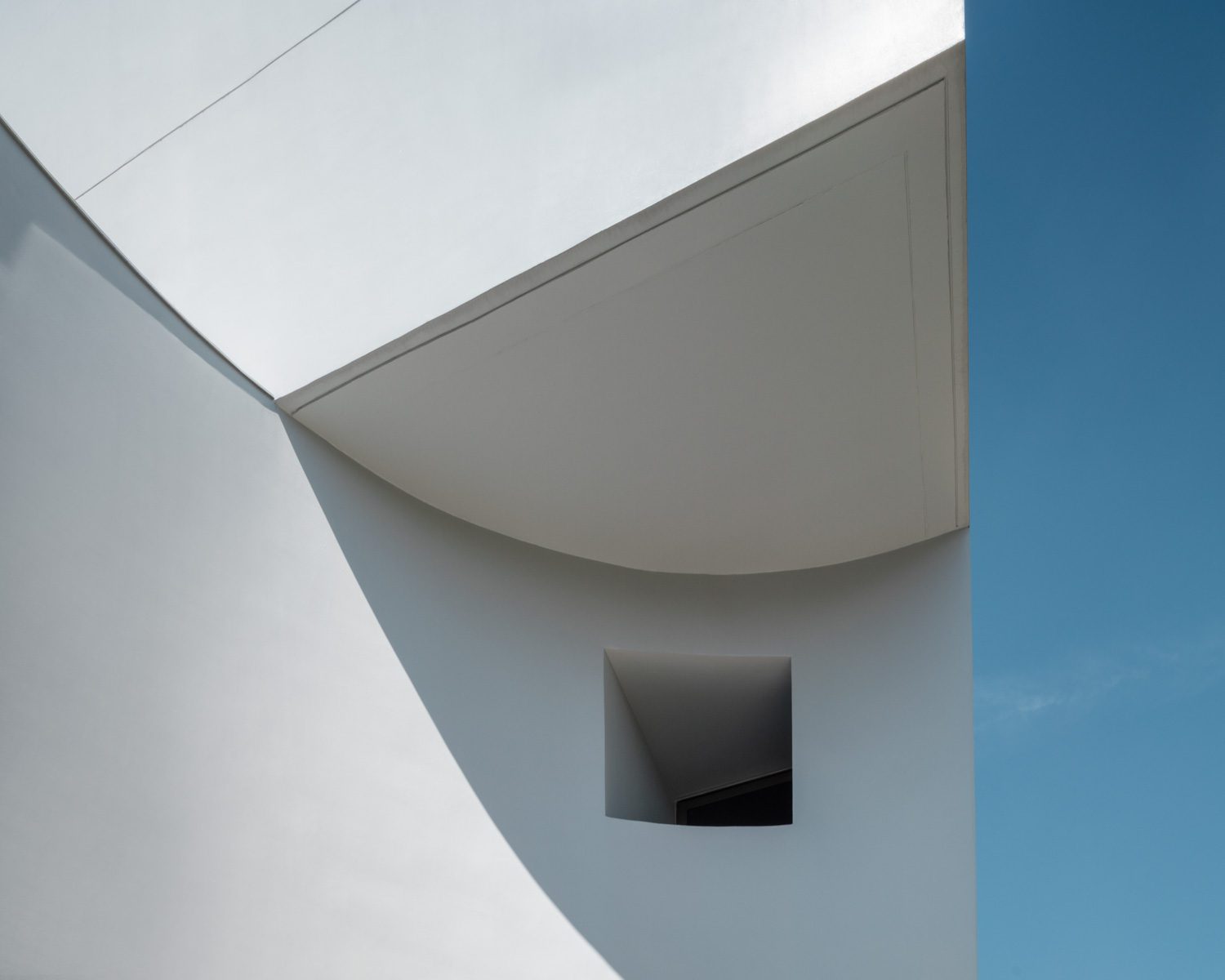
Originally, this three-story home with 350 sq.m. of total functional space was intended to have a boxy, clean-looking shape, and an open layout free of any protruding components or decorative elements. To create a distinct visual, the sharp and minimal geometric form was simplified by incorporating the physical characteristics of a ‘can’ with the house’s entrance. The access point to the house was gouged out into a concave structure that recessed deep inside and underneath the upper section of the house, which still retains the box-like shape.
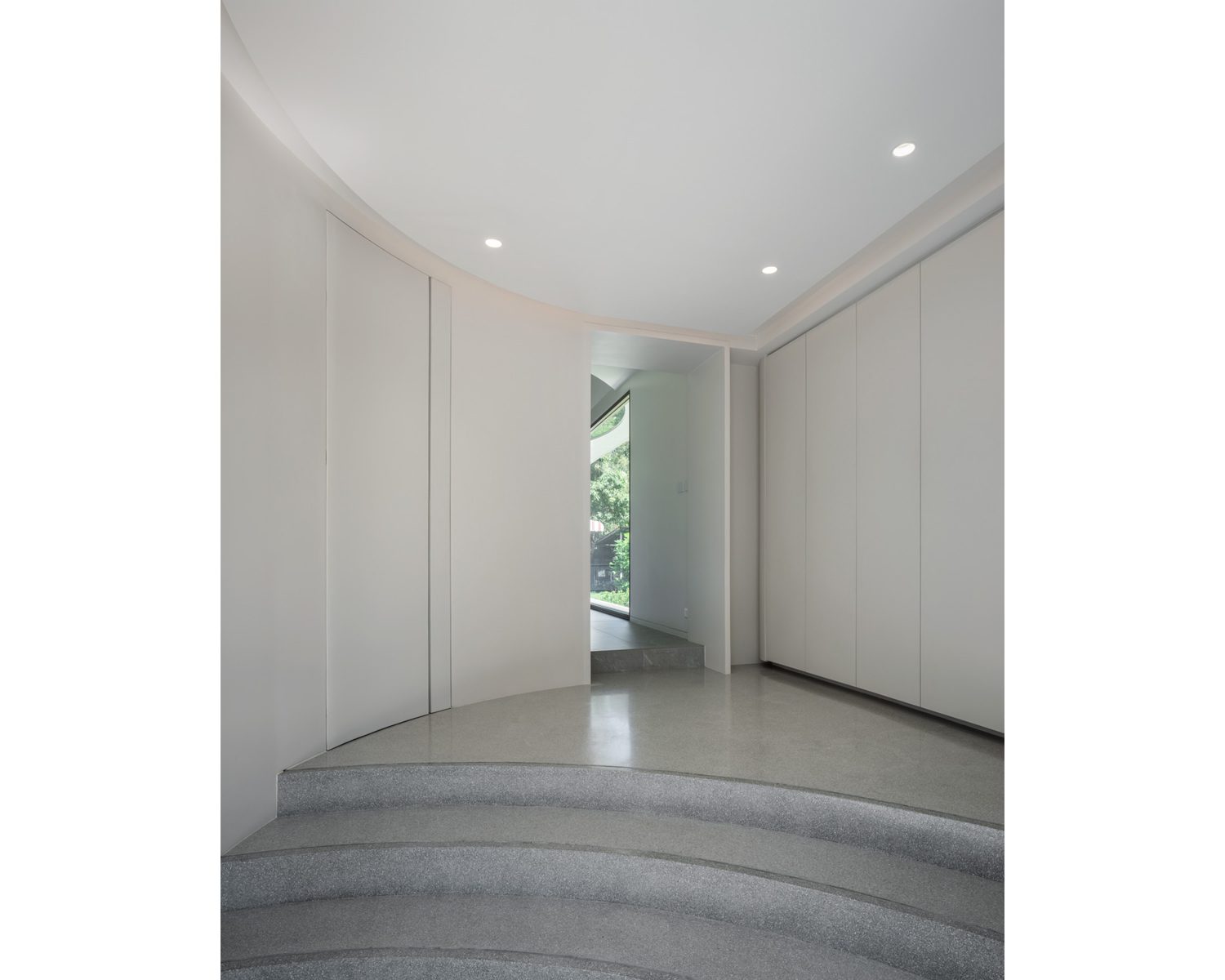


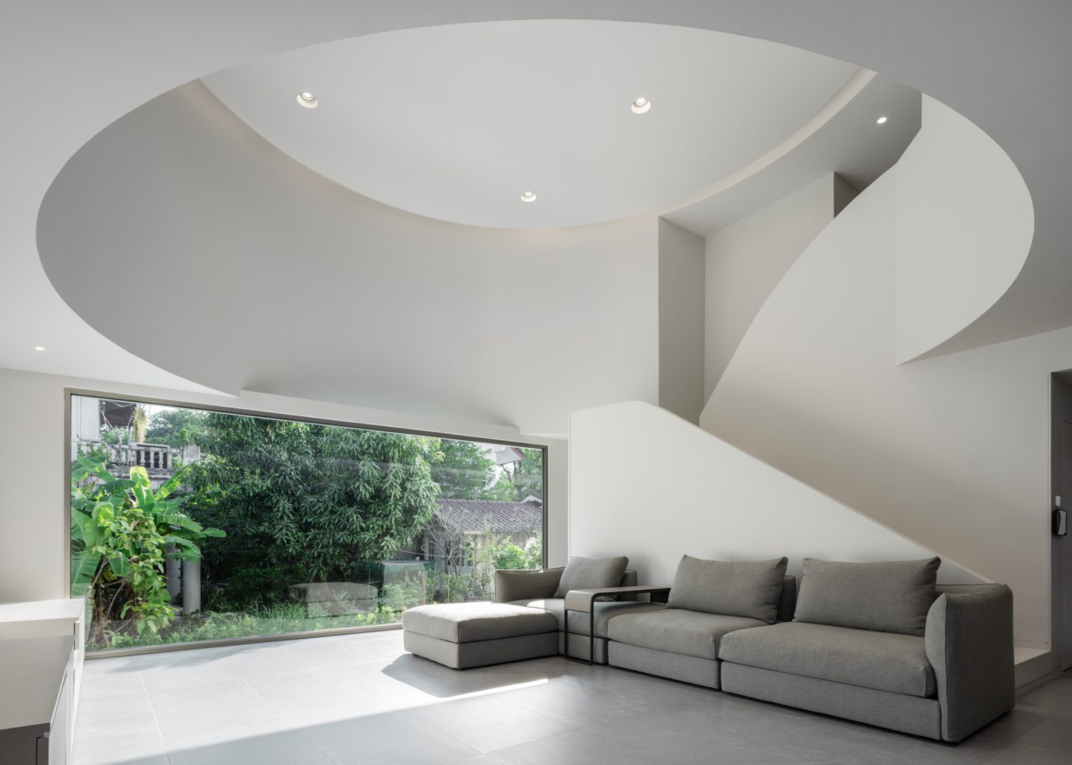
A small foyer with a shoe cabinet welcomes visitors when they enter the house. The main living area is located above the foyer and is one of the functional spaces where the ‘can’ concept is most visible. The foyer’s spatial characteristics as a circular hall include a double-volume ceiling with a stairway in the center leading up to the second floor. Despite its small size, the foyer was designed with the goal of incorporating as much openness and spaciousness as possible into the living spaces. Following the main concept, the living room consists of a pantry where the owners spend the majority of their time and a large opening, where one side is designed to bring greater spaciousness and connectivity between outdoor and indoor space. The corner also connects to the large enough in-between space between the structure and the adjacent house, while the unpleasant surroundings are kept at bay and prevented from disturbing the curated perspective. The pantry is designed to have its own moderate-sized opening in a position that does not interfere with the space’s visual access to the outside environment.
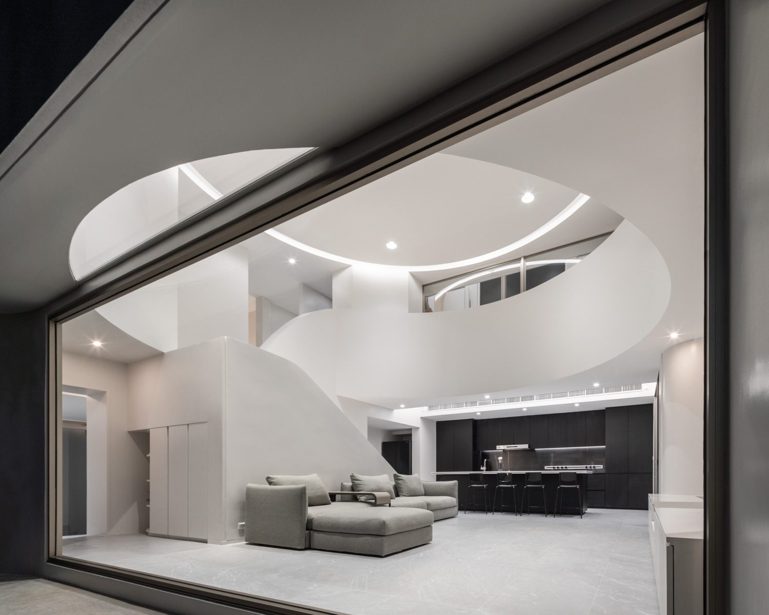
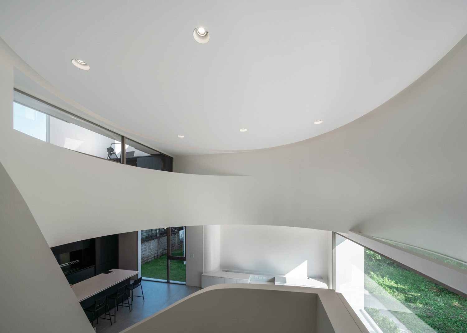
The parts of the beam structure make their way into the circular foyer as the design’s gimmick and attempt to create the area into a ‘perfect circle’.


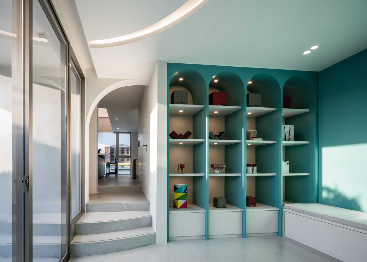
The laundry room’s turquoise color vivifies this particular part of the white home.
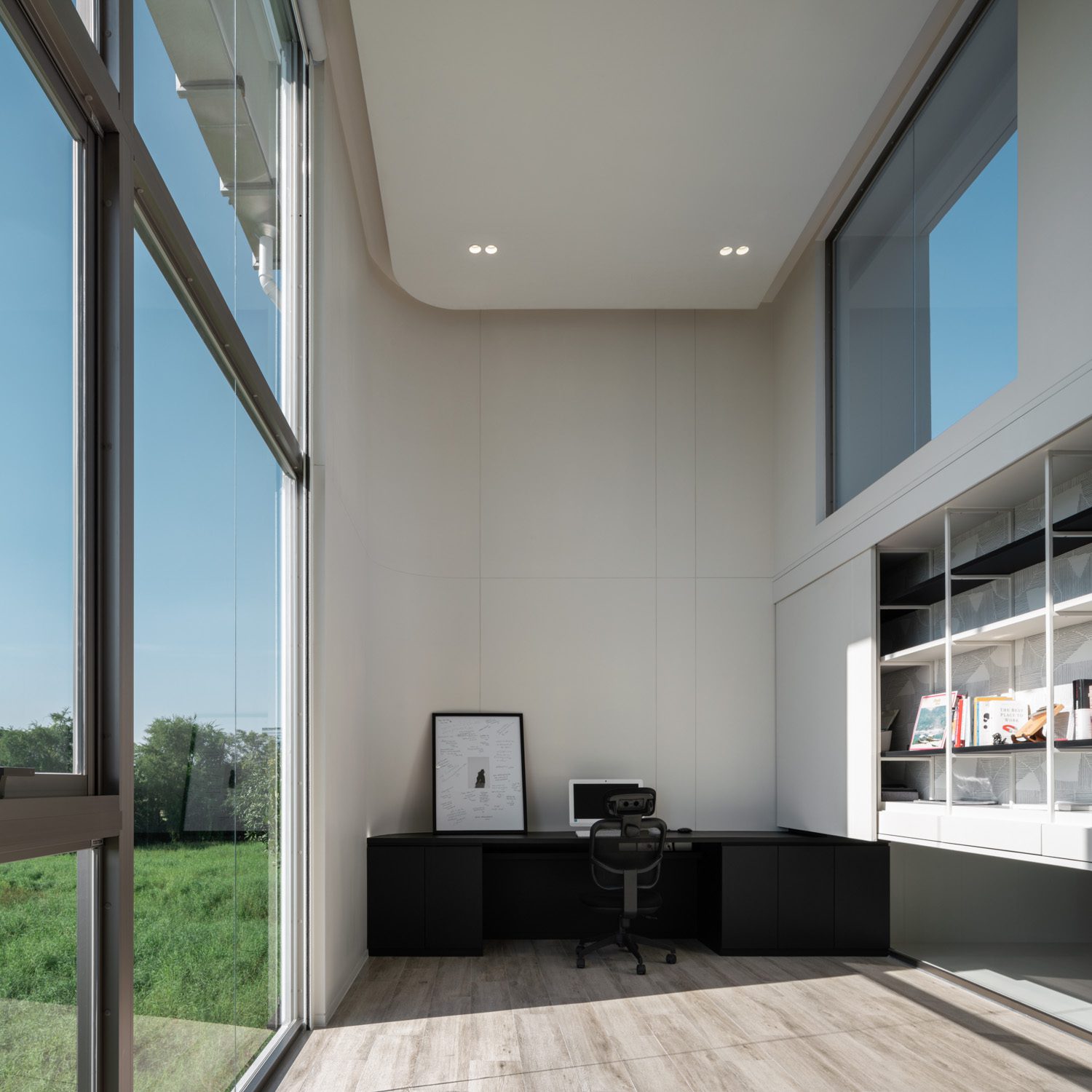
The two bedrooms and a study located along the double-space foyer that continues from the lower floor create a more private living quarter on the second floor. Because the owner spends most of his time in the study, extra space and openness are added to the layout. The double-space concept is reintroduced in a specific portion of the functional program, resulting in the room’s layout being quite long and narrow. A curtain wall is used on one side of the room to allow for more natural light and to make the space feel less confined. Certainly, the location of this massive opening corresponds with the outside environment, which is more open and visually appealing than other sides of the house that face neighboring built structures.
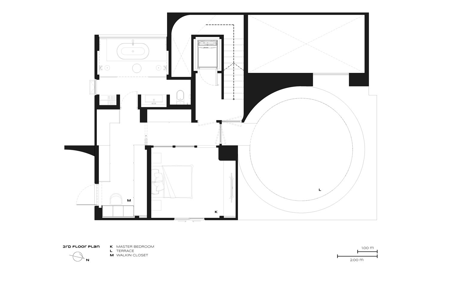
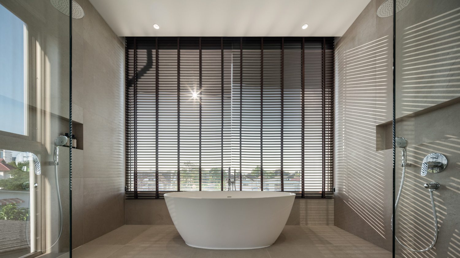
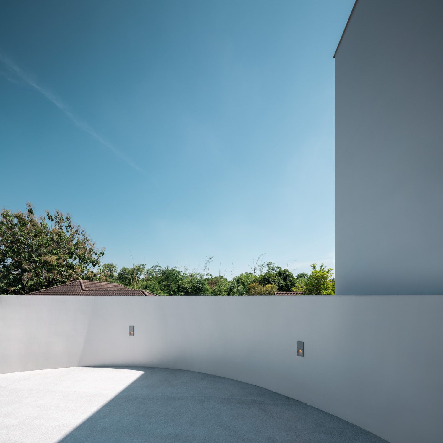
The third floor of the functional program is dedicated to the master bedroom of the owners, who are a couple starting a new family. One of the bathroom’s walls is designed with an extra-large window to provide access to the outside view. The floor’s remaining functional space is transformed into a circular rooftop or another ‘can’ storing the family’s recreational space. The rooftop provides not only functional benefits but also aesthetic merits that are consistent with the design concept from which the house’s architecture and functional spaces are realized.


Simplicity and openness remain the core of the house’s interior architecture. Partitions and walkways, for example, can play with the playful qualities of curved lines and arches to make some parts of the space more interesting and fun. There are also a few areas where graphic design and material gimmicks are hidden behind the minimal appearance. Nonetheless, the house’s refined lines, like its architectural identity, remain its most distinguishing feature. It’s safe to say that the architecture of the house was designed with extreme respect for form, lines, and cohesive visual elements.
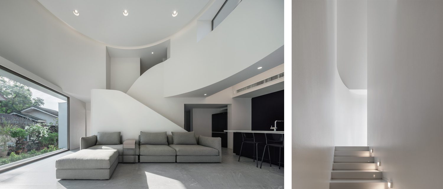
An emphasis on creating cohesive visual elements in architectural design could be a method of bringing the artistic elements found in paintings or two-dimensional artworks to architecture, where the beauty or intensity of a work is crafted from the unity of artistic compositions. It’s reflected in one of Pawan’s explanations about the serpentine but corresponding lines of the staircase in the main foyer, as well as the effects caused by the refined presences of light and shadow on the architectural form and exterior surfaces of the building. “We approached the design as a very two-dimensional creation, with each section developed separately before everything was put together,” Pawan clarified. Tiny Tin House, with its thoughtful simplicity and openness, exemplifies a design that prioritizes visual elements just as much as the quality of space and living experiences, as everything works together to deliver a complete big picture.