A collaboration between THAIGA x TAB x MAYDAY! aims to make life at Bangkok’s bus stops better
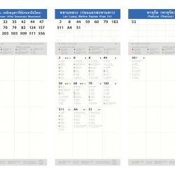
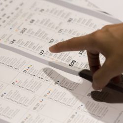
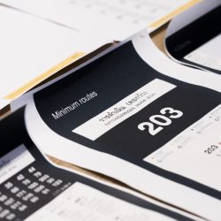
“We noticed that people who come to pay respect to the late King Bhumibol at Sanam Luang usually arrive together in big buses but they often leave separately. The problem for this large crowd of commuters is that the bus stop signs provide them with no usable information.” This observation initiated the creation of 100 bus stop signs around Rattanakosin Island, an idea proposed by MAYDAY! to the Traffic and Transportation Department following the ‘Small Change, Big Move’ concept of the design studio. MAYDAY!’s proposal was for the design and production of the signs displaying updated bus numbers and routes. The new signs would be instantly installed on the original structures of the existing bus stop signs in the area.
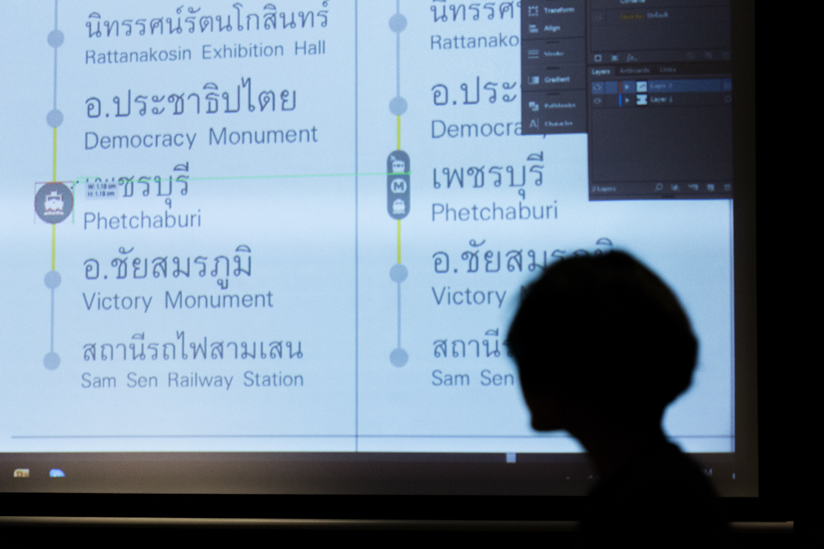
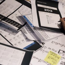
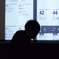
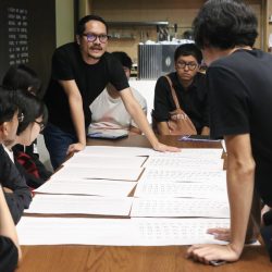
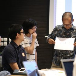
The project’s timeline was so short (from mid-August to mid-September) that it made us wonder how MAYDAY! was able to collect all the data regarding buses and stations on the island and digest it into a beautiful, easy-to-understand graphic in time for the production. Sucharee Rawithornthada, one of the team members of MAYDAY! told art4d that, before the team met with the Traffic and Transportation Department, they already had a prototype for the sign, meaning that the process didn’t actually start from zero. “Prior to this, two prototypes (sponsored by Yak Group) were installed at Khok Wua Intersection and Victory Monument so we were able to gain feedback from actual users.” After being given the green light to continue with the project, MAYDAY! contacted ThaiGa and TAB to take part as the project’s design consultants while immediately recruiting 10 volunteer graphic designers to help with the design of the layout of over 100 informative bus stop signs.
“Designing a bus stop sign for people who don’t normally use a bus” was the task that both MAYDAY! and ThaiGa had ahead of them. The work began with the team surveying the Bangkok Mass Transit Authority’s existing bus stop signs (and finding out that the signs hadn’t been updated for quite some time) before, together with the team of TEDxBangkok, visiting the actual sites to locate the signs and learn the names that their locations are commonly known by. “We agreed that the locals are the ones who know the names of the locations best, and the signs would work most effectively if they corresponded with those names that the locals actually use,” described Rawithornthada. Nevertheless, after having talked to the people in the area, the team came to realize that difficulty lied in the fact that some of the stops didn’t have a specific name and were being called by different monikers. From the point of view of regular public bus commuters, many didn’t see this as a dilemma. For this project, however, the requirement was for every bus stop to have its own name. This became an issue for the team members had to find a pattern that could be applied to every location on both inbound and outbound routes. Without any repetition or confusion, the names had to be easily understood by both regular and non-regular users as well.
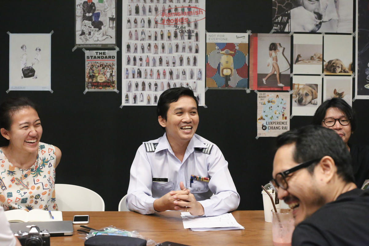
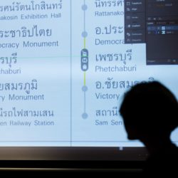
“The opinions of the team were divided into two groups. The first saw value in the idea of using the names that users were actually familiar with, but felt that doing so could pose a problem for people who’ve never or rarely been to the area.” The discussion led to the conclusion that if there were no landmark (with visually distinctive signs or symbols) nearby, the bus stop would be named after the street it was on with its specific location being included in brackets, for instance ‘Yaowarat (Old Market Yaowarat).’ If some of the stops were near the same landmark, the names would be called according to key intersections or bridges such as Ratchadamnoen (Phan Phiphop Lila Bridge), replacing the many names of the stop be it Khok Wua Intersection, The Government Lottery Office or the 14th October Memorial stop that had been used previously.
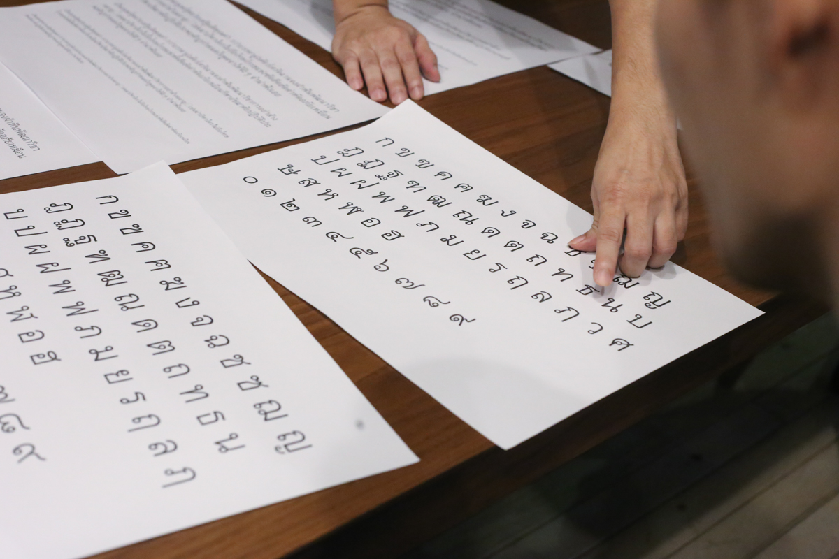
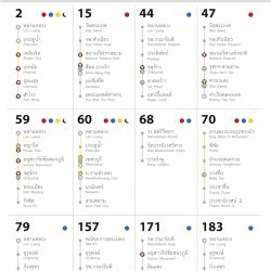
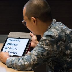
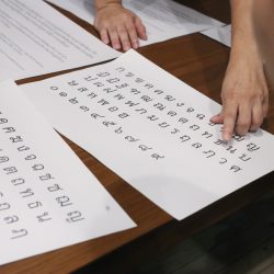
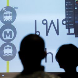
The design of the infographic was among the many elements that took the team members longer to complete than they had thought, (even though MAYDAY! already had a template to work from). art4d talked with Wee Viraporn, one of the graphic designers of ThaiGa about the details of the design. “For the exhibition ‘New Aged Citizens’ held by TCDC last year, our team conducted research to find out which font and color tone was the most elderly-friendly and we found that this demographic often has problems reading headless (Thai) alphabets.” The first issue that was finalized was the change of the DB Heavent font on the sign initially designed for MAYDAY!’s template to CM Prasanmit with the three main reasons being the fact that CM Prasanmit bears similar details to a handwriting font compared to DB Heavent where the heads of the alphabets are eliminated. Another reason was that CM Prasanmit is a font that has been used in Thai textbooks, which understandably, makes it more familiar to the majority of users, and the last but not least reason was that the font is free, which was considered to be very important since the project was a large-scale volunteer project (having 100 bus stops) and has the potential to expand if the design were to be used at all the bus stops in Bangkok. The succeeding problem was the readability of the numbers of CM Prasanmit, which are not clear enough. “We wanted a font where each of the numbers contained its own character. After the second meeting, Myriad was the choice we agreed upon.” The characters Viraporn described are the details of the outlines of numbers such as 1 and 7, 3 and 8, and 6 and 9. The angles of Myriad’s numbers are distinctively different, also, the spacing between characters doesn’t fluctuate greatly making them less visually confusing for users, especially seniors.
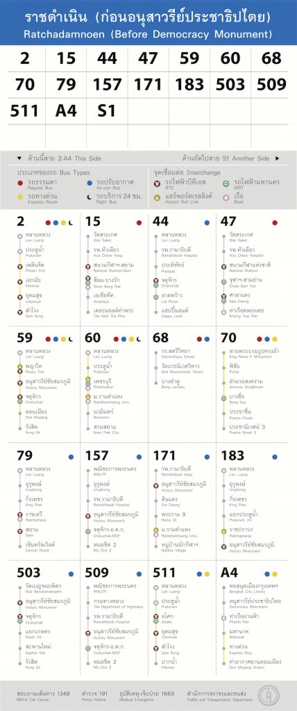
In addition to the font, the design team had to deal with other details such as the arrangement of the connected points and the use of colors. The final decision was to use vivid colors accommodating color-blind people and facilitating communication with the widest group of users as possible (but sacrificed was the work’s sense of authority). From the point of view of a regular user of pubic buses, what we see as the next challenge MAYDAY! will have to deal with is how to allow for the new signs to be understood by existing users while corresponding with the bus conductors. Looking at the issue even further, the signs should consider the future possibility of automatic ticket issuing machines that will be used within the bus system (word is that the installation of these machines is underway). Another challenge is less controllable, which is the well being of the new bus stop signs considering the fact that Thailand is a country where public furniture has such a short life span and the sight of broken public property is something we’ve grown accustomed to. It remains to be seen how MAYDAY! will be able to expand the use of their new bus stop signs to other areas of Bangkok, or even to hope further for the possibility that the project could cause the government sector to, once and for all, acknowledge and realize that the principle functionality of a bus stop sign is to provide people with necessary information and not just serve as an advertising space.
TEXT: NAPAT CHARITBUTRA
PHOTO COURTESY OF MAYDAY! x THAIGA x TAB
thaiga.or.th
facebook.com/maydaySATARANA


