THE NEW AUSTRALIAN EMBASSY COMPLEX MAY LOOK SOLID, BUT IT HAS ALSO SHOWN US THE MANY WAYS TO DEPICT NATIONAL IDENTITIES FROM THE INSIDE OUT
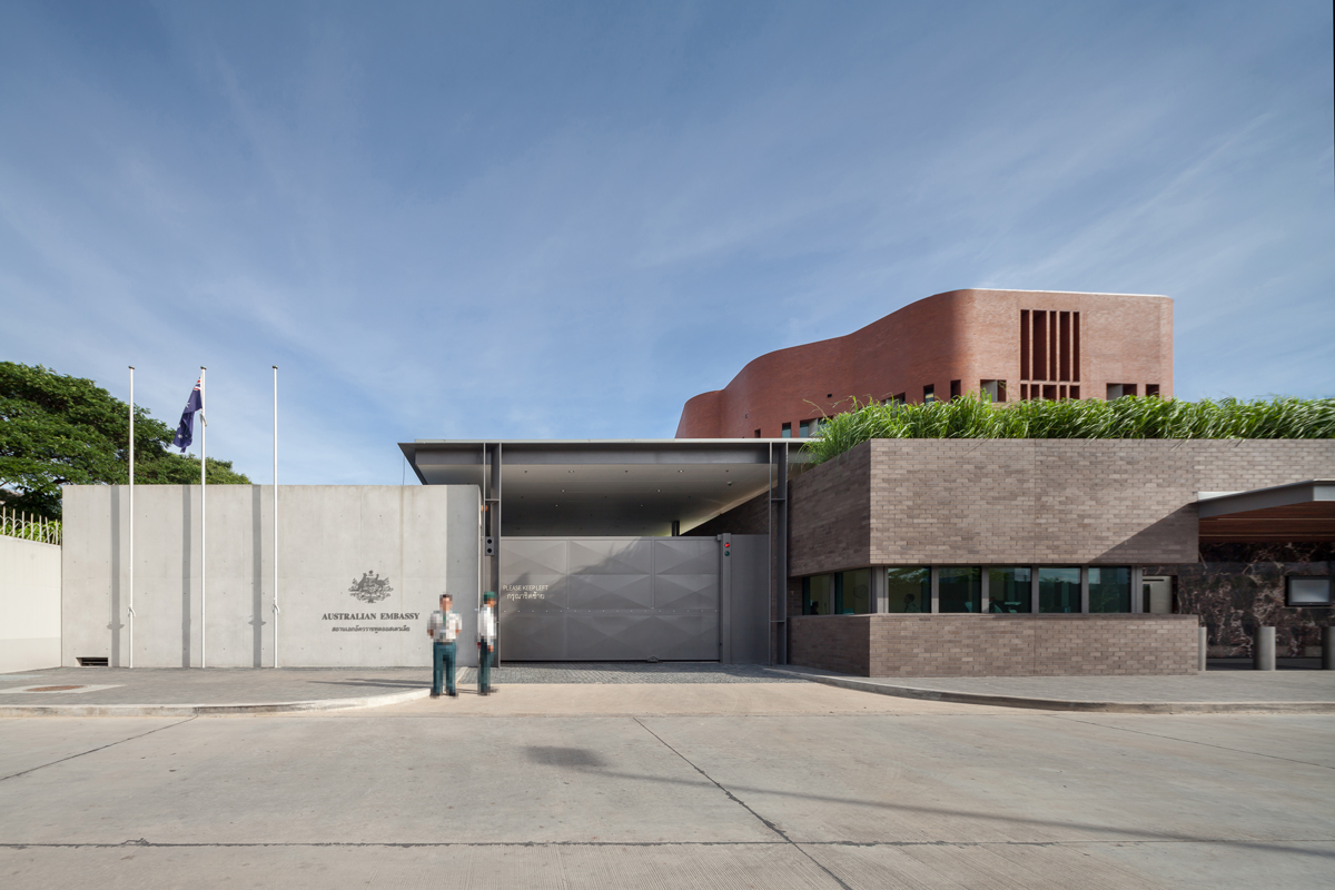
The 2004 Australian Embassy bombing in Jakarta was a serious terrorist attack that caused the Australian Government and involved agencies such as the Department of Foreign Affairs and Trade to review the country’s safety measures. His Excellency Mr. Paul Robilliard, the Australian Ambassador to the Kingdom of Thailand talked about the reasons behind the relocation of the Australian Embassy to the new venue on Wireless Road in his interview. “The decision to construct a new purpose-built Australian Embassy complex in Bangkok, comprising a Chancery and Head of Mission (HOM) Residence, was made by the Australian Government following a 2004 global review of physical security at Australia’s missions.”
While many of us don’t want to say goodbye to the sight of the yellow tile-cladded building on Sathorn Road, whether it be the Bangkok inhabitants’ personal connection with the city and its neighborhoods or those who are saddened by the fact that the building that was a collaboration between the two countries’ architectural laureates (for a more in-depth story about the old embassy building, read issue 247 of art4d) will ultimately be demolished, the change is here and we don’t want everyone to jump to the conclusion that the new won’t be just as good as the old. The truth of the matter is, the new complex, which we’re about to feature in this article, has its own story and details that are just as interesting as the iconic work that Ken Woolley and M.L. Tridhosyuth Devakul created 40 years ago. And while the old embassy building expressed Thai and Australian characteristics through different elements of architectural language, the new building and its 19,700-square-meter program, which has a team of Australian architects of BVN overseeing the design, is conceived from a similar approach to the project’s design question on “how to create a symbol that represents Australia and at the same time is able to combine and convey the context of the country where the building is located such as Thailand.” Such question led to the materialization of ideas into the visually perceptible tactility of the new architectural program where idiosyncratic Australian and Thai characteristics are visibly present yet intuitive and abstract.

/ THE DECISION TO CONSTRUCT A NEW AUSTRALIAN EMBASSY COMPLEX IN BANGKOK WAS MADE BY THE AUSTRALIAN GOVERNMENT FOLLOWING A 2004 GLOBAL REVIEW OF PHYSICAL SECURITY AT AUSTRALIA’S MISSIONS /
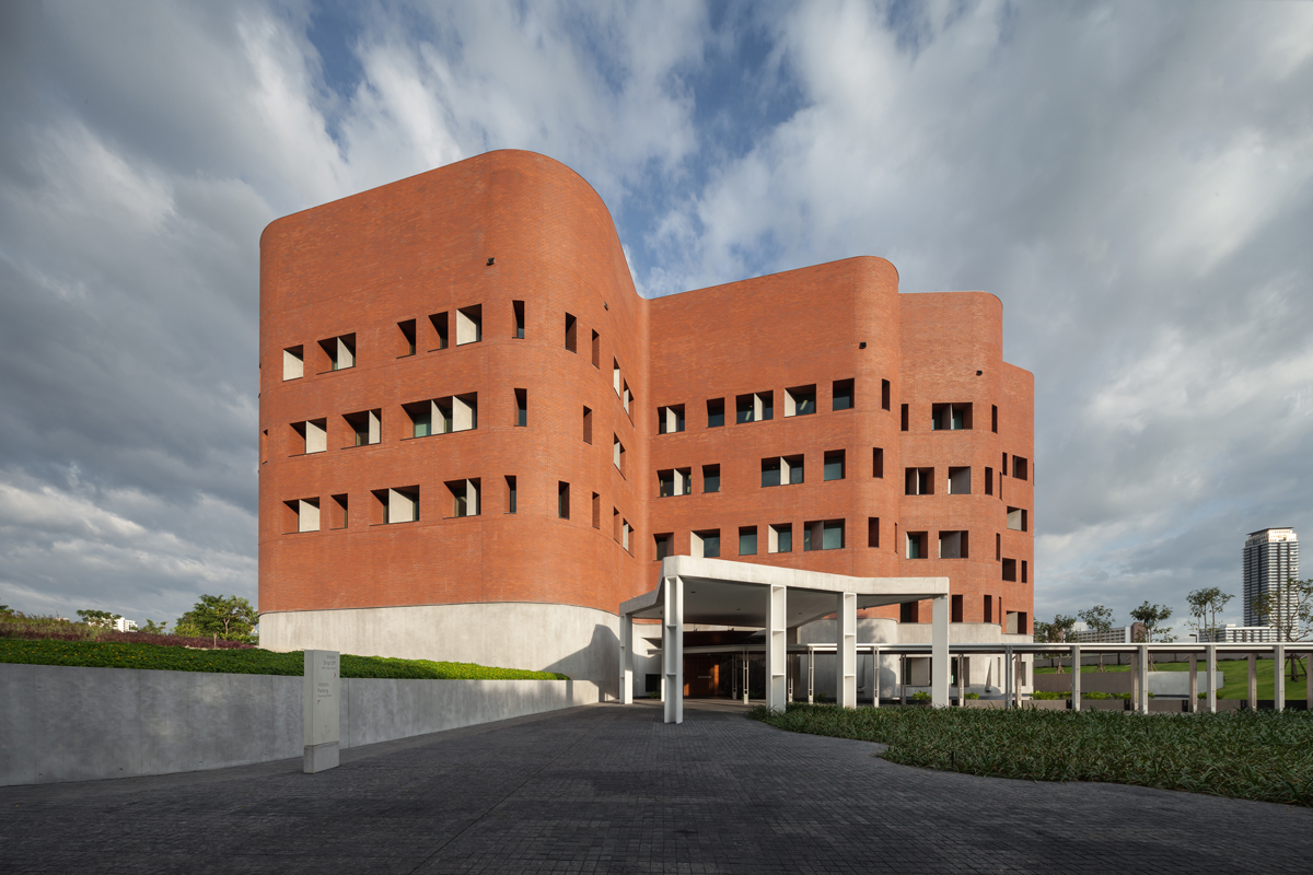
“Both buildings reflect Australian architectural values and aspirations, of course, in different ways,” said Mr. Robilliard. While the protagonist of the old embassy is the local material like the ‘yellow ceramic tiles’ from a factory in Lampang that were used to cover the entire exterior surface of the building, James Grose, architect and the National Director of BVN, explained that the Thai identity is still resonated through the presence of the main construction material. However, instead of straightforwardly using the ‘red brick’ that impressed a great deal out of the design team when they visited historical sites in Sukhothai and Ayutthaya, the team brought the idea that they had for the material to a brick manufacturer in Australia for further development, consequentially leading to the birth of a brick of a bespoke color known as ‘Embassy Red.’ In addition to the reinforced strength manufactured specially to meet the embassy’s construction standards, the bricks were designed to have different units with variations of curves that could be used to construct the architecture’s organic, curved form without any interruptions that the sharp edges and corners of a normal brick would bring.
The architecture team dictated the different functionalities of the buildings in the program by using bricks with different color tones and scales. One of the most discernable structures of the program is the ‘chancery’ building that has the ‘Embassy Red’ bricks playing the leading role. Grose further explained that the undulating form of the building is a reflection of Australia’s unique landscape of the country’s famous Uluru. The design of the ‘residence’ sees the use of bricks in a smaller size with a darker color tone of burnt sugar. The intention behind such use of material was to create a distinctive characteristic for the building and residential functionalities of the interior space. Another interesting material used with the interior of the residence is Pilbara, a limestone with a distinctive red oxide found exclusively in the northern and western region of Australia, which is a meaningful addition to the architecture’s Australian accent. The ‘wall’ is the last part that is constructed from bricks. This particular architectural composition also functions as the project’s service area and sees the use of bricks with a lighter brown tone and a size that is more domestic to render a friendly, welcoming vibe for the embassy’s visitors.


Apart from the brick that serves as the project’s principle character, other materials such as the steel structure including the exposed concrete surface of other architectural planes all contribute to the interesting dimension of the interior space. “When you approach the building, you feel like it is a bare concrete wall. But in fact, the tactility and human scale it has helps to resonate with the idea of nature,” added Grose.
And while there’s a sense of rawness to the complex’s outdoor space due to the use of materials such as bricks and exposed concrete, such stiffness is softened by the presence of ‘pine wood,’ one of the key compositions of the building’s interior decorations. Not only does the wood help to make the space feel friendlier for users, but the material itself is another representation of Australia for pine wood is a widely used material of the land down under. The massive void at the center of the chancery building that connects the ground floor to the roof structure and the rarely used u-profile glass create a unique sense of space reminiscent of the Australian landscape. The new floor plan replaces isolated units and rooms of the old embassy with a more universal workplace where each department is more visually connected, granting access to different activities going on in the chancery while encouraging the staff members to interact with each other.


/ THE DESIGN OF THE LANDSCAPE ILLUSTRATES THE RELATIONSHIP BETWEEN THE TWO COUNTRIES WHERE PEOPLE’S WAYS OF LIFE ARE CLOSELY CONNECTED TO NATURE /
Equally interesting as the architectural structure itself is the unique landscape architecture. With the project’s overall aesthetic being the organic architectural form that intertwines with the luscious green scape and surrounding physical context of the site, the use of local plants such as Banyan and Golden Rain trees or even Citronella grasses growing on the rooftop of the residence building that are met and mingled with by an eclectic mix of strange-looking Australian plants are one of the gimmicks that portrays the obscured boundary between the definition of Thai and Australian identities. Like embassy building on Sathorn Road that vigorously used water to convey the Thai riverfront way of life, this new complex incorporates water into the program with a waterway that runs around and through the lobby of the chancery building, physically linking the interior and exterior spaces into one. Grose told us that the design of the landscape illustrates the relationship between the two countries where people’s ways of life are closely connected to nature as with the Australians’ deep connection with the land and the Thais’ with water. While such details are not discernable at first, we sense the story being told as the architecture gradually reveals its distinctive presence amidst the restless change of Bangkok.


It is very likely that within less than a decade, we will be looking back at how much the Australian Embassy Complex and other embassy buildings in the neighborhood will be affected by the city’s evolving urban fabric, especially after the coming of mega real estate development projects like One Bangkok across the street. Nevertheless, while modern in its accent, BVN’s architectural design does not fail to respect its surrounding social and cultural context (as Kenneth Frampton defines Critical Regionalism as an attempt to confront placelessness). We believe that the architecture of the Australian Embassy Complex will become a timeless and memorable creation that won’t fade away into the city’s sprawling mass of ubiquitous built structures.
“The success of the building, I think, has a lot to do with the ability of the architecture to find or to give meaning in a world that is becoming less and less about meaning. It’s critical to bring meaning into people’s lives when the rest of the world is trying to be the same,” Grose summed up for us all.

© John Gollings

-

- © John Gollings


-

- © John Gollings


-

- © John Gollings
-

- © John Gollings
-

- © John Gollings
-

- © John Gollings
-

- © John Gollings
-

- © John Gollings
เหตุการณ์วางระเบิดหน้าสถานทูตออสเตรเลียที่จาการ์ตาเมื่อปี 2004 นับเป็นเหตุก่อการร้ายที่รุนแรงที่สุดครั้งหนึ่งที่ส่งผลให้รัฐบาลกลางออสเตรเลียและหน่วยงานที่ได้รับผลกระทบโดยตรงอย่างกระทรวงการต่างประเทศและการค้า ต้องกลับมาทบทวนมาตรการด้านความปลอดภัยของตัวเองกันอย่างยกใหญ่ Paul Robilliard เอกอัครราชทูตออสเตรเลียประจำประเทศไทย ได้ให้สัมภาษณ์และกล่าวถึงเหตุผลของการย้ายมายังที่ตั้งใหม่บนถนนวิทยุไว้ว่า “การตัดสินใจสร้างอาคารสถานทูตออสเตรเลียแห่งใหม่ขึ้นในกรุงเทพฯ ซึ่งประกอบไปด้วยอาคารที่ทำการ และบ้านพักของเอกอัครราชทูตนั้น เกิดขึ้นโดยรัฐบาลออสเตรเลียภายหลังการทบทวนความมั่นคงทางกายภาพของที่ทำาการสถานทูตออสเตรเลียที่ตั้งอยู่ในประเทศต่างๆ ทั่วโลกเมื่อปี 2004”
ถึงแม้ว่าหลายคนจะใจหายไม่น้อยที่อยู่ดีๆ ก็ต้องโบกมือลาอาคารกรุกระเบื้องสีเหลืองบนถนนสาทรหลังเดิม ไม่ว่าจะเพราะด้วยความผูกพันที่ตัวอาคารเองมีต่อคนกรุงเทพฯ และย่านสาทร หรือจะเพราะความรู้สึกเสียดายผลงานสถาปัตยกรรมที่เกิดจากการจับมือกันระหว่างสถาปนิกชั้นครูของทั้งสองชาติก็ตาม (อ่านเพิ่มเติมเกี่ยวกับอาคารสถานทูตหลังเก่าได้จากที่นี่) แต่เมื่อความเปลี่ยนแปลงเดินทางมาถึงแล้ว เราก็ไม่อยากให้ทุกคนรีบด่วนสรุปและพาลมองว่าของใหม่นั้นดีได้ไม่เท่าเก่า เพราะเอาเข้าจริงอาคารหลังใหม่ที่เรากำลังจะพูดถึงนี้มีเรื่องราวและรายละเอียดที่น่าสนใจไม่แพ้ผลงานที่ Ken Woolley และ ม.ล.ตรีทศยุทธ เทวกุล
ได้ฝากไว้เมื่อ 40 ปีก่อนเลย และในขณะที่ผลงานชิ้นเก่าพยายามแสดงออกถึงความเป็นไทยและออสเตรเลียออกมาผ่านภาษาทางสถาปัตยกรรมในลักษณะต่างๆ อาคารหลังใหม่ขนาด 19,700 ตารางเมตร ที่ได้ทีมสถาปนิกออสเตรเลียอย่าง BVN มาเป็นคนออกแบบนี้ก็เกิดขึ้นมาจากการหาวิธีตอบคำาถามที่คล้ายๆ กันด้วยคือ “ทำอย่างไรจึงจะสามารถสร้างสัญลักษณ์ที่สื่อแทนถึงประเทศออสเตรเลียขึ้นมา โดยที่ในขณะเดียวกันก็ต้องสามารถผสานและสื่อถึงบริบทของที่ตั้งอย่างประเทศไทยไปพร้อมกันได้” จนเกิดเป็นทั้งกายภาพที่เรามองเห็นและจับต้องได้ และบรรยากาศบางอย่างที่สะท้อนทั้งความเป็นออสเตรเลียและความเป็นไทยในแบบที่เราเองก็จับต้องไม่ได้โดยตรง “อาคารทั้งสองต่างก็สะท้อนคุณค่าและปณิธานของสถาปัตยกรรมออสเตรเลียออกมาด้วยกันทั้งคู่ แต่ในวิธีการที่ต่างกัน” Robilliard กล่าว
ในขณะที่พระเอกของสถานทูตหลังเก่าคือวัสดุท้องถิ่นอย่าง “กระเบื้องเซรามิกสีเหลือง” จากโรงงานกระเบื้องดินเผาจากลำปางที่ถูกนำมากรุไว้ทั่วทั้งอาคาร James Grose สถาปนิกผู้บริหารสูงสุดจาก BVN เล่าให้เราฟังว่ากับอาคารหลังใหม่นี้ ความเป็นไทยยังคงถูกสื่อออกมาผ่านการใช้วัสดุก่อสร้างเช่นเคย แต่แทนที่จะหยิบเอา “อิฐมอญแดง” ที่ทีมสถาปนิกประทับใจหลังจากได้เดินทางไปเยี่ยมชมพื้นที่ประวัติศาสตร์สุโขทัยและอยุธยา มาใช้กับอาคารโดยตรง พวกเขากลับเลือกนำมันกลับไปให้บริษัทผู้ผลิตอิฐที่ออสเตรเลียเป็นคนช่วยพัฒนาแทน จนสุดท้ายก็ได้เป็นอิฐสีพิเศษในชื่อ ‘Embassy Red’ ที่นอกจากจะมีความแข็งแรงมากขึ้นเพื่อให้ได้มาตรฐานสำหรับการออกแบบสถานทูตแล้ว ตัวอิฐเองยังถูกออกแบบมาให้มีความโค้งเป็นยูนิตพิเศษแบบต่างๆ เพื่อให้การนำามาใช้กับอาคารสถานทูตหลังที่มีรูปทรงโค้งมนซับซ้อนนั้นเป็นไปได้อย่างราบรื่น ไม่เกิดการสะดุดหรือเหลี่ยมมุมของอิฐเมื่อต้องนำมาก่อเป็นกำแพงโค้ง
สถาปนิกยังเลือกแสดงถึงความแตกต่างของโปรแกรมการใช้งานในแต่ละอาคาร ด้วยการใช้อิฐที่มีสีและสเกลที่ต่างกันออกไปด้วย ส่วนแรกที่เห็นได้เด่นชัดมาแต่ไกลคือ ‘อาคารที่ทำการสถานทูต’ (chancery) ที่นอกจากอิฐ Embassy Red จะเป็นพระเอกแล้ว James ยังเสริมว่ารูปทรงที่โค้งเว้าของอาคารนั้นยังช่วยสื่อถึงความเป็นแลนด์สเคปของออสเตรเลียด้วย ซึ่งเราน่าจะแอบคุ้นๆ กับแลนด์ฟอร์มทางตอนกลางของทวีปที่มีชื่อว่า Uluru กันอยู่บ้าง ในขณะที่ส่วน ‘บ้านพักทูตออสเตรเลีย’ (residence) นั้น อิฐที่นำมาใช้จะมีขนาดที่เล็กลงมาพอสมควร พร้อมกับโทนสีที่เข้มขึ้นออกไปทางน้ำตาลไหม้ เพื่อต้องการแสดงถึงความแตกต่างให้ชัดเจนว่าสเปซภายในอาคารหลังนี้คือพื้นที่สำหรับการพักอาศัย ไม่ใช่พื้นที่สำนักงาน แถมภายในบ้านพักยังมีการใส่วัสดุที่มีความพิเศษมากๆ ซึ่งหาได้จากเฉพาะทางตอนเหนือและตะวันตกของออสเตรเลียอย่าง Pilbara หินอ่อนที่มีออกไซด์สีแดงที่ให้สีสันเฉพาะตัวเข้าไปตกแต่งเพิ่มเติมด้วย เพื่อช่วยให้กลิ่นไอความเป็นออสเตรเลียนั้นมีมากยิ่งขึ้น ส่วนสุดท้ายที่อิฐถูกนำมาใช้คือ ‘กำแพง’ (wall) ที่ทำาหน้าที่เป็นส่วนเซอร์วิสของโครงการด้วยนั้น ไม่เพียงแค่สีของอิฐจะมีโทนสีน้ำตาลที่อ่อนลง แต่ขนาดของอิฐก็มีความ domestic กว่าเดิม เพื่อสร้างความเป็นมิตรให้กับผู้ที่มาติดต่อกับสถานทูต
นอกเหนือจาก “อิฐ” ที่ถูกใช้เป็นตัวละครหลักแล้ว วัสดุอื่นๆ ที่ถูกใส่เข้าไปไม่ว่าจะเป็นโครงสร้างเหล็ก หรือระนาบทางสถาปัตยกรรมในส่วนต่างๆ ที่เกิดจากการใช้คอนกรีตเปลือยต่างก็เป็นตัวช่วยเพิ่มมิติให้กับสเปซภายในสถานทูตได้อย่างน่าสนใจเช่นกัน “เวลาที่คุณเข้ามาใกล้ตัวอาคาร คุณจะรู้สึกเหมือนกับว่ามันเป็นแค่กำแพงคอนกรีตเปลือยธรรมดาๆ แต่ในความเป็นจริงแล้ว การรับรู้ผ่านสัมผัสและสัดส่วนที่เหมาะสมกับการใช้งานของมัน ยังช่วยสะท้อนแนวความคิดที่เกี่ยวข้องกับธรรมชาติได้เป็นอย่างดี” James กล่าว และถึงแม้บรรยากาศภายนอกของอาคารอาจดูมีความดิบแข็งอยู่บ้างเนื่องจากตัววัสดุที่ถูกนำมาใช้เป็นหลักไม่ว่าจะเป็นอิฐหรือคอนกรีตเปลือยก็ตาม แต่ความแข็งที่ว่านั้นก็ถูกเบรคไว้ได้อย่างน่าสนใจด้วยการเลือกให้ “ไม้สน”เป็นวัสดุตกแต่งหลักภายในอาคาร โดยนอกจากมันจะทำให้สเปซที่อยู่ด้านในนั้นมีความเป็นมิตรมากขึ้นแล้ว ไม้สนเองจะยังช่วยสื่อถึงความเป็นออสเตรเลียได้อีกทางด้วยเช่นกัน เพราะมันถือเป็นหนึ่งในวัสดุที่ถูกใช้อย่างแพร่หลายมากในประเทศ และเมื่อบวกกับการเจาะสเปซให้เชื่อมตั้งแต่ชั้นล่างสุดจนถึงหลังคาตรงบริเวณกลางอาคารที่ทำาการสถานทูต พร้อมการใช้วัสดุที่เราก็ไม่ค่อยจะได้พบบ่อยนักในอาคารบ้านเราคือกระจก u-profile บรรยากาศของการทำงานที่ได้กลับมานั้น ทำให้ผู้ใช้หรือแม้แต่ผู้ที่มีโอกาสเข้าไปสัมผัสรู้สึกเหมือนกับว่าตัวเองไม่ได้อยู่ในประเทศไทยเลยแม้แต่น้อย การจัดวางผังที่เปลี่ยนไปของที่ทำการแห่งใหม่แทนที่การซอยเป็นห้องย่อยๆ ทึบๆ แยกกันตามหน่วยงานต่างๆ เหมือนอย่างที่มีในสถานทูตเก่า นอกจากจะช่วยให้ได้ความรู้สึกของพื้นที่การทำงานที่มีความเป็นสากลมากขึ้นแล้ว การที่แต่ละหน่วยงานมีความเชื่อมต่อกันมากขึ้นจนสามารถมองทะลุลงไปเห็นว่ากำลังเกิดอะไรขึ้นบ้างในแต่ละส่วนนั้น ยังช่วยทำให้เจ้าหน้าที่ได้เห็นหน้าค่าตาเพื่อนร่วมงานคนอื่นๆ มากยิ่งขึ้นด้วย
ส่วนสุดท้ายที่เราคิดว่าน่าสนใจไม่แพ้งานสถาปัตยกรรมก็คืองานออกแบบภูมิทัศน์ ด้วยความที่โครงการในภาพรวมนั้นมีรูปทรงของอาคารในลักษณะโค้งมนเป็น organic form ซึ่งสอดผสานไปกับสวนและบริบทโดยรอบ การเลือกใช้ต้นไม้ทั้งไม้ท้องถิ่นของไทย เช่น ไทร ราชพฤกษ์ หรือแม้แต่ตะไคร้หอมที่ถูกนำไปปลูกไว้บนหลังคาของบ้านพักทูตเพราะมีรูปทรงของใบที่น่าสนใจ สลับปะปนไปกับต้นไม้หน้าตาประหลาดๆ จากออสเตรเลียอีกจำนวนมาก ถือเป็นอีกหนึ่งกลวิธีที่ช่วยสะท้อนกลับไปกลับมาว่าอะไรคือความเป็นออสเตรเลีย หรือว่าอะไรคือความเป็นไทย ที่ถูกใส่ไว้ในสถานที่แห่งนี้กันแน่ และในขณะที่อาคารสถานทูตบนถนนสาทรมีการนำน้ำเข้ามาใช้เป็นส่วนหนึ่งของสถาปัตยกรรม จนทำให้เราคุ้นชินกับบรรยากาศความเป็นวิถีริมน้ำแบบไทยๆ ที่ถูกใส่ไว้ในนั้น อาคารสถานทูตแห่งใหม่นี้ก็ยังคงนำน้ำเข้ามาใช้เป็นส่วนหนึ่งในรูปแบบที่คล้ายๆ กัน โดยนอกจากมันจะถูกใช้ล้อมรอบอาคารที่ทำการแล้ว การออกแบบให้เหมือนกับว่าแผ่นน้ำนั้นทะลุเข้าไปภายในโถงกลางอาคารยังช่วยเชื่อมระหว่างสเปซภายนอกและภายในได้อีกทางด้วย James เล่าให้เราฟังว่าการออกแบบภูมิทัศน์ที่เห็นนี้เป็นตัวอย่างหนึ่งที่แสดงให้เห็นถึงความสัมพันธ์ระหว่างสองประเทศ โดยเขามองว่าจริงๆ แล้วทั้งคนไทยและคนออสเตรเลียนั้นต่างก็มีวิถีชีวิตที่ผูกโยงอยู่กับธรรมชาติในลักษณะที่ไม่ต่างกันสักเท่าไร คือคนออสเตรเลียกับผืนดิน (land) และคนไทยกับผืนน้ำ (water) เพราะการคำนึงถึงรายละเอียดที่ก็ไม่ได้ชัดเจนในแรกเห็นแบบนี้นี่เองที่ทำให้เรารู้สึกว่าอาคารสถานทูตออสเตรเลียแห่งนี้มีเรื่องราวและโดดเด่นออกมาท่ามกลางความเปลี่ยนแปลงของกรุงเทพฯ ได้อย่างน่าประทับใจ
แม้ว่าในเวลาอีกไม่ถึง 10 ปี ข้างหน้านี้ เราอาจจะต้องกลับมาพิจารณาดูกันใหม่ว่าอาคารสถานทูตออสเตรเลียประจำประเทศไทย รวมทั้งอาคารสถานทูตและที่ทำการอื่นๆ ที่อยู่ในบริเวณใกล้เคียงจะได้รับผลกระทบในแง่ความเปลี่ยนแปลงของเนื้อเมืองในระดับใดกันบ้างภายหลังการมาถึงของโครงการพัฒนาอสังหาริมทรัพย์ขนาดยักษ์ ที่อยู่ถัดกันไปแค่เพียงข้ามถนนอย่าง One Bangkok แต่ถึงอย่างนั้น เราก็เชื่อว่าด้วยการออกแบบสถาปัตยกรรมของ BVN ที่ถึงจะมีภาษาแบบโมเดิร์นอยู่บ้าง แต่ก็ยังคงเคารพในบริบททางสังคมและวัฒนธรรมไปพร้อมๆ กันด้วย อย่างที่เราอาจเคยได้ยิน Kenneth Frampton นิยาม Critical Regionalism เพื่อค้านความ placelessness เอาไว้ จะช่วยทำให้อาคารหลังนี้เป็นที่จดจำ และไม่กลืนหลายไปกับมวลอาคารอื่นๆ ที่นับวันดูจะยิ่งค่อยๆ ขาดอัตลักษณ์ของตัวเองเข้าไปทุกที James ทิ้งท้ายกับเราว่า “ผมเชื่อว่าความสำเร็จของอาคารหลังนี้มันเกี่ยวข้องเป็นอย่างมากกับความสามารถของสถาปัตยกรรมในการที่จะค้นหาหรือให้ความหมายอะไรบางอย่างให้กับโลกที่มีทีท่าว่าจะไร้ความหมายลงไปทุกวันๆ คือ มันสำคัญมากที่เราจะต้องนำสิ่งที่มีความหมายกลับไปยังชีวิตของผู้คน ในเวลาที่ทั้งโลกพยายามที่จะเป็นเหมือนๆ กัน”
TEXT: PAPHOP KERDSUP
PHOTO : KETSIREE WONGWAN (EXCEPT AS NOTED)
bvn.com.au