REBRANDING OF FURUKAWA MANUFACTURING, THE COMPANY BEHIND THE JAPANESE AUTOMOTIVE MANUFACTURING SECTOR, EMPLOYS SIGNAGE DESIGN BY IROBE DESIGN INSTITUTE TO REINFORCE ARCHITECTURAL SOLUTIONS
TEXT: NAPAT CHARITBUTRA
PHOTO CREDIT AS NOTED
(For Thai, press here)
Every company, whether long-established or newly founded, has its own unique set of challenges. For Furukawa Manufacturing in Ota, Gunma Prefecture, Japan—a company that has long been designing and manufacturing production systems for leading Japanese automotive parts manufacturers and automobile brands—their problem lay in how they were perceived. They focused on designing and manufacturing production systems, or simply put, they work behind the scenes in automotive manufacturing. As a result, the general public is largely unaware of the company’s existence, which has led to a significant shortage of personnel in recent years.
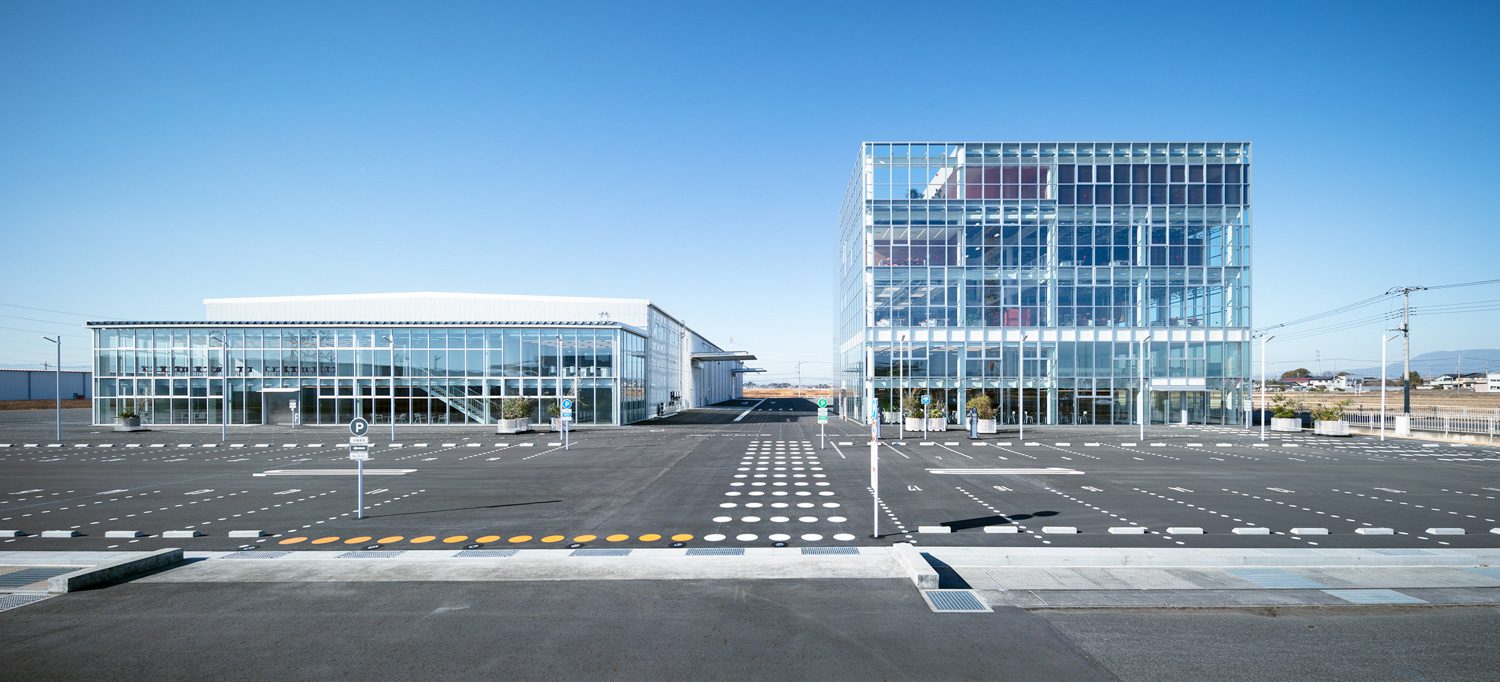
Photo: Takumi Ota
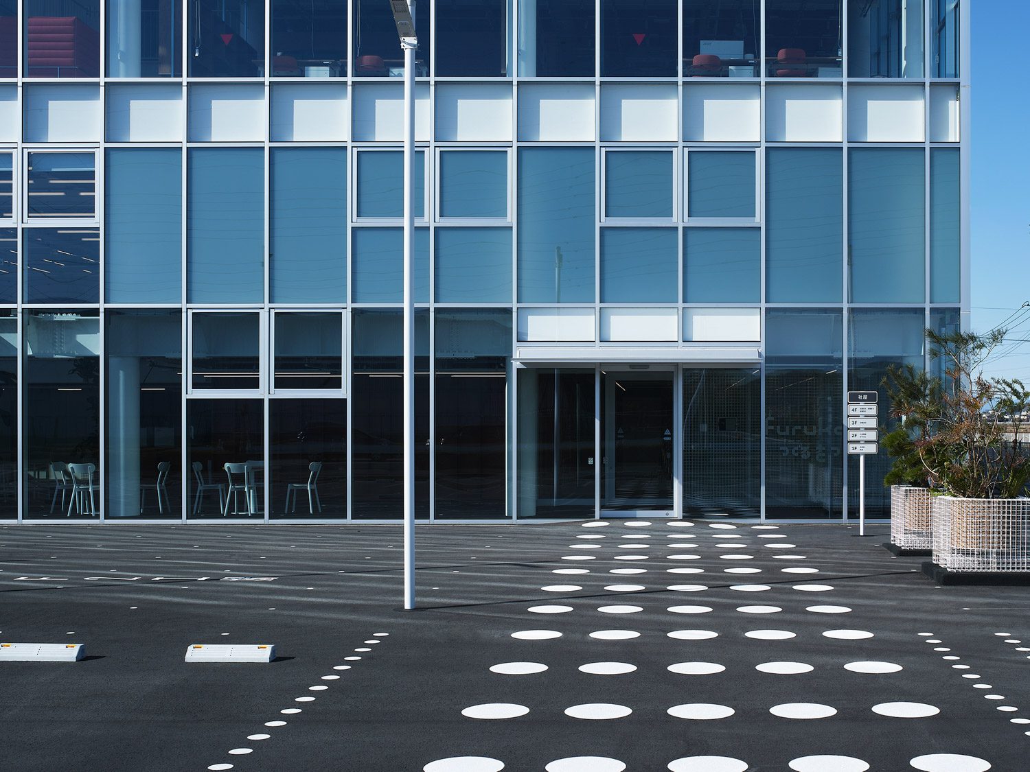
To address this issue, Schemata Architects, led by Jo Nagasaka, proposed an architectural solution aimed at ‘opening’ the company up to the outside world. This involved designing a transparent office building so that outsiders could clearly see the work taking place inside. Meanwhile, for the graphic aspect of the rebranding, Irobe Design Institute adapted street traffic markings into the signage designs for the office and factory.
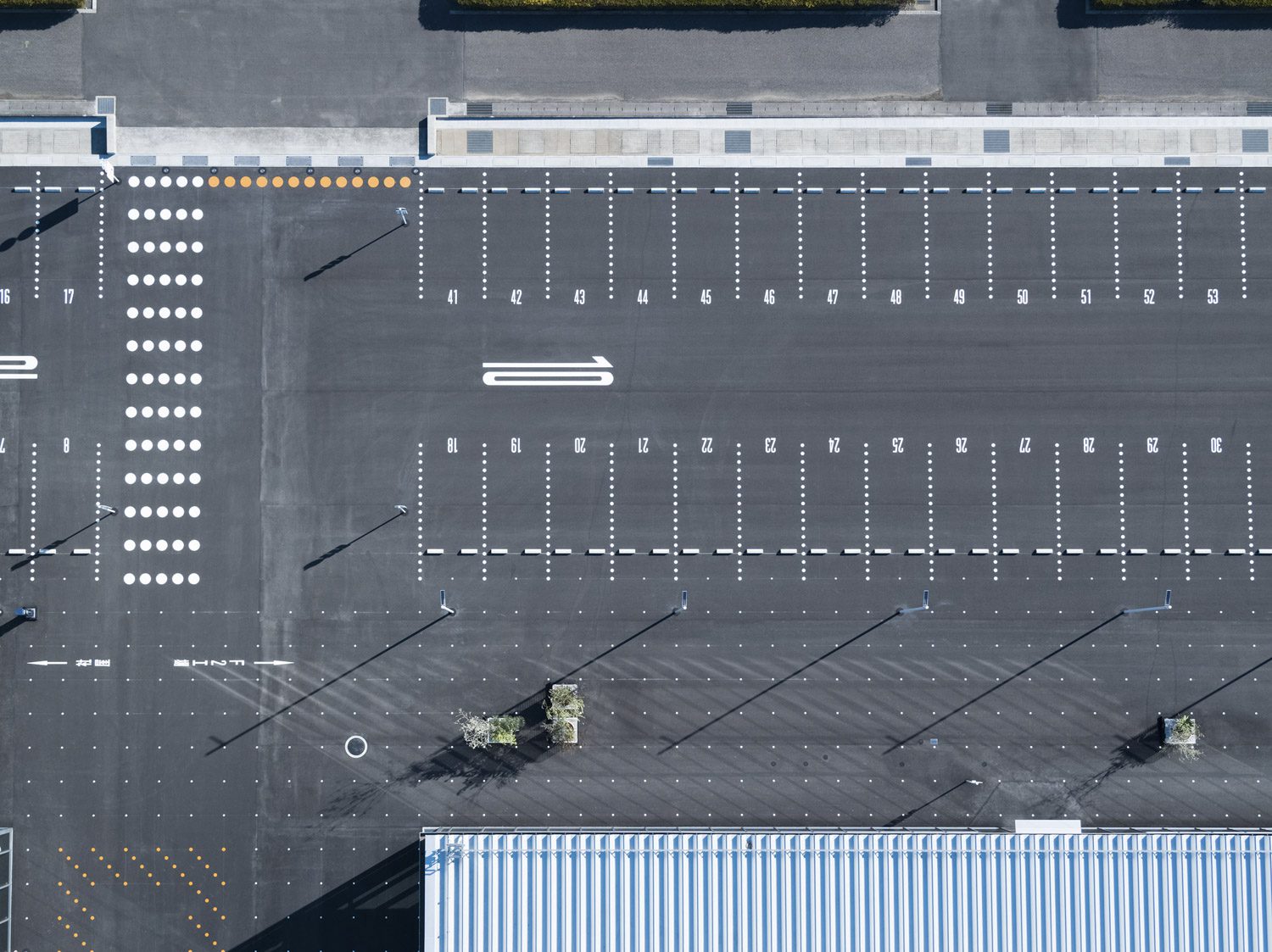
Photo: Takumi Ota
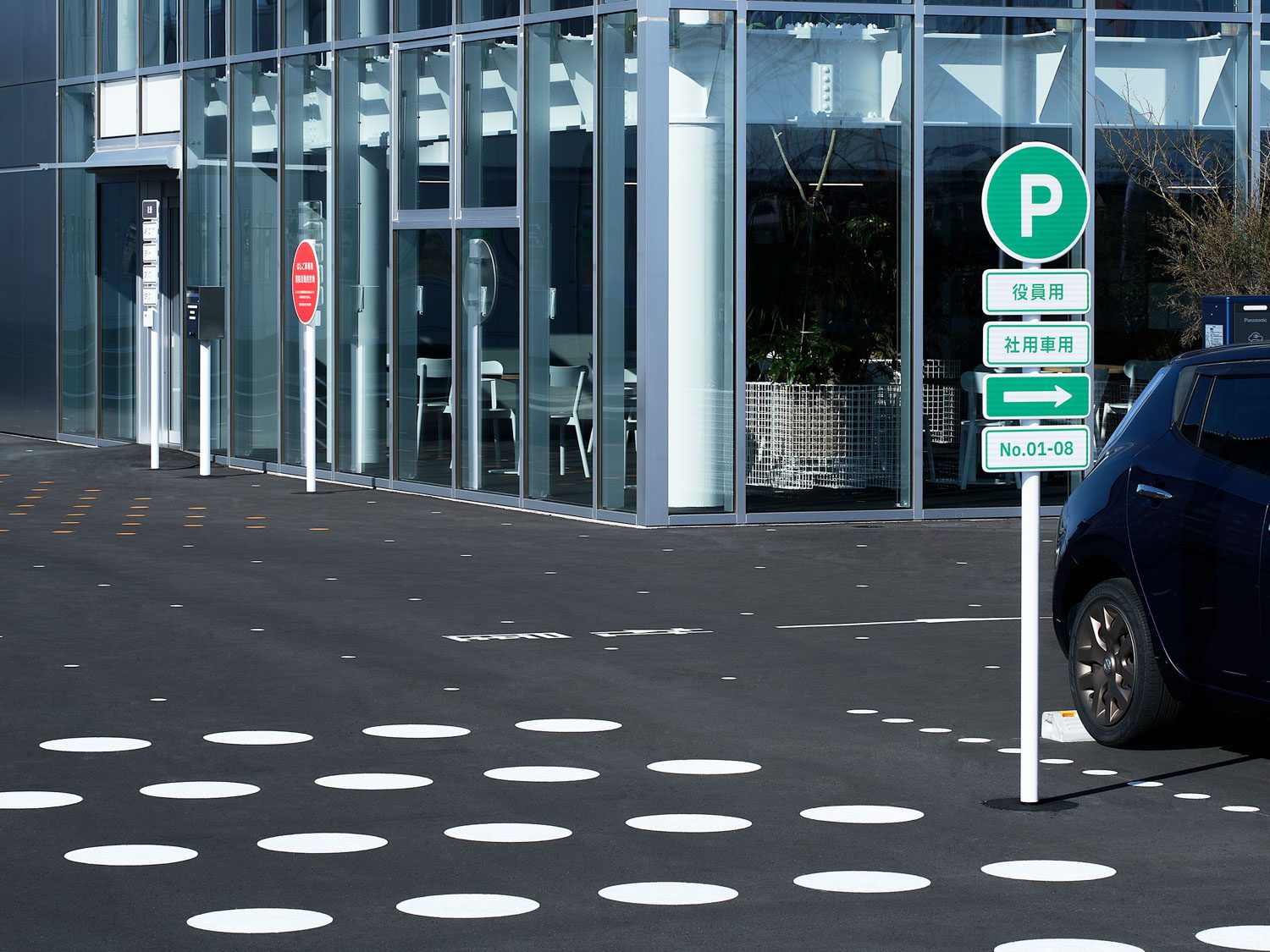
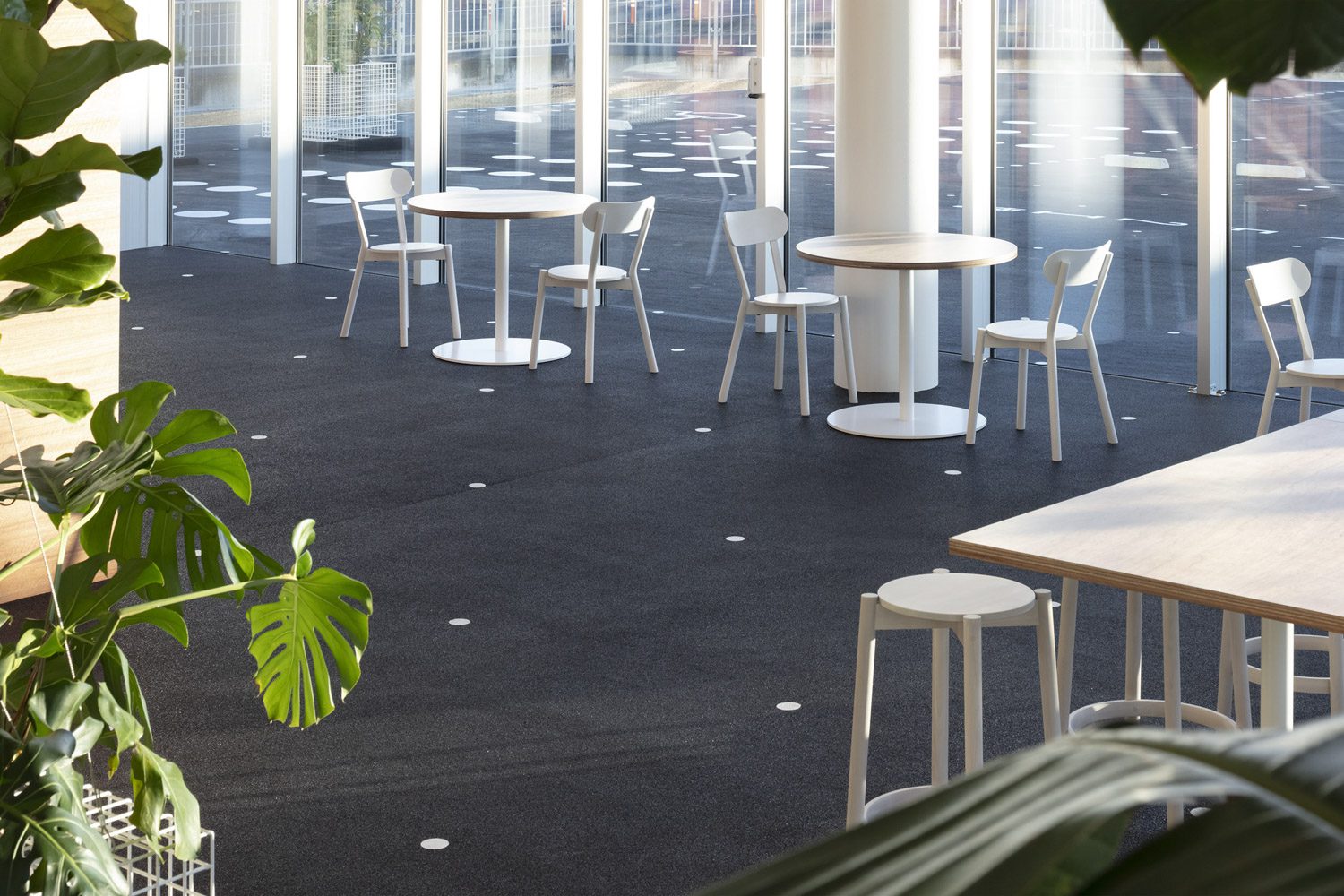
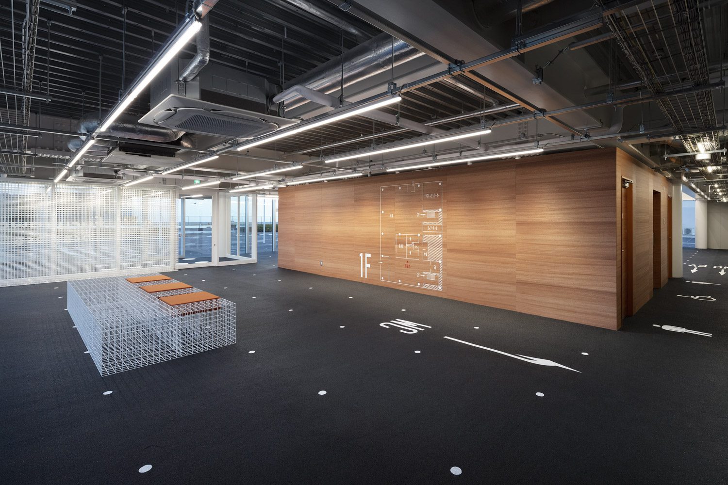
Beyond just meeting budget control requirements, the incorporation of elements such as dots, dashed lines, solid lines, and arrows as signage throughout the building was directly inspired by the architecture itself. Due to the building’s extremely open design, the boundary between the exterior and interior was intentionally blurred. This included using the same design of asphalt as the parking lot as flooring inside the entire ground floor of the building (only clear glass partitions separate the interior space from the outside, ensuring that cars won’t mistakenly drive in). This design choice naturally brought the symbols and markings from the roadway into the building’s interior. From this starting point, these graphical elements were applied throughout the office building and factory.
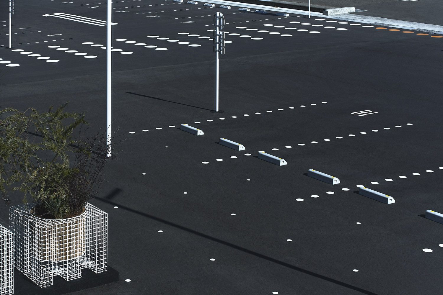
Photo: Rico Okaniwa
Examples of this integration include the white dots on the black flooring of the ground floor, which serve as a grid system aligned with the building’s architectural grid. The building directory displayed on the wall closely resembles a traffic sign, and directional arrows and markers inside the building are applied to corridor floors like lane arrows on a road. This straightforwardness and the company’s engineering-focused character are also evident in the design of the map directory, where the building’s floor plan was simplified into wall graphics. Additionally, Irobe Design Institute extended their work by creating a new corporate identity that plays with fundamental shapes such as squares and triangles, as well as grid patterns.
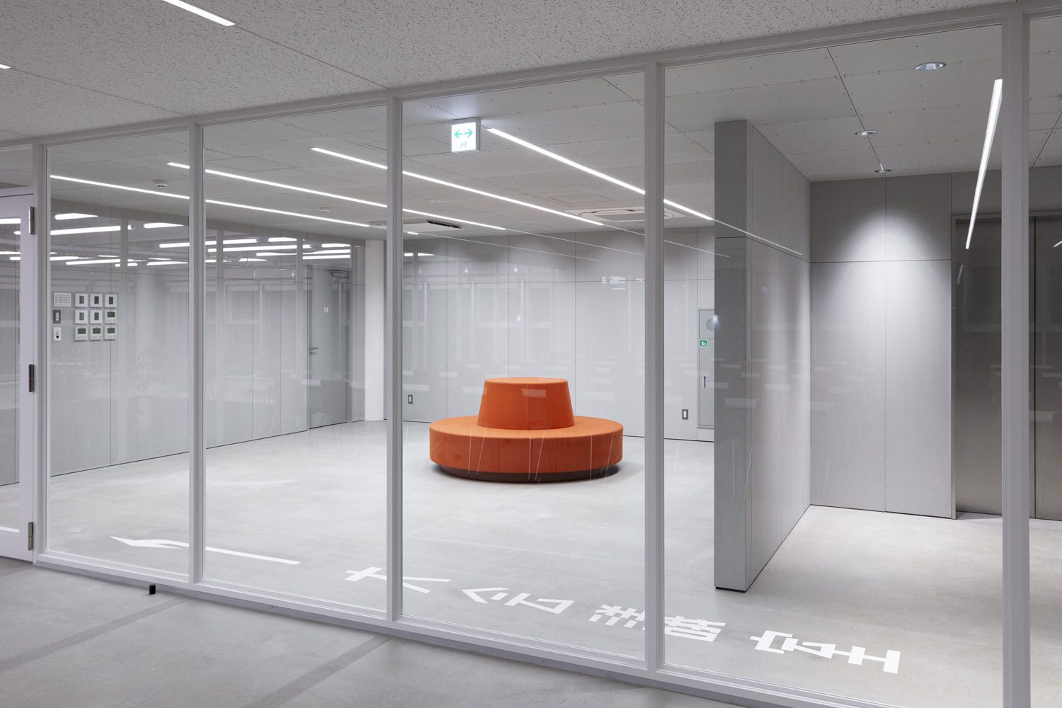
Photo: Takumi Ota
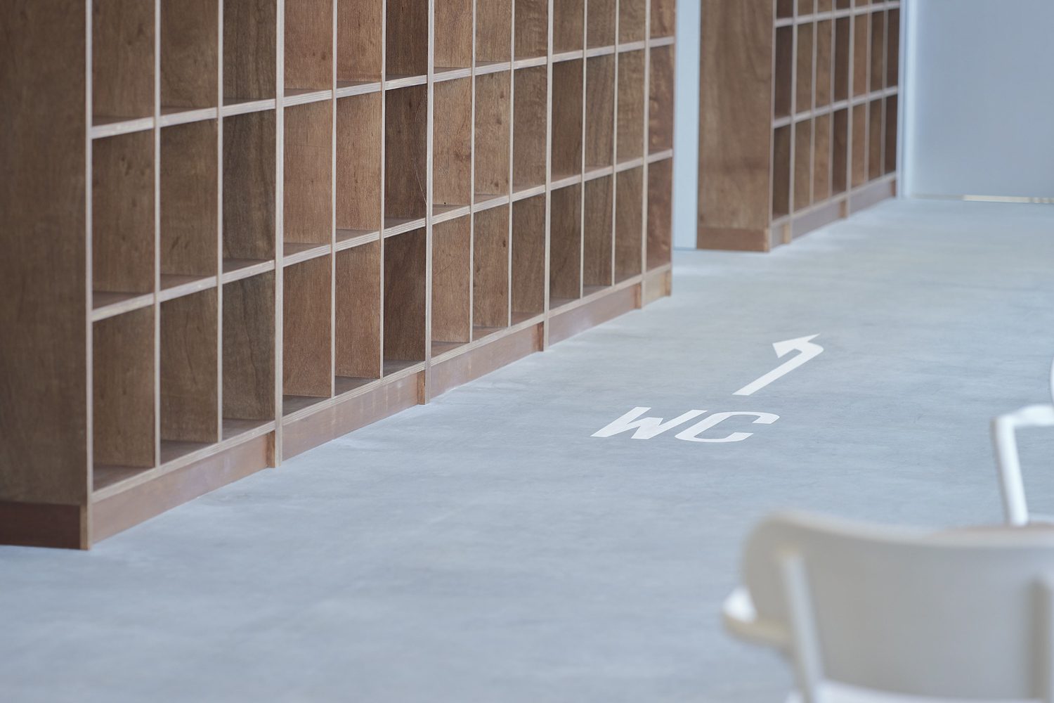
Photo: Rico Okaniwa
From another perspective, considering that Furukawa Manufacturing has been behind the smooth operation of millions of automobiles over the past several decades without most people ever knowing their name, using road traffic markings in the company’s signage design is both fitting and symbolic. Just as traffic signs are essential but often overlooked elements on roads, Furukawa Manufacturing acts like a backbone or critical system behind the scenes of automotive production. It appears that the combined architectural and graphic rebranding strategies have effectively addressed and resolved the company’s pain point. Since the completion of the redesign, the number of job applicants to Furukawa Manufacturing has increased severalfold.
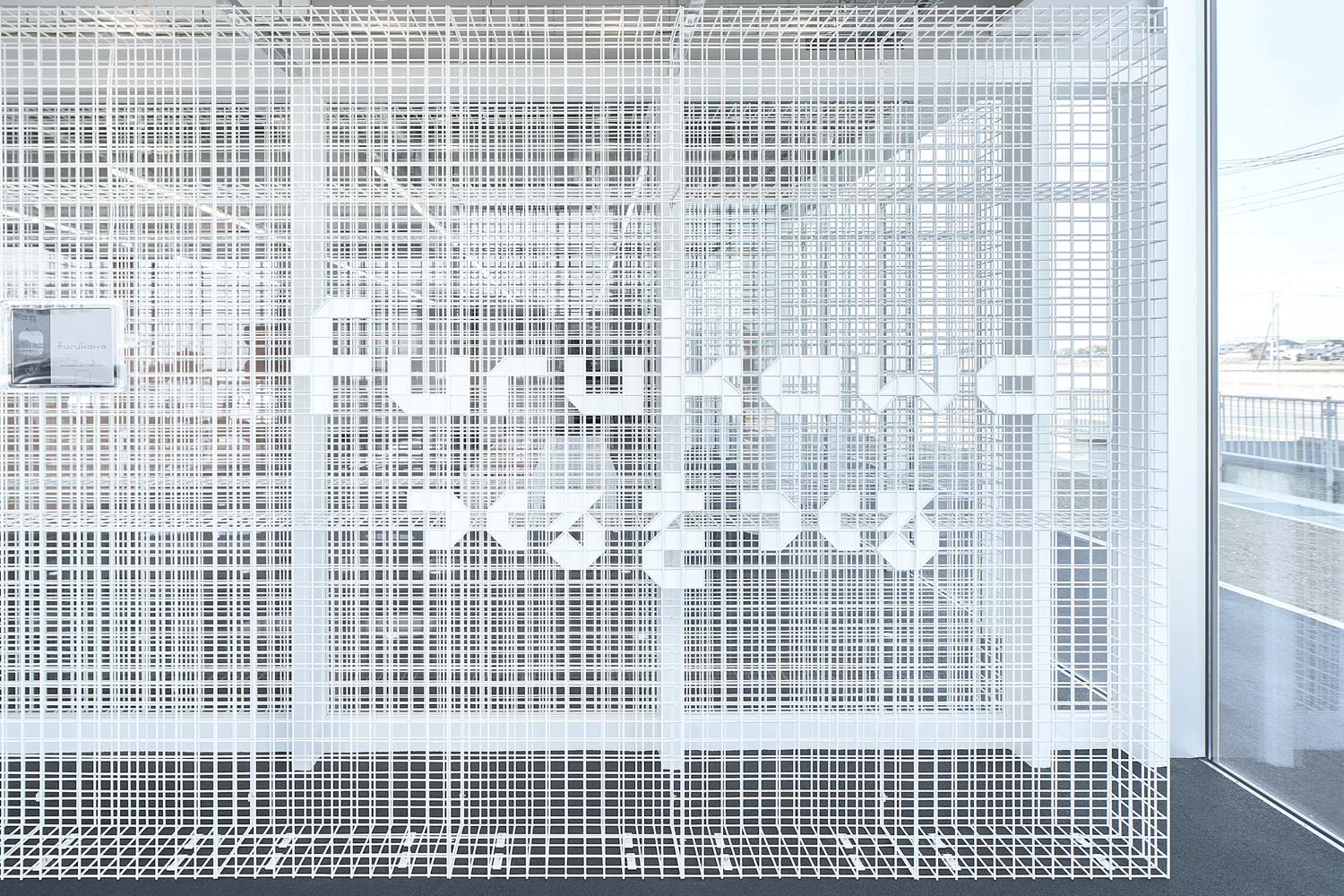
Furukawa CI | Photo: Rico Okaniwa
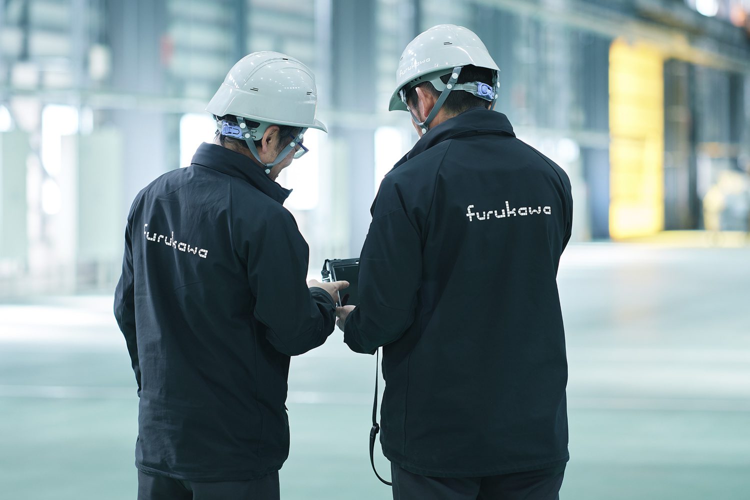
Furukawa CI | Photo: Rico Okaniwa

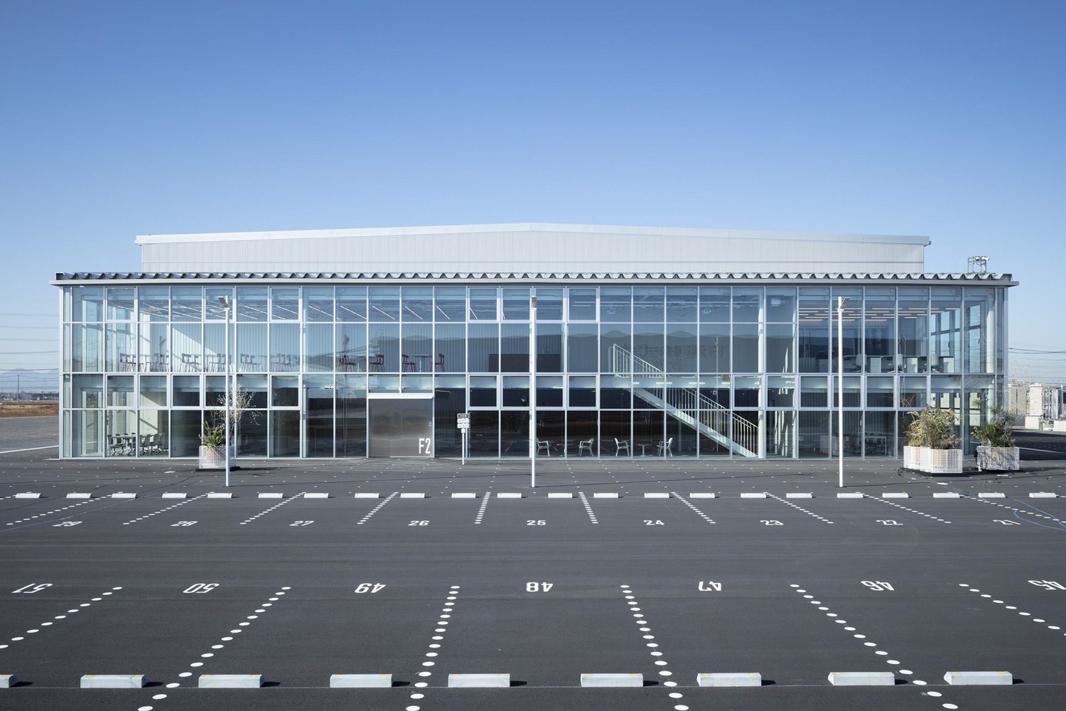 Photo: Takumi Ota