MONOTYPE STUDIO CONTINUES THE LEGACY OF THE LEGENDARY HELVETICA WITH THE RECENTLY UNVEILED FONT WITHIN WHICH CONTAINS OVER A MILLION VARIABLES, OR, TO BE MORE SPECIFIC, 1.235 MILLION VARIABLES
TEXT: PIYAPONG BHUMICHITRA
IMAGE AND VIDEO COURTESY OF MONOTYPE STUDIO
(For Thai, press here)
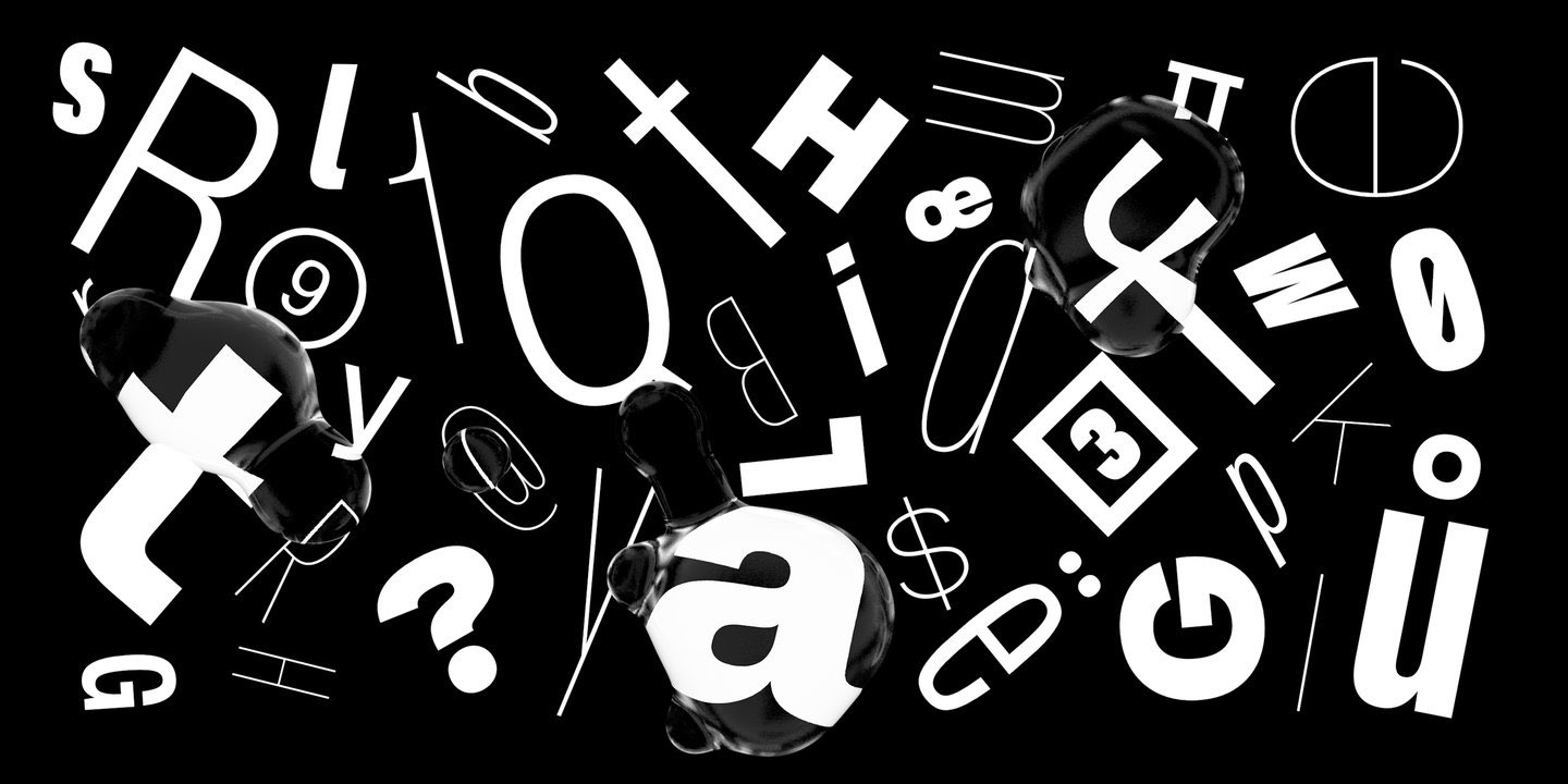
© 2021 Monotype Imaging Holdings Inc.
In 2019, not long after Monotype Studio launched Helvetica Now, the creative director of Monotype, Charles Nix had an interview with theverge.com about the backstory of the design of Helvetica Now. One of the questions William Joel asked him was did he ever think about designing Helvetica as a variable font.
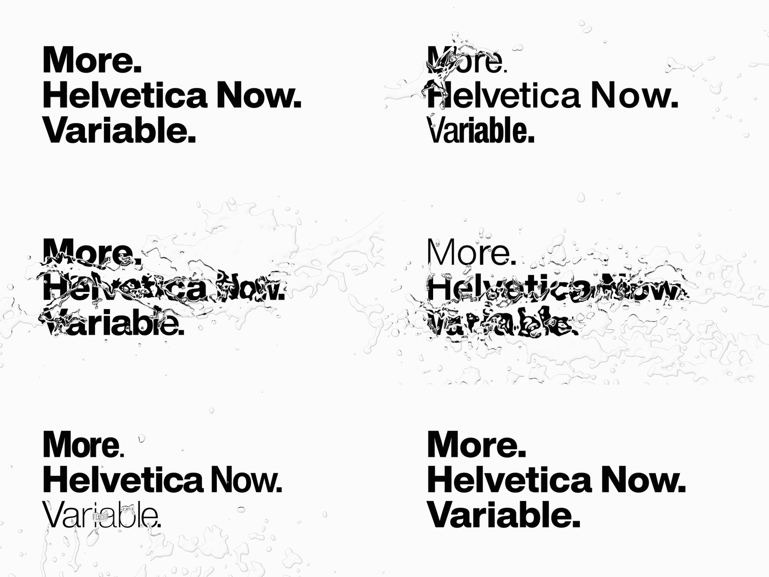
‘Of course I have,’ was Nix’s answer. It’s been a little over two years now (current time July 2021), and Monotype Studio finally releases Helvetica Now Variable they have developed from Helvetica Now’s variable font format. Which means within that one file of font there are over a million variables. Yep. You’ve got that right. 1.235 million variables to be specific.
© 2021 Monotype Imaging Holdings Inc.
Before we dive deeper into the story of Helvetica Now Variable, let’s go back and talk about Helvetica Now. Back in 2015, Monotype’s team of font designers at the studio’s Germany office were developing an idea for a new version of Helvetica. They researched the information and traced back the font’s first version designed by Max Miedinger and Eduard Hoffmann back in 1957. They looked up and found the design process, the hot lead typesetting technique, as well as the transportation of the type metals to different countries including various ways about how the font had been used.
They discovered that in the first thirty years, some of the Latin letters of the Helvetica typeface had more than one variable to use. For instance, the ‘R’ with had a straight leg whereas the ‘a’ was actually the letter ‘d’ with no leg, and the clean ‘U’ was found without any additional projection. Even the punctuation had different variations, from sharp to round edges. When digitalised, these alternatives were not included, hence the Monotype team’s attempt to bring them back. But the most crucial reason behind their decision to readjust the font that had been heavily used by almost every sector was due to the fact that Helvetica becomes difficult to read when used in smaller spaces. Particularly at a size smaller than 6 points, such as the small display screens of smart watches or smartphones.
© 2021 Monotype Imaging Holdings Inc.
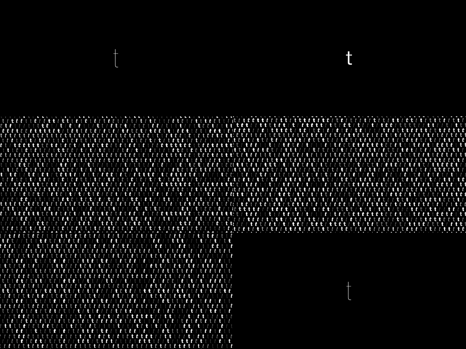
From the first step in 2015, they came up with three sizes based on different usages. Helvetica Now, therefore, has become a typeface with three available optical sizes—Micro, Text, and Display. All of them also include symbols other than punctuations such as currency symbols, the @ sign and different types of arrows. In total, Helvetica Now has over 40,000 characters.
© 2021 Monotype Imaging Holdings Inc.
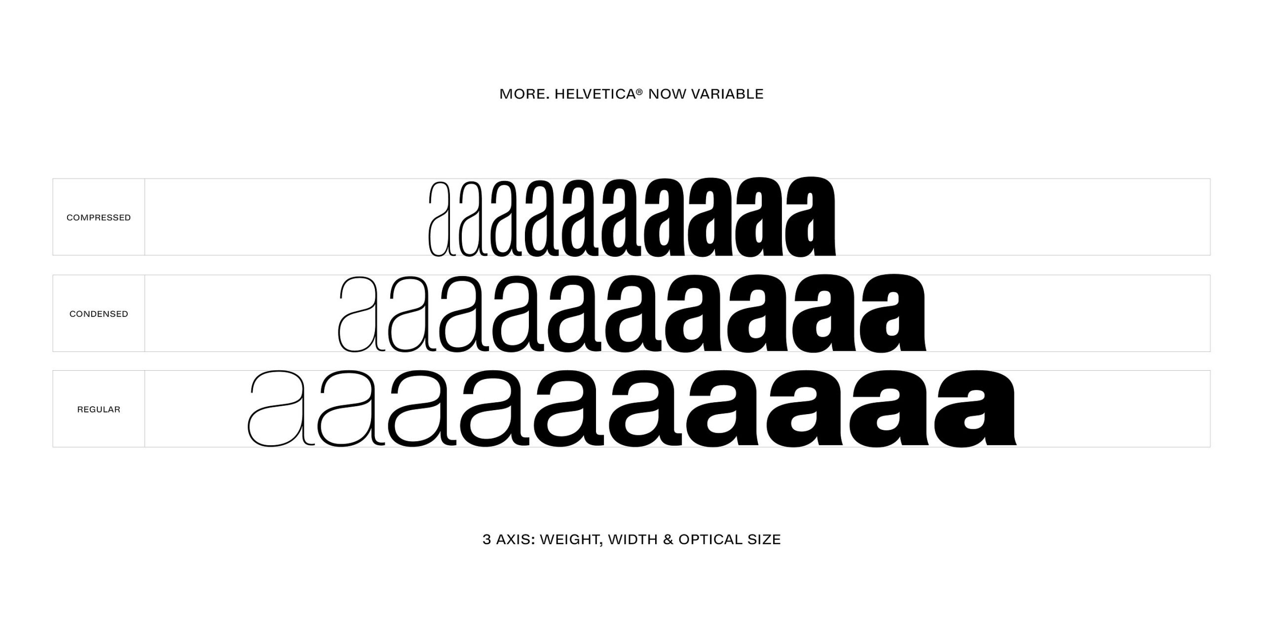
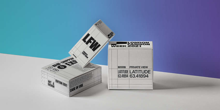
While that sounds like a lot, the number is incomparable to the the Regular Helvetica Now Variable, with over a million characters and over 2.5 million Italic characters, not to mention how every of these characters are put together in one font file. Monotype first introduced ‘Helvetica Now’ Variable in July of 2021 with Regular and Italic style available for purchase. Monotype suggests that the new addition be used as an extension of Helvetica Now or it can be further customized. With the weight (from hairline to extra black) and the optical sizes that are easy to read (from 4 points to any size). It also includes brand new Compressed and Condensed widths, which are details that graphic designers are familiar with.

© 2021 Monotype Imaging Holdings Inc.
Recently after the launch of Helvetica Now Variable, we had a chance to talk with Suppakit Chalermlarp, the co-founder of Katatrad, a type design studio and Thailand’s leading digital type foundry. This is a part of Suppakit’s insights and opinions about the typeface. The conversation grants us a better understanding in grasping the variable font, which was born from the mutual agreement between big tech companies including Adobe, Apple, Microsoft and Google in 2016. This was before it was later developed into the One variable font file technology, which includes every width and weight within the font’s variation axis.
Suppakit Chalermlarp: The variable font technology enables designers to have more fun using all these different characters because it grants everyone endless possibilities. No matter whether they are used on print media or display screens, especially nowadays when there’s an incredible variety of gadgets and display technologies. Such high flexible ability helps the characters to adjust to fit varying sizes and proportions of display screens, from large to small, high definition to low definition. It also uses a lot less resources compared to the current fonts.
© 2021 Monotype Imaging Holdings Inc.
art4d: How will the 1.235 millions of characters promoted by Monotype affect font design developed by other studios in the future? Because by just thinking about buying Helvetica Now Variable means that there’s practically no need to buy other Sans Serif fonts for years, isn’t that so?
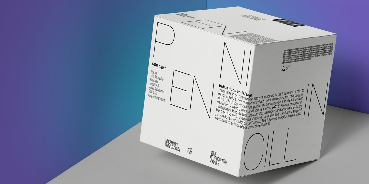
SC: Normally, we set the weight at 100-900 and we equate 100 to Thin, 400 to regular and 900 to Black. Initially, we would adjust the width, maybe 100 a time, but using a variable font is more special in the way that it doesn’t require you to make an adjustment of 100 at a time, and you can adjust at whatever number you want, so that explains what Monotype said that each font can have incredibly diverse weights.
© 2021 Monotype Imaging Holdings Inc.
art4d: How will a variable font of such magnitude impact the type foundry industry in general?
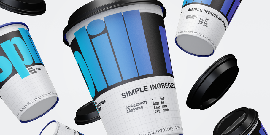
SC: The issue has been widely and enthusiastically discussed among the type foundry industry and how much the arrival of this technology affects the existing price structure. If you ask me, I think everything moves forward eventually. The arrival of variable fonts is just one of the changes. I think it’s going to take a while until the market adjusts to the point where things fall into place. To answer the question about whether Helvetica Now Variable will be problematic to other type foundries, personally, I don’t think it’s going to be a problem in the long run because eventually each foundry will develop its own variable font. But if we’re talking short-term, there may be certain impacts because it naturally takes a long time for a development to reach completion.
© 2021 Monotype Imaging Holdings Inc.
art4d: What about the small font foundries, how do you think this will affect them?
SC: I think variable font is going to have some impact on the smaller font foundries, but I think it’s going to be only in the beginning. I don’t think it’s going to wipe every small designer out from the industry because developing a variable font is going to take more time like I mentioned earlier. So if you have a bigger team, you can work faster. If your team is small, it’s going to take a longer time to work on it.

© 2021 Monotype Imaging Holdings Inc.
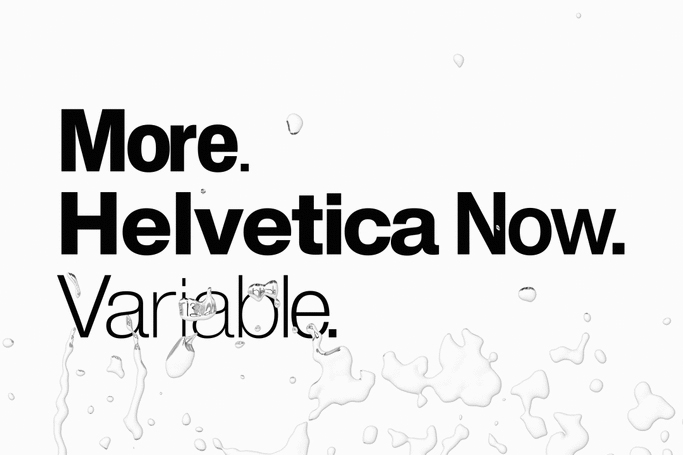
Monotype claims that Helvetica Now Variable will change people’s understanding of typeface to the extent where everyone will forget what typeface was like before Helvetica Now Variable. Is this an exaggerated statement for advertising purpose, or a hyperbole similar to a sensationalized news headline? Or perhaps the copywriter’s work? It’s the users and font designers who are the ones who can answer these questions best.

 © 2021 Monotype Imaging Holdings Inc.