PLAN ARCHITECT, ALONG WITH GLA DESIGN STUDIO AND PLAN MOTIF TRANSFORMED THE OLD BUILDING OF THE BANK OF THAILAND’S NORTHEASTERN REGION OFFICE INTO AN APPROACHABLE LEARNING SPACE IN KHONKAEN’S DOWNTOWN
TEXT: PRATCHAYAPOL LERTWICHA
PHOTO: PANORAMIC STUDIO EXCEPT AS NOTED
(For Thai, press here)
Buildings are similar to human beings for the way they can change roles and statuses as time goes by.
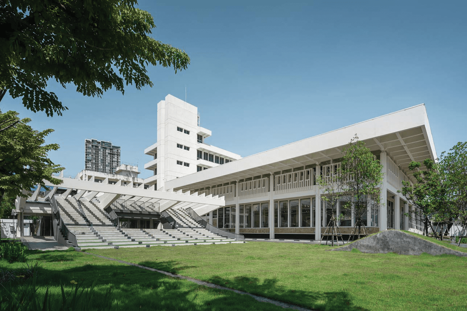
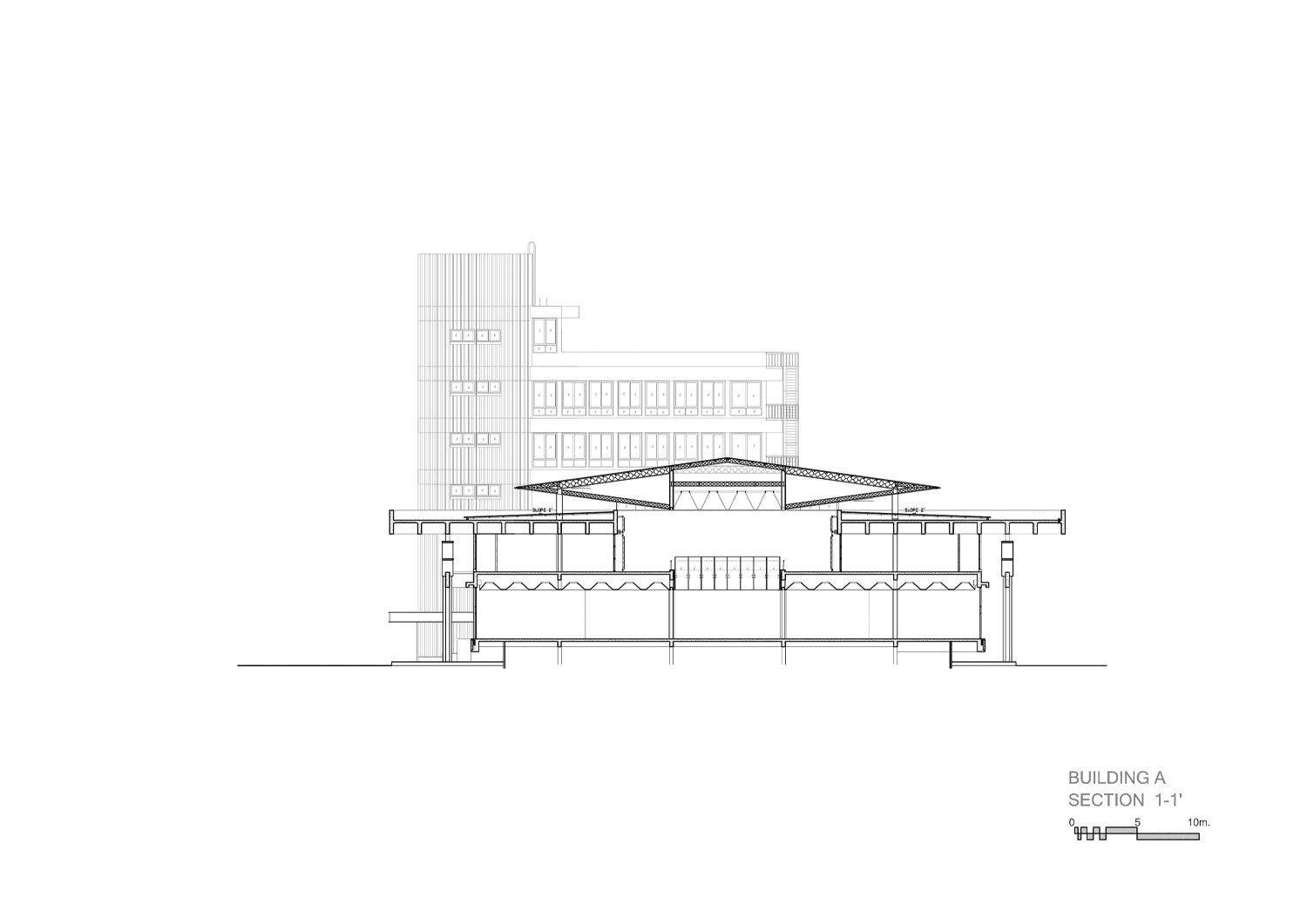
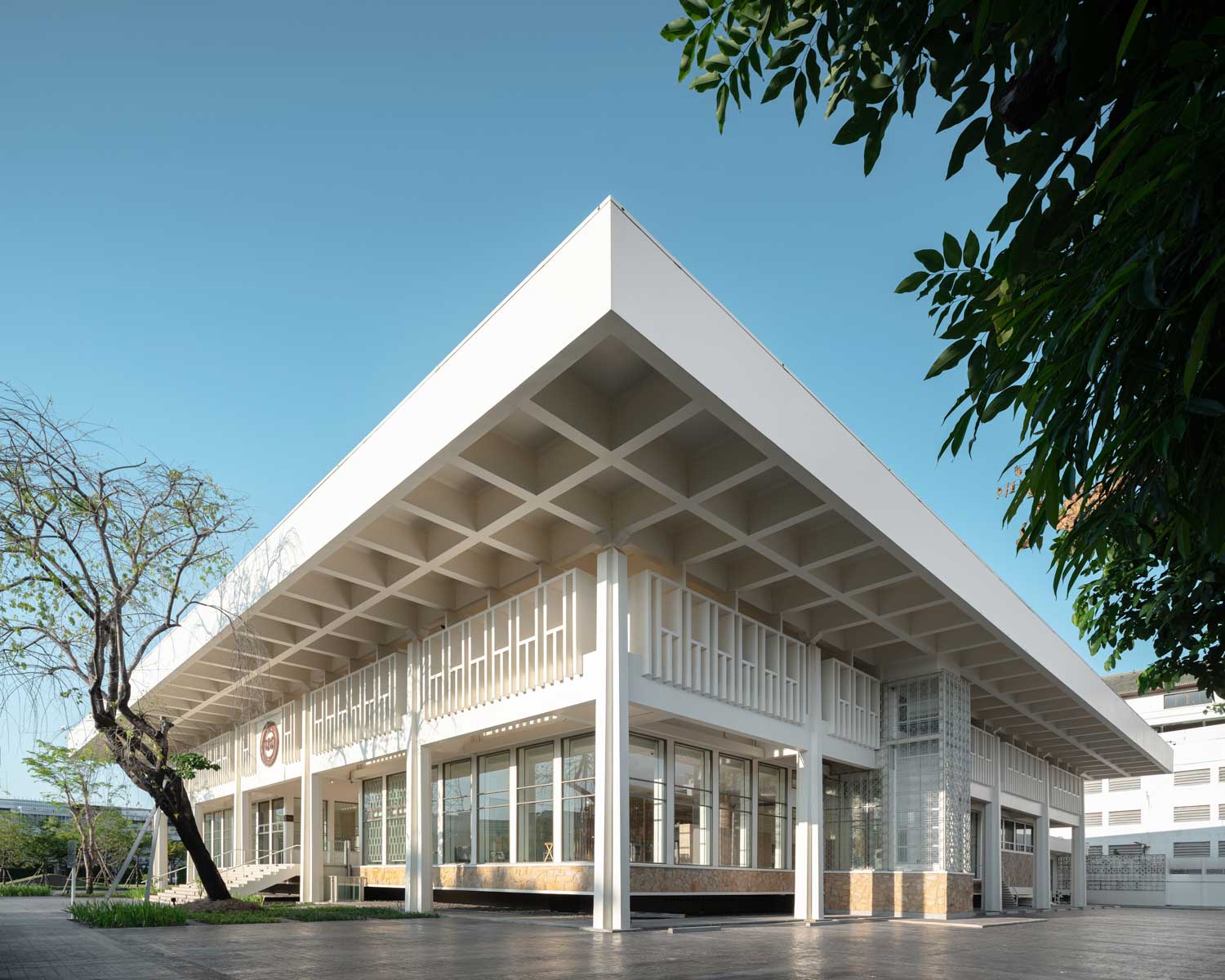
Situated at the intersection of Srichan Road and Klang Muang Road in Khon Kaen Province, lies the esteemed architecture of Bank of Thailand’s Northeastern Region Office. One of the buildings located within the perimeter is the main building, which was designed by Jira Silpakanok, the architect renowned for designing the iconic Scala movie theater. This particular Bank of Thailand’s office building exemplifies a skillful integration of modern and the vernacular architecture from Thailand’s Northeastern region. Its roof incorporates an innovative waffle slab structure, which was considered progressive at the time, to extend its overhanging section. This design element serves the dual purpose of providing protection from both the sun and rain. Additionally, the recessed walls deliberately expose a series of pillars, reminiscent of traditional vernacular houses found in the northeastern or Isan region of Thailand.
When its lease agreement with the Crown Property Bureau concluded in 2017, Bank of Thailand decided to find a new location for its Northeastern Region Office. The construction of the new office building is situated adjacent to the vast waterscape of Bueng Kaen Nakhon Pond. Subsequently, the Treasury Department undertook the task of renovating the vacant office building, transforming it into the Treasury Museum. This establishment not only serves as a repository of knowledge but also functions as an educational hub for the residents and visitors of Khon Kaen. Plan Motif, the studio appointed as the lead design team for the museum’s permanent exhibition, invited Plan Architect to oversee the renovation of the building, while GLA Design Studio was brought in to handle the comprehensive transformation of the project’s landscape.
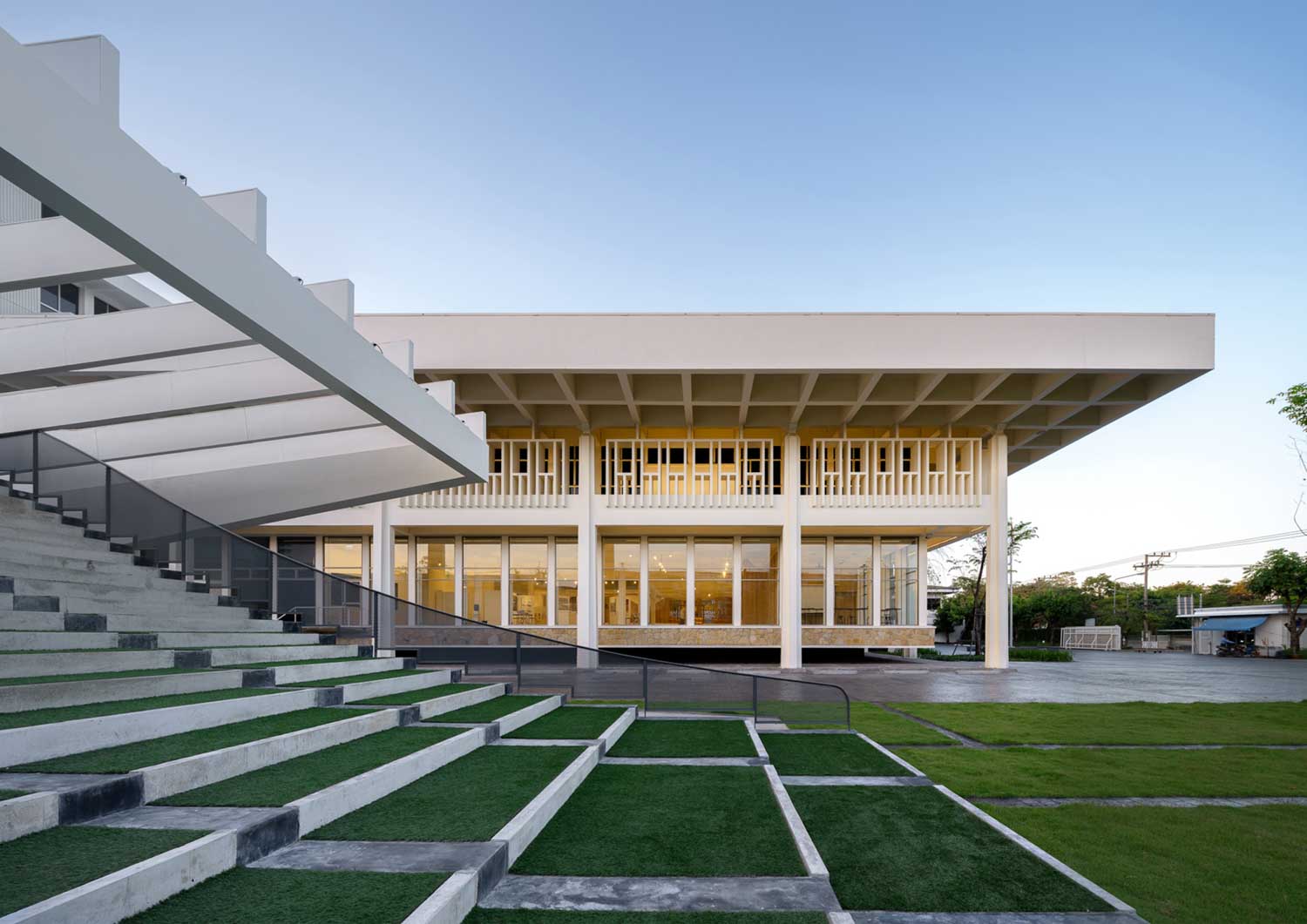
Photo courtesy of Plan Architect
The original building was intentionally designed with maximum security in mind to house a vast collection of ancient and invaluable artifacts as well as historically significant documents and information. Consequently, the walls of the ground floor were built with increased thickness and sturdiness, positioned at a height above the average eye level. This deliberate design choice effectively renders the interior of the building nearly imperceptible to external observers. Upon traversing the premises, it becomes apparent that no windows or apertures are present at the visually accessible level. All of the windows have been equipped with window grills, which effectively strengthen access control. Additionally, security grills were also found partitioning the interior space into distinct sections.
Since the building’s intimidating appearance was not aligned with its new roles as a museum and learning center, the main objectives of Plan Architect were to enhance the edifice’s aesthetic appeal while attempting to preserve the original architecture as much as possible.
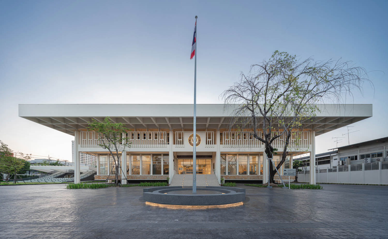
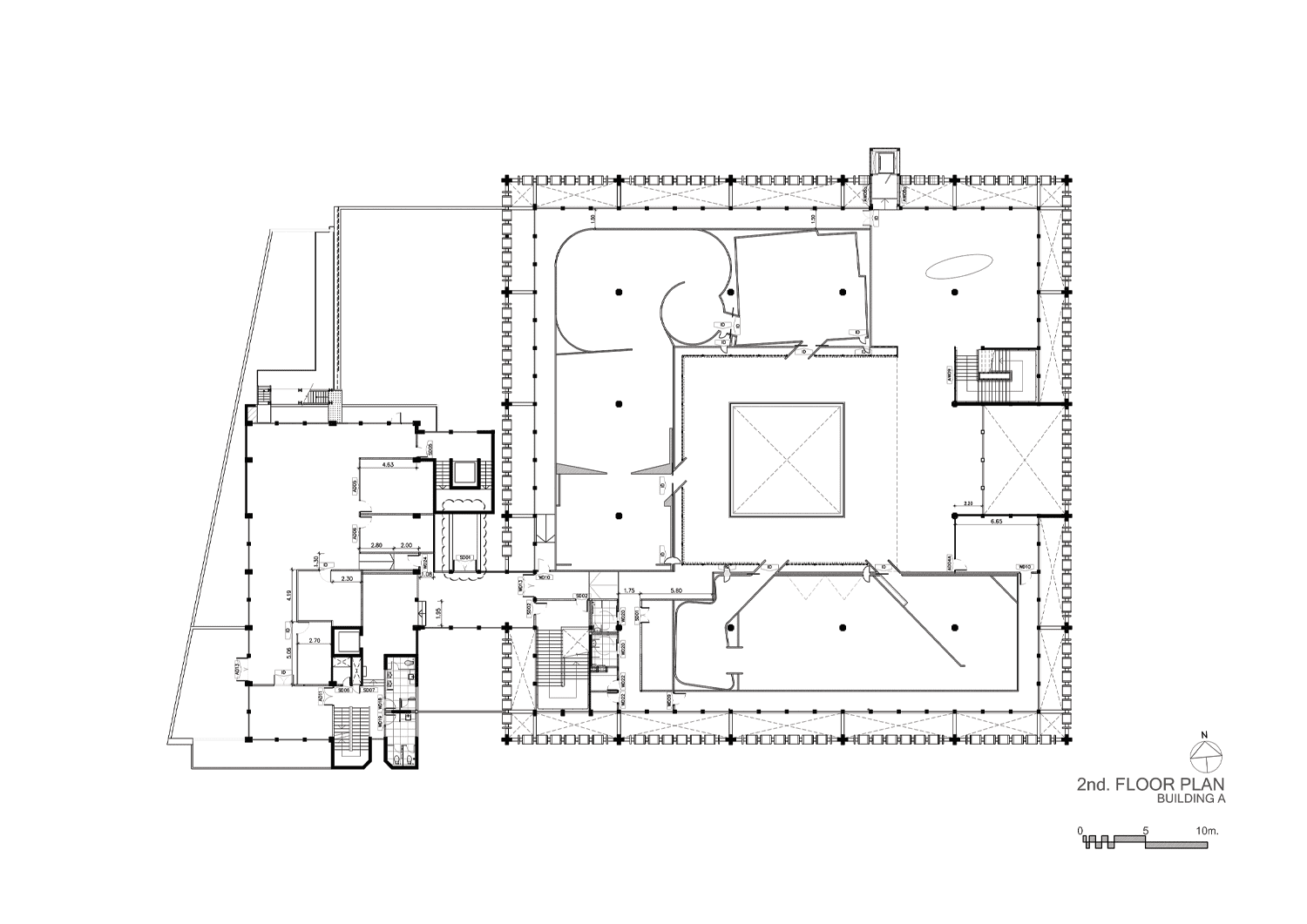
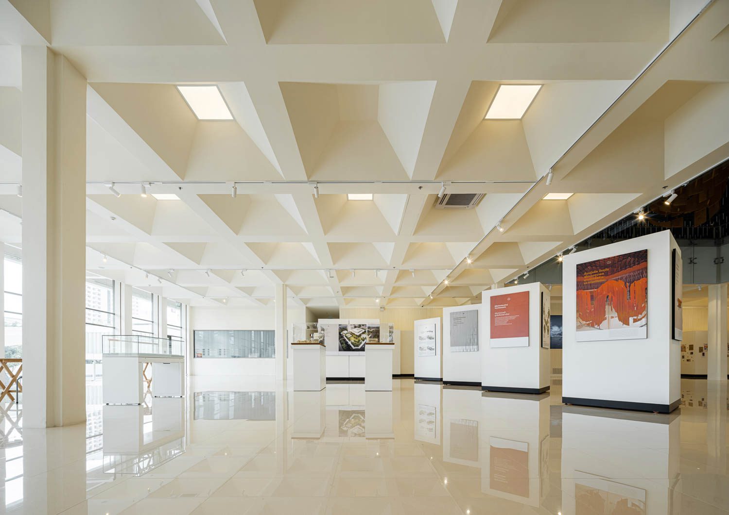
Plan Architect converted the previously partitioned first floor area into an atrium with versatile functions. This transformation has created an open and expansive space that facilitates a wide range of activities with optimal flexibility. The tall, solid walls were demolished and replaced with transparent curtain walls that extend from the floor to the ceiling. This new design allows for the entry of natural light and provides access to the outside surroundings. The sandstone walls’ texture, which adds to the unique and memorable character of the building, is also present in the finishing material of the beams. The aesthetically pleasing elements of the building’s exterior waffle slab structure serve as a source of inspiration for the design of the interior ceiling. This design approach not only helps in maintaining the building’s original character but also fosters a seamless connection between the interior and exterior spaces.
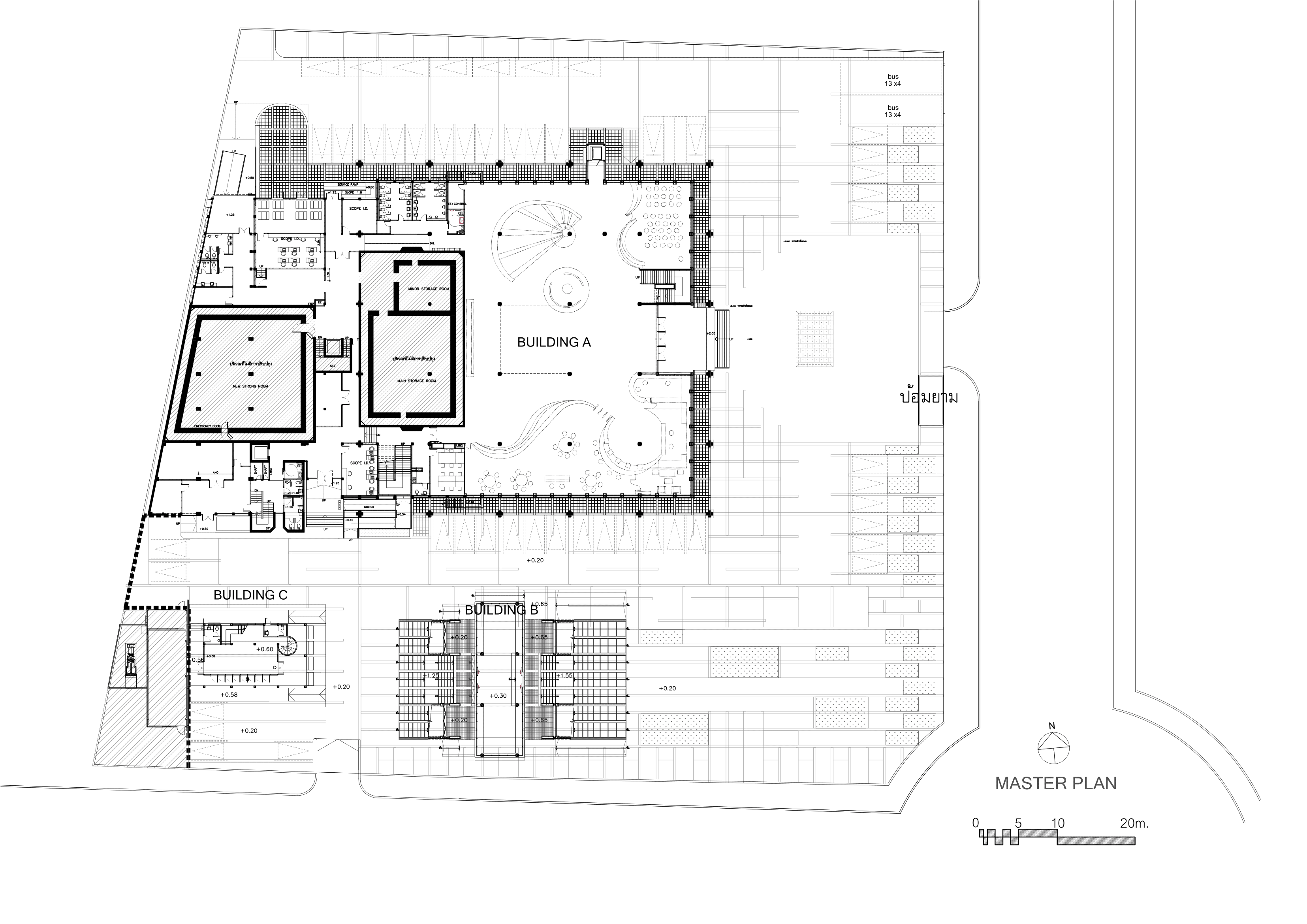
Master plan
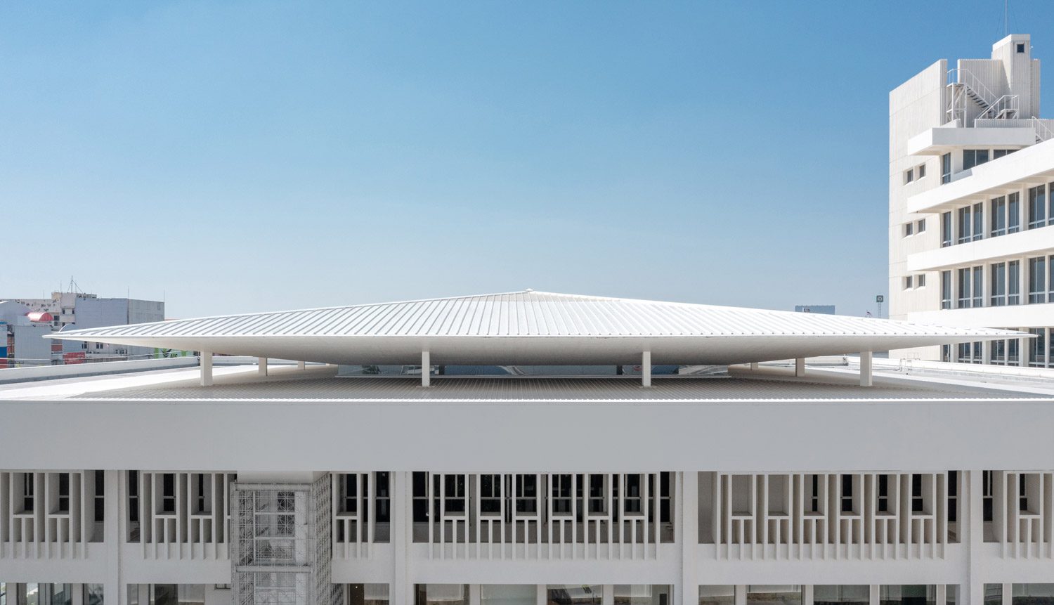
The architect has strategically eliminated sections of the second-story floor surrounding the courtyard, resulting in a substantial void that seamlessly connects the first and second floors. The metal security grill, which was originally installed around the court to deter theft, has now assumed a new purpose as the ornamental walls of the second floor, where the exhibition space is located. The construction of the roof is designed to convert the court into an enclosed interior area. The pyramid roof presents a visual challenge for visitors upon entering the building, as it is intentionally designed to create the illusion of seamlessly blending into other architectural elements. This design choice reflects the architect’s intention to maintain the building’s original appearance. The roof has been deliberately designed with small openings on its sides to allow for the entry of natural light, which serves to illuminate the interior and create a sense of grandeur and spaciousness throughout the entire space.
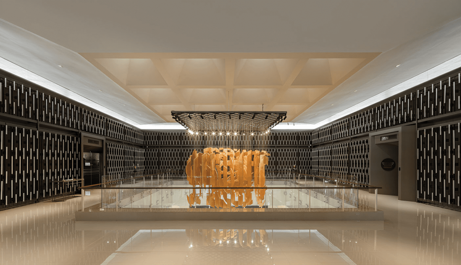
The original building incorporated components such as wrought iron and wooden panels, which have been skillfully reintegrated into various parts of the structure. For example, wrought iron is reused as a sturdy frame of the elevator as well as the canopy above the building’s side entrances. The aged wooden panels serve a dual purpose, functioning both as the stair railing and as decorative elements at the entrance of the elevator.
Apart from the primary structure, other buildings also underwent renovation. The previous learning center, located at the property’s corner, has been repurposed as a multifunctional building, with plans being devised to transform it into either a commercial space available for rent or a small gallery in the coming years. The addition of wooden slats on the façade effectively communicates an architectural style that harmonizes with the main building while also mitigating the impact of excessive heat.
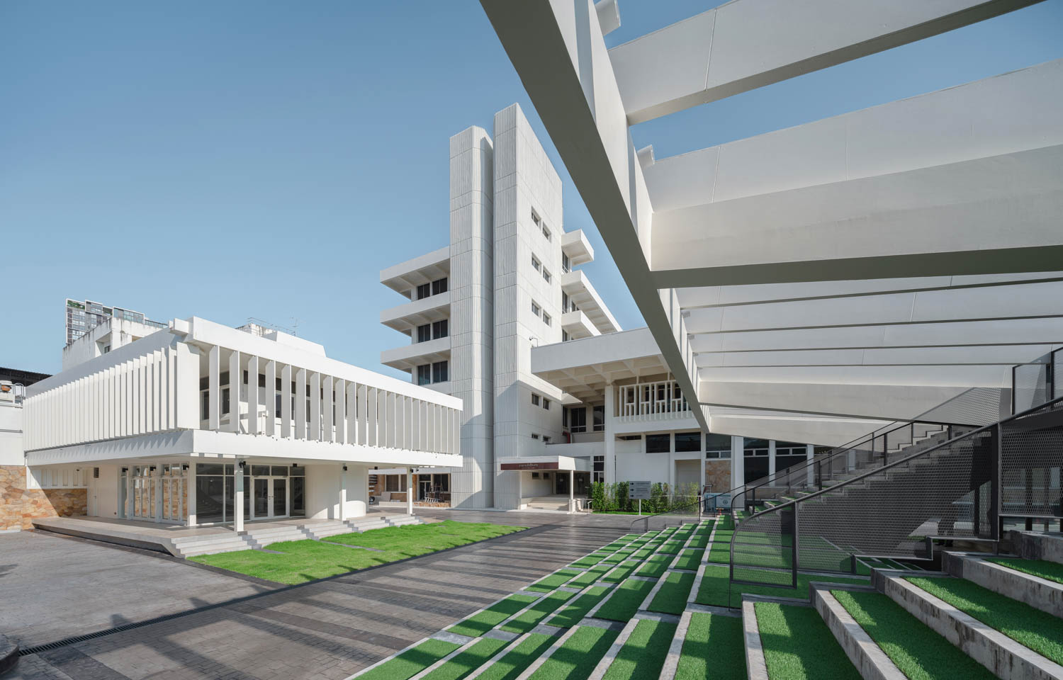
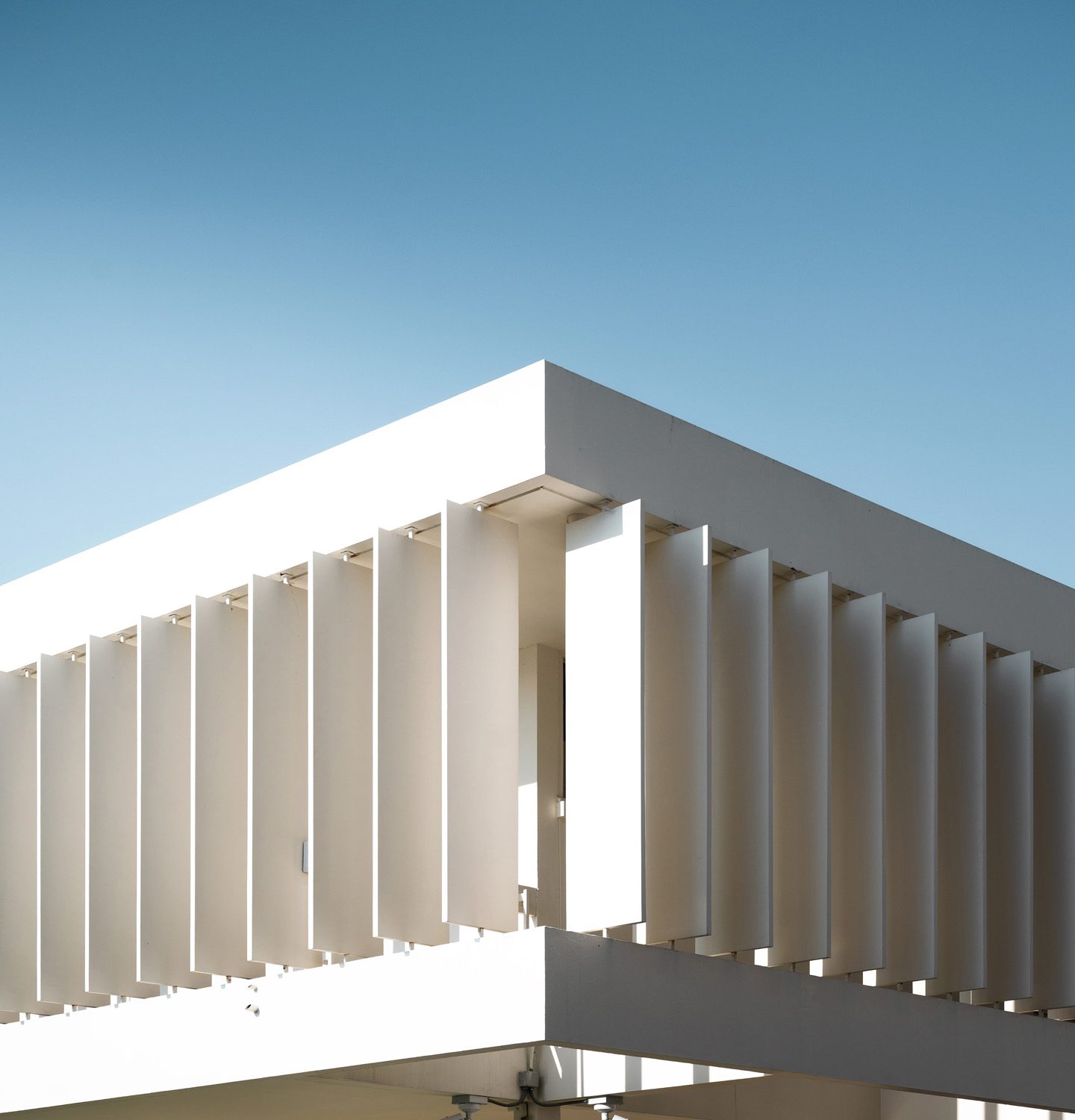
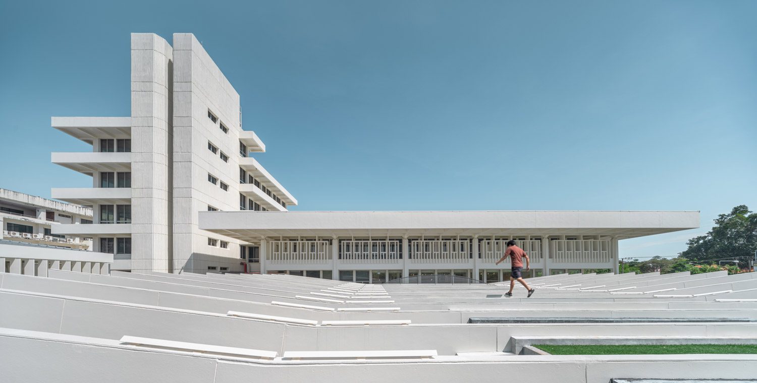
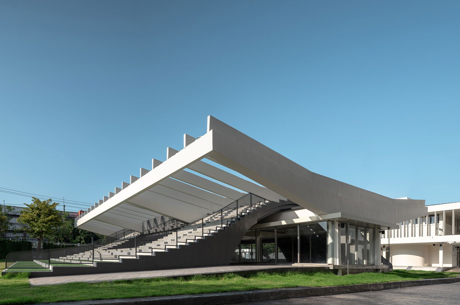
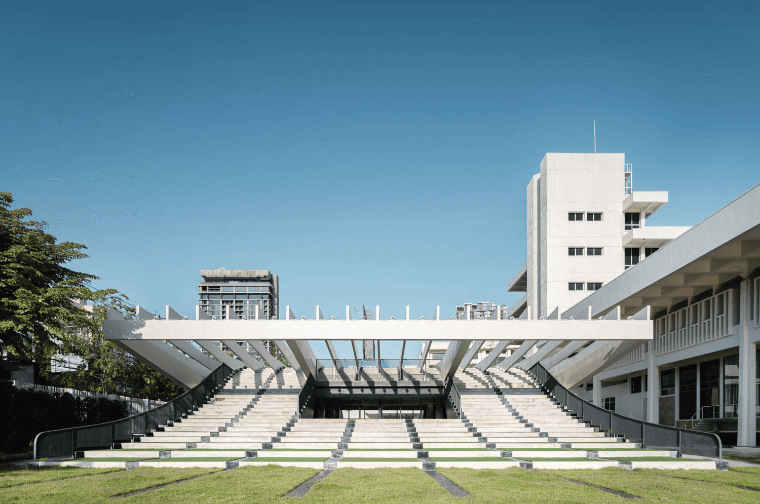
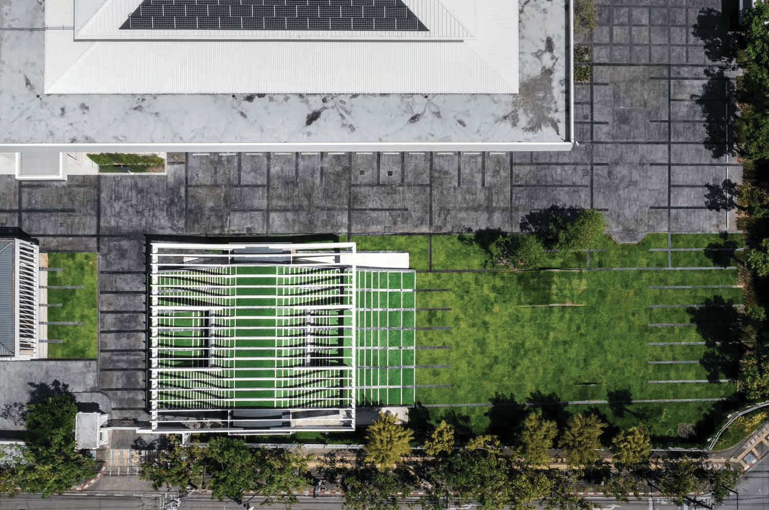
In close proximity lies a building with a remarkable butterfly-inspired structure, which, too, has gone through renovations to transform it into another multi-purpose facility. The structure has been equipped with additional fins, which replicate the slat configuration found in other buildings. The landscape architecture seamlessly integrates with the butterfly building, yet it is designed on a distinct structure that is elevated and separate from the original building to prevent any potential issues related to subsidence. The terraced floor consists of a series of steps that provide a range of functions, including an amphitheater and a small stage, depending on the intended use.
Knowledge is a crucial mechanism that drives progress, spanning from individuals to communities to provincial and national levels. Despite being a prominent city in the Northeastern region, Khon Kaen still faces limitations in terms of its available learning resources. The Treasury Museum offers itself as an alternative for the residents of Khon Kaen to explore history, discover new stories, find respite, and express their own thoughts.
The architect’s role in this project is to transform an old office building, previously confined and characterized by steel bars and solid walls, into a source of knowledge that welcomes and embraces everyone with open arms.
