ZEHARN & ZEHERNG, THE SINGAPOREAN TWIN ARTISTS, TOOK AN UNCONVENTIONAL APPROACH TO CAPTURE THE PEACE CENTRE DEPARTMENT STORE IN SINGAPORE WHICH WAS RECENTLY CLOSED, WHICH IS THROUGH THE EYES OF MODELS AND CARTOON FIGURES IN ADVERTISEMENT POSTERS
TEXT & PHOTO: PRATCHAYAPOL LERTWICHA
(For Thai, press here)
Lim Zeharn and Lim Zeherng
2023
Comb bound
14.8 x 21 cm
218 pages
The intricate nature of architecture renders its replication on a one-to-one scale particularly challenging, in stark contrast to the realms of sculpture, painting, or product design. Consequently, photography emerges as an essential instrument for capturing the essence of architectural forms. As these edifices inevitably face their demise, the role of photography becomes magnified, transforming into a repository of detail, memory, and the very soul of buildings long after they have vanished from the physical landscape.
![THROUGH THEIR EYES [PEACE CENTRE]](https://art4d.com/wp-content/uploads/2024/04/0Q4A0024_crop_low-res.jpg)
The Peace Centre, emerging in the wake of Singapore’s newfound independence, marked its inception in December 1974. This establishment not only symbolized a step towards modernity but also served as the cornerstone of Singapore’s urban development. It epitomized modern progress, becoming the premier destination for those seeking to experience the most modern and largest bowling alley in Singapore. Struggling to adapt to the rapid emergence of modern retail spaces, it gradually succumbed to neglect. Its once vibrant halls dimmed, transitioning into a hub known for cheap printing services and echoic karaoke lounges—a stark contrast to its illustrious beginnings.
Despite its faded glory, the Peace Centre remains a poignant symbol in the collective memory of Singaporeans. Its sale and impending closure in 2024, a decision that preludes its physical disappearance, has sparked a creative resurgence. The DECK, an art photography center, seized this moment to curate an exhibition within the Peace Centre’s walls, a part of the Singapore Art Week 2023. This initiative saw the participation of Zeharn & Zeherng, a duo of Singaporean twin artists, who contributed ‘Through their Eyes [Peace Centre],’ a photographic ode to the mall’s lingering atmosphere.
![THROUGH THEIR EYES [PEACE CENTRE] review](https://art4d.com/wp-content/uploads/2024/04/0Q4A0012_crop_low-res.jpg)
Architectural photography typically brings to mind polished images showcasing interior spaces, the stunning façade of buildings from various angles, helping us appreciate the architectural form and its surrounding context. However, the Peace Centre images in this book offer an unexpectedly peculiar perspective.
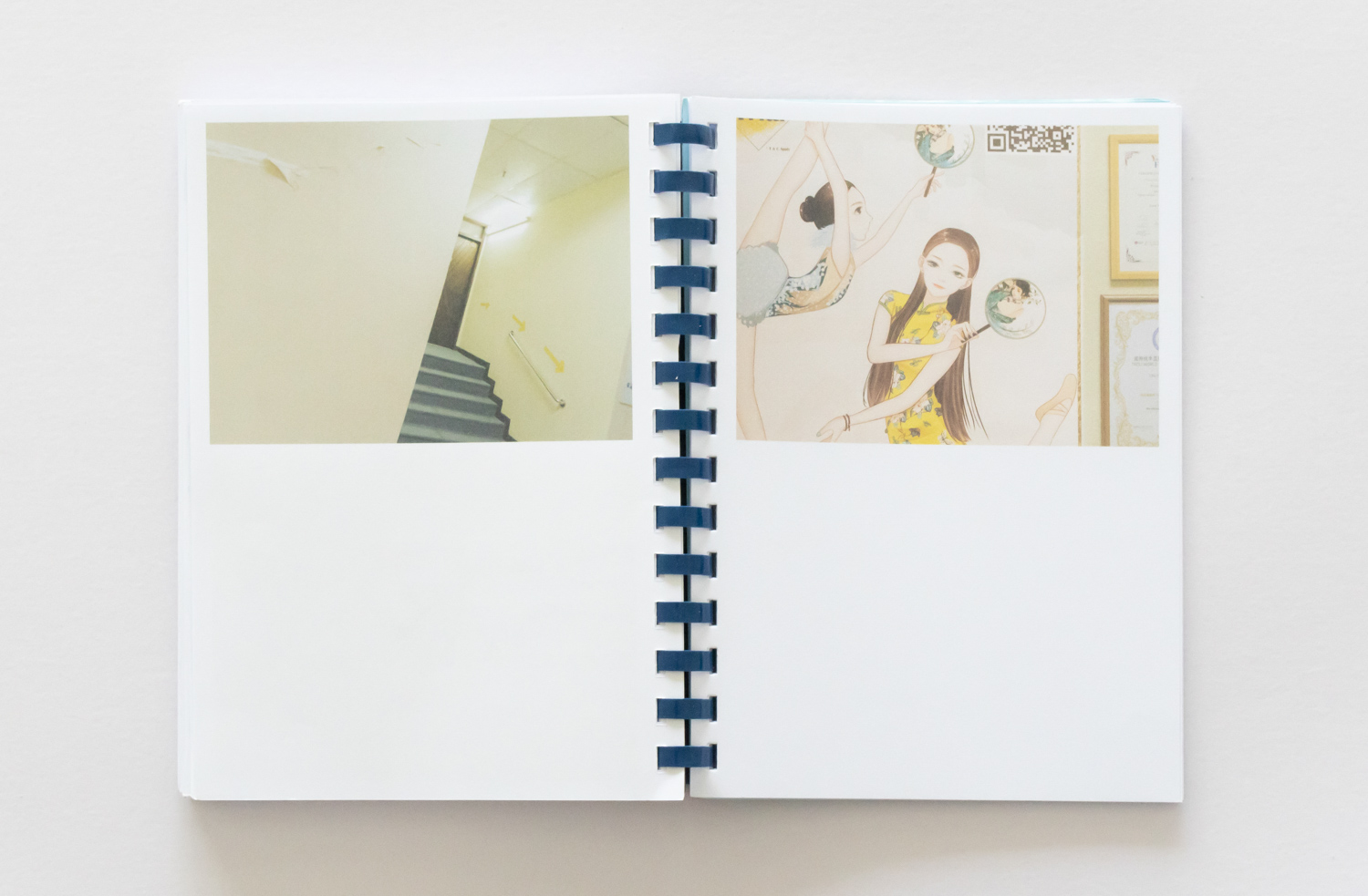
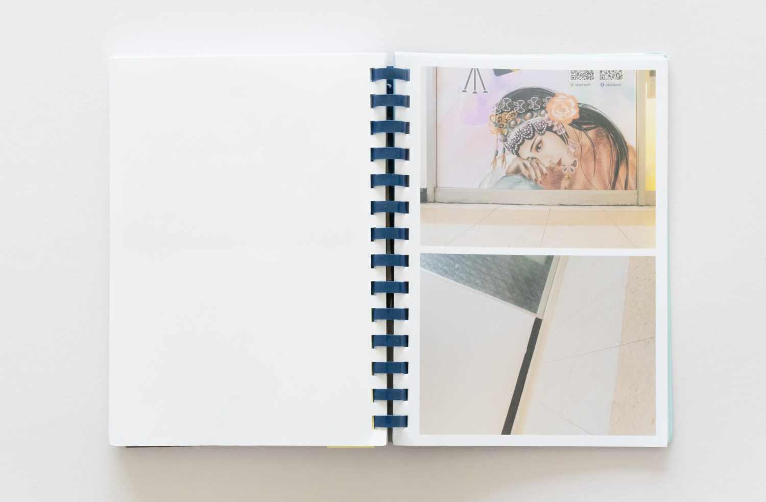
The book juxtaposes two distinct types of photography on each spread. The first type offers unconventional perspectives—alternating between a featureless wall and an exposed ceiling; the second type immortalizes individuals or cartoon characters on advertisement posters on the walls. These bizarre-looking photos emerge from an innovative technique: affixing a mobile phone camera to the eyes of the people or cartoon characters on the old posters, thereby capturing their perpetual observation of their surroundings, keeping their watchful eyes as days went by.
![THROUGH THEIR EYES [PEACE CENTRE] review](https://art4d.com/wp-content/uploads/2024/04/0Q4A0014_crop_low-res.jpg)
“When the announcement came that Peace Centre was successfully sold for redevelopment, the attention of the media centered heavily on the plight of affected tenants. While we sympathized with their predicament, we felt that Peace Centre held a unique character that extends far beyond its mere physical structure and it was being overlooked amidst the discussions, from its iconic floor tiles and single-file escalators to its wooden handrails and faded pastel green walls.”
“The myriad of posters in the building’s interior, depicting exaggerated faces and figures were particularly striking to us. From our perspective, these elements weren’t just decorations; they were integral components that breathed life into the otherwise lackluster space. They, too, deserved recognition as residents of the mall.”
![THROUGH THEIR EYES [PEACE CENTRE] review](https://art4d.com/wp-content/uploads/2024/04/0Q4A0017_crop_low-res.jpg)
Zeharn & Zeherng are not captivated by the structures or the people; instead, it’s the subtleties of objects and materials that capture their interest. Their photographs meticulously document the intricate details found within the Peace Centre. A deeper examination of these images shows that they elevate mundane objects to the status of protagonists from the very beginning of their creative process. Rather than capturing images through their own perspective, they take a step back, allowing individuals in posters and cartoon characters to dominate the visual narrative. This approach results in images where objects seem to observe one another, crafting viewpoints far beyond those an average visitor to the mall might experience. Examples include skewed angles exposing worn-out ceilings, close-up shots that are level with the floor, or instances where characters in posters look out past the confines of the building to the vacant sky and the unexceptional, forgettable greenery that surrounds it.
So, what value lies in capturing seemingly mundane scenes such as deteriorating gypsum ceilings or unadorned walls? At the very least, these images present an authentic depiction of life inside the building, marked by the dirt and remnants on these surfaces. Overlapping layers of tape on the ceiling could signify an improvised struggle against water leaks, underscoring the building’s long-standing battle with moisture. These details are frequently ignored and seldom celebrated as the highlights of architectural photography.
![THROUGH THEIR EYES [PEACE CENTRE] review](https://art4d.com/wp-content/uploads/2024/04/0Q4A0018_crop_low-res.jpg)
Photographs capturing seemingly unordinary elements like wooden handrails and tiled floors are, in fact, vital records of the material nuances that contribute to a building’s unique atmosphere. In a city like Singapore, where rapid development leads to the frequent replacement of old with new, these architectural details are at risk of vanishing. Such details not only embody the architectural heritage of Singapore but also serve as a bridge connecting the past to the present—a connection that might seem hyperbolic until one considers how commonplace features, like single-story houses with wooden walls and zinc roofs well known in Bangkok, are now rarities here. Only a few enclaves, such as Kampung Lorong Buangkok or Pulau Ubin—rural villages repurposed as tourist destinations—still display these architectural relics. The images captured from these perspectives are both unassuming and candid, faithfully documenting the context and the enveloping ambiance of these locations. These everyday scenes, integral to our understanding of place and history, may soon disappear from view.
![THROUGH THEIR EYES [PEACE CENTRE] review](https://art4d.com/wp-content/uploads/2024/04/0Q4A0016_crop_low-res.jpg)
Choosing to display only close-up images of people in posters and the perspectives seen by these characters limits the viewer’s understanding. One might feel disoriented, unsure of where the characters in the advertisements are looking and where the posters are located within the room. Arranging images in a 2×2 grid is a clever way to hint at information and add a sense of space to the flat pages of a book. For instance, when a model is positioned in the lower right but the ambiance shot is in the upper left, it suggests that the model is looking upward. Placing two images in the upper slots of the grid emphasizes that the viewpoint is from above eye level.
The book is printed on ordinary, unremarkable paper, with a clear plastic cover and is bound with a spiral coil that might initially suggest a hastily made product. However, the reality is far from this superficial assessment. Zeharn & Zeherng chose to produce the book at Ho Services, the longest-operating printing and photocopy shop in the Peace Centre, to mirror the mall’s recent identity as a hub for affordable printing services, from the very process of its creation.
![THROUGH THEIR EYES [PEACE CENTRE] review](https://art4d.com/wp-content/uploads/2024/04/0Q4A0027_crop_low-res.jpg)
Capturing architectural memories can be approached from endlessly varied perspectives. In ‘Through their Eyes [Peace Centre],’ shifting the focus to objects—an often overlooked aspect—reveals views that ordinary people might ignore, creating a space for seemingly valueless items and insignificant details. Who knows, perhaps in the future, these could become a cherished legacy of memories.

![THROUGH THEIR EYES [PEACE CENTRE] review](https://art4d.com/wp-content/uploads/2024/04/0Q4A0025_crop_low-res.jpg)


