INSPIRED BY THE MEMPHIS GROUP, PIG DESIGN CREATED UNORTHODOX ARCHITECTURE FULL OF STRIKING AND BEWILDERING VISUAL ELEMENTS
TEXT: PRATCHAYAPOL LERTWICHA
PHOTO: FENG SHAO
(For Thai, press here)
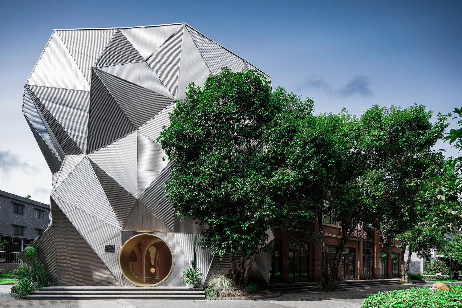
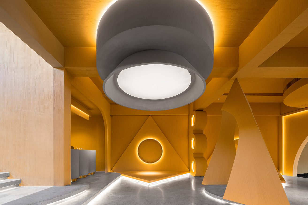
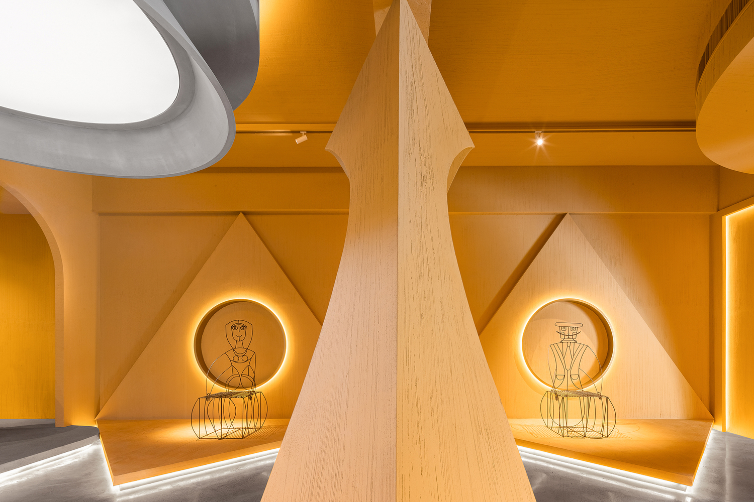
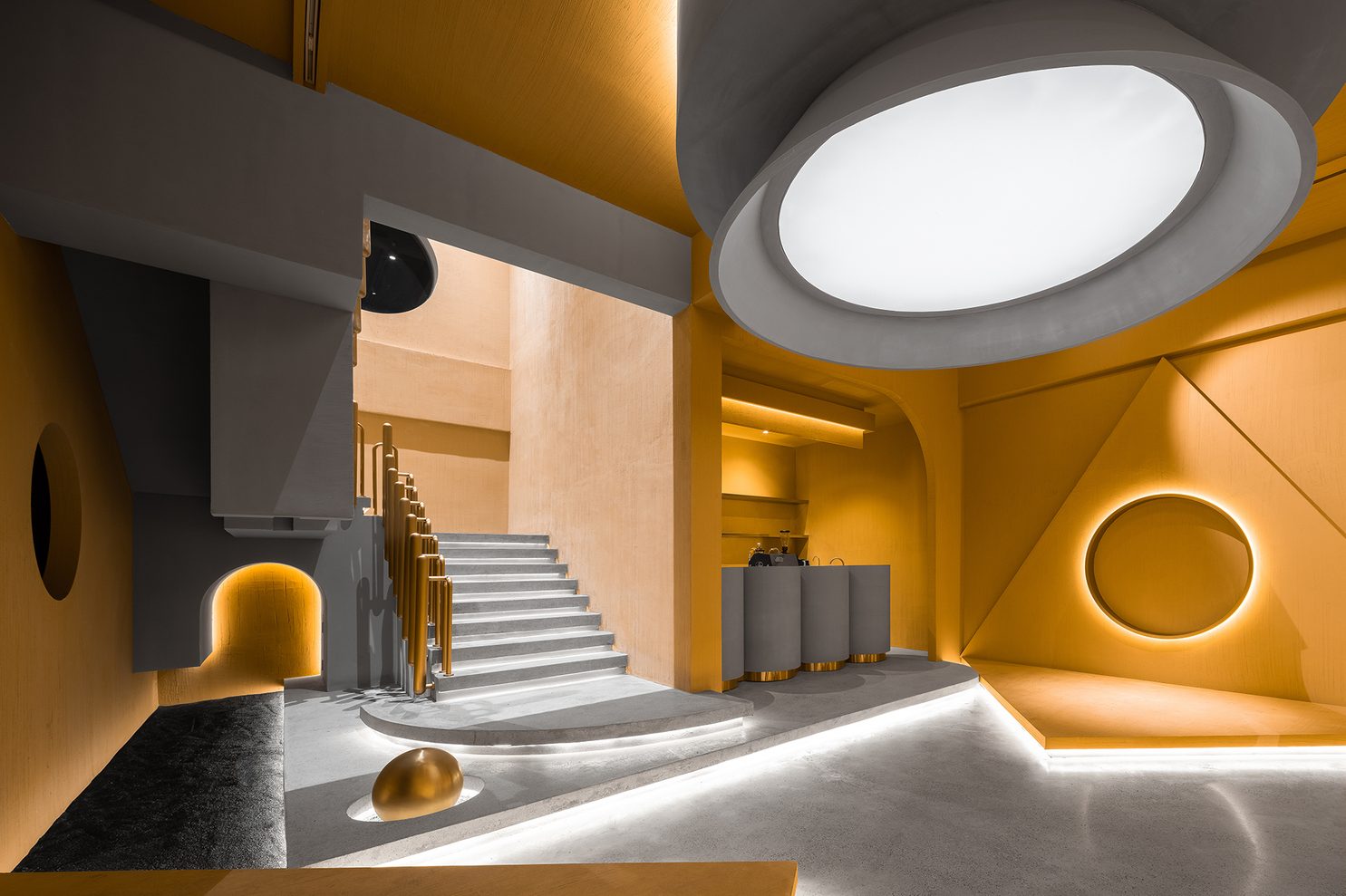
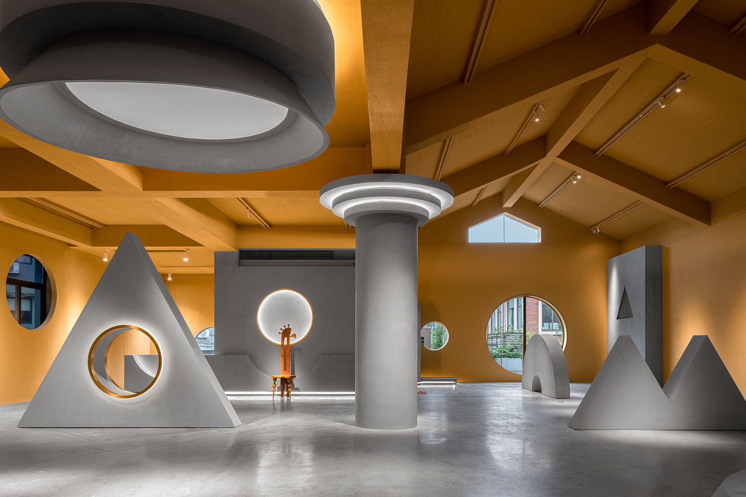
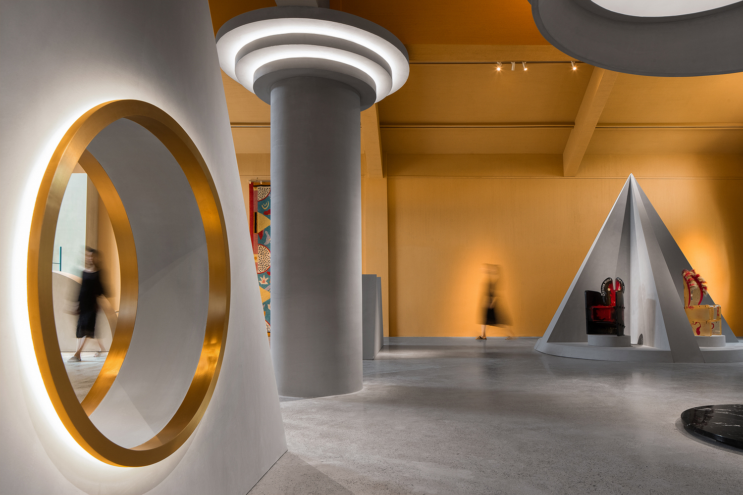
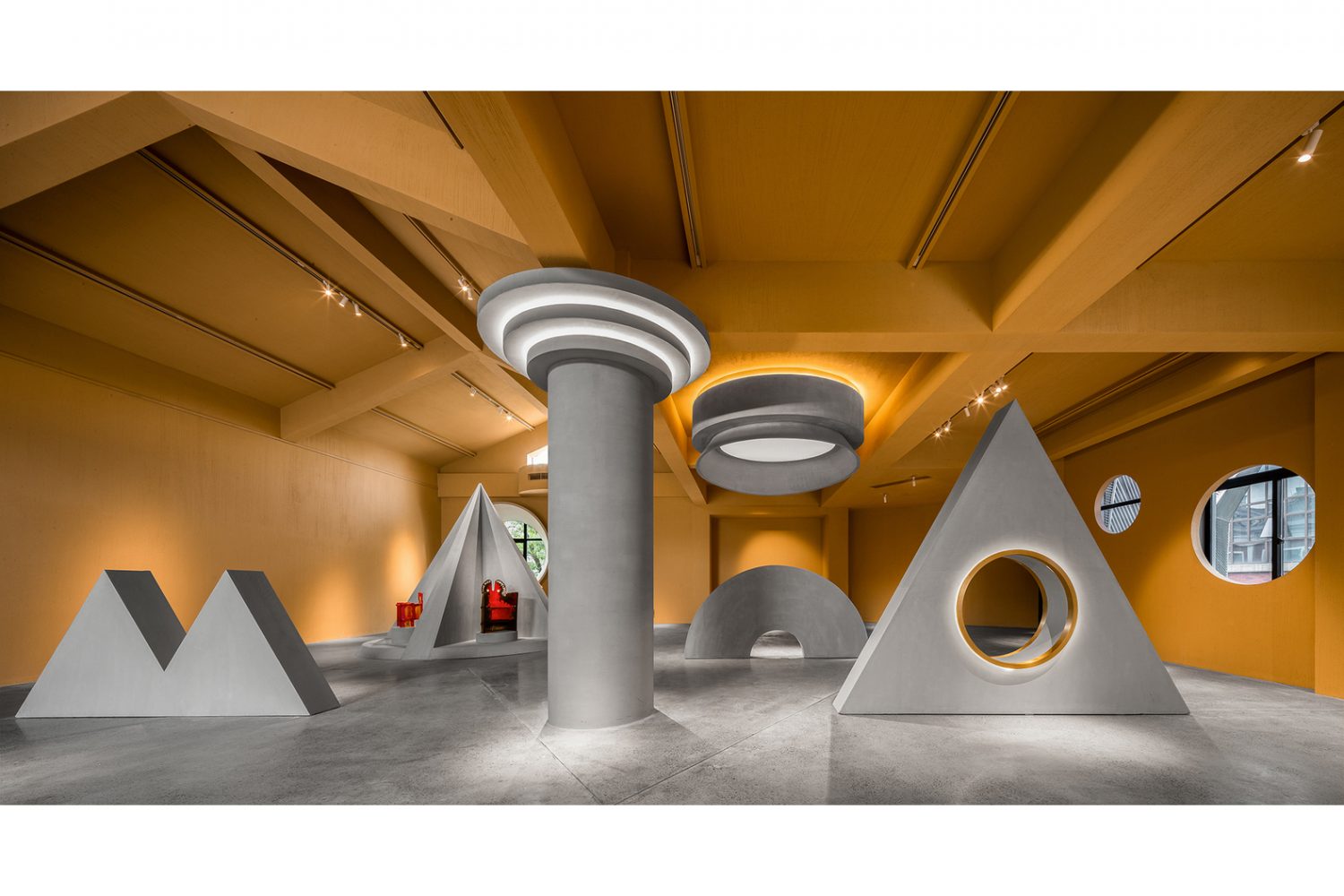
After seeing Ya Space!, a building in Hangzhou, China, we wanted to do nothing but scream ‘aiya’! The architectural space designed by PIG DESIGN consists of a cafe and the showroom for Memphis, the Italian design and architecture group who were prominent during the 80s. The exclamation mark is our bewilderment and excitement from the bold, unusual looking geometric shapes that are being used as the building’s key architectural element. It’s quite obvious that the design team has taken this as an opportunity to release their steam. And while the work seems insanely out there, the rationale behind the extreme creative outburst is the attempt for the work to be a continuum of the Memphis tenet known for its unorthodox yet simple and straightforward aesthetics. It is directly translated into visually striking geometric forms, vibrant colors and diverse textures.
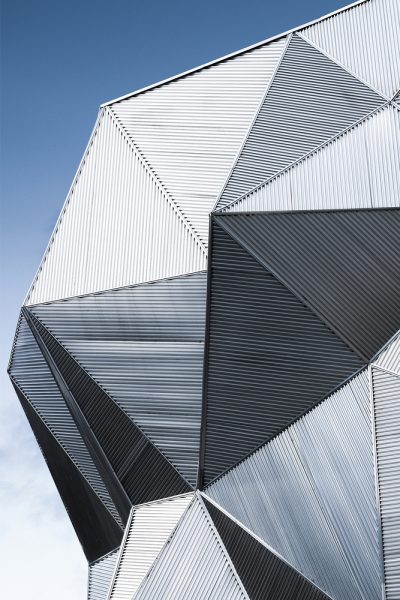
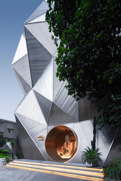
The Memphis influences can be found in different components of the project, from how the name ‘Ya’ (崖) which translates to Cliff in Chinese, is a reference to the Cliff City, the nickname of Memphis City in China The meaning is also the genesis of the dramatic facade with the detail of corrugated stainless steel sheets that renders the physical connection with the word ‘cliff.” The exclamation mark (!) put at the end of the project’s moniker appears on the circular entrance door designed to do its job in attracting visitors, marking a successful attempt to include the name as a part of the building’s architectural composition.
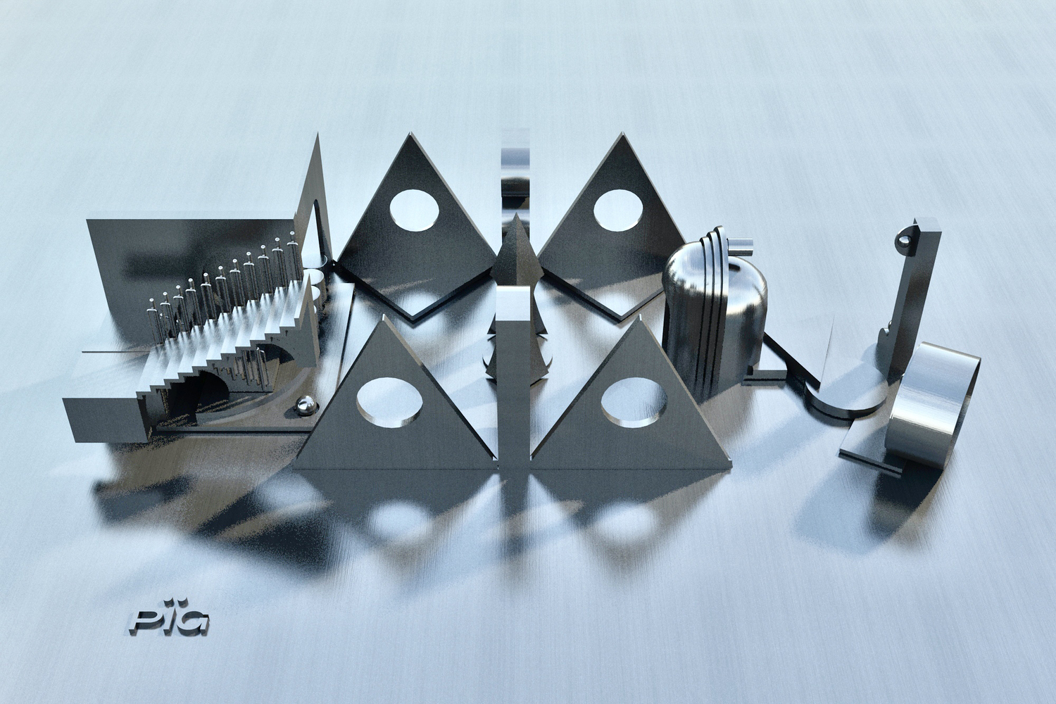
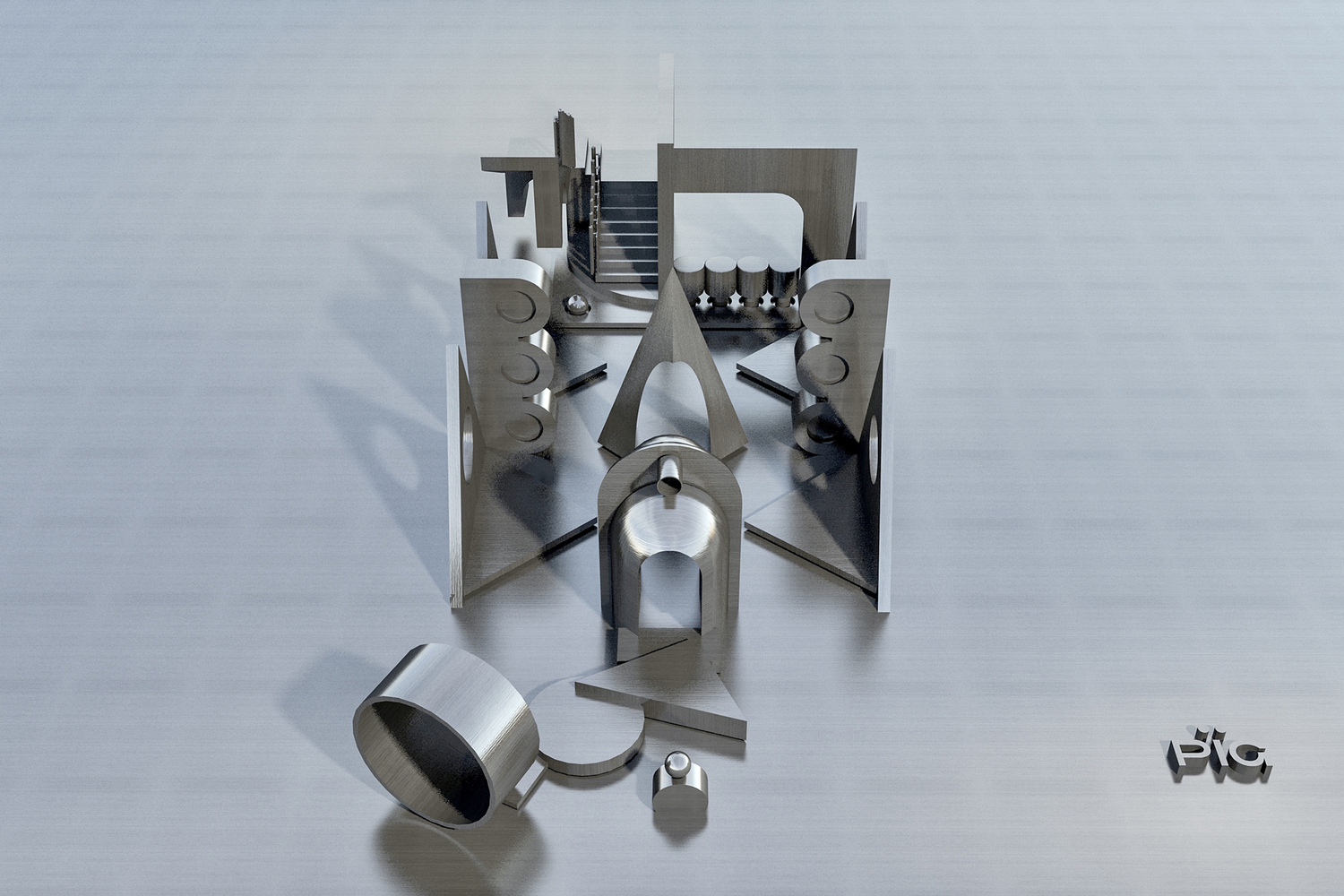
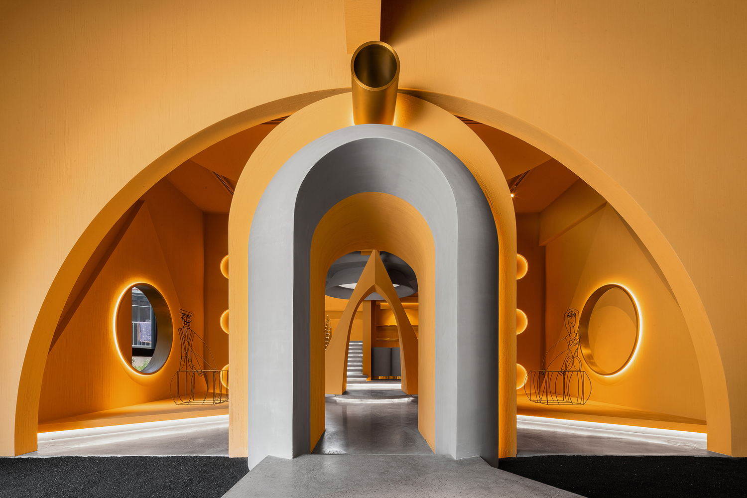
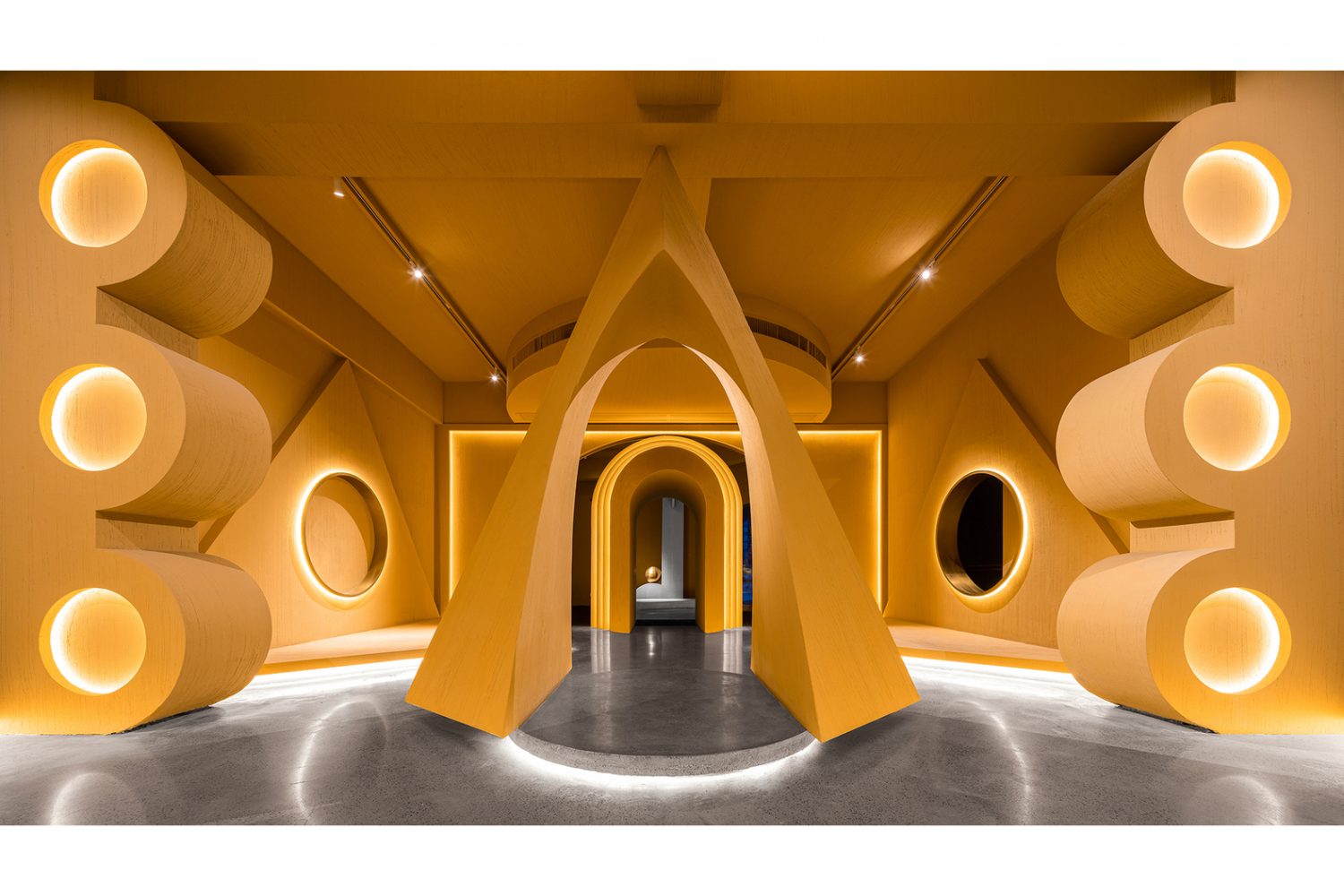
While walking inside, one comes across design language that looks and feels entirely different. The first of the two floors of the building houses a small cafe. The showroom where a collection of Memphis furniture is showcased occupies the spaces on both the first and second floor. Several peculiar-looking shapes can be found on every level and surface of the interiors from the floor, walls and ceiling, creating diverse spatial experiences in various corners of the program.
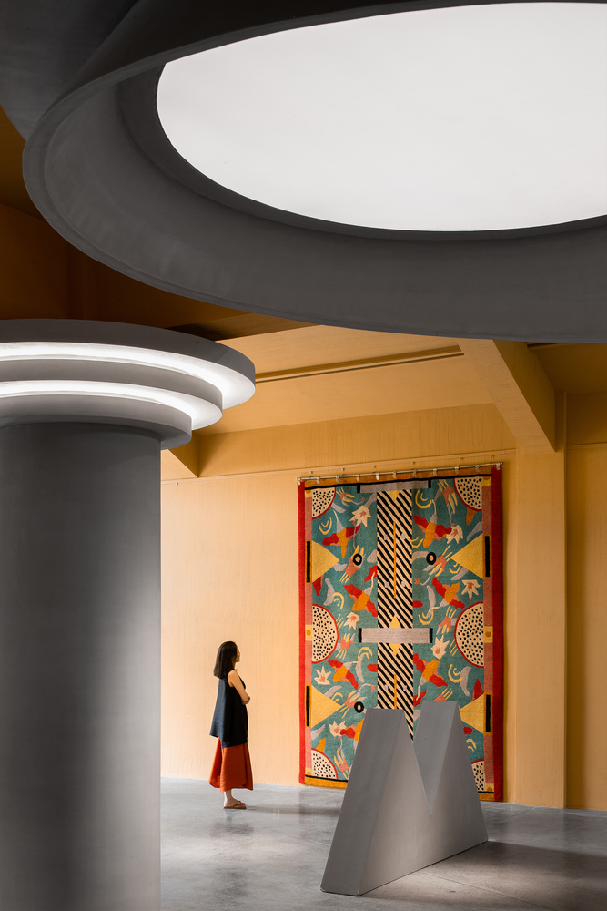
In the meantime, the controlled grey and yellow tone of the backdrop is perfectly practical considering how visually explosive the space could have been with all the furniture if the space was more colourful.
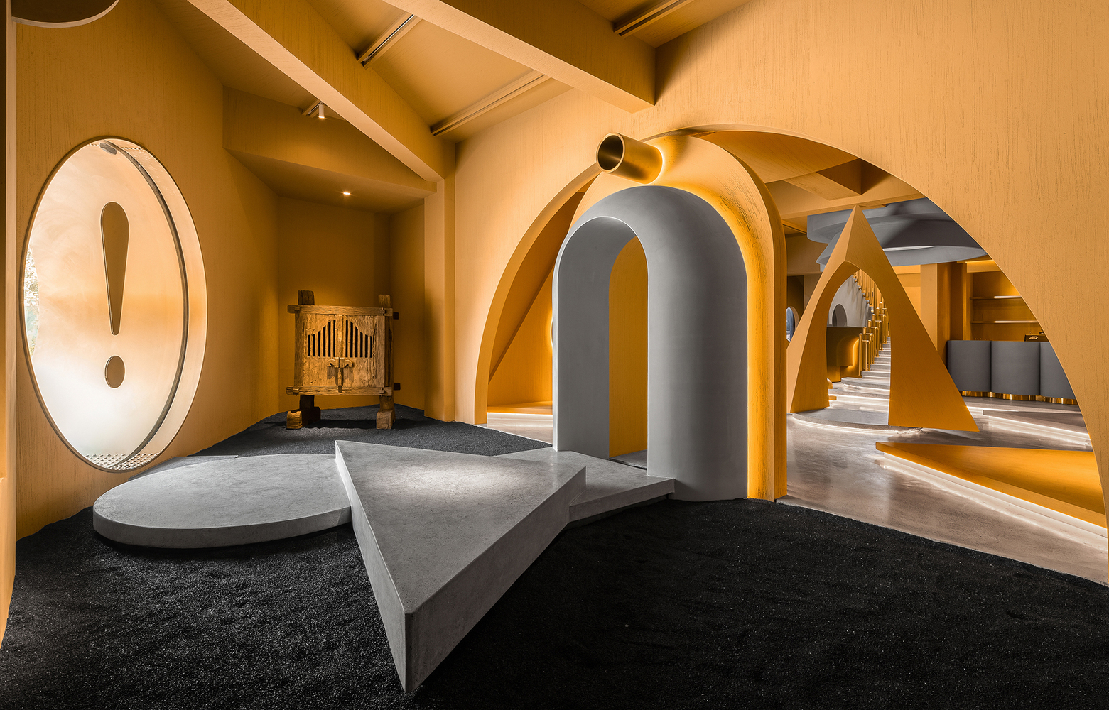
It’s true that Ya Space! is an attempt to pass on the Memphis quirkiness through forms and design that obviously breaks away from the norm. There is however an inevitable question about how long such eccentricity will last through time. While Memphis’s emergence during the 80s was only a brief moment in the long history of design, as time passed, the group has proven that its impact and philosophy raises an important question of ‘what actually a good design?’, a question that still withholds its intensity, even today. The question regarding the longevity of this Memphis-Influenced project is something many will continue to ponder, and so is doubt about whether this exhilarating work of architecture is here to stay or not. But for the time being, let’s just say ‘aiya!’ one more time.

