AFTER 30 YEARS OF BUSINESS, ANANTA INVITES IF TO TRANSFORM THE SHOP’S DESIGN AND ENVIRONMENTAL GRAPHIC TO PROVIDE NEW EXPERIENCES FOR THE CUSTOMERS
TEXT: SUTEE NAKARAKORNKUL
PHOTO: KETSIREE WONGWAN
(For Thai, press here)
With 30-years of experience in the jewelry and accessory industry, it should be more than enough of an indication to convey ANANTA’s ongoing success, the Thai jewelry brand that is still able to maintain the loyalty and interest of its customers. But what will make the brand perpetuate the popularity in years to come? The answer to that question may lie in ANANTA’s latest move with IF (Integrated Field) chosen to oversee the revamp of the brand’s shop.
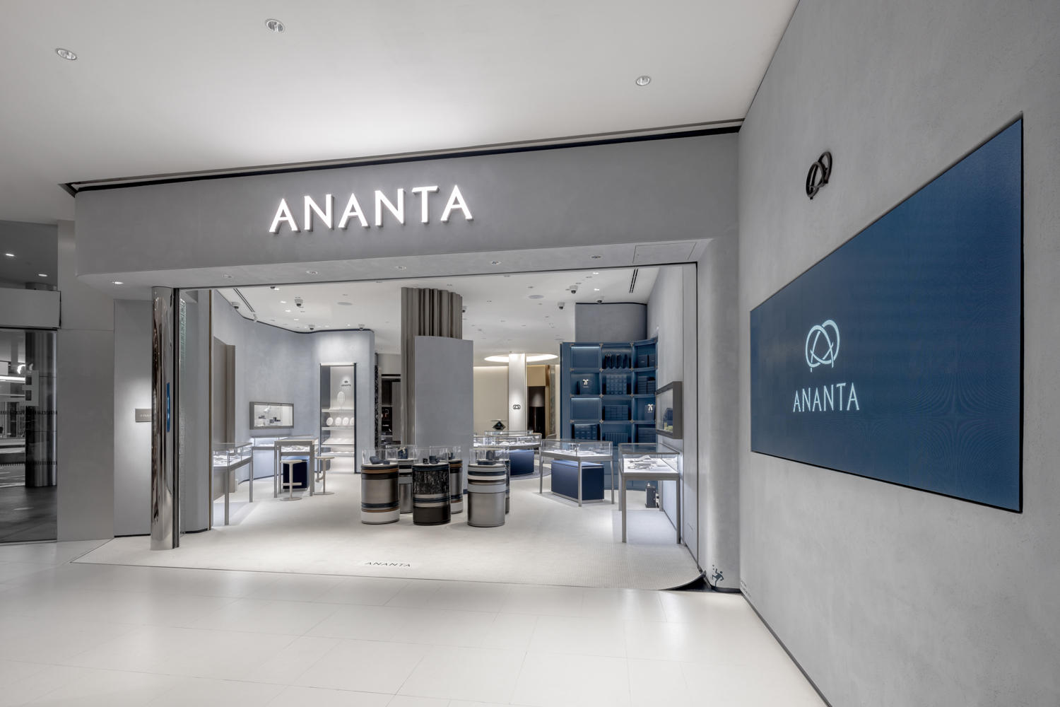
CentralWorld Branch
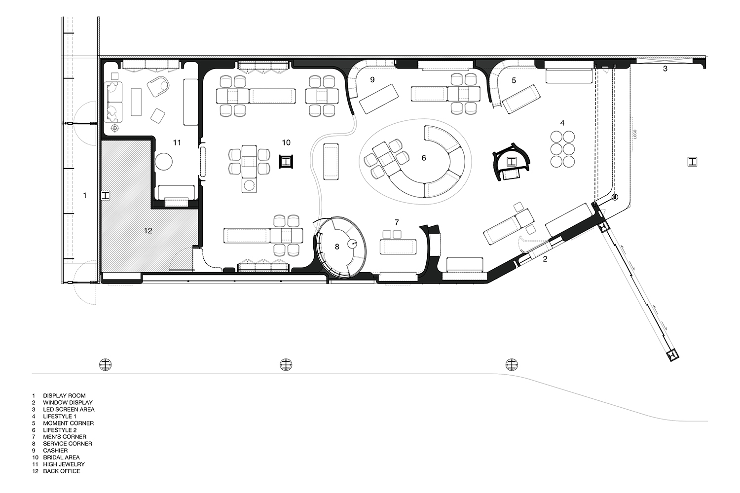
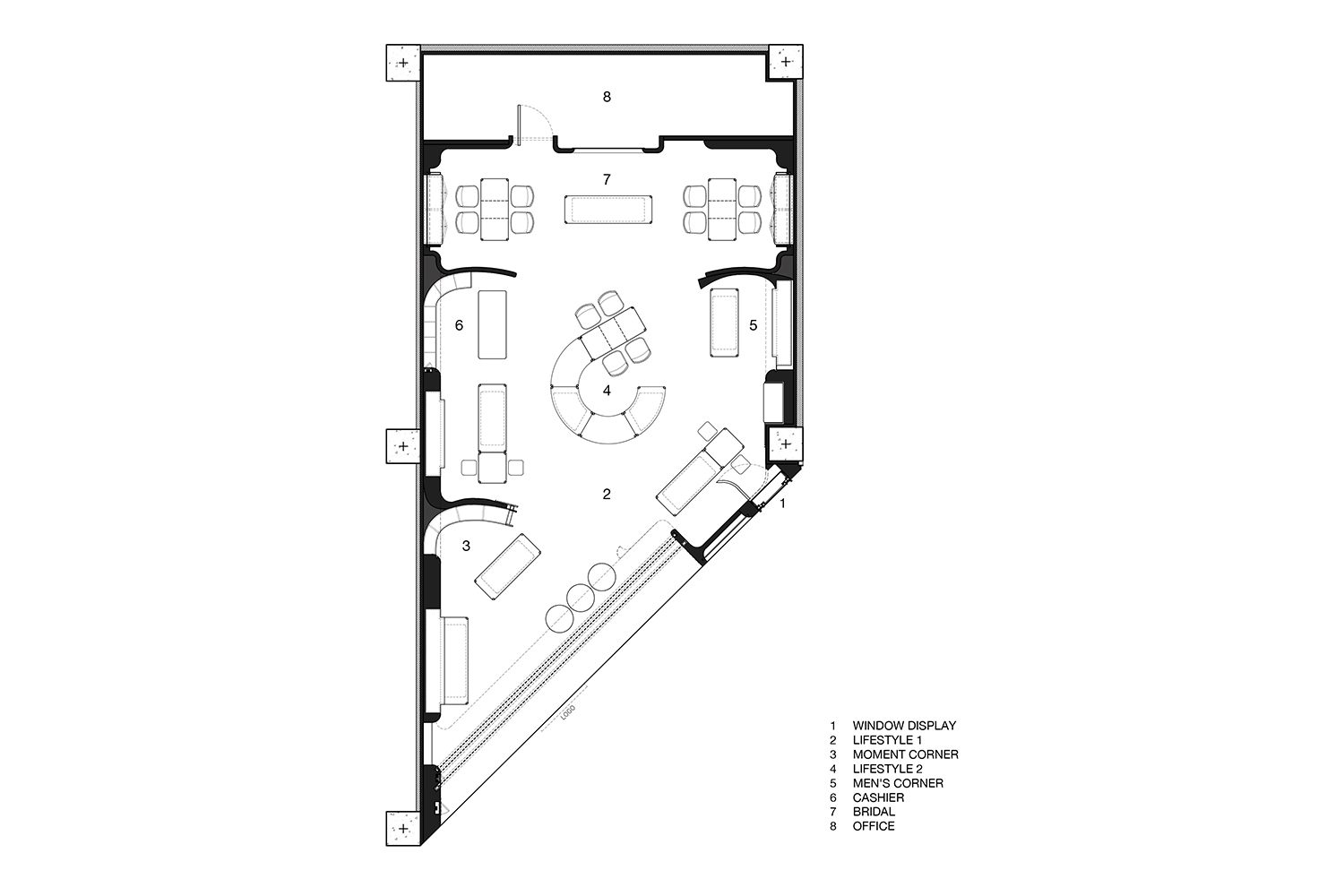
Apart from product development, the refurbishment intends to provide customers with a refreshing buying experience and bring forth new perceptions toward the brand. The design team worked with the brief, which encompassed the design of the retail space and environmental graphic for ANANTA’s CentralWorld and CentralPlaza Pinklao branch.
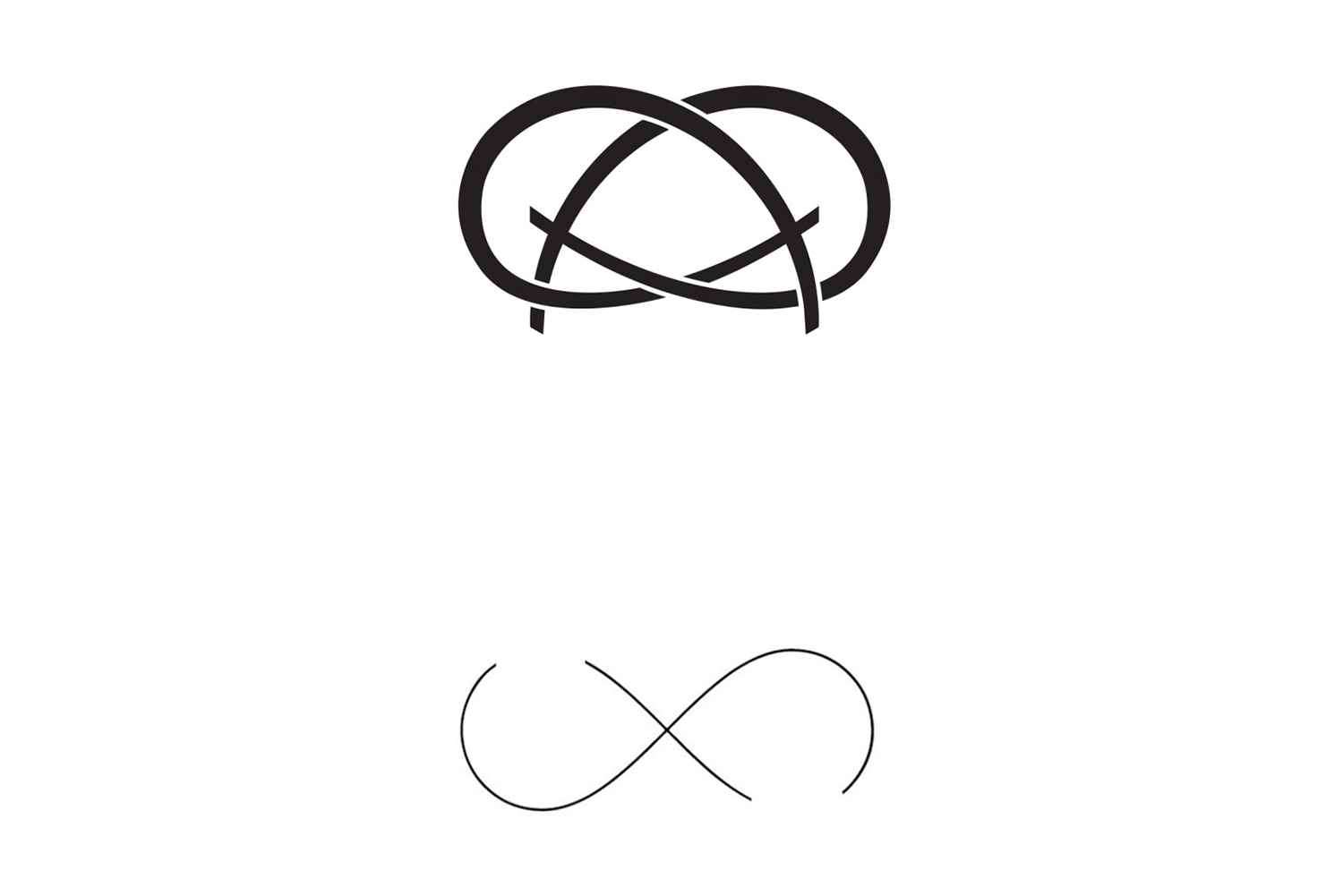
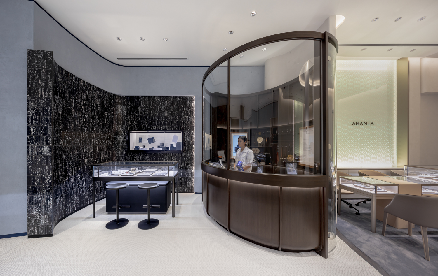
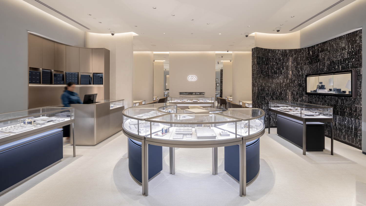
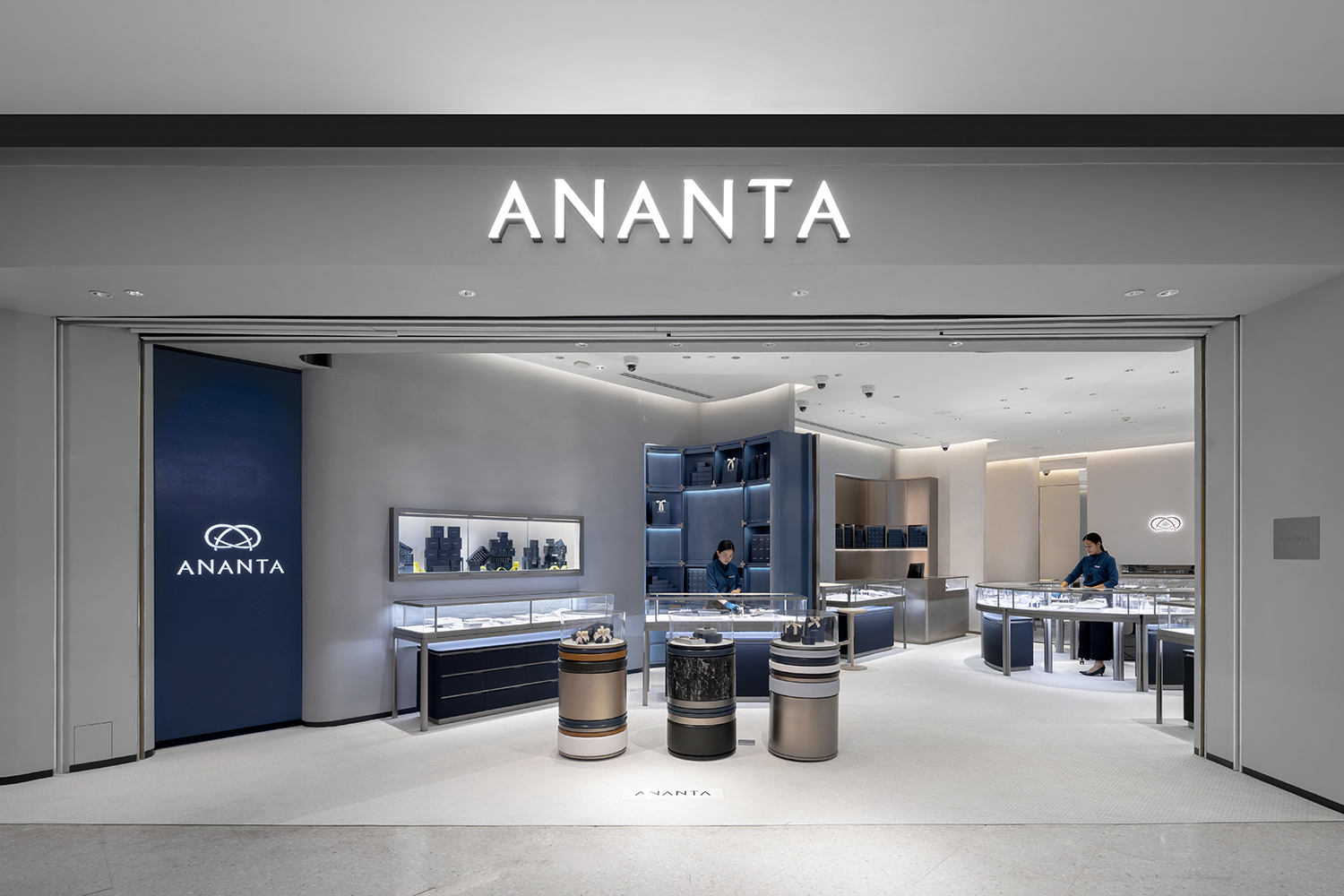
The keyword of the design, ‘Everyday Lifestyle’, is the concept that aims to communicate with a straightforward and simple message about diamonds as an everyday accessory for people of all ages and genders. The design team translated the curved lines of the brand’s infinity logo into details of the interior floor plan, creating walls that render both inside and outside curves, disguising the rectangular shape of the shops’ original layout. The design also enables spaces and functional areas such as the reception counter and different product display zones while facilitating the overall spatial program in one continuous flow.
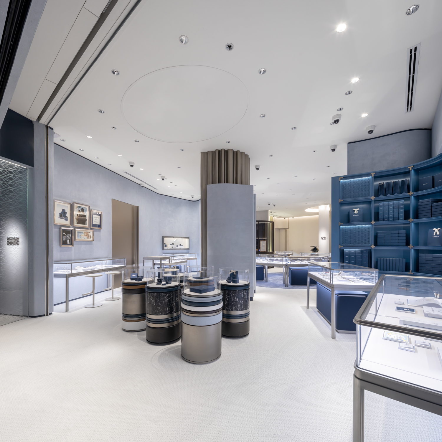
CentralWorld Branch
CentralWorld Branch
CentralPlaza Pinklao Branch

CentralWorld Branch
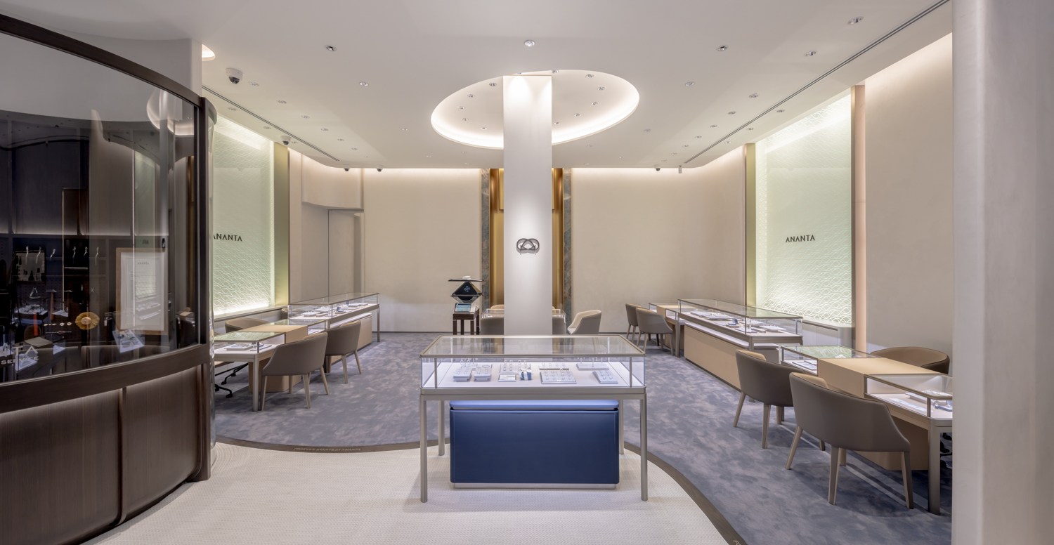
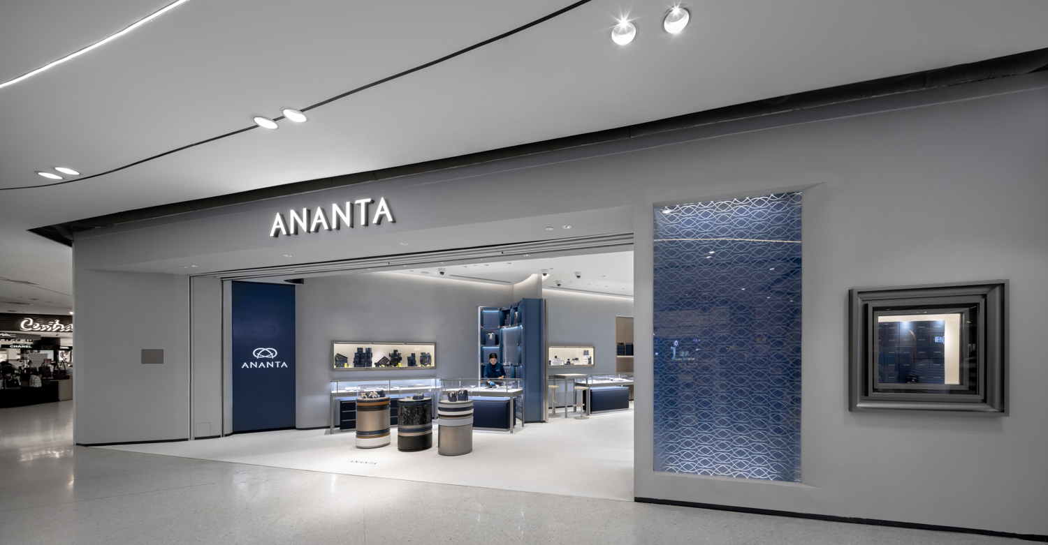
The design team manages the space by keeping the storefront open, allowing the area to accommodate new products and activities. Such openness also makes the shops look and feel more accessible, suggesting the convenience of the buying experience. The interior program is divided into zones, with each zone decorated to be in line with each product line. Over 70% of each store houses the ‘Lifestyle’ zone for the brand’s lifestyle jewelry. Meanwhile, the ‘Men’s Corner’ zone displaying the collection created specifically for male clientele sees the use of dark stone walls and furniture. It bears a nice contrast with the upbeat yet elegant ‘Moment’ counter displaying customizable lifestyle jewelry where blue walls and shelves meet with the gleaming surface of stainless-steel lines.
CentralPlaza Pinklao Branch
CentralWorld Branch
CentralWorld Branch
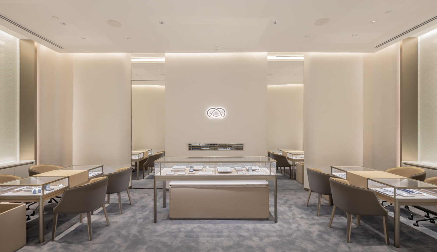
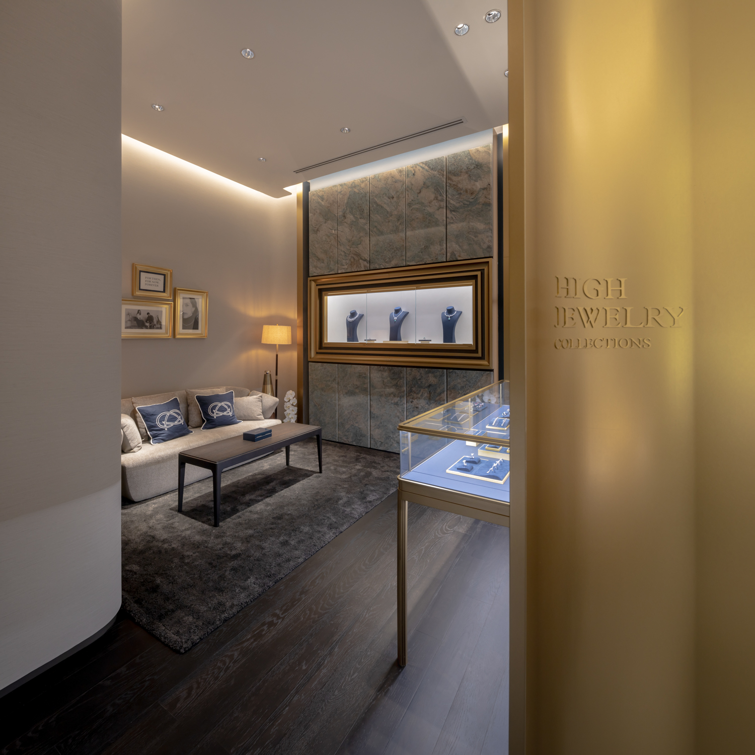
The ‘Bridal’ zone showcasing engagement and wedding rings possesses a warm and dreamy mood with white toned decor. The last zone, ‘High Jewelry’, is located towards the furthest part of the shop, displaying top-of-the-line, attentively selected pieces with a reception area that provides privacy under a friendly, casual vibe.
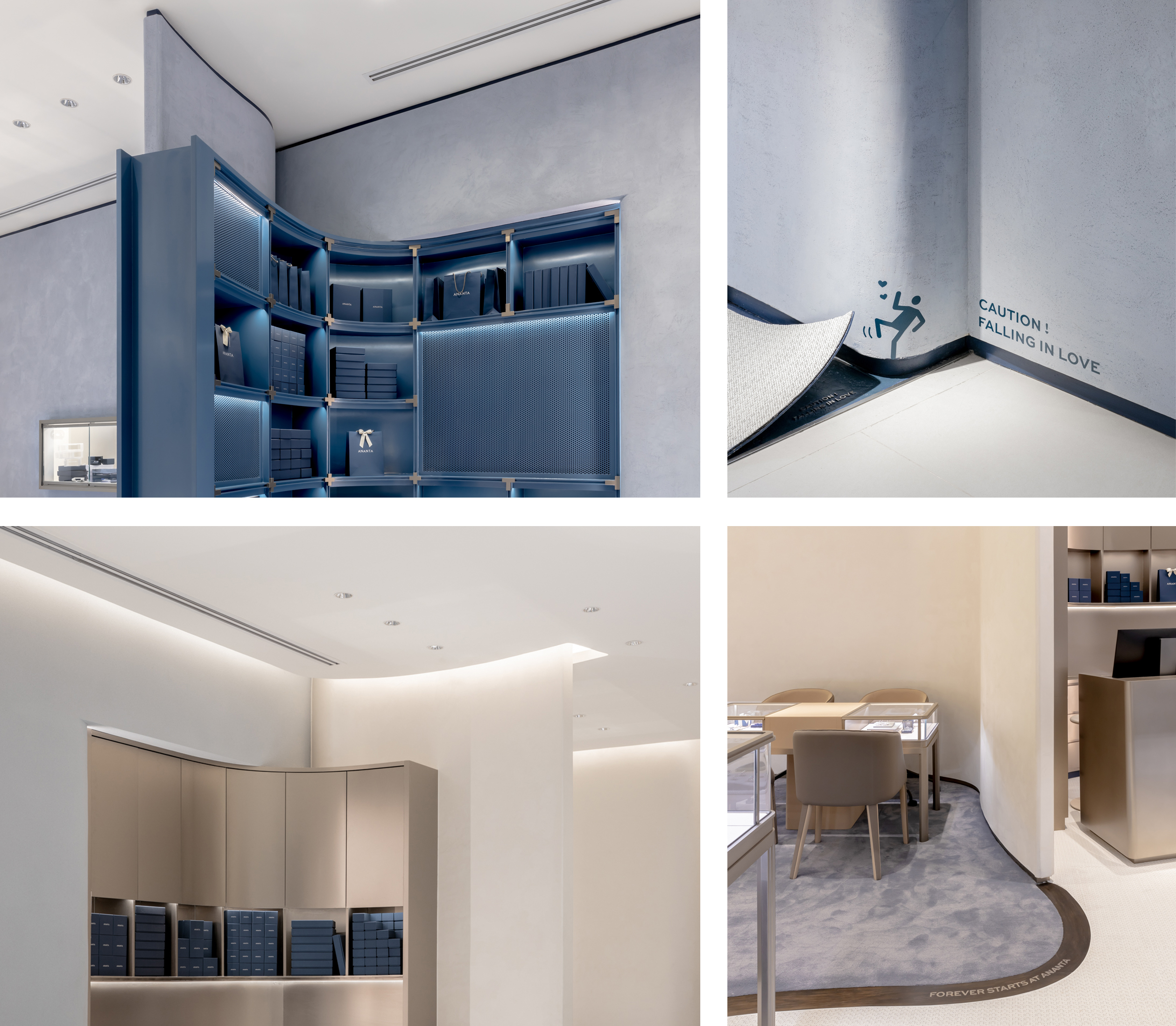
The design team goes with the slightly coarse and seamless texture for almost the entirety of the walls, corresponding with their fluid mass. Together they toned down the intimidating image of a diamond store nicely. The brown and dark blue, which are the brand’s old and new corporate colors, are paired up, making the overall image of the brand and the stores more vivacious and accessible.
CentralPlaza Pinklao Branch
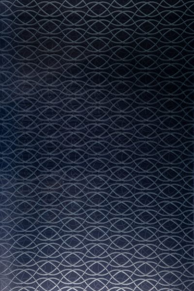
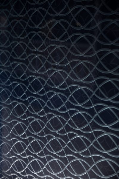
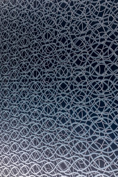
There are few other details of the display design that are a part of the store’s façade. The brand infinity logo plays with the name ANANTA, which is a Sanskrit word for eternity. Two layers of graphic, one on a transparent glass and the other on the backdrop, create a visual effect that looks as if the logo’s infinite line is moving endlessly, appearing like a tightly intertwined root at first glance, perfectly conveying the brand’s identity expressed through its slogan, “Moment Lasts Forever.”
facebook.com/if.integratedfield.co.ltd
facebook.com/anantajewelry

 CentralPlaza Pinklao Branch