FIND OUT WITH ART4D WHAT MAKES PROMPT DESIGN STANDING AT THE FOREFRONT OF THE WORLD’S PRODUCT DESIGN INDUSTRY AND SPEAKS TO SOMCHANA KANGWARNJIT, A FOUNDER OF PROMPT DESIGN, ABOUT HIS JOURNEY, UNIQUE IDEATION PROCESS, AND THE STORY BEHIND HIS 5 SELECTED WORKS
TEXT: PRATARN TEERATADA
PHOTO COURTESY OF PROMPT DESIGN
(For Thai, press here)
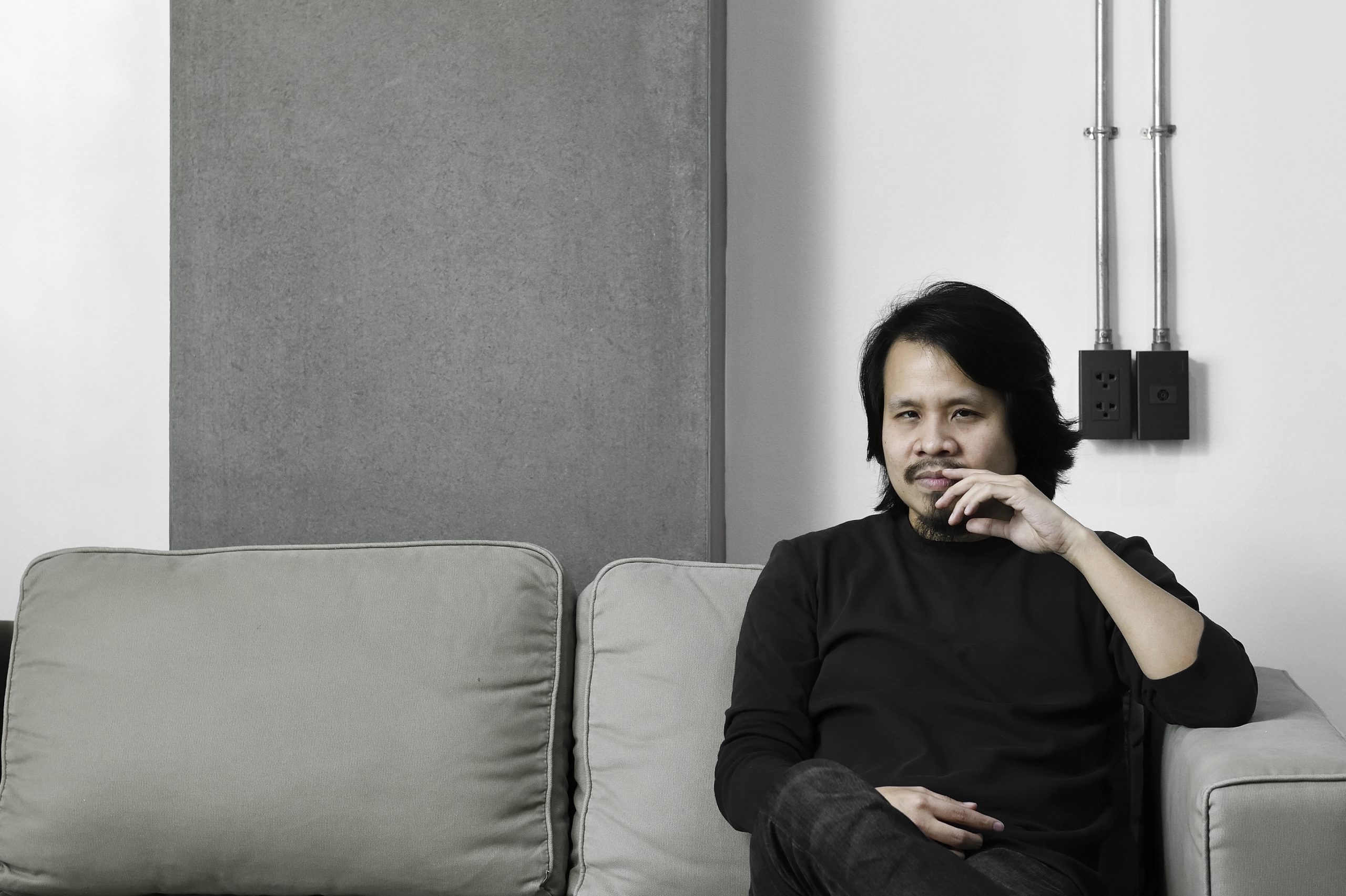
Somchana Kangwarnjit is one of the product designers who has frequented international design competitions. Having won several globally renowned awards, his works are of diverse concepts, displaying how he always understands the assignments and can communicate with the target market effectively. His company, Prompt Design, has seen an incredible growth since its foundation in 2009, and is currently standing at the forefront of the world’s product design industry. art4d talks with Somchana about the baby and major steps of his journey, methods and approaches he has taken for his ideation that has made Prompt Design’s repertoire unique and barely miss any mark.
art4d: Could you tell us about Prompt Design’s history, from the beginning until now?
Somchana Kangwarnjit: It all began fifteen years ago, out of my ignorance, but incredible love and passion for product packaging design since I was still a student. When I first started the company, I really didn’t know whether I would be able to have clients or projects to work with, and there really weren’t any back then (laugh). I didn’t know at the time but I found out later that packaging design projects either went to advertising agencies or printing houses. This was several decades ago, and these types of projects were actually their side jobs. So finding works was truly a struggle, and business owners back then didn’t pay that much attention to packaging and those who did were mostly international brands, which often came with their own global guidelines, and Thai designers only adjusted them to be more local, which is kind of sad.
Fortunately, I’ve always liked to compete in design competitions since I was a student so after I opened the company, I still continued with competitions, and submitted works under Prompt Design. I had a lot of free time because I didn’t have that much work to do so I competed and won this quite large award in the packaging design industry, and that sort of opened up a door into the industry. Being at the award ceremony, I was able to see how top designers worked with global brands and they were giving speeches and lectures, and gradually I began to understand packaging design more and more.
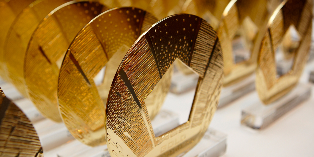
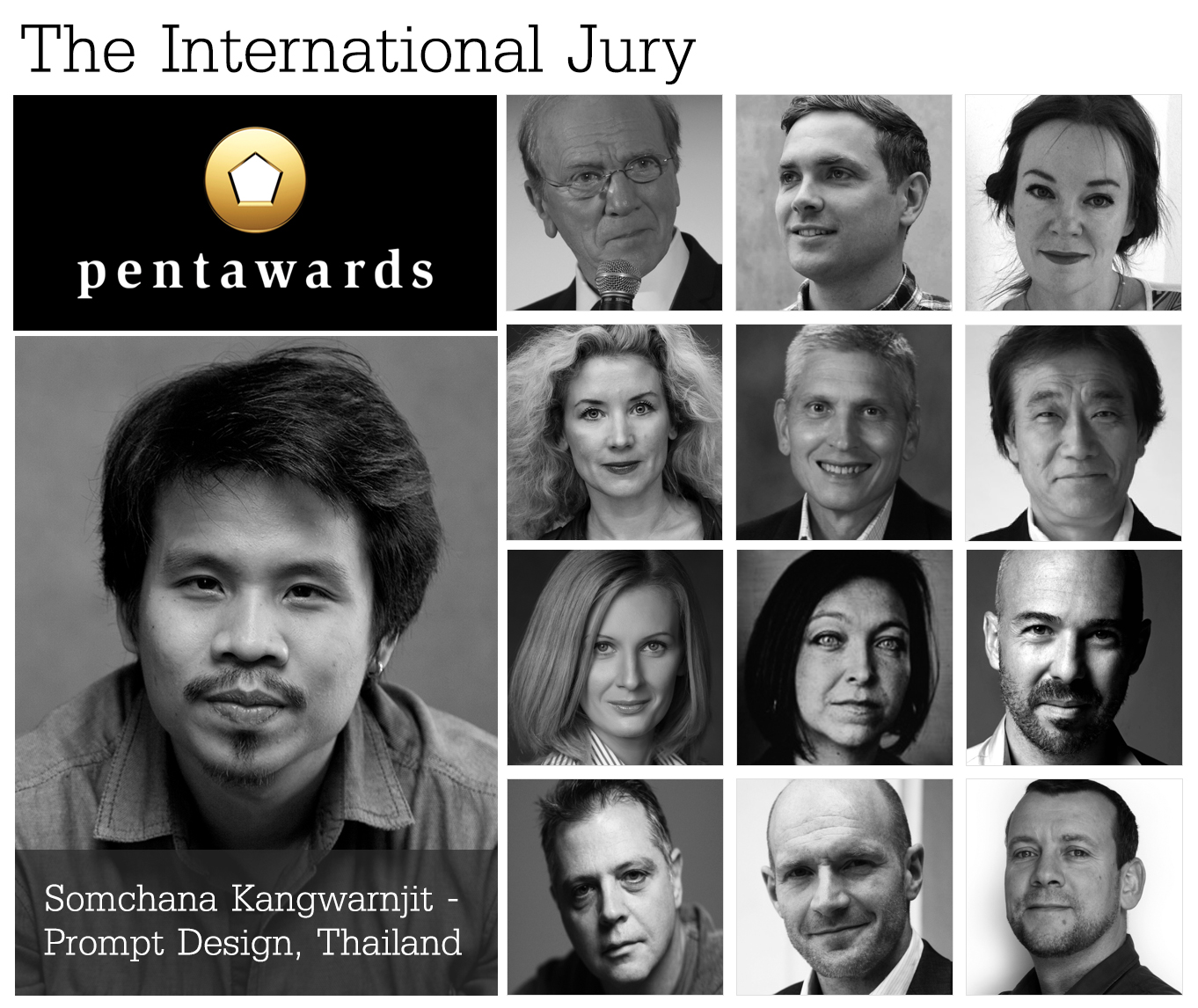
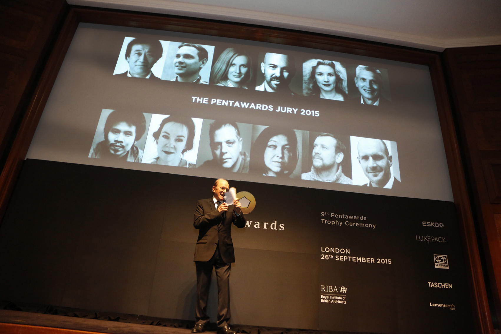
I continued to compete throughout the first three years and won many awards. It was around 2013 when the biggest packaging design association in the world, PENTAWARDS, invited me to be on their judging panel and I consider this experience to be a gateway to the universe of packaging design for me. The experiences I gained from it were tremendous. More people, overseas clients, were starting to know and get familiar with Prompt Design and I was given many great opportunities from other associations to be on their judging panels, about 20 to be more precise. And that allowed me to see the big picture of this global arena of packaging design.
From my personal goal, and something that I’m personally proud of, to something my team also takes pride in, and something my country can be proud of, too. It’s like winning gold medals at the Olympics and I haven’t stopped competing. Prompt Design is now ranked 15th in the world when it comes to packaging design. And we still haven’t stopped. We definitely have to continue to develop.
art4d: What qualities should a good packaging designer have?
SK: Personally, I think the appeal of product packaging design is about how it combines different sciences and disciplines such as branding, interdisciplinary design, marketing, and logistics engineering. Basically, you need to have a good enough understanding about these areas, at least to a certain extent.
art4d: Could you tell us about the work process, from the briefing, market research, target customer to the completion of a project?
SK: It’s a pretty typical process and it depends on the brief. For example, a brief can be easy because it’s something that you’ve done before or you already know the same, existing contexts of the market. A difficult brief is being the first mover in the market or having to do a re-branding, which can be quite challenging. The last and probably the most challenging one is having no brief at all and you have the freedom to create anything and determine the target market, even having the choice to develop any type of product. This kind of project can really stun you.
Design thinking focuses on doing actual surveys with the people who are potential buyers. To give you a better picture, it’s like asking for their opinions right at the moment whey they are picking a product. If you ask me, it is difficult, having to do that type of survey. I can tell you right now that is very difficult. You have to know when people are buying that particular product, at which day of the week, at what time of the day. In the past, we used to spend an entire day and still never get any information. But we’ve continued to develop to the point where we finally know how a survey should be done.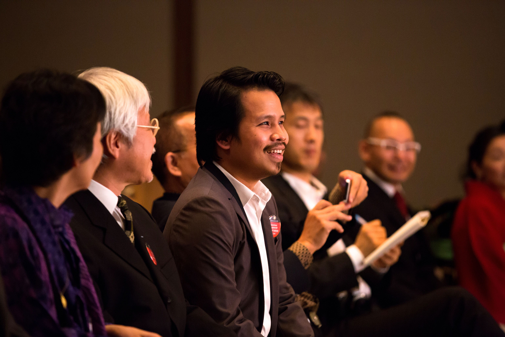
art4d: How do you assure your clients that investing in packaging design will benefit their businesses?
SK: I think the most important method is to let your work speak for itself. Your works will be the best advertisement and publicity. It can be difficult at first because clients don’t tend to believe you and suppliers won’t believe you but you have to stand your ground and continue to create great works. Having that iconic status in the industry is even better. You have to stay consistent and once you’ve achieved that, the confidence the clients have for you will automatically follow. From that point onward you will be able to create new designs more effortlessly and the clients will be more confident to invest in your ideas.
art4d: What is the toughest brief you have ever worked with and what is the solution you came up with?
SK: I think the brief wasn’t the hardest part because if you are obsessed with it enough, eventually you will work it out. But producing work that is different in the most masterful way is the most difficult aspect. There was this project, the Supha honey where the brand was planning to launch their premium honey product to sell during the holiday season. We wanted to use the kind of material that would be the most similar to real beehives. The challenge was how to find a material that could give us the physical qualities and hexagonal pattern as well as visuals at a reasonable price.
We finally decided on a type of paper called the Honeycomb Core, which has the physical attributes where each piece of paper is structurally woven into a honeycomb structure and has the ability to bear weight and force. It has kraft paper covering the top and the bottom. Originally, the material is used for palette and as a cushioning material for cars or large electrical equipment but we told the factory to remove the kraft paper covering the top part to reveal the honeycomb details, just like we intended to present with our design.
The problem was there was no factory that would make us that type of paper (laugh) because most industrial production lines aren’t designed to produce something like this. But we ended up negotiating with a factory. We sent them our portfolio so that they were confident enough to work with us as a team, for them to have the courage to do something new that would set them apart from other factories. We left them with a remark that if they helped us with this project and have the courage to take on challenging projects, people would come to them and clients would want to work with them. And the factory did it and the work ended up being one of the most praised and recognized packaging designs for honey.
art4d: Could you pick the top five proudest works you have ever done and tell us a short story behind each one?
SK: I like all the works we’ve done because each has its own merits and characters as well as challenges we had to overcome but I’ll just pick the ones that have received the most awards.
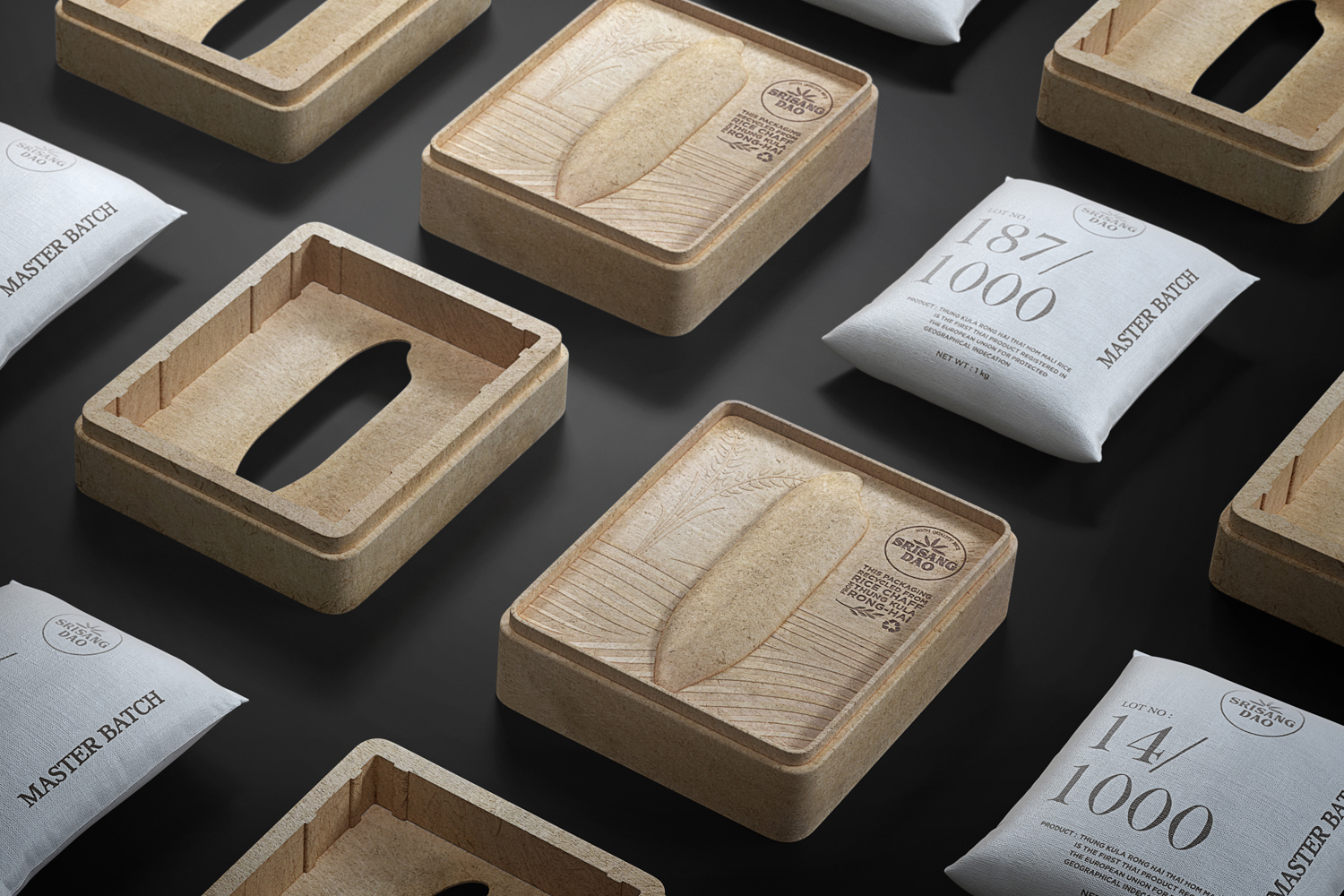
1. Srisangdao Rice (15 awards)
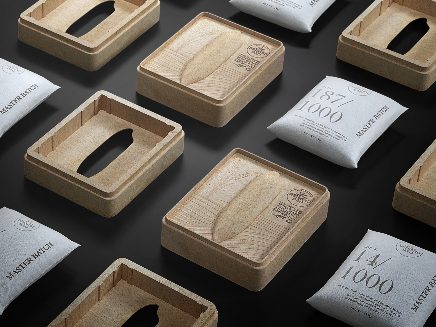
Srisangdao Rice
Thung Kula Rong Hai field is the best region to grow rice in Thailand. This particular part of the country produces jasmine rice that has been internationally recognized for its high quality. Every year, the paddies from this region are harvested in limited amount and they’re mostly organic, making them chemical-free rice of the best quality. The area is the genesis of the Srisangdao brand and its environmentally conscious philosophy.
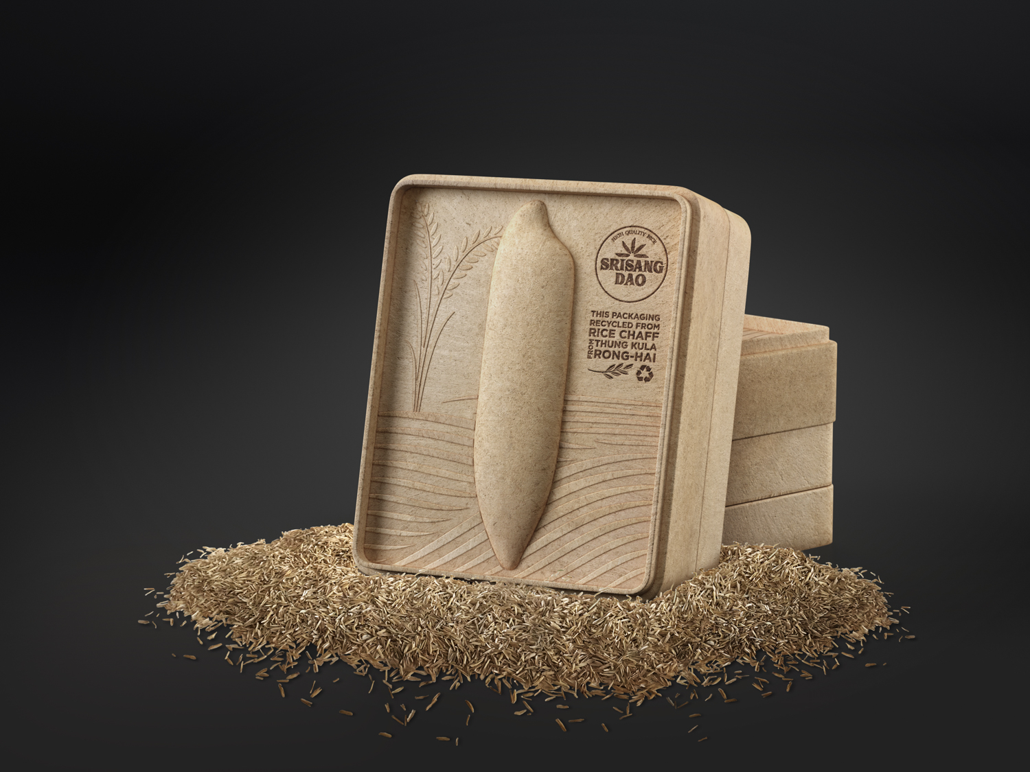
Srisangdao Rice
The packaging we designed for this product needed to convey these qualities, which is why we chose the natural material made of leftover husks from the rice mills, creating a sustainable cycle for the minimal looking packaging. The bas-relief detail is in the shape of a paddy with the graphic of Thung Kula Rong Hai field as the background and the logo, which appears in the form of a burning stamp. We also added additional information on the flap of the box while the rice is put in a grain sack with enough thickness to hold the weight of the rice. Printed on each sack is the lot number of the harvested rice. To extend the packaging’s shelf life and sustainability, the packaging can be transformed into a tissue container when its role as a rice container is over.


2. Raimaijon Sugarcane Juice (12 awards)
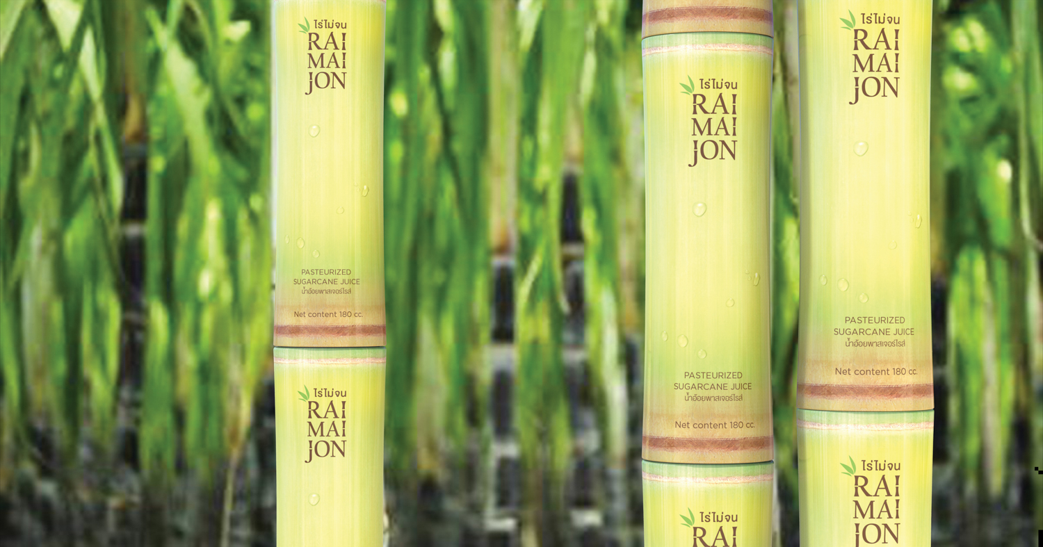
Raimaijon Sugarcane Juice
The package of this ready to drink beverage takes inspiration from the shape of a sugar cane shoot since sugar cane is the key ingredient of the drink. Consumers are able to enjoy the drinking experience that feels like they’re drinking directly from the product’s natural origin. The additional functions of the superimposed structure makes the packaging unique as the shape of a sugar cane stem is formed when the containers are stacked, helping the sales promotion to be more eye-catching and effective.
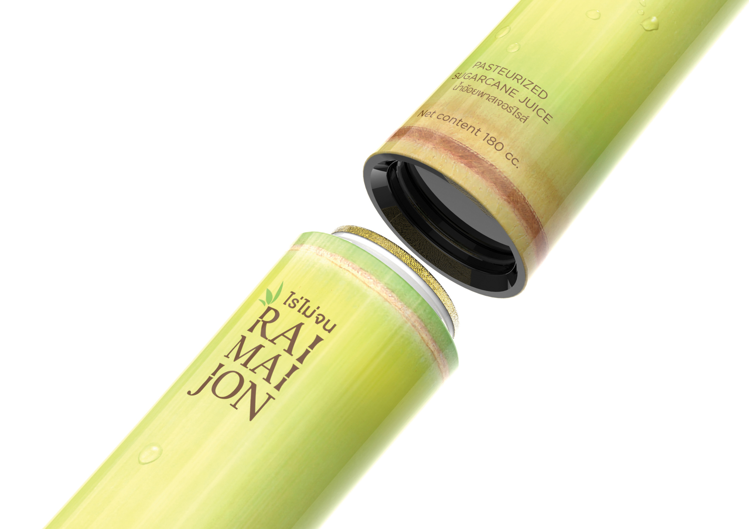
Raimaijon Sugarcane Juice


3. 4LIFE Mineral Water (7 awards)
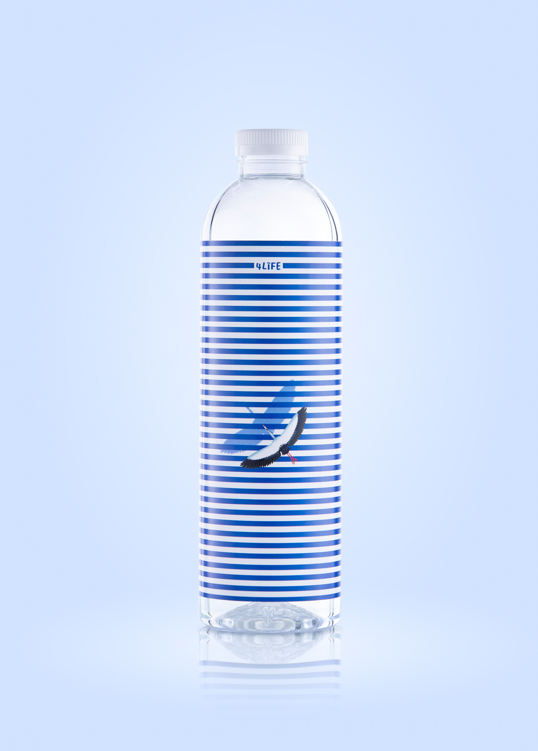
4LIFE Mineral Water
The natural mineral water brand from Doi Chiang Mountain intends for consumers to appreciate and enjoy the richness and benefits of natural water sources, while the product expresses its respect toward nature as the origin of all living creatures including human beings.


The illustration depicts the lives of wild animals near a natural water source. The horizontal stripes tell the story of water sources and living creatures such as the storks that flew to the area for food, a tiger playing with water, or even the crocodile slowly swimming through, looking for prey. The varying attributes of the waves of each bottle are like the beautiful rhythms of how lives are intertwined with water simply because ample water sources are those that enliven the livelihood of animals and human beings. Together, everything becomes the backstory behind the conception of the 4Life Mineral Water by Doi Chaang brand.
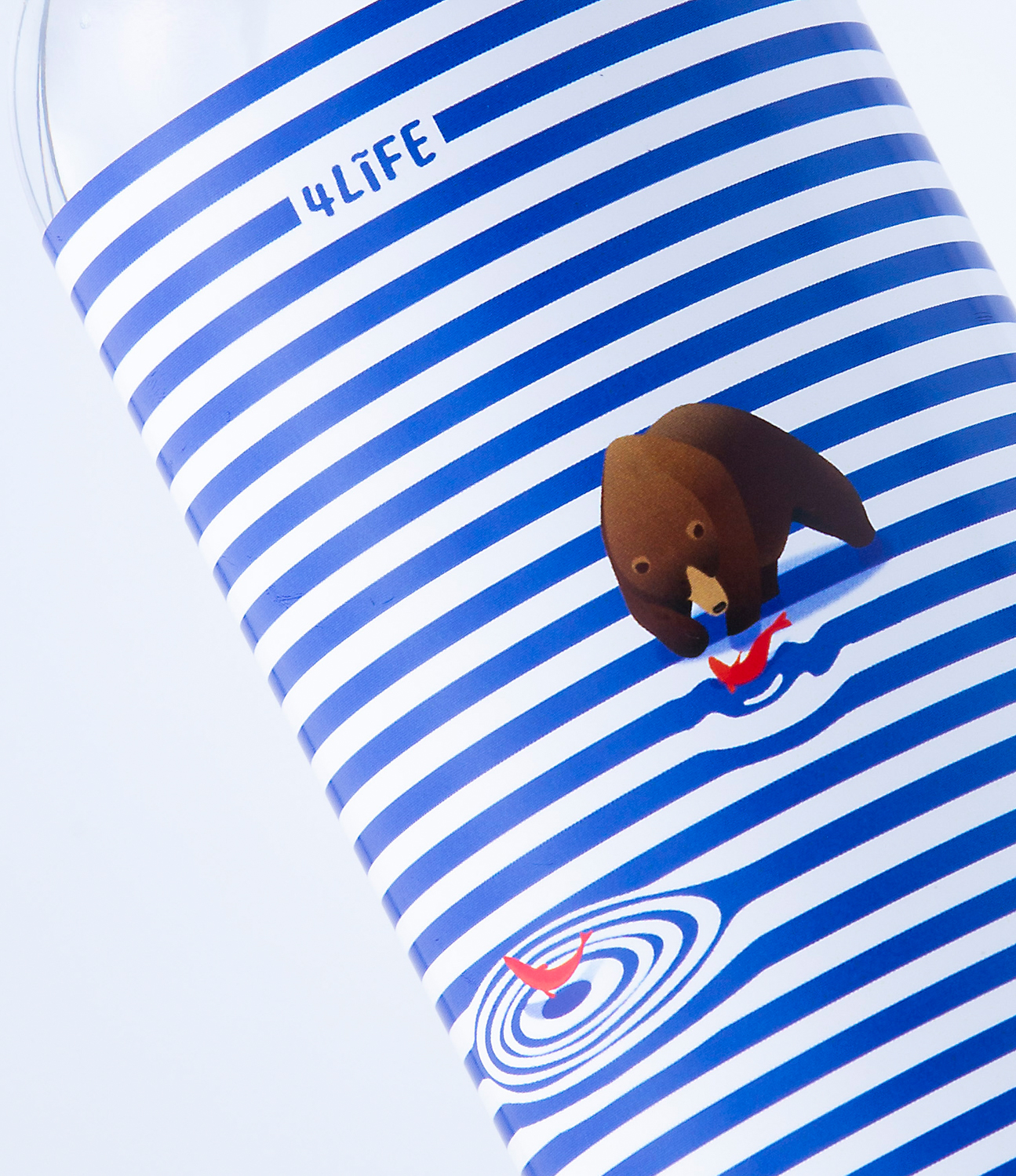
4LIFE Mineral Water
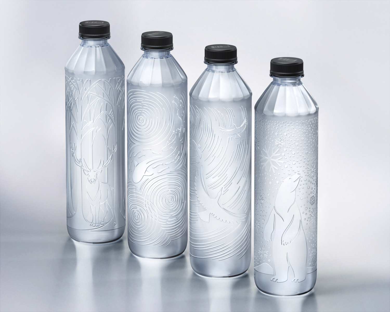
4. C2 Water No Label (7 awards)
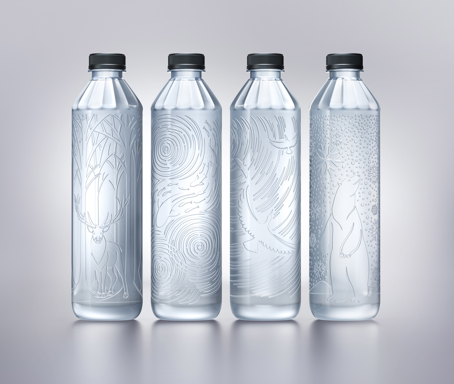
C2 Water No Label
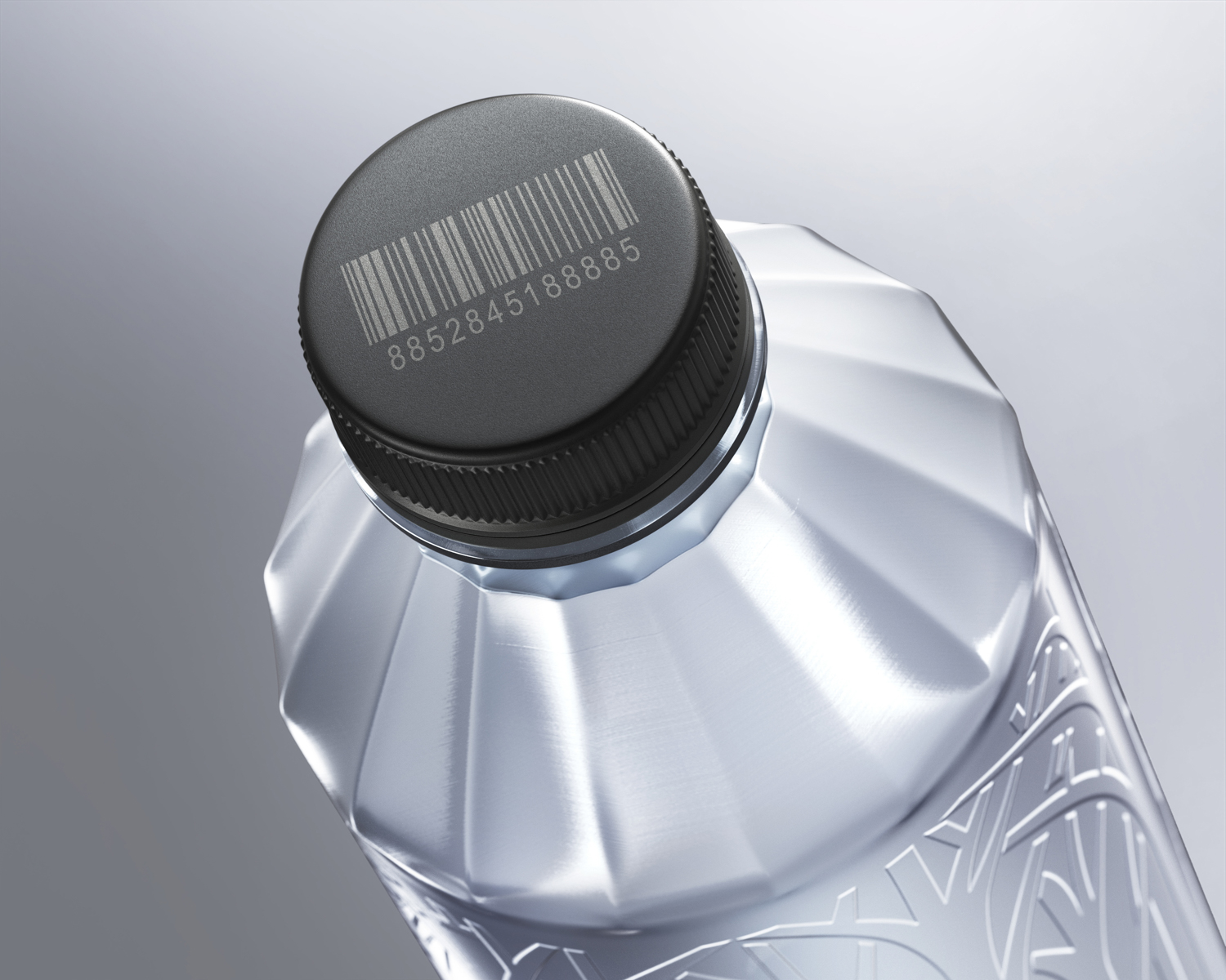
After we collected the consumer insight data, we discovered that a water bottle without label comes with two problems. One is the absence of the nutritional facts and ingredients that the product is legally required to provide, and the barcode needed for retailers’ sales transaction and inventory management. Another problem is even the consumers find that having no label isn’t beneficial while the no-label design seems like it’s a cost-reduction in disguise instead of an actual attempt to be environmentally friendly, which could cause more losses than gains.
C2 Water No Label
Once we understood the consumer insight, we utilized the design as a tool that would help us find the right solution to address the two issues. With the label, we included all the legally required information on the bottle using the embossing technique while the barcode had been screened on the cap. In terms of branding, we came up with a series of patterns for different collections and told stories about the positive impacts of environmental consciousness through illustrations of animals living happily in their natural habitats be it on land, in the sea, the sky or snowy landscape. For instance, a herd of deer in a beautiful forestland, polar bears in the snow-covered landscape, all are told in the form of embossed patterns on C2 Drinking Water’s bottles.
C2 Water No Label
The packaging is made of 100% recycled PET. The bottle having no label lessens the complication of the sorting and recycling process, which is a positive environmental move. The name of the brand, C2, comes from See Through or Circular Economy + Together, reflecting the brand’s key philosophy and missions.
5. Thai Hommali Brown Rice from HEALTHY FOOD HEALTHY LIFE (6 awards)
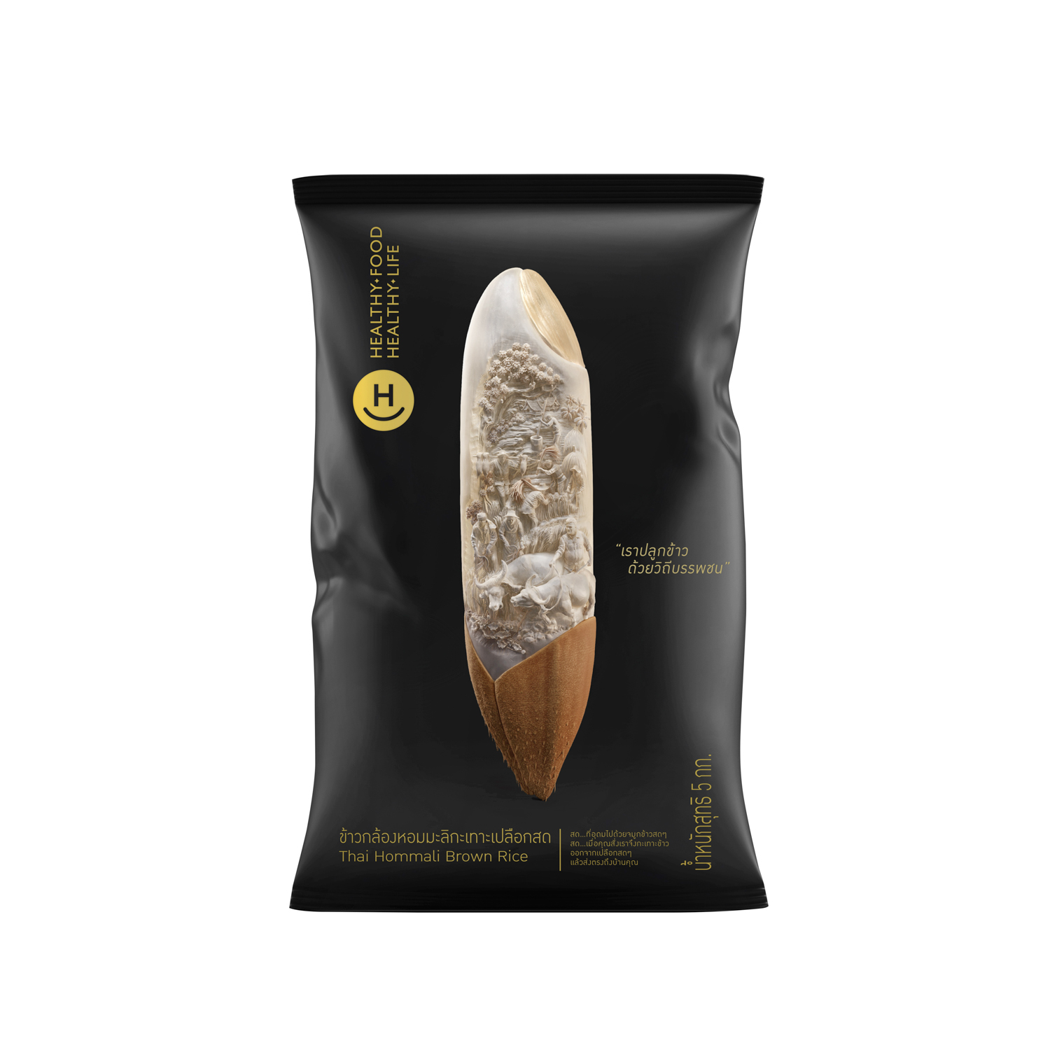
Thai Hommali Brown Rice from HEALTHY FOOD HEALTHY LIFE
We are now consuming rice that went through a mass production process, and we’re beginning to question the quality and benefits of the rice that has gone through such process. We experimented on a traditional, machine-free rice farming method, using locally-inherited wisdom with people involved in every process, using buffalos to plow the land, incorporating the traditional ways of harvesting and threshing the rice by hands. The result we have is jasmine rice that contains greater nutritional benefits than the mass produced rice. That’s how the brand, Healthy Food Healthy Life was born.
Thai Hommali Brown Rice from HEALTHY FOOD HEALTHY LIFE
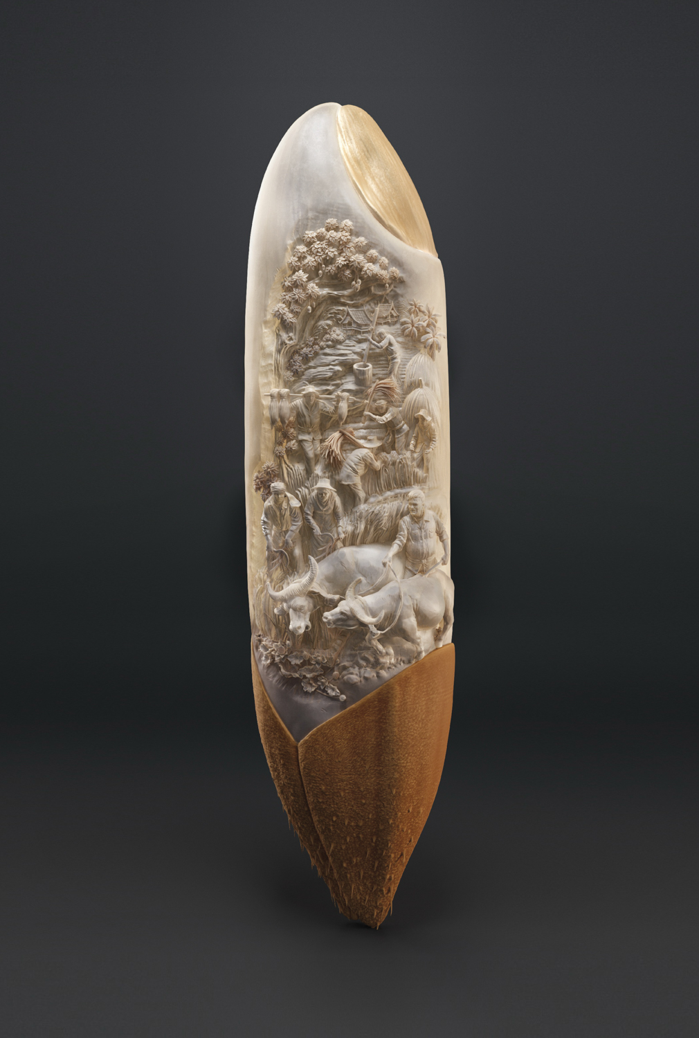
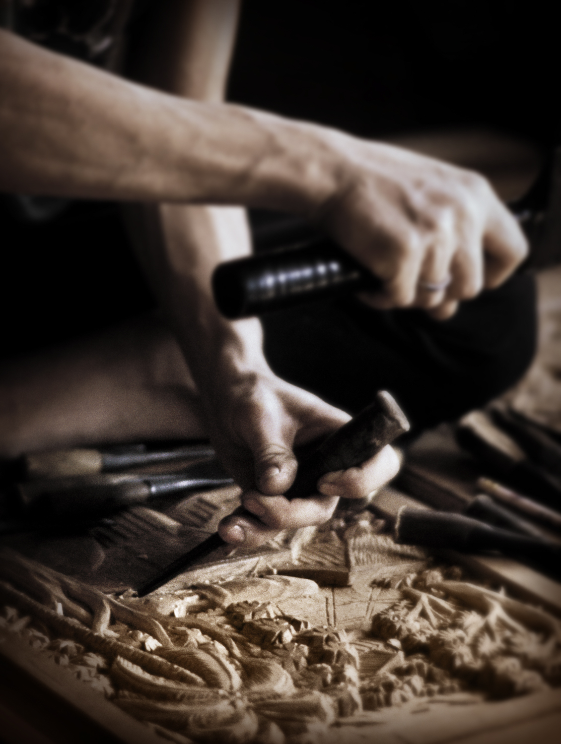
We chose visuals that can communicate the meticulousness of every single process that the rice goes through before it reaches the consumers. We carved the shape of a large grain of rice from a piece of wood and colored it to have the closest color to the actual jasmine rice. We deliberately revealed all the details in each process, and each step tells the story of how, for example, buffalos are brought in for the plowing process, as well as the threshing, which are done traditionally and meticulously by hands. The top part of the grain is the rice germ where all the special nutrients are. We worked with several local wood carvers to achieve the most perfect wooden rice-shaped packaging because we want everyone to know how difficult it is to plant, nurture and harvest rice, and the level of attentiveness required in each process, for consumers to enjoy the genuine taste of the real Thai jasmine rice.


We worked with several local wood carvers to achieve the most perfect wooden rice-shaped packaging because we want everyone to know how difficult it is to plant, nurture and harvest rice, and the level of attentiveness required in each process, for consumers to enjoy the genuine taste of the real Thai jasmine rice.
Thai Hommali Brown Rice from HEALTHY FOOD HEALTHY LIFE
art4d: Having been invited to be a judge in several globally renowned design competitions, how do you see the tendency or trajectory for the future of product packaging design?
SK: I think there are three tendencies. One is the consciousness in the environment and sustainability. The industry and consumers will be highly aware and invested in everything related to the environment. Then there’s minimalism and the kind of ideas that intend to create noises and spark new trends.
Environment is inevitable in terms of how it will gradually impact design. Almost every brand is picking up on this trend, from Design for the Circular, Design for the Zero, Design for Reuse or Edible Packaging. The trend is going to be here for at least 5-10 years.
Minimalist design is growing. We were once familiar with products that went with the hard sell tactic using colorful packaging. But nowadays, consumers, especially the Millennials, are becoming more influential in the Internet and Social media era, and that has caused many factors to change. You can see it’s happening with product design where every brand is taking the minimalist route such as iPhone or even television whose designs are getting more and more simplified. It’s the reason why other industries are catching up with the trend and packaging design is just the same. Simple, clean, minimal-looking packaging makes a product stand out and more appealing to the target consumer.
The trend- instigating design is an inevitable result of the social media-driven world where everything is moving so fast. Developing a product and packaging design used to be a long process and it took a lot of extensive planning when a product was being promoted and launched. These days, things are different. The world is moving significantly faster and there are trends happening everywhere around the world, constantly emerging and replacing each other. Packaging is one of the tools for a product to effectively access consumers and it has the ability to create a trend easily without the need for mass production. This is why we’ve seen brands with products and packaging that eagerly follow social trends because they want to their brands to make more noise and reach a wider group of consumers.