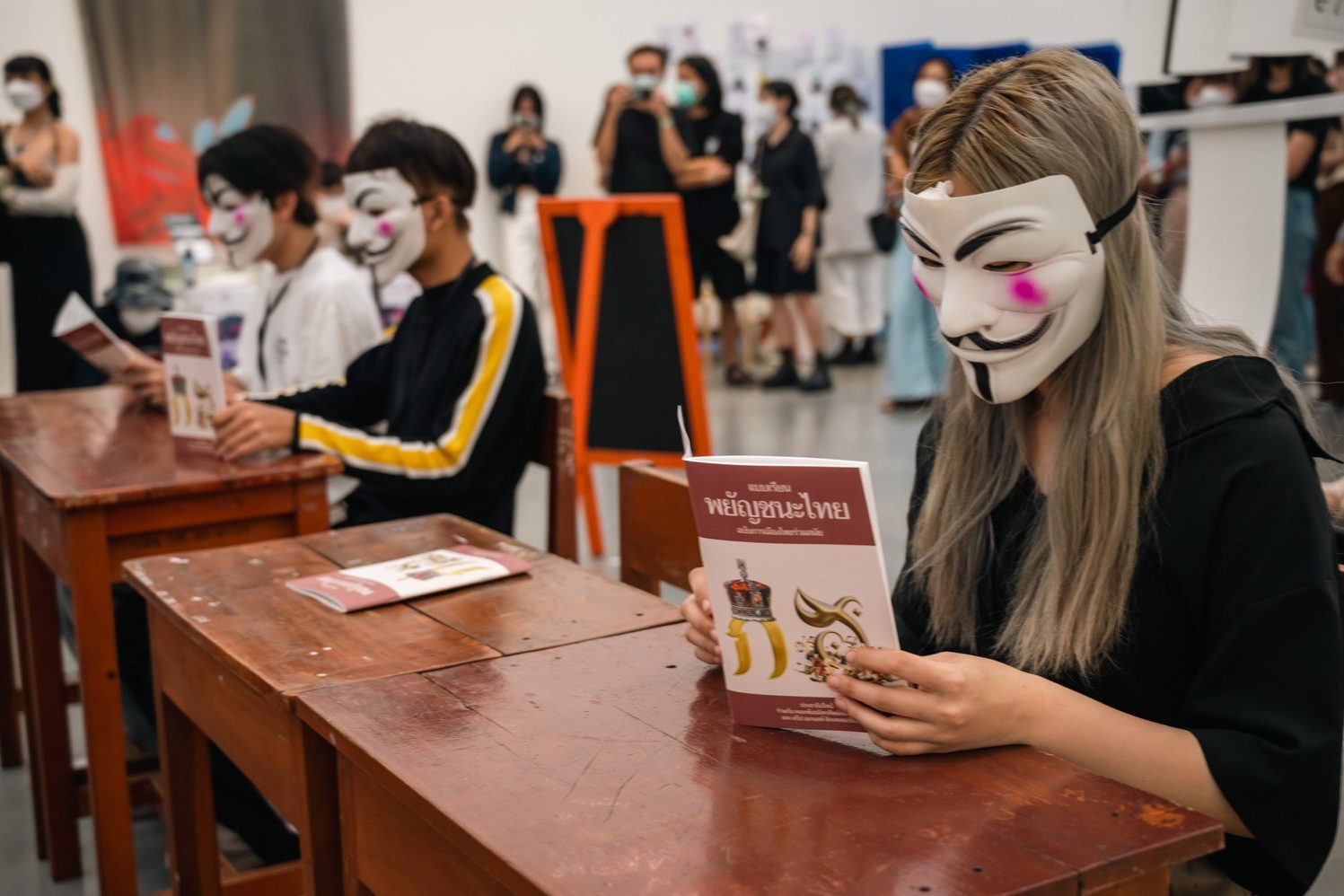
SPEAKS WITH THE GRAPHIC DESIGNER WITH THE CONVICTION TO PROTEST WITH TYPE DESIGN AND HIS RECENTLY PUBLISHED BOOK ‘MOB TYPE’ WHICH DOCUMENTS THE CHRONICLE OF PROTEST THROUGH ARTS AND TYPE DESIGN
TEXT: PRATCHAYAPOL LERTWICHA
PHOTO COURTESY OF PRACHATHIPATYPE EXCEPT AS NOTED
(For Thai, press here)
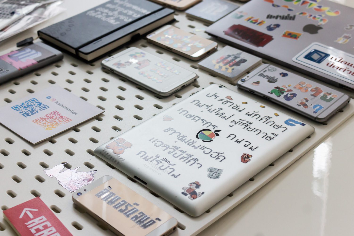
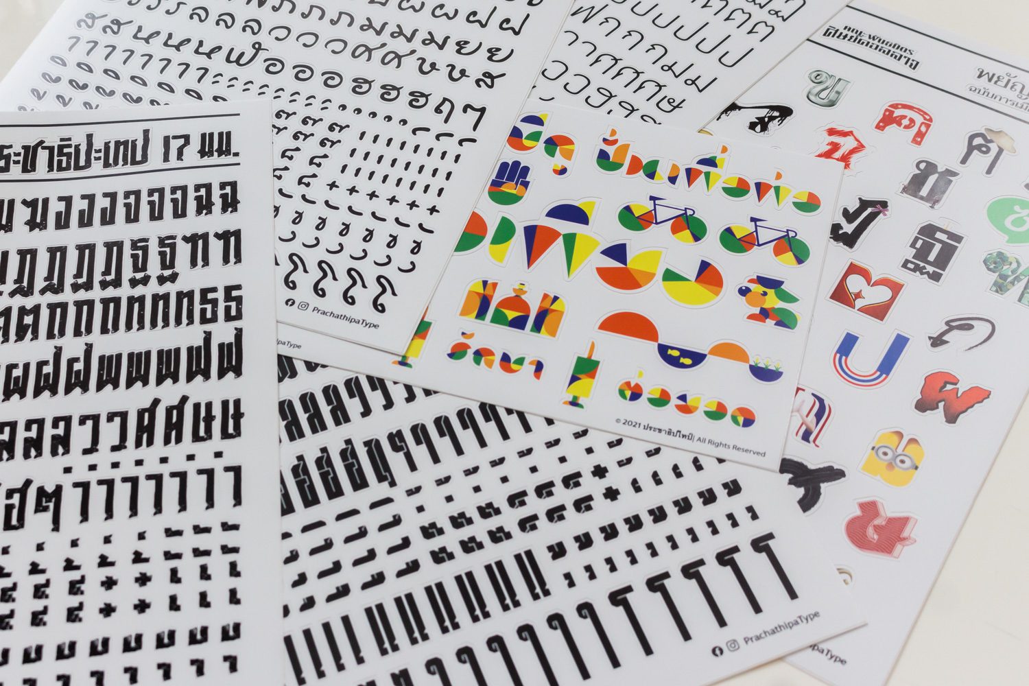
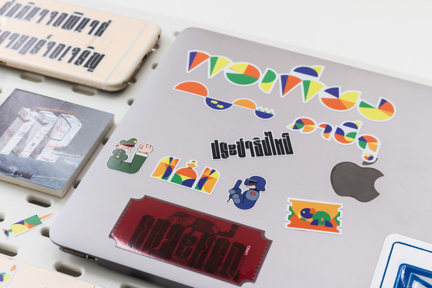
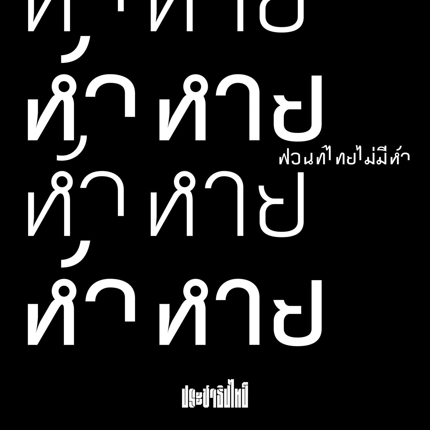
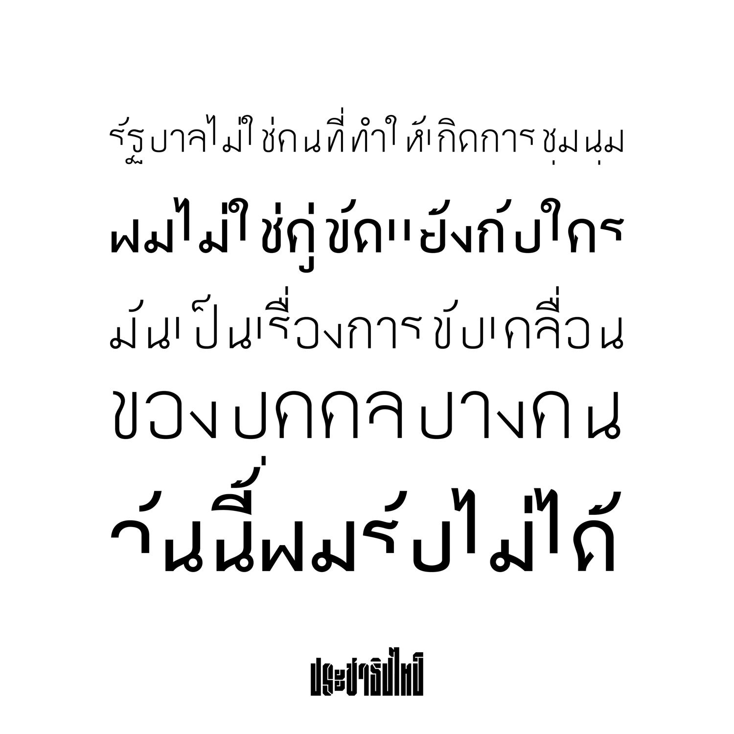
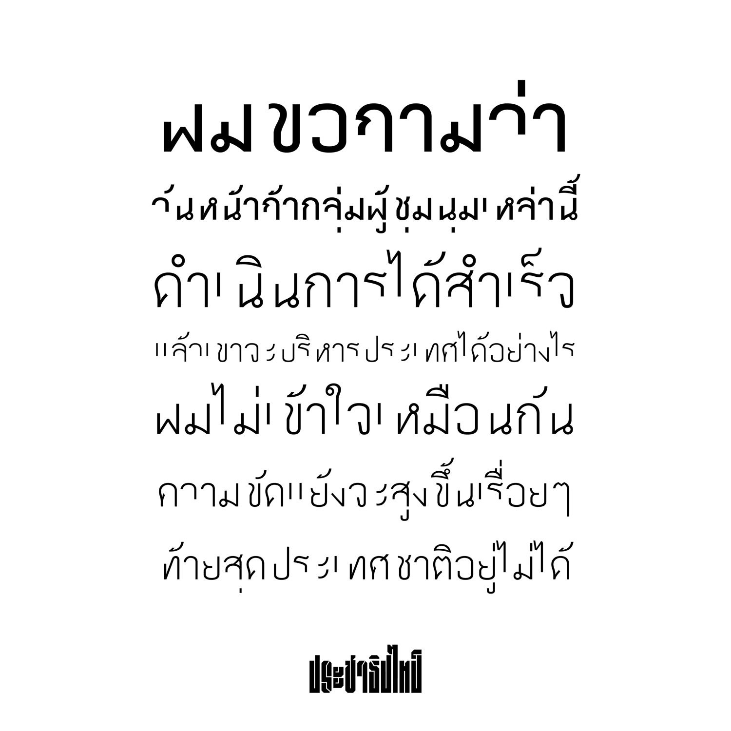
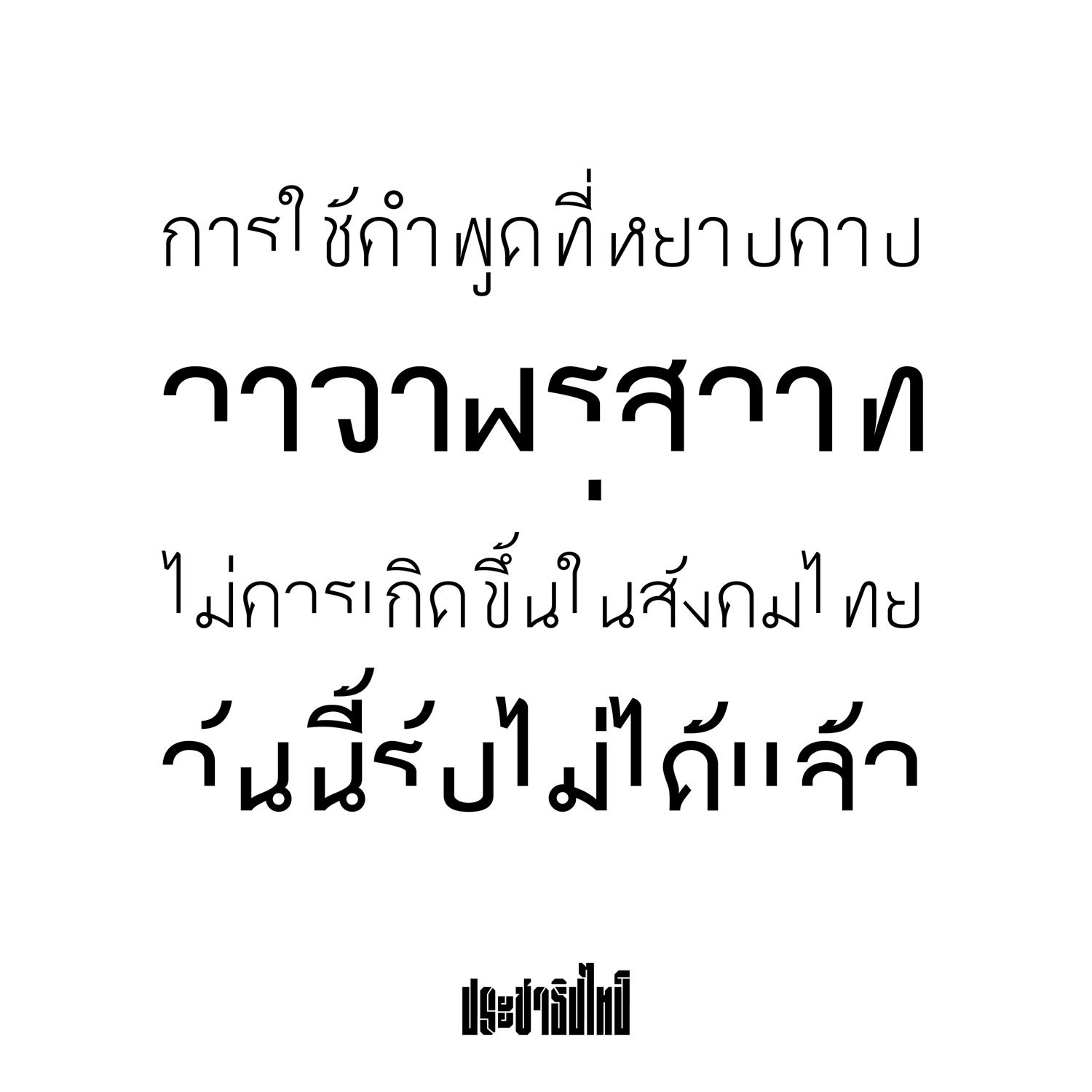
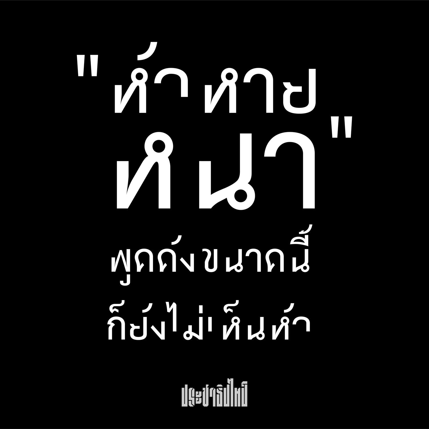
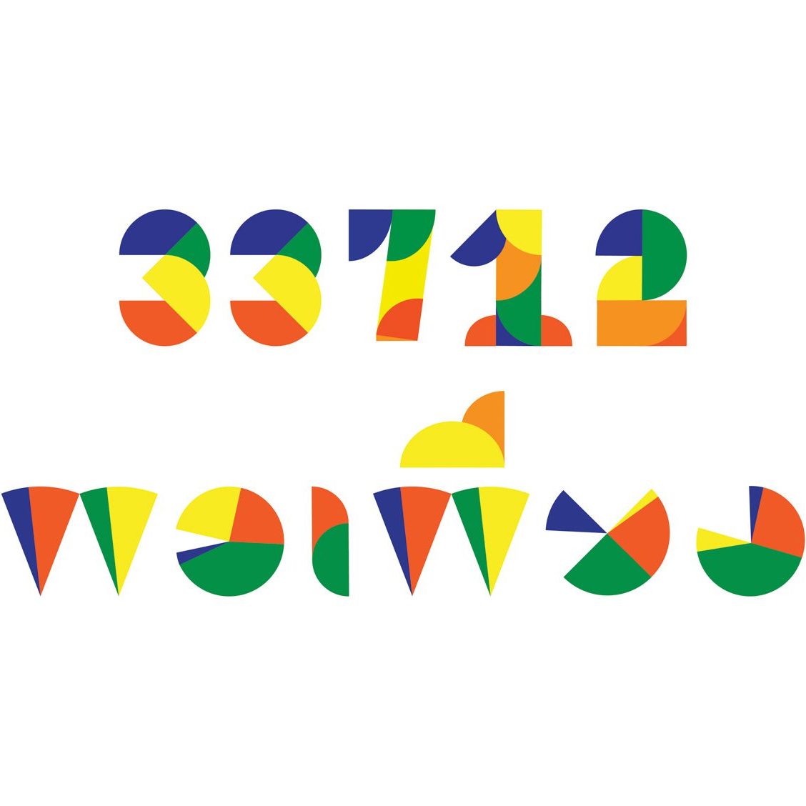
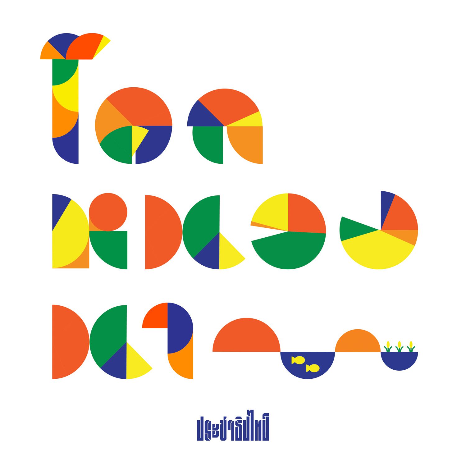
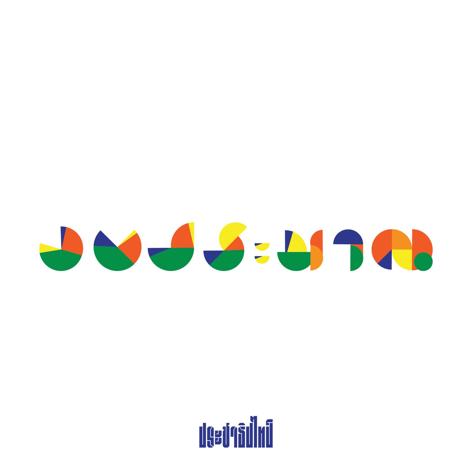
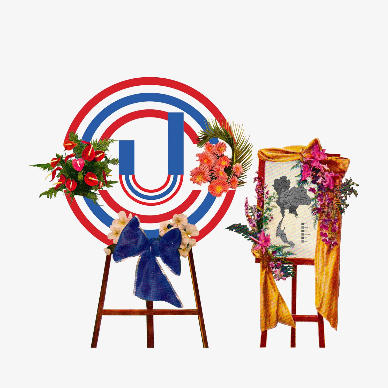
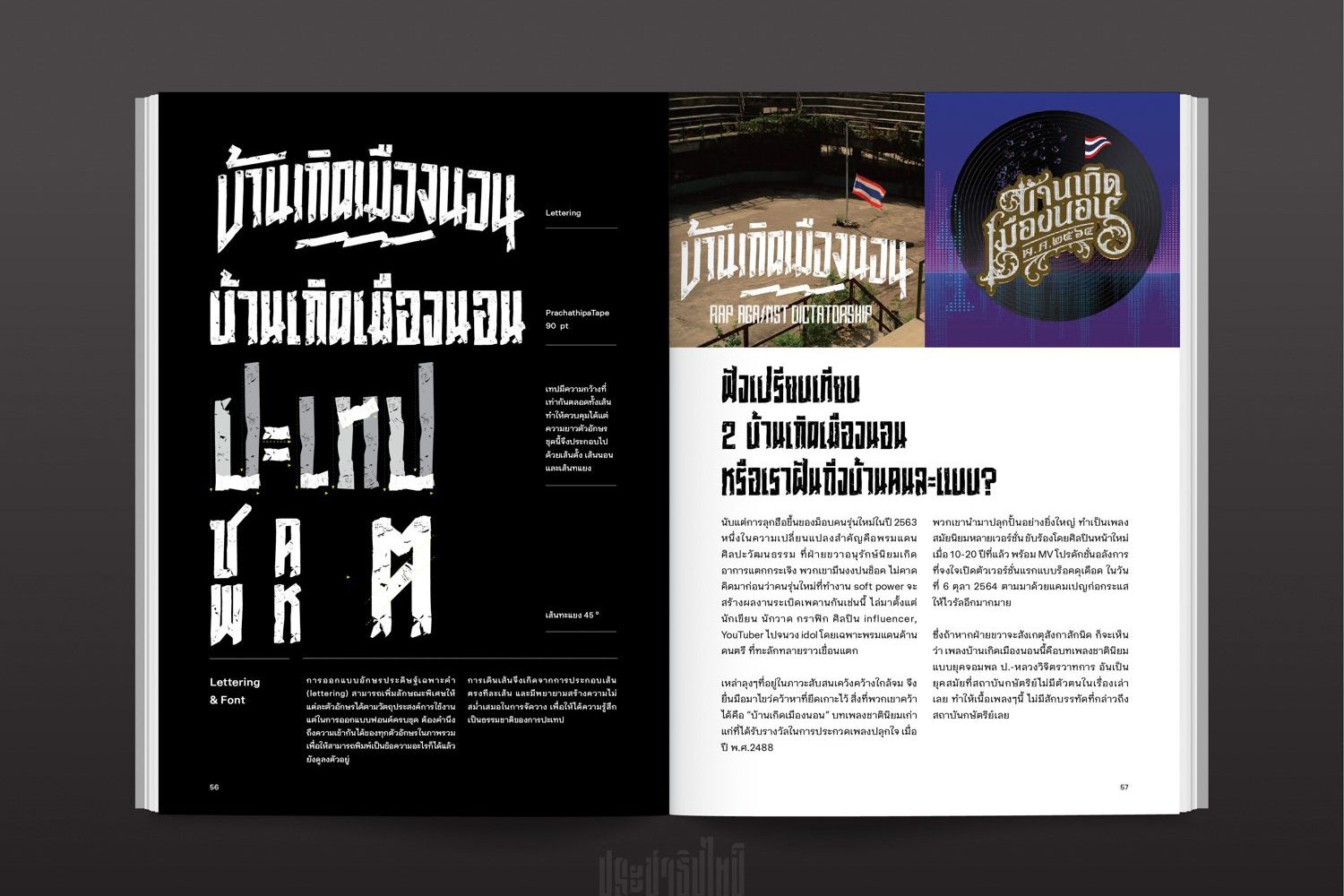
The desire for true democracy by people everywhere across Thailand has sparked some heated debate and ideological and physical clashes in Thai politics over the past two years. Throughout these years, the moniker “PrachathipaType” may have surfaced in many people’s social network timelines or feeds, owing to the font designs being developed as a witty form of satire about Thai society, causing them to be shared by enthusiastic netizens. Among them are “33712,” the font that questions the governmental budget spent on the monarchy, and “Hua Hai,” or “the missing head (looped terminal, one of the key parts of Thai letter),” the font whose heads (one of the characteristics of Thai typeface anatomy) are all eliminated as a result of the design’s intention to criticize the incident in which the senate rejected the constitution amendment bill that had gathered over 100,000 signatures from Thai citizens.
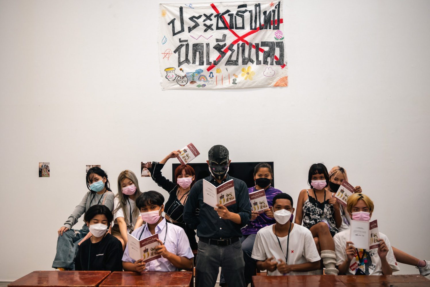
Prior to all of this, the man behind PrachathipaType was just a common graphic designer. The rise in the country’s political temperature became the catalyst for the birth of a new identity: a designer who now wears all black with a mask on and the moniker “PrachathipaType,” implying that he has nothing other than “fonts” as his weapon.
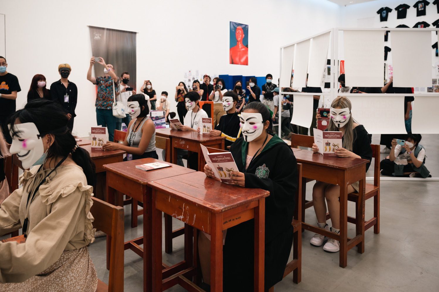
Although the people’s movement is not as fiery as it once was, the wind of change is still blowing. As a force to help keep the wind going, PrachathipaType has recently released “MOB TYPE: recording the people’s struggle through the art of lettering,” a documentation of works derived from important incidents in the last two years using “letters.” art4d takes this opportunity to speak with PrachathipaType about the conception and completion of the book.
Let’s get to know PrachathipaType together.
art4d: What is PrachathipaType’s origin story?
PrachathipaType: It all started when I was a kid. Thai culture has always piqued my curiosity. In school, I used to practice and perform Khon. My mother noticed this and suggested that I read the Art and Culture magazine. But the magazine included content that was not only about art and culture but also about other aspects of history. After reading countless issues of that magazine, I discovered that art, politics, and history have many facets and versions. That sparked a thought in the mind of a secondary school student like me.
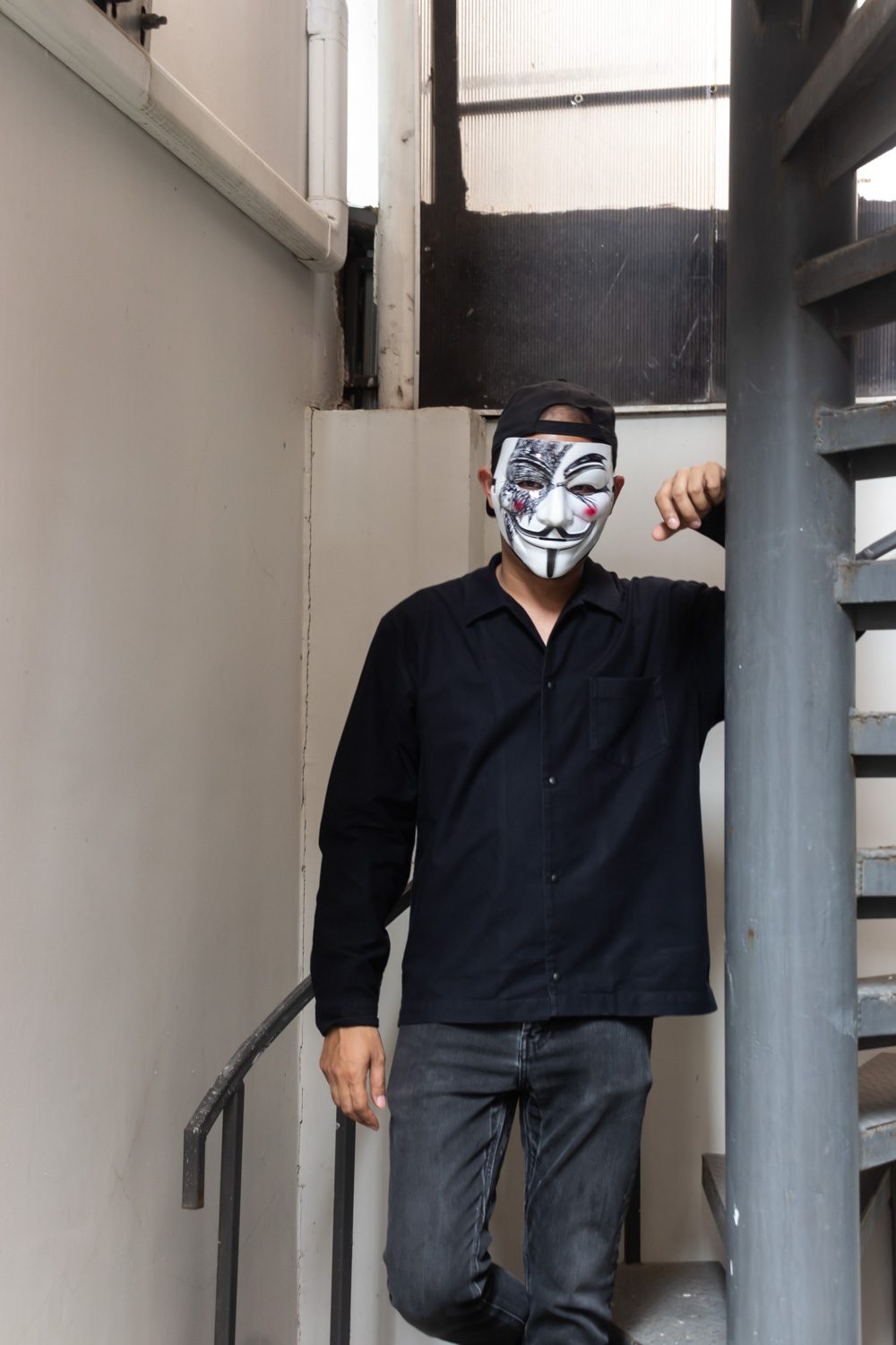
Photo: Pratchayapol Lertwicha
When I moved to England to complete my master’s degree, I was able to talk to people from many different countries, and I got asked about things that I had never been asked before, like “why do you talk so much about the monarchy?” Are members of the royal family that approachable? or “Why did you need to learn royal terms?” “Do you interact with members of the royal family that frequently in your lifetime?” That’s when I began to question my own country’s identity and its tight link with the concepts of nation, religion, and monarchy, all of which are firmly buried in the Thai people’s psyche.
During the eruption and dispersal of the Red Shirt movement and demonstration in 2010, I witnessed how my friends, who were generally very nice people and lovely to everyone, were fine with people being massacred in the heart of the capital city. My first instinct was, wait, even if people disagree with you, that doesn’t justify murdering them. I hosted a going-away party for a foreign intern during the height of the PDRC movement, and we prepared all these props, with the country’s flags and whistles, just for fun, but one of my acquaintances was furious that I was making fun of the national flag.
All of these bits and pieces of experience raised so many questions that contradicted my beliefs. Then, in 2019, when the protests against the Thai government intensified, I saw that Rap against Dictatorship and Headache Stencil were looking for artists to submit work for the “Uncensored” show they were organizing, so I decided to submit mine. As the event progressed, I had the opportunity to speak with people from that circle, and I talked with people who shared my belief that this country is falling apart, and that encouraged me to do something more substantial.
But I felt the threat of becoming more political, and it concerned me about the work and life I’d built here, so I decided that I needed a new identity. I was thinking that I wanted to be politically vocal in a new way that would allow me to experiment as a designer. That is how I came to choose lettering as my form of expression.
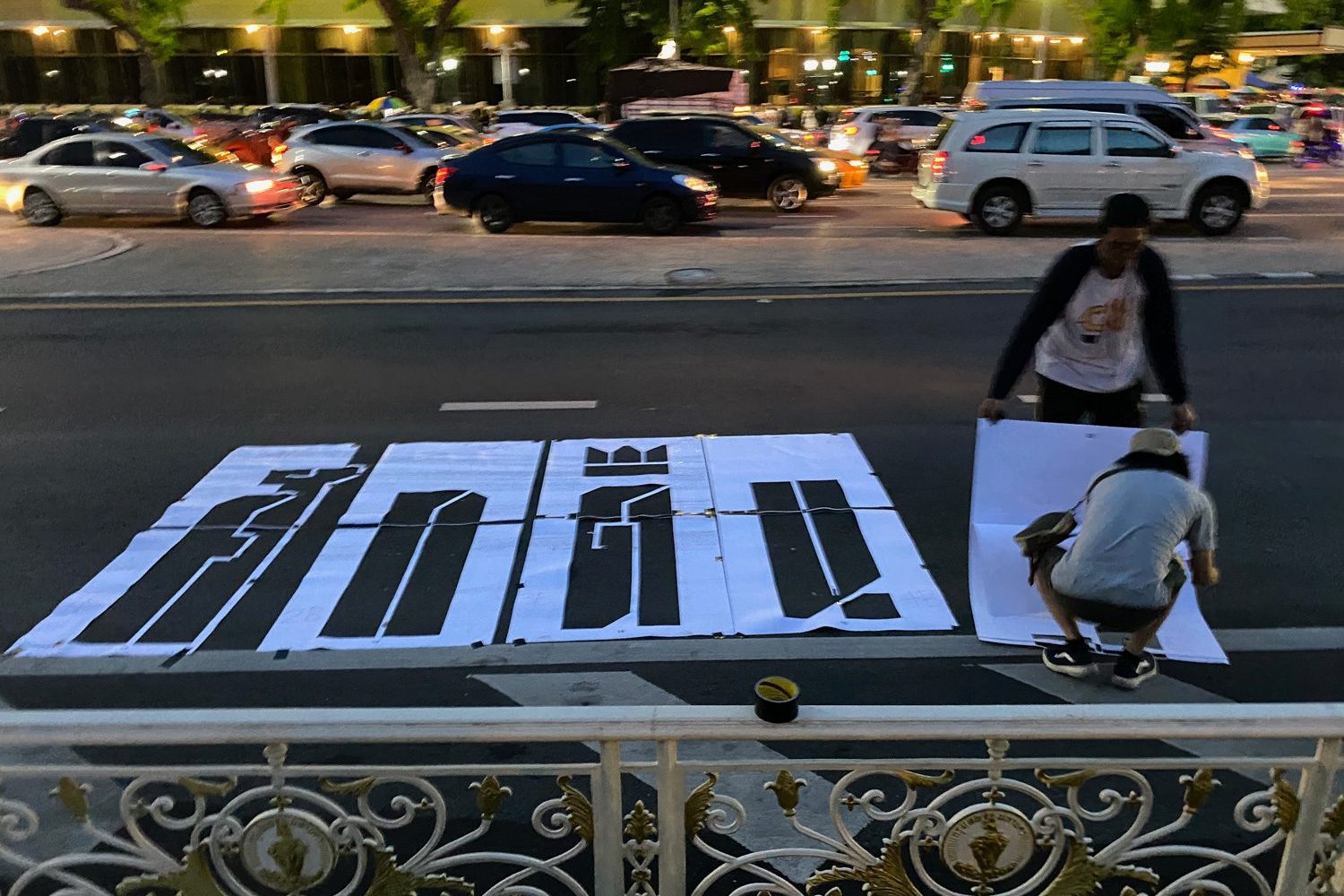
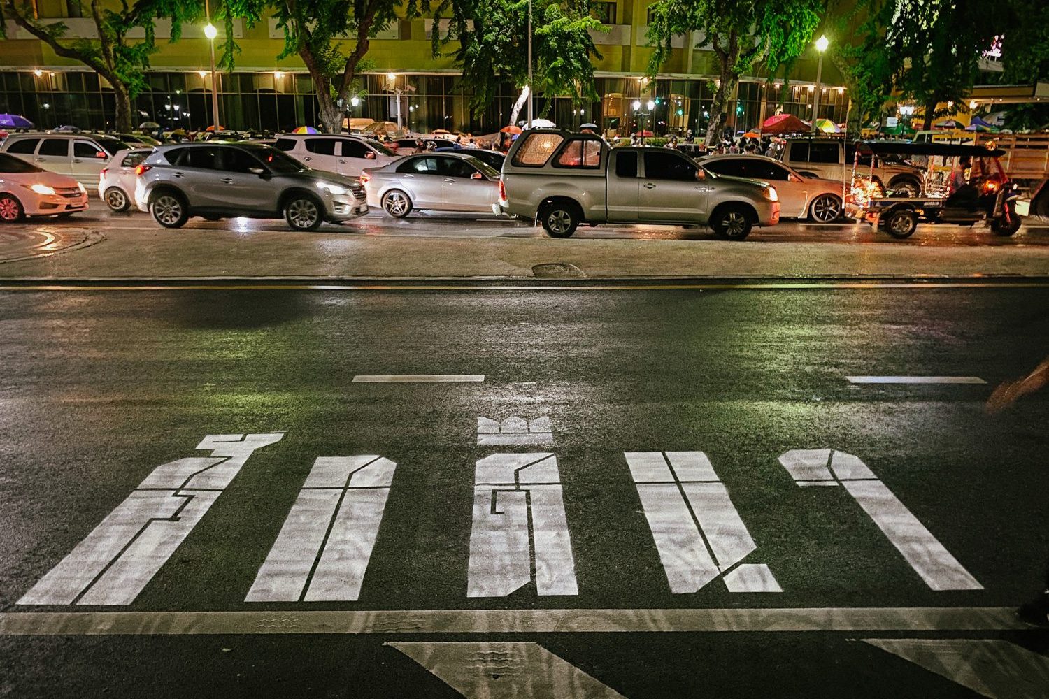
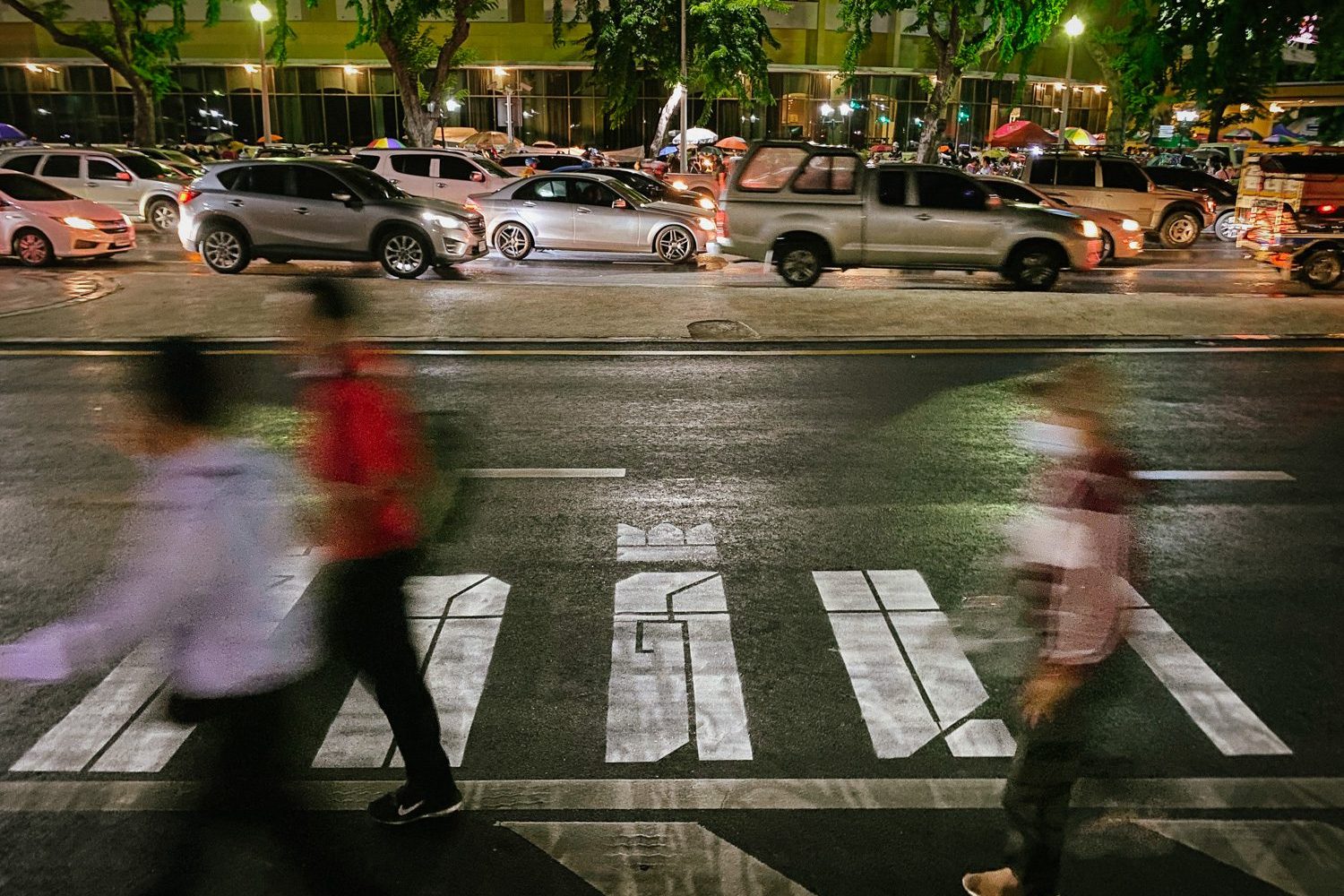
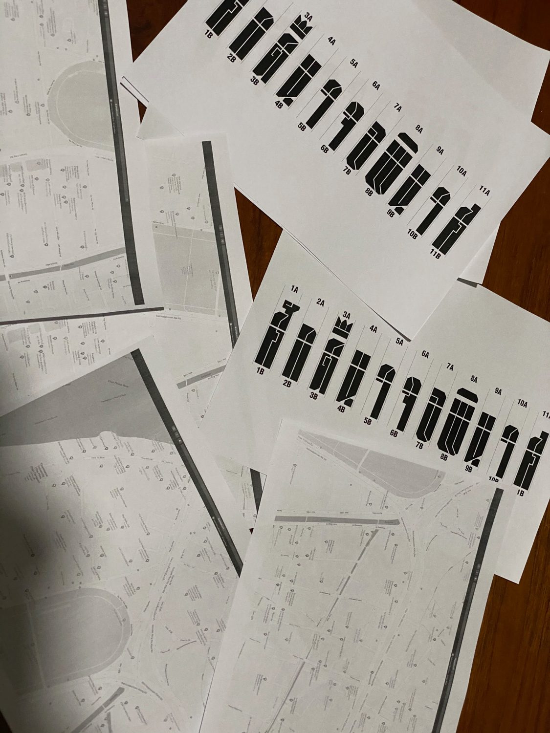
Prior to mass protest on September 19th, 2020, Headache Stencil wanted to spray “damn to the dictators” on crosswalks around Ratchadamnern Road, but they weren’t sure what typeface to use. I promised them I’d assist them in developing the design, and then we spray-painted the road in the middle of the night. It was a nice experience. Only a couple of hours after that work was shared on Headache’s page, the post received a flood of engagements. That’s when they suggested I create my own page.
art4d: What is it about letters that makes you choose to use them as your form of expression?
PrachathipaType: I’ve always been fascinated by letters and typefaces. They’re unique in that they function like a vehicle that delivers a message to the receiver with a specific sentiment. It’s similar to how when you drink a glass of wine and notice how beautiful the glass is, you naturally become more attentive to the entire drinking experience. You’d take your time sipping and smelling the wine, gradually appreciating it. Letters transmit or contain historical information, such as the Blackletter, which was popular in Germany. You can see it and feel the Germanness in it.
Another reason is that I believe design and art in Thailand are inextricably linked to three institutions: the nation, religion, and monarchy. You’d see design competitions like Fonts for the Father, and when everything is tied to the king’s exaltation, it all becomes justified. Meanwhile, those who question these institutions are annihilated. Consider the Perceptless artwork or the Ultraman-inspired Buddha image series. Isn’t it time for this country to be more accepting of differences and diversity? I thought about how fonts and letters could be utilized to call these things into question.
art4d: How do you pick what issues or subject matters to communicate, and what is your creative process like?
PrachathipaType: There’s nothing special about it. Each work responds to current events and my feelings, such as the crosswalk series, which uses a font I designed previously. When the time came, I made the necessary changes to best suit the spraying process.
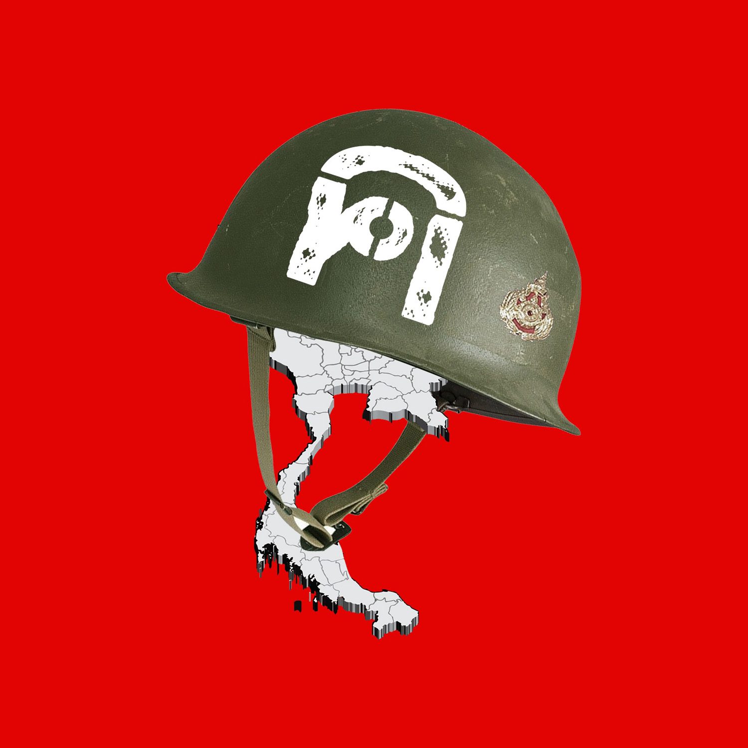
‘Hua Hai’ was created when iLaw obtained over a hundred thousand signatures for the constitution amandment bill, which was rejected by the Senate. Someone said it felt like people’s heads were cut off because they didn’t even acknowledge us as humans. “Why don’t we just cut the head of the entire set of fonts?” said a member of my team. That one was completed quite quickly.
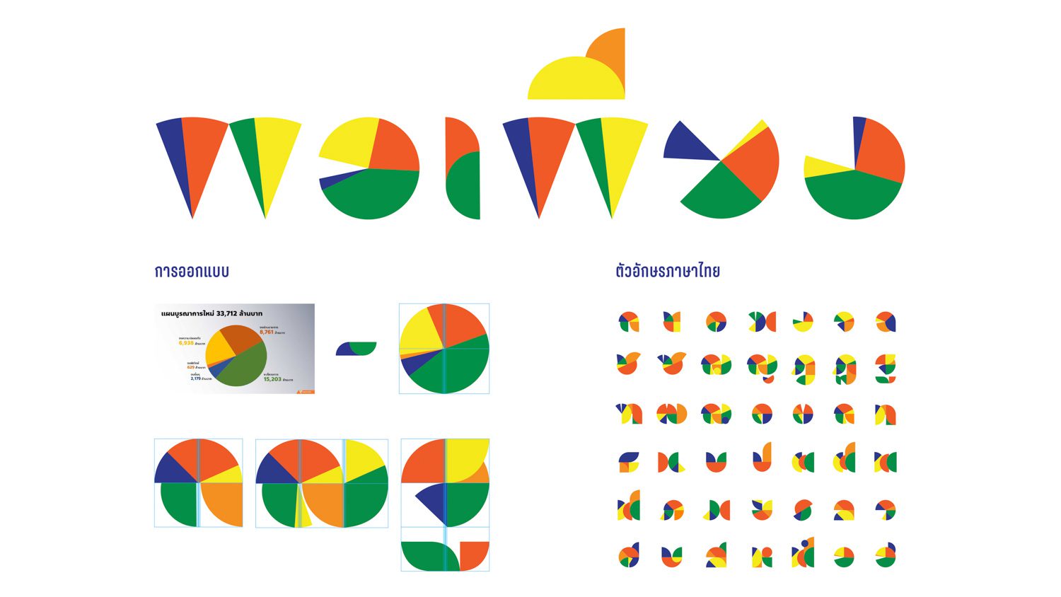
33712 was created out of pure rage. I watched how many people’s lives were ruined by COVID-19, while this government spent $30,000,000,000 on the monarchy. I was furious. But I didn’t want to express my feelings directly, but rather through mockery. So I attempted to convert the graphics used by Representative Bencha Saengchantra when she took the stand and presented the issue into a series of words. The first one I tried was the Thai term for “budget,” but I didn’t think it was sharp enough. The word ‘sufficiency’ came to mind because it carries such a strong connotation. These organizations have programmed Thai people to be humble with what they have, but the budget that has been squandered directly violates the idea that we have been told to admire and follow. After I finished, it received hundreds of likes in less than two minutes, so I decided to make a series out of it.
art4d: It’s interesting that you chose a satirical tone rather than communicating with that raging feelings. Why is that?
PrachathipaType: I didn’t want to be another flame in the fire. I feel that if I do something incredibly provocative and controversial for an already raging society, we might not get anything out of it except an even more declining spirit. I wanted to ask people to look at this vexing situation as something laughable, even though we are still angry about it. I wanted to create something that reflected how absurd these things are. That, I believe, would be far superior.
Take a look at Charlie Chaplin. He performed funny skits while sporting a Hitler mustache. It diminishes what Hitler stood for. It’s similar to how 33712 devalues the sacred concept of “sufficiency.”
art4d: Your works are more symbolic than a direct or straightforward critique of a subject.
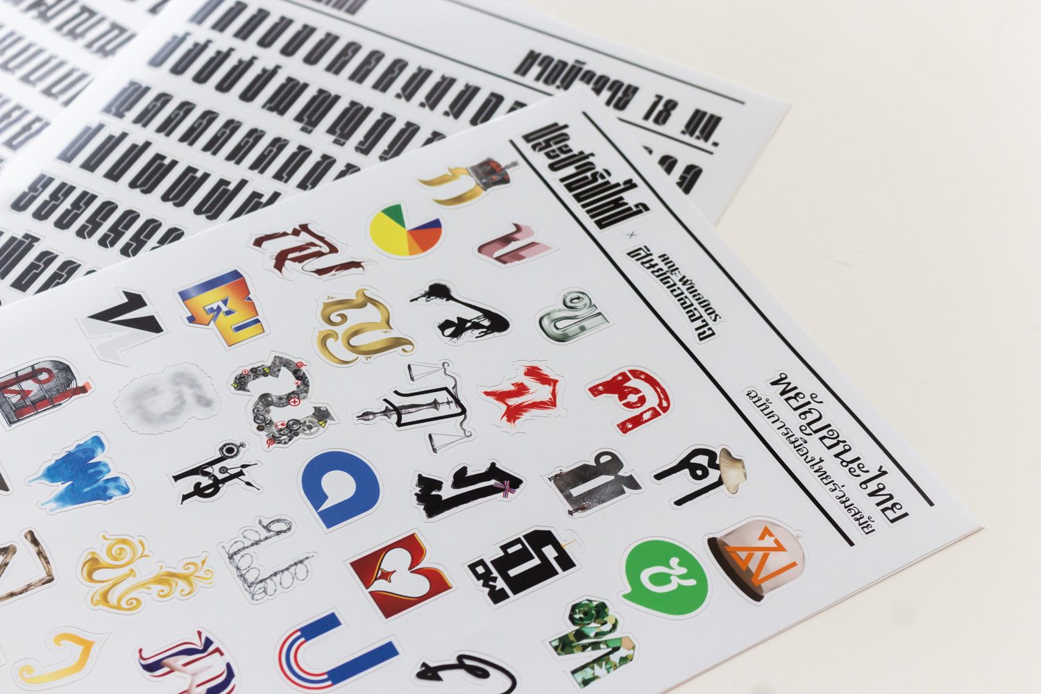
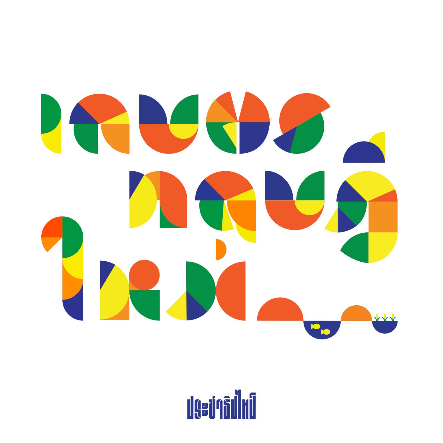
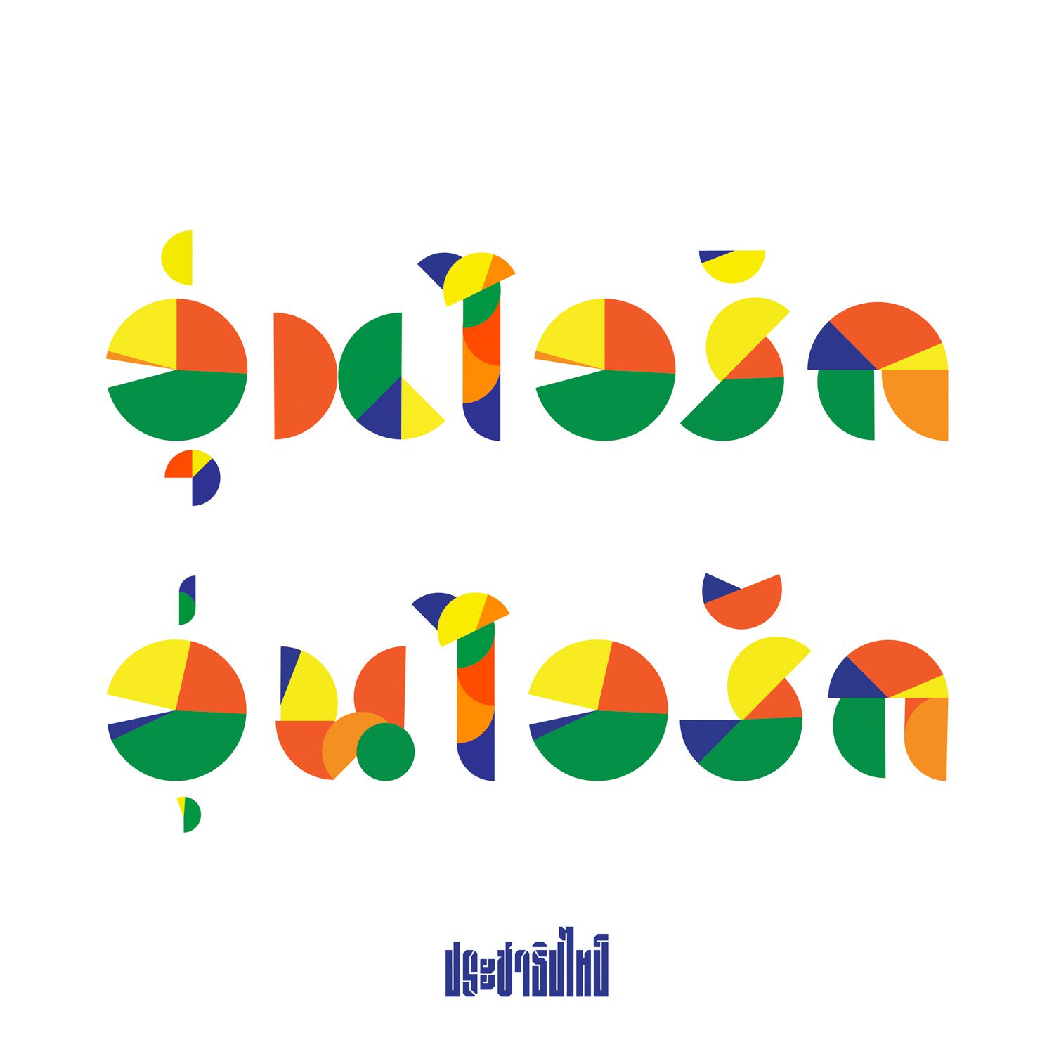
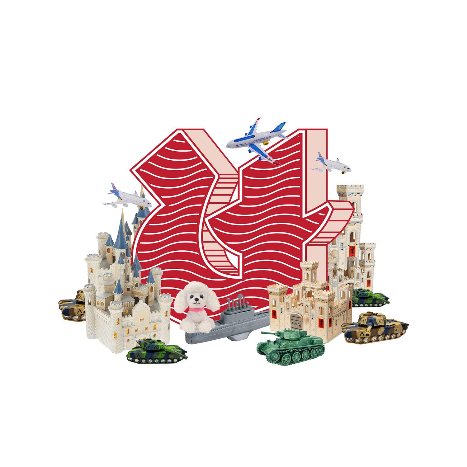
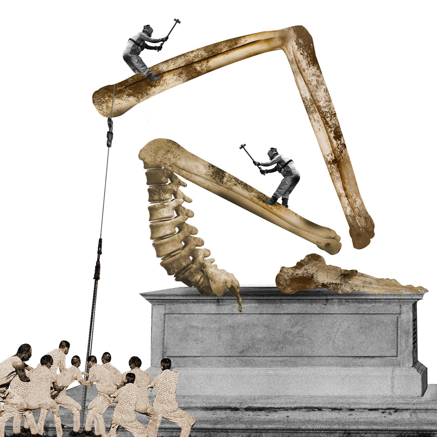
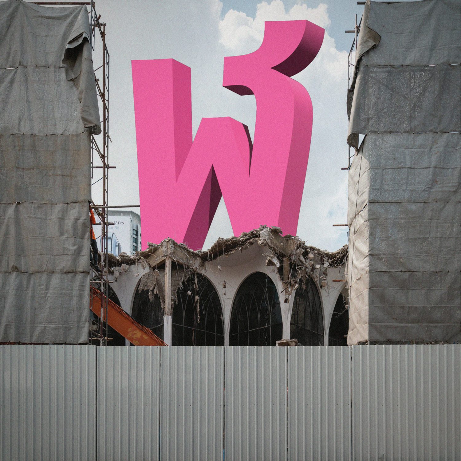
PrachathipaType: Correct. The “learning Thai alphabet” series associates each alphabet with a specific issue, such as the letter “ษ” which is related to the Thai word “ภาษี” or tax. It criticizes the wasteful use of tax money, and the design is based on that aspect. The letter “ล” is represented as the concept of “ล้มล้าง” or “abolish,” implying the demolition of a decaying structure, hence the meaning is conveyed by a symbol, in this case toppling monuments.
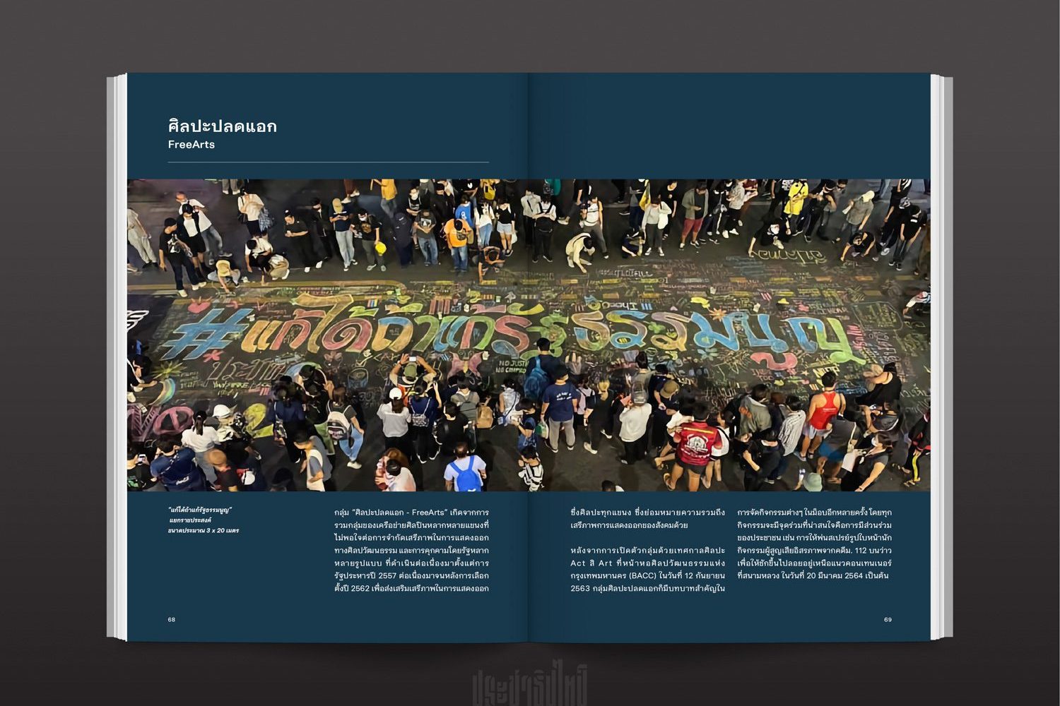
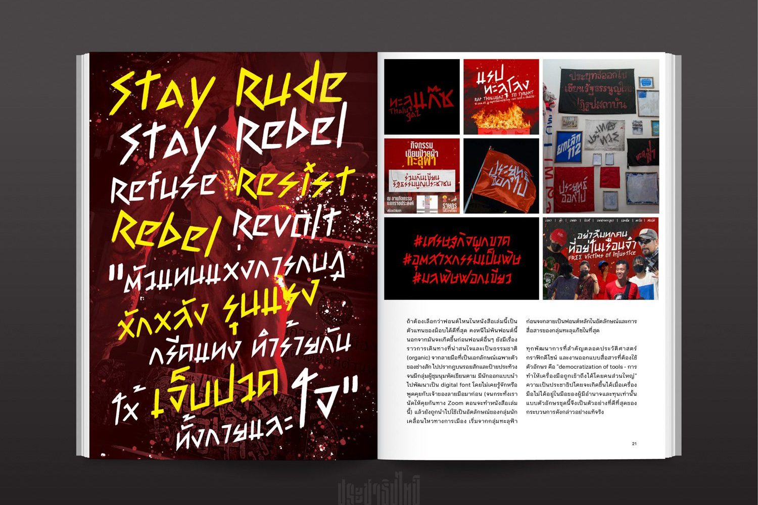
art4d: Could you tell us a little bit more about your new book, “MOB TYPE- recording the people’s struggle through the art of lettering”?
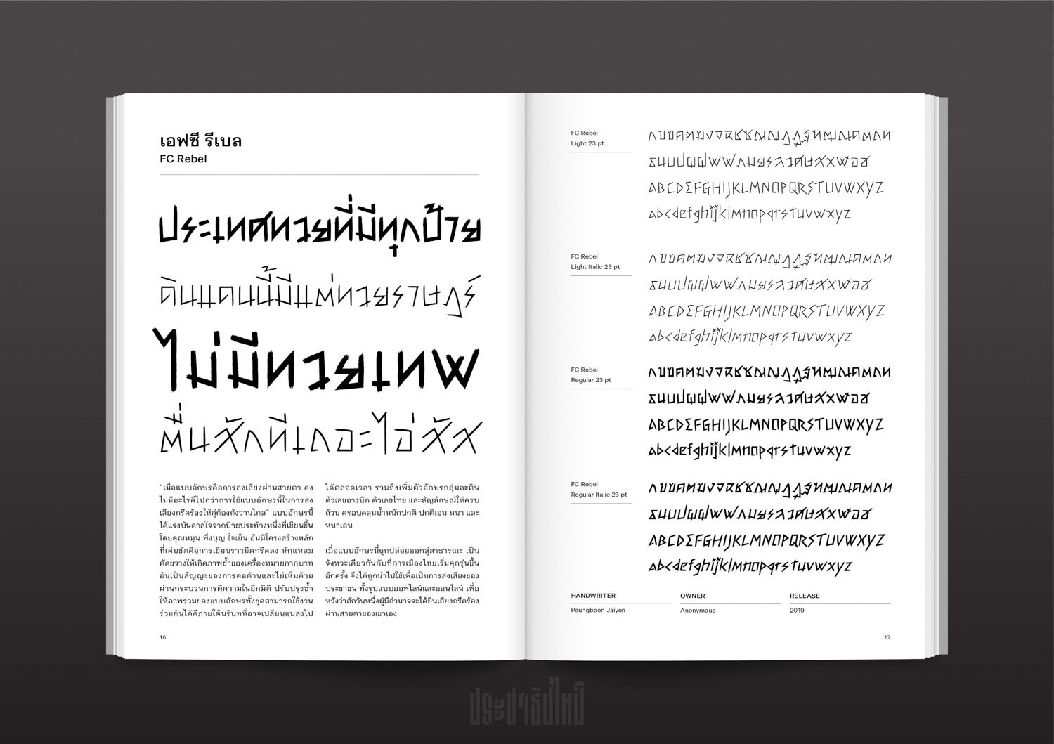
PrachathipaType: At first, I considered putting together a book about PrachathipaType’s type specimen. Prior to the Internet, type foundries liked publishing catalog-style books that showcased their own font designs. Type specimens are still being published nowadays, but they are more for collectors or to highlight functional details.
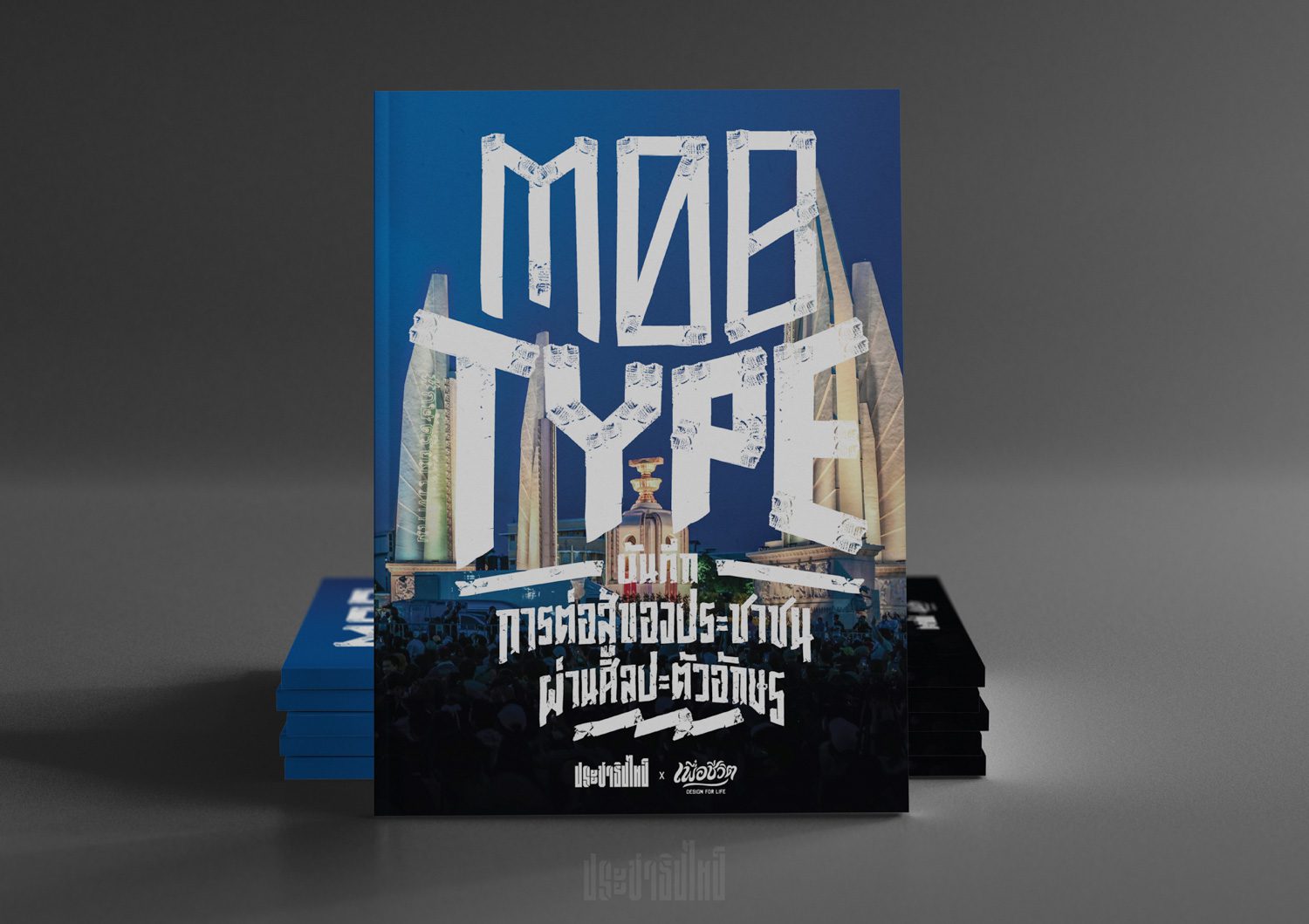
My initial thought was that our fonts aren’t that significant, as in if you look at in the bigger context or in Thai society. What’s more relevant are the stories behind the letters, such as why they were created and what incidents they were used to protest. Making a book that serves as a historical record is, in my opinion, far more essential.
When I understood that I wanted to document these political stories rather than the fonts, the idea grew to include how the book should collect fonts created by other people as well as how it should gather all of these sentiments expressed through letters rather than just featuring the fonts alone. It featured lettering or frames made for social media profiles as well as letters painted on signs, streets, and mobs, and things sort of grew from there.
One of my students once casually asked why there hadn’t been a proper book about Thai typography, and that remark caught my attention. because it is true. We don’t have many books like that. The thought occurred to me that there should be more publications on Thai typography that also describe the country’s political history and current situations. I thought it’d be a very unique project to work on.
At the same time, we want this book to be affordable to everyone while still containing high-quality printing and using good materials. We want this book to be easy to read and understand, rather than something created solely for design students but not reaching the general public. The written contents in the book, are not long, like a social media post; they are something people can read quickly, but they have all the information and explanation as to why these letters were made or what their attributes are.
I believe the book has a similar objective to PrachathipaType, in part because we want people in society who are not designers to see how design can call attention to and drive many causes. At the same time, it allows those interested in typography and design to see the political significance of these letters and typefaces. So the book can act as a bridge, connecting many ideas and debates.
In a nutshell, I think for what the book is, it’s more meaningful in and of itself as well as for the society to be something more than just another type specimen. We figured that this is the way the book could relate to everything we wanted it to be, so we were like, “Alright, let’s do this!”
art4d: Why did you choose to put together a book? Considering how there are so many alternatives nowadays, such as the Internet.
PrachathipaType: Perhaps because I come from a generation that believes in books and their permanence and tactility. Messages on social media can get lost in a timeline, but books are easy to find and can be used as a reliable source.
art4d: We know that the book covers topics other than typefaces and letters; how did you go about selecting the contents?
PrachathipaType: They came from my interests in each subject and issue, as well as movements that utilize art or design as a tool. Bottom-up movements spark my interest more than top-down ones. “Thouy Country” is one of my favorite fonts. It’s an intriguing font because it began as the handwriting of a tattoo artist in Chiang Mai before getting adopted by a variety of political groups. A type foundry replicated and turned the tattoo artist’s handwriting into a digital typeface, and the youngsters who were going to protest used this digital typeface as part of their demonstration. That’s why this font is so fascinating: it grew in such an organic way, and the story of how it evolved is interesting. That was something I felt compelled to include in the book.
art4d: What are your thoughts on the lettering and fonts that have emerged from the democratic movement in the last two years?
PrachathipaType: I believe they speak the most to young people and students since they are the majority of people who attend protests or are at the heart of movements such as Thammasat University students’ 10 demands, which were first printed in Saraban font as an official document. However, they were afterwards summarized in the form of a lecture note. There are also letterings that radiate aggression, something that was designed hastily with proportions that are easy to read on an electronic screen because everyone nowadays owns a smartphone.
If you look at the typefaces on the right wing, you’ll see intricacy, exquisiteness, and curved lines that appeal to a conservative audience.
art4d: Many people have said that if Thailand achieves true democracy, it will help the country in a number of ways. Our question to you is, “How will democracy benefit design?”
PrachathipaType: If I were to address this question from the perspective of graphic design history, the concept that runs throughout the documentary Graphic Means: A History of Graphic Design Production is the democratization of tools. You used to need funds, machines or tools, manpower, and the power or authority to order production if you wished to design and publish an idea or belief. However, as these tools became more affordable and widely used, more individuals are now able to communicate and exchange ideas and different points of view.
If we focus on Thai typography, the first Thai font was created by Prince Narisara Nuwattiwong using a broad-nib fountain pen, which is a western tool, and was initially employed on talipot fans, which were used in court or religious ceremonies. But as more people got this kind of pen and learned how to write with it, the letters ended up on pawn shop signs.
I believe that design will develop and prosper if we can live in a society where bodies of knowledge are not deeply intertwined with the power structure. We will also be more accepting of differences and diversity. This includes not only design but also other creative and artistic domains such as fine art and performance art.
art4d: Last question, what’s the future of Thailand that you envision?
PrachathipaType: I want Thailand to be a country where people are judged for their ability rather than their connections or affiliations. I want to see the laws enforced fairly. We live in a society marked by severe inequality and monopolies. When the younger generation is imprisoned in a system with even more constraints and limitations than before, it is difficult for them to develop themselves. If society is fair, everyone will get the chance to advance according to their own potential and ability. I think it’s much better that way.
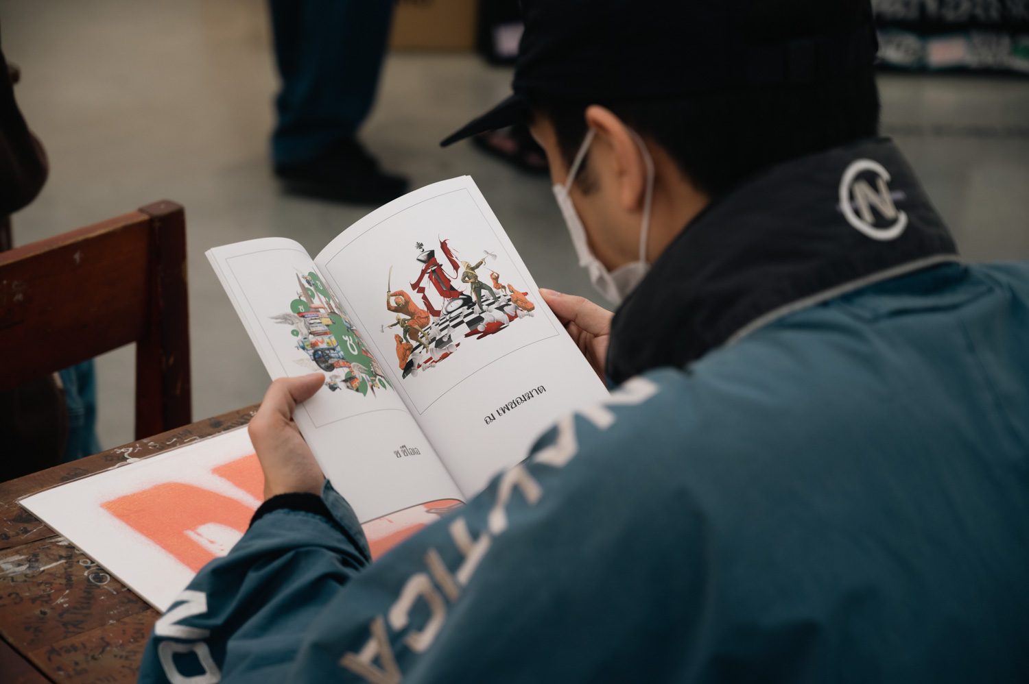
Follow PrachathipaType or order “MOB TYPE- recording the people’s struggle through the art of lettering” at

 Photo: Pratchayapol Lertwicha