REVISITING BITS10 THROUGH FOUR SELECTED BITS CONFERENCE TOPICS THAT ENCAPSULATE VARIOUS ASPECTS OF TYPOGRAPHY AND GRAPHIC DESIGN
TEXT: KITA THAPANAPHANNITIKUL
PHOTO COURTESY OF BITS
(For Thai, press here)
After over a three-year hiatus since the outbreak of COVID-19, the ‘BITS’ typography and graphic design conference, hosted by Cadson Demak, has returned. The tenth edition of BITS, held in 2023, marks a significant expansion in its scope, with the event’s official name, BITS10: Brand Identity and Typography Symposium, encapsulating its focus on more comprehensive aspects. This year’s seminar features a diverse lineup of over 30 speakers from Asia, Europe, and the United States. The program covers a wide range of subject matters, including font business, graphic design, and branding. These topics are highly relevant and applicable to the present-day market and design industry.
After attending the conference held on November 3rd, 2023, art4d has selected four interesting topics to share with those who were unable to attend the symposium.
Typecast by Typeface: How Thai fonts reveal cultural values by Philip Cornwel-Smith
Philip Cornwel-Smith, a British photographer, writer, and curator, is a long-time observer and researcher of Thai society. He is also the author of the book ‘Very Thai: Everyday Popular Culture’. In his talk titled ‘How Thai fonts reveal cultural values,’ he invited viewers to delve into Thailand’s cultural and historical past and present by examining the fonts created over different periods in history. He exemplified the arrival of Daniel Beach Bradley and his historical role in the birth of printing in Thailand, the use of specific fonts in the state-produced propaganda pamphlets, the influences of alphabets in the formation of the state, and the spirit of hip-hop culture in the graphic elements of fonts and graphic design created and used in political protests
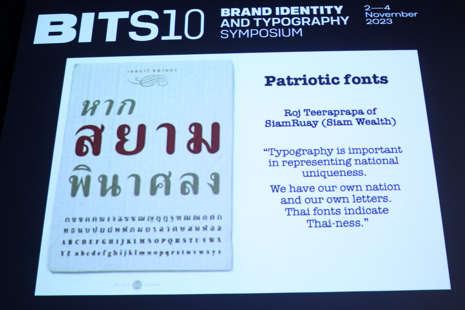


Fonts have always been utilized as a tool in the battle against opposing political ideologies to assert control over meanings. One example is the contrast between the looped letters used in the propaganda produced during Field Marshall Plaek Piboonsongkram’s government and the loopless font on the Khana Radsadorn Plaque (People’s Party Plaque). The looped font aims to convey a sense of formality and conservatism while possessing distinct characteristics that enhance readability. On the other hand, the loopless font was intended to communicate ideas and meanings that were considered more modern and progressive.
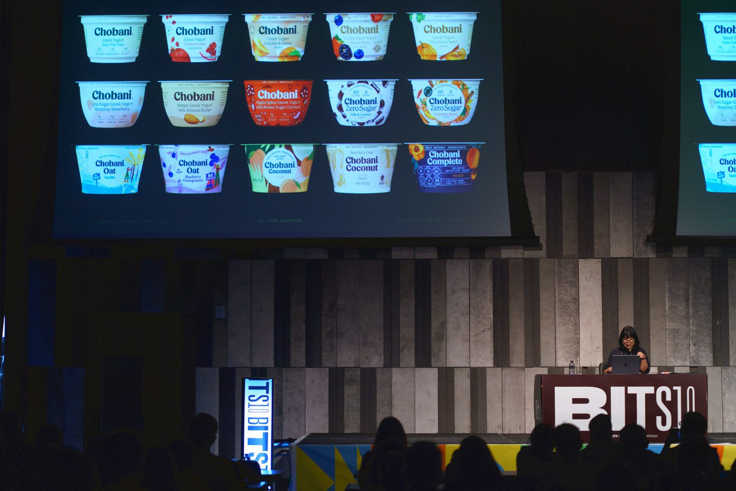
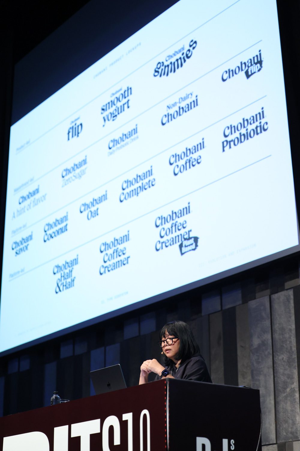
Contextual Type Ecosystem: Typography in Branding, Packaging, and Campaign by Anisa Suthayalai
Anisa Suthayalai is a creative and strategy consultant based in New York with over 25 years of work experience in the industry. As the current Creative Director for Chobani, an American yogurt brand, she shared the story of the four-year-long process of designing the new type ecosystem, developing campaign ideas, and directing the art to align with the brand’s new slogan, ‘Happily Ever After’. Anisa discussed the challenges involved in managing product lines, which are both extensive and complex. The case study selected for the presentation was about a product called Chobai Flip, whose overly confusing packaging led to a complete redesign. The presentation illustrated how imagery, font, and message work together to effectively deliver the intended brand experience and identity to consumers.
Translating Logotypes & Cross-Cultural Branding by Mim Tejapaibul
Pornpiya ‘Mim’ Tejapaibul, a member of the visual communication design team from Samatapaph, discussed the importance of having a profound understanding of both the language and context when it comes to translating logotypes. In her talk, Pornpiya summarized the process into four different components, as follows:
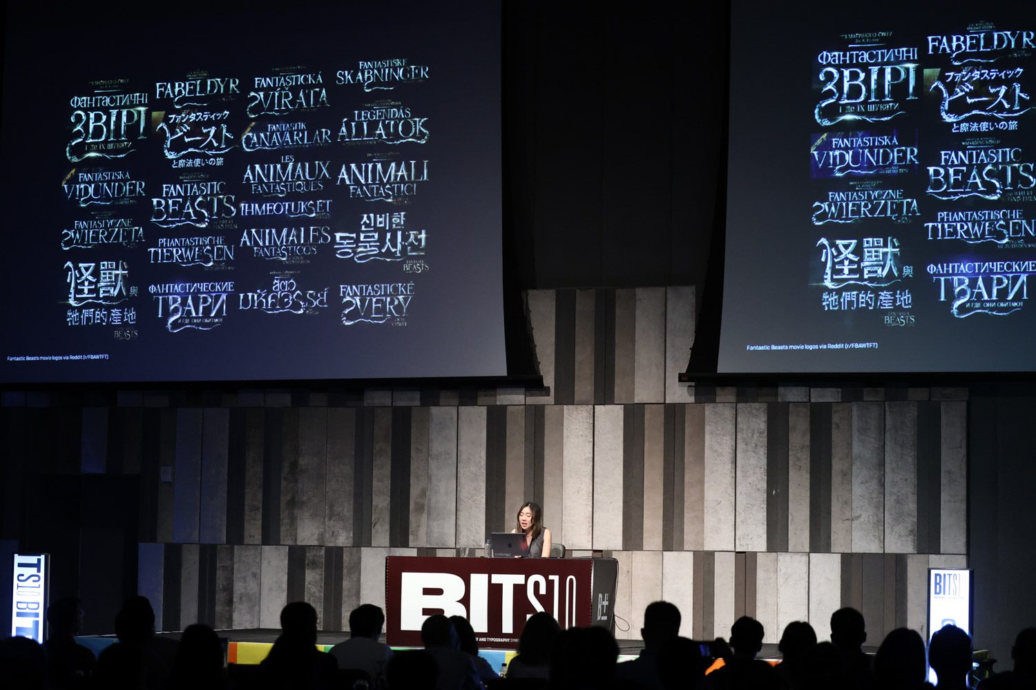
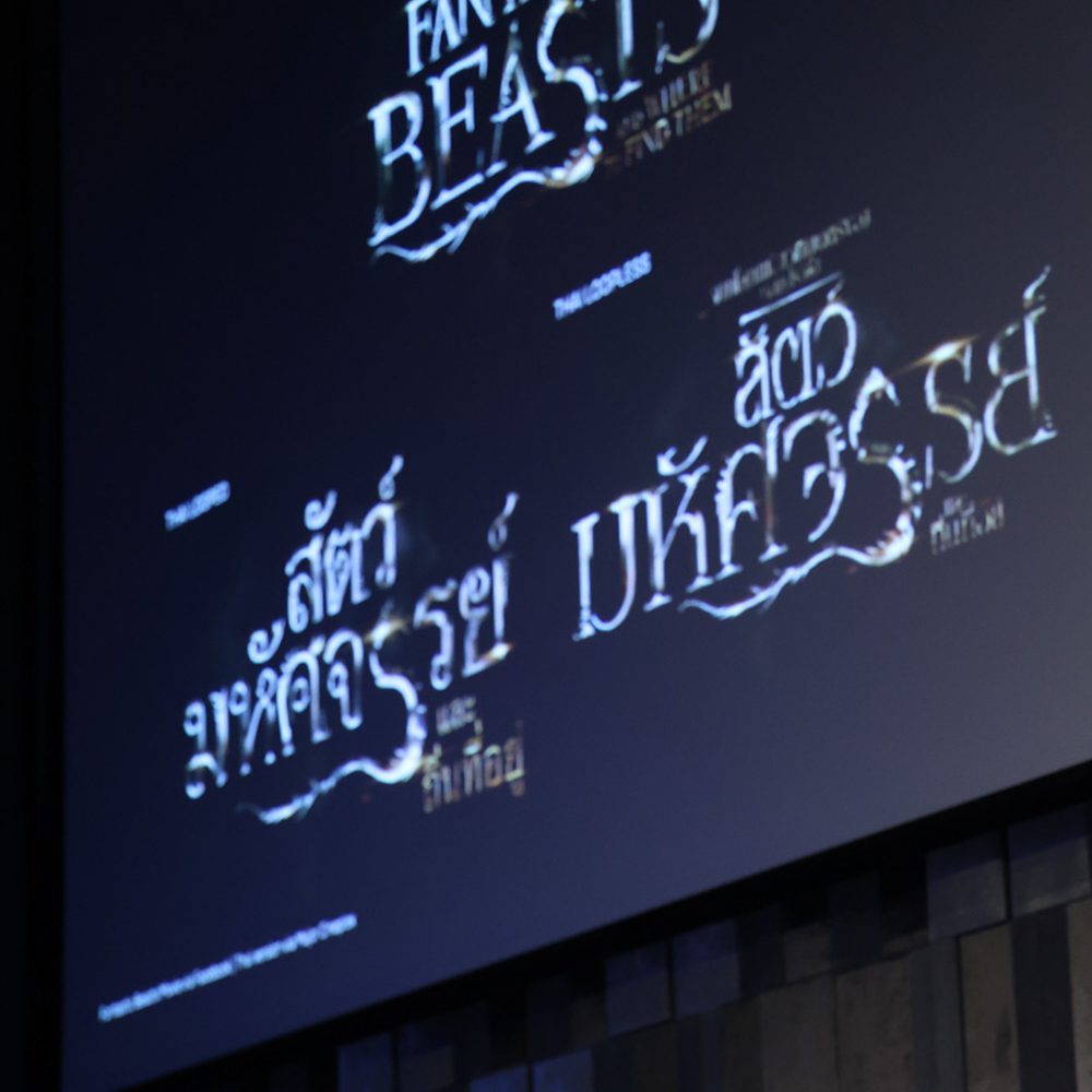
Context: The Latin alphabet can be broadly classified into serif and sans-serif fonts. In contrast, the Thai alphabet consists of two types: loop and loopless. Translating fonts between these two languages requires much more than a simple, straightforward translation. An example of this is the case of the original logo for the film Fantastic Beasts and Where to Find Them and its Thai versions, which see the use of both looped and loopless letters.
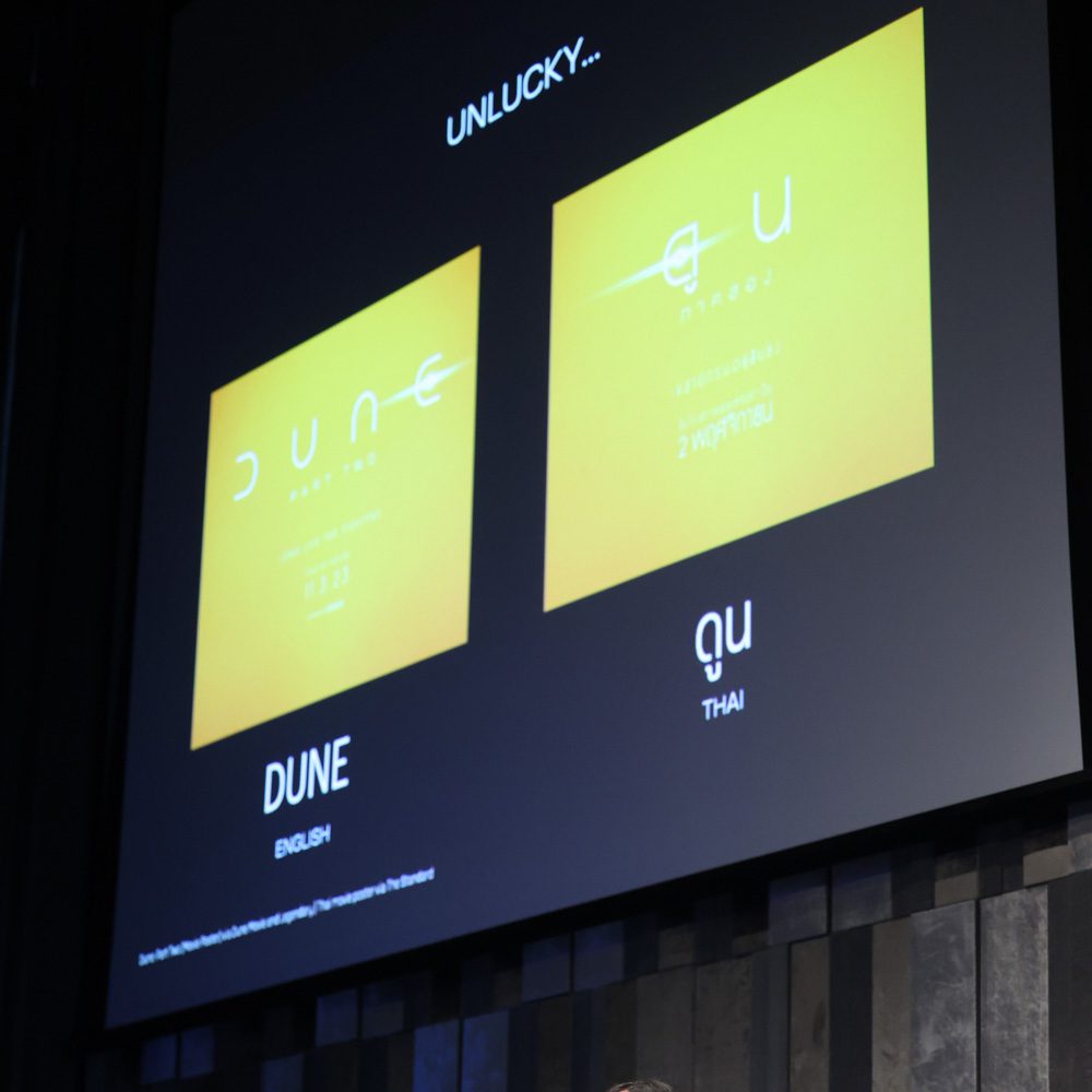
Naming: The number of words greatly influences the process of translating logotypes into different languages. While brands such as Lays and BOSS coffee have achieved successful outcomes, there are those that are less fortunate, such as the logo of the movie Dune.


Letterform: Similar forms of letters in different languages can contribute to the translated logotype being less deviated from the original, such as the similarity between ‘a’ and ‘ล’ or ‘s’ and ‘ร’ in English and Thai.
Design Element: When translating logotypes that have unique lines and colors, including these elements in the translated version can help viewers recognize and acknowledge the original brand identity more easily. The Thai Coca-Cola logo is among the designs that exhibit such an approach.
Typography and Branding by Yah-Leng Yu
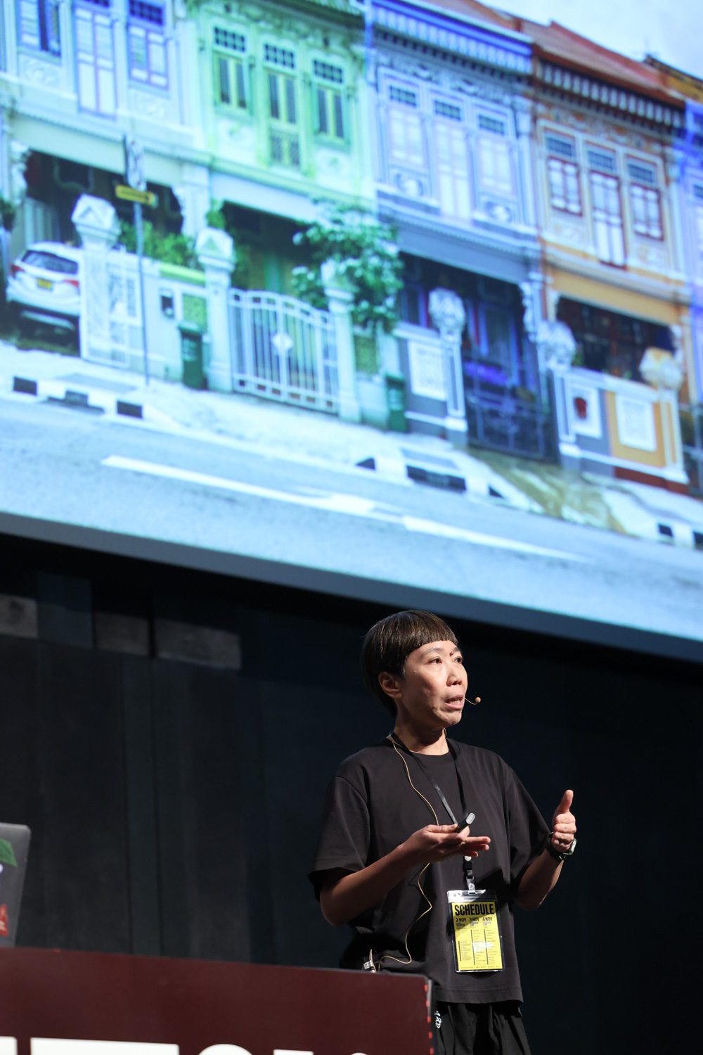
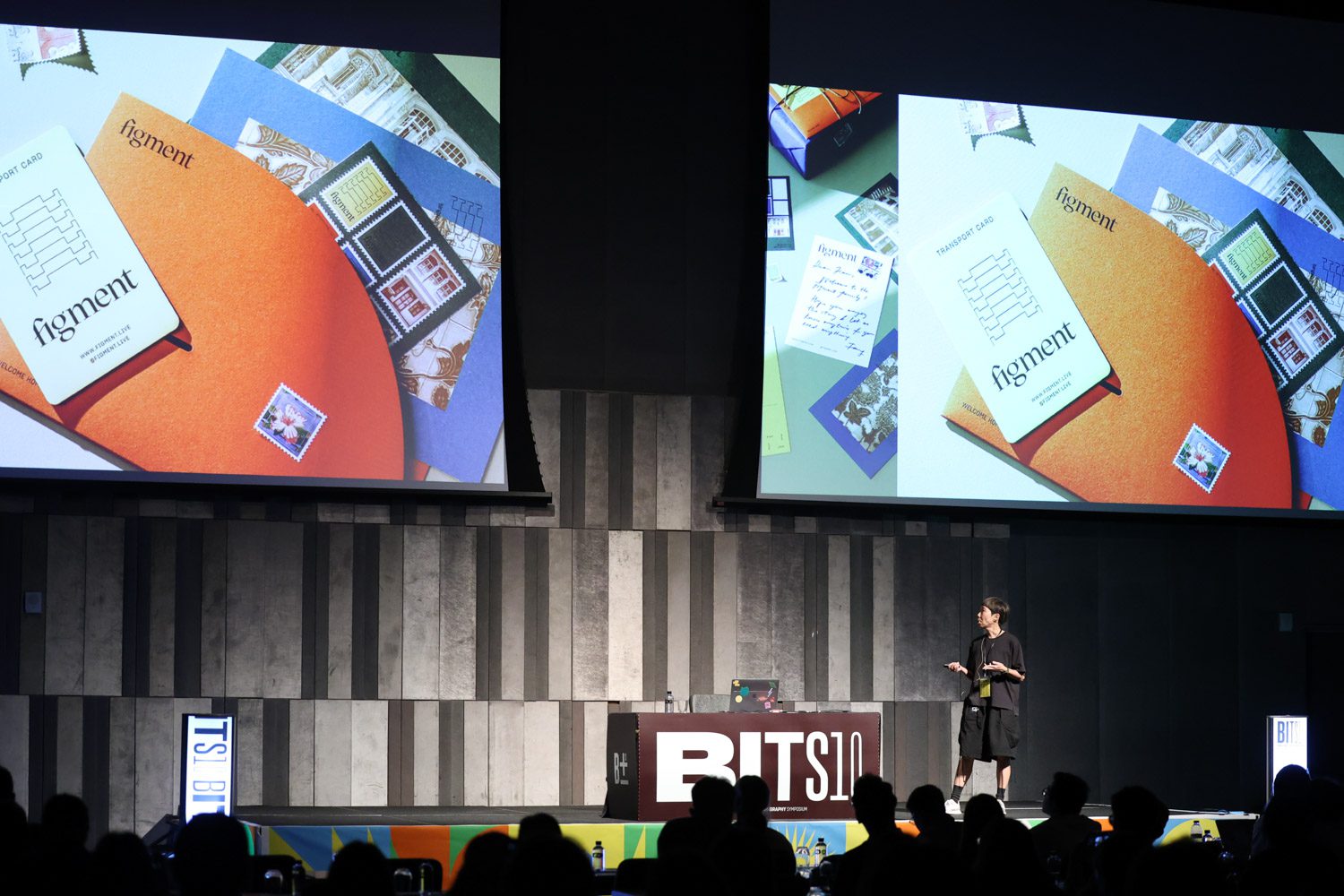
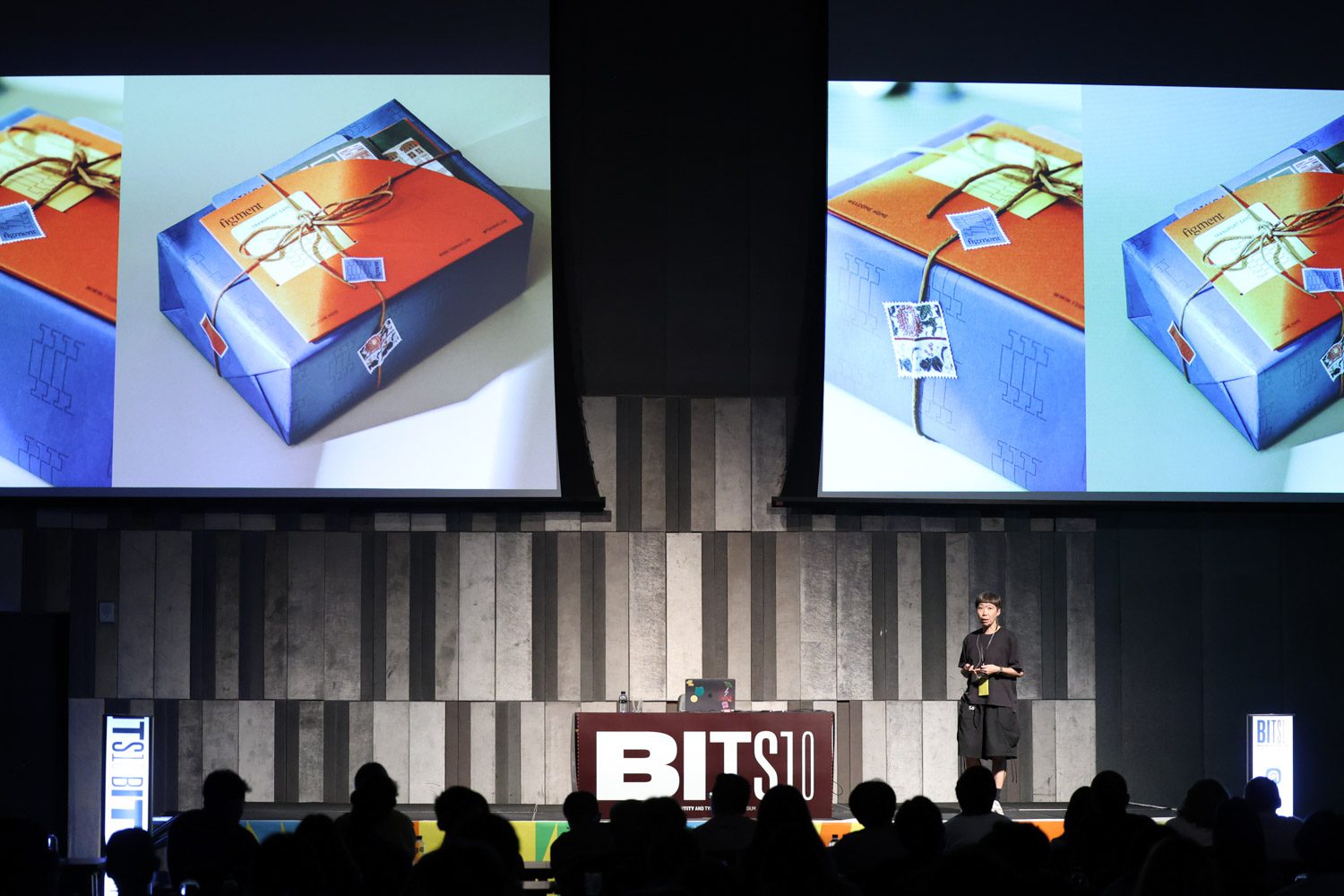
Yah-Leng Yu of Foreign Policy Design presented valuable insight into the integration of typography in the branding process. Yu showcased this approach through the analysis of three interesting case studies. ‘Figment’ is a project where the organizer of a cultural activity and exhibition in Singapore transformed an old shophouse into a boutique co-living space for rent. Foreign Policy was the team assigned to work on the logo, whose design references the shapes of roof structures in Singaporean architecture. The team also designed the logos that will be used for other future venues that Figment has been planning to develop, as well as the welcome kits, which are the result of the design team’s collaboration with local craftsmen.
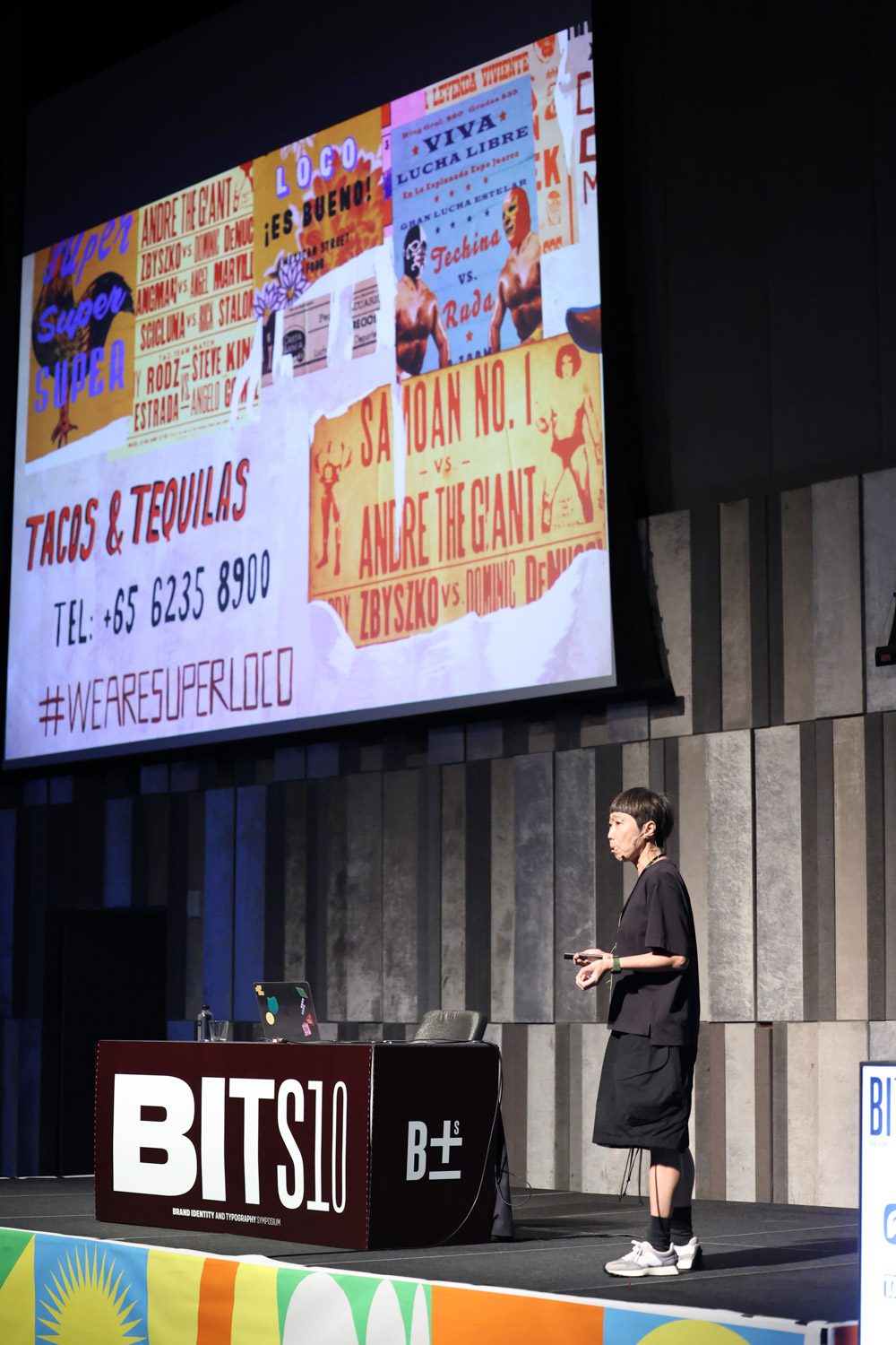
For ‘Project Send,’ a climbing wall facility, the design team did an experiment on stretching the letters before incorporating them into the motion graphic. This was done to effectively convey the dynamic identity of an extreme sports brand. The design was intended to communicate the brand’s identity, which is more than just a sports facility but a community of like-minded people. Yah-Leng Yu also collaborated with ‘Super Loco,’ a Mexican restaurant, to design a unique and unconventional handwriting typeface.
The four topics covered in the conference are just a small part of the wide range of activities that took place at BITS10. One of the interesting conversations that arose from the event was a discussion about monotype and the sharing of possible perspectives and design directions about the similarities and differences between Japanese and Chinese letters. Then there was Rainer Erich Scheichelbauer, who discussed his experience working on the typeface for Sephora and how it effectively integrated both design and management aspects. BITS10 also featured workshops and group discussions where typography and graphic design enthusiasts had the opportunity to share their experiences on a wide range of diverse and thought-provoking topics.
For the people who missed this year’s event, there’s always next time. All we can do now is eagerly wait and see what the next BITS will bring.