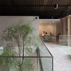
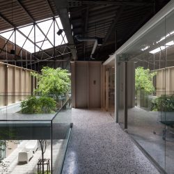
THE THING THAT MAKES SOHO DIFFERENT FROM OTHER CO-WORKING SPACES IS THE WAY IN WHICH IT AIMS TO FULFILL THE DEMANDS OF CLIENTS WHO HAVE BEEN IN THE BUSINESS FOR SOME TIME…
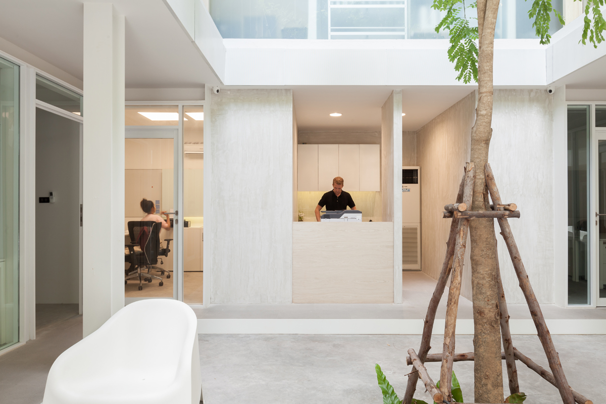
SOHO Space, Photo by Ketsiree Wongwan
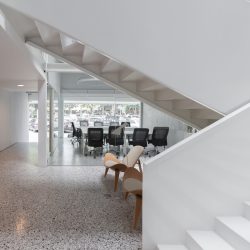
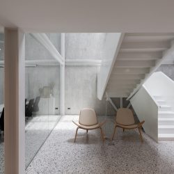
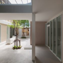
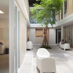
The thing that makes SOHO different from other co-working spaces is the way in which it aims to fulfill the demands of clients who have been running their businesses for quite some time. Their targeted clientele are entrepreneurs who are serious about their business operations, hence, their requirements for a proper workspace that contributes to the company’s legitimate image, especially in the eyes of their clients; although while acknowledging that they may have a rather small staff and be at an early stage of their development requiring a minimization of expenses in choosing a proper office space. Such are the tendencies of today’s start-ups that led to the development of the concept of the design of SOHO, a self-defined Micro Professional Office with all-encompassing meeting facilities on Sukhumvit Soi 26 in Bangkok. The two-storey building is comprised of meeting rooms, a reception area and a lobby waiting room located at the foyer in front of the main staircase. These particular spaces are pushed towards the front of the program while further inside, the accessibility to other functional spaces is restricted for tenants only. Surrounding the interior courtyard are office spaces as well as other shared facilities such as a pantry, printing room, etc. Architects from Sixtyseven Studio designed a fairly neutral space to accommodate the diversity of the tenants’ businesses. To achieve a more modern vibe, the greyish warehouse was brightened up with a clean-looking mesh wall and a façade with the SOHO logo on it that helps to camouflage the original roof of the building. As a part of the renovation, two layers of a white steel structure were brought in to support the roof structure of the building. Traces of the space that was once an old warehouse are revealed through the disclosure of the intentionally conserved original steel and roof structure as well as the details of the materials such as the polished stone floor, corrugated metal sheets that are similar to the ones used with the warehouse’s original façade, cold formed steel of the stair rails and exposed concrete. Light colored wood is used alongside the whiteness of the other compositions to create a more pleasant and friendlier vibe within the program.
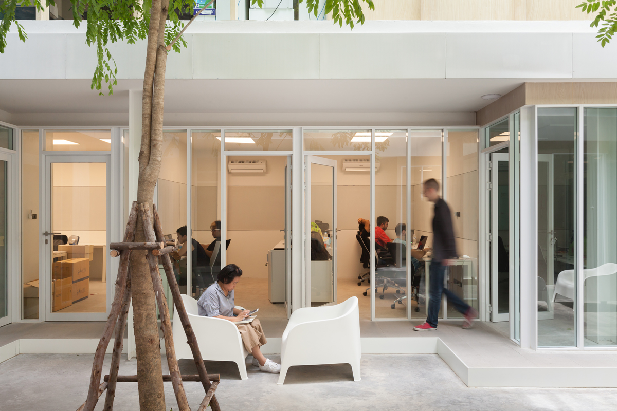
SOHO Space, Photo by Ketsiree Wongwan
TEXT: NANTHANA BOONLA-OR
sohobkk.com


