BANGKOK-BASED DESIGN CONSULTANCY FARMGROUP BRINGS NOTHING BUT A SENSATIONAL SYSTEM TO NAKHONRATCHASIMA MAZDA F.C.’S NEW IDENTITY
The journey of Newin Chidchob and Buriram United Football Club have become inspirations for both the local and national millionaires and influential figures in Thailand to become seriously interested in the business. But part of the credit goes to Worawee Magudee and the policy implemented during his management as the president of the Football Association of Thailand, particularly the establishment of a regional league where the concept of localism is brought in as the key strategy. The one province, one football team policy has facilitated a connection of local and national wealthy investors who have joined forces and given birth to this ‘Thai-style’ football business that has attracted enormous interest from those who see the potential of making some serious benefit from the sport. Surely, most of them are motivated by their passion for the teams and the fans, but there are a good number of people who want to win over the mass for future political advantage that can guarantee them a chance in the local and national political arena.
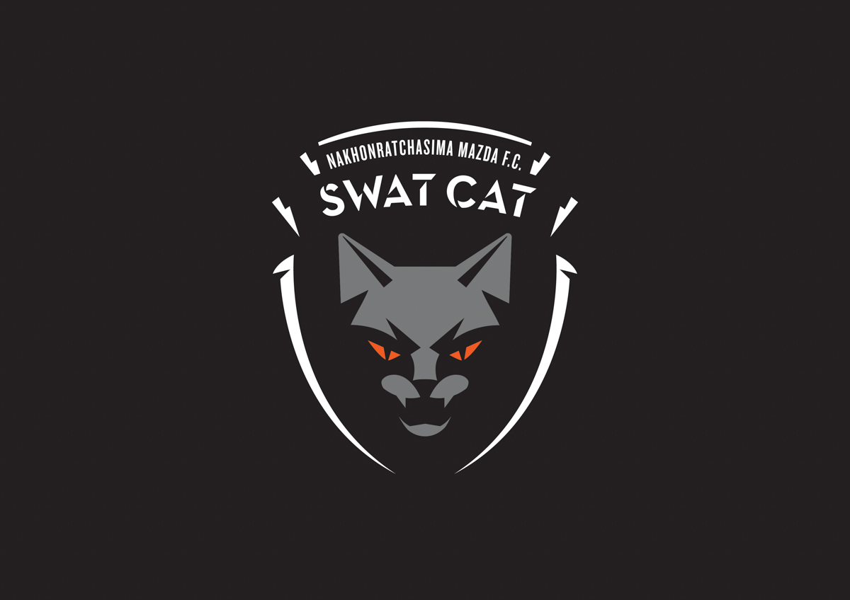
Nakhonratchasima Mazda F.C.’s new logo, Image courtesy of Farmgroup
The boom of the Thai Premier League, which from 2016 onwards goes by the official name of Thai League, has become prominent since Chonburi FC, whose popularity has risen from the promotion of localism, won the championship title of Thai Premier League in 2008. The team is considered the first true professional football club of Thailand and has inspired many other teams to follow in its footsteps. Chonburi FC is also one of the first teams to have a home field with a standardized facility, season tickets and academy that produces their own youth football team, souvenirs and most of all, thousands of loyal fans (the first local football team to ever achieve such a large fan base). After the success of Chonburi FC, Thailand has been introduced to other local and regional teams of equal popularity such as Buriram United, Chiang Rai United, Ratchaburi Mitphol and Nakhonratchasima Mazda FC.
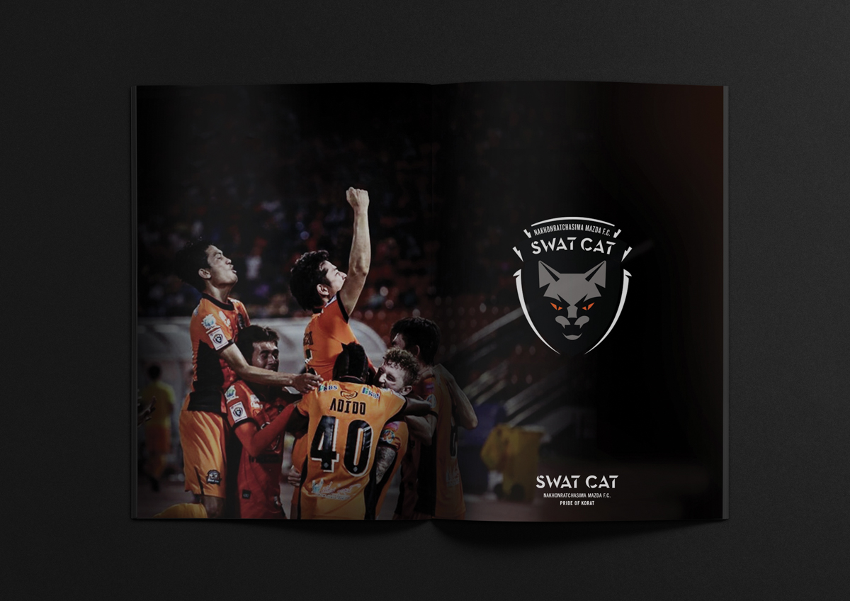
Image courtesy of Farmgroup
Back when Nakhonratchasima Mazda FC was a part of the provincial league (an inter-provincial tournament between teams from five different regions organized by the Sports Authority of Thailand), the team was known for the moniker ‘stingray.’ The name derives from the Korat Royal Thai Air Force base and a large troop of commando stingray light tanks stationed in Nakhonratchasima while most of the players on the team were soldiers from the Royal Thai Army, which eventually gave birth to Nakhonratchasima Stingray as the province’s football team before the logo and name were changed to Swat Cat. It’s one of the most popular teams of the Thai league with a strong and continually growing fan base. In the first year that the team played in the top league, Swat Cat welcomed an average of 17,677 viewers per match–the second in the league next to Buriram United.
In 2016, the board of executives of Swat Cat planned to improve the organization for the team’s more sustainable future. They foresaw the importance of the improvement of both the team’s performance and marketing strategy. The first and most obvious change that could be done was the redesign of the entire corporate identity system with Farmgroup, who was responsible for the similar task of redesigning Chonburi FC’s corporate identity, being responsible as the design team.
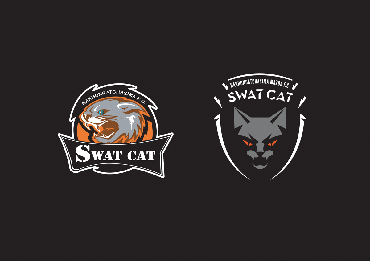
Nakhonratchasima Mazda F.C.’s new logo, Image courtesy of Farmgroup
For SWAT CAT, the core concept highlights the team’s nickname complemented by creative interpretations of the geographical and historical information all the way to the local traditions, beliefs, and cultures of Nakhonratchasima province or Korat including the fan culture of the team.
After the development and presentation with the team’s executives, the design was finalized into a Korat Cat staring out from the shadows. While the intimidating image of the devil cat will fiercely fight the visiting teams, orange, as Korat’s provincial color, is used in the design, specifically around the cat’s eyes with the objective being to maintain the characteristics of the actual Korat cat while the special features such as the silvery/grey color of the hair, pointy ears with smoothly curved edge are included in the new logo. Additionally, the logo’s frame was one of the issues that the design team experimented on with several options being presented from the one that encapsulates Korat’s characteristics, the shape of Ya Mo or Lady Mo coins, or the diamond that represents strength, to the arch structure of the province’s iconic Choompol city gate. With the opinion from the board of executives that Choompon gate is the city’s sacred structure that should only be used only with the province’s beloved historical figure such as Lady Mo, the final decision the client went with was the frame that accommodates the essential information with sharp details developed from the scratches of this devil cat’s paws.
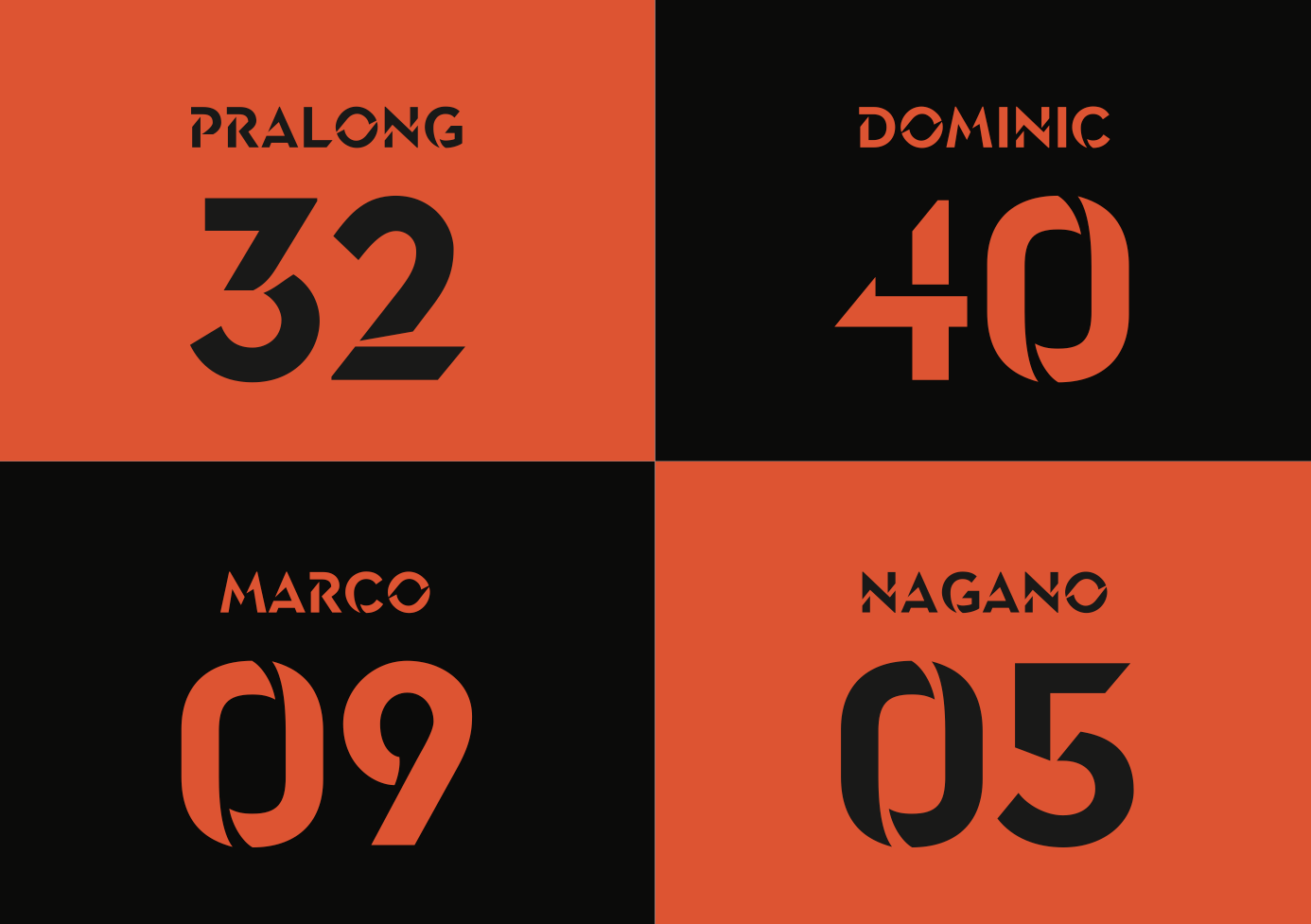
Arabic numerals and Latin alphabets of the Swat Cat Display Font, Image courtesy of Farmgroup
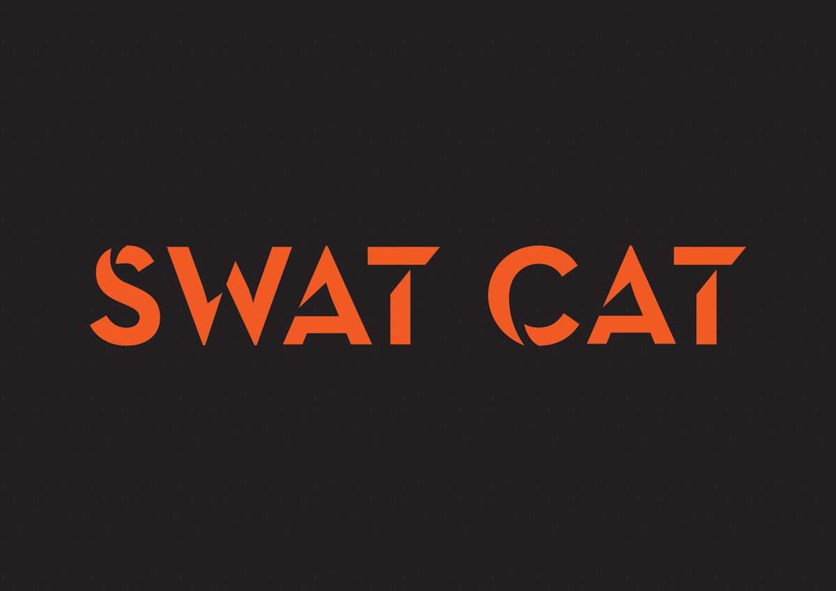
Farmgroup believes that a good corporate identity doesn’t end just at the logo, but encompasses a system and usability that not only works but is also flexible. And it is these elements that contribute to the brand’s sustainable growth. The same story goes with a football team. In the 2017 season, masterfully designed Swat Cat’s new identity and its effectively functional corporate identity system, from the logo and font to premium products and souvenirs, will be introduced to the media and the general public. In addition, the design team also proposes the idea of Swat Cat having its own display font for consistency in communication and the logo’s ability to truly reflect the team’s idiosyncratic character. Luckily, the idea was embraced by the board of executives, making Nakhonratchasima FC one of the first football clubs in Thailand that has its own display font. The Thai-Latin font goes by the name Swat Cat Display and is an interesting reflection of Swat Cat’s character with its look adapted from the stencil Sans Serif that uses corners and angles of the figure ground relationships derived from the cat claw scratches.
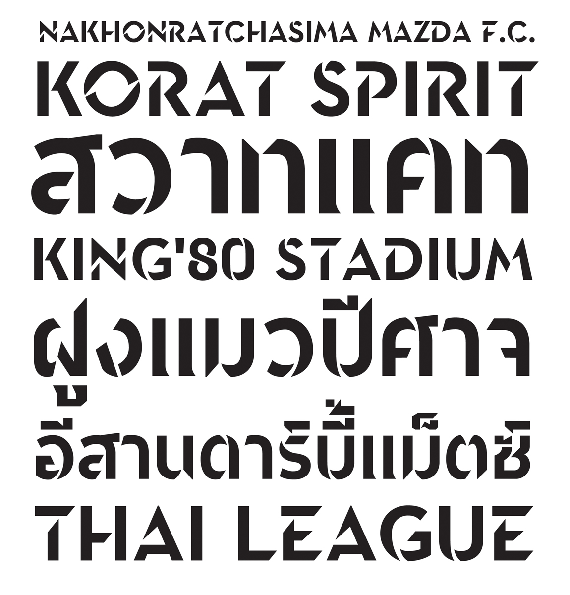
Different usages of the Swat cat display font, Image courtesy of Farmgroup
Designing the corporate identity for a football team is not an easy task to maneuver for there’s an issue about the sense of ownership over the team, which belongs not only to the owner or a group of executives but also all the fans. It’s a sensitive issue, sometimes too hard for the design team to speculate. Not long after the new logo was launched, what Farmgroup had to deal with the most were the opinions from the fans. They told us that the most difficult part of the project wasn’t the new design, but how to get it across and make it into something that the fans could identify with and embrace. They admit that the storytelling method and communicating with the fans, making them understand the process and background of the design, may not have been executed well enough, but they do believe that at the very least, making a province full of football fanatics such as Korat accept their creation was one of their greatest challenges and achievements, and that the work they create will be the best thing for the new era of Swat Cat, the era when a football team evolves to become a highly profitable product that brings the team and the province it calls home invaluable return in the future to come.
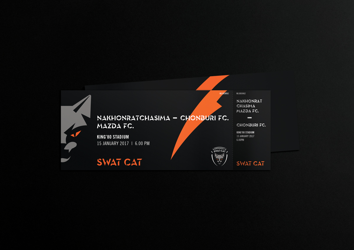
Image courtesy of Farmgroup
TEXT: PIYAPONG BHUMICHITRA
www.farmgroup.co.th

 Nakhonratchasima Mazda F.C.'s new logo, Image courtesy of Farmgroup