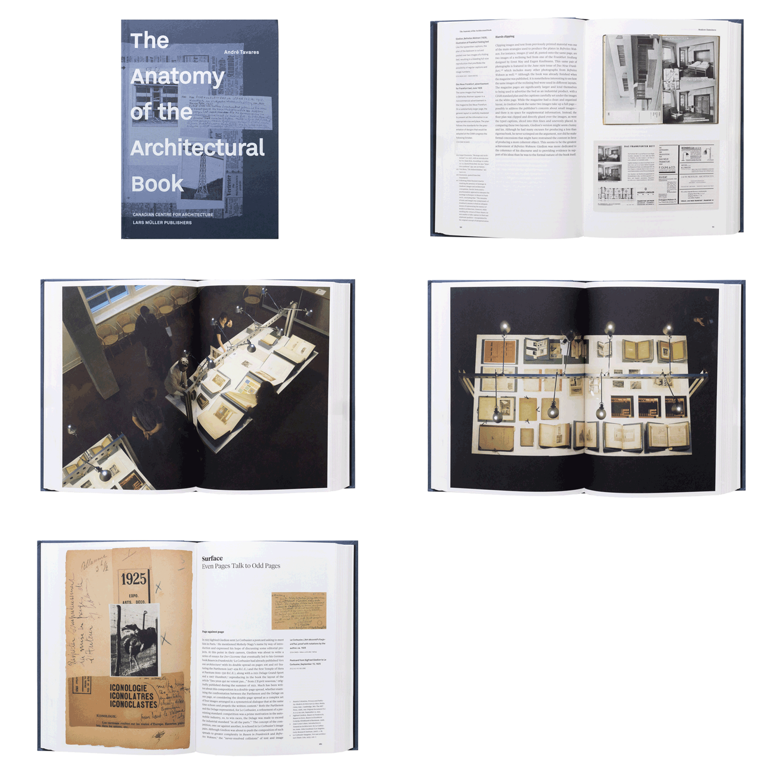
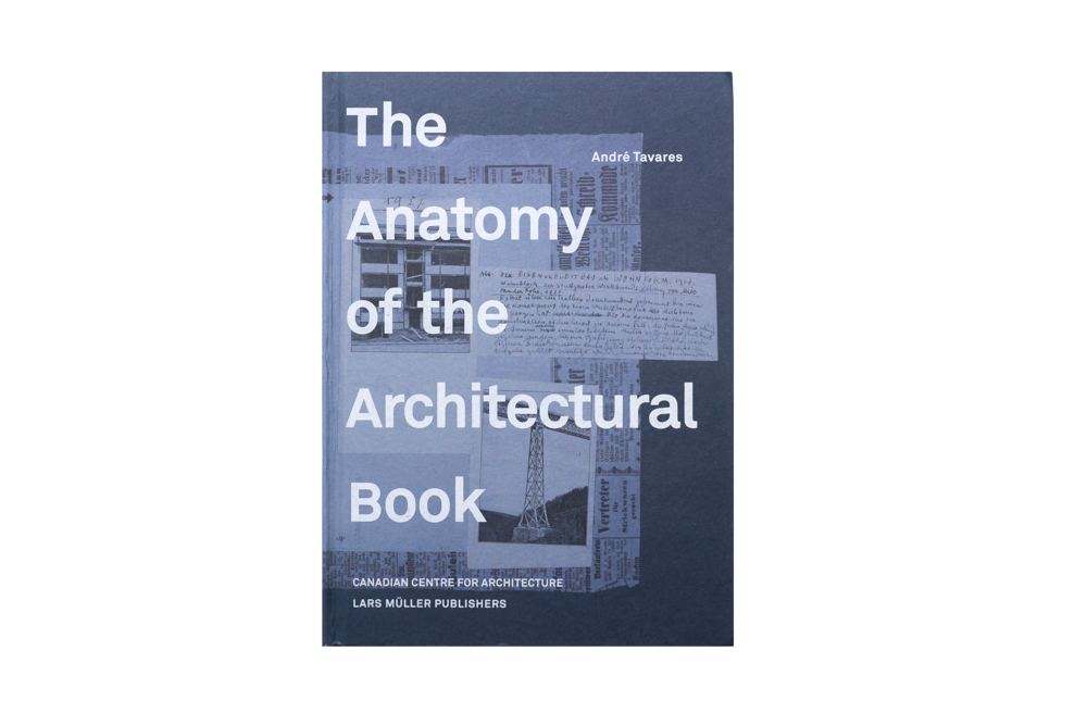
THIS 400-PAGE PUBLICATION BY ANDRÉ TAVARES AND THE CANADIAN CENTRE FOR ARCHITECTURE (ED.) MANIFESTS THAT LINKAGE THAT ALLOWS FOR ARCHITECTURAL KNOWLEDGE TO BE TRANSMITTED BACK AND FORTH THROUGH THE MEDIUM KNOWN AS ‘ARCHITECTURAL BOOKS.’
Last year, Canadian Centre for Architecture (CCA) of Canada’s Quebec organized an exhibition named ‘The Anatomy of the Architectural Book’ to explore and discuss the connections that have long existed between ‘constructional culture’ and ‘book culture’ while manifesting the linkage that allows for architectural knowledge to be transmitted back and forth through the medium known as ‘architectural books.’ The exhibition features books, drawing, documents and other collectibles from CCA’s collection. What’s interesting is this study by André Tavares that depicts the emergence of industrial development in architectural books since the early 19th Century when the chromolithographic process was still a highly popular technique. The study also includes the role of the editor as the mediator between authors (architects) and publishers all the way to the morphological features of books as a tool and process that influences the role of designers today.
The Anatomy of Architecture, Photo by Ketsiree Wongwan
The book of the same name was conceived almost at the same time as the exhibition and functions as another composition of ‘The Anatomy of the Architectural Book’ that helps us to see and understand, in greater detail, the study that Tavares spent three years to complete. The exhibition is presented in seven different themes: Texture, Spread, Sequence, Structure, Scale, Material and Trade while the book’s content features only five themes (Texture, Surface, Rhythm, Structure and Scale). For instance, the content in the ‘Rhythm’ section attempts to analyze the structural rhythm of the book, which is one of the elements that reflects the way of thinking and varying contexts in different periods of time. We can see that Fontana’s works from the 16th Century are presented using printmaking techniques and contain miscellaneous details. It is entirely different from Bauhaus’s graphic layout by László Moholy-Nagy where space was left unoccupied in the same way as works by architects from the Streamline Moderne era such as Erich Mendelsohn (despite the fact that both of their works were published closely together during the 30s). The only problem with this book is its 400 pages of material, which seems to be too much for an exhibition catalogue. But perhaps that isn’t how the book sees or positions itself with the volume and quality of content that is equivalent to a legitimate architectural book, which guarantees that a tremendous amount of new knowledge will be acquired after reading it.
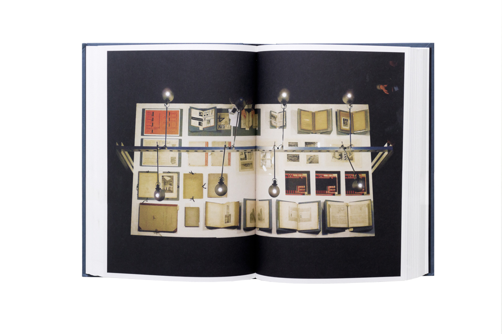
The Anatomy of Architecture, Photo by Ketsiree Wongwan
TEXT: PAPHOP KERDSUP
www.cca.qc.ca
www.lars-mueller-publishers.com

