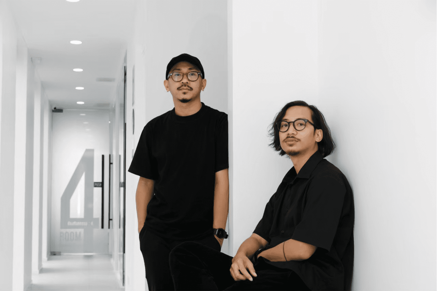
(Left) ฺBall – Tanachat Sooksawasd, (Right) Pomm – Karn Khamhaeng | Photo courtesy of pommballstudio
JOIN IN A CONVERSATION WITH THE STUDIO WHO DESIGNED AN IMPRESSIVE NUMBER OF CAFÉS IN CHIANG MAI, AND DID NOT WANT THEMSELVES TO RELENTLESSLY STRIVE TO GROW
TEXT: KITA THAPANAPHANNITIKUL
PHOTO: PANORAMIC STUDIO EXCEPT AS NOTED
(For Thai, press here)
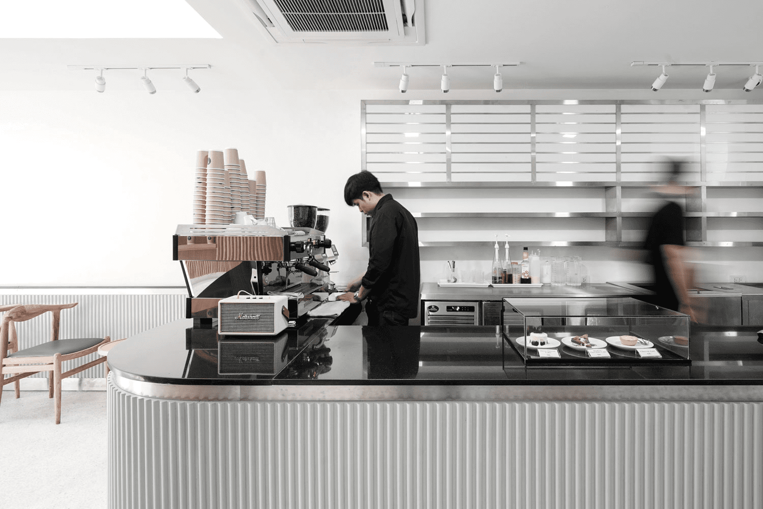
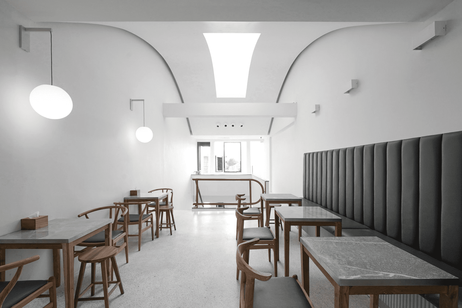
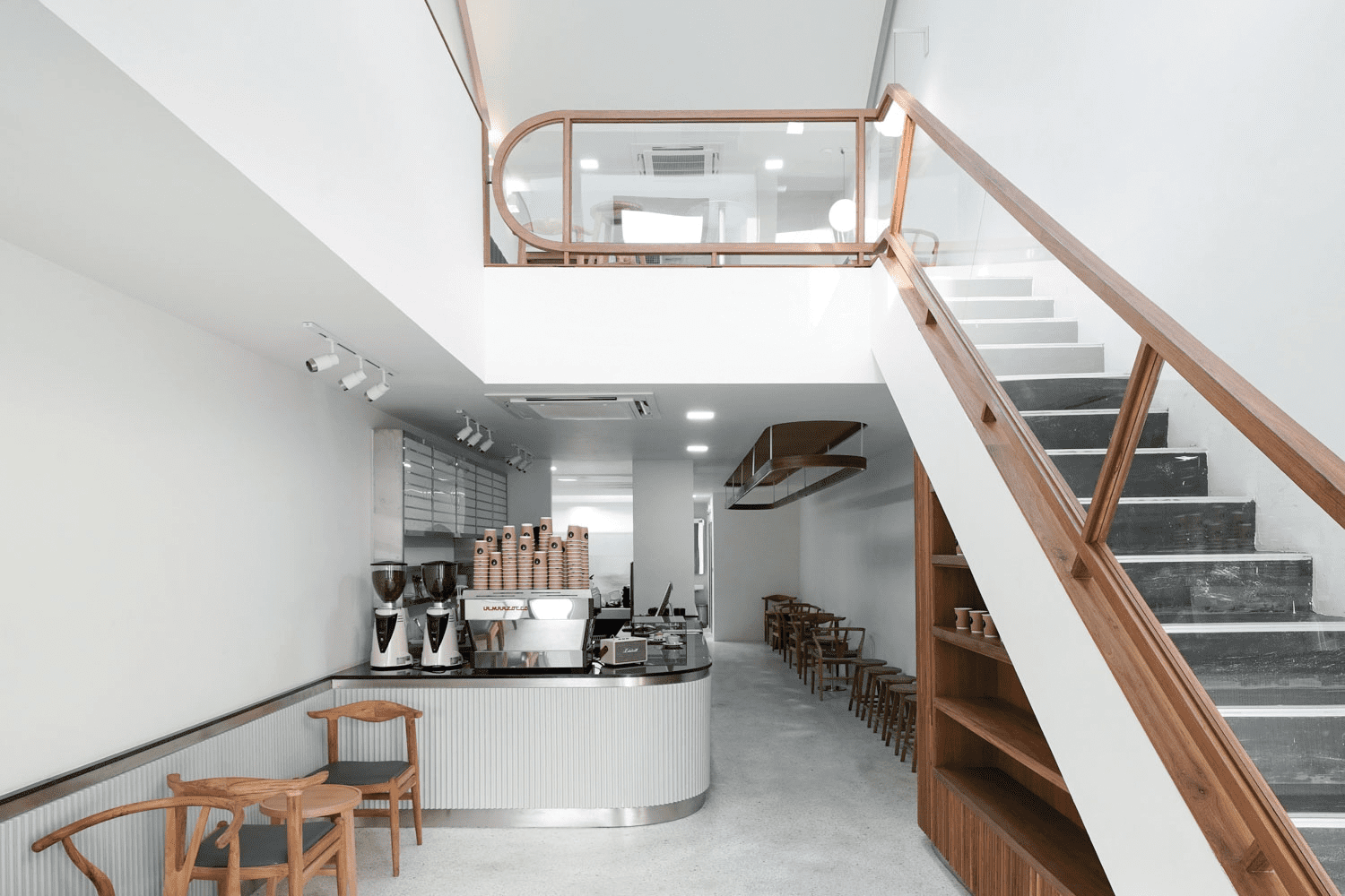
Those who have visited Chiang Mai will understand why the city is known as the country’s cafe capital. Transit Number 8, The Baristro Asian Style, and the up-and-coming COMPLEMENT CAFE’ are just a few of the well-known local establishments that have become landmarks in this northern hilly town. While each of these cafés has its own distinctive mix of strengths, brand stories, and designs, the materialization of their identities and characters has one design company behind it all.
Ball – Tanachat Sooksawasd and Pomm – Kan Khamhaeng of Chiang Mai-based pommballstudio sat down with art4d to discuss their prolific track record, which includes an impressive number of cafés they have designed. We spoke with the two founders about their studio’s gradual growth, the design process they have devised and mastered for this specific area of design, the behaviors of today’s café goers, and the direction and approach to design that are not confined to any specific style or genre but applicable to their clients’ diverse requirements.
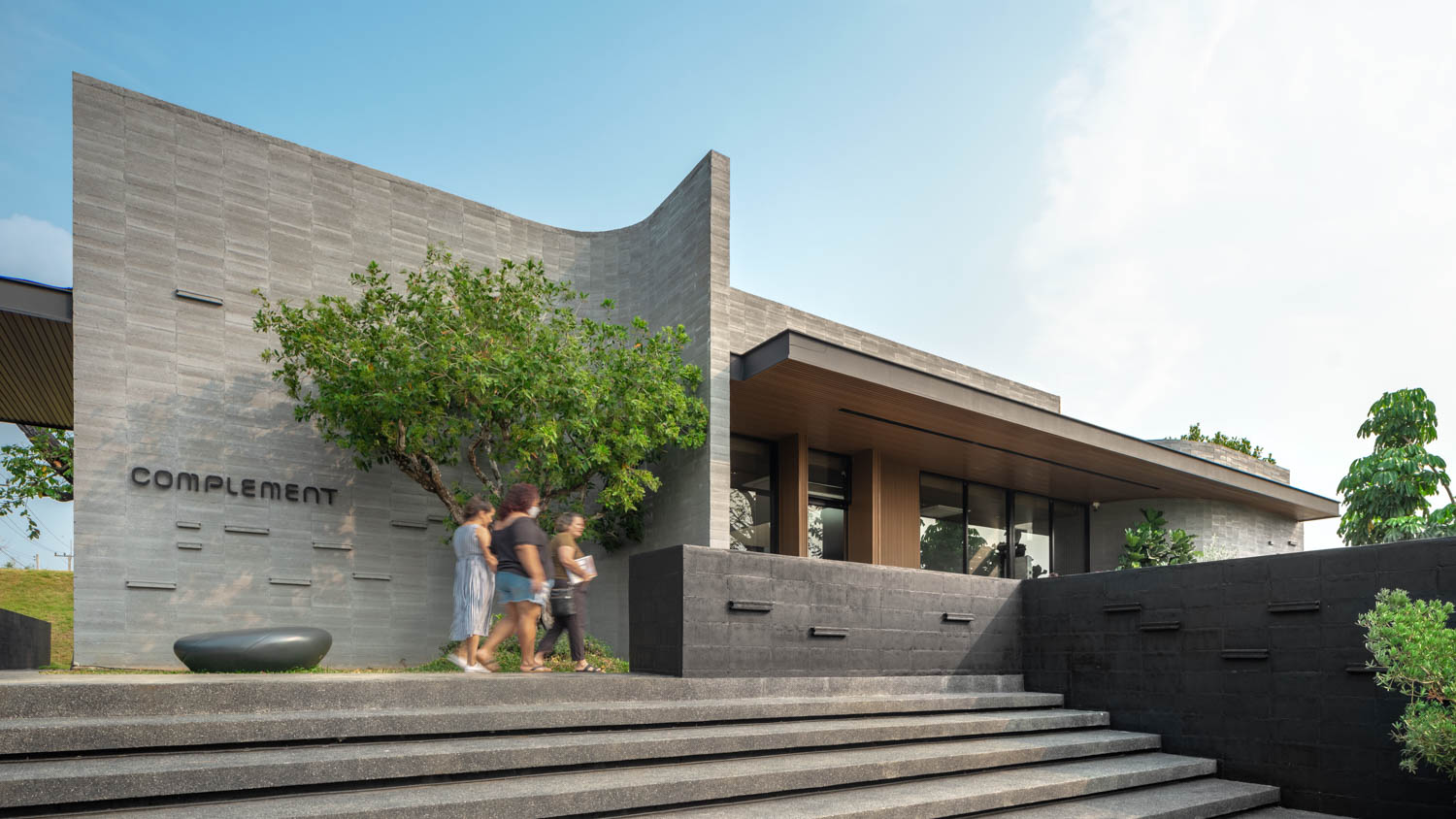
COMPLEMENT CAFE’
art4: What inspired the creation of pommballstudio?
Tanachat Sooksawasd: We were both born and raised in Chiang Mai. We both moved to Bangkok to work after graduating from college, although at different firms. We thought we had reached a plateau after four to five years and had a strong desire to return home. That’s when the notion of co-founding an office arose. We didn’t give it much thought. The studio’s name is a combination of our nicknames, Pomm and Ball. That’s how pommballstudio came to be.
Karn Khamhaeng: When we first returned to Chiang Mai and opened the office, it was only the two of us. It was similar to two freelancers collaborating. There were no plans or a well-defined organizational structure. It’s still very much that way now, or at least that’s where we’re headed (laugh). We have more employees working on our team now that we have more projects. It is, in a sense, growing. But there are only around 5–6 of us right now.
KK: It’s just that we were both working in Bangkok, so returning home seemed like we were starting all over again. The projects we were undertaking at first were of every scale—nearly everything we had never done at our Bangkok offices, where the majority of the work was high-rise structures or low-rise residential projects. Because most of the early projects in Chiang Mai were on a shophouse scale, the details were different. We discovered that because the scale was smaller, we needed to be more detail-oriented. Our smallest work to date is a two-square-meter beer kiosk. Even café design was something we first learned about after we opened our office in Chiang Mai.
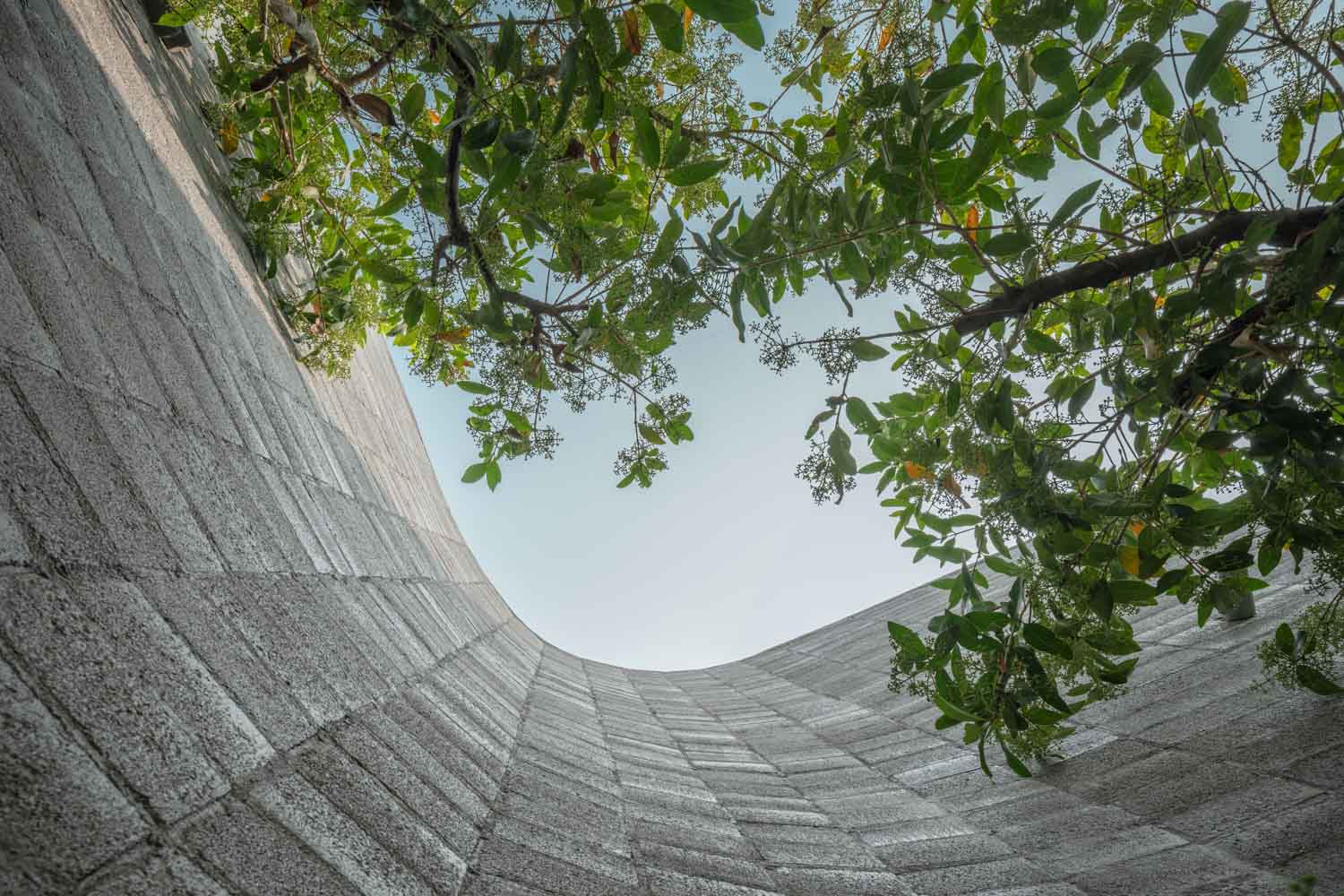
COMPLEMENT CAFE’
art4d: Why do you have so many café projects in your portfolio?
KK: I believe it is more a matter of timing. Transit Number 8 and The Baristo Asian Style were among the first projects that helped establish our name. The café business was not as popular in Chiang Mai back then as it is now. Both projects were recognized, I believe, for their ability to stand out from their contexts, which became appealing to customers and aspiring café owners who wanted their establishments to have that kind of vibe or attraction.
TS: Transit Number 8 is located in this cul-de-sac alleyway flanked by shophouses in a residential neighborhood. It has the appeal of a residential area that most people enjoy and find accessible. The contrast between the simple white building and the element of wood, as well as how the structure was converted from an old shophouse, are important factors that contribute to the location being a destination worth visiting. It’s also an interesting business strategy for entrepreneurs to look into. Everything came together and contributed to this project being a notable work that presented our studio to a larger audience. People would come to us saying they had these spaces or shophouses and wanted the exact same design (laugh).
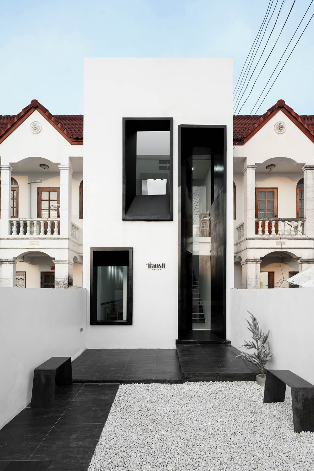
Transit Number 8 | Photo: Tanachat Sooksawasd
art4d: Despite the fact that they are both cafes, Transit Number 8 and The Baristo Asian Style have very different styles. What were the processes like when you were assigned a project?
KK: We don’t have any constraints in terms of style. We’re always looking for new and exciting materials, spaces, and details to work with. They may fit into the contemporary realm, but we don’t have a distinct style or signature that we’re recognized for.
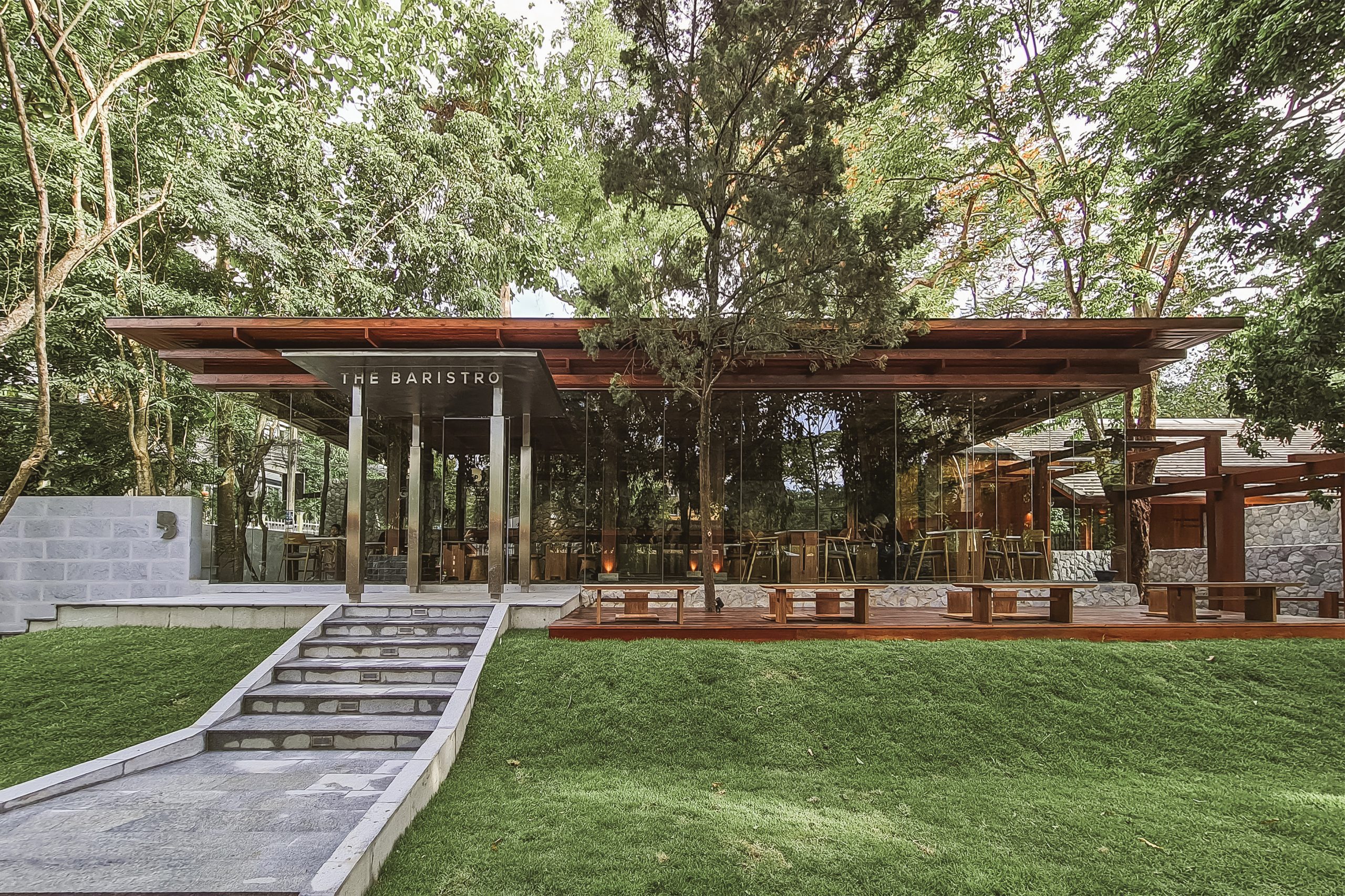
The Baristro Asian Style | Photo: pommballstudio
TS: We’ve discussed on several occasions that we don’t have a distinct design style. We could consider the site and how it should interact with the context, but this does not always imply that the design must blend into or stand out from the environment. It can be almost anything, based on the client’s vision and requirements.
We would look at the potential of what each establishment can or should be. The space or the client’s requirements will offer us a general notion of the nature of a project. So when we work, we don’t really adhere to a specific style, or think that it needs to be modern or use wood. We analyze the specific setting and requirements of each project, and the design will evolve organically to create a place that has its own distinct personality.
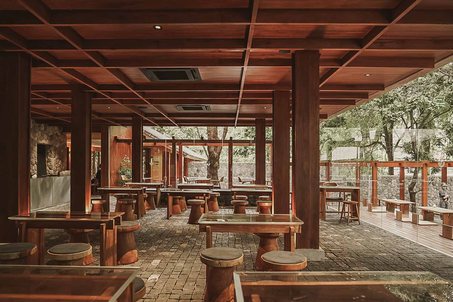
The Baristro Asian Style | Photo: pommballstudio
art4d: What are the characteristics of a good café in terms of design, and what are the challenges of designing a good café?
KK: It could be something very basic. The first step is to meet the needs of the client. It may appear to be insignificant, but it involves factors like functions, seating configuration, and overall space allocation, as well as an appearance that both we and the client are happy with. These are the things that design may help materialize. Popularity and word of mouth are additional effects that depend on how the owner operates and manages the business. There are many factors that contribute to a café’s success, including not only the beautifully designed space and its functions, but also the quality of the products and services, the latter of which is perhaps even more significant.
One of the challenges of creating a café is that it is a public space, which means that it is open and accessible to the public. Because all cafés share the same core functions—the positioning of the counter, circulation, and seating arrangement—this instantly precludes any reuse or repetition in the design. What distinguishes these locations is the ‘impression’ it gives, which can be generated by physical appearance and atmosphere. If there is even a passing resemblance, customers will notice it almost instantly, and this could result in the establishment losing its selling point and its unique character.
This impression is sometimes even more essential than the name of the place itself. People may recall The Baristro Asian Style as the café with the stone walls, and that is an impression that our design can help portray.
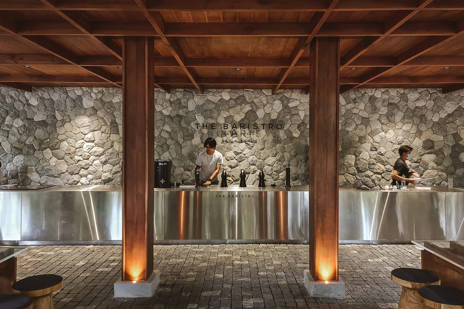
The Baristro Asian Style | Photo: pommballstudio
art4d: Do you believe the results that these two cafés offer will be different if one is an exceptionally designed place but the coffee is pretty ordinary and the other doesn’t pay much attention to design but the coffee has a great, distinguishing taste?
TS: These two cafés will undoubtedly have different clienteles. The first one is unquestionably more appealing to café hoppers. It’s the kind of place where people come to hang out with friends, taking a few photos. It may attract a large number of customers, but not all of them will return. The second may not draw many one-time visitors, but the taste of their coffee will draw people in to become regular customers.
This comparison shows how a café’s services encompass much more than just a space for people to sit and drink a cup of coffee, but also many other activities that involve human connections. There may be people taking photographs, working, and so on. An establishment can have very diverse groups of customers. We don’t consider these things to be right or wrong. It’s just up to the business owners to decide which clientele they want to target or cater to.
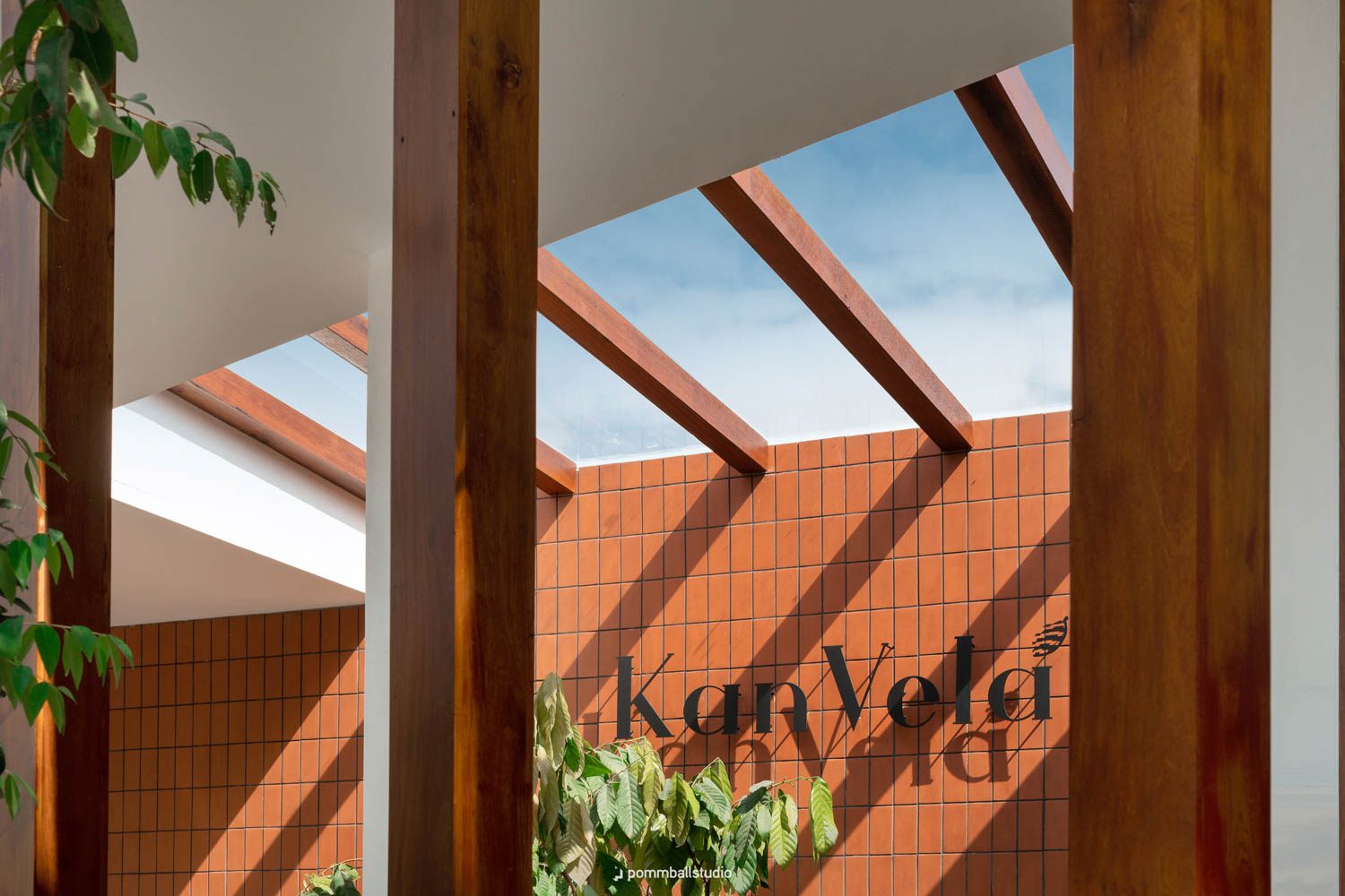
KanVela Craft Chocolate
art4d: How has the café-hopping culture influenced the design of cafes?
TS: I think the trend began to go mainstream during COVID-19. Perhaps because people couldn’t really go anywhere far from home and going to a neighborhood café could satisfy a desire to be out, to meet other people, have face-to-face conversations, or snap some photos. It compels cafés to design a space that can support a wider range of activities and consumers. Of course, there are both people who like and dislike the trend.
KK: There is a particular type of project that I think can provide a comprehensive answer to this question. Say there’s an owner who does not want a design that is too out there because they do not want their place to blow up and attract a large number of people. But if the design is able to efficiently deliver the expected functions, and the ambiance is nice, and more people start to come, the café makes more money, but it has become a destination that attracts a massive number of people. Does this mean we failed to deliver what was required from the brief?
In my opinion, designing a café is just creating a space that coincides with the owner’s business direction and goal. And each café usually has its own clientele that it caters to. There are those who target more sporadic visitors, while some places are looking to build a customer base of regular patrons. Our job is to create a nice-looking, efficiently functional space. And if we fail to provide a nice spot for the customers of the first type of café to take pictures in, it means that we’ve failed at the most crucial part of our work, which is to meet our clients’ ‘demands.’
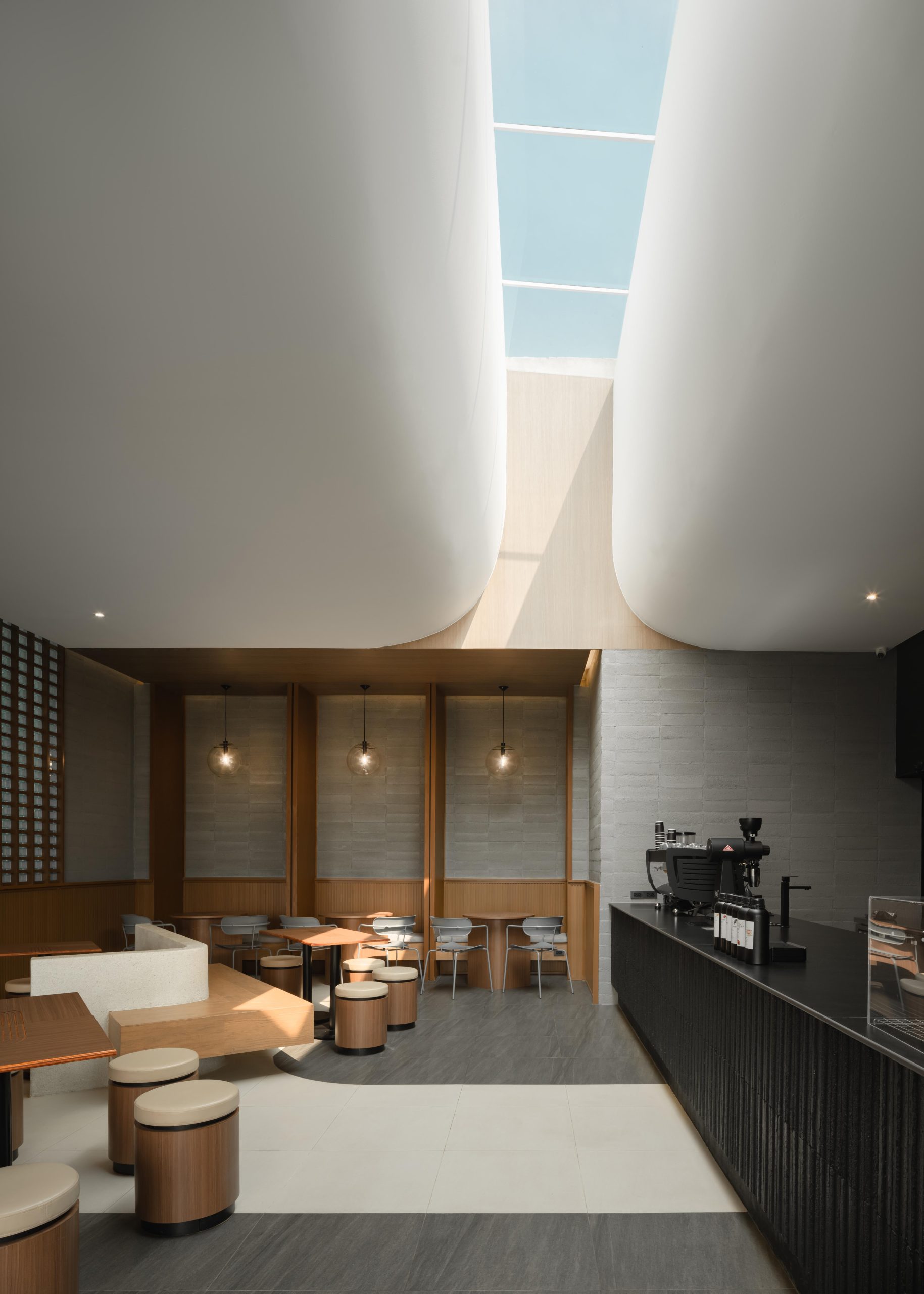
COMPLEMENT CAFE’
art4d: What is your favorite project?
TS & KK: The ones in the future (laugh).
KK: I like everything we’ve done. Like I said, the briefs we have been given vary greatly. When we work, we are continuously looking for new methods to develop designs that are unique to what has been done before. Apart from the cafes, there are also projects where we have to work with entirely different contexts. Dental Sense is one of the examples. The site is this corner plot of land, so the client’s intention was for the design to really stand out from the context of the surrounding neighborhood, so we picked up on different attributes of human teeth for the design of the overlapping features of the façade.
TS: We took on the job of designing the CI for KanVela Craft Chocolate, which solely sells chocolate products. So, it all comes down to how each project has its own aspect that makes it fun to work with. We’ve never really planned to work on only certain types of projects. We’ll do what we’re hired to do: restaurants, kiosks, houses, branding, CI, graphic design, you name it. We’ll do it as long as we’re still happy to do it. Lately, when people want us to design a café, they’ll ask us to handle everything, sort of like a one-stop service.
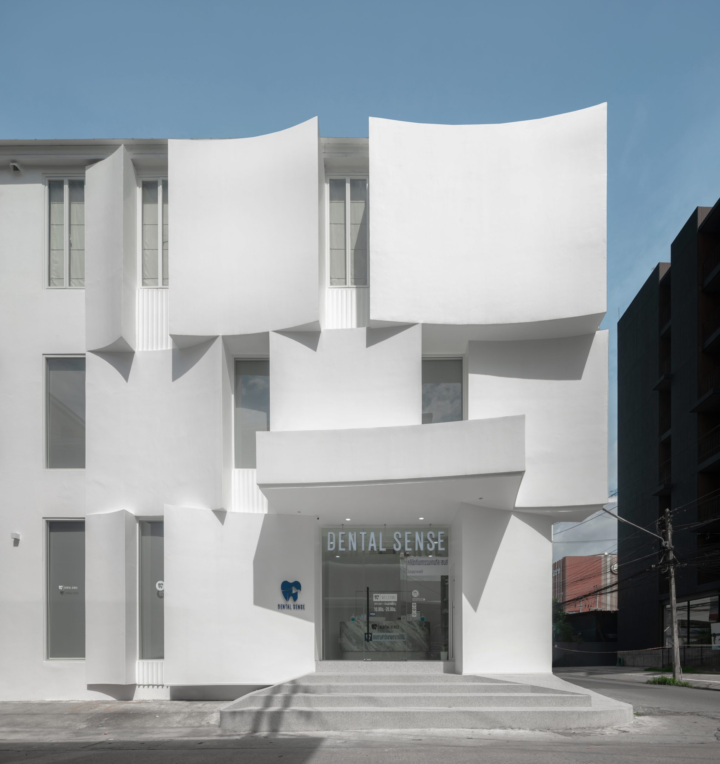
Dental Sense
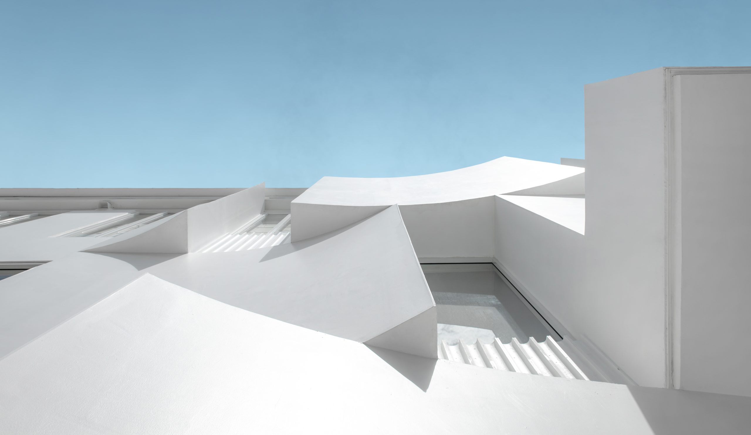
Dental Sense
art4d: What is the future you envision for pommballstudio?
KK: Things are going well for the time being. I have no plans to expand significantly as an organization. I still want us to work in a way that allows us to find joy and balance while keeping things manageable. I want our growth to be gradual. If we worked on a large-scale project right now, we probably wouldn’t be able to do well in both design and management, and I don’t think we or our client would be happy with that.
TS: We have to apologize to many clients for having to decline their requests since there are times when we just cannot accept any more projects. We know that if the workload is excessive, we won’t be able to control the time and quality of the work. Personally, I want to keep the office the way it was when we first opened. I don’t want us to relentlessly strive to grow, but I hope that things will progress gradually and in the order and time that they should.
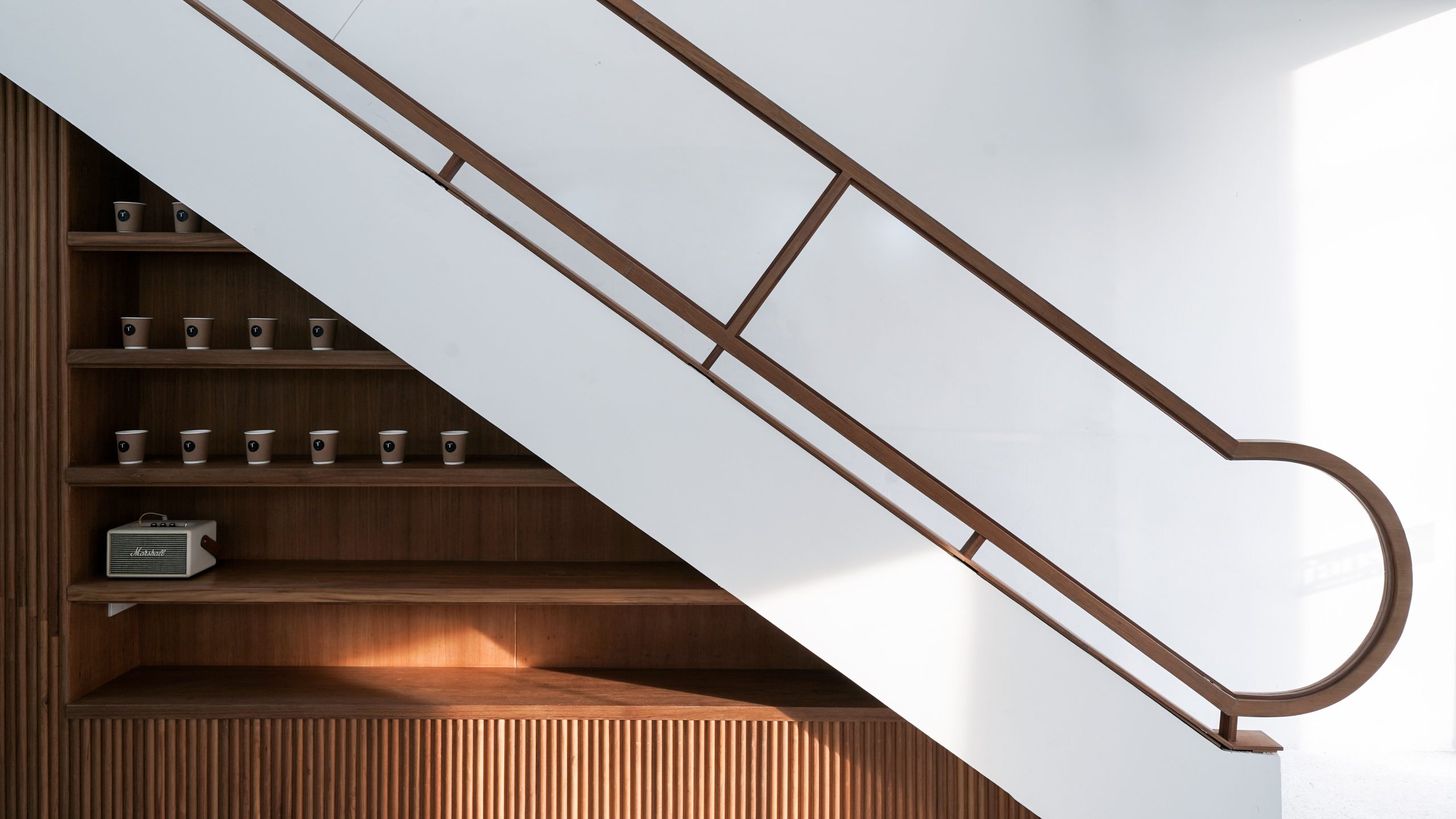
Transit Number 8 | Photo: Tanachat Sooksawasd


