LET’S FIND OUT HOW MANITA SONGSERM, THAI GRAPHIC DESIGNER BEHIND A NUMBER OF BOOK COVERS AND CULTURAL PROJECTS’ KEY VISUALS, DEVELOPS HER WORK PROCESS AND DECIPHERS INFORMATION INTO THE DESIGNS IN HER FIRST SOLO ‘INDIVIDUAL CHARACTERS’
TEXT: PAKPOOM LAMOONPAN
PHOTO: KETSIREE WONGWAN
(For English, please scroll down)
“โห พังค์ว่ะ…” คือความรู้สึกเมื่อเห็นงานของมานิตาเป็นครั้งแรกจากปกหนังสือ Sum: Forty tales from the afterlives ที่ตีพิมพ์โดย Chaichai Books ในปี 2015
ไม่ใช่ในสไตล์แต่คือความโดดเด่นกล้าหาญแบบที่วงการหนังสือไทยหามานาน จากนักออกแบบรุ่นใหม่เมื่อ 4-5 ปีก่อน ตอนนี้ มานิตา ส่งเสริม กลายมาเป็นกำลังสำคัญในการสร้างความเคลื่อนไหวให้กับงานออกแบบในบ้านเราอยู่เป็นระยะๆ ในปีนี้เธอมีนิทรรศการ Individual Characters ที่ The Jam Factory Gallery เป็นนิทรรศการเดี่ยวรวบรวมผลงานทั้งเก่าใหม่ตลอดกว่า 7 ปี ในการทำงานของเธอมาจัดแสดง ซึ่งถือว่าหาดูได้ไม่บ่อยนัก โดยเฉพาะกับกราฟิกดีไซเนอร์ในประเทศไทยที่ส่วนใหญ่จะเป็นนิทรรศการกลุ่มที่มีการกำหนดหัวข้อให้ทำงานร่วมกันหรือว่าเป็นงานใหม่ไปเลย สำหรับโชว์ของมานิตา เราคิดว่าคงเป็นเพราะความมั่นคงบางอย่างในผลงาน (หรืออาจจะเป็นความพังค์ที่ว่า) ที่ทำให้คอนเทนต์นั้นมีเนื้อหนังมากพอจนสามารถจัดนิทรรศการเดี่ยวแบบนี้ได้


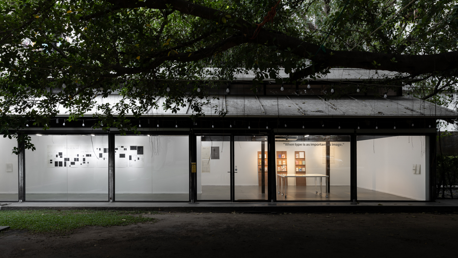
นิทรรศการถูกจัดแยกโซนเป็น 3 โซน โซนแรกคือผลงานที่ทำเพื่อโจทย์จากภายนอก เช่น งานออกแบบหนังสือ โปสเตอร์งานแสดงศิลปะ โซนที่สองคือโปรเจ็คต์ส่วนตัวที่สร้างโจทย์ของตัวเองขึ้นมา และสุดท้ายคือโซนผนังที่โชว์ขั้นตอนกระบวนการในการออกแบบของเธอ ซึ่งทำให้การชมนิทรรศการครั้งนี้ต้องเดินวนเวียนไปมาจากโซนงานที่สำเร็จแล้วเพื่อกลับมาดูผนังนี้อยู่เรื่อยๆ
มานิตาบอกกับ art4d ว่า เธอมีส่วนร่วมออกแบบสัดส่วนของผลงาน วิธีจัดแสดง ไปจนถึงสภาพแวดล้อมของแกลเลอรี่ที่เธอปรับให้แสงไฟของ The Jam Factory Gallery สว่างสดชื่นผิดหูผิดตาจากบรรยากาศปกติ เพื่อจำลองเอาสภาพแสงในห้องทำงานของเธอส่วนหนึ่งเข้ามาอยู่ในห้องนิทรรศการ


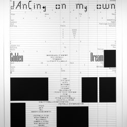
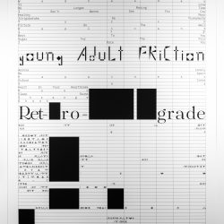
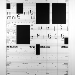
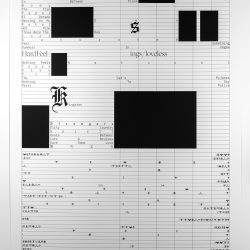
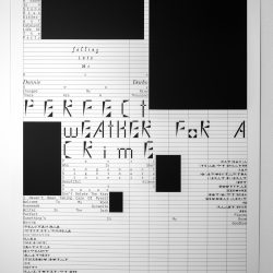
ในกลุ่มผลงานปกหนังสือและโปสเตอร์ที่ถูกจัดหมวดหมู่ไว้ด้วยกัน เราจะเห็นถึง texture หลากหลายของเนื้อกระดาษและ typography แบบต่างๆ ที่ถูก custom มาใช้กับงานนั้นๆ เมื่อมาอยู่รวมกันเยอะๆ แบบนี้ก็ยิ่งทำให้เห็นความช่ำชองของมานิตา ในการจัดเลย์เอาท์ และความสนใจในอักษรต่างๆ ชนิดที่ลงทุนสร้างอักษรมาใช้งานเอง (ที่อาจจะติดตัวมาตั้งแต่สมัยที่ไปฝึกงานกับปราบดา หยุ่น) และคงเป็นโชคดีที่ต้องทำงานกับสื่อโปสเตอร์บ่อยๆ ซึ่งเปิดโอกาสให้เธอได้ฝึกฝนการจัดการสเปซบนเลย์เอาท์ในประเทศที่นักออกแบบไม่ค่อยจะได้ทำงานบนโปสเตอร์กันเท่าไหร่ รวมถึงการได้เข้าไปทำงานกับทีมนิทรรศการของ BACC เช่นกัน ที่ดูจะลงตัวกับการทำงานสร้างระบบความคิดในการออกแบบของเธอ ที่มานิตาออกตัวว่าไม่ถนัดงาน commercial จ๋าๆ มาตั้งแต่ตอนเรียน เพราะธรรมชาติของตัวงานสาย culture นั้นเปิดพื้นที่ที่เอื้อให้เธอได้ผสมซ่อนความคิดทั้งของศิลปินที่มาจัดงานและการตีความส่วนตัวของเธอต่อบรีฟที่ได้รับมาเข้าไปในงาน ซึ่งหลายครั้งโจทย์ที่ได้รับจากคิวเรเตอร์ คือการไม่อยากไปกำหนดความคิดของคนดูก่อนที่จะเข้าไปในงาน แต่ก็ต้องมีจุดเชื่อมโยงบางอย่างที่จะสื่อสารให้คนดูเข้าใจงานนิทรรศการนั้นด้วย
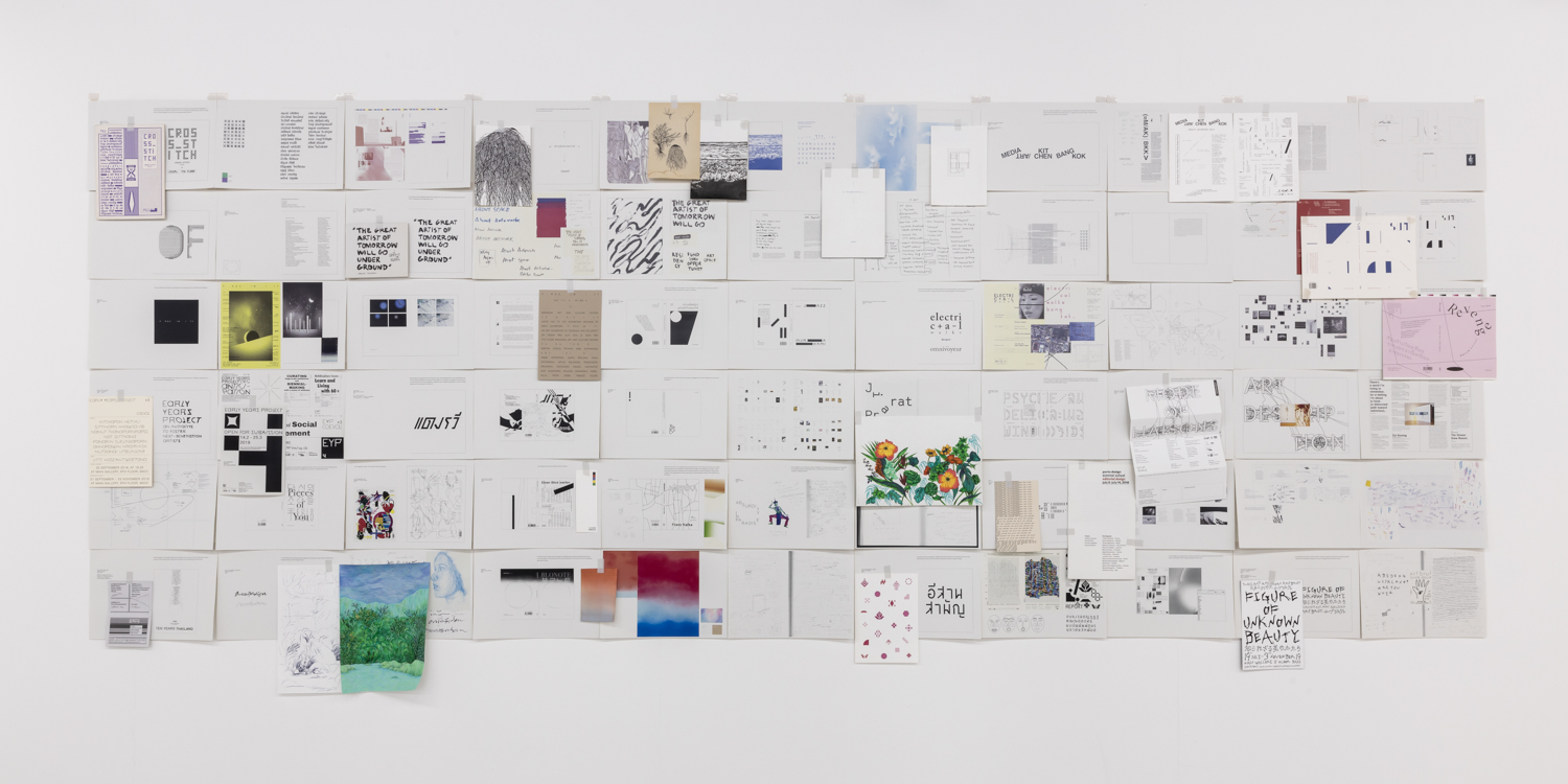


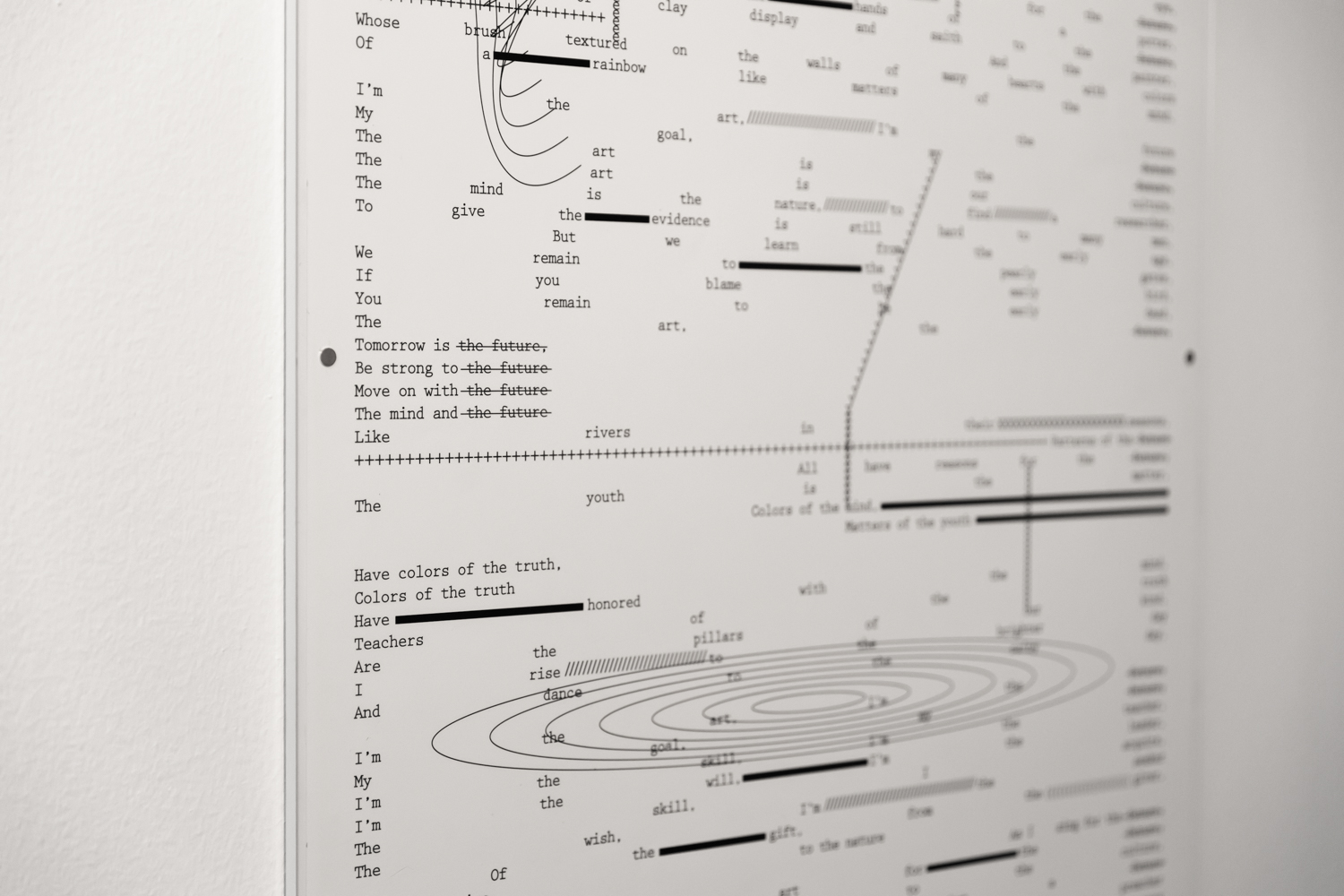
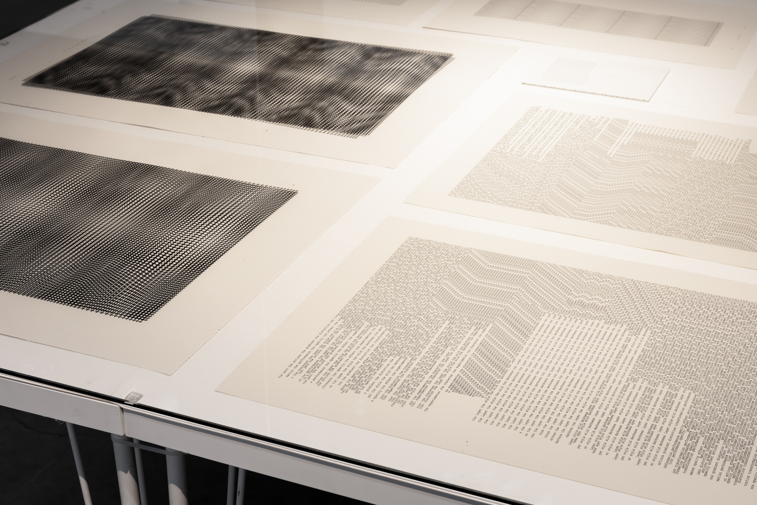
นี่เองคือที่มาของโซนกำแพงอีกส่วนที่เเสดงให้เราเห็นว่าเธอจัดการถอดรหัสข้อมูลของโจทย์งานแต่ละชิ้นออกมาอย่างไร ซึ่งมีทั้งต้นฉบับงานวาด การทดลองกับ texture ต่างๆ การลองผิดลองถูกในการวาดขึ้นรูปอักษรต่างๆ ซึ่งในแต่ละโปรเจ็คต์ก็มีการสร้างคาเเรคเตอร์ที่แตกต่างกันของงานแต่ละชิ้น เชื่อมโยงกับชื่อนิทรรศการนี้คือ Individual Characters
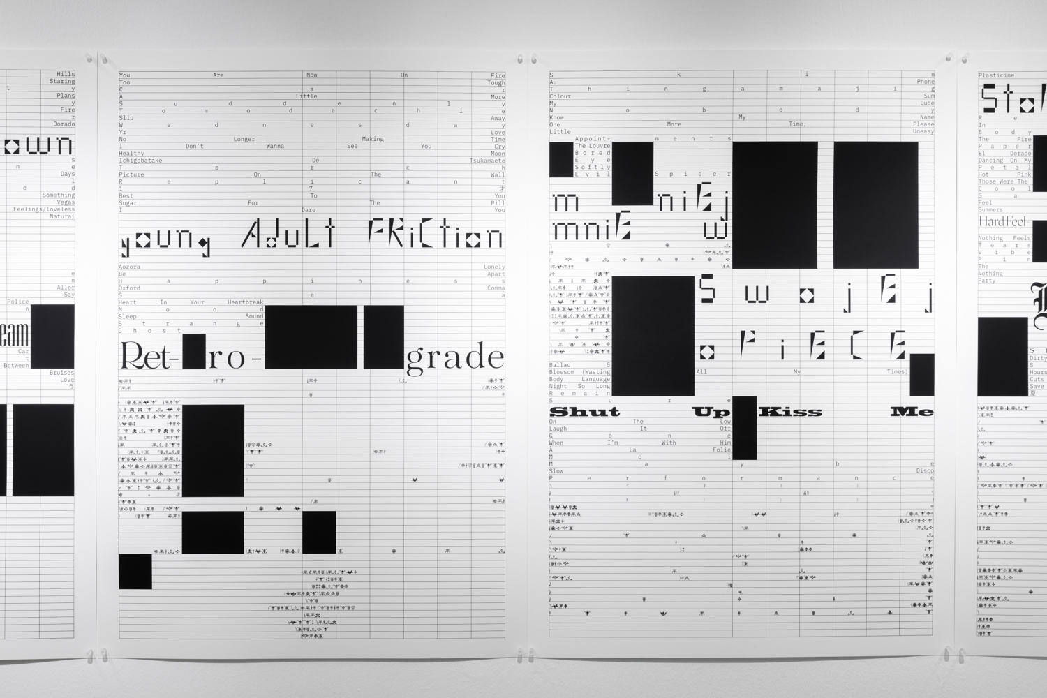
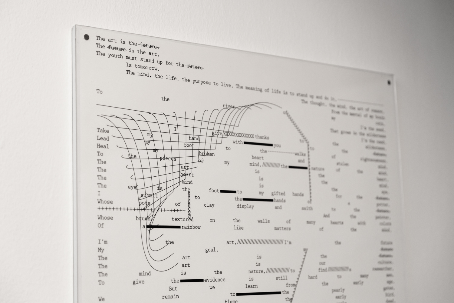
ต่อเนื่องไปส่วนที่สามคือ personal project ที่มีผลงาน screen print ชิ้นใหม่ที่ทำเพื่อนิทรรศการครั้งนี้คอยรับแขกอยู่ด้านหน้า ในโซนนี้เธอกลับมาสำรวจสิ่งที่สนใจคือการทำงานกับ text และเลย์เอาท์ มาสร้างงานด้วย “เนื้อหาของตัวเอง” และเริ่มสร้างกฎเกณท์เพื่อทดลองออกมาเป็นชิ้นงาน ทั้งการเล่นกับระยะของอักษร การตัดคำต่างๆ เป็นพื้นที่แห่งการสำรวจขยายขอบเขตการทำงานออกไปเรื่อยๆ
สำหรับคนที่ไม่ได้ติดตามงานของเธอ ดูเผินๆ Individual Characters อาจจะดูเป็นนิทรรศการที่ “อ่าน” ยาก หากไม่ได้บังเอิญไปเจอเจ้าตัวอธิบาย เพราะเป็นงานที่สามารถเลือก “อ่าน” ได้หลายแบบ แม้ว่าการได้ไปเจอกับเจ้าตัวจะได้คุยถึงเกร็ดเล็กเกร็ดน้อยเล่าถึงกระบวนการความคิดสนุกๆ ที่ลึกขึ้นมากกว่าการจัดวางเลย์เอาท์เท่ๆ แต่เราคิดว่าในก้อนกำแพง process นั้นก็เป็นของขวัญที่ทั้งดีไซเนอร์และคิวเรเตอร์เปิดโอกาสให้กับคนมาชมนิทรรศการได้ “อ่าน” เบื้องหลังที่มาของงานต่างๆ นั้นด้วยตัวเองอย่างสนุกสนานแล้ว

‘That is so…punk” is the initial thought that came to mind when I saw Manita Songserm’s work for the first time on the cover of Sum: Forty tales from the afterlives, published by Chichi Books back in 2015.
It wasn’t even about the style, it was more about that distinctiveness and bravery that Thailand’s publishing industry has been seeking for the longest time. From a new face designer who emerged in the scene 4-5 years ago, Manita Songserm has now become an important moving force that has caused some interesting movements within the industry. This year, the designer has put together her solo exhibition, Individual Characters at The Jam Factory, showcasing her old and new works throughout the 7 years of her career. This type of retrospective exhibition doesn’t come by that often, especially for graphic designers in Thailand who are usually given a topic to collaborate on or are asked to create an entirely new project for a showcase. Maybe it’s the special trait that has always been a part of her body of work (that punk quality perhaps) which gives her enough substantial content to put together a solo show.
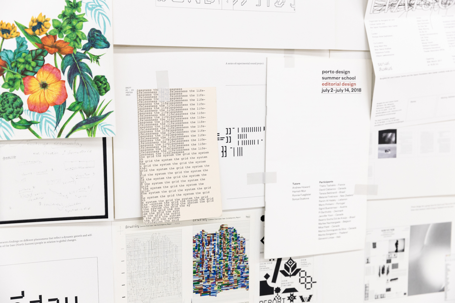
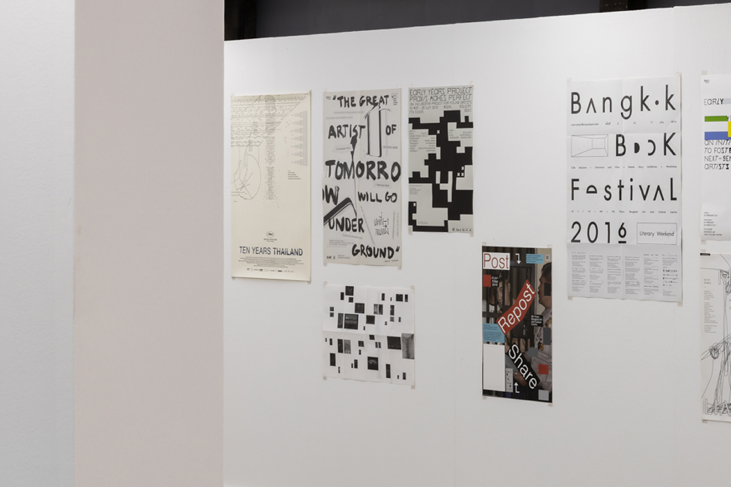
The exhibition is divided into 3 zones. The first features projects she created from different given briefs such as book designs and art exhibition posters. The second zone showcases her personal projects realized from the subject matters she came up with herself. The last zone is presented in the form of a wall revealing Songserm’s design process, allowing viewers to go back and forth between the first two zones and the last zone to take a further look into how each work was developed and executed.
Songserm told art4d that she took part in designing the scales of the works, the curatorial approaches, including the physical environment of the space where she brightened up the normal lighting in The Jam Factory Gallery to simulate the lighting in her own personal workspace.
The book covers and posters are shown in the same zone, revealing a vast array of textures, a combination of papers and typography which were customized for different specific projects. When put together, the works unveil Songserm’s masterfulness in the way she executes layouts as well as her passionate interest in typography, with each set designed for each project (we imagine it might have been a quality she picked up during her internship days with Prabda Yoon). In a country where designers rarely get to work on poster design, Songserm is also fortunate in the sense that a majority of her work has been books and posters, which grants her plenty of opportunities to master her layout design and manipulation skills. Having worked with the exhibition team of BACC also works well with her thought and work process since the designer admits to us that she isn’t exactly an expert when it comes to highly commercialized work and it has always been that way since her student days. The nature of cultural projects enable her to mix and mingle her personal interpretations, allowing for her to design posters matching to the ideas of artists whose works are being featured in exhibitions. On several occasions, one of the briefs given by curators is to not have the poster dictating the viewers’ perception before they actually see the actual works, but to still possess a certain connection in which the exhibition wishes to communicate.
The next zone paints a better picture of how Songserm decodes and translates the brief of each project, from her sketches and drafts of her drawings, to experimentations with different textures and the trials and errors of her typology design. Songserm creates a different character for each project, which explains the name ‘Individual Characters’ she has chosen for the exhibition.
The third zone is specifically for her personal projects, exhibiting works such as the new screen print she created specifically for the exhibition itself, which is shown at the front of the gallery’s space. With this zone, Songserm looks back and explores her interest in working with texts and layouts, developing works from the subject matters she has personally chosen. The designer develops her own set of rules as she experiments with kerning, word and character elimination, expanding the boundaries of her design.
For those who haven’t been following or aren’t familiar with her work, Individual Characters can be a bit hard to ‘read’ without Songserm’s elaborated explanation, for the many possible interpretations of the way it can be ‘read’. Although being able to meet her and talk to her a little about the thoughts and details behind her thought process can deepen one’s understanding and appreciation beyond the cool layouts she creates. The wall she has put together showcasing the entire work process for everyone to see is already a great opportunity for the viewers to understand and enjoy the back stories and behind-the-scenes of her amazing body of work.