HERZOG & DE MEURON AND JUNGLIM ARCHITECTURE CREATE A NEW LANDMARK FOR CHEONGDAM-DONG, THE BUSINESS DISTRICT IN SOUTHERN SEOUL, WITH AN OFFICE SPACE AND ART GALLERY BUILDING WHICH APPEARS LIKE A LARGE, SMOOTH, UNIFIED PIECE OF CONCRETE
TEXT: KITA THAPANAPHANNITIKUL
PHOTO: IWAN BAAN
(For Thai, press here)
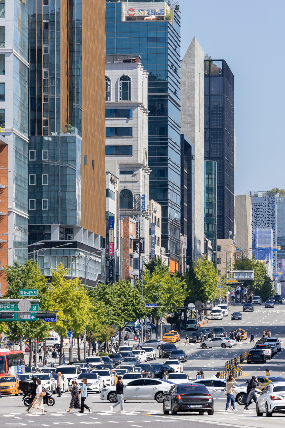
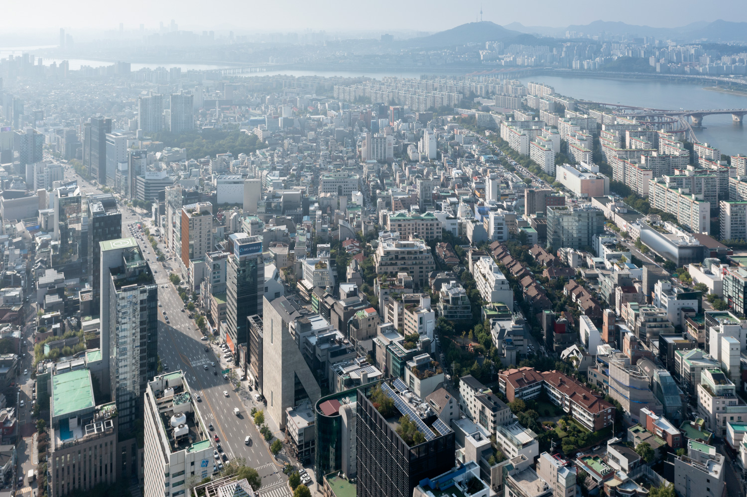
Following MKM Museum Küppersmühle in Germany, another project by Herzog & de Meuron was recently completed in September of this year on the other side of the world, South Korea to be precise. Named ‘ST International HQ and SONGEUN Art Space’, the building is a collaborative project between Herzog & de Meuron and local architecture firm JUNGLIM architecture. It sits in the middle of a highly crowded neighborhood of office buildings and shopping destinations, which occupy both sides of the road of Cheongdam-dong in southern Seoul, known as one of the priciest areas that is also home to some of the most expensive real estate development projects in the city. The building whose existence has become a new landmark of the neighborhood, presents itself as a public space of the art world amidst the chaos of the business district, inviting passerby with its visually distinctive form. The building’s front faces a public road with its rear welcoming residents of the local community with open arms.
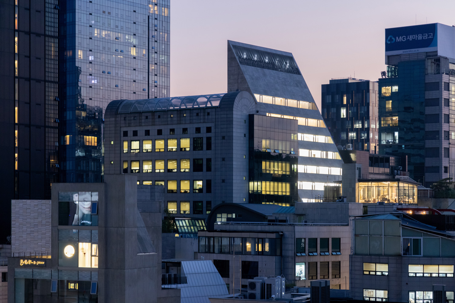
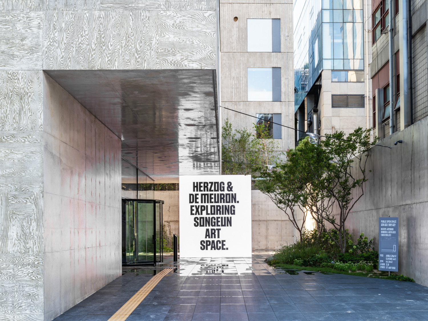
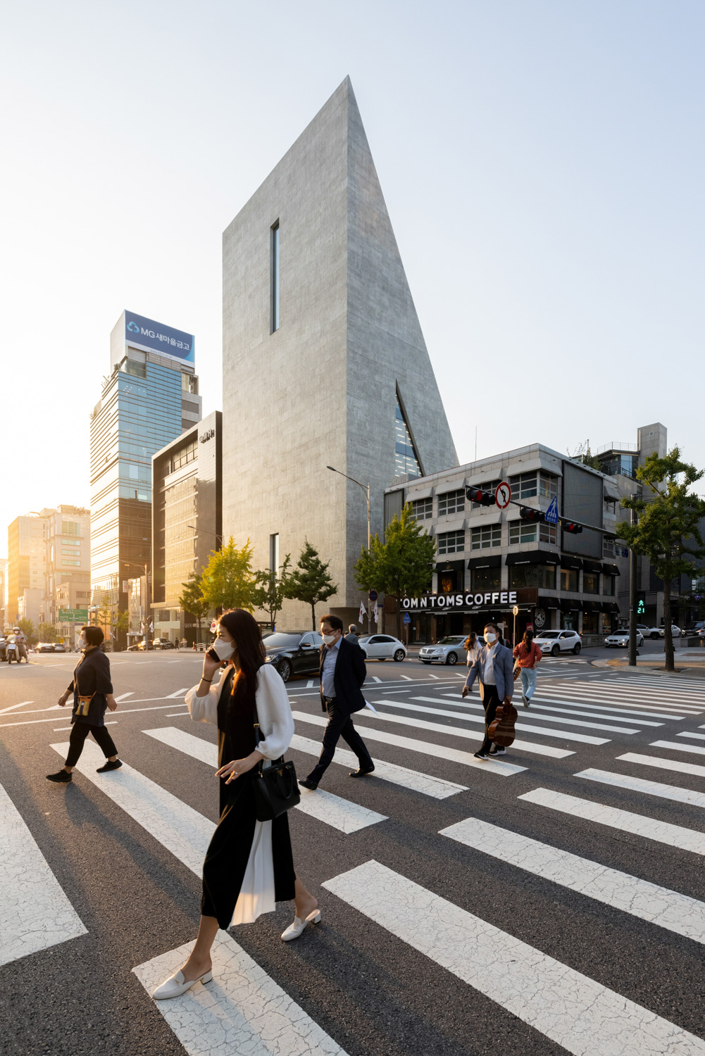
‘ST International HQ and SONGEUN Art Space’ is a new home for energy company ST International and SongEun Art and Cultural Foundation. The 11-story high monolithic structure with five underground floors tallies the total functional spaces of 8,000 square meters, occupying 1,200 square meters of land. The art space takes up the space from the B3 to the 4th floor of the building to be closer and more accessible to people with the office spaces setting up shops on the 5th to 11th floor. The building is designed to deliver the best possible spatial efficiency under the building laws and regulations it’s required to follow. The triangular shape has the highest point at 60 meters, with one side facing the road and the other sloping toward the rear. It disconnects itself from the road and pavement with a solid wall that houses only two openings. To the back, the building is designed to incline downward to the neighboring low rise buildings, unabashedly opening itself in the manner that is distinctively different from its other three sides. The glass wall of this particular side of the structure connects the interiors with the exterior, facilitating a connection between the art space and the local community.
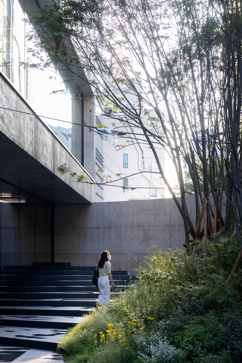
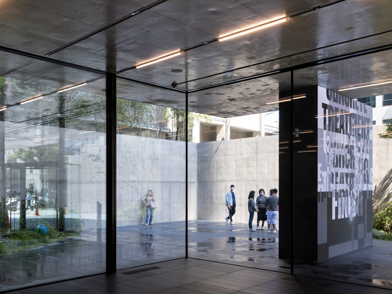
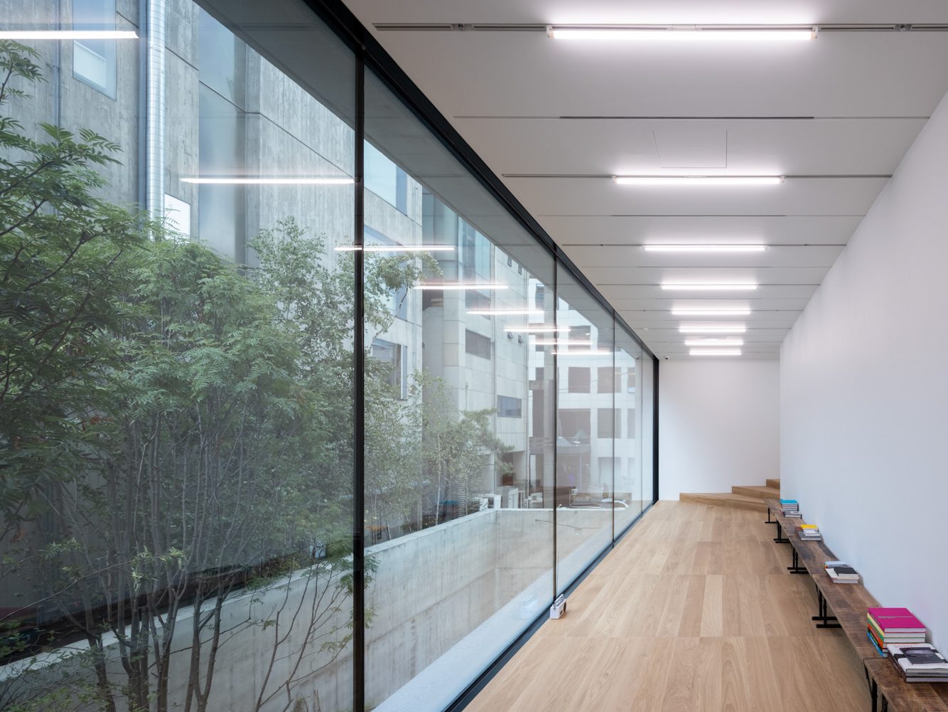
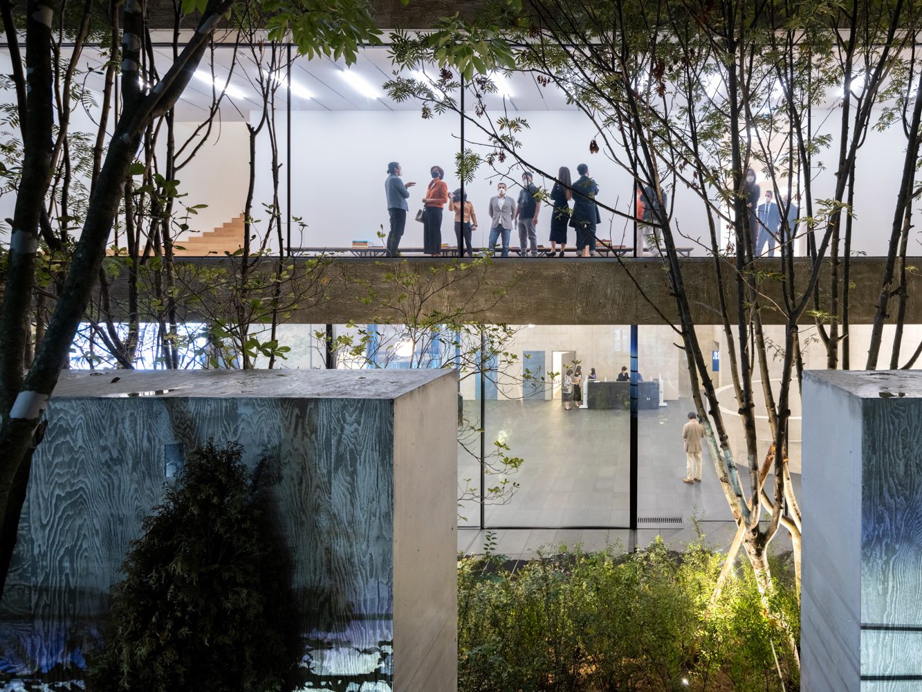
While the building appears to disassociate itself from the outside world with the solidity of its front wall, once visitors enter the project’s functional spaces, the spatial characteristic of the first floor looks and feels the opposite. The interior and exterior spaces are connected using various methods. One of them is that the framed glass wall designed to be the thinnest possible to minimize any visual obstructions that it may cause. The planes of the floor and ceilings are linked through the use of identical materials. Even the steps of the staircase are divided by transparent glass panels with the indoor staircase leading up to the second floor while the outdoor staircase serves as multi functional terraced space. The green space is embraced by a rigid concrete wall at the back yet opens itself up to be visually and physically accessed via the open ground in front of the building’s entrance, physically connecting to the pavement. The space simultaneously becomes a public space and a part of the project’s functional program, inviting outsiders to use the building without feeling excluded as people are unknowingly drawn into the art space.
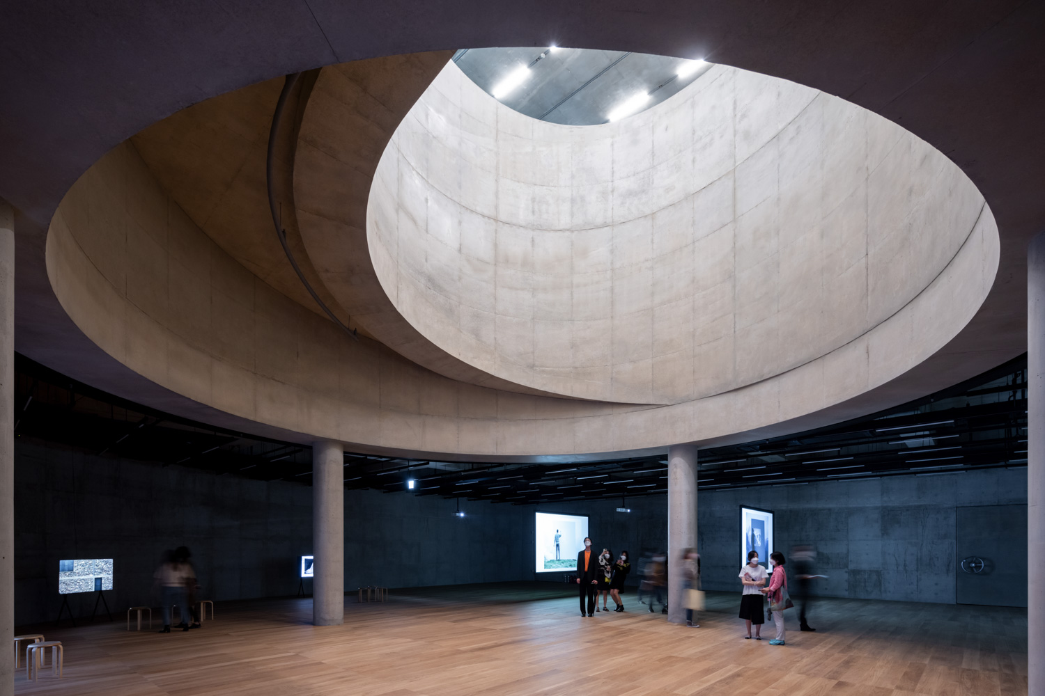
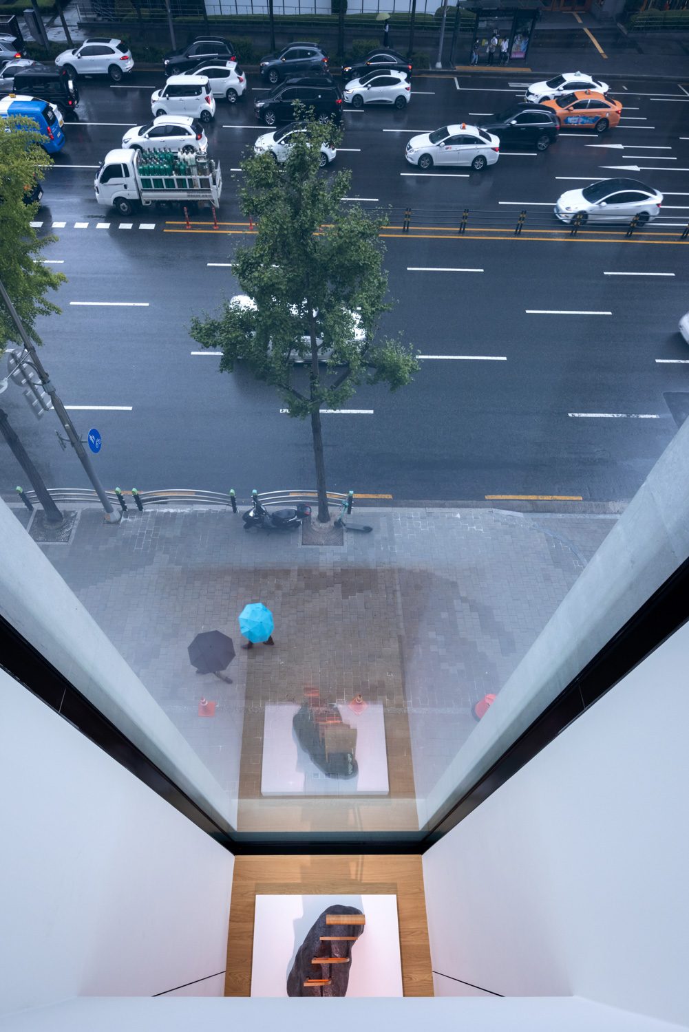
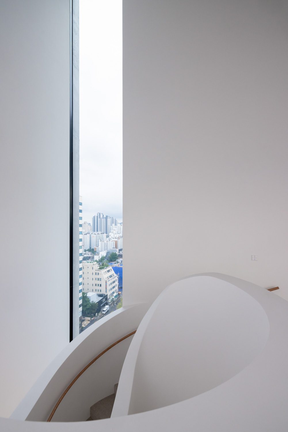
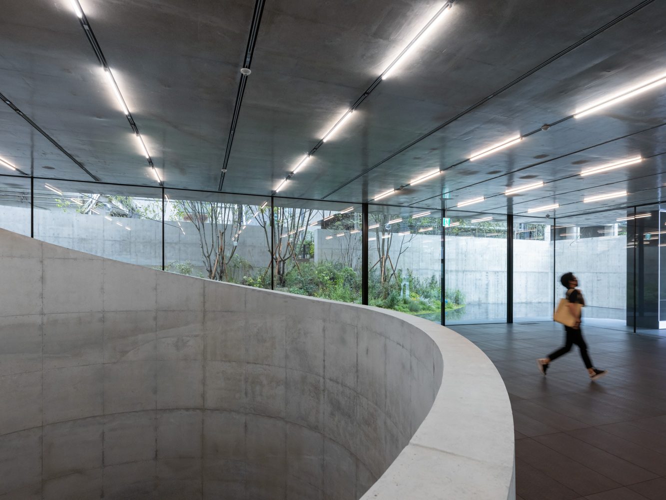
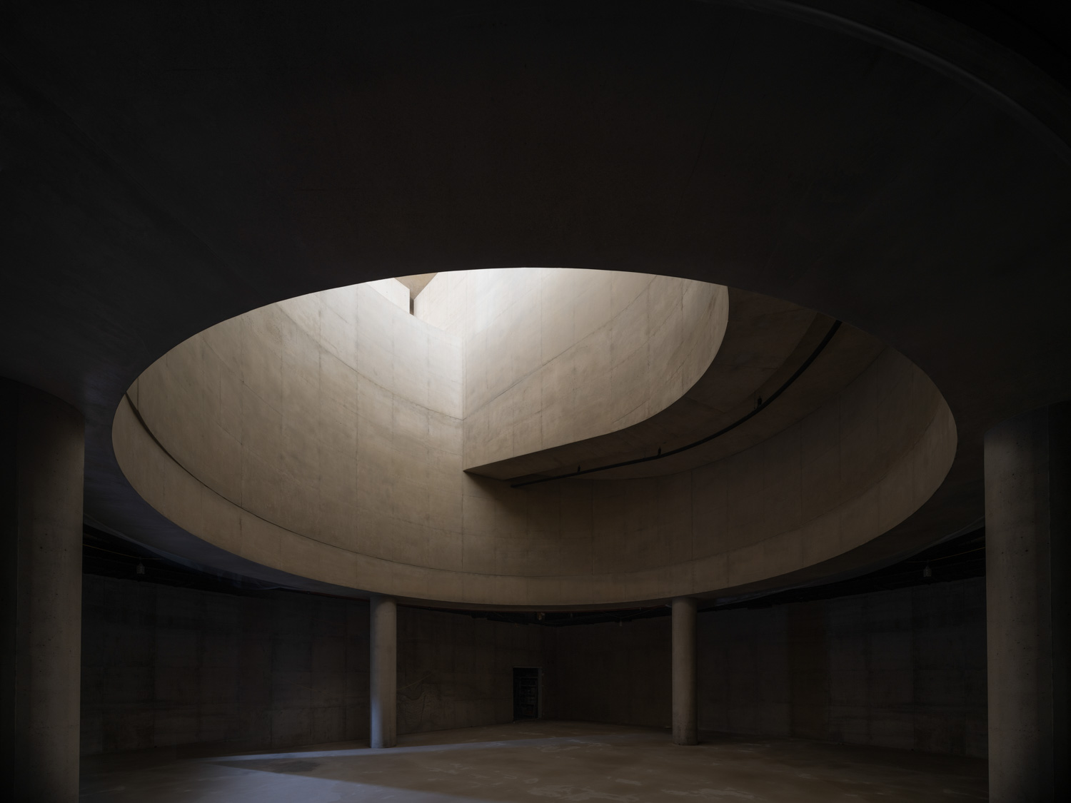
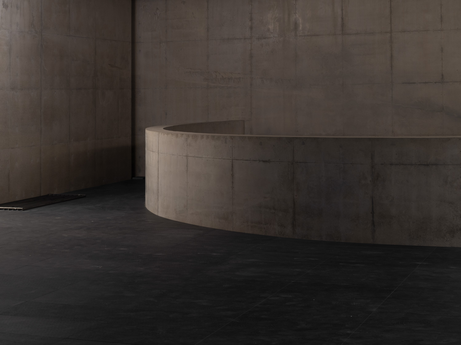
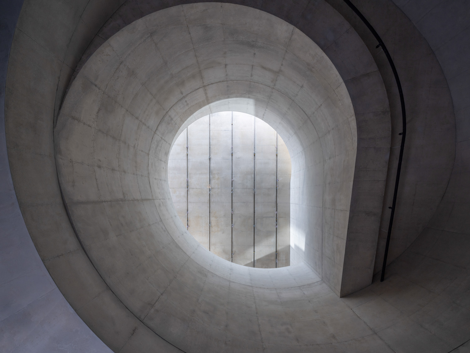
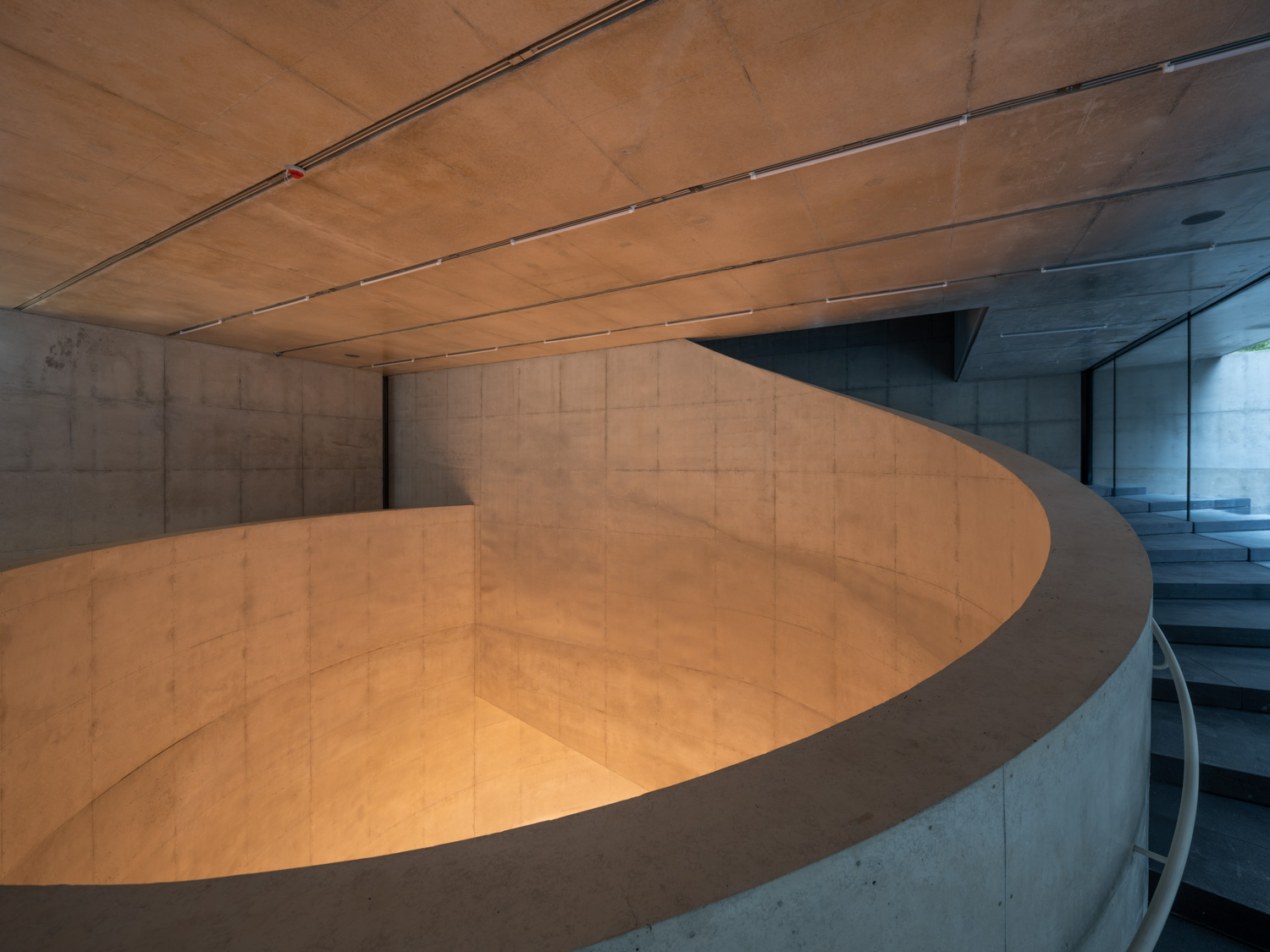
The first element that catches one’s attention when stepping foot inside the building is the massive, two-story height void. Looking down, the void runs through the B1 floor where the parking space is located and the exhibition space on the B2 floor. The void also serves as a free space that artists and curators can work with while bringing natural light into the exhibition space, setting the art space apart from other areas on the same floor. The four columns bear the weight of the structure that forms the void, highlighting the presence of the light cast on the surface. The collective presence of light and space gives birth to an exhibition area that accommodates various types of activities, especially those that need visual appeals such as live performances or lectures.The void isn’t formed unintentionally but from the curvature of the ramp that leads to the parking lot and wraps around the empty space. With a true understanding of the building’s superimposed planes and spaces, Herzog & de Meuron works around the space of the parking lot by turning it into an indoor exhibition area and a pivotal part of the building’s identity.
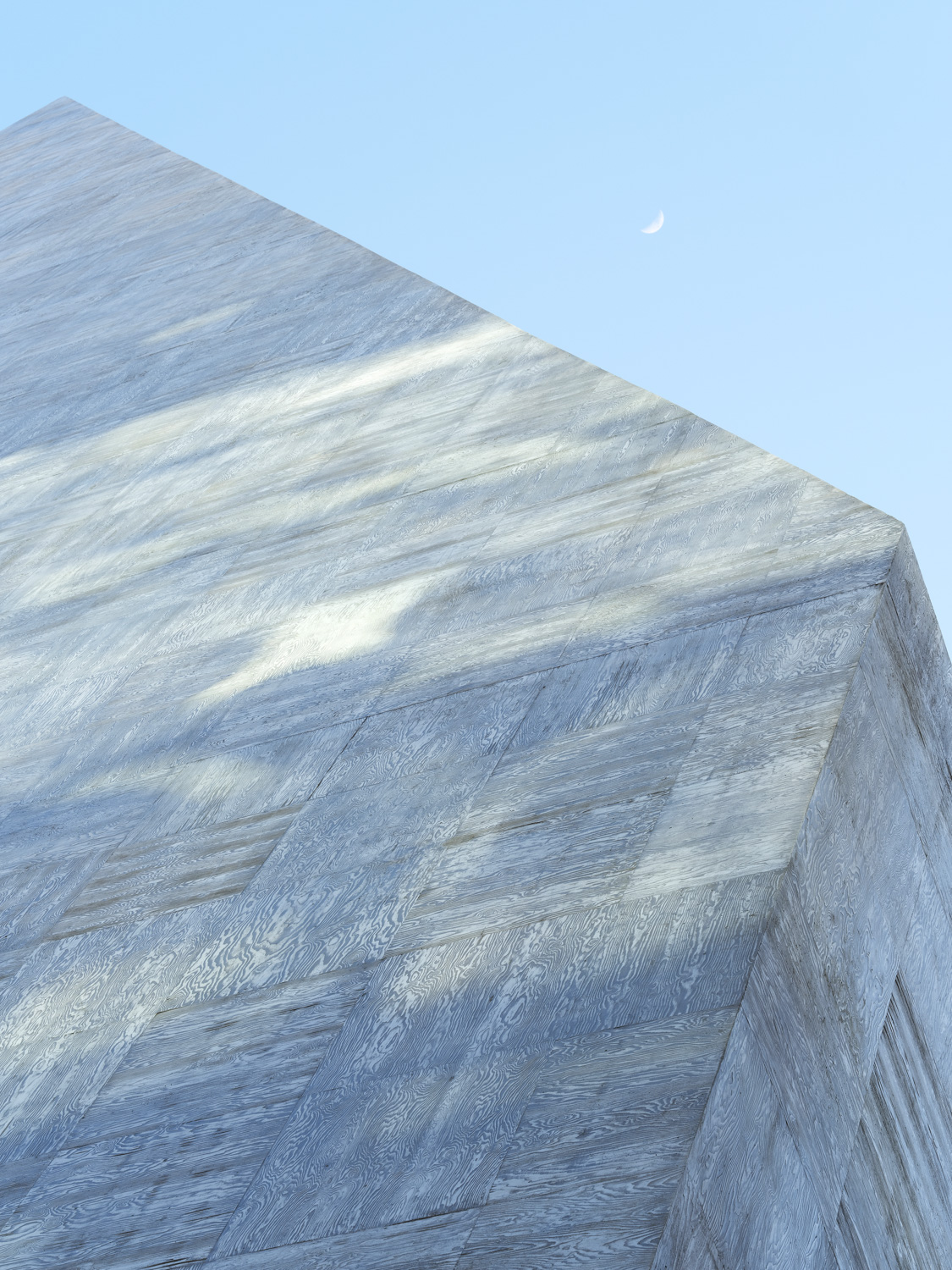
While implementing a material such as concrete makes the building seem rigid and unfriendly, Herzog & de Meuron reimagines the preconceived notion of concrete and introduces a new approach to materiality through construction details and techniques. From afar, the facade of ST International HQ and SONGEUN Art Space appears like a large smooth, unified mass of concrete. Up-close, the facade reveals a 1×1 meter cavity between each concrete slab and placed inside is a wooden panel with a wavy pattern that looks as if it was printed on. The alternating arrangement of the vertical and horizontal patterns of the wooden panels forms a series of grids, and turns the facade into a finished jigsaw puzzle where all the pieces are put together, rendering a completed big picture. Looking closer, one can see the natural elements, lines and pattern on each wooden piece. The illusion the facade brings dynamic visual effects that vary by different distances; a wonderful implication of the name SONGEUN and the meaning ‘Hidden Pine Tree’ it holds.
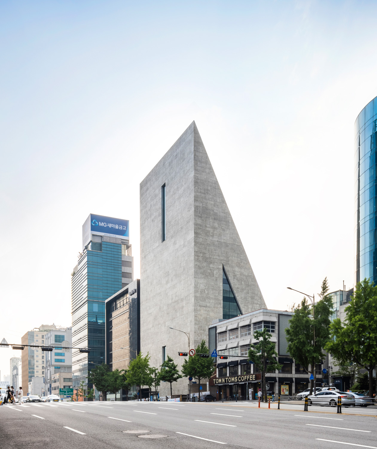
The architecture of ST International HQ and SONGEUN Art Space communicates with the passerby by lowering the building’s physical presence to correspond with the roadway at the front and the community situated to the back of the building. The play with varying levels of opacity and airiness of the elevation creates different ways of how the building is perceived, consequently appealing to people with its refreshing and welcoming image. The building portrays the role of architecture and how it serves not just its users but as an extended presence of a platform for a cultural space and art in the middle of the city’s bustling business district. The emerging cultural space lures people in and brings new and more diversified activities to the neighborhood, notably shifting the business-oriented district to focus more on ‘people’, which is the heart and soul of this and every urban neighborhood.
