TASTE SPACE DESIGNED A BAR TO DISPLAY A CONCEPT ‘RETRO-FUTURISM’ WHICH CAPTURES THE VITAL COMPONENTS FROM 1960S CINEMA FOLLOWING THE OWNER’S PASSION
TEXT: SURAWIT BOONJOO
PHOTO: ADISORN RUANGSIRIDECHA
(For Thai, press here)
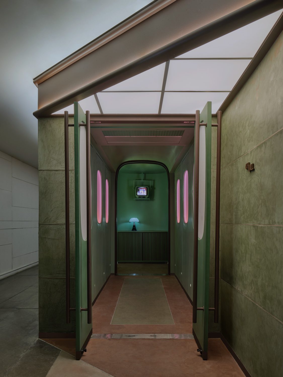
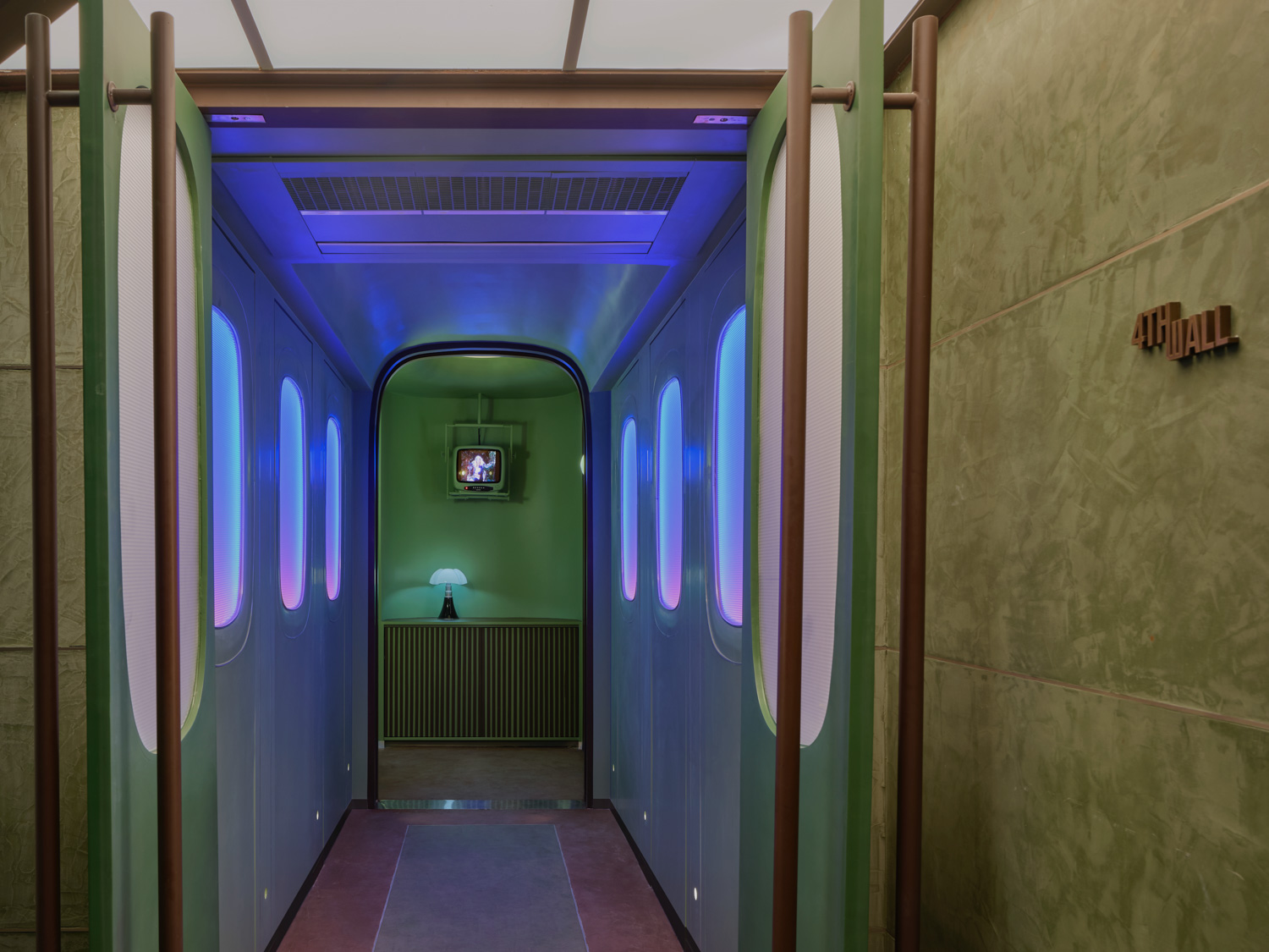
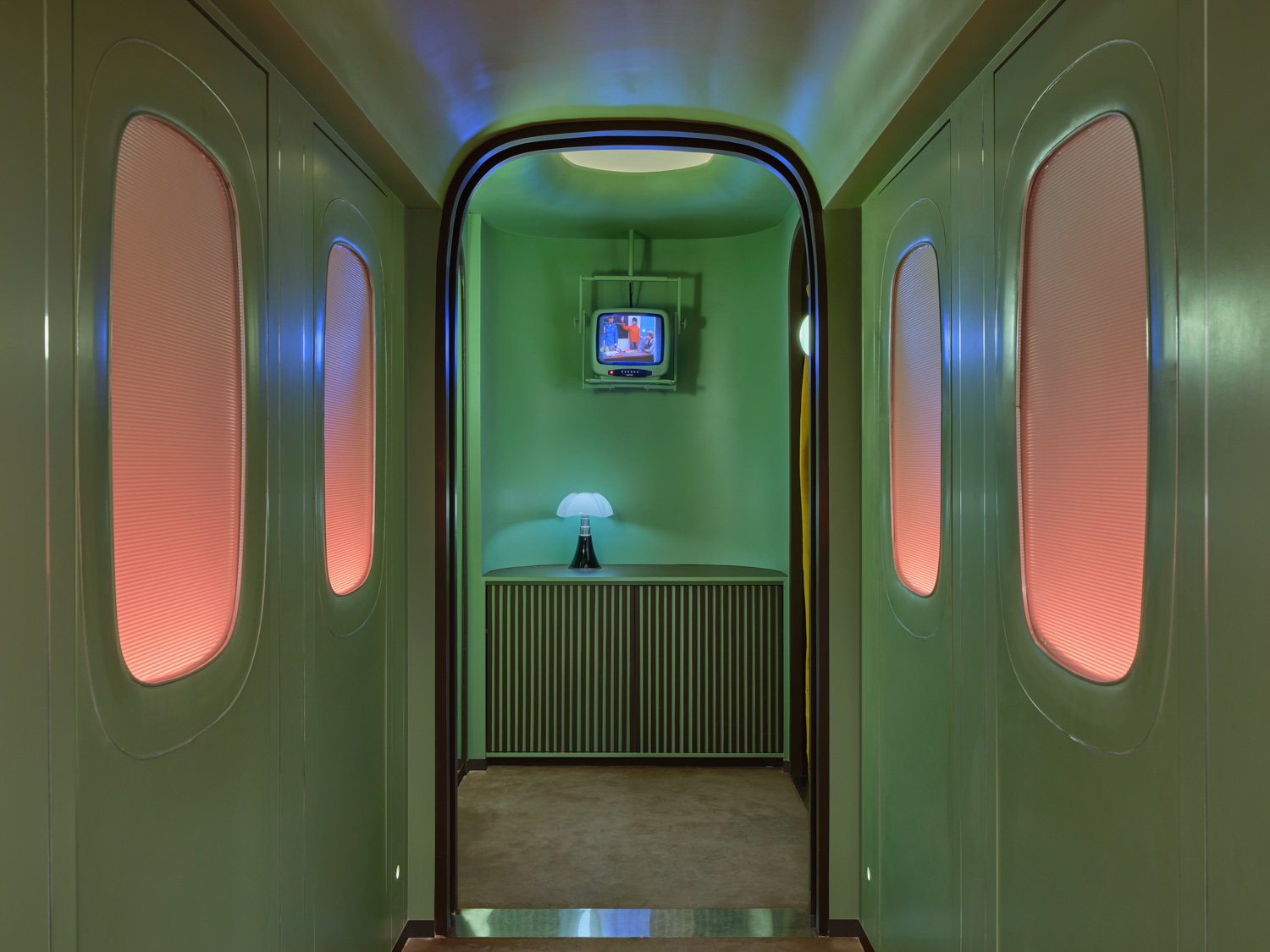
The ambiance of the 4th Wall, a suave cocktail bar nestled on the second floor of the LUXX Langsuan Hotel in Bangkok, dramatically embraces a palette of vibrant colors, rich materials, and standout aesthetics that boldly break from the spatial continuum around it. At the juncture of two somber green walls lies the gateway to this establishment, which opened its doors in the closing months of last year. Orchestrated by the acclaimed interior design firm Taste Space under the aegis of Kijtanes Kajornrattanadech, the venue is crafted to evoke the essence of a ‘neighborhood bar.’ Here, both staff and visitors are enveloped in a convivial, community-centric sphere, akin to being part of a vast, celebratory circle, facilitated by an expressive communication and a design vernacular that weaves together elements of the past and present within a ‘retro-futurism’ theme.
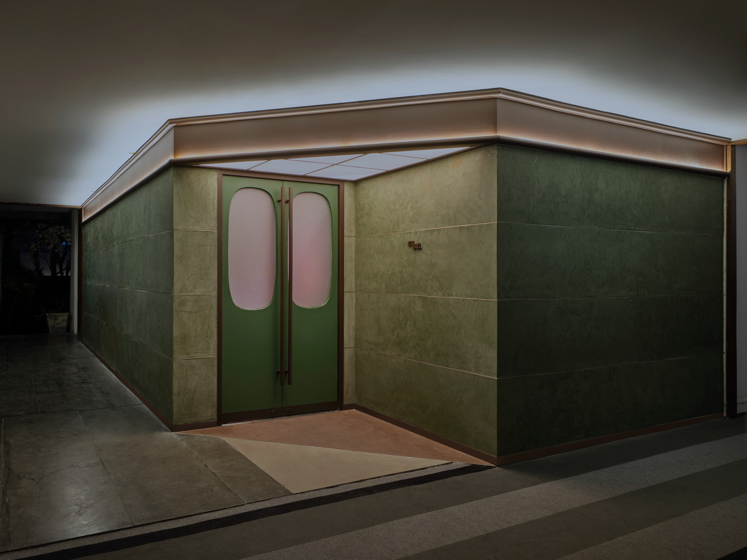
The term “4th Wall,” borrowed from the lexicon of film and theatre, refers to the unseen barrier that traditionally separates actors from their audience, maintaining a palpable though invisible divide. This theatrical concept has been ingeniously appropriated as a fundamental design principle here, with the intent to break down these barriers to shorten the distance of interaction, thereby fostering a cohesive and charming atmosphere that enhances the ‘local bar’ experience.
In parallel, each facet of the design—from the elements of forms and colors to their strategic placements—adopts a ‘retro yet futuristic’ visuals. These components craft a backdrop that not only supports but amplifies the primary ambiance of the bar, ensuring it manifests with clarity and well-rounded perfection. Through this lens, the green walls fulfill the role of backdrop and act as a temporal diaphragm, subtly delineating two distinct eras
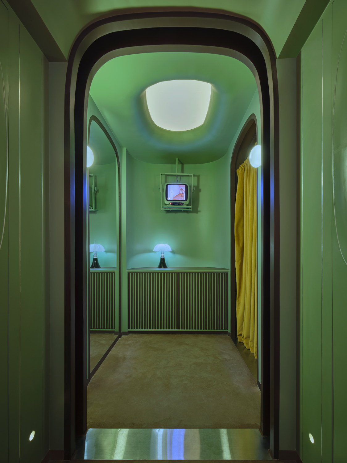
Taste Space has meticulously designed an emotional journey back in time for visitors. Upon crossing the threshold, the pathway leading through the bar is flanked by walls resembling a continuous sequence of doors, with elliptical glass sections, consistently illuminated by lights that shift in color. The entire space curves towards the far end of the room where a small television displays 1960s films in a loop. This area plays a crucial role in referencing and inspiring the overall composition and image. It reconnects patrons with the design, decor, and architectural ambiance of the 1960s as they emerge from behind the curtain.
The owner’s passion for 1960s cinema has made watching a diverse array of films from that era—recommended by the owner himself—a vital component in capturing the design’s mood and tone. Combined with extensive research, this approach has crystallized into the ability to selectively present only specific elements that embody the iconic imagery of that period or design, integrating them clearly and cohesively.

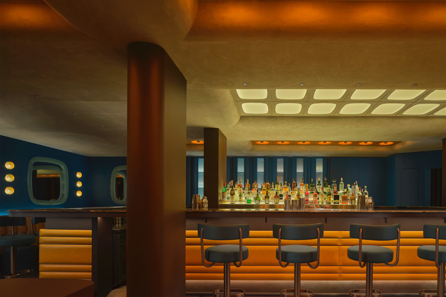
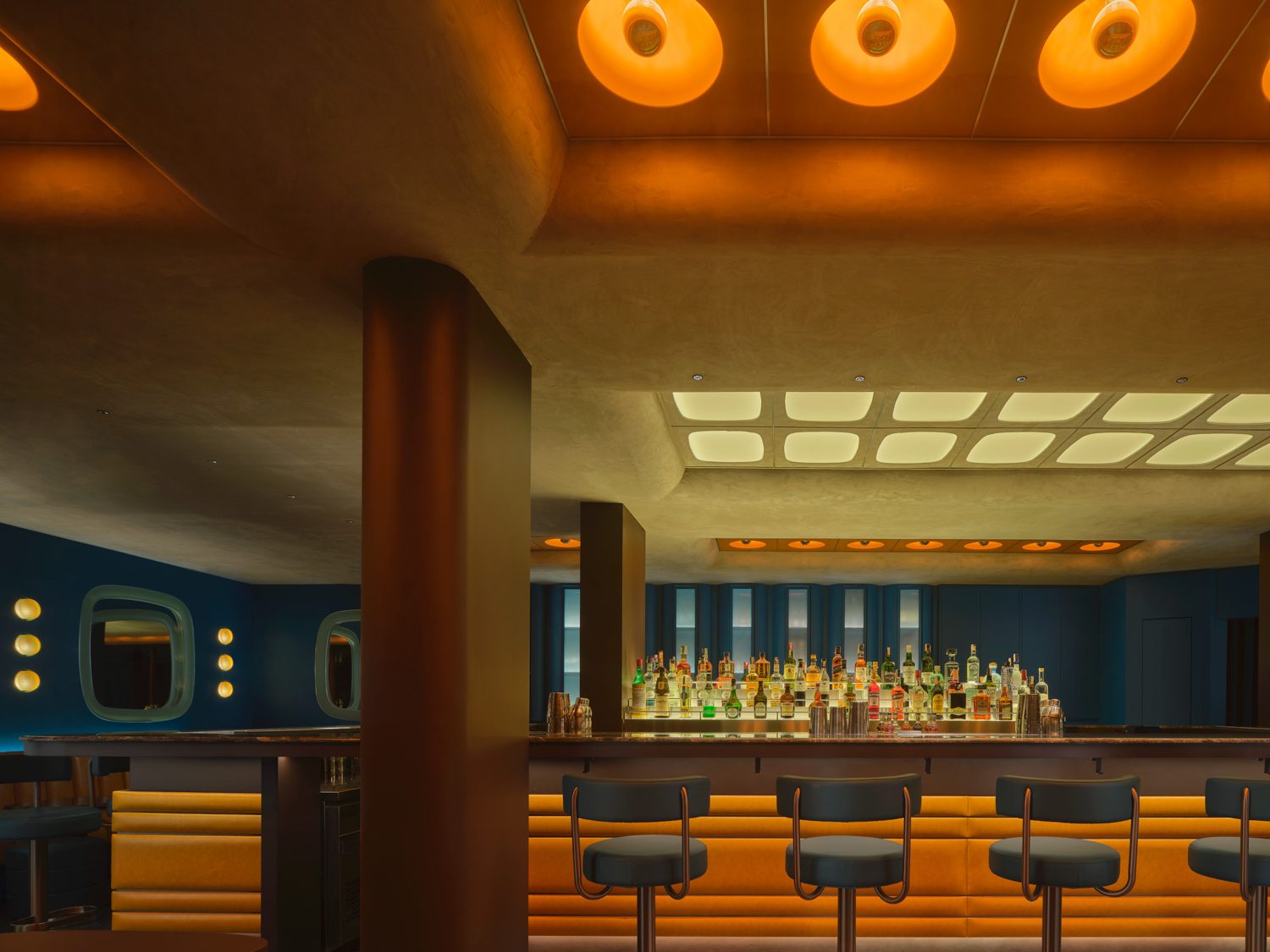
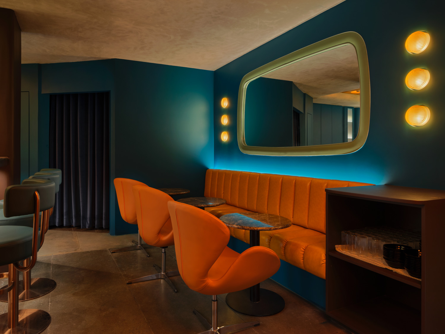
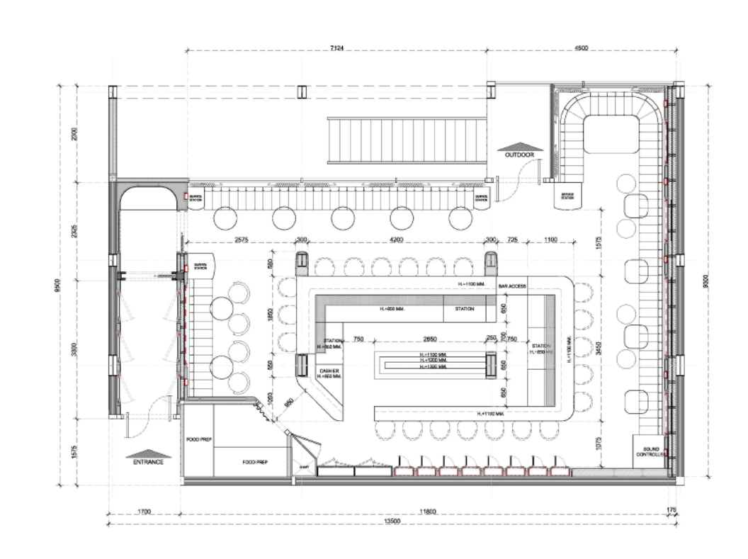
After emerging from the bright, green-lit tunnel, it takes a minute to adjust to the interior’s dimmer lighting. A prominent visual anchor in this space is the large bar configured as a rectangular frame, with its bottom left corner diagonally cut to echo the same corner of the outermost wall. Positioned centrally, the bar is encircled by spherical chairs around the counter and paralleled by furniture arrangements along the walls, leaving only the area behind the counter for storage. This layout, with seating facing inward towards the focal point of the bar, addresses the challenge of breaking the fourth wall, though in a manner contrasting with the initial, overt barrier.
The bar area’s decor elements are thoughtfully aligned in a rhythm that conveys a feeling of being transported back in time, highlighted by the dynamic yet disparate continuity of each section’s connection through symbolic imagery of the era. Kijtanes, explaining his design approach for this project, noted that he chose a pattern along with concrete materials for the ceiling’s rough, rectangular recessed designs paired with a bold green and orange palette. This representation of ‘brutalism’ creates a cohesive bridge between the starkly contrasting design elements of two different eras.
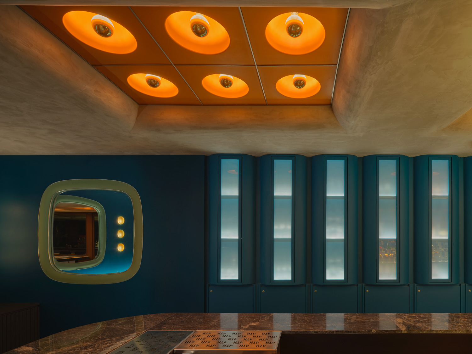
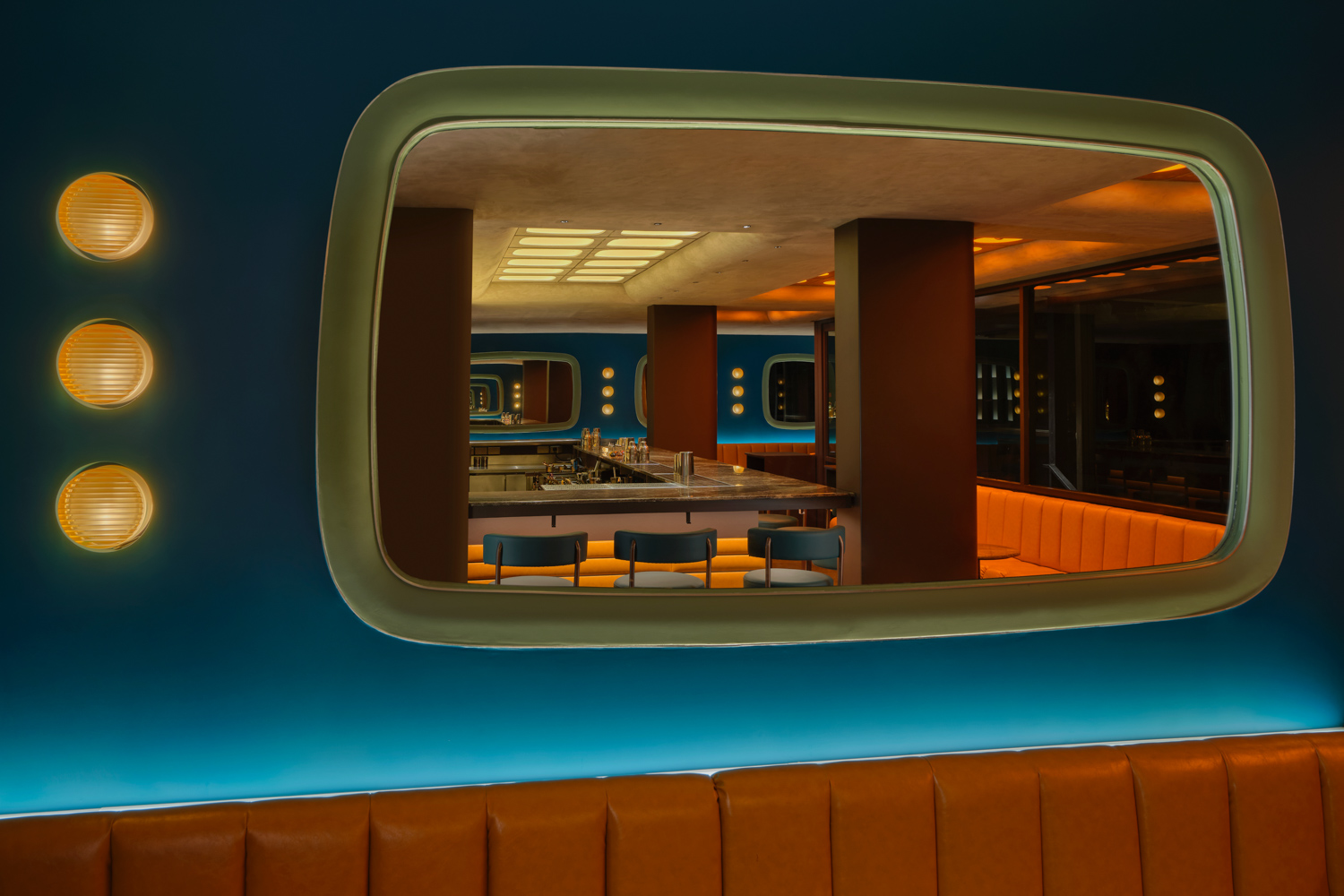
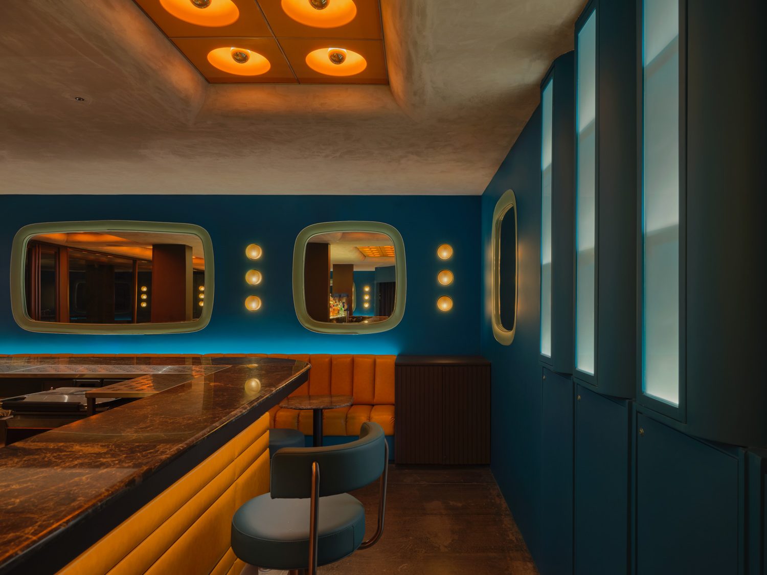
Additionally, spherical and curved lights are strategically placed in sequence, complemented by plastic and acrylic surface materials. These elements reflect a ‘retro’ aesthetic intertwined with the repetition characteristic of the Industrial Revolution era. Elliptical shapes, similar to those of the curved television screens of the past, are adapted for various decor elements, including the corridors and mirror decorations in shapes mimicking televisions, arranged in sequence on the walls of the bar area. These, coupled with vertically aligned, dynamically changing lights, project a ‘futuristic’ image that overlays another dimension onto the space.
The integration of various styles and eras showcases a myriad of manipulations in materials and shapes. The design harmonizes and aligns lines, and adjusts shades within a complementary range, avoiding any separation. The ceiling’s concrete beams, with their smoothly curved lines, form the focal point, representing a fusion of elements from both styles and rendering the design a seamless hybrid of past and futuristic elements.
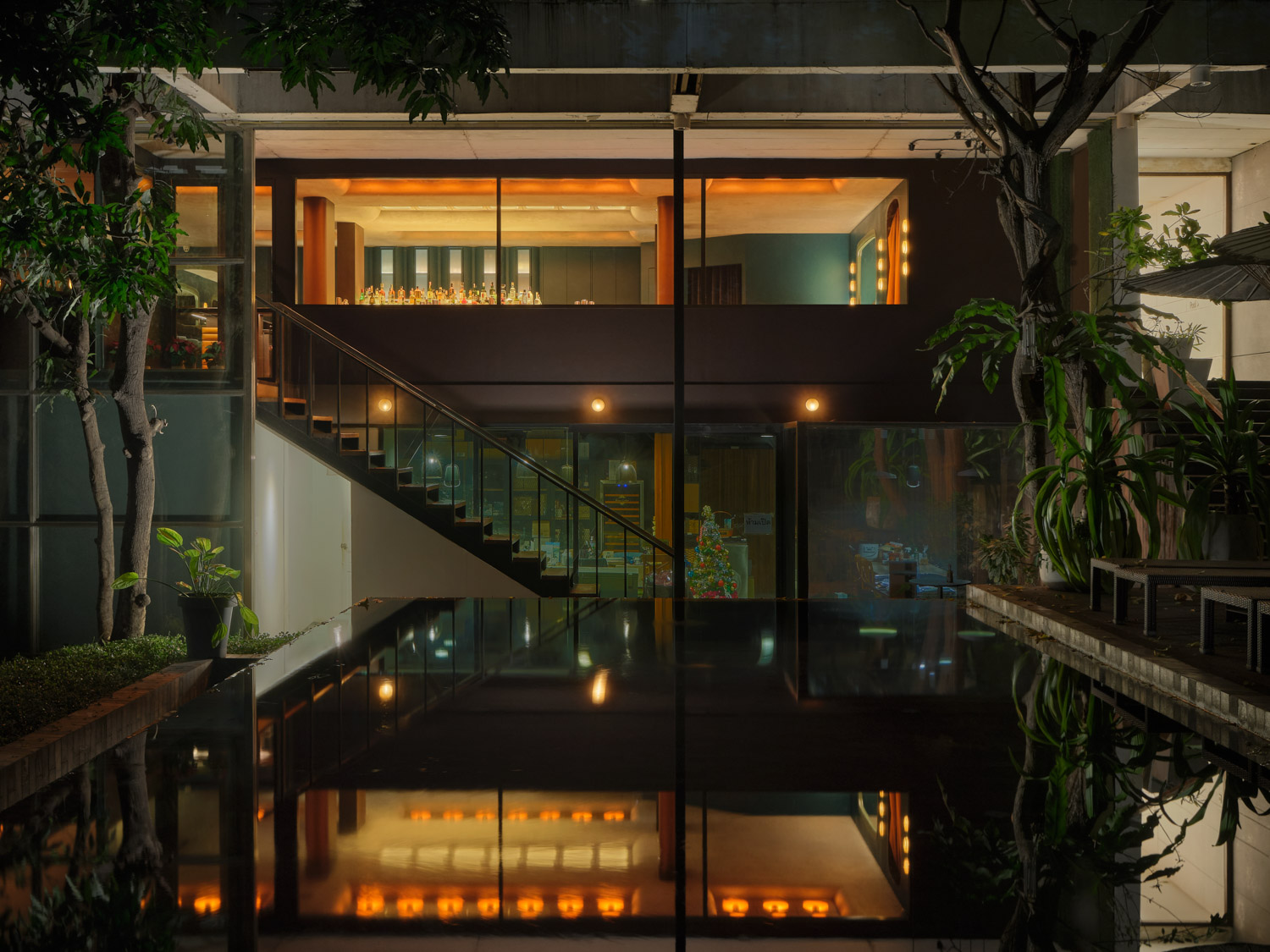
From the vantage of the swimming pool at the building’s rear, a wall section parallel to this side, situated above the sofa, is fitted with amber-tinted transparent glass panels. These panels delicately filter light while offering expansive views of the outdoors. From the opposite perspective, this installation frames a vista that captures the decorative elements, conjuring a futuristic space as if it had emerged from another time, continuously replaying scenes reminiscent of a cinematic narrative.
The ‘4th Wall’ design is distinguished by its ability to create indelible images and narrate through a series of phrases drawn from design languages spanning various eras, culminating in a richly textured hybrid aesthetic. It transcends the superficiality of a design that aims to fit functional usage in conceptual ideas. Through the amalgamation of diverse design methodologies, the definition of this project will continue to evolve and unfold. Concurrently, the meticulously engineered atmosphere is perpetually open to discovery and reinterpretation, influenced by shifting viewpoints, diverse locations, and the passage of time.
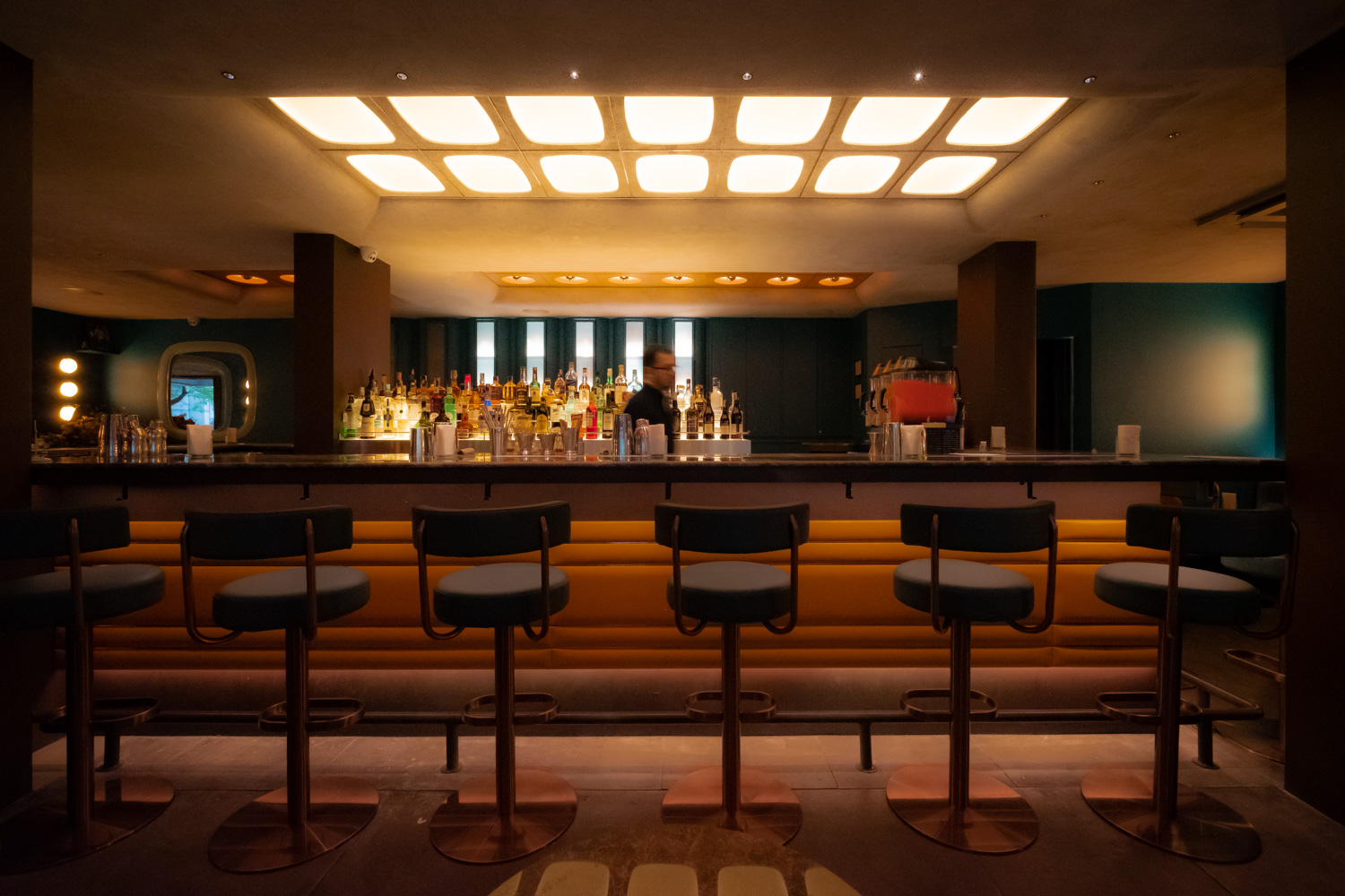
Yet, all this is subtly suffused with the essence of the 1960s landscape, a common thread binding every element tightly together. Indeed, Kijtanes’ recent articulation of ‘retro-futurism + brutalism’ might well suffice to encapsulate this concept, or stand ready to evolve and be redefined continuously.

