FIND OUT HOW TIDTANG STUDIO HAS DEVELOPED A NEW WAY TO INCORPORATE ‘THAI-NESS’ INTO THE ARCHITECTURAL ELEMENTS USED IN THE MOST COMPREHENSIVE MANNER AT THE LATEST SHOPPING OUTLET IN TOWN
TEXT: PITI AMRARANGA
PHOTO: KETSIREE WONGWAN
(For Thai, press here)
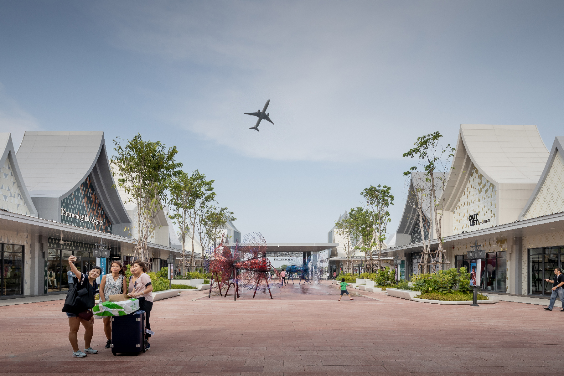
Say you’re a Chinese tourist who hasn’t really had a chance to visit Thailand and now the plane is about to land at Suvarnabhumi Airport. The first thing on the tour’s program is to stop by at a massive outlet, freshly opened, not too far from the airport. You’re more than ready for some selfie snaps and some social media check-ins to share with your friends that you’ve arrived safe and sound in Thailand. You’re fully rested having dozed off and getting some good sleep on the plane. The battery and memory of your camera and phone are full and ready. The vast 40,000-square-meter land isn’t too big to spend a couple of hours shopping, and buying items and delicious food. Statistically, within this amount of time, you and your family can easily take up to 100-200 photos. But that also depends on the place and whether it has many and interesting enough spots that are worth sharing on your social media platforms. But before the bus takes off to take you to this particular outlet, you begin to realize that you’ve been too far too many places like this already in your life and they all look the same. So, why did the tour program put this place the first to-do thing on your first day in Thailand? As you’re pondering harder, the bus finally stops, parking right at the front entrance, and you find yourself standing before Thailand’s very first luxury outlet.
Now let’s imagine you’re the architect who was chosen to design the project. Your job is to visualize and materialize the Thai-ness that everyone can instantly understand and relate to even without any prior experience or knowledge about the country at all. Managing the shops inside the project of such a scale to be equally distinctive is undoubtedly a challenge. How can you manage every square meter of the program to be equally interesting and appealing, particularly under the expectation of tourists who are always drawn to something new, original and within the most limited budget?
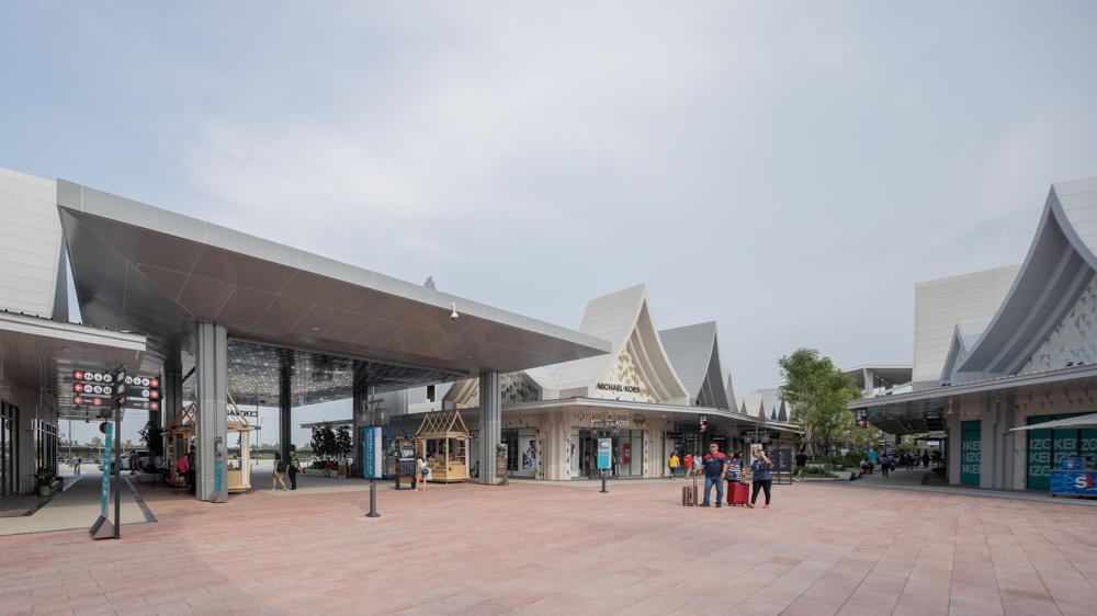
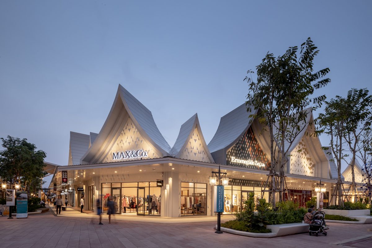
TIDTANG STUDIO are the team of architects assigned to oversee the design of the project. They began the work process with understanding the nature of the project as a place where a large number of people come, mainly, to shop. The brief given by Central Group was the desire to use the Thai identity and characteristics to differentiate the project from other outlets in other countries. The design process was similar to working out jigsaw puzzles with different problems emerging here and there. The first issue they had to work out was how to translate the Thai-ness into something people can instantly and easily understand. Going back to the interpretation of the characteristics of a village, following the project’s given name, the design team categorized the elements in a Thai local community into 4 different types of built structures: market, home, temple, and palace. The four types of building share one element, and that is the gable roof where two steep curved lines meet and form a triangular roof structure with a pointy end. This simple form is an image that has been embedded in both Thai and foreigners’ collective consciousness through long and repetitive tourism promotions, and it seems to be the answer they were looking for.
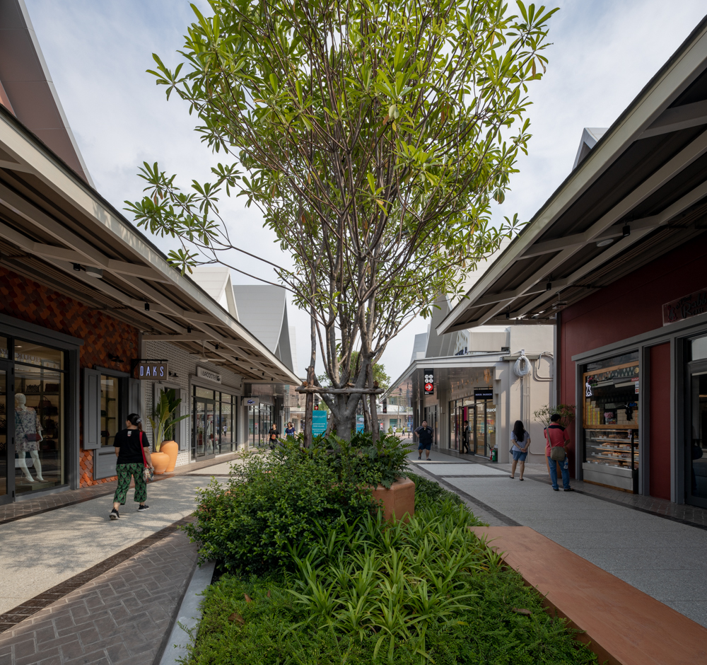
The next issue they had to work out was the allocation of functional space for every square meter of the program to be equally distinctive and interesting. TIDTANG STUDIO proposed the idea of dividing the program into 4 different zones, referring to them as the 4 Artisan Villages (Wooden Village, Metal Village, Weaver Village and Clay Village). Such direction gave birth to 4 different decorative schemes: 1. Materials 2. Patterns 3. Painted surface with textural finish 4. Painted wall surface. The four basic equations spawned hundreds of decorative methods, which ended up making each one of the shops systematically stand out. For example, one of the shops in the Wooden Village is decorated with cedar boards, while the next one in the same zone employs the ornamental details of Pakon wall pattern. The next one is decorated with the wall painted in the texture that is physically similar to wood, while the next one is painted in simple, warm tone color. Such system causes the neighboring shops to stand out instead of being completely homogenized while the 30-50 cm. set back and the details of concrete molding and cornice bring greater dimension to the buildings’ orientation.
Having to work with over 200 retailers, the design was unable to provide detailed and different working drawings for each and every one of them. They worked with the contractor by using a set of codes, for instance, the D-3A-WP2-L specification with the D referring to the form of the roof structure; the 3A specifies the glass material and A type window. W refers to the Wooden Village while P2 means Type 2 painting. The L at the end translates to the height of the low hanging roof, which is designed with 50-centimeter-height difference from the adjacent shop’s higher roof structure. The use of code system is interesting for the way it is able to minimize mistakes for work processes of such scale and complication. Once everyone learns the codes, the construction process becomes significantly more efficient.
When discussing the notion of Thai-ness, TIDTANG STUDIO shares their interesting approach with art4d on interpreting and using the Thai identity in the design. “We’re interested in finding that middle ground where both Thai people can accept it and foreigners can effortlessly understand.” They are aware that there are many levels when it comes to the discussion about Thai-ness. The ancient Thai aesthetics may seem exotic and interesting to foreigners, but considered old-fashioned to Thai people. There’s a fine line between the unique and the taboo, and the designers know that they have to be particularly careful about what to use. “Playing with something that is so concrete in terms of form, we didn’t really worry much about the criticism we may get from using something we’d used with Busaba Ayutthaya. Central Village wants to be this version of Thai-ness that’s easier to understand. The design is filled with details of the Thai characteristics and identity that are very neutral, explaining its use of architectural elements that is very common and relatable. Initially, we were more interested in something that is more vernacular and we would love to use that in every project if we could. We know it doesn’t always have to be the gable roof.”
Last year alone, Thailand welcomed 38 millions tourists, ranked at the 4th as the most visited country in the world. The tourism industry generated over 2 trillion THB to the country’s economy. With this information, we can still pride on the fact that Thailand, as a country, still sells. During the time when Thailand picked up the idea of becoming an Aerotropolis and set forth its first step to build a city whose infrastructure, land use, and economy are all centered on an airport, the country is expected to welcome many more visitors from different places and cultures. Will the notion of ‘Thai-ness’ that Thai people appreciate and the ‘Thai-ness’ foreigners love be able to collide? How can we work out this enigma when there’s only one reality? Or do we need to provide different sets of definitions to explain the possible meanings of Thai-ness for different groups of people? Perhaps that’s the issue we should really be contemplating at the moment.
centralvillagebangkok.com
fb.com/CENTRALVILLAGEfanpage
fb.com/tidtangstudio


