SUPERMACHINE STUDIO INTEGRATES THAI PLAYFULNESS IN THE DESIGN OF THIS FREITAG STORE
TEXT: PRATARN TEERATADA
PHOTO: KETSIREE WONGWAN EXCEPT AS NOTED
(For Thai, press here)
“Sunny (Chanasinj Sachdev), the owner of PRONTO has been asking me to design the shop’s Silom branch since the middle of last year. We actually talked several years back when he first started with PRONTO’s Siam Square branch but Zurich oversaw the design themselves with that one. Call it a matter of good luck if you might, but with COVID still going down, headquarters naturally wouldn’t be able to take care of the design first-hand so there was an opportunity for a local studio such as ourselves to go for it. But we had to provide them with all the design concepts, down to every little detail. It made us understand the brand that has won over loyal followers worldwide such as FREITAG a lot more.”
Photo: Gunny
That was Pitupong Chaowakul, the spearhead of Supermachine Studio telling us about the convergence between himself and the world-renowned Swiss brand known for its recycled, one-of-a-kind bags and accessories made from recycled truck tarp and fully compostable textiles. There’s probably no need to elaborate more about the qualities and durability of the brand’s product. This conversation revolves more around the challenges that lie in telling the evolving history of a very well-known legendary brand alongside the integration of the playful Thai characteristics, which is one of Supermachine Studio’s signatures that they have always mastered and been known for.
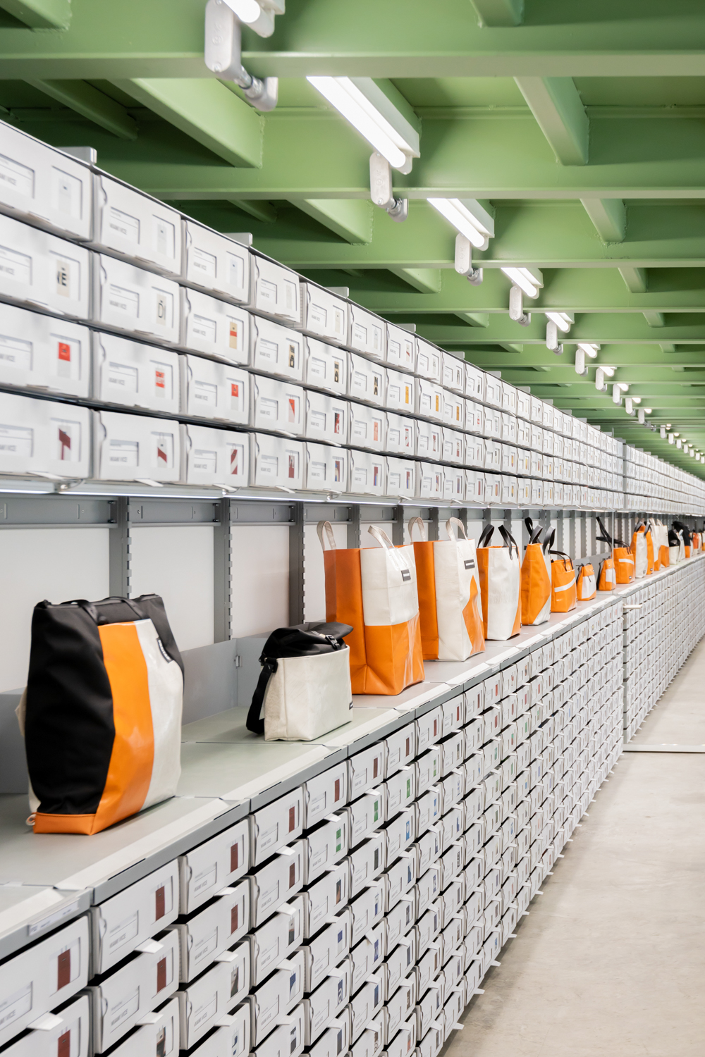
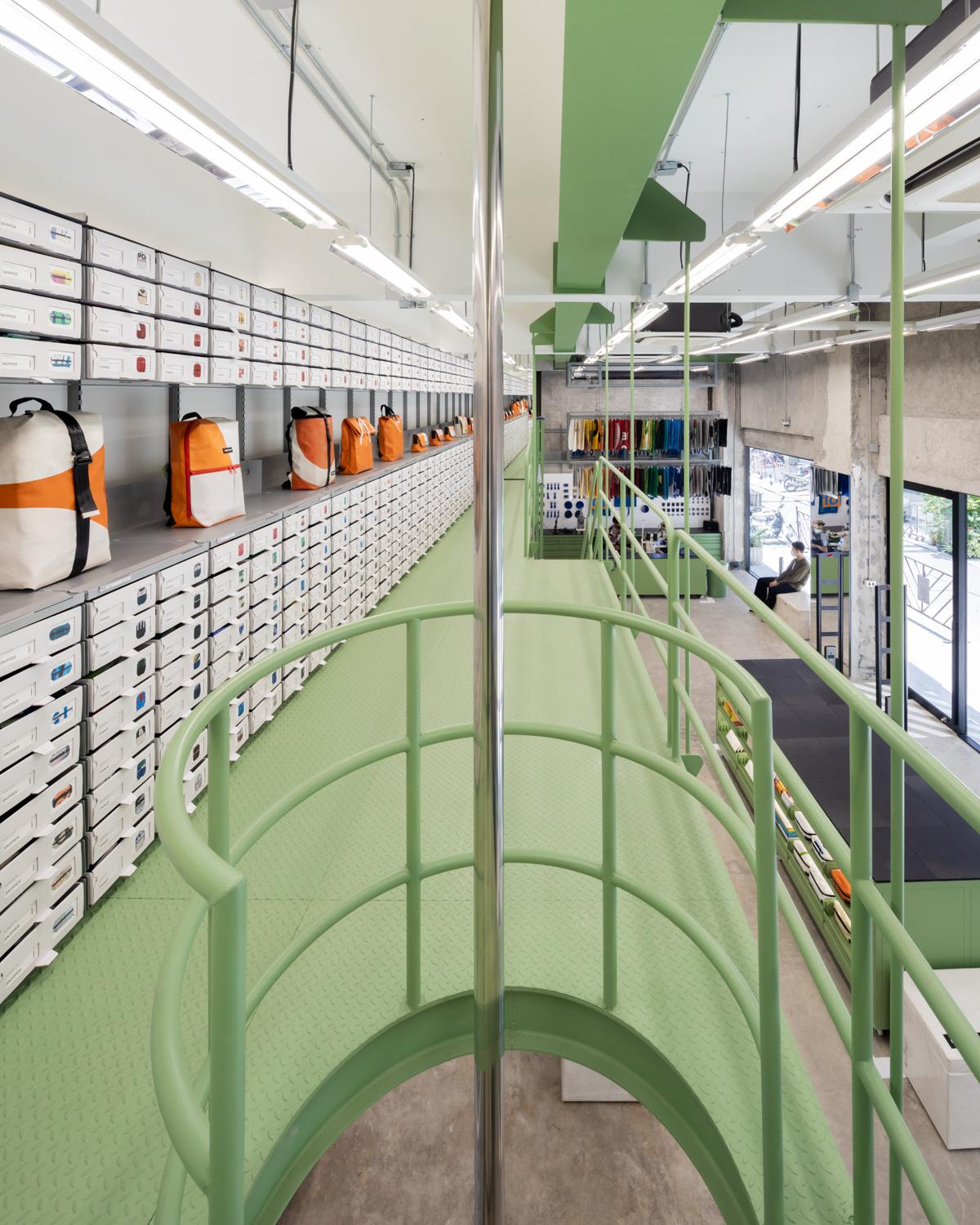
FREITAG’s Headquarters in Zurich, Switzerland aka the Logistics warehouse is considered to be the blueprint of the interior design of FREITAG shops scattered in cities worldwide. One of the most notable characteristics of the headquarters is its industrial space and the green table that serves as the shop’s centre stage, as well as the walls. The vertical walls are made up of cardboard drawers which store different models of the bags with information and pictures provided at the front for the FREITAG enthusiasts to browse through, in attempts to find the very item that resonates with their style and functional demands. Choosing a FREITAG bag is always a tough decision.
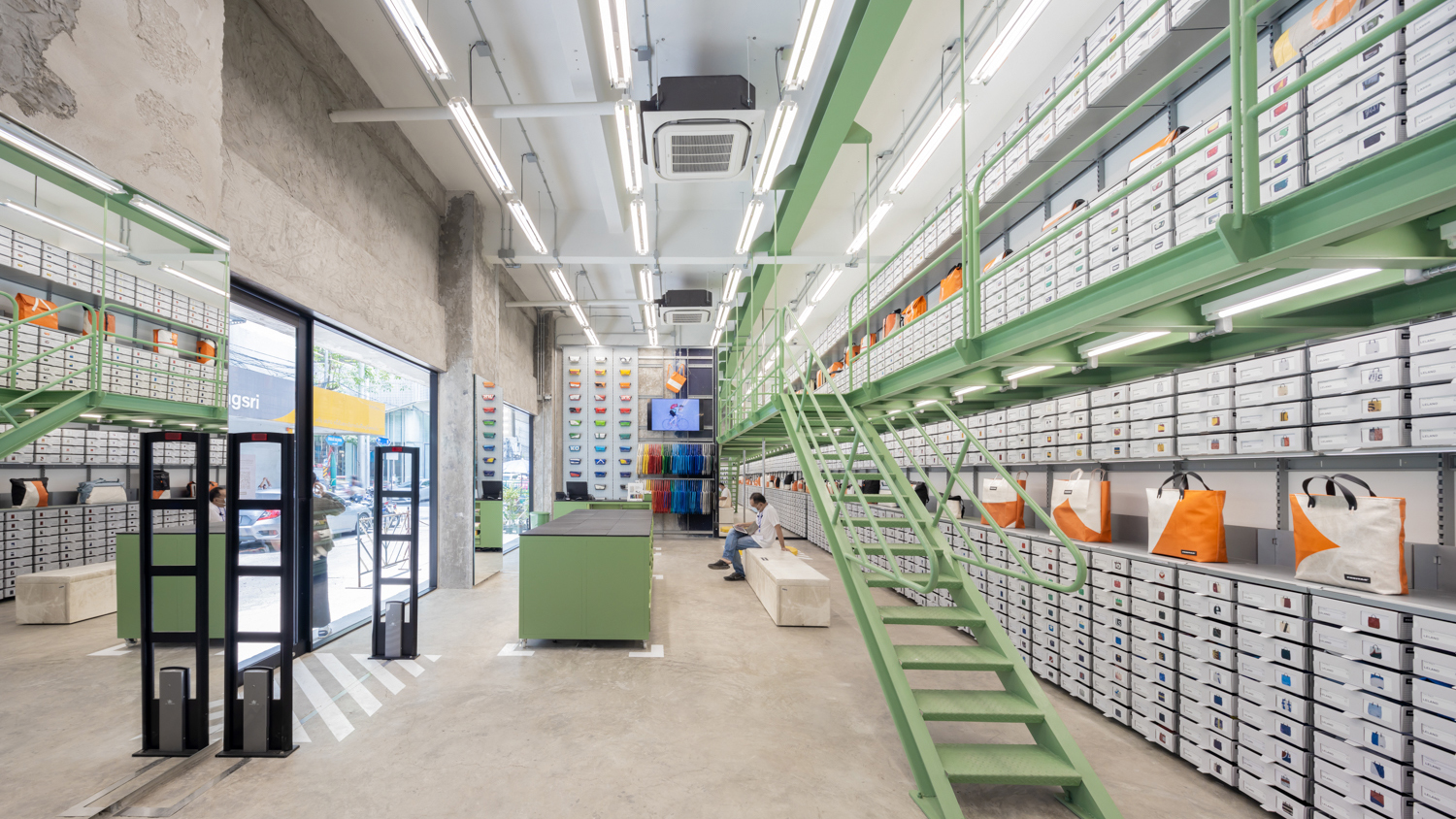
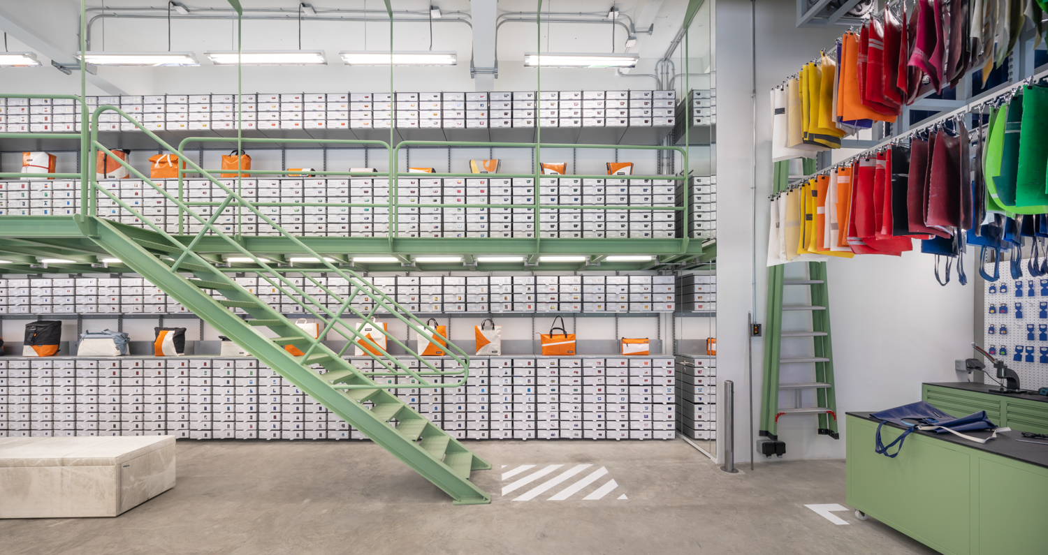
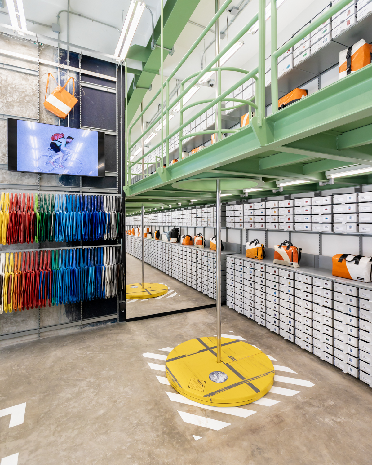
“The idea I had when I saw the site was quite simple. The space at Silom is quite small but the ceiling is quite high. We want people to see the signature white FREITAG wall that runs from floor to ceiling, towering on both the right and left side. Think of that scene in The Matrix when Keanu demands ‘guns, lots of guns’ and then these walls of guns appear out of nowhere. It isn’t all that extra because there are stores like the one in Basel where they designed the entire floor-to-ceiling display wall where customers have to climb a stair to see the displayed items. The initial idea we proposed was quite nerdy but very Supermachine-like, which is the balcony style stair with wheels that can move left and right using a joystick. But then there was a question about what if one client took a long, other customers would have to wait for what we wouldn’t know how long for. So we came up with the guided camera system that would allow people to browse the products on the upper drawers while they’re standing on the ground floor. It’s pretty nerdy. The Amsterdam store, which was about to open at the time, also has this type of crazy machine. But with the context of Thailand where there’s a lot of FREITAG buffs, our machine might sound like a funny idea but it wasn’t exactly practical. So we decided on adding the mezzanine, but we didn’t want it to be too big and block all the displayed bags so it ended up being like a structure that’s suspended from the ceiling. When the store first opened and I was browsing the products with Gunny (one of the members of the design team), we agreed that the mezzanine is the right decision because the FREITAG’s clientele take a long time to choose their perfect item. They tend to go from one item to another. Take me for example; I’m like that, too. I want everything.”
The fun part is that with each FREITAG store, there is always an attempt to create this local character whose core idea is developed from the aforementioned signature element. And that’s right up Supermachine’s alley.

Photo: Adisorn Ruangsiridecha
“When we add the mezzanine with a small staircase that can take people upstairs, Gunny proposed the idea of having a sliding pole considering the fact that the store is in Silom, which is kind of the capital of pole dancing in Thailand. The headquarters loved the idea. So we develop the design of this stainless steel pole to have a crash pad. We contacted the people who make gymnastic pads and then we covered it with a tarp they had at the factory. All these little details and processes are what every designer dreams of doing. The sign follows quite a similar story. There’s a team in Switzerland that made the sign from upcycled old aluminum frames. You can see that there is effort in the collaboration.”
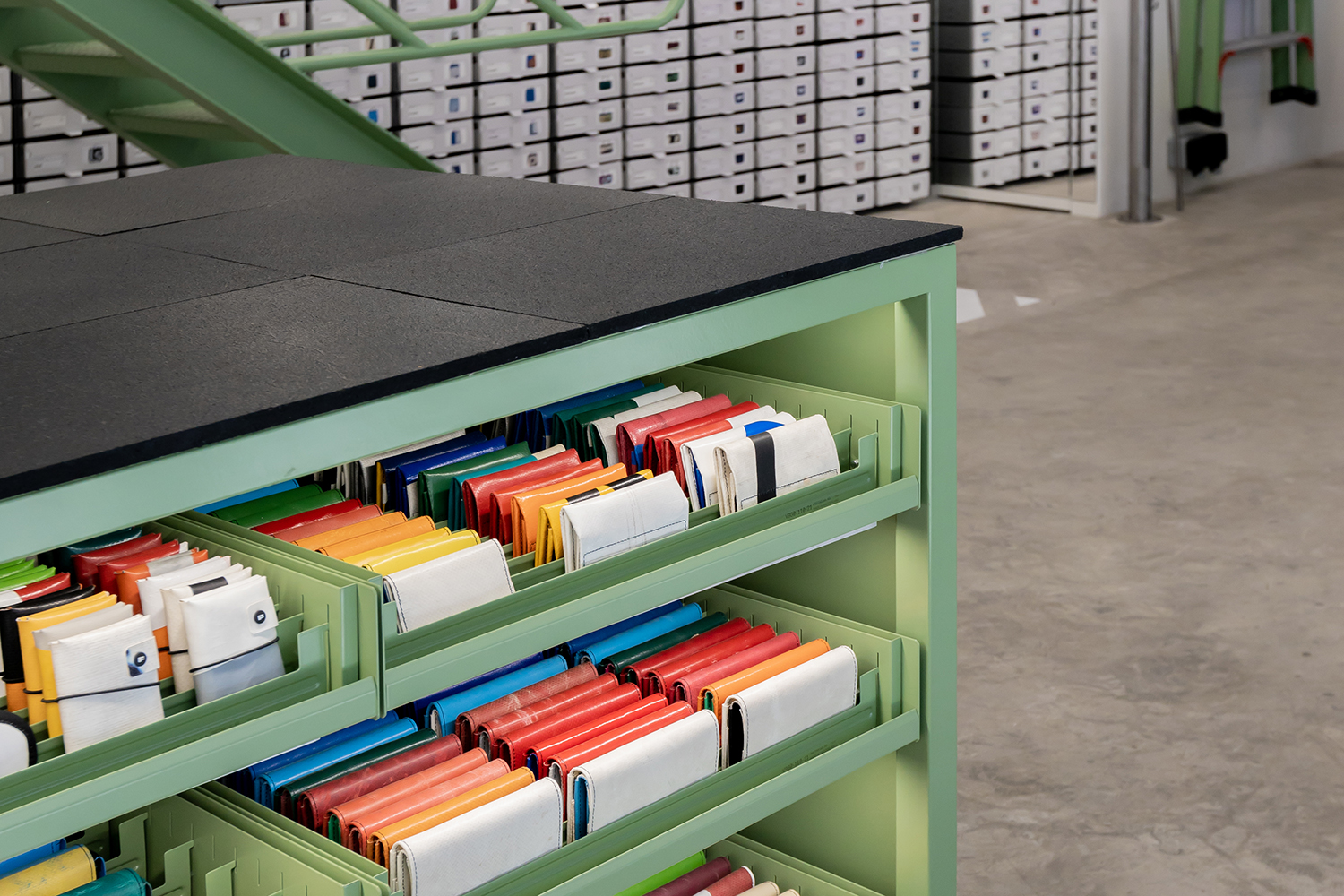
“As for us, it took a while for us to find the countertop. The thing is, all the main display systems of F-store are designed and manufactured in Switzerland, the railings, drawers, product packages, lighting, etc. It’s very systematic. We finalized the design and the headquarters broke it down into details, manufactured the entire thing and shipped it here to be installed. But we needed to take care of the large piece which was the countertop. We had Tlejourn help us with this one. He was already experimenting on rubber scraps and he used to create this floor tile made of crushed old truck tires. We discussed the idea with the headquarters and they loved it because the idea really matches the “From trucks to bags” concept of their products.”
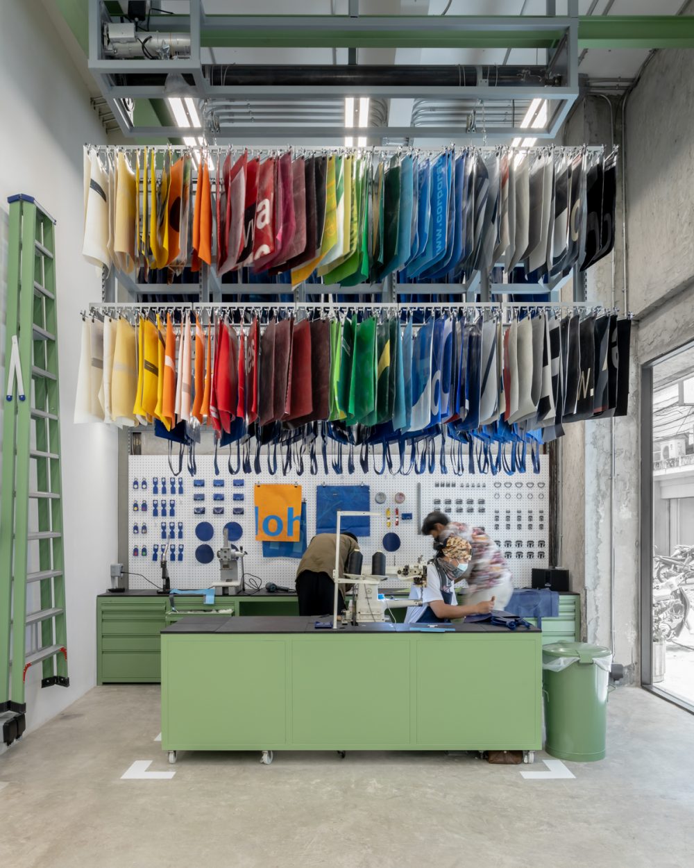
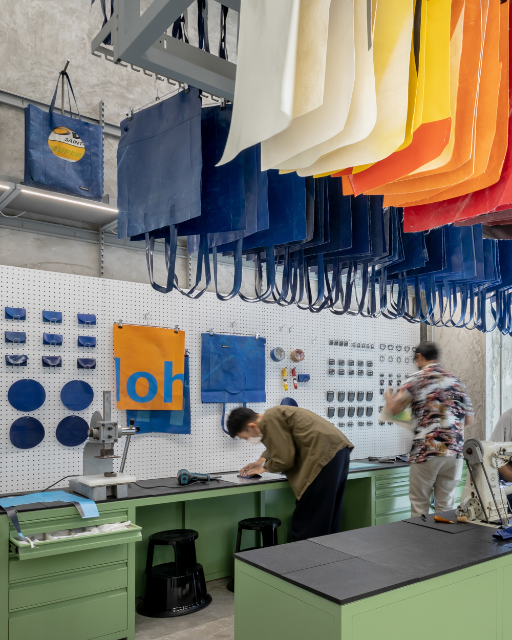
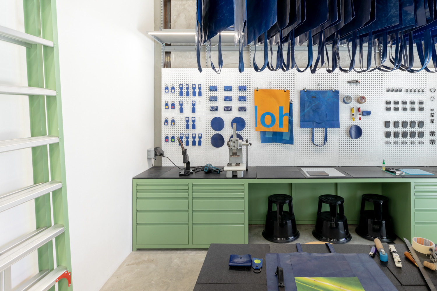
It’s a small store but the story Chaowakul shared with us was a long one and he told it with such excitement and enthusiasm. The last part called Sweat Yourself is one of FREITAG’s highly successful concepts—the DIY section where customers can help make their own bag. And there’s only a limited number of Sweat Yourself sections worldwide.
“The fact that the space is small, we had to design the material display system with pulleys where you can pull them down and release them back up. When you press it, the display shelf descends and when it’s pulled up, it’s stored in this pod. It’s a very simple mechanism and we used the motor that is used with a regular roller door. It’s funny, I think, how Supermachine’s primitive machine seems to go well with FREITAG’s pragmatism.”
The post-industrial warehouse concept that Corsin Zarn lays out for every FREITAG store worldwide has been interpreted and ramified into endless creativity for the world’s most famous recycled bag brand. For Thailand’s Silom shop, Supermachine Studio delivers a smooth result that seems to satisfy both the brand and the prospective customers. At the moment, a prior appointment is needed if you’re going to visit the shop. But there’s no need to rush. It won’t be long until the normal opening hours and protocols are back. People will be pouring in, that’s one thing we’re certain about. Like Chaowakul said, “the FREITAG fans take time choosing what’s right for them.”
supermachine.wordpress.com
facebook.com/Supermachine-studio
facebook.com/freitagbyprontobkk

 Photo: Adisorn Ruangsiridecha