 Photo: Foto_momo
 WEE VIRAPORN INTRODUCES A ‘FONT REVIVAL’, A PROCESS AIMED TO PRESERVE A CULTURAL AND HISTORICAL VALUE OF FONTS
TEXT: WEE VIRAPORN
PHOTO CREDIT AS NOTED
(For Thai, press here)
What are the signs that you have arrived at your destination when you travel to a country or city? We might be greeted by an advertising sign produced by a local tourism authority that features a slew of landmarks and symbols representing the locality. Perhaps we can tell by the way people look or dress in comparison to where we came from. There’s also the language; a greeting in a dialect we don’t understand or are unfamiliar with. Then we’ll be bombarded with more signs promoting products and services, all the way to information made by local governments, businesses, and individuals in all types of public settings.
I recently discovered a project by the Road Research Society, a non-profit organization in Hong Kong, that works to revive the typefaces on old traffic signs that were made by detained inmates. The team collects images of the signs and redraws them into a digital file before assembling everything together using Glyphs (one of the font design softwares widely used among professional font designers). The project’s purpose is to preserve the original characteristics of the fonts, which were an important component of Hong Kong’s image and identity. The font, dubbed ‘Prison Gothic,’ pays tribute to the convicts who created the original design.
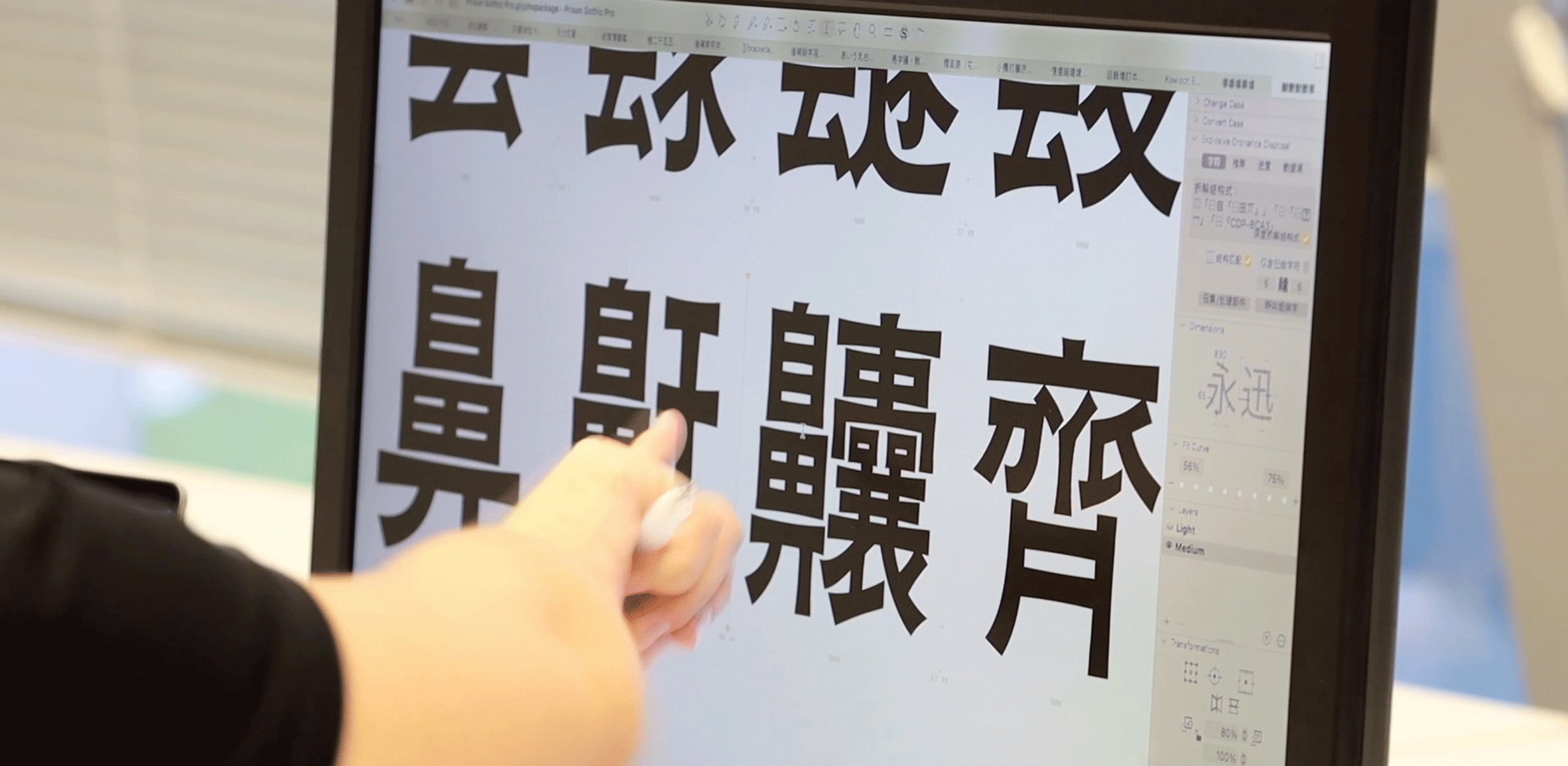
Photo courtesy of Road Research Society
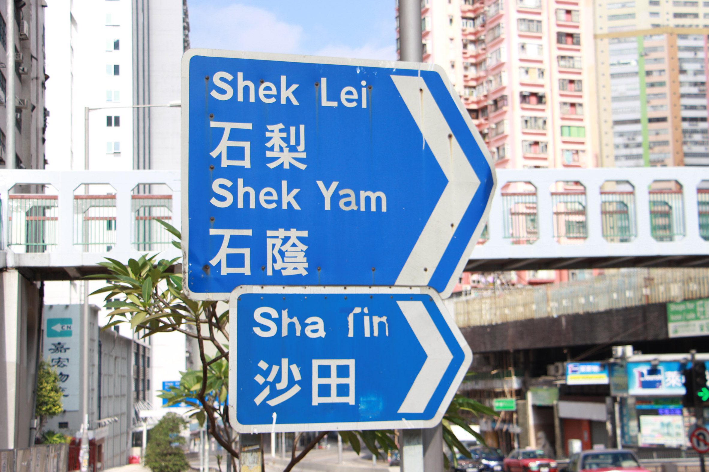
Photo courtesy of Road Research Society
The font ‘revival’ is quite common in the Western design industry. Many of the typefaces we know and use on computers today are centuries old and have been revived and evolved to meet the changing needs of the media and consumers. That’s why we’ve heard designers talk about finding inspirations from the past in a variety of ways, from poring over old books to visiting cemeteries to examine letters on headstone epitaphs.
‘Johnston’ is one of the fonts that has survived the test of time. Originally designed for use with London’s transportation system, the font has been revived, modified, and reinterpreted by a number of designers and developers over the course of a century, making the Johnston font an essential component of the city’s image and identity.
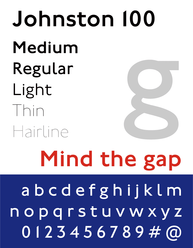
Photo courtesy of Wikipedia
The importance of font design has expanded, particularly in brand building. In today’s materialistic world of visual communication, a typeface is one of the factors that allows consumers to recognize a brand’s personality or even its vibe without having to see its logo, corporate colors, or ambassador.
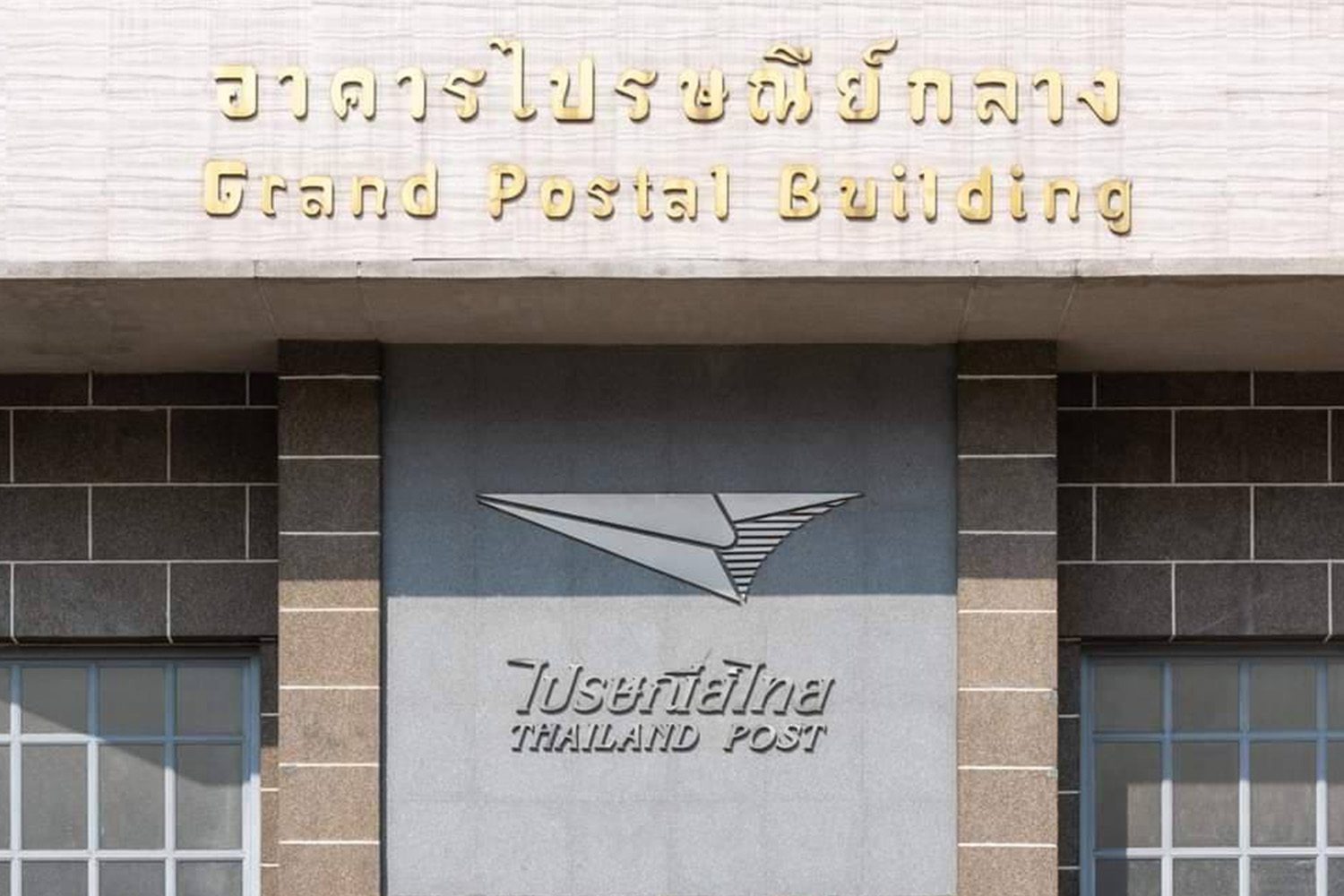
In Thailand, interest in typography is still largely restricted to specific industries or groups. Many terrible misplacements have occurred due to a lack of public understanding of the historical significance of fonts and how they carry certain ties with eras in the country’s history. One example is Central Post Office Building, whose Art Deco architecture built during the People’s Party’s administration is a complete mismatch with the FahtalaiJone font on the sign. The font was actually produced in 2000 for a film of the same name. The aesthetic characteristic prominent in artwork and poster design during an era in Thai cinema has nothing to do with architecture. Not to mention that the font has been overused in activities such as vintage walking streets that became ubiquitous in Thailand between 1997 and 2007.
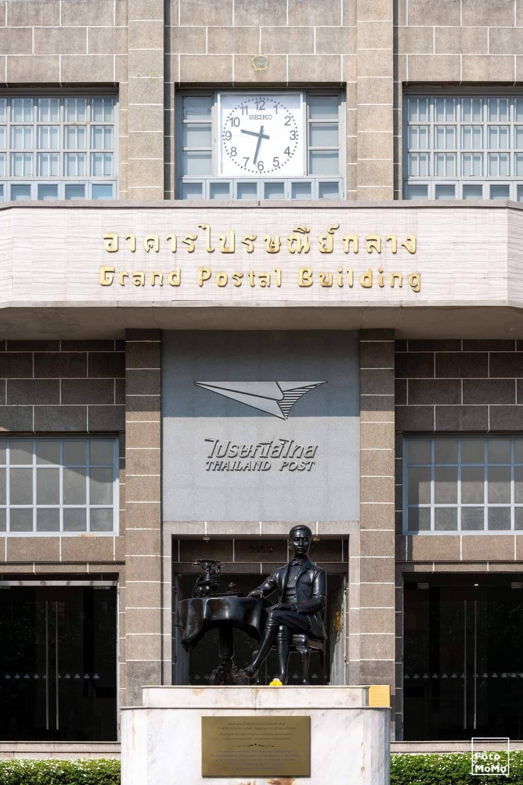
Photo: Foto_momo


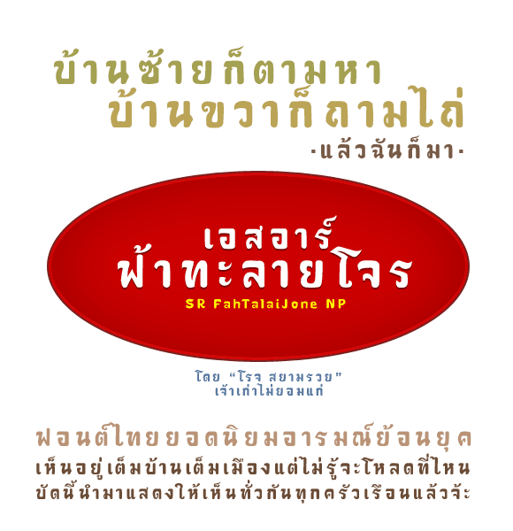
Photo courtesy of Pairoj Teeraprapra
Perhaps a good font is similar to the air. We breathe it in without realizing its presence. The body of knowledge around Thailand’s font design industry, particularly the classification, has not seen any substantial theoretical conclusion in the twenty years since Pracha Suweeranon’s ’10 Fonts and 10 Eras of Thai Society.’ A large number of fonts, along with architecture and places, were destroyed before they could be digitized.
However, there have been a handful of Thai fonts over the years. Ziam Type is a group of designers that have consistently revived old Thai fonts they come across at various times and places. By going through their portfolio on Behance, one can find the revival of old fonts used on bridges, monuments and building signs. Puan and Seri, the typeface developed from the unique artistic style of P. Suwannasingha, the brilliant painter who created many distinctive works in Thailand’s Lampang province, is one of their most notable works.


There are also brands that are adamant about creating a new identity while retaining their previous image, such as Lido Connect, which uses the letters from the sign of Lido Cineplex as the logo. Rajadamnern Stadium is also an attempt to polish and deconstruct the art deco font written in Thai on the original sign into the beautiful English logotype. While the original intentions of these brands are preserved, the revived fonts serve as a crucial component of a visually appealing corporate identity that is in sync with the organizations’ new business ventures.
Video courtesy of Farm Group
Many early digital Thai fonts from the 1980s and 1990s were formerly stranded in this in-between period when computer operating systems were transitioning to unicode, rendering the old fonts unusable. While the typefaces had not received any further development, owing in part to the fact that the original producers were no longer in business, some were picked up by DB Fonts and improved into the MN font family, making them compatible with contemporary operating systems.
The Thai state’s bureaucratic and educational systems are notorious for their conservatism. What we hope for is that the ‘conserve’ part of the word will extend beyond the conservation of tangible ancient sites and artefacts. If Thai people pride themselves in having our own language and alphabets, we as a community should recognize the cultural values of fonts and make an effort to maintain and preserve these old sets of letters in order for them to survive and live through innumerable technological transitions in the long future to come.