LAWS AND REGULATIONS WOULD BE THE STRONGEST LIMITATION FOR ARCHITECTS, BUT THE DESIGN UNDER THE LIMITATION DOES NOT HAVE TO BE BORING. THIS SQUARE-SHAPED HOUSE DESIGNED BY PHTAA LIVING DESIGN MANAGES TO SHOW OFF THE OWNER’S IDENTITY
TEXT: KITA THAPANAPHANNITIKUL
PHOTO: KUKKONG THIRATHOMRONGKIAT
(For Thai, press here)
House R3 came with several challenging requirements, ranging from the small land on which it’s located, pollution concerns from Rama 3 Road, building laws and regulations regarding setback range, and the need to allocate functional spaces for five inhabitants to have their own private areas. Additionally, the design had to include a designated area for the owner’s furniture collection. But for PHTAA Living Design, such limitations were considered a challenge as they devised a design that effectively balanced the limitations imposed by the constraints and demands of users. A project of such nature made us wonder how a house with this many restrictions and limitations that appeared to hinder substantial development could effectively convey its true character.
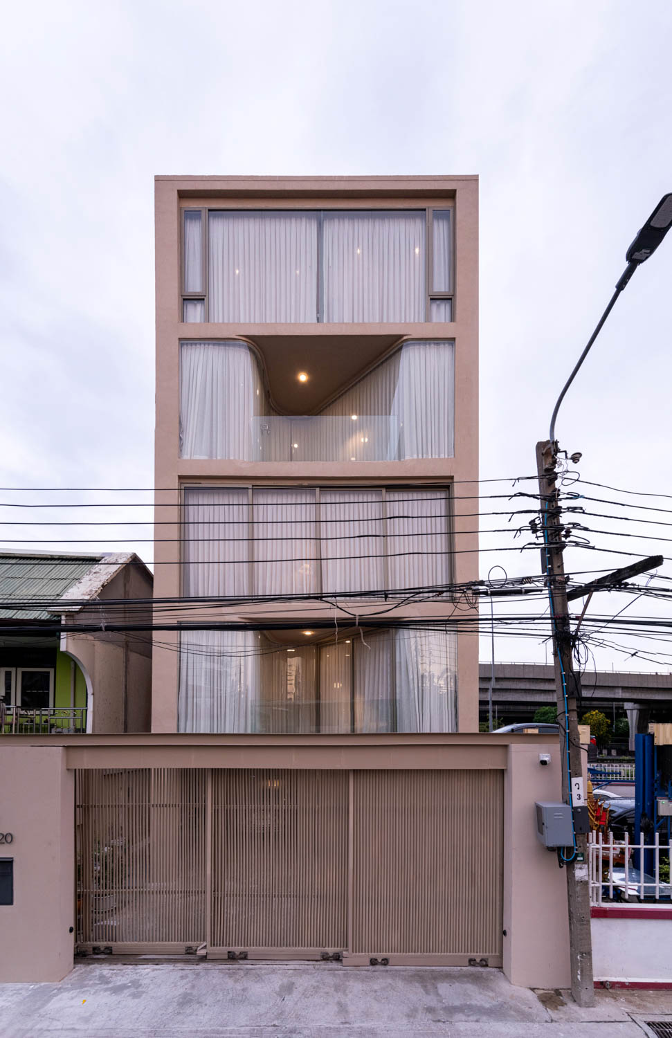
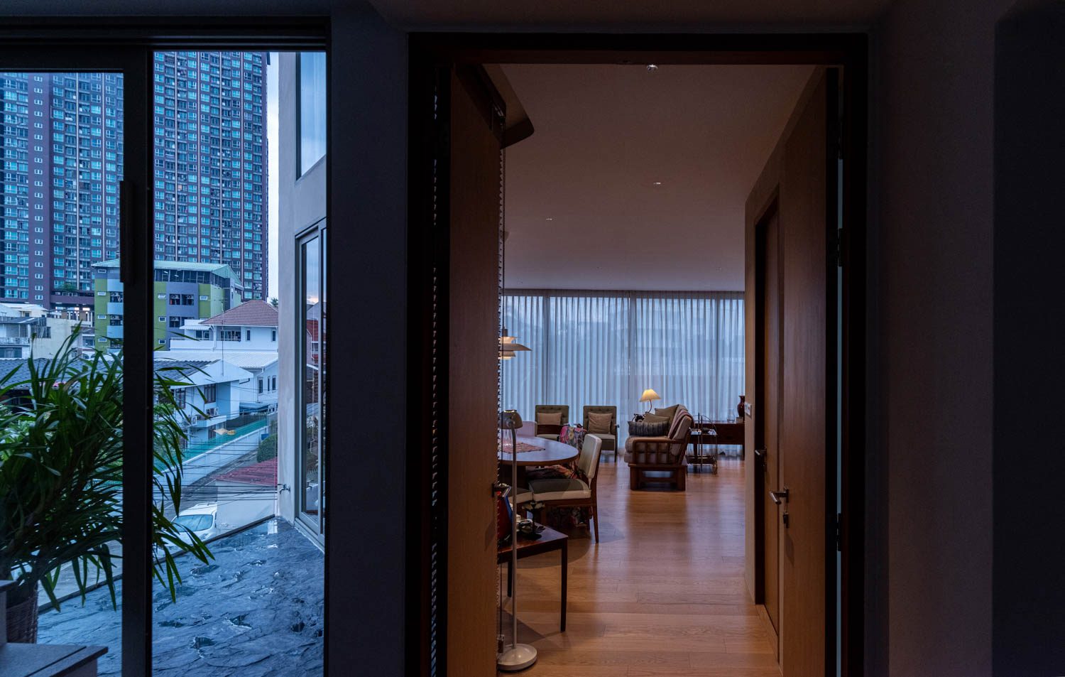
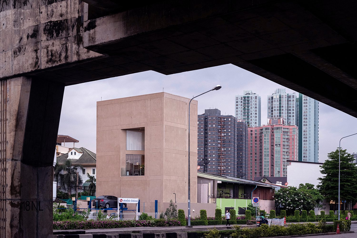
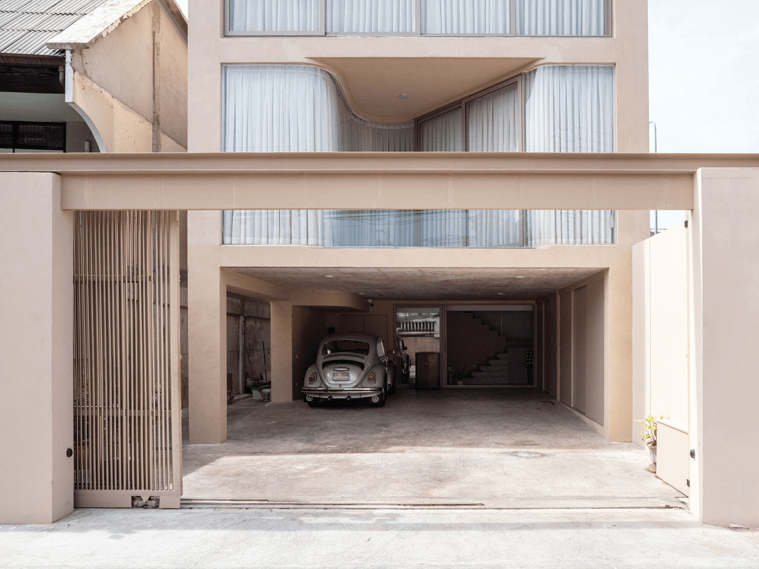
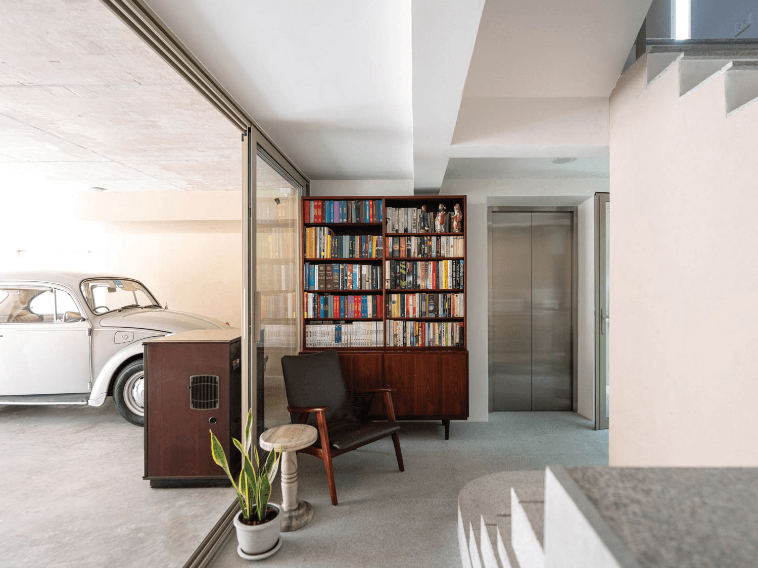
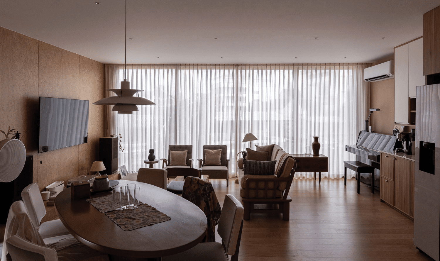
House R3, in its overall appearance, exhibits the characteristics of an enclosed, box-shaped shophouse structure that is commonly found throughout Bangkok. The design of aligned stacked floors enables each level to efficiently use functional space without the need to give up any usable area for setbacks or openings. The functional program begins on the ground floor, which accommodates a parking area for three vehicles and a kitchen facility. The communal living room is situated on the third floor, while the personal living spaces of the five inhabitants are located on the second, fourth, and fifth floors.
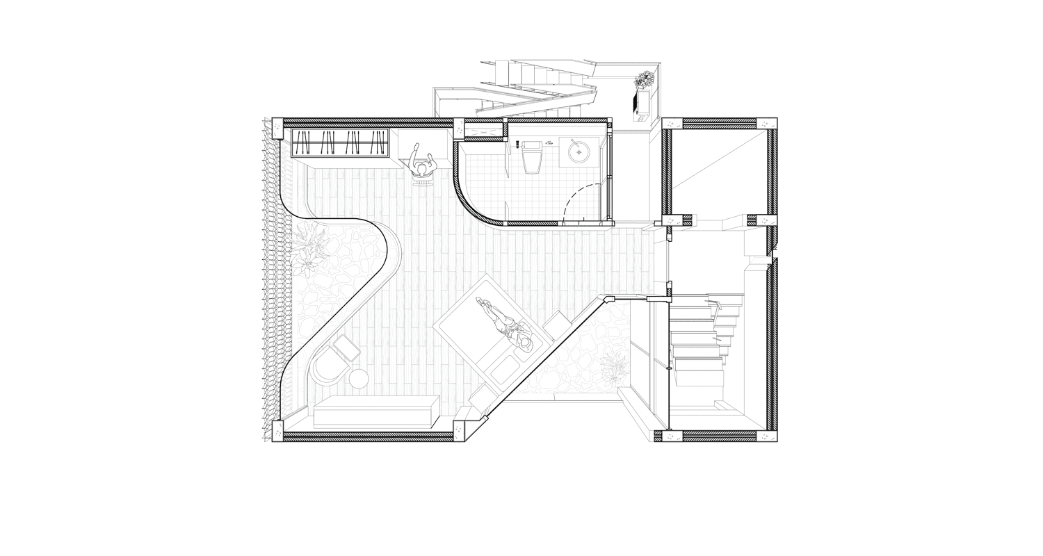
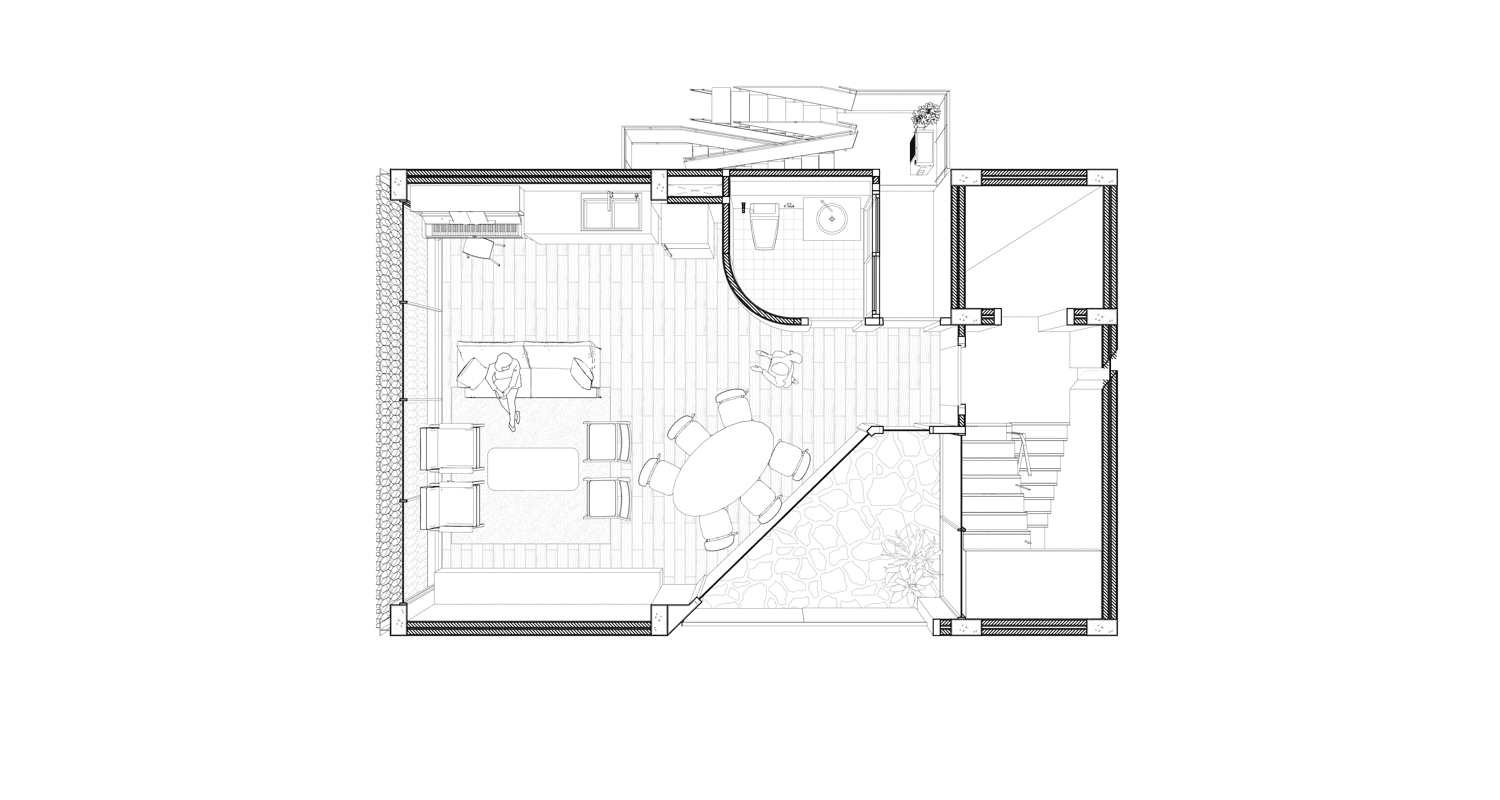
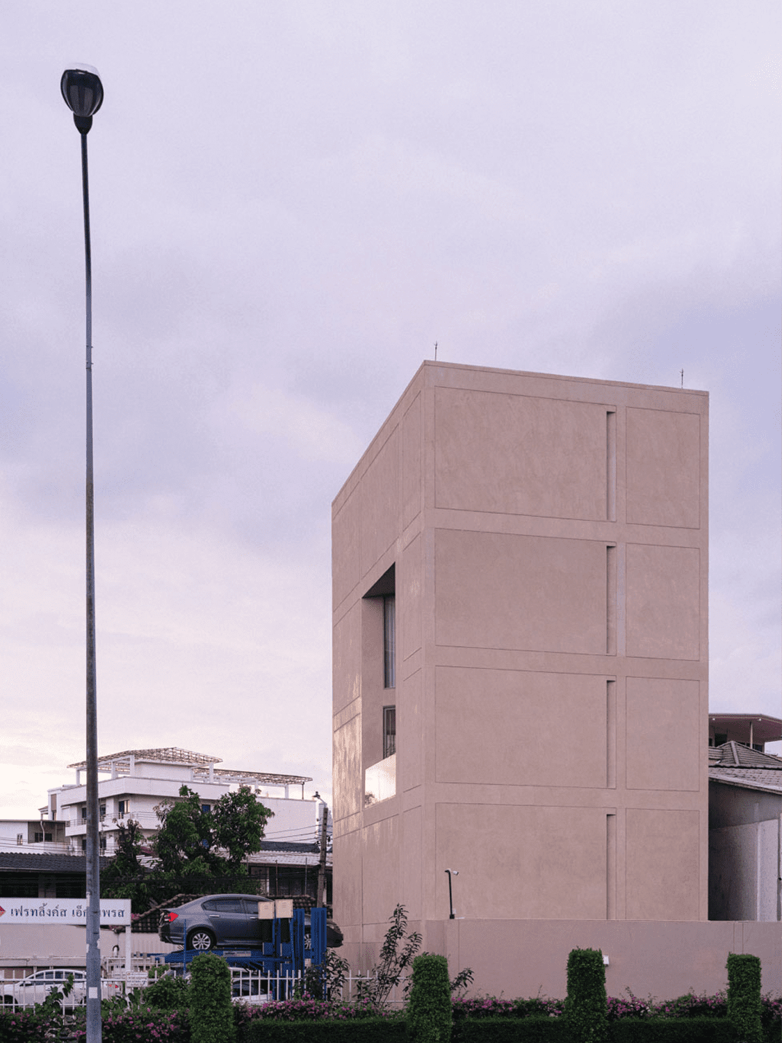
Upon my initial observation of House R3, I was immediately drawn to the terrace, which is a double space with a unique triangular shape that is seamlessly nestled within the solid and enclosed rectangular mass of one side of the building’s elevation. The terrace was designed with the intention of creating a functional interior area while maximizing the usable space without any effects from the legally required setbacks. Within the triangular void, openings are built along a diagonal axis, effectively providing natural light and ventilation for both floors. This design feature works in conjunction with the core located at the rear of the building, enhancing the transfer of heat and air cooling within the interior through stack ventilation.
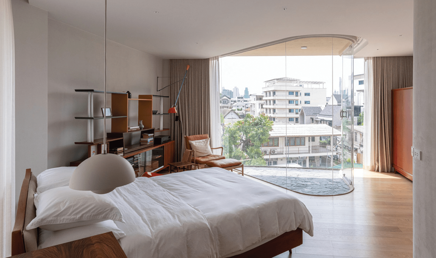
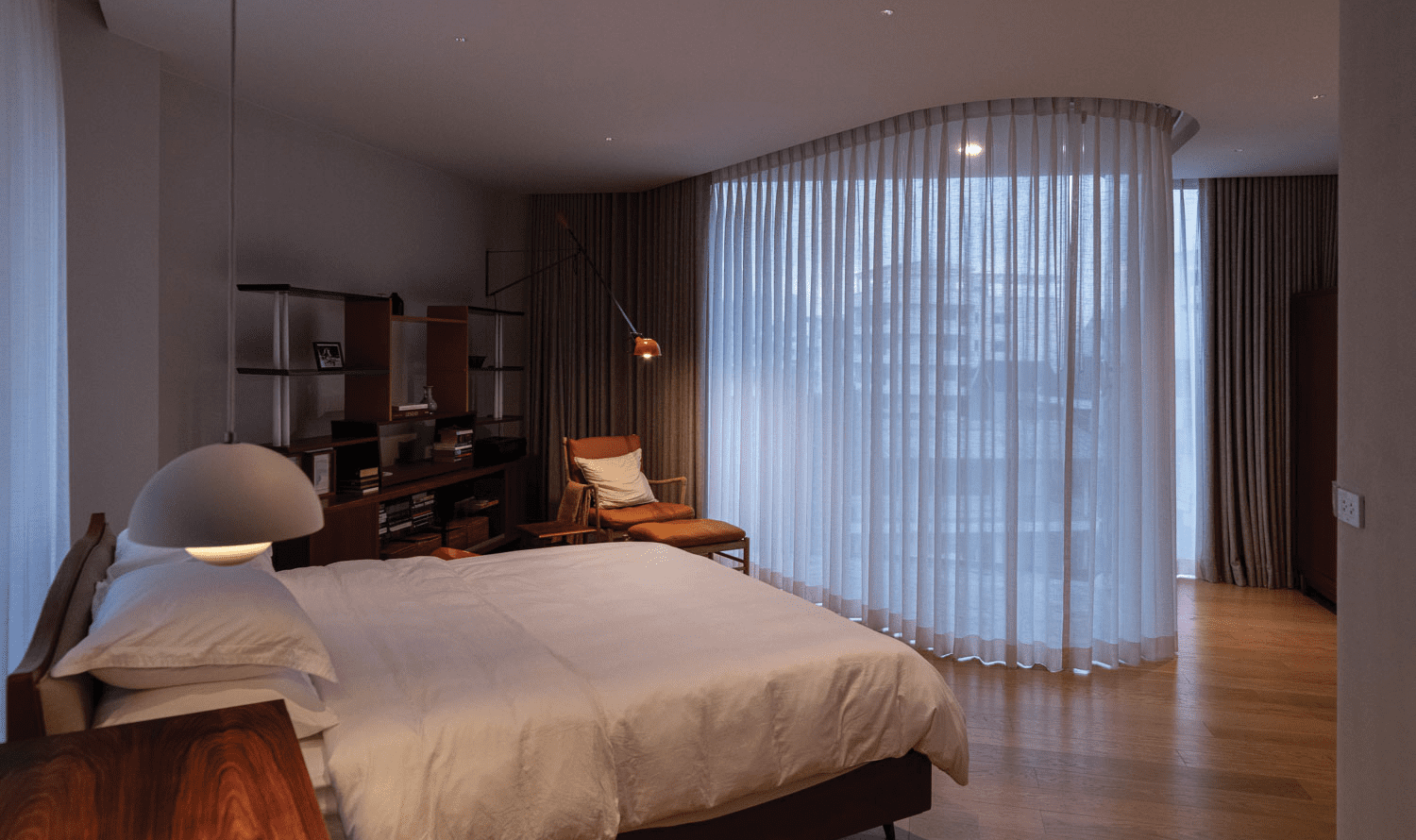
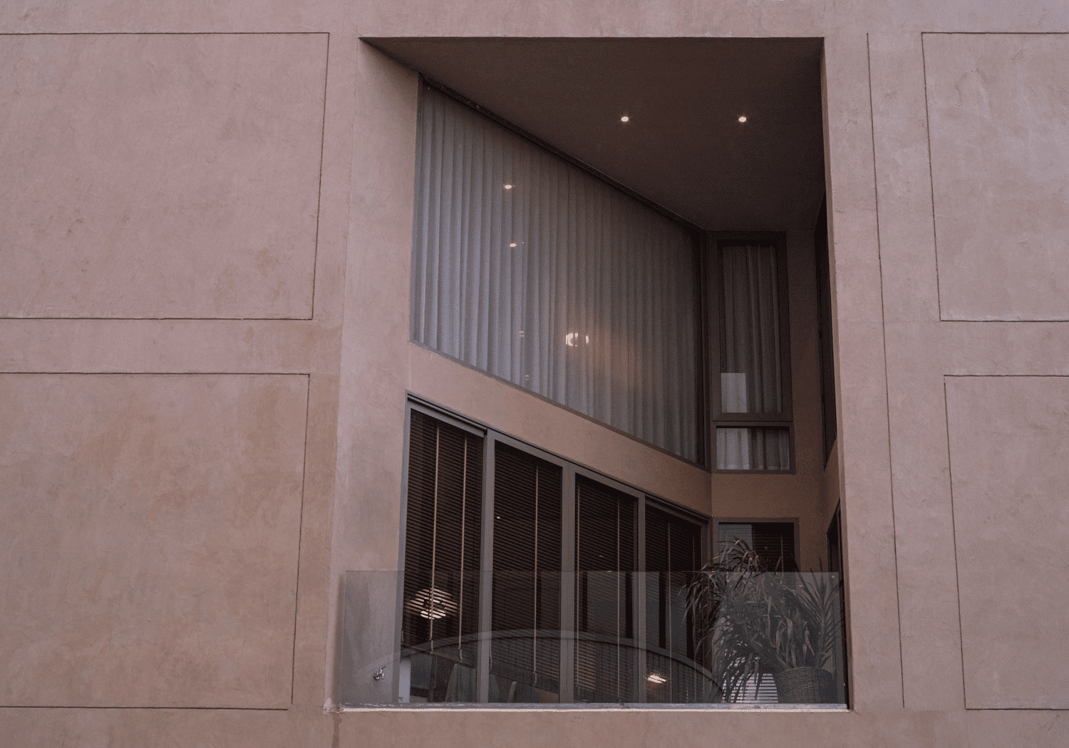 The triangular-shaped double-volume terrace has been integrated into the front façade. The sliding doors on the second and fifth floors are parallel to the building, whereas the curtain walls on the second and fourth floors are recessed into the structure, consequently creating two more double-space triangular voids, which bear a resemblance to the void on one of the sides of the building. The sole distinction lies in the recessed curtain walls, which feature curved lines that serve to soften any sharp corners that could occur within the interior functional spaces.
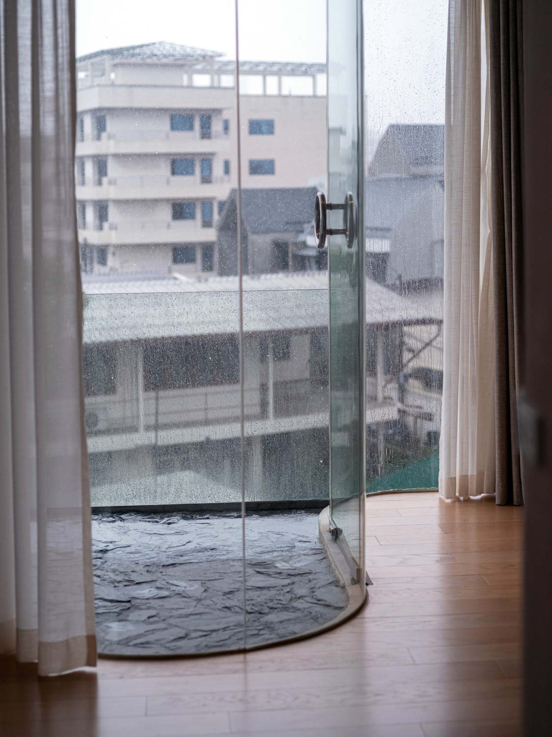
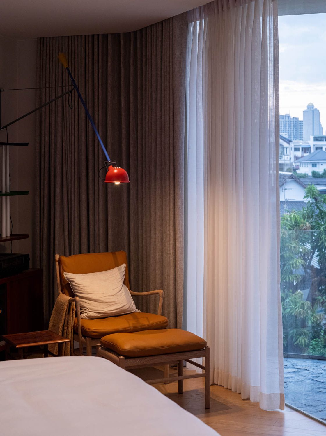
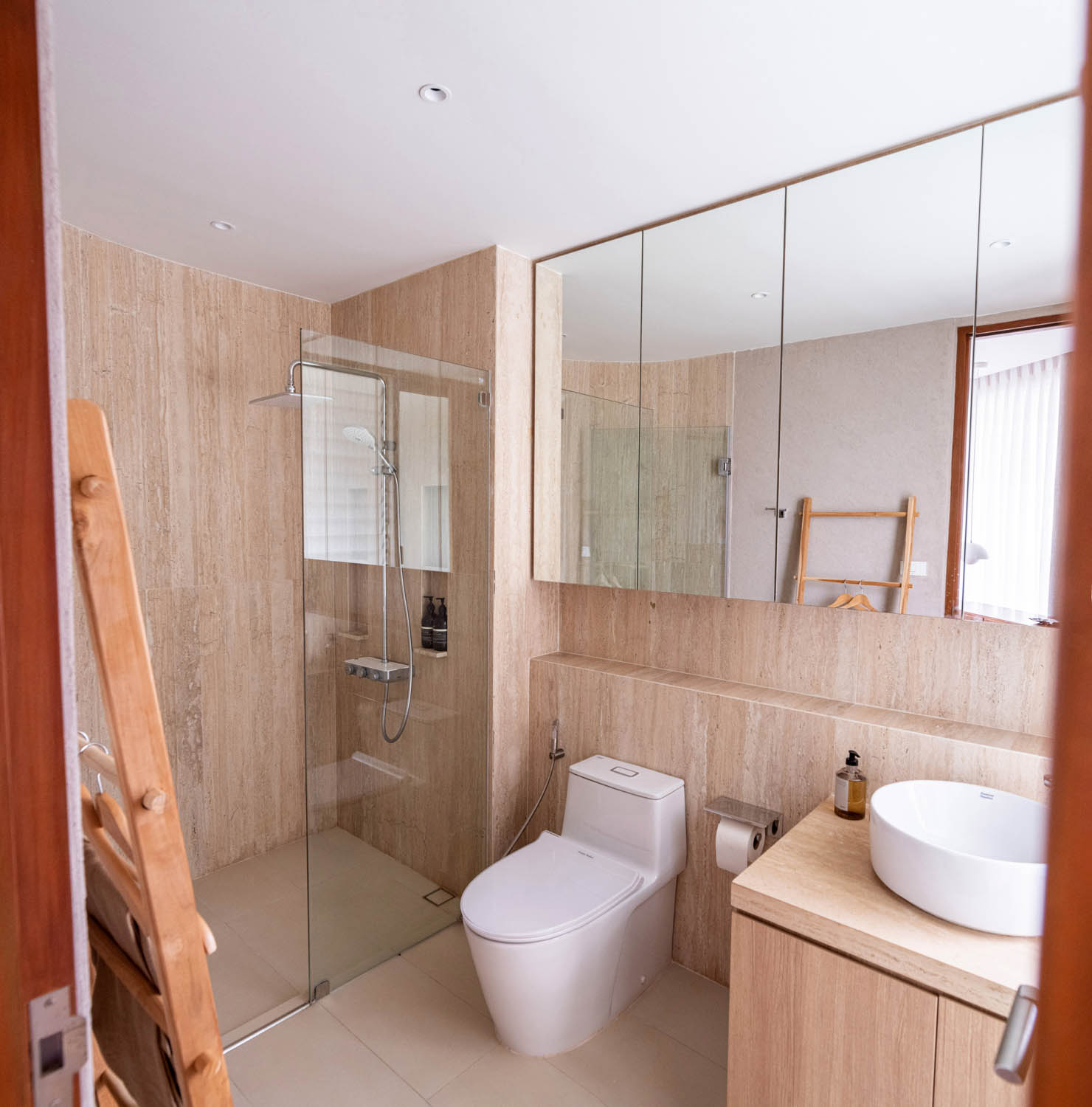
The spacious terrace and the curved curtain walls at the front of the building, which is essentially a simple rectangular shape, turn the house into a structure with interesting elements of design. But a challenge emerged in determining a layout that would effectively accommodate the actual uses. The furniture placement was therefore carefully thought out to fit the various corners caused by the aforementioned openings and voids. It involved strategically positioning the furniture to be consistent with the interior walls, particularly in areas with multiple corners. For instance, beds and chairs were placed diagonally to optimize the use of space. The presence of curved walls in the bathroom can be attributed to the architect’s deliberate efforts to optimize functionality and enhance the user experience by incorporating elements of interior design.
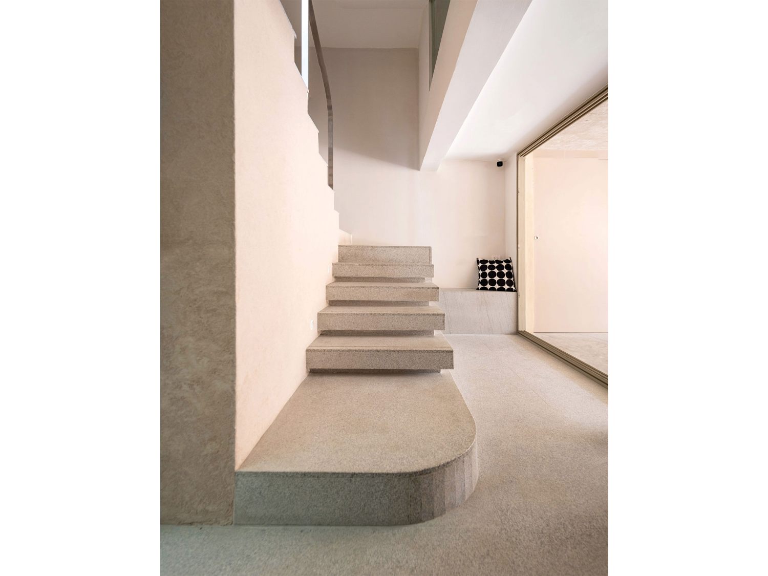
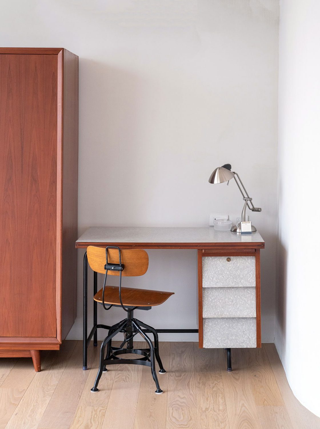
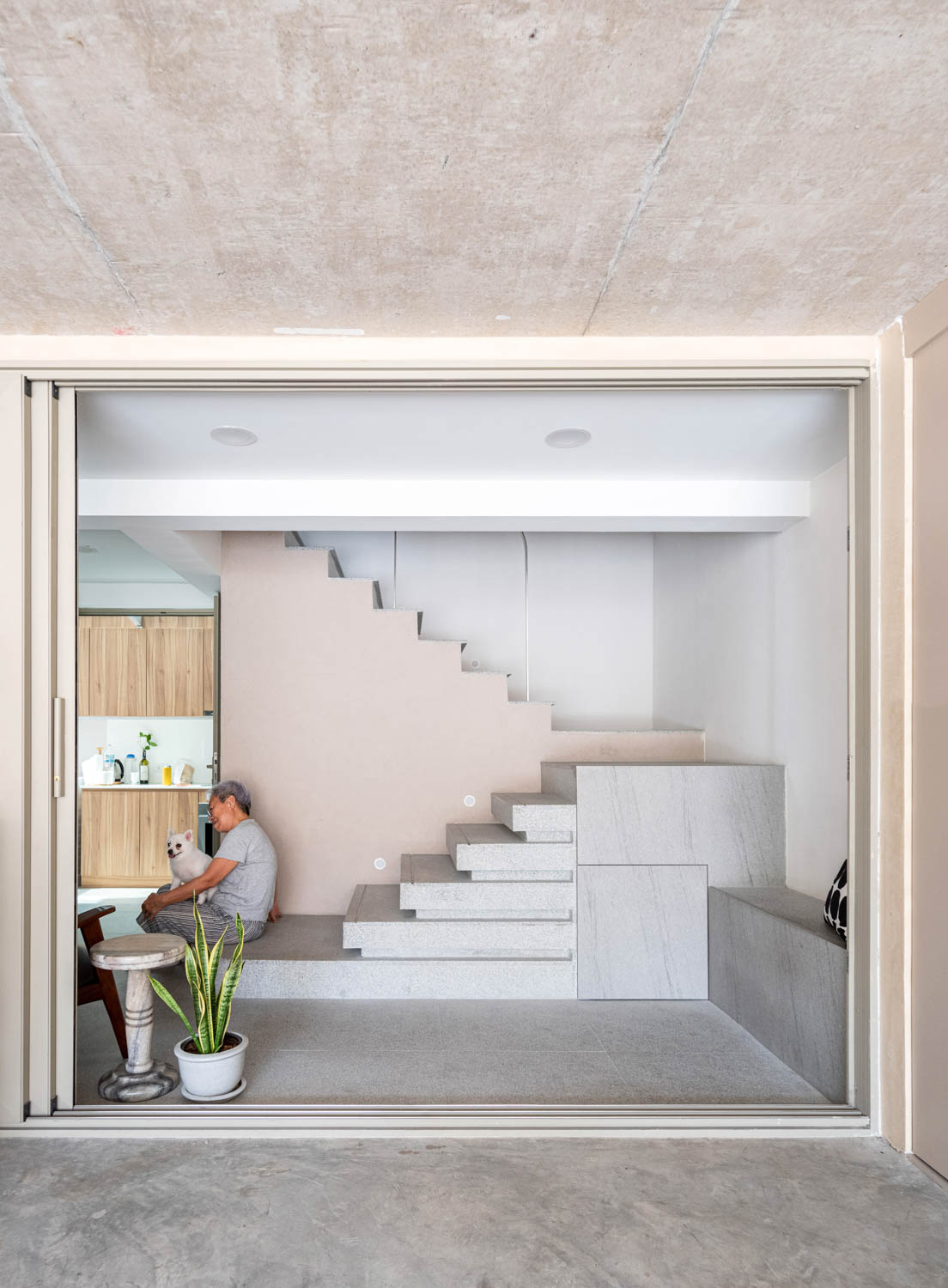
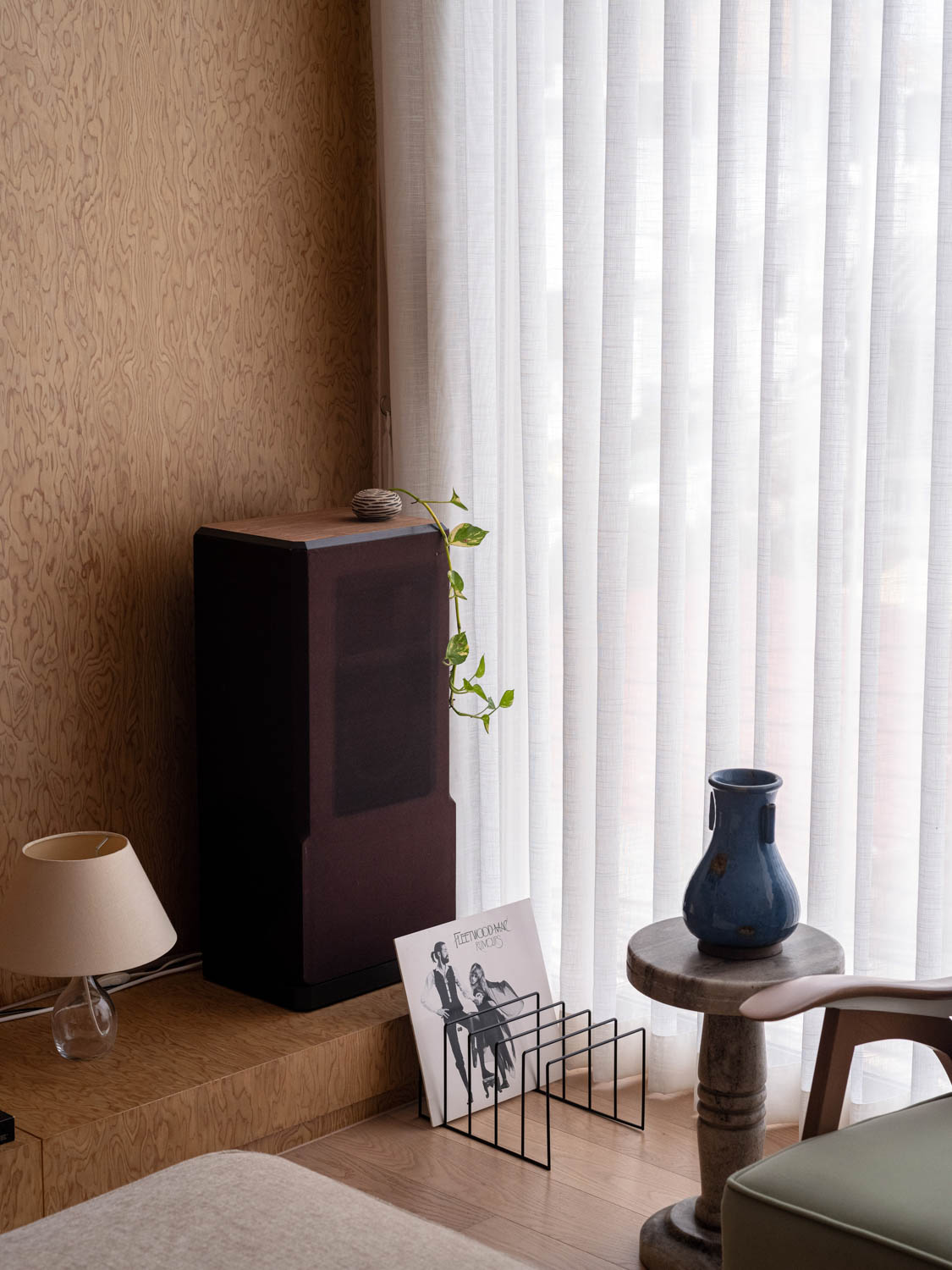
The numerous pieces of mid-century furniture that the owner has diligently collected over the years give House R3 its own distinctive character in addition to its impressive architecture and interior spaces. The arrangement of the furniture was taken into consideration in the initial stages of the design process. The owner meticulously measures the dimensions of each piece of furniture for the design team to seamlessly incorporate them into other components, including the built-in elements, in the most effective manner. As a result, the overall layout is filled with earthy elements, from the granite and wood to the plaster walls painted in a natural-looking cream color. Everything present in the environment serves as an ideal setting for the carefully curated vintage furniture, allowing the owner’s personality to be expressed as an integral part of the overall ambiance of the house. In addition to the interior spaces, the personal tastes and characteristics of the inhabitants are also reflected in the light brown exterior walls of the building.
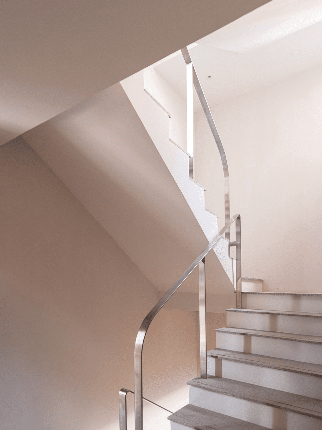
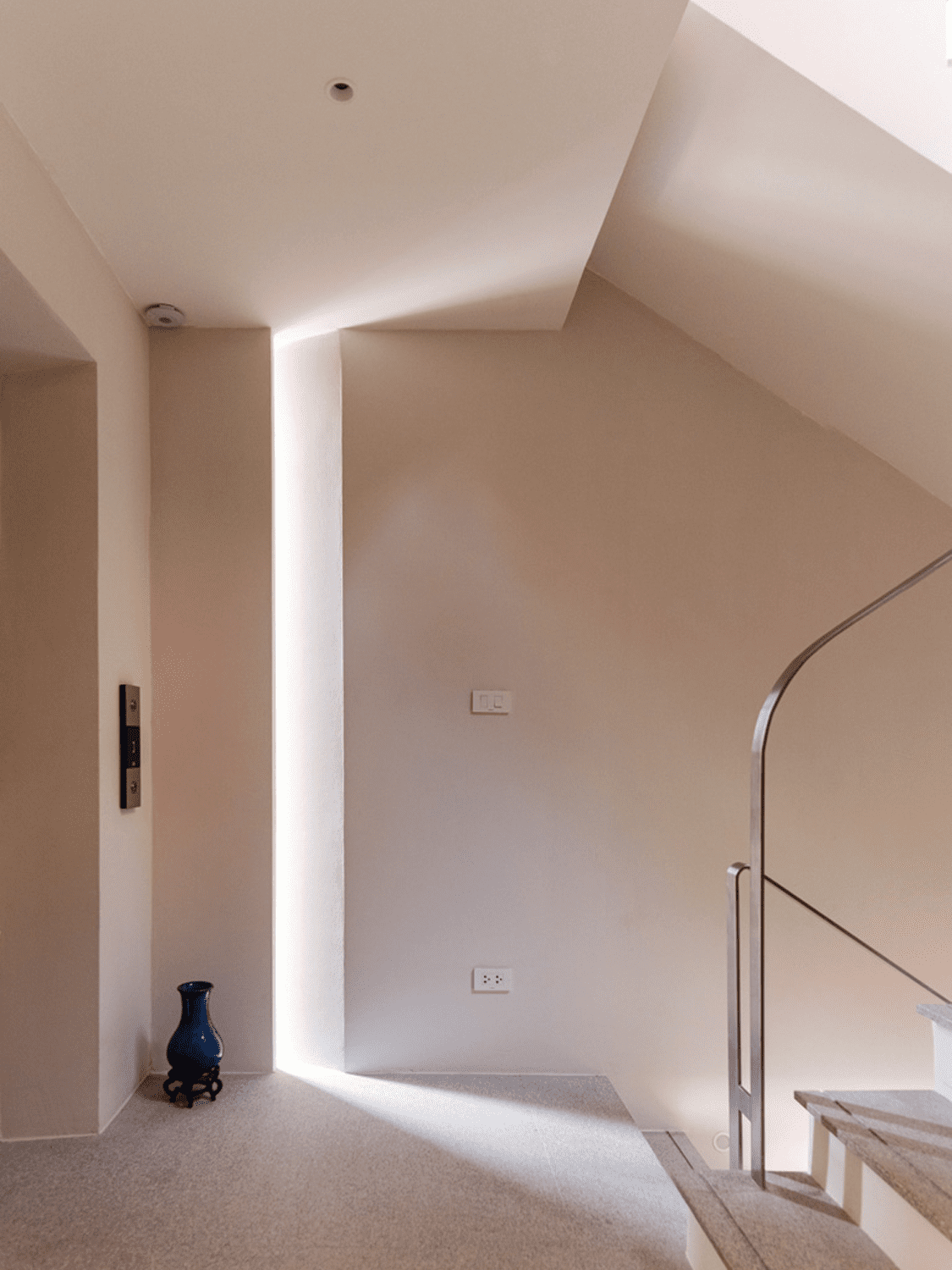
 The architect made the decision to utilize flat slabs for the structure. The slabs, which consist of reinforced concrete and are directly supported by concrete columns without the inclusion of beams, were used with the intention of maintaining clean and open interior spaces. The core, consisting of a stairwell and elevator, is positioned towards the rear in order to facilitate the allocation of the remaining functional areas. The core also serves the purpose of mitigating the vibration and noise pollution originating from Rama 3 Road, which is situated at the back of the house. Additional details include the intentional creation of grooves between the beams and exterior walls, which are meant to minimize cracks. Interestingly, these grooves ultimately become the primary lines that define each side of the building’s elevation.
The functional space of House R3, spanning 800 square meters, exemplifies the development of architectural design that PHTAA Living Design has beautifully crafted despite several limitations in a simple yet highly effective way. The transformation begins with the rectangular box-shaped building, evolving into a structure featuring terraces with ample spaces, which derives from an intention to minimize the loss of functional space caused by setbacks, then to the façade design with complementary elements. Meanwhile, the interior layouts of the rooms are thoughtfully designed to correspond with the geometric-shaped spaces of the floors. These methods can be applied to the designs of other urban homes, extending beyond the confines of this particular parcel of land. This design may birth many more generic, mass-produced houses in the future. But what sets one house apart from others is the unique personality and character of its inhabitants. In the case of House R3, this distinctive character is conveyed by the presence of mid-century furniture placed throughout the different corners of the living spaces, transforming the modest dwelling into a truly exceptional space despite being created within numerous constraints.
