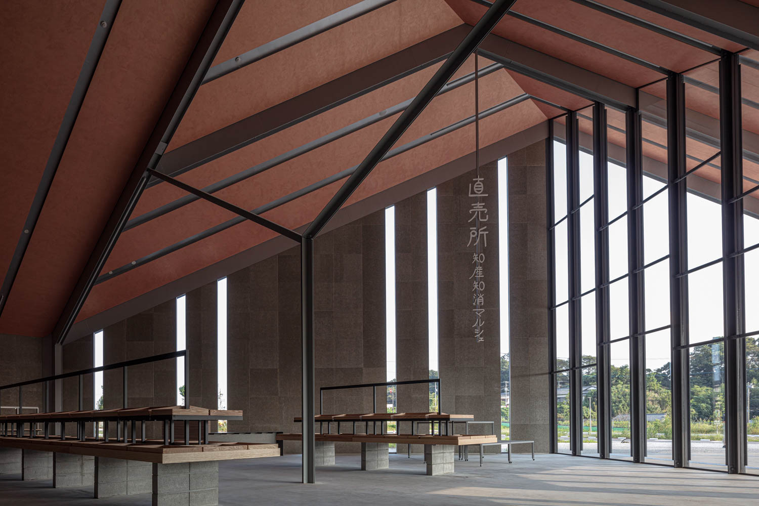
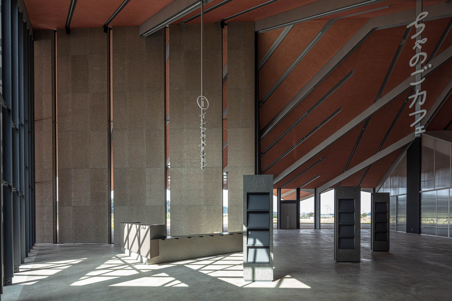
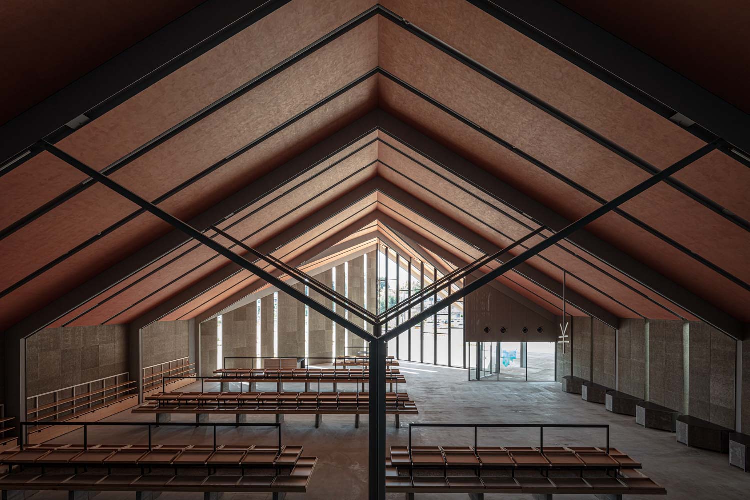
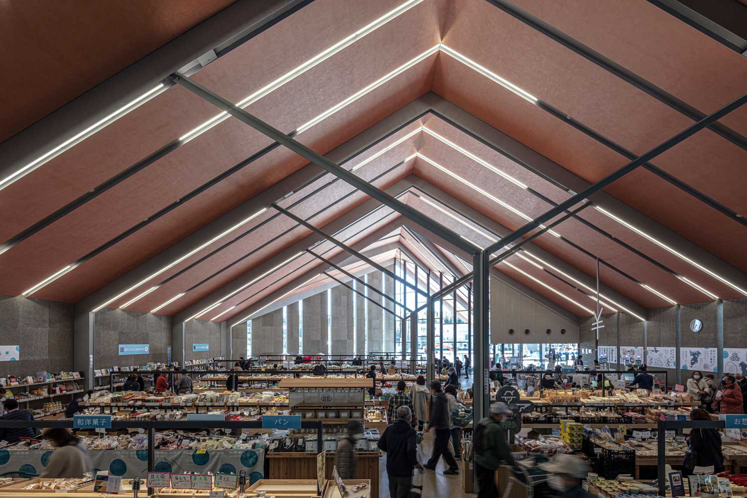
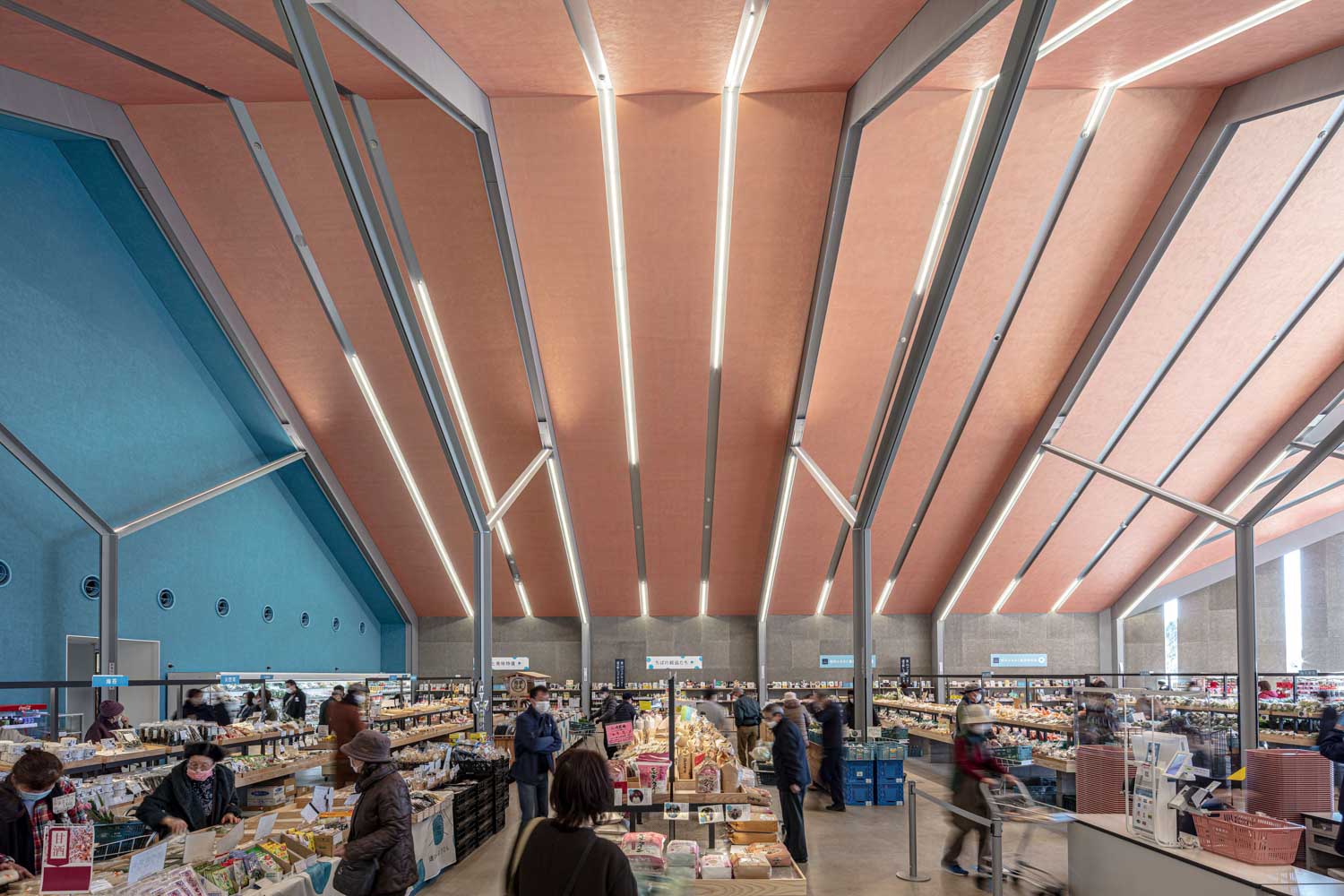
THE VISUALLY STRIKING ROADSIDE STATION IN SHONAN, JAPAN. THE BUILDING’S INCLINING FRONT PART OF THE ROOF THAT DEVIATES FROM THE MAIN NORTH-SOUTH AXIS AND THE ZIGZAG WALL OUTLINE IS HOW THE JAPANESE DESIGN STUDIO NASCA MAKES IT STAND OUT
TEXT: PRATCHAYAPOL LERTWICHA
PHOTO: ASAKAWA SATOSHI
(For Thai, press here)
The Roadside Station Shonan Tento is a building situated in the town of Shonan in the Chiba prefecture of Japan. The roadside station is specifically designed and constructed to provide a comfortable resting area for tourists after a long drive on the expressway. The station houses a variety of shops selling agricultural and local food products, serving as a gateway for tourists and providing a glimpse into the Shonan region.
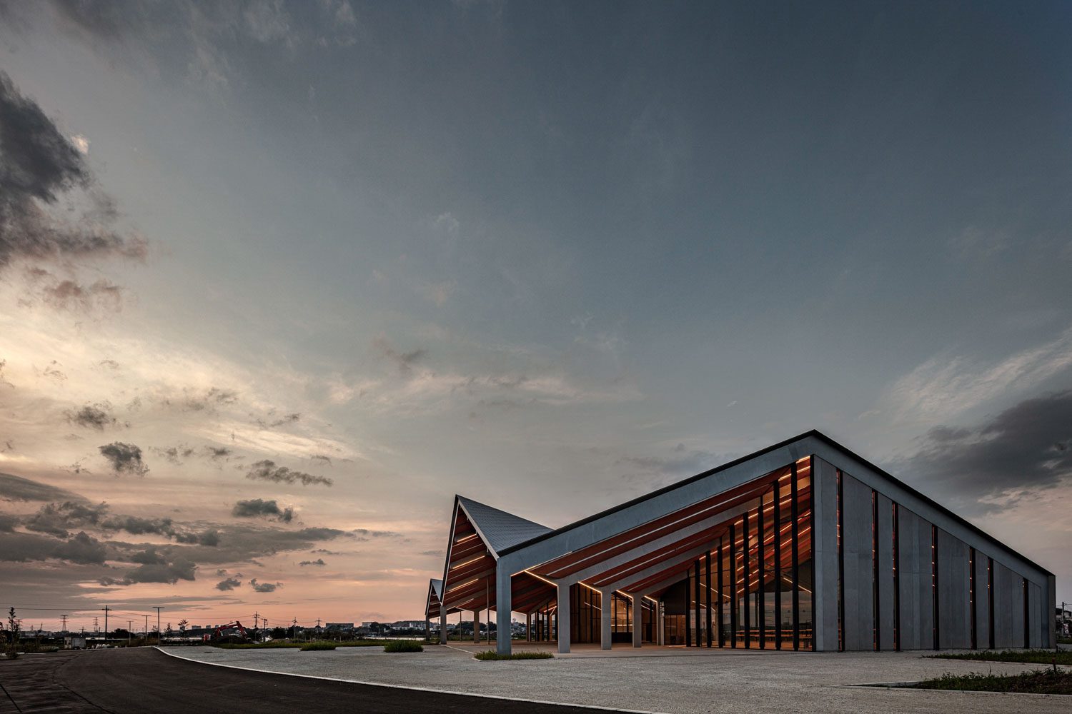
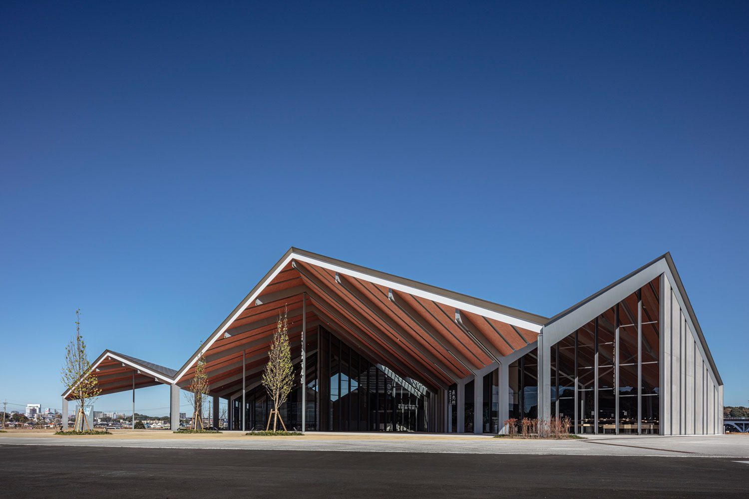
The building is an extension of the Roadside Station Shonan Tsubasa and has been designed by the Japanese architecture studio NASCA. The architect intended to create a visually striking building that would act as a landmark visible from a distance, despite the vast 9.8-acre site.
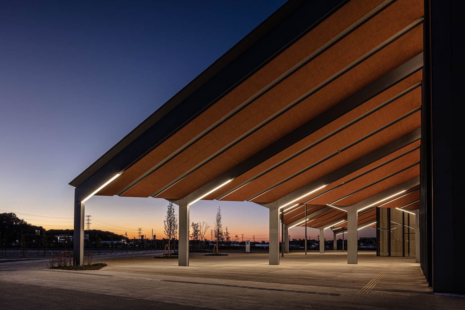
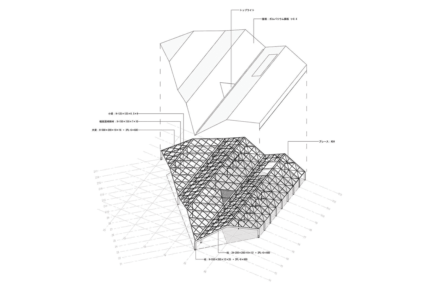
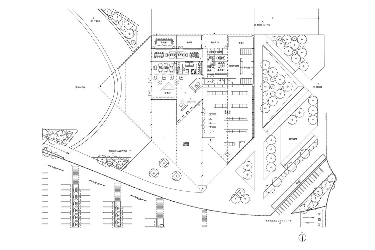
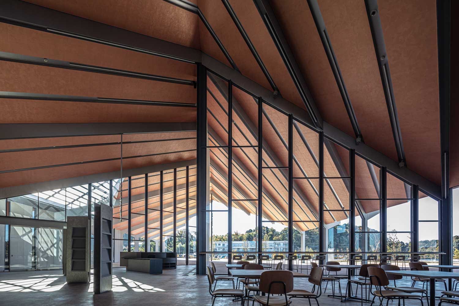
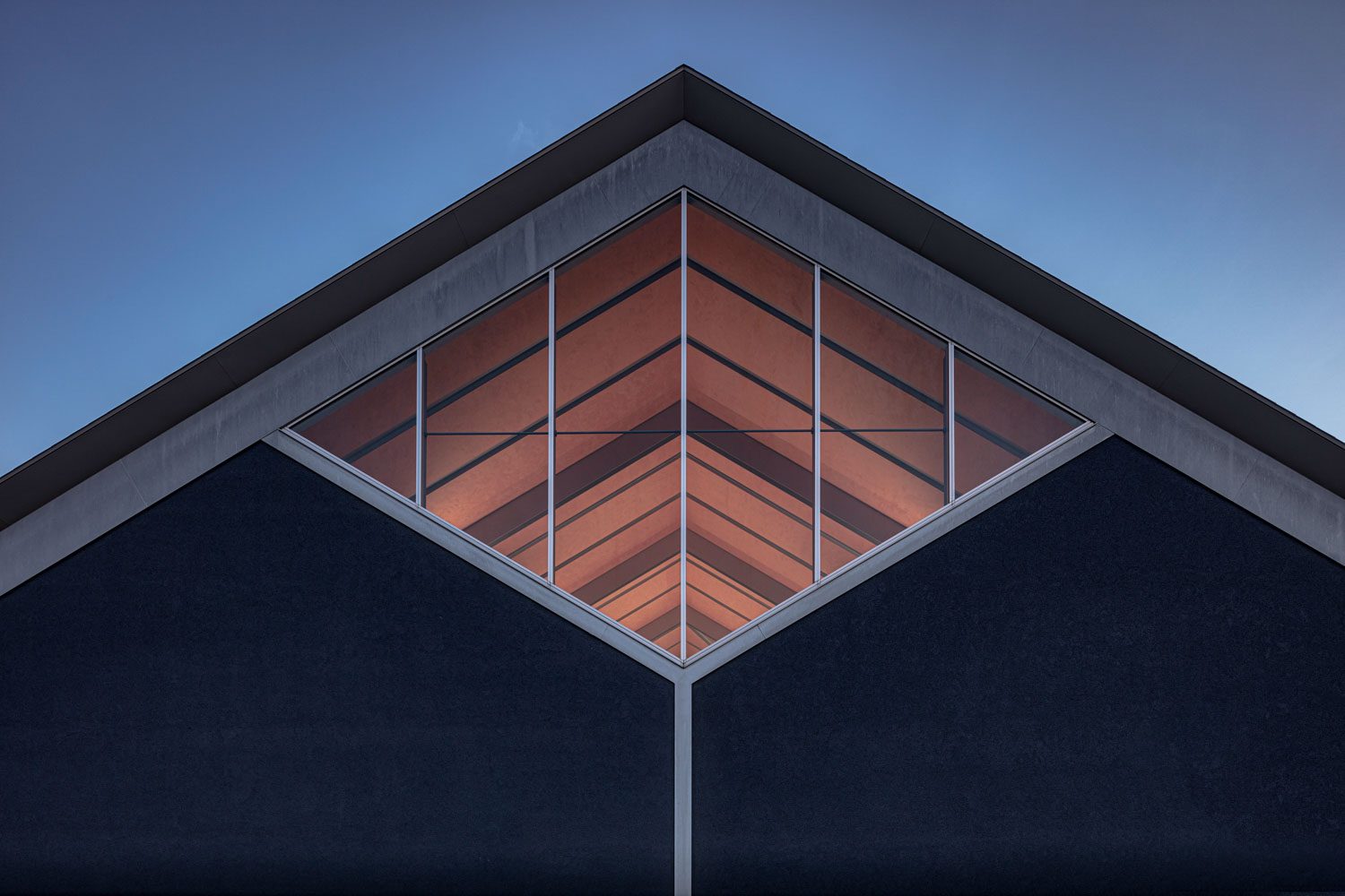
The architect developed a design featuring a sequence of interconnected hip roofs that cover the entire 3,000-square-meter building. The architecture draws inspiration from the design of the glasshouses that are frequently encountered in the area. Although the building has a simple square shape as its elemental form, its striking feature is achieved with the inclining front part of the roof that deviates from the main north-south axis. This creates a zigzag outline for the building’s structure that enhances its overall visual appeal.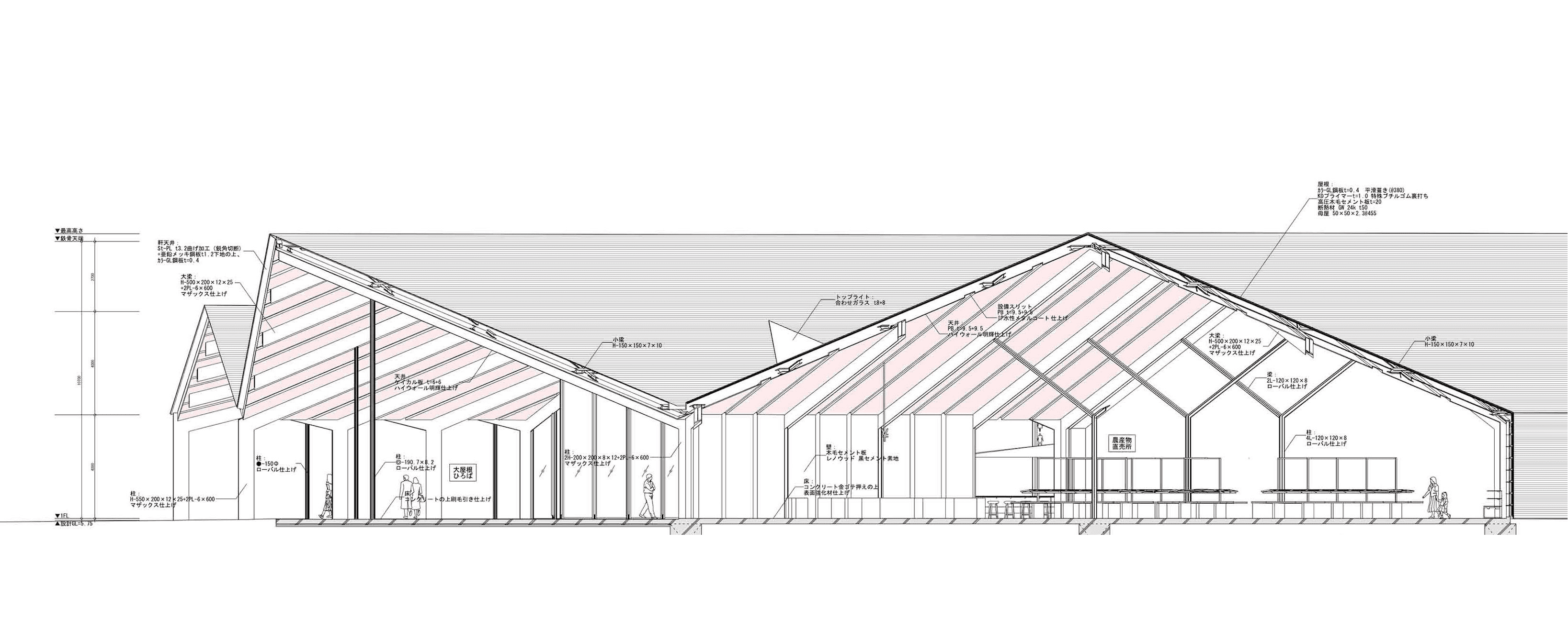 The design creates an effect where the building appears to have more than four sides, with the corners that emerge contributing as additional “sides”. Such special visual features attract the attention of travelers approaching the roadside station from various directions. The building’s stud beams and purlins, along with the columns and aluminum frames of its transparent glass walls, create a sense of depth and grandeur through the formation of lines, some of which intersect at perpendicular angles.
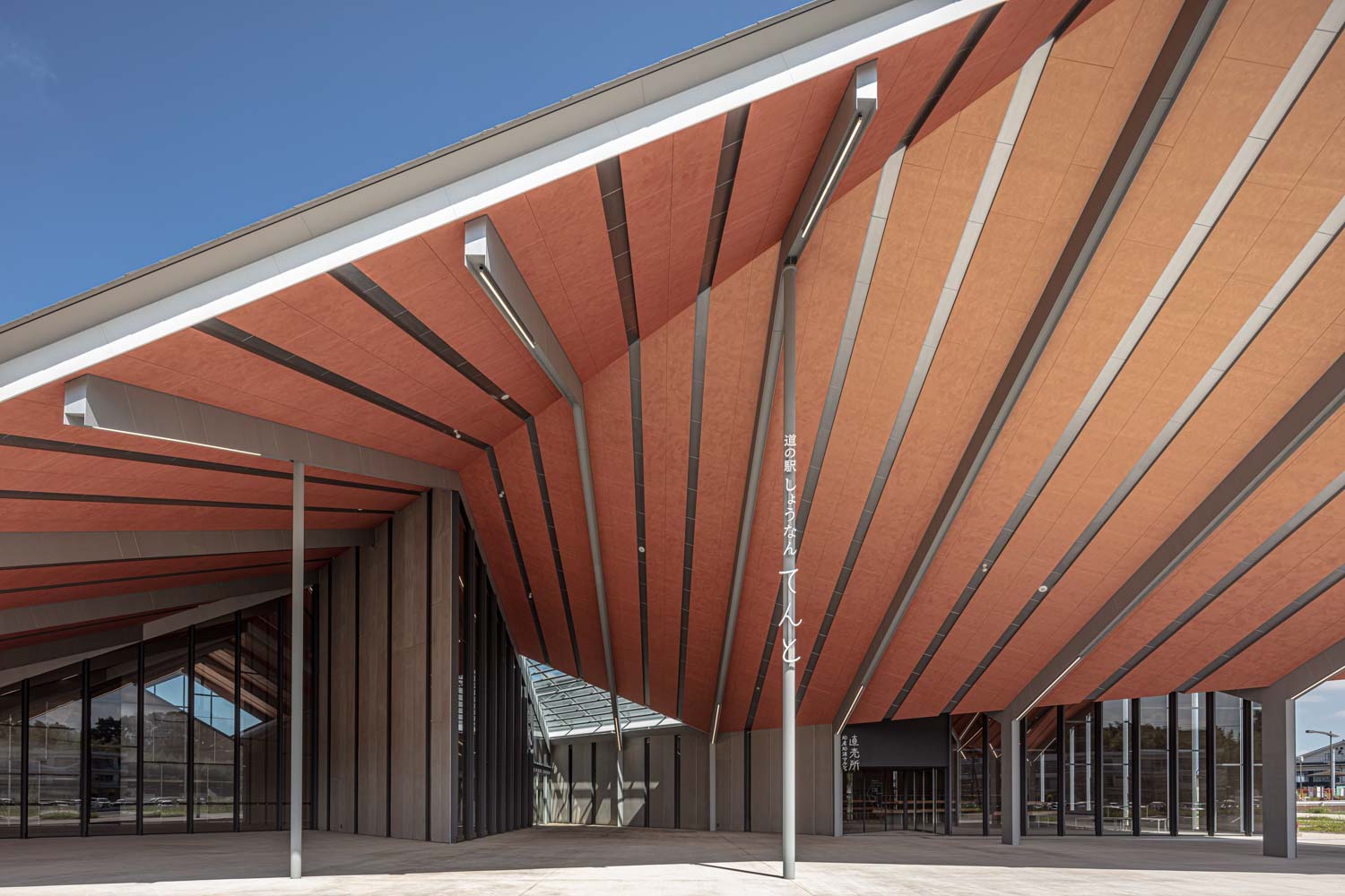
In addition to the retail spaces, the architect incorporated a semi-outdoor area into the building’s design. This space can be utilized for a variety of activities, ranging from food events to music festivals, with the goal of fostering a stronger connection between tourists, outside visitors, and the local community. The ceiling has been painted orange, while parts of the walls are painted dark blue, following the architect’s intention to create a harmonious blend between the structure, the space, and the shops it houses with the presence of defined lines and vivid colors.
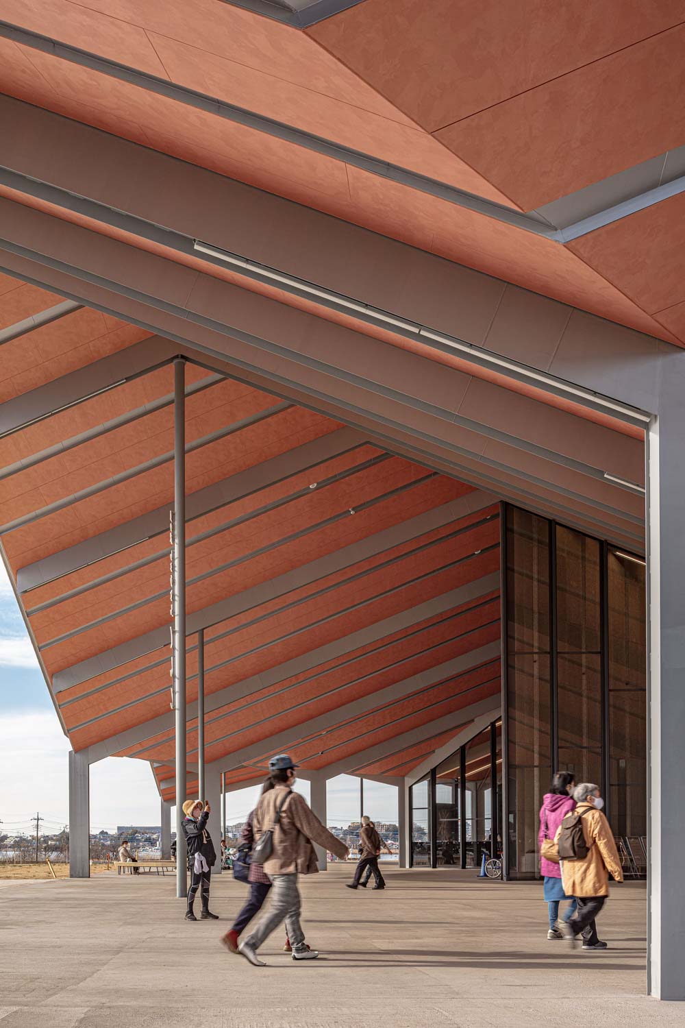
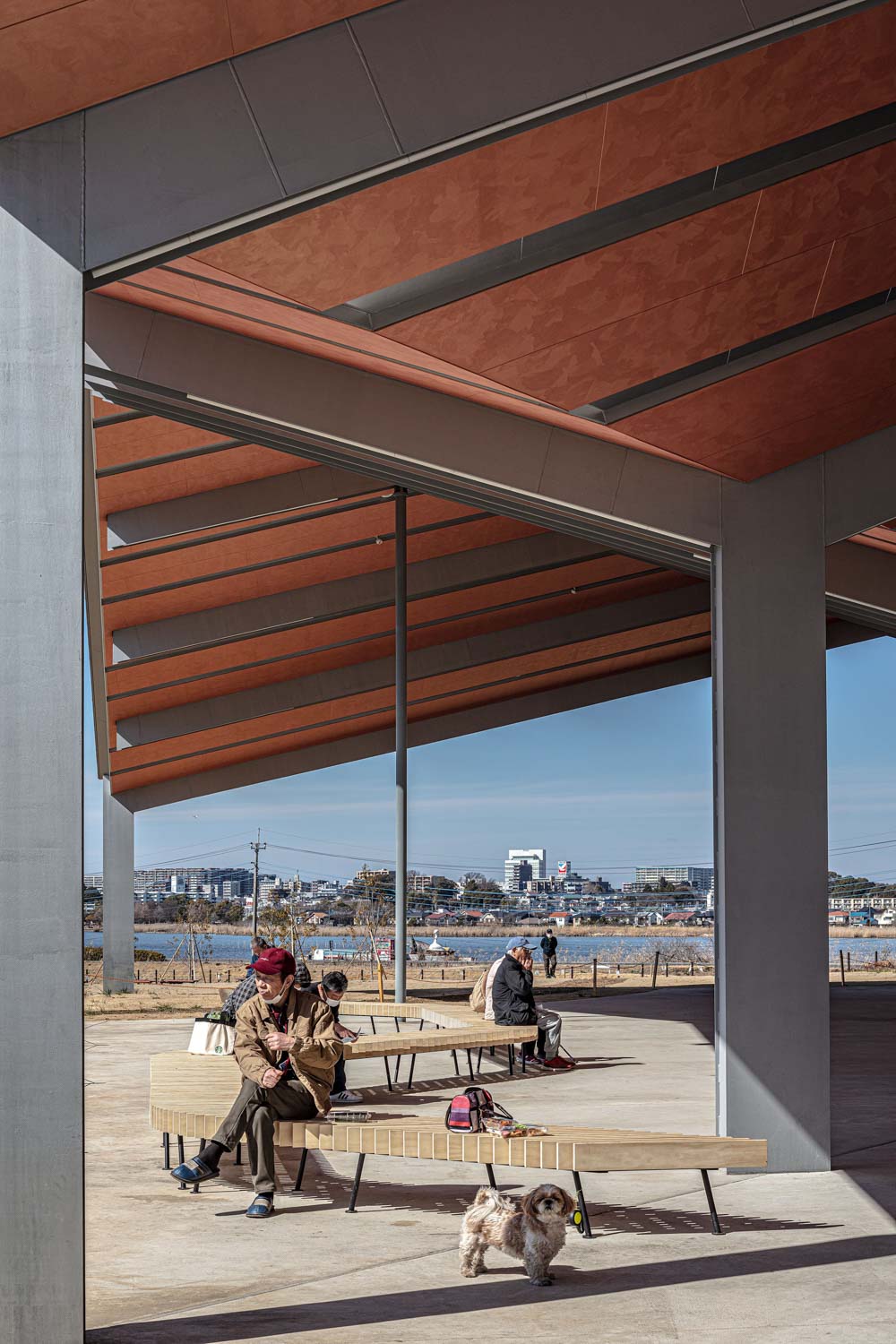
Roadside architecture, particularly those constructed along major public roads, is comparable to a clickbait headline. It must be compelling enough to catch people’s attention quickly, as it could be easily missed and forgotten if it fails to do so. Unlike other buildings that rely on bizarre visuals or big signs to attract people’s interest, Shonan Tento uses cleverly intertwined simplistic lines to create a charming structure that naturally encourages tourists and locals to take a closer look. Just like its name implies, this “Tento” (‘tent’ or ‘reset area’ in Japanese) embodies both the building’s function as a roadside station as well as the characteristics of its unique architectural form.
studio-nasca.com

