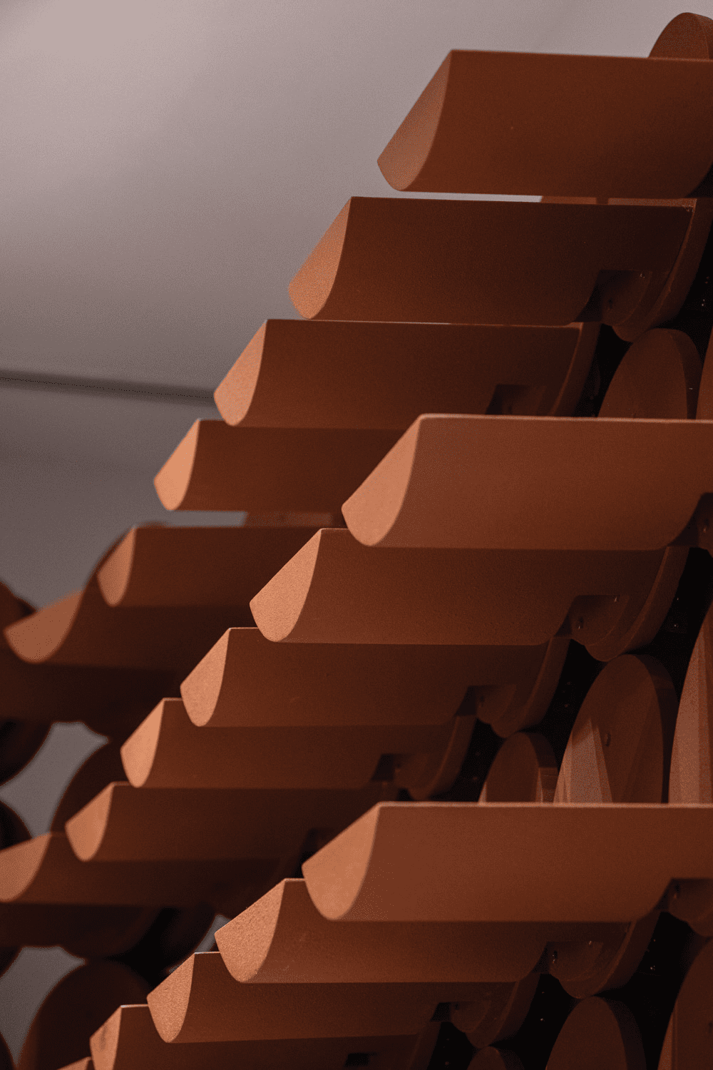
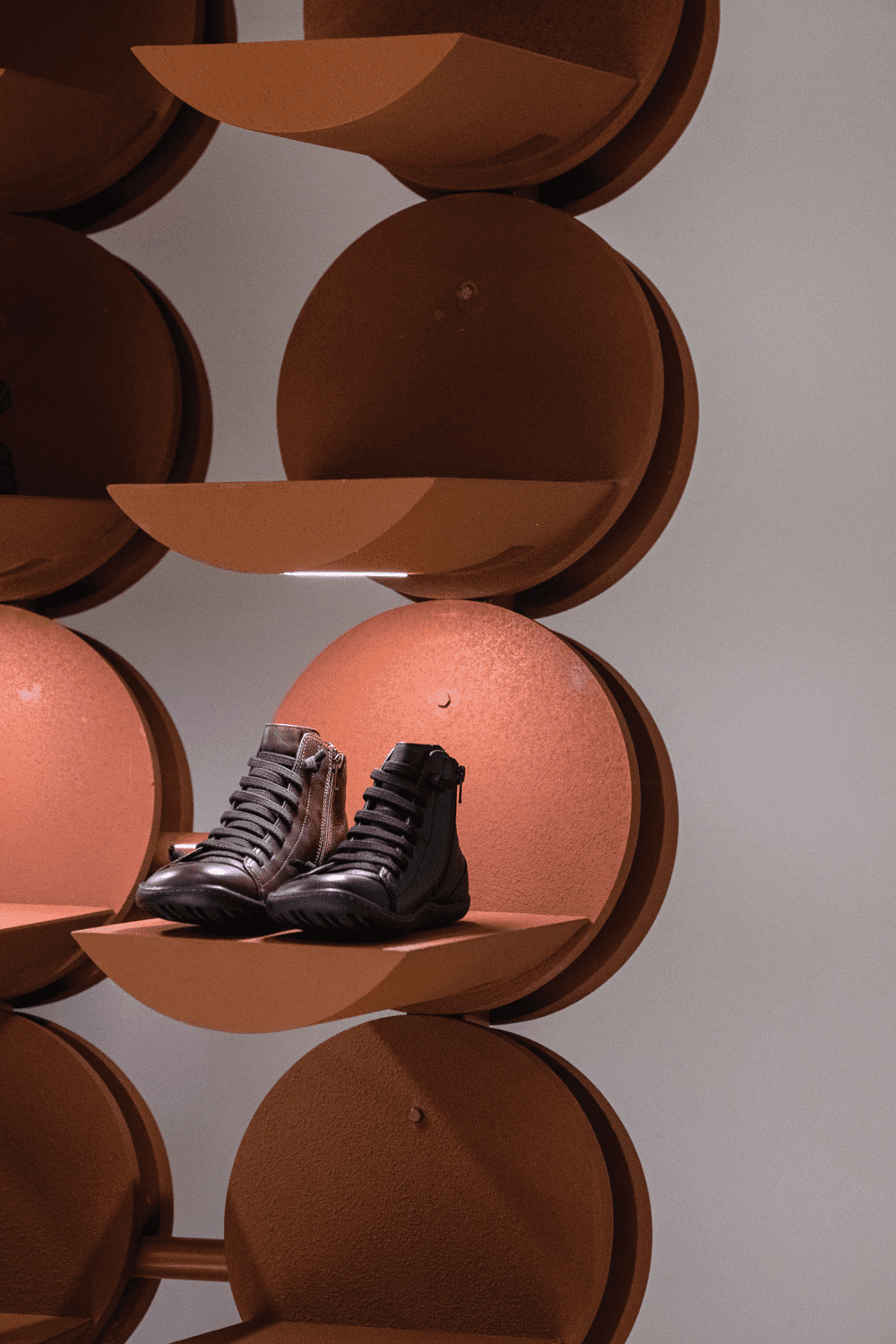
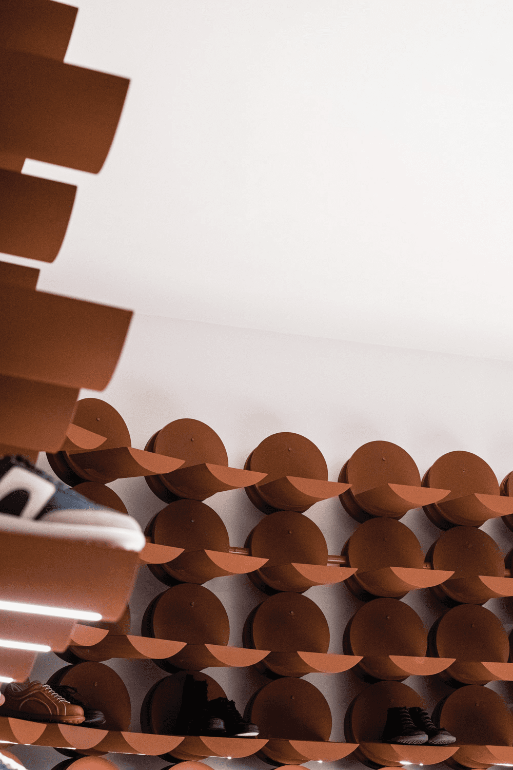
PHTAA FURTHERED THE CONCEPT OF ‘RE-APPROPRIATE,’ BY ELEVATING THE APPEARANCE OF THE ‘RETAINING WALL’ AND INCORPORATING MANY OF ITS ELEMENTS INTO THE DESIGN OF THE CAMPER RETAIL SHOP IN CENTRAL WORLD
TEXT: PRATCHAYAPOL LERTWICHA
PHOTO: KUKKONG THIRATHOMRONGKIAT EXCEPT AS NOTED
(For Thai, press here)
Camper has always been widely known as a distinct, design-conscious shoe brand that consistently releases fresh-looking and beautiful footwear. However, Camper’s definition of design is not limited to its shoes but also to its retail spaces, many of which are interesting collaborations between the brand and some of the world’s most renowned designers.
Camper recently launched Camper Toðer, a campaign that has invited designers, architects, and artists to be the minds behind the brand’s retail shops. It has birthed James Hayon’s design for the Madrid branch, the New York branch designed by Nendo, and the Milan and Barcelona branches by Kengo Kuma.

Bangkok, as one of the designated countries of the campaign, also recently welcomed a Camper Together store of its own at centralwOrld shopping mall, marking the brand’s fifth chain in Asia. The shop has PHTAA, an acclaimed Bangkok-based design studio, leading the design direction.
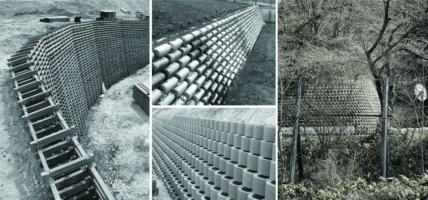
PHTAA’s works are inspired by the re-appropriate’ concept, which up-cycles old materials and objects by giving them new functions. For example, the BLU 395 is PHTAA’s brilliant use of manhole covers with the design of the façade, or H Dining, where flooring bricks are used as the finishing material on the walls. PHTAA furthered this approach with the design of the Bangkok Toðer shop by elevating the appearance of the ‘retaining wall’ and incorporating many of its elements into the design of the retail space.
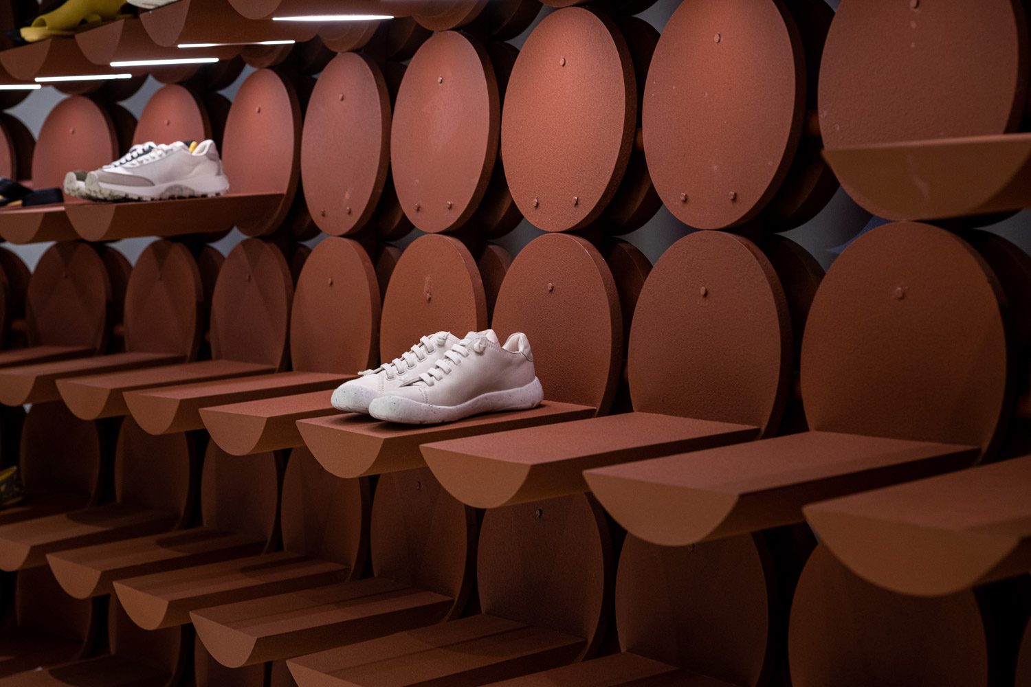
PHTAA noted that they liked how the circular patterns on retaining walls have some interesting connections with the soles of various models of Camper shoes, such as Peu and Pelotas, which were once popular among architects and designers. The circular bumps of the sole’s pattern inspired the form of the display shelves, which renew memories and connections between creative crowds and the Camper shoes.
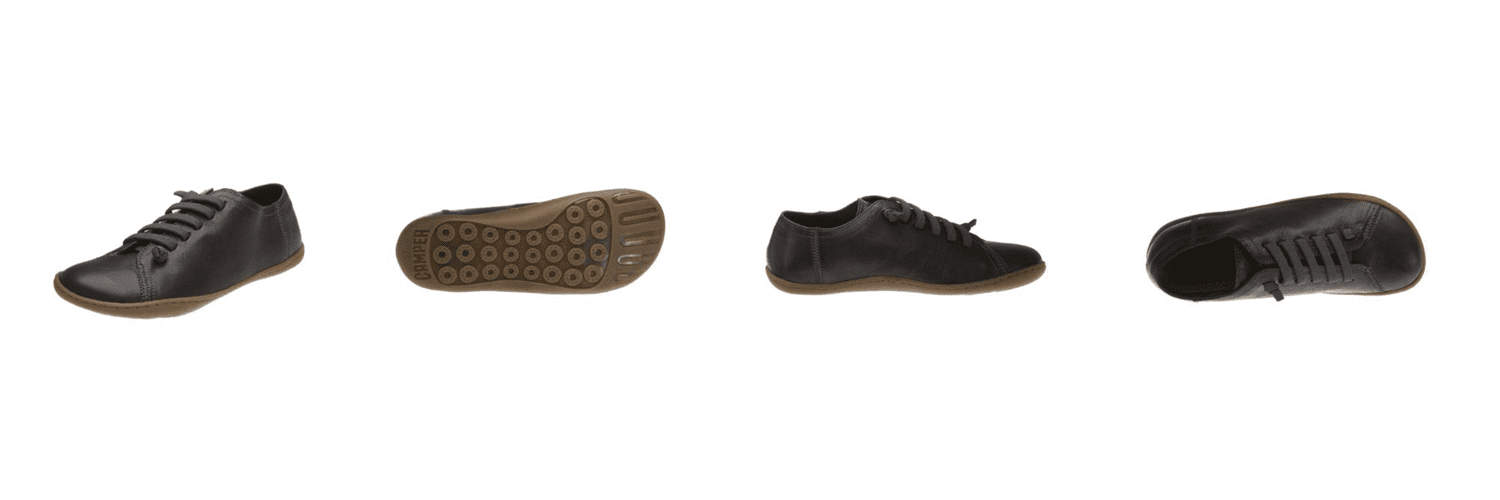
© Camper
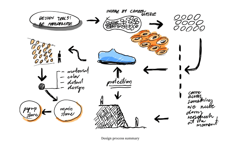
© PHTAA
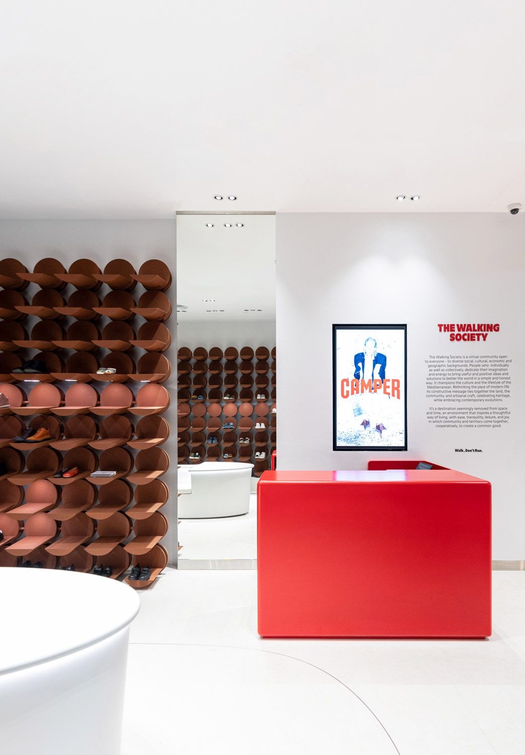
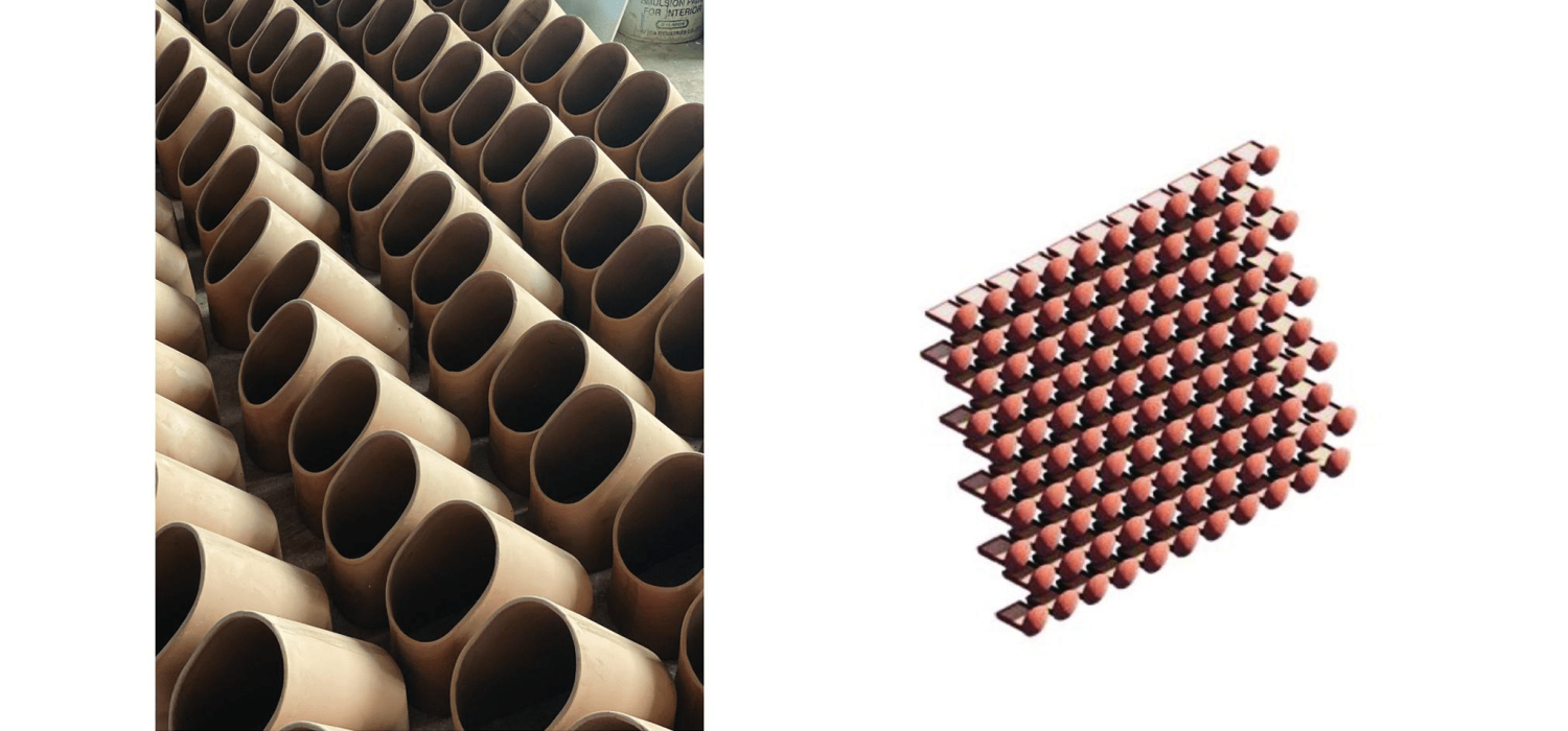
The shelves are designed to look like a series of interconnected panels of spherical units, with each unit holding a wing that extends as the space for displaying shoes. The circular component and the protruding wings are made of ceramic, creating a delicate, natural imperfection that stands out against the other neatly built interior design components. The spherical units are attached to the slightly elevated and deviated steel structure, which allows the lower section of the shelves to be displayed without being obscured.
Aside from the main display area, which takes up most of the space of the shop, a number of white chairs are placed in the empty space in the middle for customers to sit on while trying on shoes. The cashier’s desk is a tapering structure with a bright red hue that matches the Camper logo. Another product display shelf is installed at the front but is made of a transparent material, allowing visual access to and emphasizing the presence of the retaining wall positioned farther within.
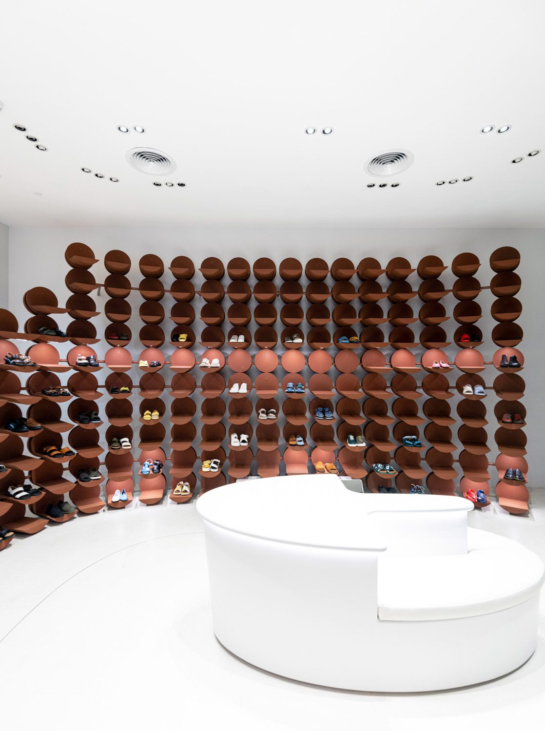

The white floor and ceiling transform the shop into a small gallery-like space, providing the ideal backdrop for the primary display components, the red cashier table, and various models of shoes to not only coexist but complement one another. While many of the neighboring shops opt for eye-catching designs and visuals to attract passersby, the new Camper shop at centralwOrld takes a different route, capturing people’s attention with its charming subtlety, inviting people to take a closer look at the details of the Camper shoes as well as the uniquely appealing retaining walls.
