Tag: Denmark

FJORDENHUS | GUARDIAN GLASS

Photo: David de Larrea Remiro

FJORDENHUS | GUARDIAN GLASS

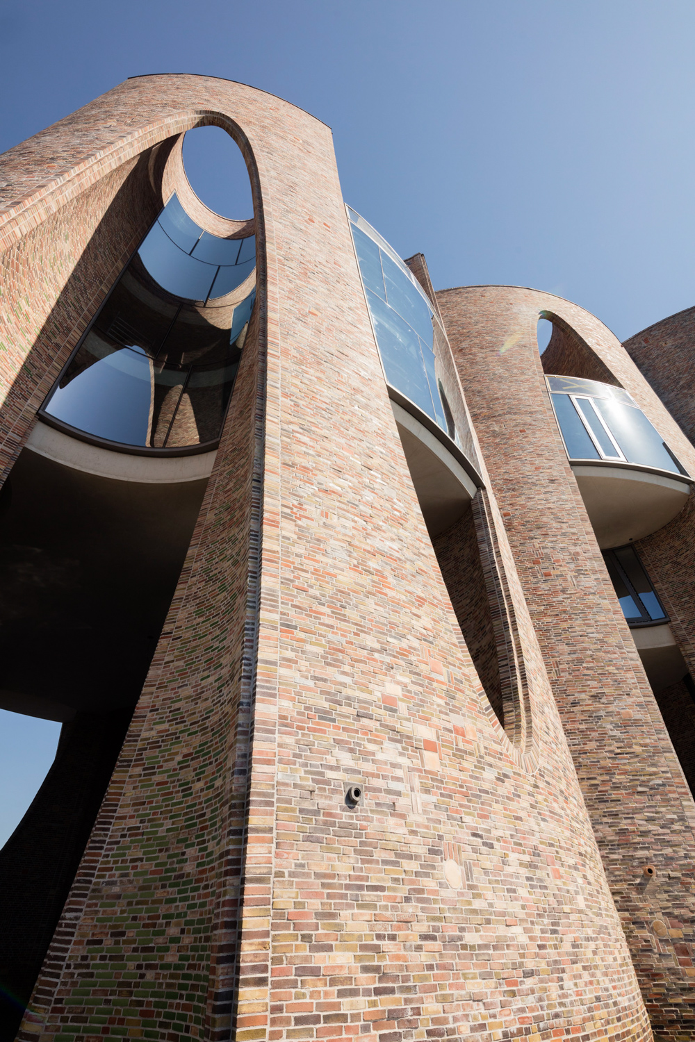
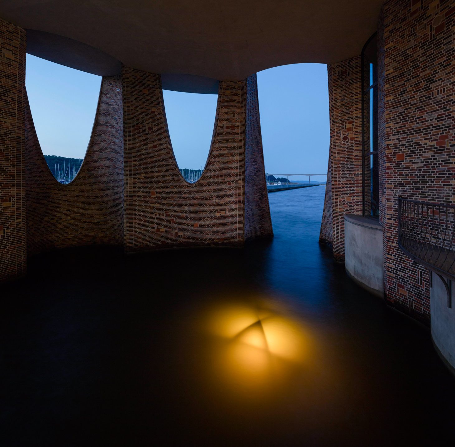
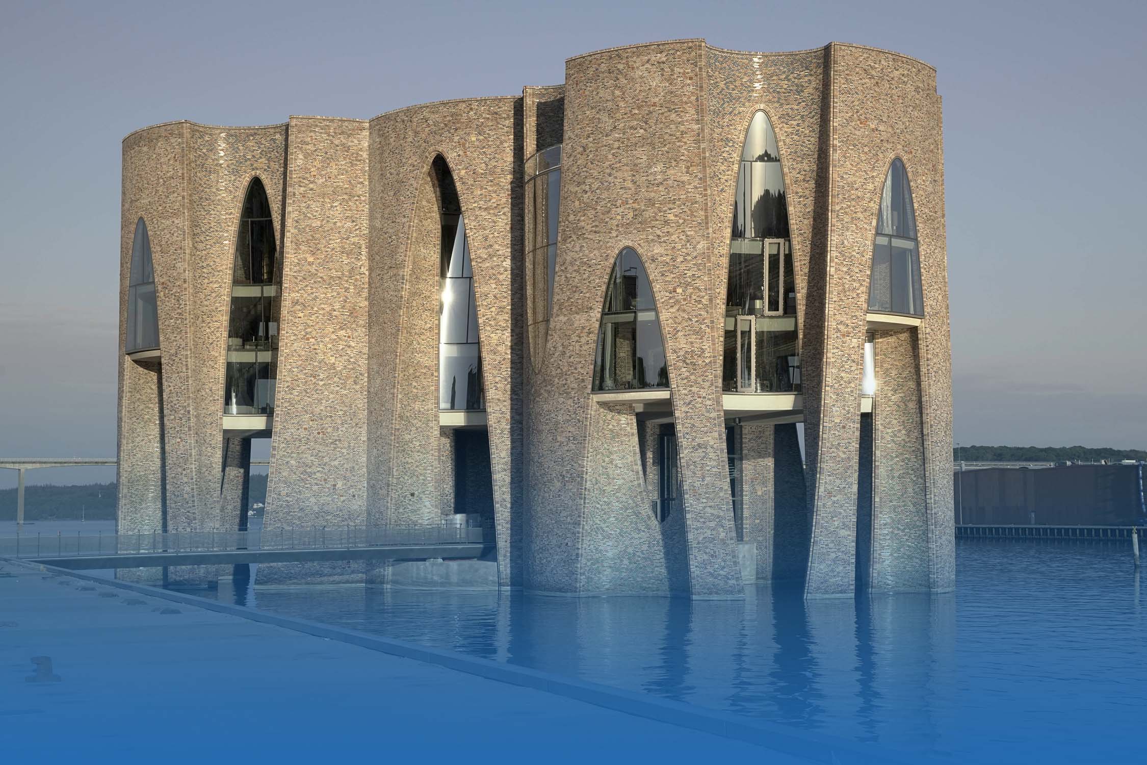
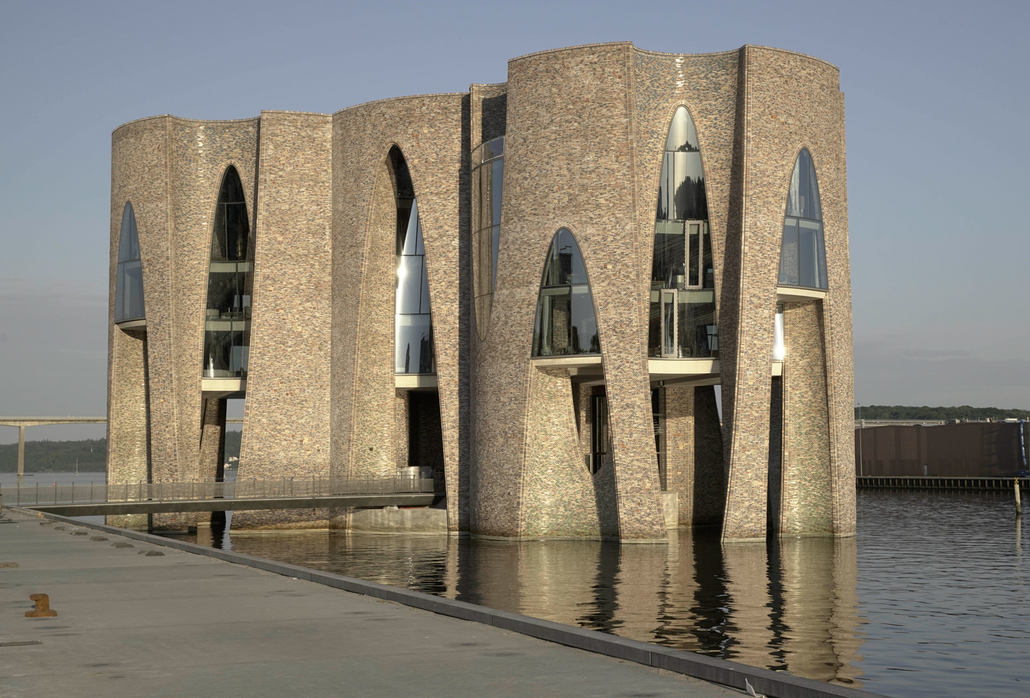
FJORDENHUS IS A CYLINDRICAL BUILDING DESIGNED BY THE ARTIST, OLAFUR ELIASSON AND ARCHITECT, SEBASTIAN BEHMANN, FEATURING AN ORIGINAL DANISH BRICK FACADE CONTRASTING WITH SUNGUARD HIGH PERFORMANCE NEUTRAL 60/40 COATED GLASS FROM GUARDIAN GLASS

TEXT: WARUT DUANGKAEWKART
PHOTO: ANDERS SUNE BERG EXCEPT AS NOTED

(For Thai, press here)

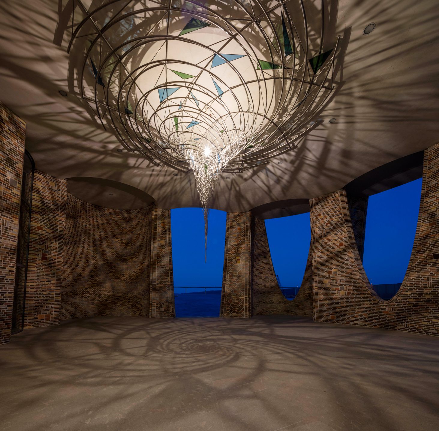
Many must be familiar with the name Olafur Eliasson, the Danish artist with countless iconic projects, from sculptures to installation art such as The Weather Project at London’s  Tate Modern. But not many people are aware that aside from his art projects, Olafur Eliasson has some architectural projects sitting in his portfolio. The first architectural project he did is a collaboration with Sebastian Behmann for the design of Fjordenhus, the built structure located on the river next to Havneøen island, a man-built land constructed as a part of the new urban initiatives. The building houses Kirk Kapital’s head office, which occupies the upper floors. The ground floor is open as a public space that welcomes visitors to experiece Olafur Eliasson’s site specofic art piece, created particularly for the project. 
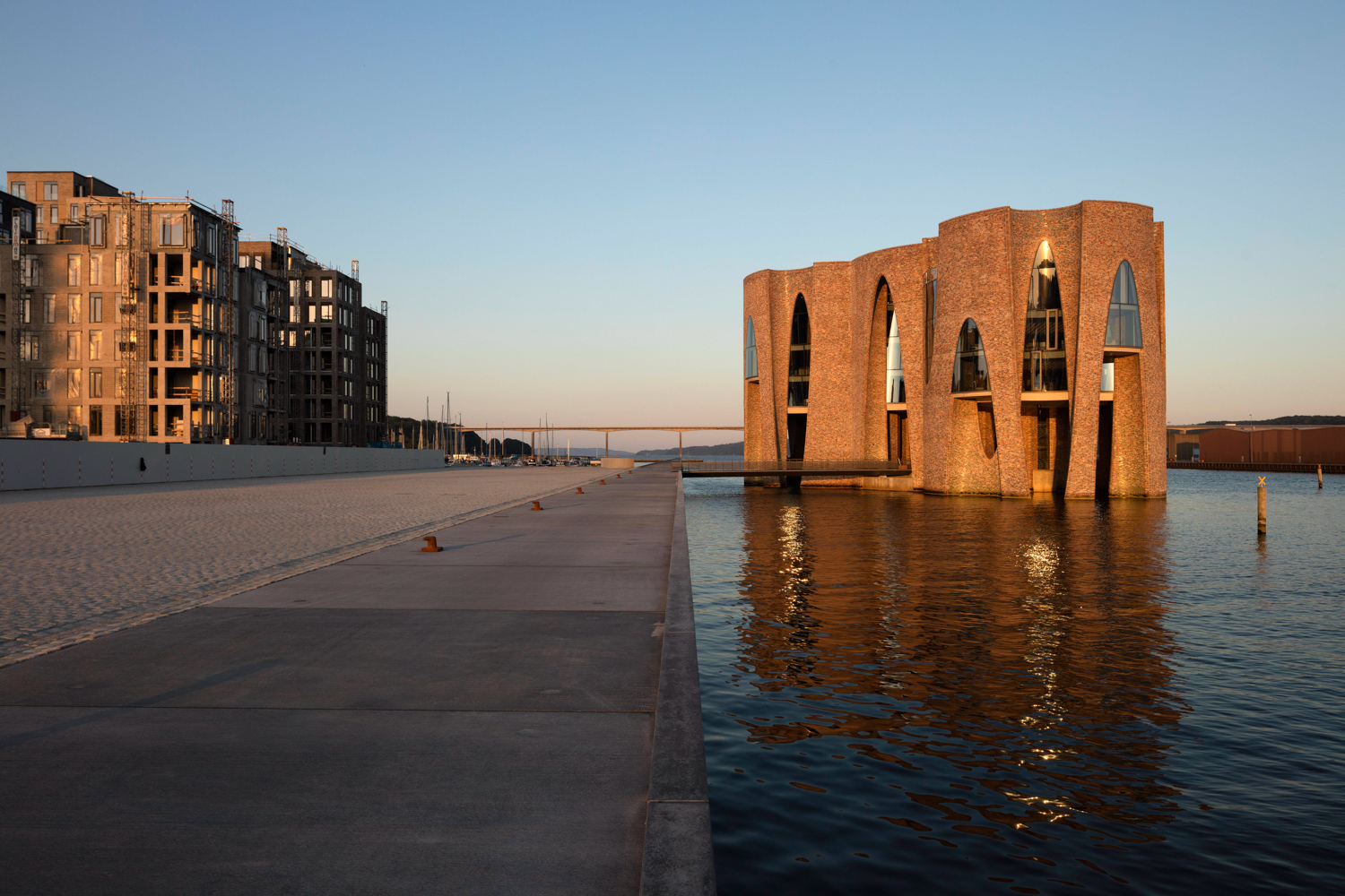
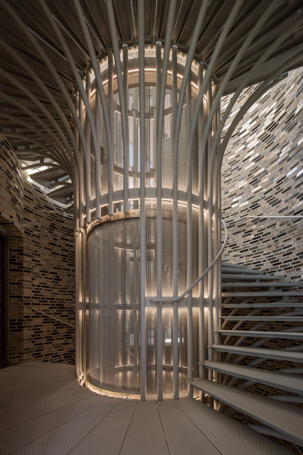
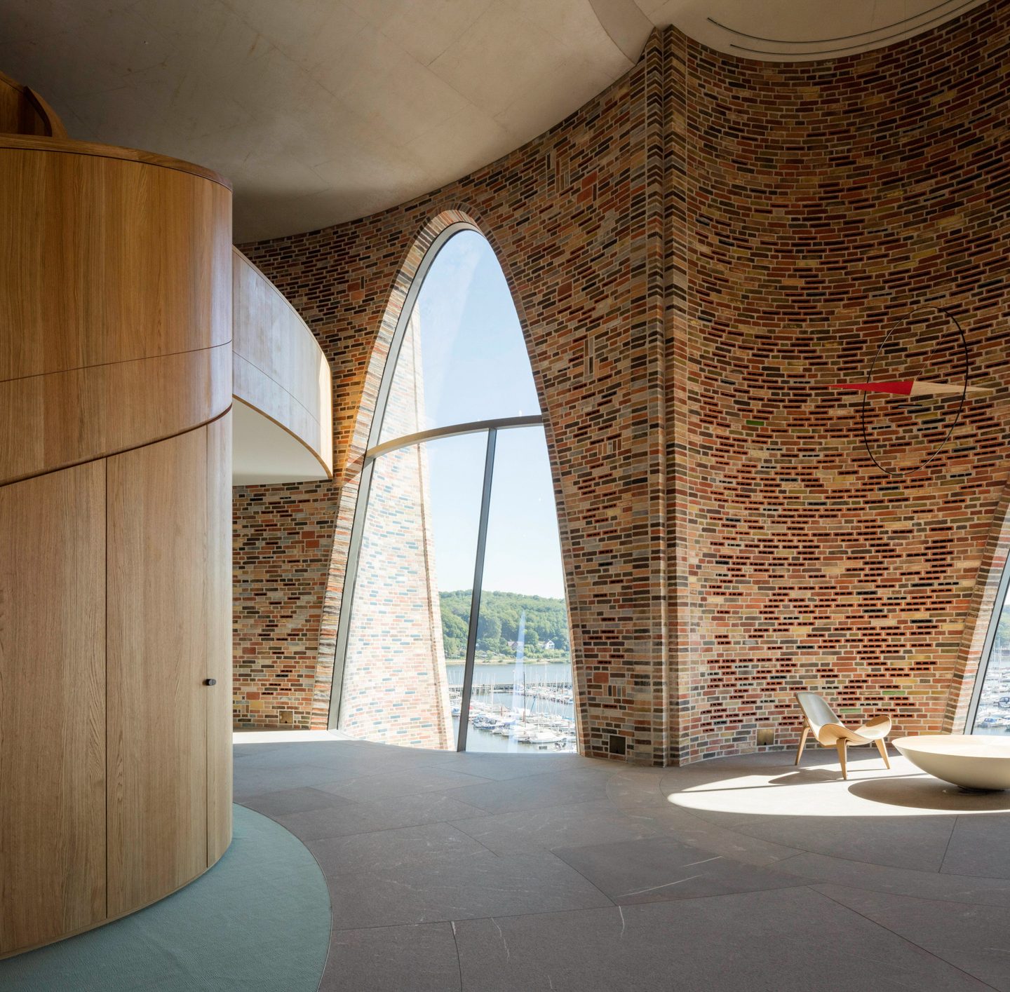
The building is designed to have a cylindrical form with over 28-meter height, and divided into four superimposed and overlapped segments. Created is an interesting building mass where Denmark’s traditional bricks cladding both the interior and exterior surfaces. The brick facade has now become an integral part of the building’s identity, portraying its close association with the nostalgic aestheic of old buildings. The lighthouse situated in the middle of the water bears the physical appearance of a brick structure from a distance. The structure, however, contains myrid details of the bricks, which comprise 15 differnet color tones. 
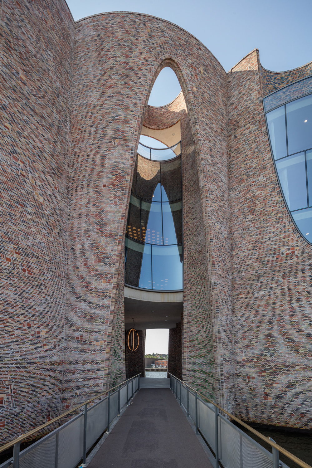
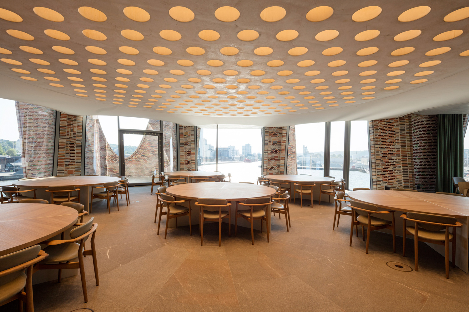
From the building’s shell to the interior spaces and opennings, everything is designed to render a spatial characteristic of the freely concaved and indented space with curvical lines that run in both vertical and horizontal axes. The result is a series of smaller spaces embraced by the building’s physical structure and opennings that function as foyers connecting different parts and chambers inside the interior together. Some of the opennings look toward the fjords and the surrounding cityscape. These openings use double-layered glass specificaly cut and bent to physically correspond woth the lines and silhoutte of the building. 
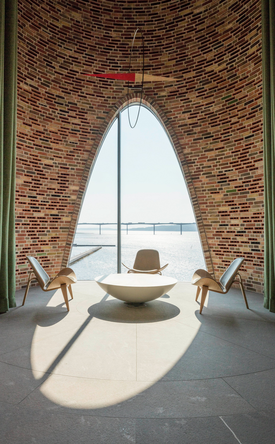
The project’s Glass of choice is Sunguard High Performance Neutral 60/40 Coated Glass, which combines solar control and thermal insulation. 

The design and application of the glass is a collaborative creation between the designers and Guardian to achieve the curvature and form that Eliasson  had intended. The opennings reveal themsleves as gorgeous windows that look almost like an artwork, perfectly complementing the building’s architectural character to be even more stunning.

It isn’t that often to see such an impeccable and distinctive fusion of art and architecture. Fjordenhus is one of the proofs how meticulously designed and executed construction technology as well as thoughtful material selection can give birth to a work of architecture of such distinctive attributes. 

For further information you can contact our experts, by visiting us at: 
Official Website / https://www.guardianglass.com/ap/en
Official Facebook / https://www.facebook.com/guardianglassap
Email / guardiansupport@guardian.com

LEGO HOUSE | GUARDIAN GLASS

LEGO HOUSE | GUARDIAN GLASS

LEGO HOUSE, DESIGNED BY BIG, CONCEPTUALIZES THE LEGO BRICKS THROUGHOUT THE BUILDING FROM THE EXTERIOR TO THE EXHIBITION SPACE WHERE SUNGUARD® EXTRA SELECTIVE SNX 60/28 GLASS WAS INSTALLED TO DRAW NATURAL LIGHT INTO THE SPACE, REVEALING THE IMPRESSIVE DETAILS OF LEGO

TEXT: WARUT DUANGKAEWKART
PHOTO: IWAN BAAN

(For Thai, press here)

LEGO is a part of many people’s childhood. LEGO’s modular system that can be endlessly assembled has, at times, turned into small works of architecture where different pieces are joined together with boundless freedom. The wonderful nature of LEGO pieces plays a monumental part in the conceptualization of the LEGO House. The design team of BIG materialises the building that looks as if it were made out of real LEGO pieces.

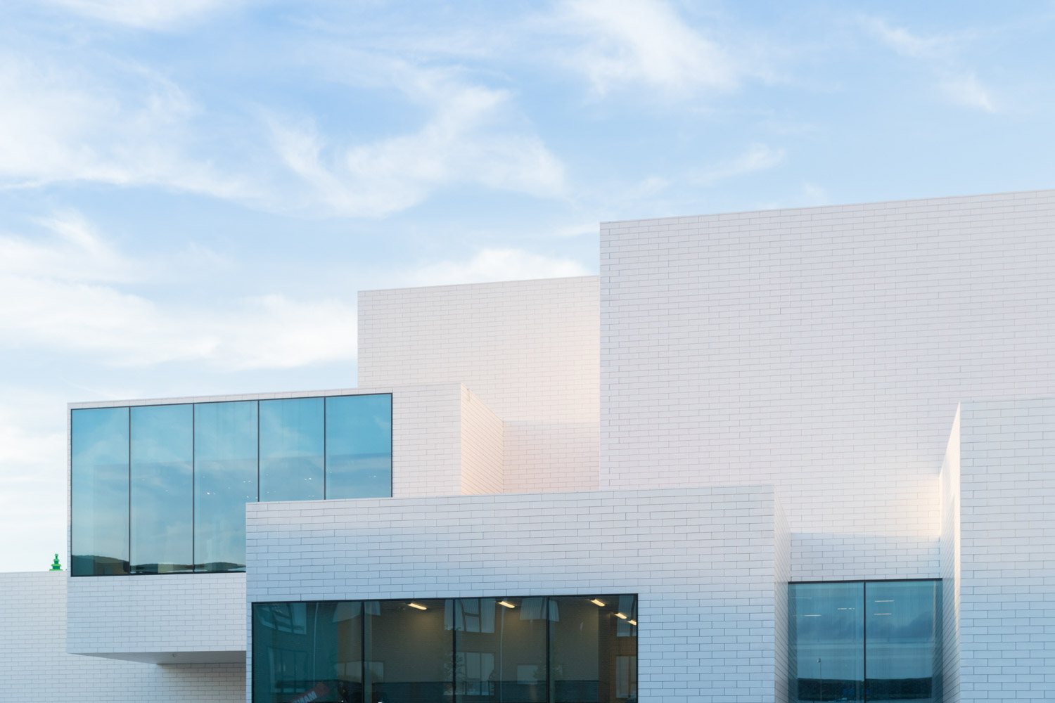
Situated in Billund, Denmark where LEGO originated, the museum is intended to help turn the city into the country’s future youth hub. The LEGO house serves as the city’s landmark and symbol with over 12,000-square meter functional space that tells stories of every aspect of the iconic toy. The physical attributes of LEGO find their ways to the building’s architecture, which is designed to look like an assembly of massive, white LEGO pieces, arranged and superimposed into an incredibly distinctive work of architecture.

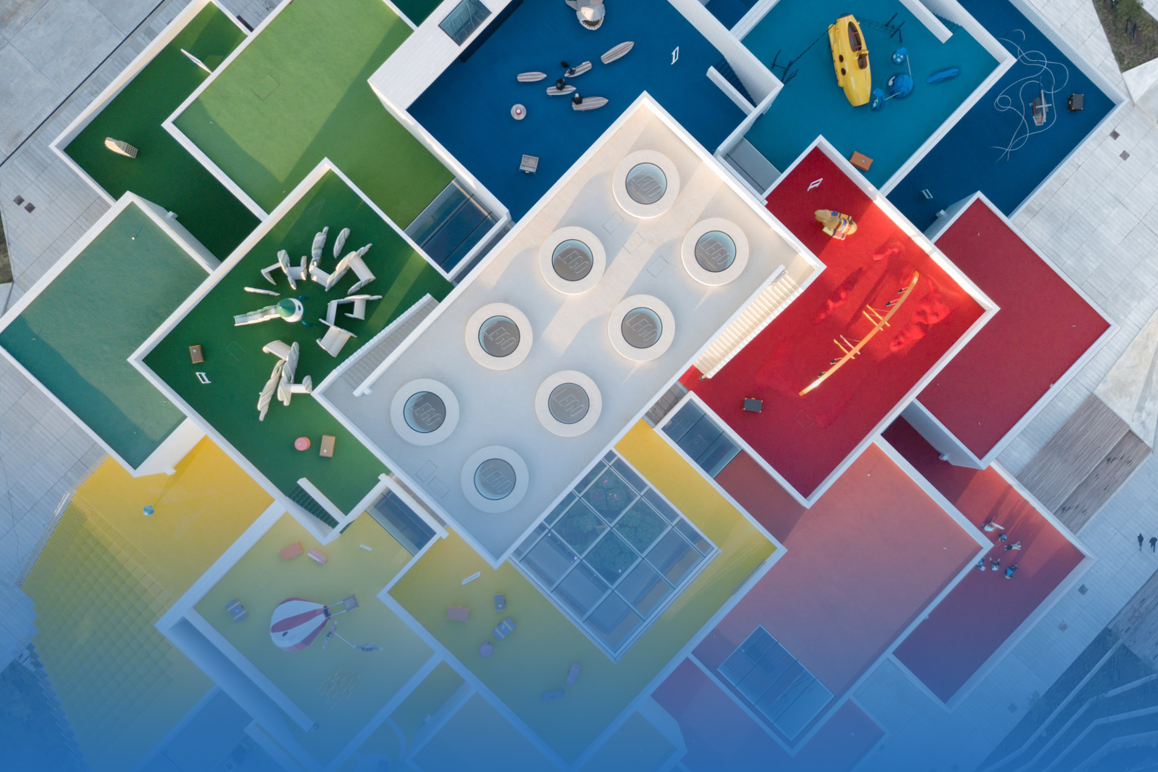
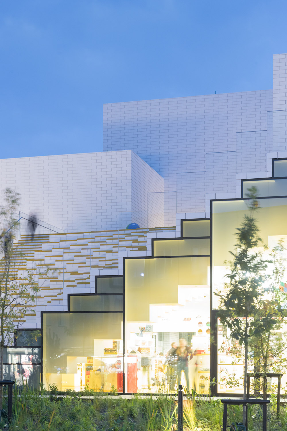
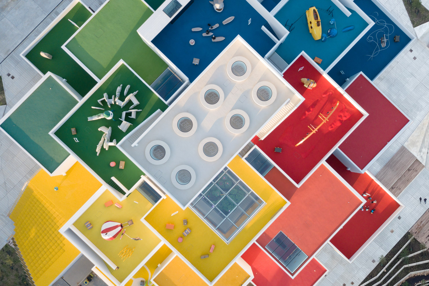
From the outside, looking at the building from an eye level, users are able to see the white building appears in the proportion similar to LEGO pieces. Parts of the building are designed to have both rigid white walls and massive glass walls that facilitate a visual connection between the interiors and outside environment. From the top, the rooftops of all buildings are in different colors with the tones similar to those of LEGO pieces. The areas accommodate outdoor spaces such as playgrounds while colors are used to differentiate various learning zones of the museum’s functional program. The interior program comprises a cafe, restaurant, souvenir shop, exhibition rooms, learning and playing areas, all existing in a hierarchy of thoughtfully curated learning experiences with colors playing a significant part in identifying and defining spaces.  

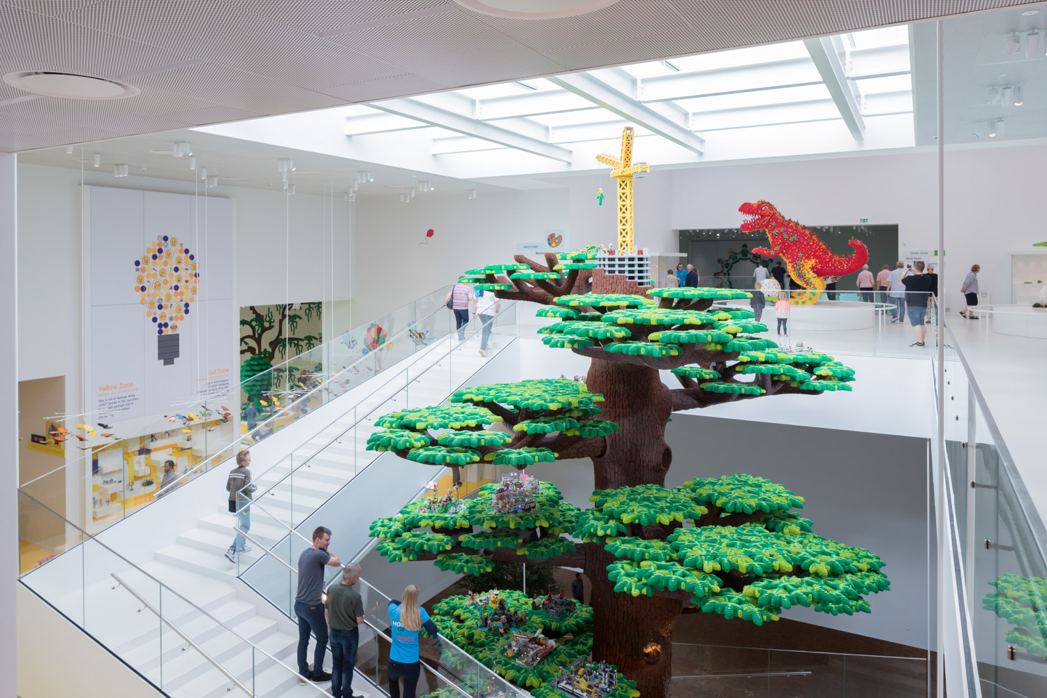
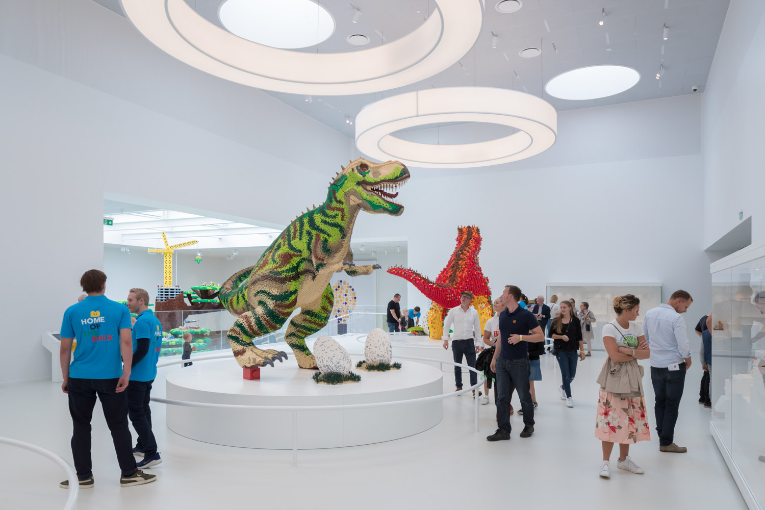
The main hall exhibits a large LEGO tree, surrounded by a stairway and natural light casted from the skylight, nicely brightening the entire space. Another highlight of the program is the exhibition room where special collections of LEGO are shown. The room is designed to have eight, circular skylights, symbolising a LEGO piece’s signature attributes. This particular detail can be clearly seen from the top view. The design uses SunGuard® Extra Selective SNX 60/28 glass that can bring in 60% natural light while filtering and allowing only 28% heat from the sunrays to come into the interiors. The material keeps the interior space beautifully lit, spacious, and cool while providing the right amount of light for the exhibition.

Glass is an integral part of several components of the design, from the walls to railing, for the program’s intention to provide the openness and spaciousness while still maintaining the much needed safety for the majority of users who are children. The material’s transparency also facilitates different parts of the interior spaces to enable the overall learning experiences.

For further information you can contact our experts, by visiting us at: 
Official Website / https://www.guardianglass.com/ap/en
Official Facebook / https://www.facebook.com/guardianglassap
Email / guardiansupport@guardian.com