DESPITE THE EVOLVING REALM PACKAGING DESIGN, THE PHYSICAL APPEARANCE OF AN INHALER HAS REMAINED SURPRISINGLY THE SAME wind inhaler
Apart from the products of highend brands, we have barely seen anything new among these ubiquitous aroma sticks until WIND presented itself as a game changer in the business, attracting consumers with its unconventional design.
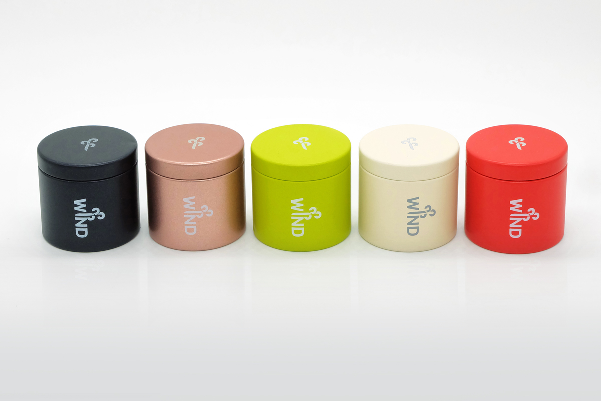
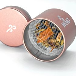
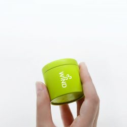
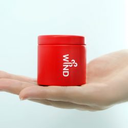
The founders of the brand are Anuchit Kumnoi, author / illustrator known by the moniker ‘Kiwtum’ and two of his college friends with backgrounds as a television producer and event organizer. They started off by roaming the streets of Yaowarat interviewing the wise men and women with vast knowledge of traditional Chinese medicine as they worked toward the development of the formula for the inhaler. The three (all graphic design graduates) agreed on the idea of creating an inhaler for modern consumers with a design that could answer to the tastes and lifestyle of the Instagram generation. The name of the brand ‘WIND’ comes from the expression ‘pen lom’ or ‘fainting’ in Thai ( the meaning of the word ‘lom’ in English is ‘wind’). This linguistic interplay was translated into the design of the logo where a mass of moving air blows out the ‘I’ letter which finds its way onto the cap as a secondary logo. Another element that differentiates WIND from most inhalers in the market is the packaging, whose comparatively larger size is inspired by a tea canister. While the rather large size can lessen the convenience of portability, it keeps the aromatic scent for a much greater longevity not to mention the fact that it is a great deal easier to find after being thrown in a purse or bag.
ยาดมเป็นของใช้ที่เหมือนถูกแช่แข็งในด้านการออกแบบบรรจุภัณฑ์ นอกจากโปรดักท์จากแบรนด์หรูๆ เราแทบไม่เห็นยาดมตามร้านขายของทั่วไปมีการเปลี่ยนแปลงมากนักมานานแล้ว จนกระทั่ง WIND ยาดมที่มีบรรจุภัณฑ์ดูไม่ค่อยเหมือนยาดม เท่าไรได้เปิดตัวมาเป็นทางเลือกให้กับผู้บริโภคในช่วงต้นปี
เจ้าของยาดมแบรนด์นี้คือ อนุชิต คำน้อย นักเขียน / นักวาดภาพประกอบนามปากกา ‘คิ้วต่ำ’ และเพื่อนมหาวิทยาลัยอีกสองคนที่มีแบ็คกราวน์การทำงานเป็นโปรดิวเซอร์รายการทีวีและงานอีเวนต์ พวกเขาตั้งต้นจากการเดินเยาวราชสัมภาษณ์ผู้เฒ่าผู้แก่ตามร้านยาจีน เพื่อปรุงสูตรยาดมขึ้นมา ก่อนจะขยับมาถกกันเรื่องการออกแบบบรรจุภัณฑ์ทั้งสามคน (ที่จบปริญญาตรีด้านกราฟิกดีไซน์มา) เห็นตรงกันว่าจะทำยาดมให้คนยุคนี้พกโดยไม่เคอะเขินและไม่เป็นส่วนเกินบนโต๊ะทำงาน หรือเป็นของที่ต้องหยิบออกไปจากเฟรมกล้องเวลาจะถ่ายรูปลงโซเชี่ยล ชื่อแบรนด์ WIND มาจากเหตุผลเดียวกันนี้ (ล้อมาจากคำว่า “เป็นลม”) อนุชิตออกแบบโดยเล่นกับตัวอักษรที่ให้จังหวะเหมือนลมกำลังพุ่งออกมาจากตัว I และตัดทอนตัว I ไปใช้ในรูปแบบต่างๆ อย่างเช่นโลโก้บนฝาเปิด อีกส่วนที่ทำให้ WIND ต่างจากยาดมทั่วไปคือขนาดของกระปุก พวกเขาบอกว่าที่มาของขนาดใหญ่กว่าปกติทั่วไปเกิดจากการปรับเอากระปุกใบชามาใช้เป็นกระปุกยาดม ซึ่งถึงแม้จะมีข้อเสียในแง่ของความสะดวกในการพกพา แต่ก็มีข้อดีในเรื่องประสิทธิภาพของการเก็บกลิ่นสมุนไพรและตัดปัญหาเวลาล้วงหยิบในกระเป๋าถือแล้วหาไม่เจอ
TEXT : NAPAT CHARITBUTRA
PHOTO COURTESY OF WIND
fb.com/windsmellingsalty