OVER THE PAST COUPLE OF YEARS, WE HAVE SEEN BIG BRANDS DEVELOPING THEIR FONTS, CREATING THEIR OWN ACCENT FOR DIFFERENT MEANS AND PLATFORMS OF COMMUNICATION, BOTH PHYSICAL AND DIGITAL
The most recent launch comes from Netflix who debuted its very own custom typeface named Netflix Sans, the development of which is the results of a collaboration between Netflix’s in-house design team and Dalton Maag.
If a product owner or service provider views branding as an asset, investing a part of its capital in the design of its own typeface is a reasonable process they must consider alongside many factors such as whether the money spent on having someone design a typeface would be beneficial for the company in the long run, especially when there is the scale of the business involved that must be considered. And with the business model of typefaces and fonts (with elaborated copyright issues) changing through time and alongside technological progress as well as the way fonts are used (looking back to the time when fonts used to be bought and sold in the form of a file on a CD-rom as the method has now shifted to online purchases or how a set of typeface can be rented but attached to it are conditions that involve reaching targeted view counts and so on) there is nothing strange about investing money in the development of a custom typeface that a brand legally and officially owns. It ends the issues of copyright fees and originality, which fonts that any other brands can also buy and use are not able to offer.
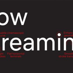
As a service provider of video streaming who is stepping up the game by creating its own original content, Netflix’s position and the diversity of its own content forced the design of Netflix Sans to be so highly neutral that even the details of the ‘t’ are simplified in a way such as that we can’t really notice any distinctive characteristics of the form. But such neutrality does come with many upsides; one being that it can be used with films and series from practically all genres. Since we don’t want to jump the gun and call Netflix Sans boring, all we can do now is wait and see how the new font will work out after it has been used for an extended period of time.


ในช่วง 2-3 ปีมานี้ เราเห็นแบรนด์ใหญ่ๆ หลายแบรนด์หันมาพัฒนาแบบตัวอักษรเป็นของตัวเอง เพื่อสร้างน้ำเสียงเฉพาะในการสื่อสารที่ต้องควบคุมให้ไปในทางเดียวกันบนทุกสื่อ ทั้งในโลกของ physical และ digital ล่าสุดเราได้เห็นการเปิดตัว custom typeface ของ Netflix ในชื่อ Netflix Sans ซึ่งเป็นการพัฒนาร่วมกันระหว่างทีมออกแบบอินเฮาส์กับค่ายฟอนต์ Dalton Maag
ถ้าเจ้าของสินค้าหรือบริการมองเรื่องการสร้างแบรนด์เป็นสินทรัพย์ การลงทุนกับแบบตัวอักษรก็เป็นส่วนหนึ่งของกระบวนการที่ต้องพิจารณาถึงความคุ้มค่าอันเหมาะสมกับขนาดธุรกิจ และเนื่องจากโมเดลธุรกิจของการซื้อขายฟอนต์ (หรือถ้าพูดให้ถูกคือการซื้อขายลิขสิทธิ์ในการใช้งาน) ได้ผ่านความเปลี่ยนแปลงมามากมายตามเทคโนโลยีและการใช้งาน จากการซื้อขายไฟล์ด้วยแผ่นดิสก์ มาเป็นการซื้อขายออนไลน์ จนถึงการเช่าใช้ด้วยเงื่อนไขที่ผูกติดกับยอดการถูกมองเห็นของสื่อโฆษณาออนไลน์ จึงไม่ใช่เรื่องแปลกที่การลงทุนพัฒนา custom typeface ที่แบรนด์ได้สิทธิ์ขาดในความเป็นเจ้าของ จะคุ้มค่ากว่าการจ่ายค่าลิขสิทธิ์ให้แบบตัวอักษรที่แบรนด์อื่นก็สามารถซื้อมาใช้ได้ไปเรื่อยๆ
ในฐานะผู้ให้บริการ video streaming ที่ขยับบทบาทมาเป็นผู้ผลิตคอนเทนต์เอง ความหลากหลายของคอนเทนต์ที่ Netflix ถืออยู่กลายเป็นข้อบังคับให้หน้าตาของ Netflix Sans ดูเป็นกลาง (neutral) เอามากๆ จนแม้แต่ดีเทลที่มีเรื่องราวอย่างการบากหางของตัว t ก็ยังไม่ทำให้เกิดบุคลิกเฉพาะได้ขนาดนั้นในสายตาของเรา แน่นอนว่าความเป็นกลางนี้มีข้อดีในการนำไปใช้กับภาพยนตร์หรือซีรีส์แนวไหนก็ได้ แต่เราก็ยังไม่แน่ใจว่ามันจะเวิร์คหรือน่าเบื่อกันแน่ และคงทำได้แค่รอดูกันไปนานๆ
TEXT: WEE VIRAPORN
PHOTO COURTESY OF NETFLIX AND DALTON MAAG
netfilx.com