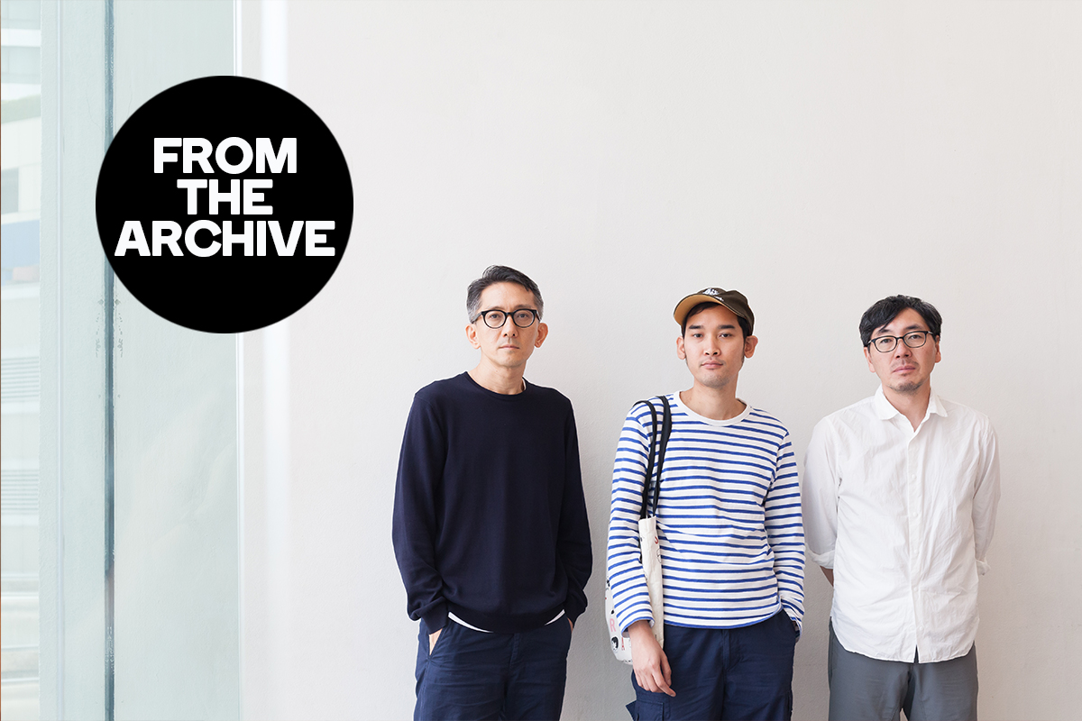
TOKYO-BASED DESIGN STUDIO, GROOVISIONS SHARES THEIR OPTIMISTIC APPROACH TOWARDS THE WORKING PROCESS
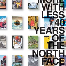
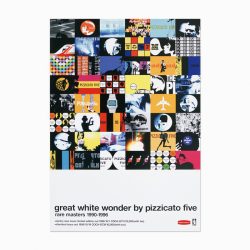
Founded in Kyoto in 1993 before relocating to Tokyo in 1997, groovisions’ works encompass a wide range of media ranging from music, publications, fashion, interior, website and application design. Some of their most renowned projects include their collaboration with the band Pizzicato Five, the designs they created for magazine Metro min., the window display for Maison Hermès, the exhibition ‘DO MORE WITH LESS 40 YEARS OF THE NORTH FACE’, motion graphics for Expo 2005 in Aichi, Japan, the MUJI to GO campaign and recently the development of the app ‘chappie.’ The three designers shared their professional experiences and personal anecdotes in the special event ‘Pieces,’ being held for the first time at the Bangkok Art and Culture Centre on the afternoon of June 28, 2015. This conversation took place after their lecture.
art4d: Back in the 90s, groovisions’ keyword was ‘digital,’ is it still the same now that we’re in the 21st century?
HIROSHI ITO: It’s design now.
art4d: Why did you guys change it?
HI: Before, we didn’t think of ourselves as a design studio, I mean back in the 90s, because most of our works were related to the music industry, but that is not the case now. Our clients are more diverse now so design is essentially the key. When we first started, it was more like working with friends, when I was teaching graphic design and working as a DJ at night and that’s how we met Pizzicato Five and started doing motion graphics for them, later moving on to CD covers, which was followed by us working with many other bands. In Japan, people’s perceptions of graphic design used to be confined only to prints. I mean poster design was like the main dream project. But it’s not like that anymore. In the Digital Age, the world is turning really fast and once the technology changes, things change accordingly, so design is what we have to stick to because it’s the heart of every media that we work with.
art4d: Let’s talk about design then.
GROOVISIONS: OK.
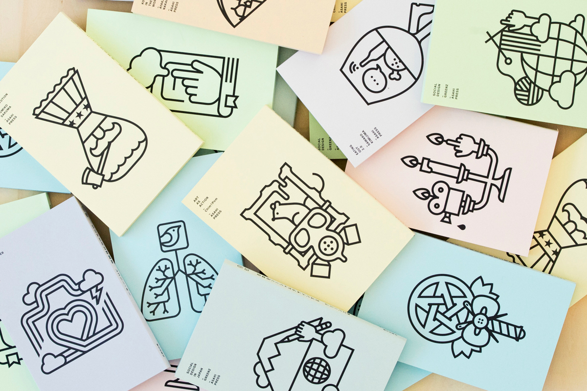
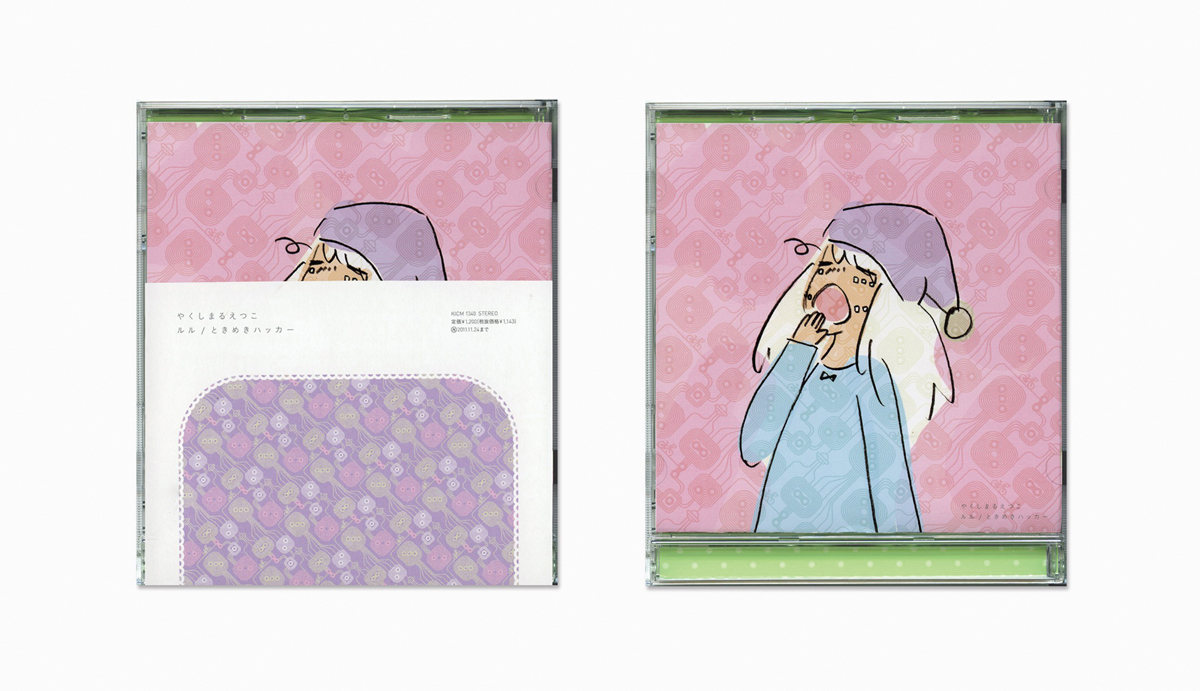
art4d: Almost every project by groovisions comes in cute pastel color tones, what is the idea behind that, why are you primarily using such colors? It has become somewhat of your character now.
HI: We get that question a lot, but ours is actually very different from the typical way of using the pastel color tones.
art4d: Is it your personal preference or taste? How come you don’t use other tones?
PAKPOOM LAMOONPAN: You could say that. At groovisions, we’re pretty strict when it comes to colors. If the color is wrong, even just a little bit, it has to be fixed. It’s very common and constant.
art4d: Who decides what’s right and what’s not, Ito or Hara or both?
PL: It is more likely that Hara says which is the right one. When I first worked here, I had to ask them quite often whether or not the colors were okay. If it was too dark, I would have to redo it because I liked to use strange colors, but it depends on the other colors that are used for the piece as well. And you can’t save it for later because everything has to go together as a scheme.
TORU HARA: We don’t have the perfect color tone that we can specifically say that this is our kind of color.
art4d: What’s your favorite color?
HI: White.
TH: I don’t have a specific one, but I have to make them match.
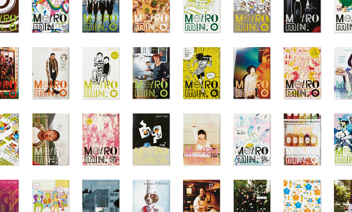
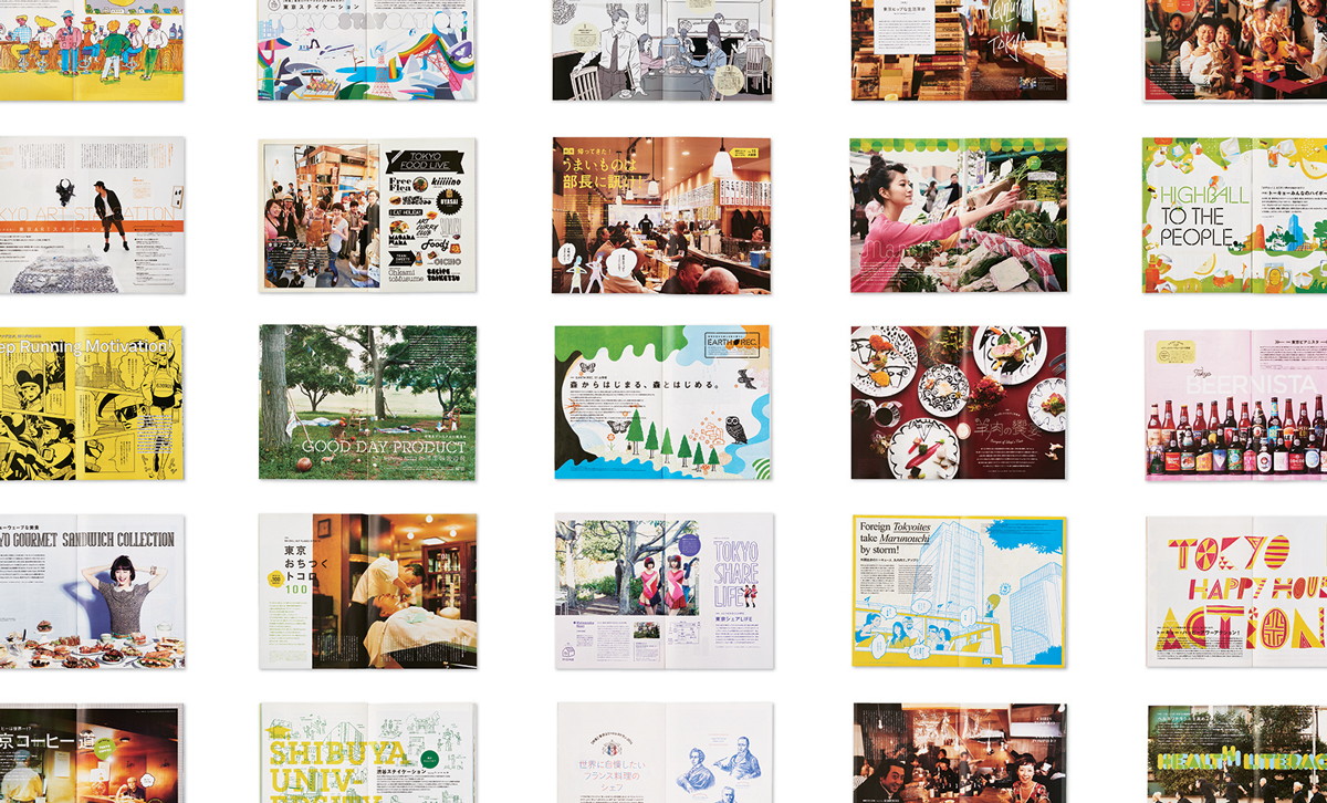
art4d: We think Metro min. is a very interesting project, could you tell us a bit about how it got started?
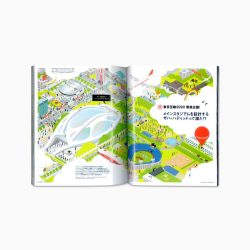
HI: Metro is the word we use to refer to Tokyo’s subway and min. is shortened from Minute, so Metro min. is basically a monthly free paper and each issue features different stories of and within Tokyo. It is given away for free at subway stations around the city.
art4d: What is the concept behind Metro min.?
TH: We didn’t come up with the concept, the editorial staff from the publication company came up with that. Their idea was that they wanted people who commuted using the subway to have something to read when they were on the train. When Metro min. started, smart phones weren’t around so “little spare time (minutes)” was the aim. If the project were to have happened today, it probably wouldn’t have worked.
art4d: But everyone still reads it, even today.
TH: Yes. It has been ongoing for ten years but people’s behaviors have changed. They pick up the paper but instead of reading it right there, they take it with them and read it at home. So in terms of the layout design, we are able to use a smaller font to fit more information in since the readers are not reading the paper on the train anymore. Making it readable on a moving train is no longer a key factor.
art4d: What are your responsibilities for Metro min.?
TH: For each issue, we design the cover and all of the inner pages except the advertisement pages. Regarding the con-tent, one special feature story is issued every time. There have been a lot of stories about food lately and the content has been favored because the style has changed, not only to give “information” about the shops or products but also to let the readers “study” the story behind and dig deeper into the history to deeply understand. So our first duty is to design a catchy cover that is interesting enough to be picked up, even in a crowded subway. The next is to design pages that are well-organized, fun to read and look at and not easy to be thrown away. Those are our main dedications when we design Metro min..
art4d: How long does it take for you to complete an issue?
PL: About one month for one issue since it is a monthly paper. But we will be given only about 2 weeks to design because the editorial work takes a while too. If you just want raw information, you don’t need design. Some people use smartphones to access information but this free paper has something you can’t find with your phone. The longevity of information or stories in Metro min. is greater than those online.
art4d: Japanese people are very conscious when it comes to the environment, are there many free papers still left these days?
PL: Yes. But there’s one thing that you have to understand, environmentally conscious in Japan doesn’t mean that they don’t use, because I think they use a lot of resources but they also have a very efficient recycling system as well as discipline. It’s not that they care for the environment so they stop producing waste or use fewer resources.
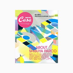
art4d: We saw the work you did for Casa BRUTUS, what are the differences between the two publications?
HI: We are not the art director for Casa BRUTUS.
art4d: On your website, there’s a project where you did a layout for Casa BRUTUS.
TH: Oh yes, we did. We didn’t do the entire artwork but more of the illustrations, covers or design for specific content. So you wanted to say that Casa BRUTUS and Metro min. are similar and ask what the differences between those two are, correct? Since what those two feature is often similar, I think the output naturally becomes similar. What the difference would be is “speed.” We design Metro min. by trying to make the readers excited to act quickly, but for Casa BRUTUS, I think the design is done to give a mild impression.
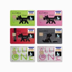
art4d: We’re really interested in the ALL IN ONE project and wish to know how you persuaded a client such as THE NISHI – NIPPON CITY BANK to accept an idea that doesn’t seem to suit their identity as a financial institution, especially when what you did was this dog in a cartoonish drawing?
HI: It doesn’t look like the kind of graphic you would expect for a bank, is that what you mean?
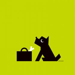
art4d: Not at all. If in Thailand, it would be very hard to convince a client that is a gigantic corporation to accept the kind of idea that you did for CITY BANK Japan. Thai banks like to pick already famous characters, like Dorae-mon or characters from LINE, for their promotional campaigns. They don’t necessarily come up with an idea to create a new character specifically for the bank in the way that you did for ALL IN ONE.
HI: It’s difficult in Japan, too. Sometimes there is a case that we have to use characters like Snoopy or Hello Kitty, which are already famous, but what we did for the bank was because they specifically asked us to create a new character. It’s not that we suggested that they should use a new character and they followed our advice. An advertising agency contacted us to take the job. It depends on the target group as well, I think because ALL IN ONE is a type of cash card so we didn’t essentially create the character for the bank but for the card. When it’s just a product, it is relatively flexible. The target group of this card is teenagers, young working people, so it was helpful.
PL: Part of it is also that it is very common in Japanese culture to use this particular kind of character as a mascot that communicates with the clients for a brand.
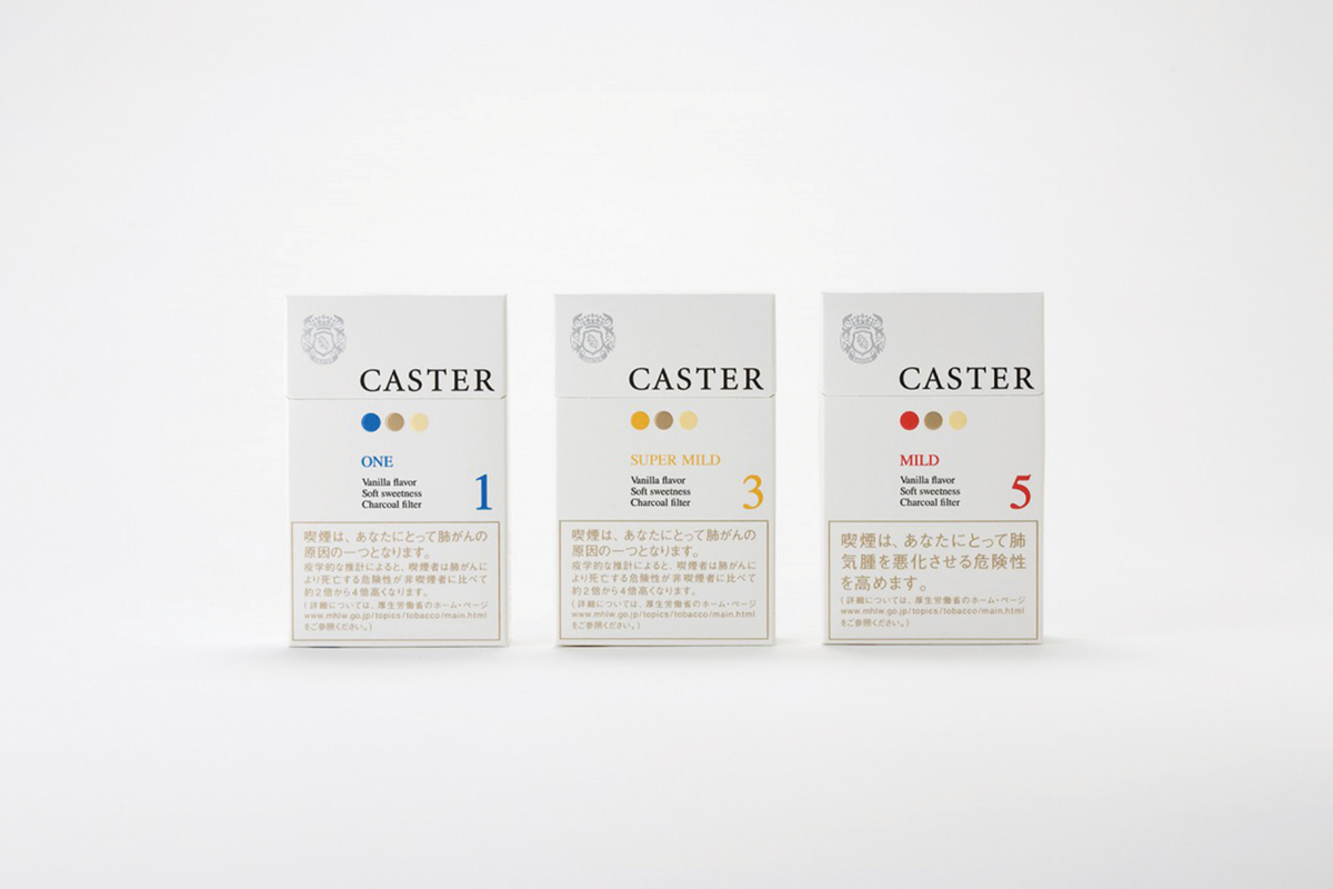
art4d: What about the identity for Caster cigarettes, the three circles in different colors? I’d like to pose the same question as to how you got the client to buy such a simple idea, was there any meaning hidden in those three dots?
TH: It didn’t have to be a circle. It could have been anything. Those three dots have meanings but that wasn’t the big point, because Caster’s concept was actually white space. For this particular project, they were expecting a cigarette pack with a lot of clean and white space so the main goal wasn’t to sell the idea of having the three dots. We presented the idea that white packaging would catch the attention of the buyers because other brands often come with colorful packaging, so white can really stand out from the crowd. If you present the three dots as something meaningful, the client might ask you to expand the graphic, to make the logo bigger, but when the main idea was white space, there wasn’t any problem because what we really wanted to work with here was the space. The dots didn’t have that much meaning.
art4d: The entire packaging is the identity.
HI: Yes. The goal is how to make Caster stand out from other brands. While lots of other brands put graphics in the middle, we moved it a bit and once we did that, a space was created and it looked beautiful. Once that’s the case, other compositions weren’t the key elements we wanted to point out anymore.
art4d: There’s been such a great diversity in the works you have done, from motion graphics and websites to products, have you ever thought about doing an interior design or architectural project, perhaps an installation?
HI: We’re not professional in that area. We often work together with architects though to do planning of shops and etc.
art4d: Who designed groovisions’ office?
TH: Tezuka Architects.
art4d: Are they the couple where the husband wears a blue shirt and the wife wears a red shirt?
TH: That’s them.
art4d: What about furniture design, do you plan to do that again?
HI: We used to be able to do it without any sense of hesitation. But as we experienced other stuff, we learned that there are things that we should not do without a sense of hesitation. But of course, if the chance comes, we would like to do it again.
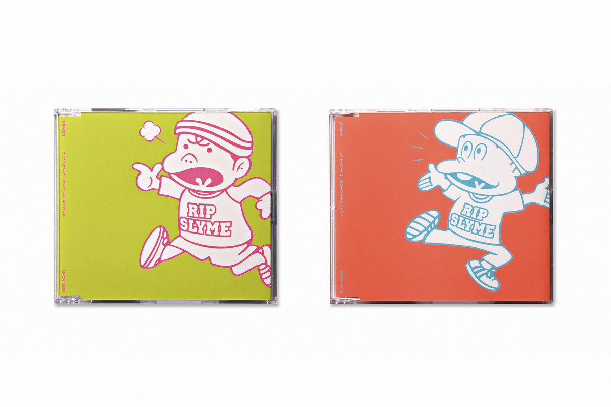
art4d: You did a bunch of album covers in your early days, are you guys musicians as well?
HI: I used to DJ when I was younger because I like music so I bought a lot of records.
art4d: When you work on a cover for an album, what is the process like? Do you have to listen to the music and translate it into visuals?
HI: Music usually has its own style in each category but if they come to us, it’s because they want something that’s different from the stuff you normally see or expect to see on a cover. And once the artist wants us to help them to do something unique, we try not to stick to the existing style or rules. We read the lyrics, seeing what’s between the lines that we can do something fun with.
art4d: Is it often that they ask you to fix the design?
HI: Not that often. If we can give an idea that the musician didn’t think of at all, the conversation will not reach the details, so that makes it less likely.
art4d: We heard the word fun a lot when talking to you guys, perhaps that should be your keyword.
PL: This Japanese word actually has three meanings — interesting, funny and fun. I translate it as fun most of the time, so…
HI: I think ‘pop’ is another keyword that would fit with our work in this category. In Japan, the meaning of pop and the worldview that pop points to change constantly. The word pop 10 years ago was different from what it means now.
art4d: Who gives the final decision for each project, is it Hara san or Ito san?
HI: It depends.
art4d: Without one of you, would groovisions still be groovisions?
HI: Our goal is that even if all of us left, groovisions would still be groovisions.
art4d: Do you mean the groovisions spirit?
HI: No, it’s about completing the system and method that we use to create. If it works, the result will be good enough in its own way no matter who uses it. It’s like an application that’s so good that anyone can use it. We create our own system for the works that we do at the office.
PL: There are a lot of systems. If someone says that this project should be done this way, we understand right away how it should be done.
art4d: Do you think spirit is in a way a style?
HI: No.
art4d: When you guys work, what comes first, idea or style?
HI: I don’t think we have a style.
art4d: We think you have a pretty outstanding style.
HI: It’s more of a system or a protocol than a style. It is more important than the style that comes out in the end.
art4d: Can we ask you something else that is not related to design?
GROOVISIONS: Absolutely.
art4d: Do you guys read manga and which one is your favorite?
TH: I do but it is hard to pick… I have a few favorites. We even invited the artist to work with us on an album cover.
art4d: I recently read a manga called RIN and it’s a story about a manga artist and I see how everyone in the story works so hard. Why do Japanese people have to work that hard?
TH: I am thankful for the work I’ve been given. You can’t throw that away. Being able to do things that you like as a job is a good thing.
art4d: We read how manga artists have to work so hard, some produce like 400 pages per month and they’re throwing their health away because they’re so dedicated to the work that they do. Do you guys work that hard?
TH: Being a manga artist is a very special profession. It’s tougher than that of most designers because you have to produce new work, sometimes on a daily or weekly basis, which is really tough, but as long as they like what they do then that should be a happy thing.
art4d: But you guys don’t work that hard, right?
TH: No, not that hard. It isn’t like what happens in BAKUMAN where they have to check the rating every week and everyone is competing all the time. We don’t have to work under that kind of pressure, fortunately.
art4d: How many hours do you normally work in a day?
TH: It’s hard to tell because we’re not always at the desk and not only counting the time that we’re at the office. We leave the desk but sometimes we’re still working.
PL: I arrive at the office around 11 a.m. and leave around 10 or 11 p.m. Nobody works on weekends. I heard that some of the design studios work 7 days a week. It’s busier here compared to when I was working in Thailand, but it didn’t take long to adjust. I had to because there’s really no choice. I mean what else can you do, you know what I mean? It’s groovisions, it’s fun so there’s no point in complaining? Bring it on.
art4d: What are your hobbies?
HI: I don’t have a specific hobby. I do a lot of things but I think of all of them as parts of the work. Our work is involved with so many things in this world, so I’ll always find time to try things out. If it’s not my kind of thing, I’ll stop. You have to understand the world and you have to try things out in order to learn, or just to understand what it is or what it is like. Once you think you know enough, you can stop.
art4d: Last question, what would you say are your weak points in terms of design?
HI/TH: The business aspect of it and so many other things.
art4d: So many? Could you give us an example?
GROOVISIONS: Cynical personality and others.
art4d: But your works are awesome.
GROOVISIONS: We were just kidding. We don’t know how to explain it.
art4d: Well, thank you for your time.
GROOVISIONS: Thank you.

groovisions ก่อตั้งขึ้นเมื่อปี พ.ศ. 2536 ที่เกียวโต ก่อนจะย้ายมาเปิดออฟฟิศที่โตเกียวในปี 2540 ผลงานของพวกเขาครอบคลุมสื่อหลากหลายประเภท ตั้งแต่ดนตรี สิ่งพิมพ์ ตกแต่งภายใน แฟชั่น ไปจนถึงเว็บไซต์และแอพพลิเคชั่น ผลงานที่สร้างชื่อให้กับ groovisions ประกอบด้วยงานออกแบบที่ทำร่วมกับศิลปินวง Pizzicato Five งานออกแบบให้กับนิตยสารต่างๆ อย่างเช่น Metro min. หรือว่าจะเป็นการทำ Window Display ให้กับ Maison Hermès งานออกแบบนิทรรศการ ‘DO MORE WITH LESS 40 YEARS OF THE NORTH FACE’ งานโมชั่นกราฟิกสำหรับงาน Expo 2005 ที่จังหวัดไอจิ ประเทศญี่ปุ่น งานออกแบบให้กับแคมเปญ MUJI to GO และล่าสุดกับ app ‘chappie’ พวกเขาทั้ง 3 คน มาร่วมแชร์ประสบการณ์ทั้งเรื่องงานและมุมมองในการใช้ชีวิตในงาน Pieces ครั้งที่ 1 ที่หอศิลป์กรุงเทพฯ เมื่อบ่ายวันที่ 28 มิถุนายน และนี่คือบทสนทนาเล็กๆ หลังการบรรยายของพวกเขา
ย้อนกลับไปช่วงปี 90s groovisions มีคีย์เวิร์ดสำหรับบริษัทตัวเองว่า ‘ดิจิตอล’ แล้วตอนนี้ ศตวรรษที่ 21 แล้ว พวกคุณยังใช้คำว่าดิจิตอลอยู่หรือเปล่า?
HIROSHI ITO: เราใช้คำว่า ‘ดีไซน์’ แล้วตอนนี้
ใช้คำว่าดีไซน์แล้วหรือครับ ทำไมถึงเปลี่ยนไป?
HI: ก่อนหน้านี้เราไม่ได้คิดว่าเราเป็นสตูดิโอออกแบบ หมายถึงช่วงปี 90s นะ เพราะตอนนั้นงานส่วนใหญ่ของเรามันเกี่ยวแต่กับดนตรี แต่ตอนนี้ไม่ใช่แล้ว พอเรามีลูกค้าที่หลากหลายขึ้นเราเลยต้องยึดว่าต่อไปนี้สิ่งสำคัญที่สุดคือดีไซน์นะ ตอนที่เราเพิ่งเริ่มมันเหมือนทำงานกับเพื่อน อย่างตอนที่ผมเป็นอาจารย์สอนกราฟิกดีไซน์ พอตกกลางคืนก็ไปเป็น DJ ทำให้เราได้รู้จักกับวง Pizzicato Five แล้วก็เริ่มทำโมชั่นกราฟิกให้พวกเขา แล้วก็ทำปกซีดีซึ่งมีทำให้อีกหลายๆ วง ที่ญี่ปุ่นถ้าเมื่อก่อนเรานึกถึงงานออกแบบกราฟิก เราจะนึกถึงแค่สิ่งพิมพ์ ผมว่างานออกแบบโปสเตอร์นี่น่าจะถือเป็นโปรเจ็คต์ในฝันเลย แต่เดี๋ยวนี้มันไม่ใช่แบบนั้นแล้ว พอเราอยู่ในยุคดิจิตอล โลกหมุนไปเร็วมาก พอเทคโนโลยีเปลี่ยน อะไรๆ ก็เปลี่ยนไปด้วยคำว่า ดีไซน์ เลยเป็นสิ่งที่เรายึดถืออยู่ตลอด เพราะมันเป็นหัวใจของสื่อทุกสื่อที่เราทำ
เอาเป็นว่าช่วงแรกเราจะคุยกันถึงเรื่องดีไซน์ก่อนละกัน
GROOVISIONS: โอเคครับ
งานแทบจะทุกโปรเจ็คต์ของ groovisions มักจะใช้สีที่ดูน่ารัก พวกชุดสีพาสเทลหลายๆ ชุดที่คุณชอบเลือกใช้ เราอยากรู้ว่า คุณมีไอเดียอะไร ทำไมถึงเลือกสีออกมาเป็นแบบนั้น จนกลายเป็นคาแร็คเตอร์ของพวกคุณไปเลย?
HI: เป็นคำถามที่พวกเราถูกถามอยู่บ่อยๆ จริงๆ แล้วการเลือกใช้สีพาสเทลของพวกเราต่างจากที่คนอื่นใช้มากกว่า
เป็นเพราะความชอบหรือ? ทำไมไม่ ใช้สีโทนอื่นบ้างล่ะ?
PAKPOOM LAMOONPAN: ถ้าจะพูดก็คืออย่างนั้นแหละครับ คือทุกคนที่ทำงานที่ groovisions เราจะค่อนข้าง strict เรื่องการเลือกใช้สีมากๆ ถ้าสีผิดไปนิดเดียวก็จะไม่ใช่ ก็ต้องแก้ไขกันบ่อยมาก
แล้วระหว่าง Ito – san กับ Hara – san นี่ ใครจะเป็นคนบอกว่าใช่หรือไม่ใช่ หรือทั้งคู่เลย?
PL: Hara-san จะเป็นคนบอกครับว่าอันไหนใช่ อย่างเวลาที่ผมเข้ามาทำงานที่ groovisions ใหม่ๆ ก็จะต้องไปถามพวกเขาบ่อยๆ ว่า สีแบบนี้โอเคหรือยัง สีตุ่นไปก็จะไม่ได้ จะโดนบอกให้แก้บ่อย เพราะว่าผมชอบใช้สีแปลกๆ มันขึ้นอยู่กับสีรอบๆ ด้วย เพราะงั้นจะเก็บสีนี้ ไว้ ใช้งานหน้าก็ไม่ได้ เพราะทุกอย่างมันต้องไปด้วยกัน เป็นชุดสีเดียวกัน
TORU HARA: เราไม่ได้มีสีที่เพอร์เฟคอะไรในใจแบบที่จะสามารถพูดได้ว่า จงดูนะ นี่คือสีแบบของเรา เราไม่ได้มีอะไรแบบนี้เลย
พวกคุณชอบสีอะไรมากที่สุด?
HI: สีขาวครับ
TH: จริงๆ แล้วก็ไม่ ได้มีสีไหนเป็นพิเศษหรอก มันต้องประกอบกัน
เราคิดว่าแม็กกาซีน Metro min. เป็นโปรเจ็คต์ที่น่าสนใจมาก ช่วยเล่าให้ฟังหน่อยว่ามีความเป็นมายังไง?
HI: Metro ก็คือชื่อเรียกรถไฟใต้ดินของโตเกียว ส่วนคำว่า min. ย่อมาจาก Minute Metro min. เป็นฟรี-เปเปอร์รายเดือนที่พูดถึงเรื่องราวของโตเกียวในแต่ละเล่ม วางแจกอยู่ในสถานีรถไฟใต้ดินทั่วโตเกียว
อะไรคือคอนเซ็ปต์เบื้องหลัง Metro min.
TH: จริงๆ เราไม่ได้เป็นคนคิดคอนเซ็ปต์ กองบรรณาธิการจากบริษัทอื่นเป็นคนคิดขึ้นมา สิ่งที่เขาคิดก็คือ อยากให้คนที่นั่งรถไฟใต้ดินได้นั่งอ่านไปด้วยเวลาขึ้นรถไฟ ตอนแรกที่เริ่มทำ Metro min. เรายังไม่มีสมาร์ทโฟนใช้กัน เลยคิดว่าน่าจะมีหนังสือเอาไว้อ่านแก้เหงาเวลานั่งรถไฟ ถ้าเกิดเริ่มทำสมัยนี้ มันอาจจะไม่ฮิตก็ได้
ตอนนี้ทุกคนก็ยังหยิบอ่านอยู่
TH: ยังหยิบอ่านอยู่ครับ แจกมาได้ 10 ปีแล้ว เพียงแต่ว่าตอนนี้พฤติกรรมของคนอ่านที่นั่งในรถไฟเปลี่ยนไปแล้ว แทนที่จะหยิบขึ้นมาอ่านกันเลย ก็เปลี่ยนไปหยิบติดมือกลับไปอ่านที่บ้านแทน ส่วนในแง่ของการออกแบบเลย์เอาท์เราก็สามารถที่จะใช้ฟอนต์ที่ขนาดเล็กลงกว่าเมื่อก่อนได้ เพราะคนอ่านหนังสือเราไม่ได้นั่งอ่านกันบนรถไฟแล้ว ไม่ได้จำกัดว่าต้องใช้ตัวใหญ่เพื่อให้อ่านสะดวกเวลาที่รถวิ่งอีกต่อไปแล้ว
พวกคุณทำอะไรให้ Metro min. บ้าง
TH: เราเป็นคนคิดปกกับคิดฟอร์แมตและการออกแบบในแต่ละเล่มยกเว้นแค่หน้าโฆษณา เรื่องเด่นประจำฉบับเดือนละเรื่อง ช่วงหลังๆ นี่จะพูดถึงอาหารซะส่วนใหญ่ เนื้อหามันก็ค่อนข้างจะเป็นที่นิยมอยู่นะ เพราะกับร้านค้าหรือโปรดักท์ แต่ ให้ผู้อ่านได้เรียนรู้เรื่อง-ราวที่อยู่เบื้องหลังเพื่อที่จะได้เข้าใจมันให้ลึกขึ้นด้วย เพราะฉะนั้นสิ่งแรกเลยคือต้องออกแบบปกที่น่าดึงดูด น่าสนใจพอที่จะให้คนหยิบไปได้ แม้จะในชั่วโมงเร่งด่วนที่แออัดไปด้วยผู้คนก็ตาม
ใช้เวลาแค่ไหนในการทำแต่ละเล่ม?
PL: ประมาณหนึ่งเดือนต่อเล่ม แต่จริงๆ พวกเรามีเวลาแค่สองอาทิตย์ครับ เพราะกว่าจะได้เรื่องจากทีมที่ทำคอนเทนต์มาออกแบบก็ค่อนข้างใช้เวลาเหมือนกัน สมัยนี้ถ้าต้องการข้อมูลเปล่าๆ ก็ไม่จำเป็นต้องออกแบบอะไรนะ บางคนก็ไปใช้สมาร์ทโฟน แต่ฟรีเปเปอร์เล่มนี้มีเนื้อหาที่ไม่ใช่คุณจะหาอ่านเอาได้จากในโทรศัพท์ ข้อมูลหรือเรื่องราวใน Metro min. จะมีอายุนานกว่านั้น
คนญี่ปุ่นดูจะเอาใจใส่กับเรื่องสิ่งแวดล้อมมากขนาดนั้น แล้วการแจกฟรีเปเปอร์ยังมีอยู่มากหรือเปล่าครับ?
PL: มีครับ ต้องเข้าใจก่อนนะครับว่า ใส่ใจสิ่งแวดล้อมในญี่ปุ่นนี่ไม่ได้แปลว่าไม่ใช้ ผมว่ามันใช้เยอะมาก แต่ประเทศเขามีการจัดเก็บและทิ้งได้เป็นอย่างดี มีทั้งการแยกประเภทขยะเพื่อเอาไปรีไซเคิล เป็นอารมณ์นั้น เขาไม่ได้บอกว่า โอ๊ย พวกเราโคตรรักสิ่งแวดล้อม ถ้างั้นเราไม่ผลิต เราจะใช้ให้น้อยลง คือมันไม่ใช่ ผมว่าผลิตเยอะที่สุดในโลกแล้วล่ะ
เราเคยเห็นคุณทำงานให้กับ Casa BRUTUS ด้วย มันแตกต่างอย่างไรกับการทำ Metro min.?
HI: เราไม่ได้ทำ BRUTUS นี่
เห็นในเว็บ groovisions ก็มีงานที่ทำเลยเอาท์ ให้ Casa BRUTUS ไม่ ใช่หรือ?
TH: อ่อ ใช่ครับ เราทำให้ Casa BRUTUS แต่เราไม่ ได้ทำอาร์ตเวิร์คให้ทั้งเล่มนะ เหมือนเขาเชิญเราไปทำภาพประกอบ ทำปก หรือดีไซน์เป็นเรื่องๆ ไปอย่างนั้นมากกว่า คือคุณอยากถามว่าระหว่าง Casa BRUTUS กับ Metro min. มีอะไรที่เหมือนหรือต่างกันบ้างใช่ รึเปล่า? คือด้วยความที่เนื้อหาของทั้งสองเล่มมันค่อนข้างคล้ายกัน จนเป็นรูปแบบที่ใกล้เคียงกัน ผมเลยคิดว่าผลลัพธ์ที่ได้ออกมามันก็น่าจะเหมือนกันแน่นอนอยู่แล้ว แต่สิ่งที่แตกต่างกันน่าจะเป็นเรื่องของความเร็ว เราออกแบบ Metro min. โดยพยายามที่จะเข้าถึงไม่ใช่แบบนั้น เราแค่เสนอว่าจะขายบุหรี่ในแพ็คเกจสีขาวที่น่าซื้อ และถ้าคุณสังเกตบนแผงขายบุหรี่คุณจะเห็นว่าส่วนมากหน้าตาแต่ละยี่ห้อจะเป็นสีเยอะๆ เพราะฉะนั้นสีขาวมันก็เลยสามารถที่จะดูเด่นออกมาได้ แล้วก็เวลาพรีเซ็นต์กับลูกค้าสมมติเราไปบอกว่าจุด จุด จุด นี้มีความหมาย อาจจะเจอลูกค้าบอกว่า งั้นขยาย 3 จุดนี้ให้ใหญ่ขึ้นหรือว่าขยายให้โลโก้ใหญ่ขึ้นได้ไหม แต่เรานำเสนอว่าเราต้องการพื้นที่สีขาว มันก็จะไม่มีปัญหานี้ จุด 3 จุดนี้มันไม่มีความหมายสำคัญนะครับ เพราะสิ่งที่เราอยากทำงานนี้ก็คือเล่นกับสเปซ
พูดง่ายๆ คือ แพ็คเกจจิ้งทั้งหมดเลยคือ identity?
HI: ใช่ โจทย์คือทำอย่างไรให้ต่างจากบุหรี่ยี่ห้ออื่น บุหรี่อื่นกราฟิกอยู่ตรงกลางหมด เราเขยิบออกมานิดหนึ่ง พอทำปุ๊บเกิดสเปซ แล้วมันสวย พอเป็นอย่างนี้เรื่ององค์ประกอบอื่นๆ มันก็ไม่ใช่ความหมายที่ต้องการเน้นอีกต่อไป
พวกคุณทำงานกันหลากหลายมาก มีทั้งโมชั่นกราฟิก เว็บไซต์ และโปรดักท์ แล้วมีความคิดที่จะทำอินทีเรียหรืองานสถาปัตยกรรมบ้างไหม หรืออย่างงานอินสตอลเลชั่นอะไรพวกนี้?
HI: เราไม่ใช่โปรในด้านนี้ครับ คือเราก็ทำงานร่วมกับสถาปนิกอยู่หลายครั้งนะ แต่จะเป็นงานวางผังร้านค้าหรืออะไรทำนองนี้มากกว่า
ใครเป็นคนออกแบบออฟฟิศของ groovisions?
TH: Tezuka Architects
ที่สามี ใส่เสื้อสีน้ำเงินและภรรยาสีแดงใช่มั้ย?
TH: ใช่ คู่นั้นแหล่ะ
แล้วถ้าเป็นการออกแบบเฟอร์นิเจอร์ล่ะ มีแผนว่าจะทำอีกบ้างมั้ย?
HI: แต่ก่อนได้ทำหลายอย่างแบบที่ไม่ต้องคิดอะไรเลยนะ มีแต่คนเอาเฟอร์นิเจอร์มาให้ แต่พอเราได้ทำอะไรมาหลายๆ อย่าง เราก็ได้เรียนรู้ว่ามีของอยู่หลายๆ อย่างนะ ที่ไม่ควรจะทำมันแบบที่ไม่คิดอะไร เลยทำให้ไม่มีโอกาสได้ทำเยอะเหมือนเมื่อก่อน แต่ถ้ามีโอกาสก็คงจะทำ
เห็นงานช่วงแรกๆ พวกคุณทำปกอัลบั้มเยอะมาก แล้วพวกคุณเป็นนักดนตรีกันด้วยหรือปล่า?
HI: ตั้งแต่ตอนสมัยเด็กๆ โตมาก็ไม่ได้เล่นแล้วครับ ก็เลยเลิก คือจริงๆ เป็นดีเจช่วงที่ยังหนุ่มๆ เพราะชอบเพลงเลยซื้อแผ่นมาเยอะครับ
เวลาเริ่มออกแบบปกสักอัลบั้ม มีขั้นตอนในการทำงานอย่างไร ต้องฟังก่อนแล้วพยายามแปลให้มันออกมาเป็นภาพหรือเปล่า?
HI: คือปกติดนตรีมันก็มีสไตล์ของมันในแต่ละแนว แต่ถ้าศิลปินเขาเข้ามาหาเรา นั่นก็เพราะเขาอยากได้อะไรที่ต่างจากปกติที่เห็นบนปก พอศิลปินอยากให้ช่วยทำอะไรที่มันไม่เหมือนใคร เราเลยเลือกไม่ฟังเพลงเลยดีกว่า เราใช้วิธีดูเนื้อเพลง ดูว่าในเนื้อเพลงจะมีอะไรซ่อนอยู่และสามารถเอามาทำอะไรที่มันสนุกๆ ได้บ้าง
วงที่มาให้ออกแบบนี่ขอแก้เยอะไหม?
HI: ก็ไม่เยอะมากครับ คือถ้าเราทำสิ่งที่ศิลปินคาดไม่ถึงก็ไม่ต้องแก้เยอะครับ
พอได้นั่งคุยกันสักพัก ผมได้ยินคำว่าสนุกบ่อยมากเลย จนคิดว่าสนุกจะเป็นคีย์เวิร์ดของพวกคุณมากกว่าคำว่า ดีไซน์หรือเปล่า?
PL: คือภาษาญี่ปุ่นคำนี้เวลาแปลมันจะมีสามความหมายน่ะครับ น่าสนใจ ตลก และสนุก ส่วนใหญ่ผมก็จะแปลไปว่าสนุก
HI: น่าจะเป็นคำว่า pop ด้วย ถ้าพูดถึงคำว่า pop ที่ญี่ปุ่นก็เปลี่ยนไปเรื่อยๆ 10 ปีที่แล้วกับตอนนี้มันก็ไม่เหมือนกัน
ในแต่ละโปรเจ็คต์นี่ ใครจะเป็นคนตัดสินใจคนสุดท้ายระหว่าง Hara – san กับ Ito – san
HI: แล้วแต่งาน
ถ้าขาดคนใดคนหนึ่งไป groovisions ยังเป็น groovisions อยู่หรือเปล่า?
HI: เป้าหมายของเราคือต่อให้ไม่มี ใครเหลืออยู่ groovisions ก็ยังเป็น groovisions เหมือนเดิม
หมายความว่าไม่ว่าคุณสองคนจะไม่อยู่แล้วแต่ว่าสปิริตบางอย่างของ groovisions ยังอยู่ใช่ ไหม แล้วสปิริตนั้นมันคืออะไร?
HI: จริงๆ แล้วคือการทำให้ system และวิธีคิดของพวกเรานั้นสมบูรณ์ จนไม่ว่าใครได้มาใช้ก็ยังเหมือนกับเราเป็นคนทำเอง พูดง่ายๆ คือเหมือนมีคนมาใช้ app ที่มันดีจนไม่ว่าใครก็สามารถใช้ได้ เราจะสร้าง system ต่างๆ ขึ้นเองเพื่อใช้ในการทำงานที่ออฟฟิศ
PL: เวลาทำงานจะมี system เยอะมาก ถ้าสมมติว่าในออฟฟิศพูดขึ้นมาว่า โปรเจ็คต์นี้ต้องทำงานแนวนี้นะ เราก็จะเข้าใจเลยว่าต้องแนวนี้
คำว่าสปิริตนี่หมายถึงสไตล์หรือเปล่า?
HI: ไม่ใช่
เวลาพวกคุณทำงาน ไอเดียมาก่อนหรือว่าสไตล์มาก่อน?
HI: ผมคิดว่าเราไม่มีสไตล์นะ
จริงหรือ แต่เราว่าสไตล์ของ groovisions นี่ชัดมากเลยนะ
HI: มันเป็น system หรือกฎเกณฑ์มากกว่าสไตล์นะ สิ่งที่สำคัญมันมากกว่าสไตล์ที่ออกมาในตอนสุดท้ายซะอีก
งั้นเราขอถามเรื่องอื่นที่ไม่เกี่ยวกับงานออกแบบแล้วนะ
GROOVISIONS: เชิญเลยครับ
พวกคุณอ่าน manga กันมั้ยครับ แล้วชอบเรื่องอะไรมากที่สุด?
TH: อ่านครับ ไม่ได้ชอบเรื่องอะไรมากเป็นพิเศษ มีอยู่เรื่องหนึ่งที่ไม่ได้ฮิตในเมืองไทยแน่ๆ เพราะเขาออกช้ามาก เล่มหนึ่งกว่าจะออกก็ตั้ง 3 ปี แต่พวกเราชอบมากขนาดเชิญเขามาร่วมงานกัน ให้มาวาดหน้าปกอัลบั้ม
ผมพึ่งอ่าน manga เรื่องหนึ่งชื่อ RIN เป็นเรื่องของคนเขียน manga เห็นในเรื่องพวกเขาต้องทุ่มเททำงานกันหนักมากๆ เลยอยากรู้ว่าทำไมคนญี่ปุ่นถึงทำงานกันหนักขนาดนั้น?
TH: คนญี่ปุ่นรู้สึกว่า การที่เราได้ทำงานคือเราต้องขอบคุณที่เขาให้งานเรามาทำ เราจะเอาคำขอบคุณนี้โยนทิ้งไปไม่ได้ การได้ทำงานมันเป็นเรื่องดี
เคยอ่านเจอว่านักเขียนการ์ตูนต้องทำงานหนัก บางคนเดือนหนึ่งต้องเขียนต้นฉบับถึง 400 หน้า ทำให้เขาทำงานหนักจนไม่ดูแลสุขภาพเพราะเอาแต่ทุ่มเทให้กับการวาดการ์ตูน ผมแค่อยากจะถามว่าพวกคุณทำงานหนักกันมากขนาดนั้นรึเปล่า?
TH: จริงๆ อาชีพนักเขียนการ์ตูนนี่พิเศษกว่าคนธรรมดามากนะ โหดกว่านักออกแบบ ต้องผลิตงานออกมาใหม่ตลอด บางครั้งทุกวัน หรือทุกสัปดาห์ ซึ่งมันโหดมาก แต่ตราบใดที่เขาชอบที่จะทำมัน ก็น่าจะมีความสุขนะ
แต่พวกคุณไม่ได้ทำงานหนักขนาดนั้นใช่ไหม?
TH: ไม่ได้ทำงานหนักขนาดนั้น ไม่ได้ทำเหมือนอย่างในเรื่อง BAKUMAN ที่มันจะต้องมีการวัดอันดับความนิยมของแต่ละเรื่องทุกอาทิตย์ นักเขียนการ์ตูนต้องแข่ง-ขันกันตลอดเวลา โชคดีที่เราไม่ได้กดดันกันขนาดนั้น
แล้วพวกคุณทำงานกันวันละกี่ชั่วโมง?
TH: มันยากที่จะบอกเหมือนกันเพราะสิ่งที่เราทำเป็นอาชีพที่ไม่รู้จะบอกได้ว่าตอนไหนทำงาน ตอนไหนไม่ทำงาน บางทีก็ไม่ได้นั่งโต๊ะตลอดเวลา พอลุกออกจากโต๊ะแล้วไม่ได้ทำงานก็ไม่ใช่
PL: ผมเข้างาน 11 โมงกว่า ออกสี่ห้าทุ่ม วันเสาร์อาทิตย์ก็ไม่มี ใครทำงาน เคยได้ยินว่าแต่ก่อนนี้พวกดีไซน์สตูดิโอที่โหดๆ เขาจะทำกันเต็ม 7 วันเลย เทียบกับตอนอยู่ไทยก็ถือว่าที่นี่ยุ่งกว่า แต่ก็ไม่ ได้ ใช้เวลาปรับตัวนาน ผมปรับตัวได้ ถ้าไม่ทำแล้วจะทำอะไร มันไม่มีทางเลือก นึกออกรึเปล่า เฮ้ย นี่ groovisions นะเว้ย จะบ่นทำไม โอเค สนุกดี มาเลย
แล้วมีงานอดิเรกอะไรกันบ้าง?
HI: ผมไม่คิดว่าอะไรมันเป็นงานอดิเรกพิเศษนะ ก็เล่นอะไรไปเรื่อย คือมันมีเยอะครับ แต่ผมคิดว่ามันเป็นส่วนหนึ่งของงานด้วย จริงๆ แล้วเหมือนงานเราต้องเกี่ยวข้องกับเรื่องอะไรต่างๆ ในโลกนี้ เวลามีอะไรก็ไปลองนิดนึง ผิดก็เลิกไป ก็เลิกไปหลายอย่างเหมือนกัน คือต้องเข้าใจโลก ถ้าเกิดว่าไม่ลองบางทีมันก็ไม่รู้ หรือบางทีแค่เข้าใจว่ามันเป็นอย่างไรเหมือนสร้างกิจกรรมใหม่ๆ พอรู้แล้วก็เลิก
งั้นคำถามสุดท้าย ขอถามหน่อยว่าจุดอ่อนแต่ละคนในงานออกแบบคืออะไร
HI/TH: ธุรกิจ แล้วก็มีอีกหลายอย่างเลย
หลายอย่างเลยหรือ ช่วยยกตัวอย่างให้ฟังหน่อย
GROOVISIONS: บุคลิคที่ชอบมองโลกในแง่ร้าย แล้วก็อื่นๆ
แต่คุณทำงานออกมาดูดีมากเลยนะ
GROOVISIONS: พูดเล่น แต่มันไม่รู้จะบอกยังไง
ขอบคุณมาก
GROOVISIONS: ขอบคุณมากครับ
TEXT : PIYAPONG BHUMICHITRA & VARATORN RATDILOKPANICH
PORTRAIT : KETSIREE WONGWAN
PHOTO COURTESY OF GROOVISIONS
Originally published in art4d No.229, September 2015.
groovisions.com