THIS RECENTLY OPENED CAFE IN THE RAMINTRA NEIGHBORHOOD SHOWS US HOW ASWA (ARCHITECTURAL STUDIO OF WORK-AHOLIC) EXPRESS A COLLECTIVE PERSONALITY OF SNOG XX’S CAFFEINE AND ALCOHOL-FRIENDLY SERVICES
TEXT: NATHANICH CHAIDEE
PHOTO: KETSIREE WONGWAN
(For Thai, press here)
The brief given to the design team of SNOG XX, a café in the Ramintra neighborhood, is clear and purposeful. It needs to include the place’s future operation as a bar with a playful character that resonates with the establishment’s moniker. ASWA (Architectural Studio of Work-Aholic), the designated project’s architect, translates the idea into the exuberant use of lines, forms, and materials that express a collective personality of SNOG XX’s caffeine and alcohol-friendly services.
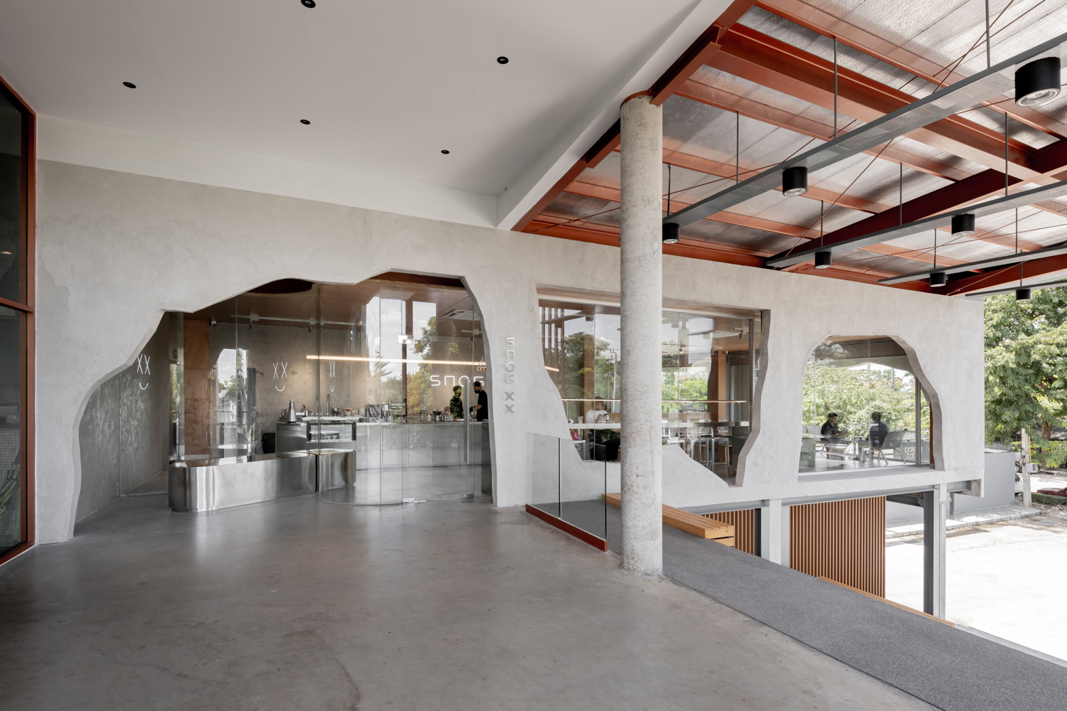
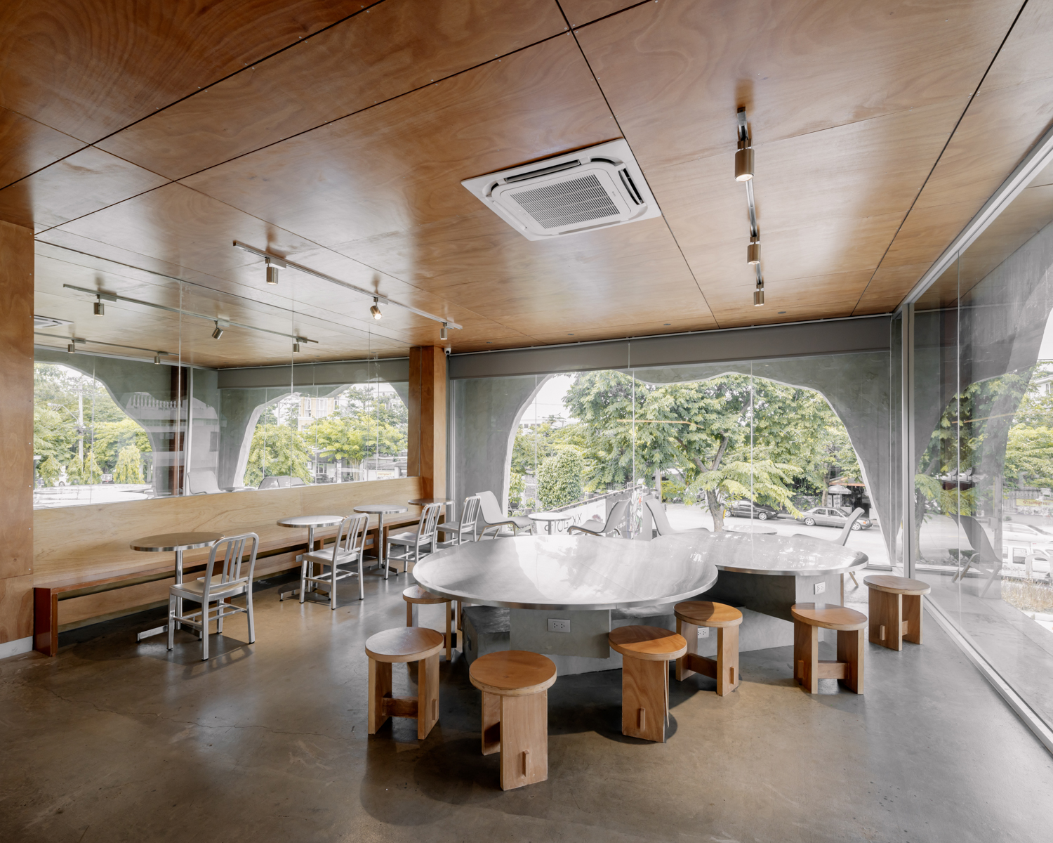
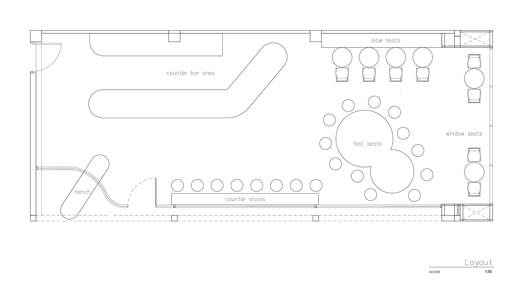
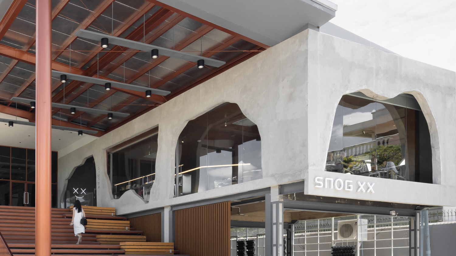
The facade’s design follows the owner’s wish. “We want it to look like a wrecked concrete wall, like someone smashed a hole into the wall to enter.” To achieve such an aesthetic, the architect uses a fiberglass sculpture (created by the owner’s artist friend), built and altered on the actual site until the desired form is rendered. Contrary to the facade’s rawness, the interior decoration is surprisingly clean in character. It’s expressed through surfaces and materials of the arched mirror wall at the front, to cute gimmicks intentionally designed for clients to take pictures with, for instance, the bench deliberately placed to look like it smashed through the glass wall or the way the arched mirror plays with the cafe’s logo and creates unexpected reflective effects.
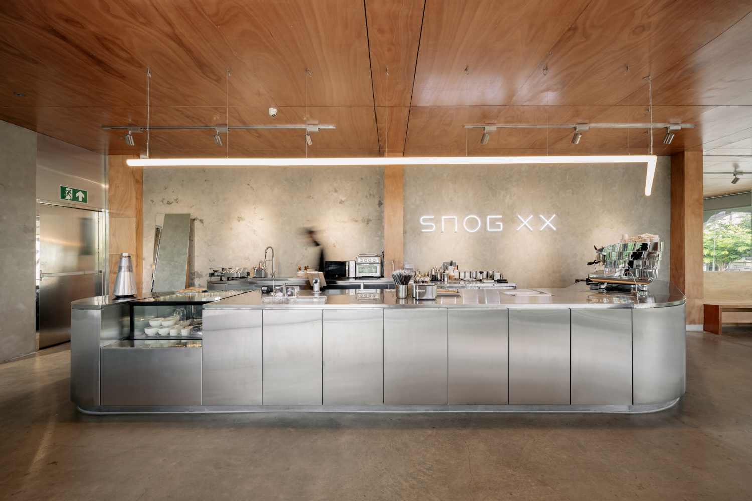
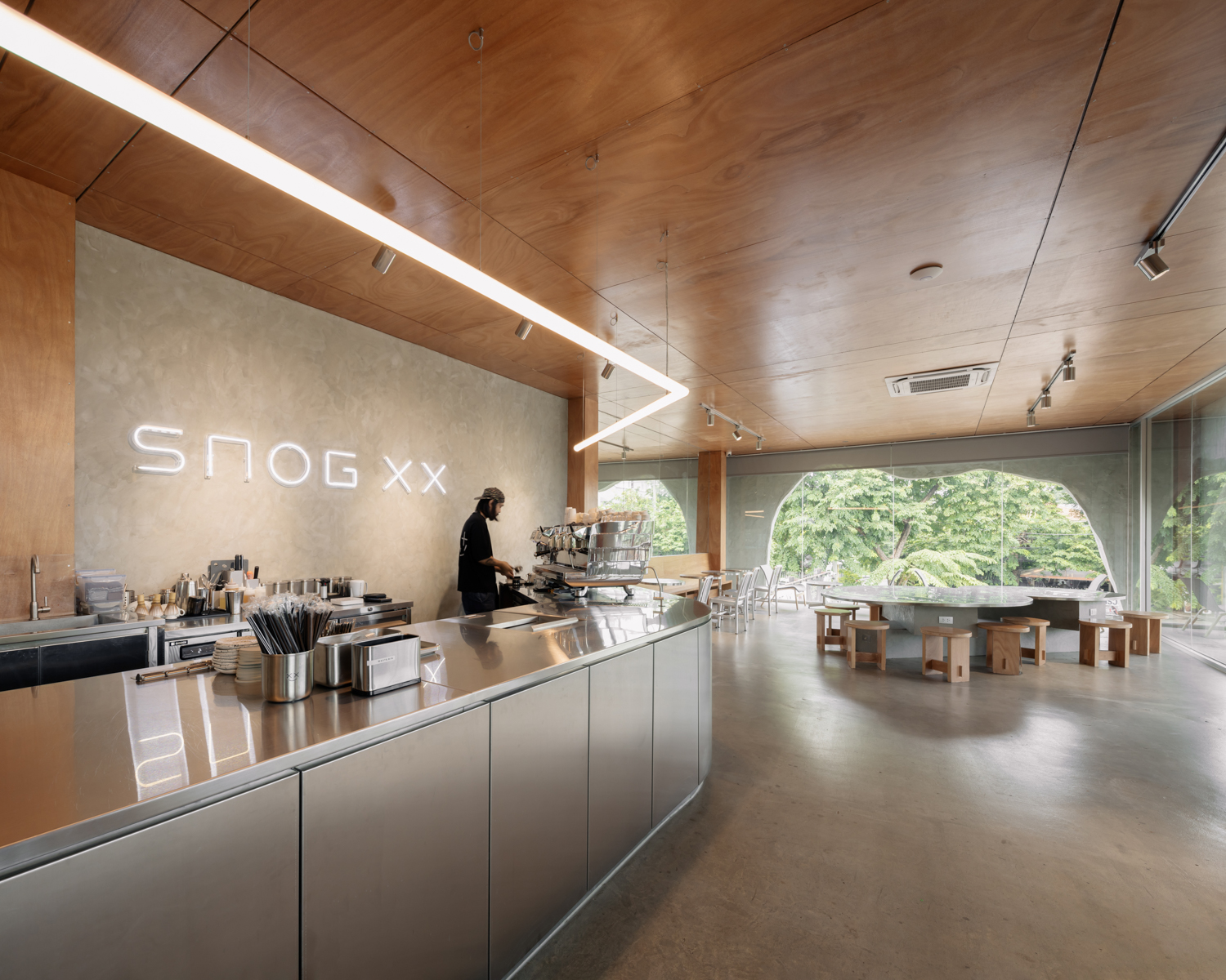
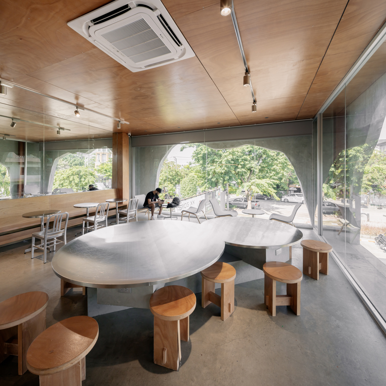
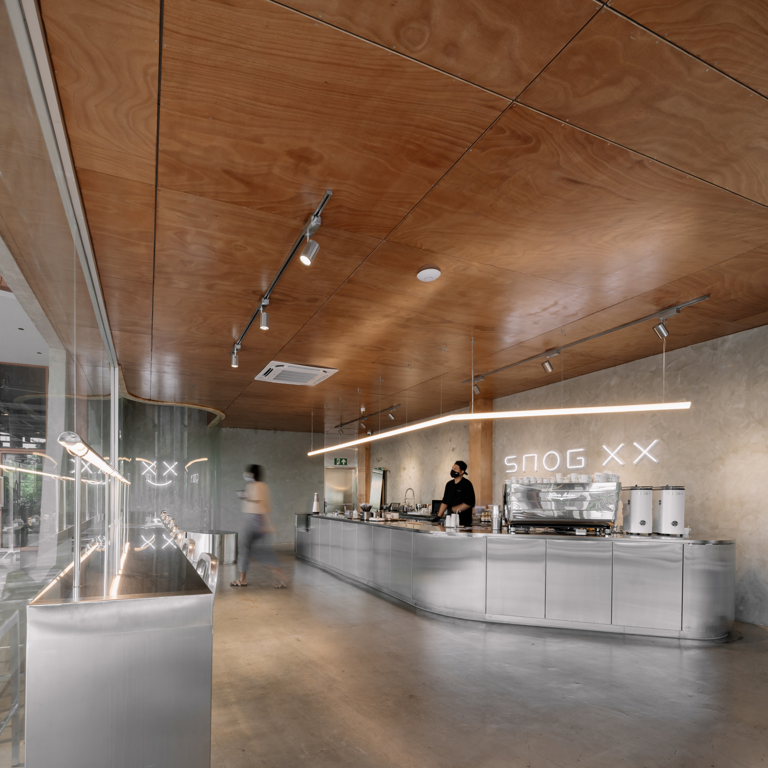
ASWA told art4d that the design’s essence lies in contrast between two sentiments (crude-refined). In other words, it’s the ‘simplification’ of the rustic rawness of the exterior and the transition into the curved corners and spaciousness of the interior. The design achieves the concept through the interplay between the expressed characteristics of forms and glossy surfaces’ true nature. In this sense, the ‘truth to material’ doesn’t refer to textural deterioration or roughness that we’re familiar with, but it’s more about how the material’s expresses its true characteristics, whether it’s stainless steel, plywood ceiling with exposed joinery details, polished concrete floor, a mirror whose varying depths of the surface render different reflective effects.
The idea about ‘simplification’ also encompasses the use of furniture of with unusual-looking forms and sizes, the curved counter clad with stainless steel, a circular center table designed to be smaller than its usually large size to accommodate clients’ behaviors and activities, resonating with the cafe’s character. A sizeable mirrored wall reflects the outside surroundings, whereas the plywood ceiling deliberately reveals the joinery details of wooden panels and nails. The minimal space and materials will eventually be complemented and enlivened by the people who come to the café.
As mentioned earlier, in the future, SNOG XX is planning to operate as a bar during its nighttime opening hours. Lighting design becomes a monumental player that will make the interior atmosphere more fun and upbeat. The polished surfaces will propel the night vibe and hang out space, keeping the drinks, the music, and the design aesthetics in a beautiful, unanimous flow.

