BEHIND THE (NEWLY DESIGNED) FAÇADES OF BVLGARI STORES IN KL AND BANGKOK, WHICH RESULTED FROM THE COLLABORATION BETWEEN THE LUXURY BRAND AND THE FAMOUS ARCHITECT MVRDV, LIES A STORY THAT CAN DATE BACK TO ITS FIRST FLAGSHIP STORE AT VIA DEI CONDOTTI 10 IN ROME WHERE THE LETTER V WAS FIRST INTRODUCED TO THE BRAND’S LOGO AND STOREFRONT DESIGN
TEXT: PAPHOP KERDSUP
PHOTO: KETSIREE WONGWAN EXCEPT AS NOTED
(For Thai, press here)
It was late last year when I found out about MVRDV’s project in Bangkok, I could not help but wonder what the famous Dutch architecture firm was doing in Thailand and where the project had been hiding all this time. After doing a bit of asking around from one of the reliable sources such as SkyscraperCity, not to mention big names like SOM, Foster + Partners, OMA or BIG, there were hardly any signs about a MVRDV’s project here (except for how my many encounters Winy Maas has had both in Thailand and other countries got me thinking light-heartedly that they would probably be doing something in Thailand soon). It wasn’t until I saw the photographs taken by Ketsiree Wongwan, art4d’s architectural photographer whom the architect had commissioned to take pictures of the work, and everything was finally unveiled that the project in question was BVLGARI FAÇADE DESIGN at Iconsiam Shopping Mall.
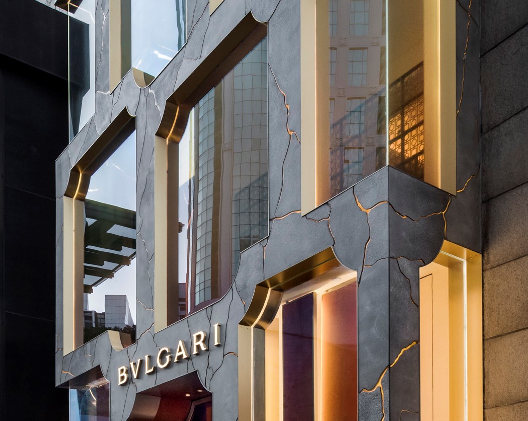
Just to give you a bit of context, this marks the second collaboration in which MVRDV has worked with BVLGARI to design the brand’s storefront or ‘façade.’ The revamp of the Bukit Bintang branch in Kuala Lumpur, Malaysia, in 2018 was the first project under the supervision of Jacob van Rijs, one of MVRDV’s architects and founders (which is probably the reason why despite having met Mass so many times, I didn’t give have a clue about the project). The cool thing about this façade design is how it’s a contemporary reinterpretation and depiction of the brand’s 140-year history, with the Via dei Condotti 10 branch in Rome being the center of the narrative.
The first two branches, Via Sistina (opened in 1884) and Via dei Condotti ( opened in 1894), were within walking distance and not too far from Scalinata di Trinità dei Monti or Spanish Steps in Rome’s city center. Via dei Condotti 10 was launched in 1905 (and is the only remaining shop to date), following the two branches, and it’s considered the brand’s threshold for many aspects. It is BVLGARI’s first boutique flagship store and was also the first time that the letter ‘V’ was used in BVLGARI instead of the ‘U’ for the storefront design. The spelling is a reference to old Roman characters and later became the brand’s current logo. The branch’s storefront is also the inspiration for MVRDV’s new façade design for both the Bukit Bintang and ICONSIAM branches, including the following shops that will open in the future.
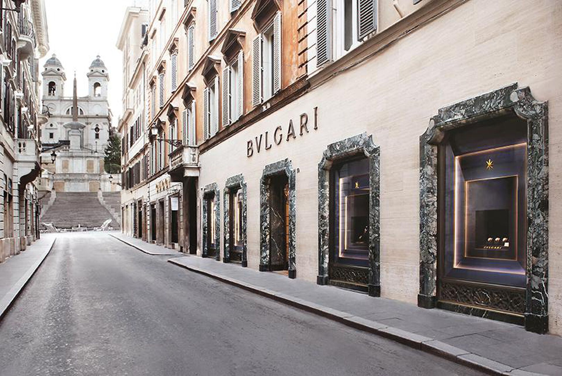
Photo courtesy of BVLGARI
But what are the reasons behind MVRDV’s use of this particular façade as the inspiration for their designs? Going back to after Sotirio Voulgaris, the brand’s founder, recently passed away, BVLGARI decided on conducting a major renovation on the Via dei Condotti between 1933 and 1934, with an Italian architect, Florestano di Fausto, who was assigned to oversee the design (the same person who initiated the BVLGARI spelling). It was one of the essential details of Fausto inherited from another renovation of the branch in 2014 as a part of the 130th anniversary by American architect Peter Mario. The façade designs MVRDV has completed with other stores around the world is the sizeable four section, display window’ and the main entrance situated right at the storefront’s center, which is framed by the cornice made of a light green stone from Africa with the form simplified from the door and window frames used in historical buildings in Italy.
")
")
")
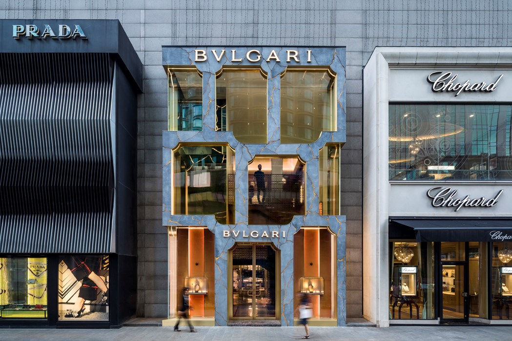
Photo: Daria Scagliola
With this being the point of reference, MVRDV worked with the cornice outline, reinterpreting, simplifying and expanding it until the design generated door and window frames of various forms and scales. The variations were then rearranged into each branch’s façade, with all the shops sharing certain commonalities in terms of architectural language. Each shop contains unique characteristics with the way the design experiments and plays with the materiality differently. For the Bukit Bintang branch, the architect used GRC as the principal material, cutting the concrete slabs into patterns that reminisces the cracks on old buildings before pouring resin into the cracks and installing the LED stripes. The final result is the façade that delivers varying effects at different times of the day. Under natural light, the rigidity and stillness of concrete are accentuated, while nighttime sees a more dramatic impact of the light illuminating through the cracks, causing BVLGARI to stand out from neighboring shops of other luxury brands. The architect developed these details with TU Delft and Tensoforma, the two companies with expertise in façade design and construction.


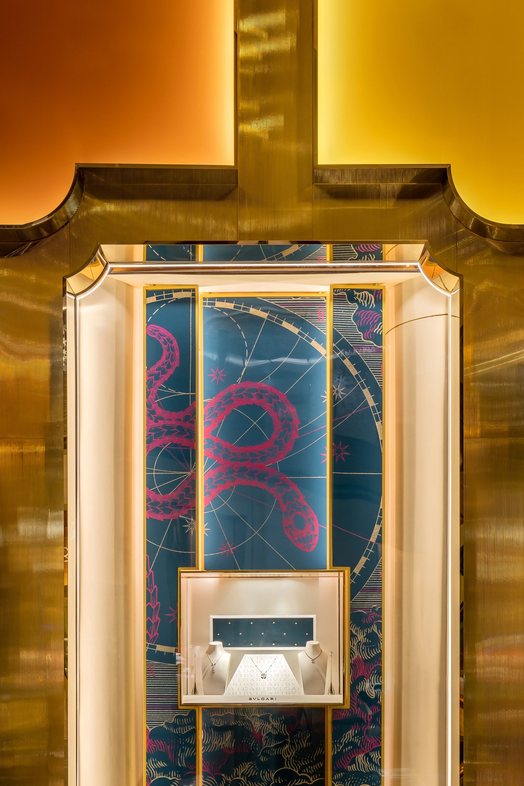
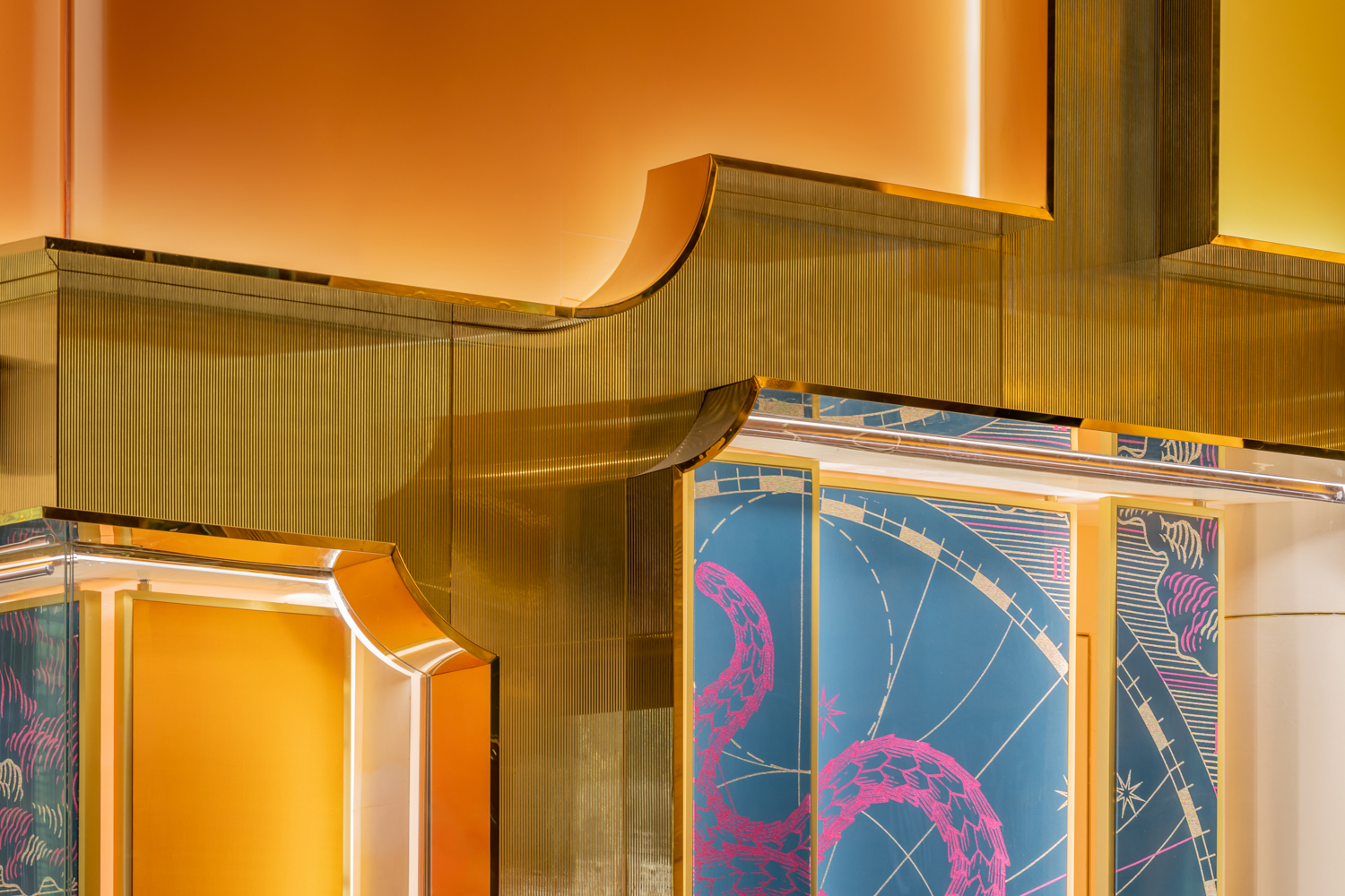
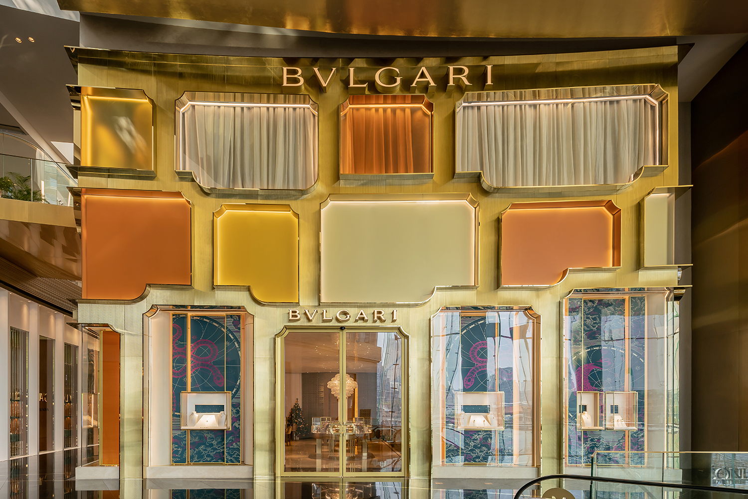
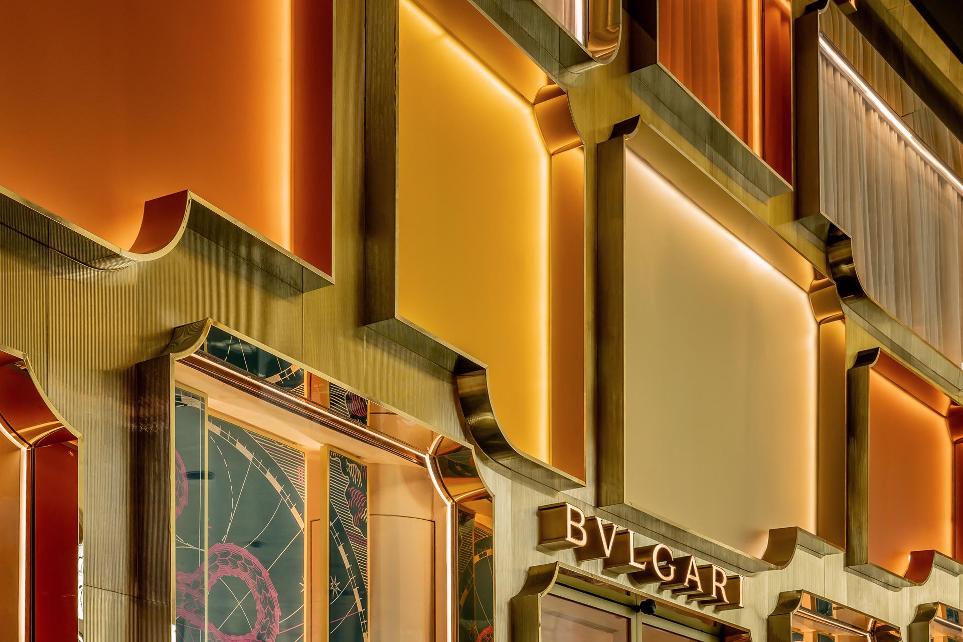
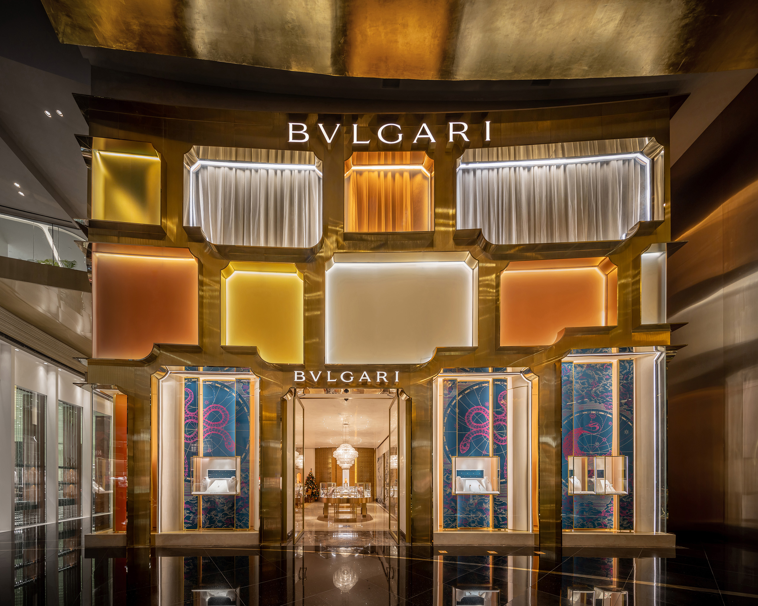
The ICONSIAM branch’s façade seems to have fewer technical details than the Kuala Lumpur branch, partly due to the more straightforward use of the cornice’s outline with the chosen material. MVRDV simply bent the brass sheets into the design mentioned above with smaller corrugated brass sheets cladding the area between the display windows’ frames. The gimmicks found in the way different materials are used correspond with the interior space’s functionalities and privacy levels. Transparent glass is used for the product display area on the ground floor while with the VIP guest area on the second floor, where more privacy is required calls for dense walls and frosted tinted glass in various colors which were brought in, enabling the glow of metallic tones such as brass, copper and silver to be revealed when touched by light. All these elements and the shop’s strategic location contribute to the façade’s visual appeal that effectively attracts the passerby’s interest.


In terms of how the design handles the surrounding context, the ICONSIAM branch’s façade works comparatively better. While the Bukit Bintang branch situated next to the street and is enchanted by the contrast of the surrounding elements, the ICONSIAM branch deals with a much more challenging environment where the ‘gold’ of the shopping mall’s ICONLUXE Zone and the storefronts of other brands can easily subsume the shop into indistinguishable uniformity. The gleaming effect of the various metallic tones is a brilliant solution to the challenge of how to make ‘BVLGARI’ stand out from other brands.
The only thing we find to be a bit off about this collaboration between MVRDV and BVLGARI is that the work covers merely the façade, and even though Jacob van Rijs had summarised this Bangkok project as “With this design, we bring a Roman zest for life to Bangkok,” it would have been even better to see the interior space offer the said type of experience to users as well.