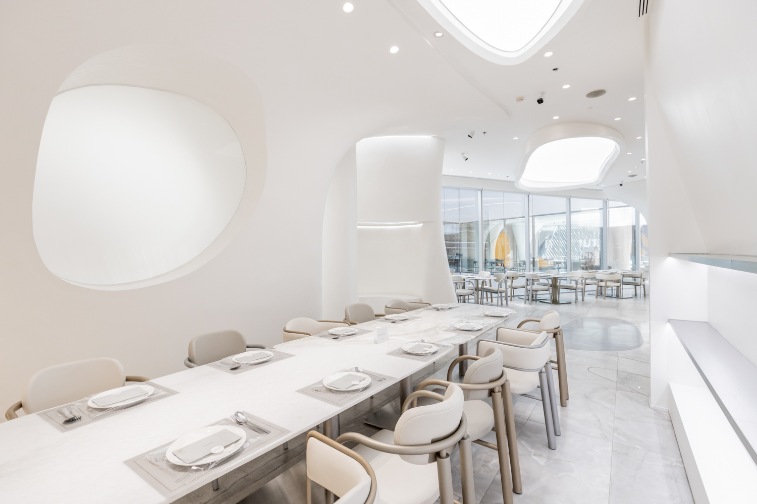
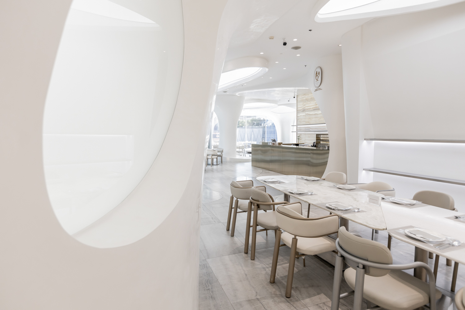
TRIMODE STUDIO CARRIES KAITHONG ORIGINAL’S DNA OF METICULOUSNESS AND REFINED CULINARY CREATION IN THE DESIGN WHICH ENCAPSULATES THE CONNECTION BETWEEN HUMANS AND NATURE, ELABORATES WITH DELICATE DESIGN DETAILS, AND OFFERS A UNIQUE AND MEMORABLE SPATIAL EXPERIENCE.
TEXT: NATHANICH CHAIDEE
PHOTO: KETSIREE WONGWAN EXCEPT AS NOTED
(For Thai, press here)
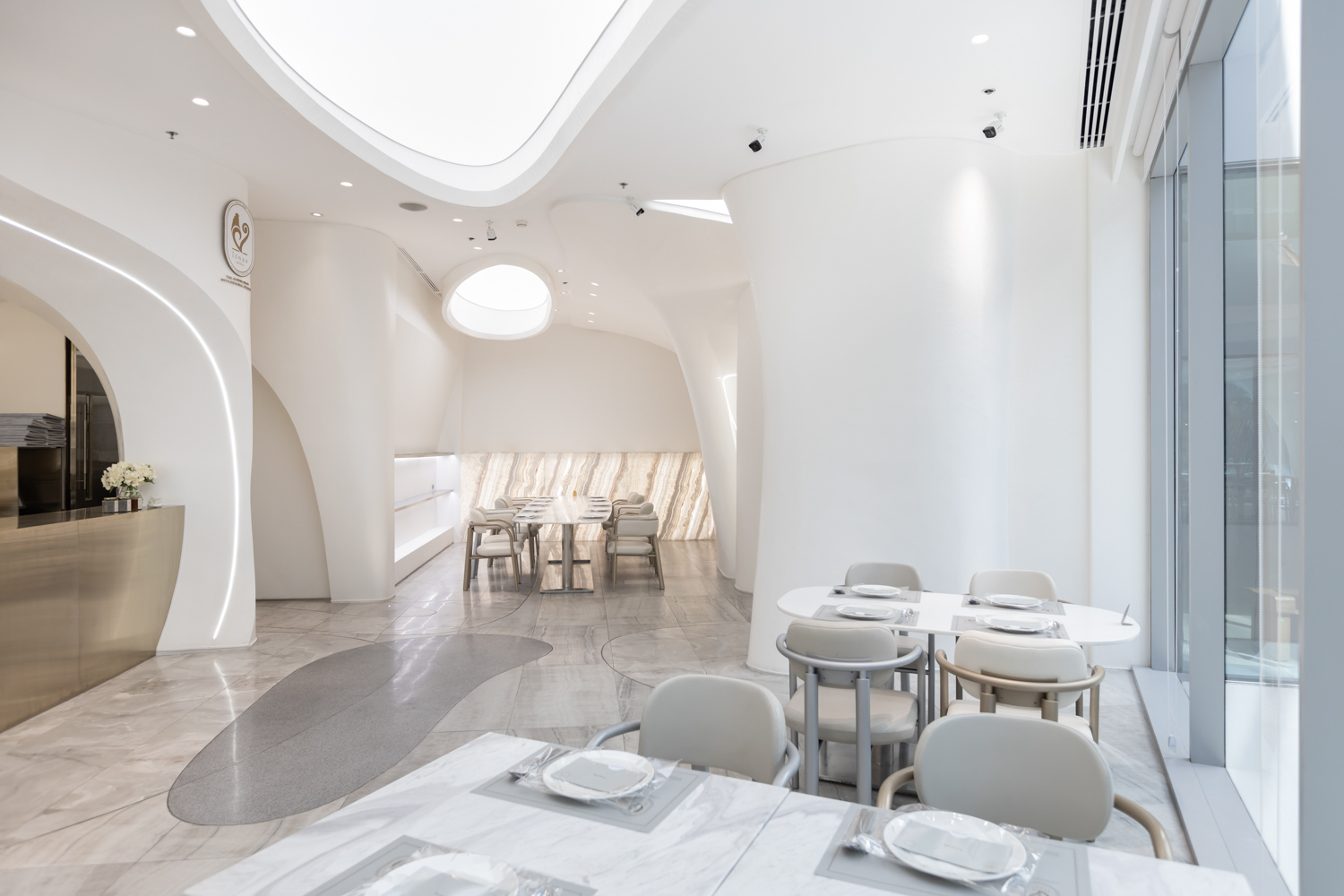
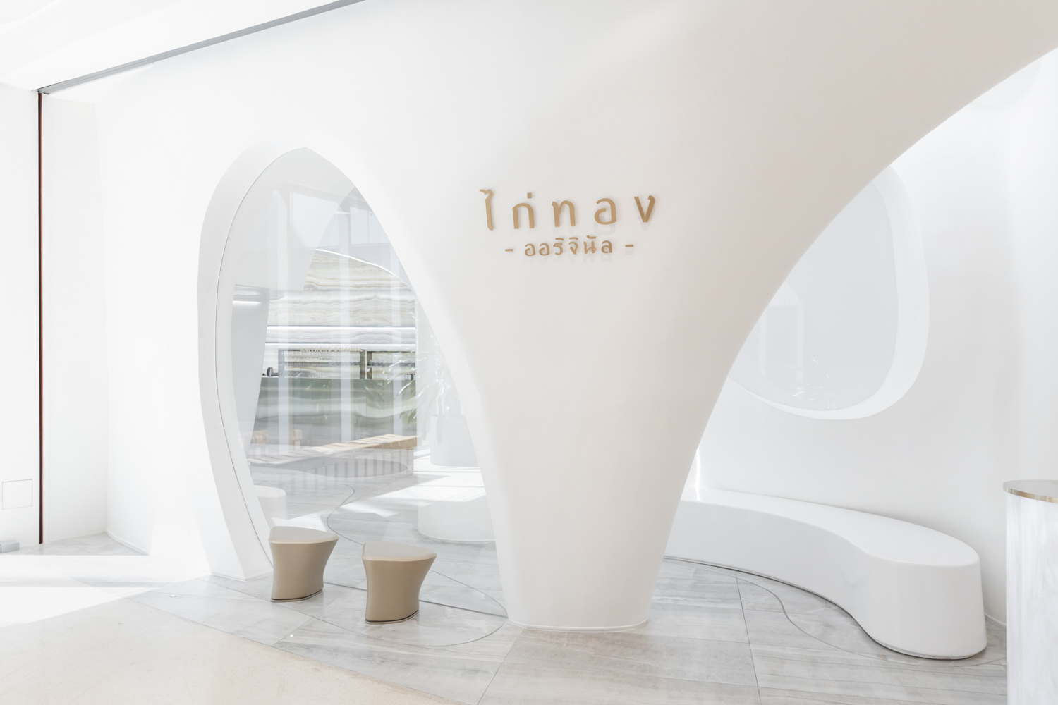
Kaithong Original is known as a warm and welcoming restaurant for friends and family gatherings. The concept has been with the brand since the opening of their first branch twenty four years ago. Each dish at Kaithong Original is an expression of love, attentively and meticulously prepared for their clients. Trimode Studio translates this sentiment into the visuals and physical space of Kaithong Original, the brand’s latest branch at Central Embassy Department Store.
The Trimode team were also chosen to design two previous branches of Kaithong Original at Central Phuket Floresta and Central Eastville Department Store. The third branch sees an adaptation of Kaithong Original’s refined culinary creation–the brand’s DNA, which encapsulates the lovely mother-child bond and the connection between humans and nature. “Nature is all around us, and it nurtures humans to continue living. Perhaps it isn’t the same kind of love between a mother and child, but it is a relationship with that same unconditional compassion.”
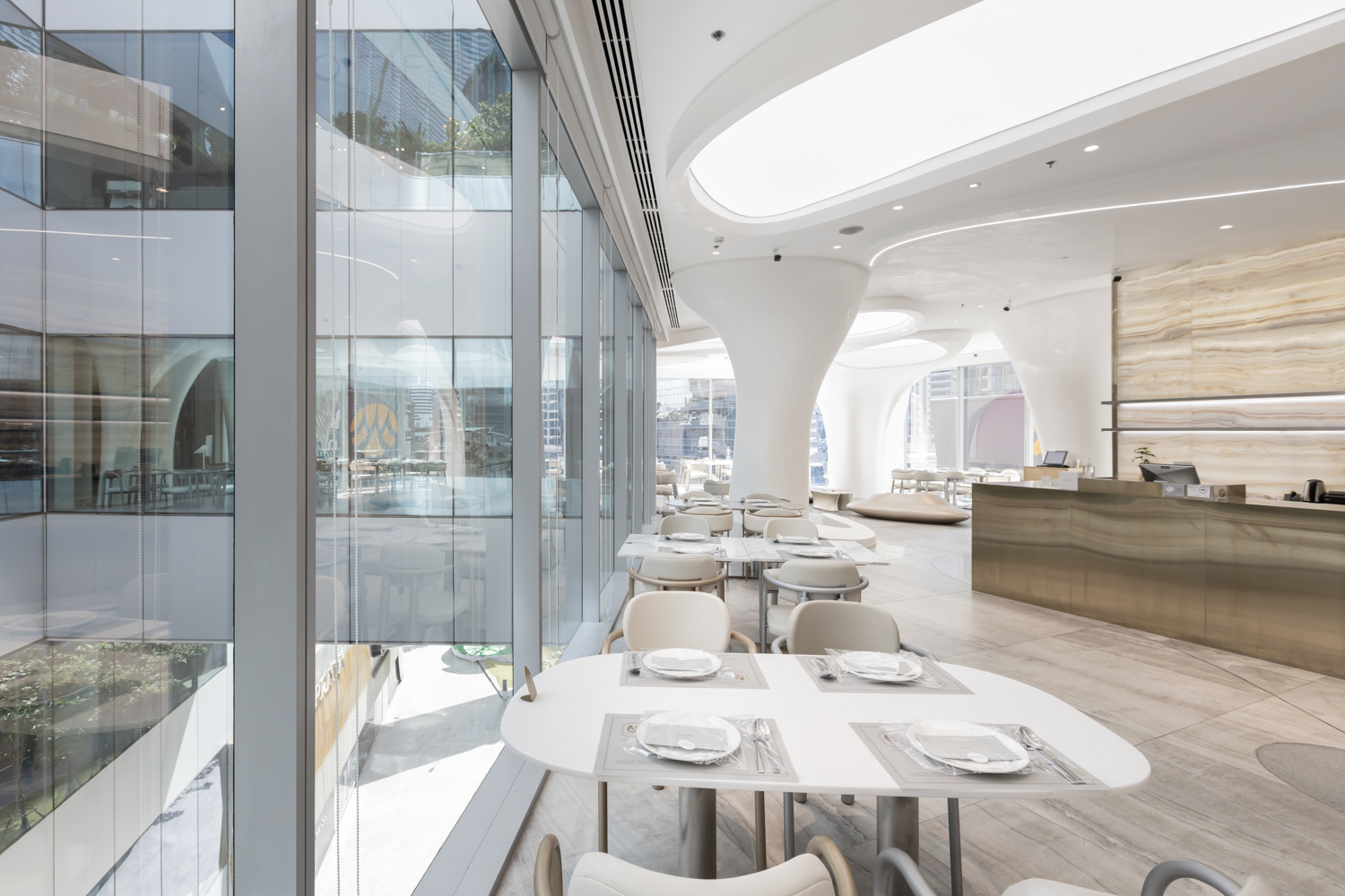
Working with the actual site in an upscale department store has its challenges. Access to indirect and direct light became an obstacle especially with the space whose three sides are partitioned with glass walls. Since that was the case, they had to work very carefully when they were allocating functional spaces and curating the mood and tone to correspond with the concept. ‘Forenoon’ is what they used to define the fundamental elements of the design.
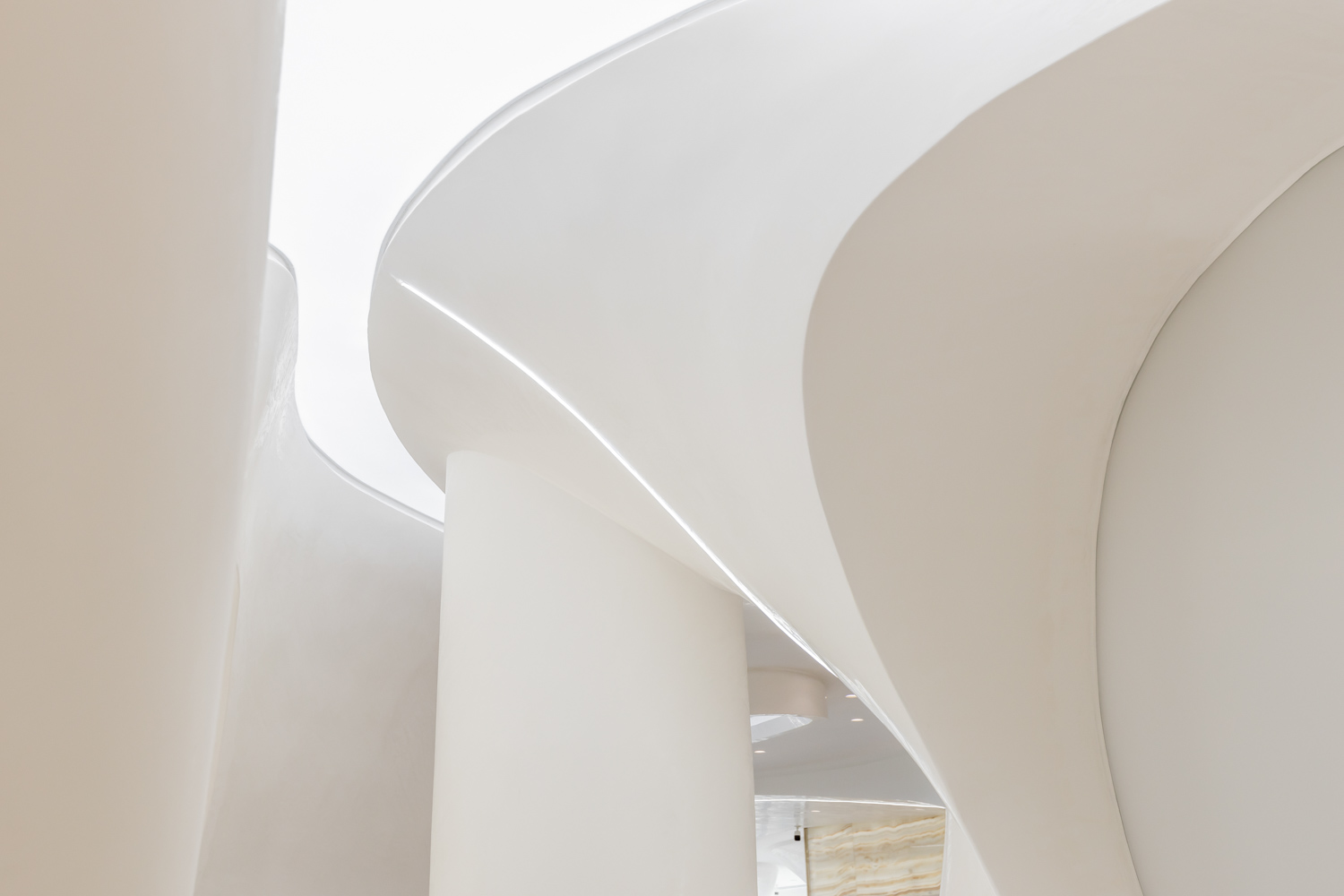
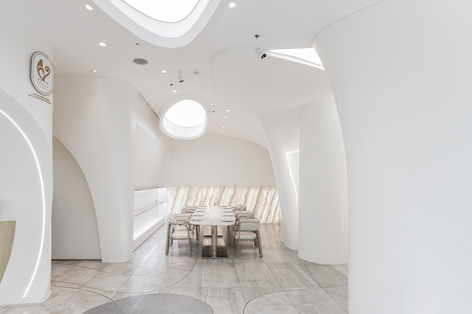
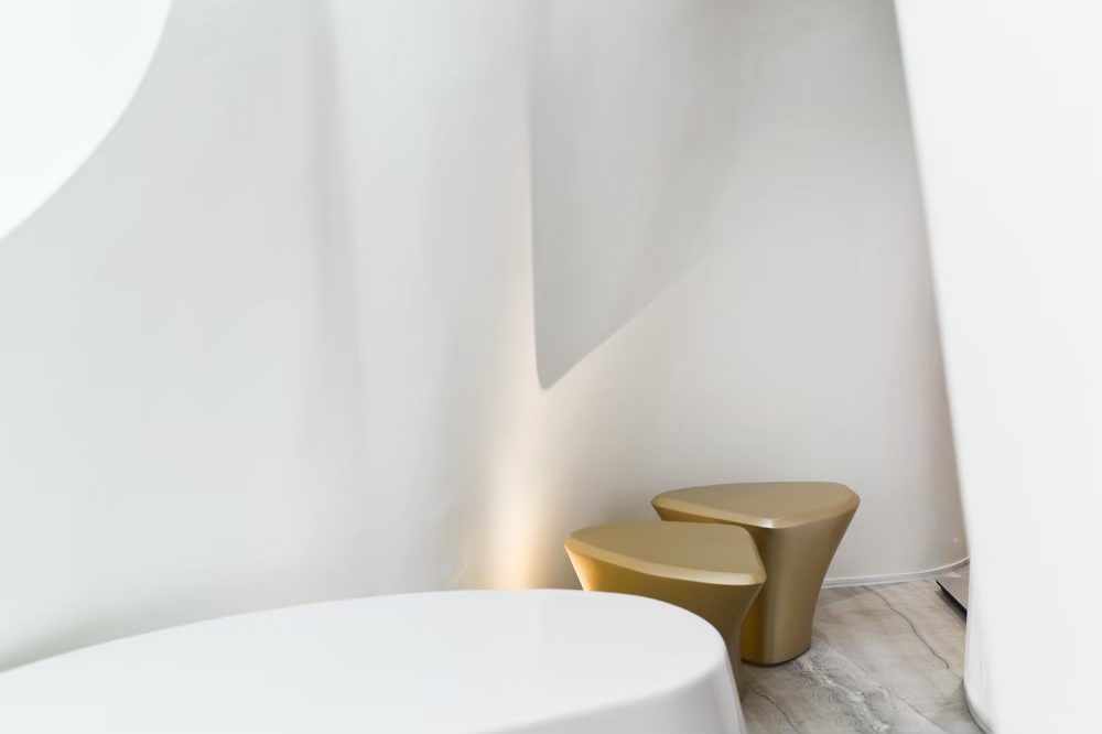
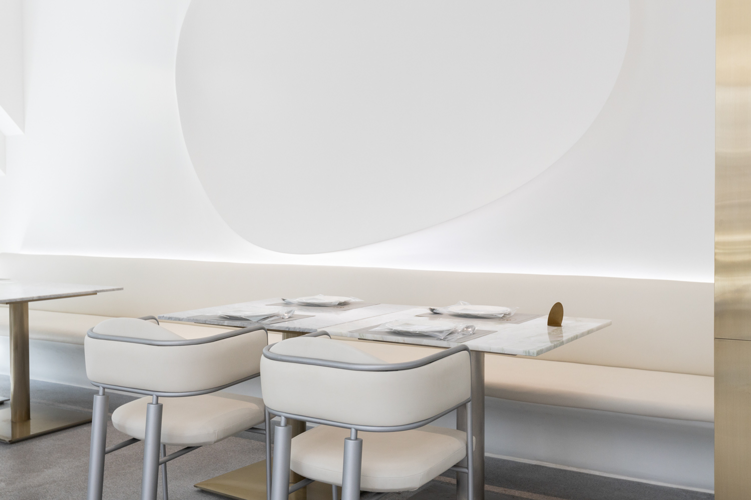
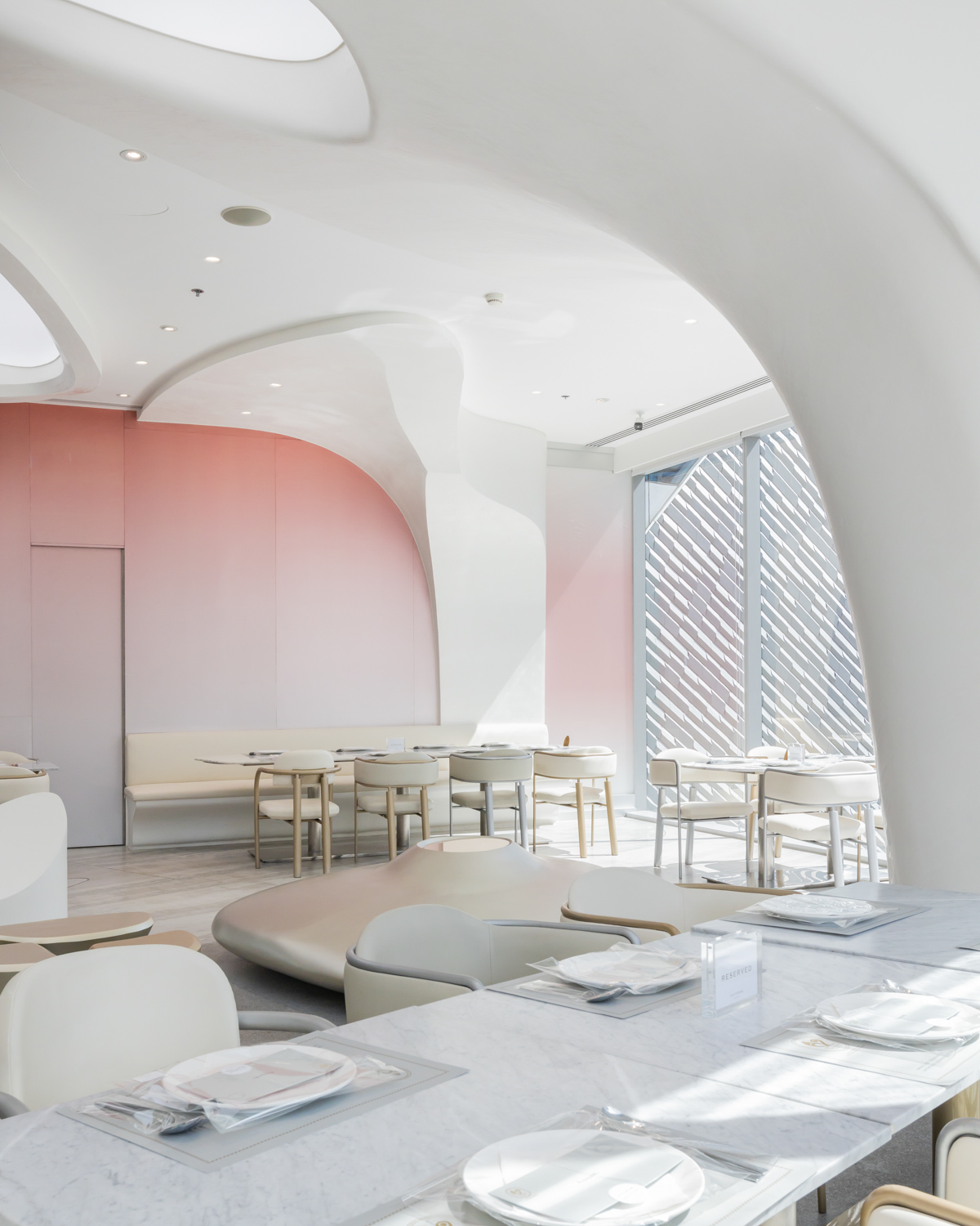
“Forenoon refers to the morning light; the hours before noon–the light that unfolds from all the colors on the light spectrum. It’s an indication of a new day. With the light that comes in from the three sides of the space, we wanted to use the openings to their fullest. With that in mind, we worked with the columns and interiors by incorporating nature into the storytelling. Curved, organic lines and forms helped us resolve the issues with the columns while creating this feeling of being embraced. The functional space we created reveals itself as a naturally concaved space defined by natural boundaries. The interior light and shadows work in tandem, pulling users in with its warm embrace.”
Once they settled on the idea of how to define the space, they began developing the interiors, curating spatial functionalities for each zone with a different lighting effects, from natural light, indirect light that comes from the daylight hidden inside the walls, and localized lighting designed to illuminate the food being served on the table.
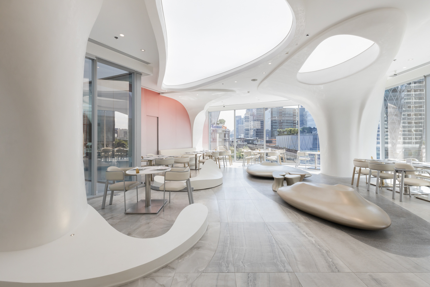
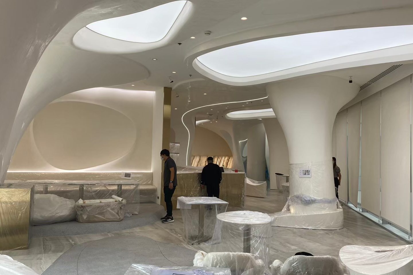
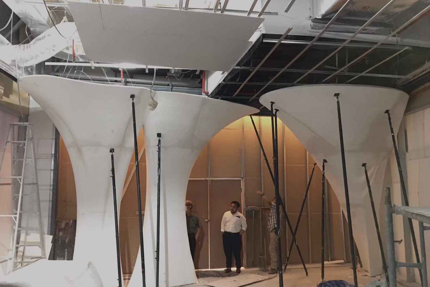
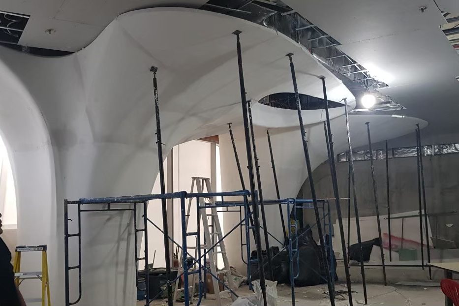
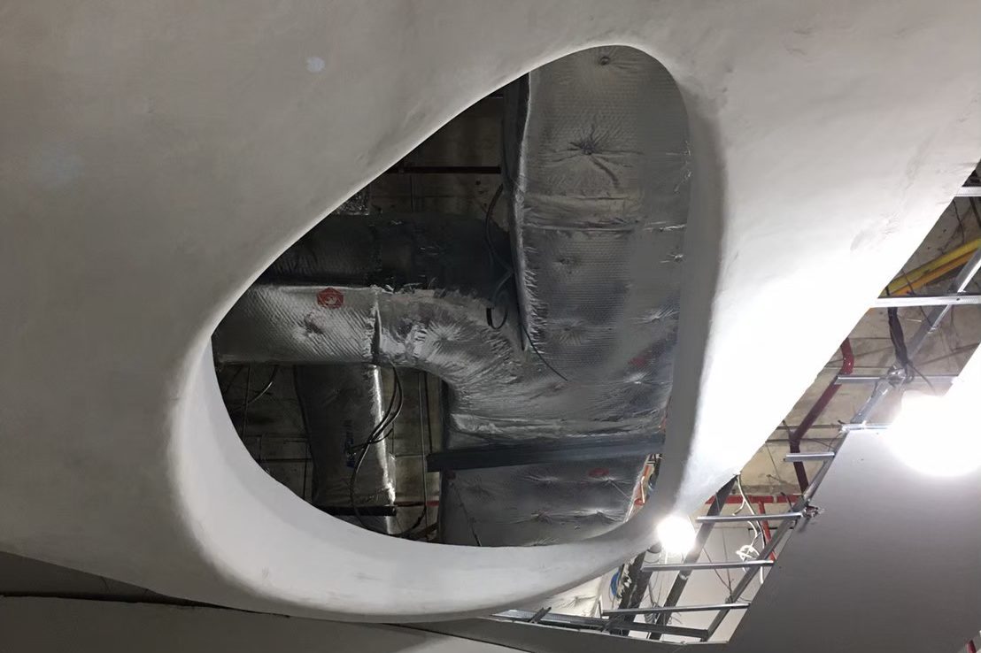
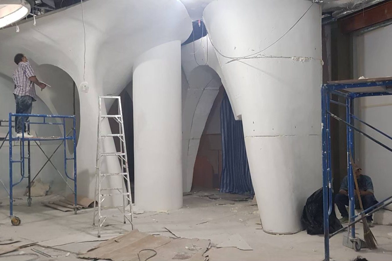
What’s particularly interesting about these curved forms is the technique that Trimode used to experiment with their furniture design. This time around, they brought back the method to work with the entire interior program under a limited time frame, which is typical for construction sites inside shopping malls.
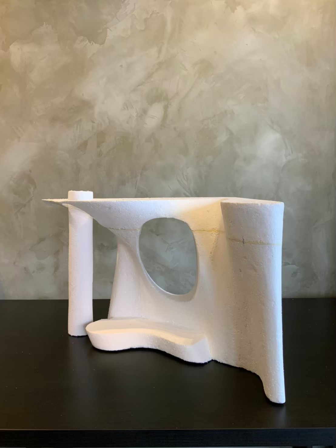
Photo courtesy of Trimode Studio
“Since it’s the technique that most Thai contractors aren’t familiar with, the per-construction trial is extremely crucial. We completed the 3D printing and tested it with the space. We then printed the foam prototypes to re-test the strength of each part. After we were done with the CNC, we employed the sprayed concrete method to create different layers of thickness. Lastly, we used stone powder cement for the coating and completed the finishing with a trowel. Even though we planned the setting, the site preparation and assembly, we had to finish the job on-site with hand-crafting techniques.
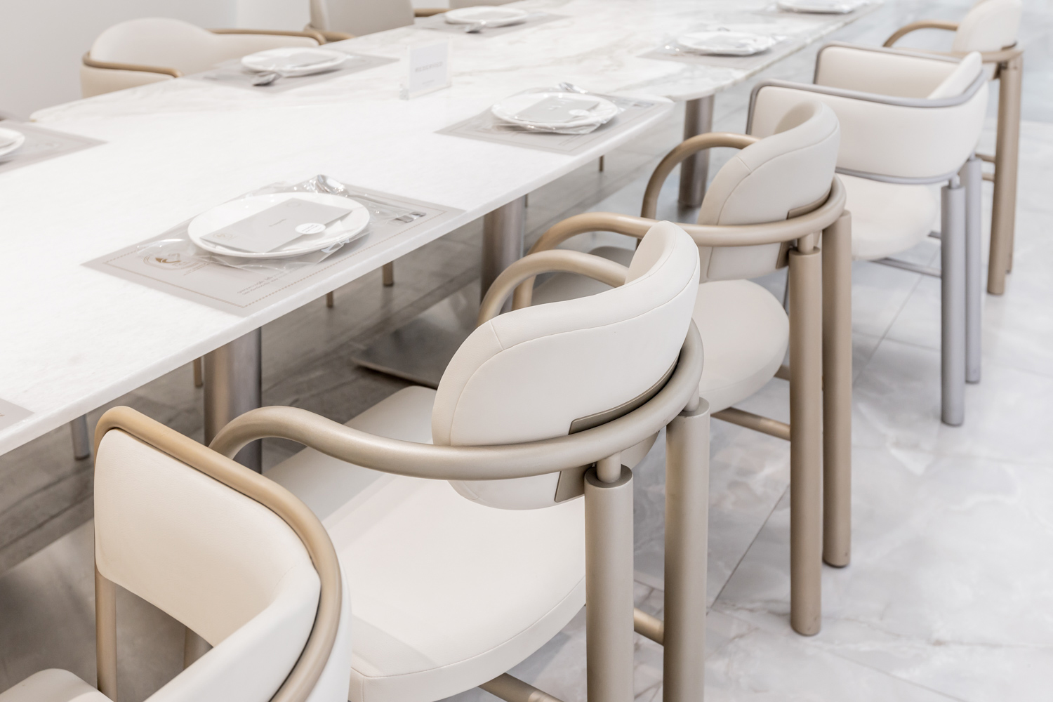
Apart from space allocation, the furniture has been designed to harmoniously converse with the curved lines. Collectively, everything projects memorable and unique visuals with meticulous details that can be found at different sections of the program.
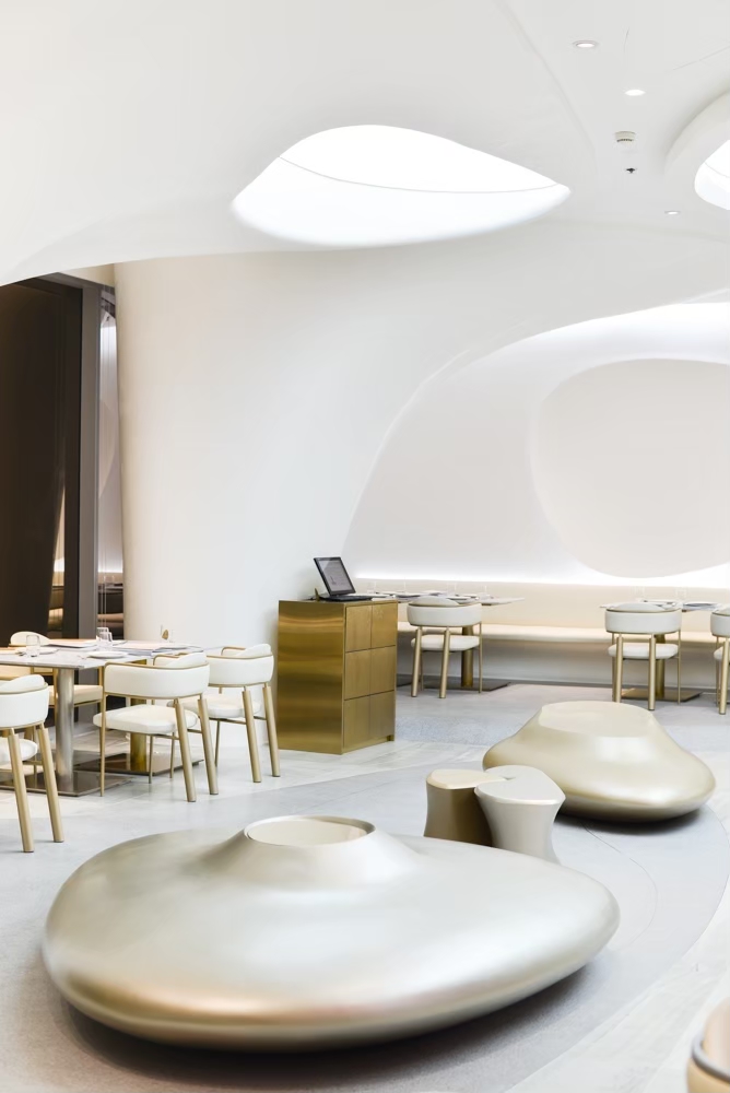
Photo courtesy of Trimode Studio
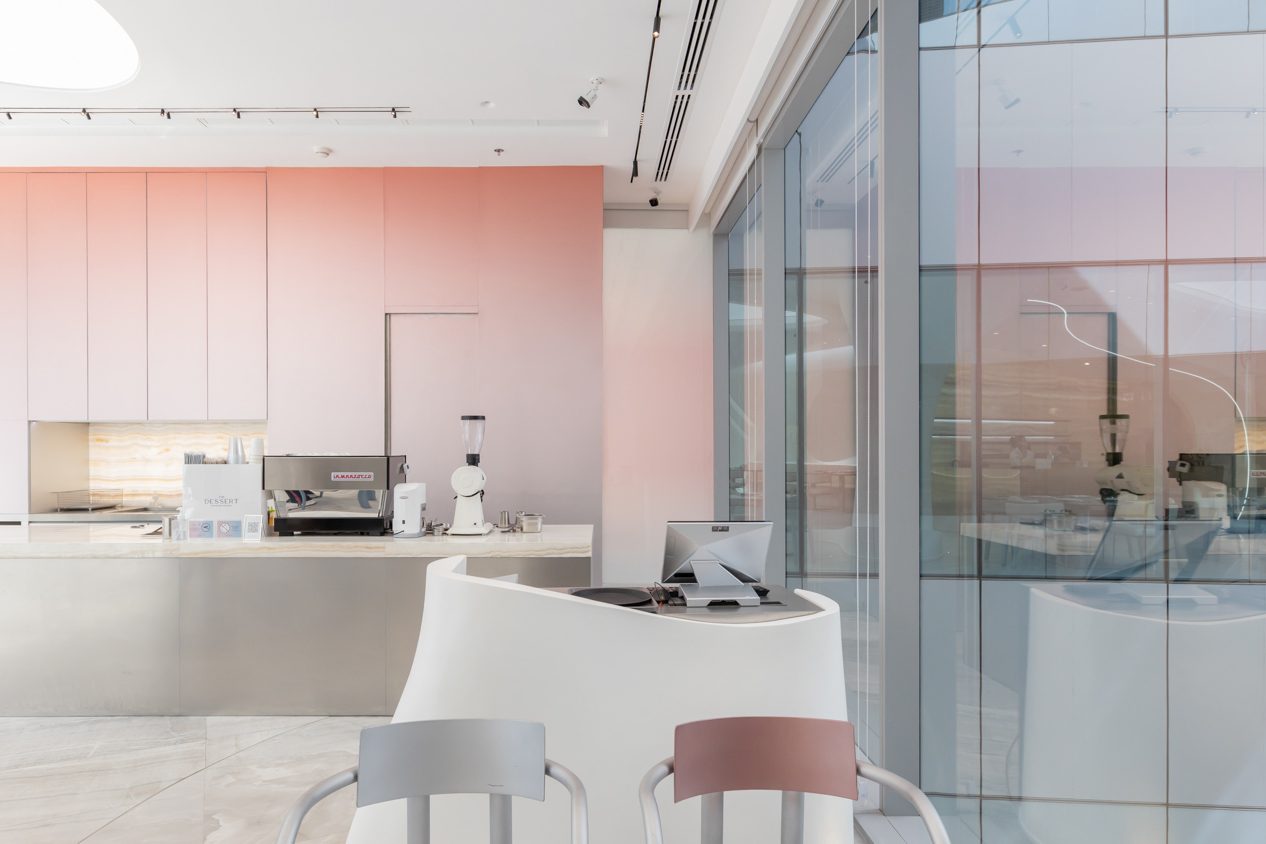
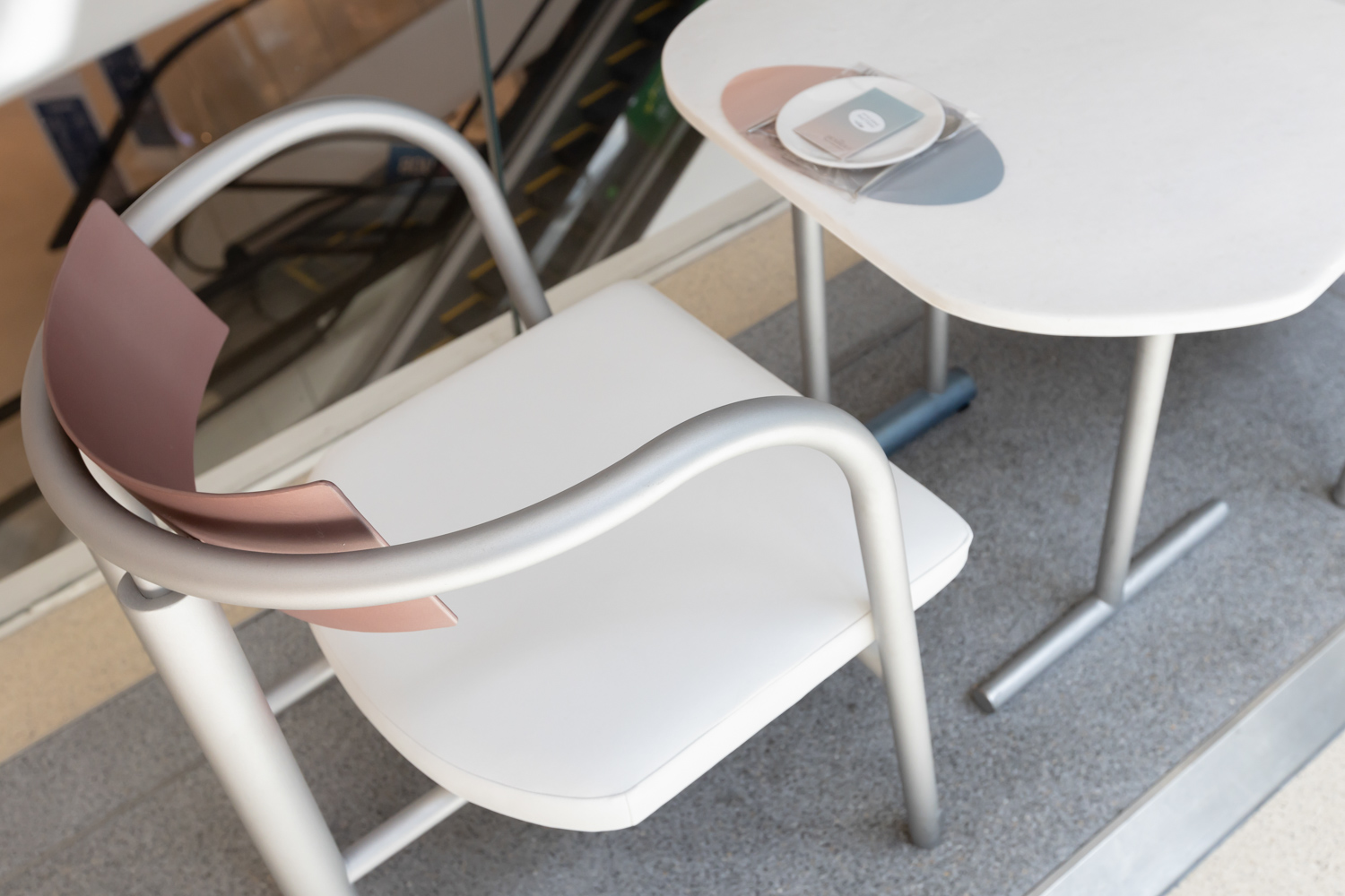
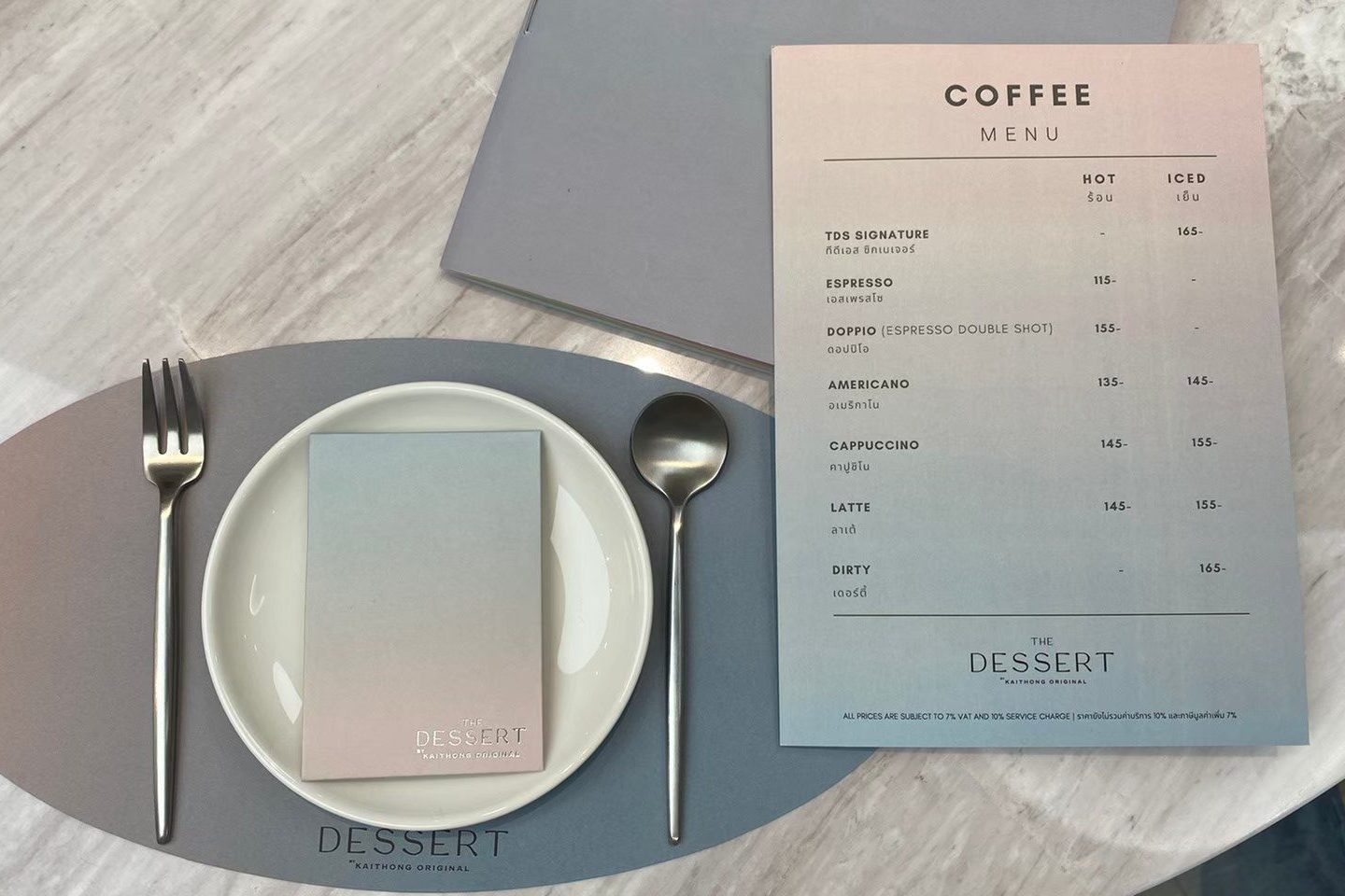
Another highlight of the Kaithong Original brand is ‘The Dessert’. The sweetness appears in the shape and form of colors chosen to encapsulate the forenoon concept. The design plays with the gradient shades of natural light with an emphasis on the icy-cold silvery color. A tint of pink/purple light visualizes and underlines the character of Kaithong Original brand’s famous desserts while the satin texture and colors of the utensils create a feeling of perpetual coolness.
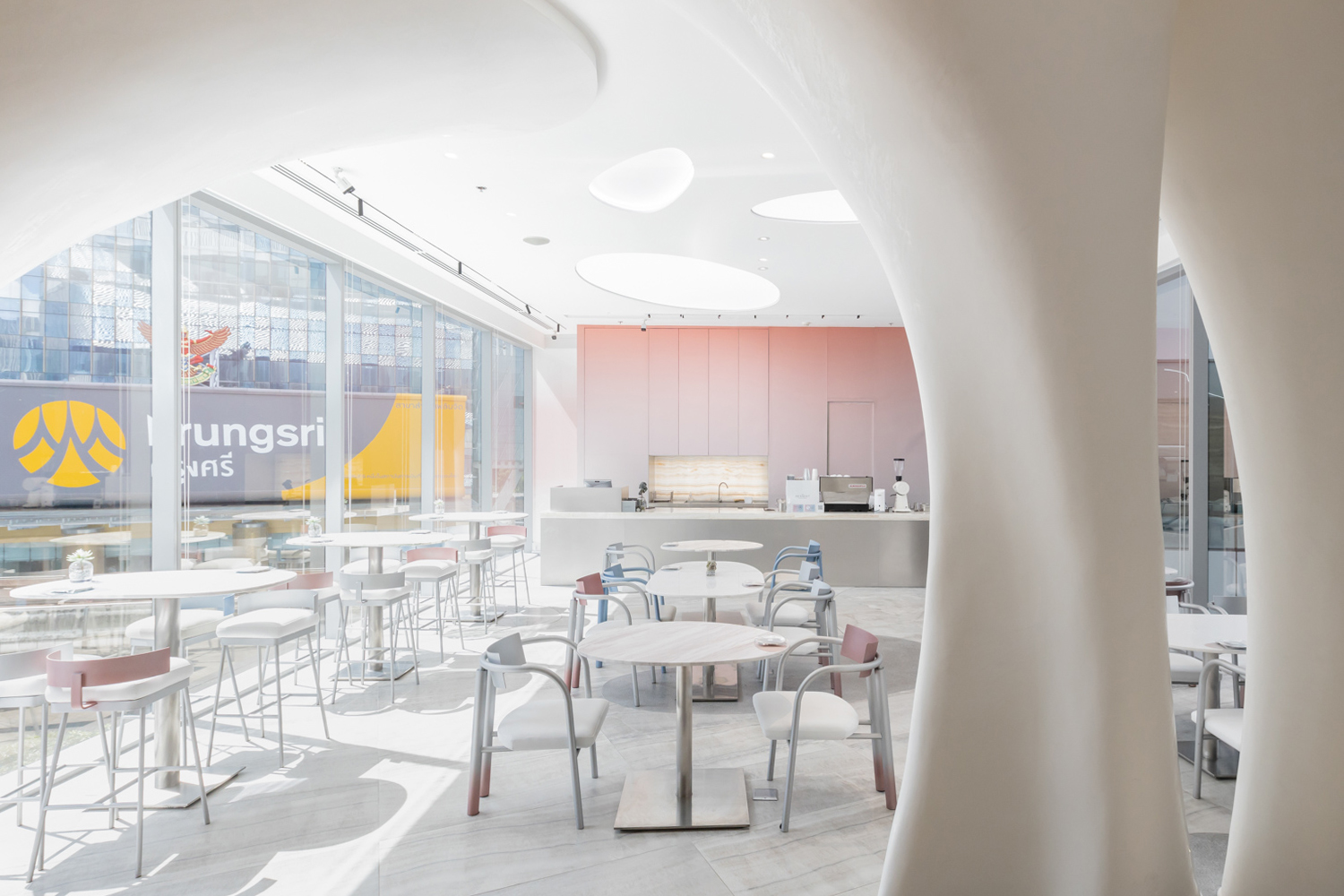
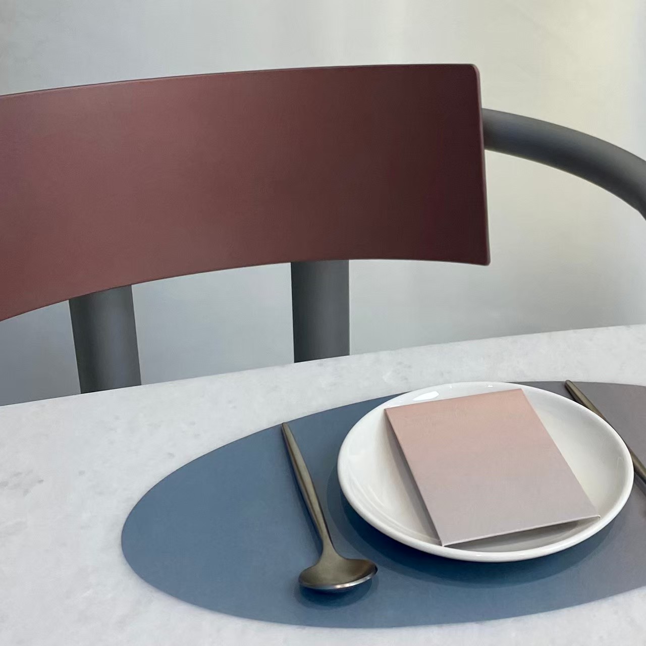
Photo courtesy of Trimode Studio
We asked Trimode about what a commercial project of such elaborated details and creativity actually gives the clients, and the answer is the value and experience hidden in every element of the space. “The intricacy, meticulousness and skills are integral parts of the design and construction process. When people experience the space, they can tell that it’s different from what they have seen. The clean, immaculate, and refined design and construction details resulting from the use of one single material reflects the design process’ very core, and it’s a value that people can sense and experience for themselves.”

