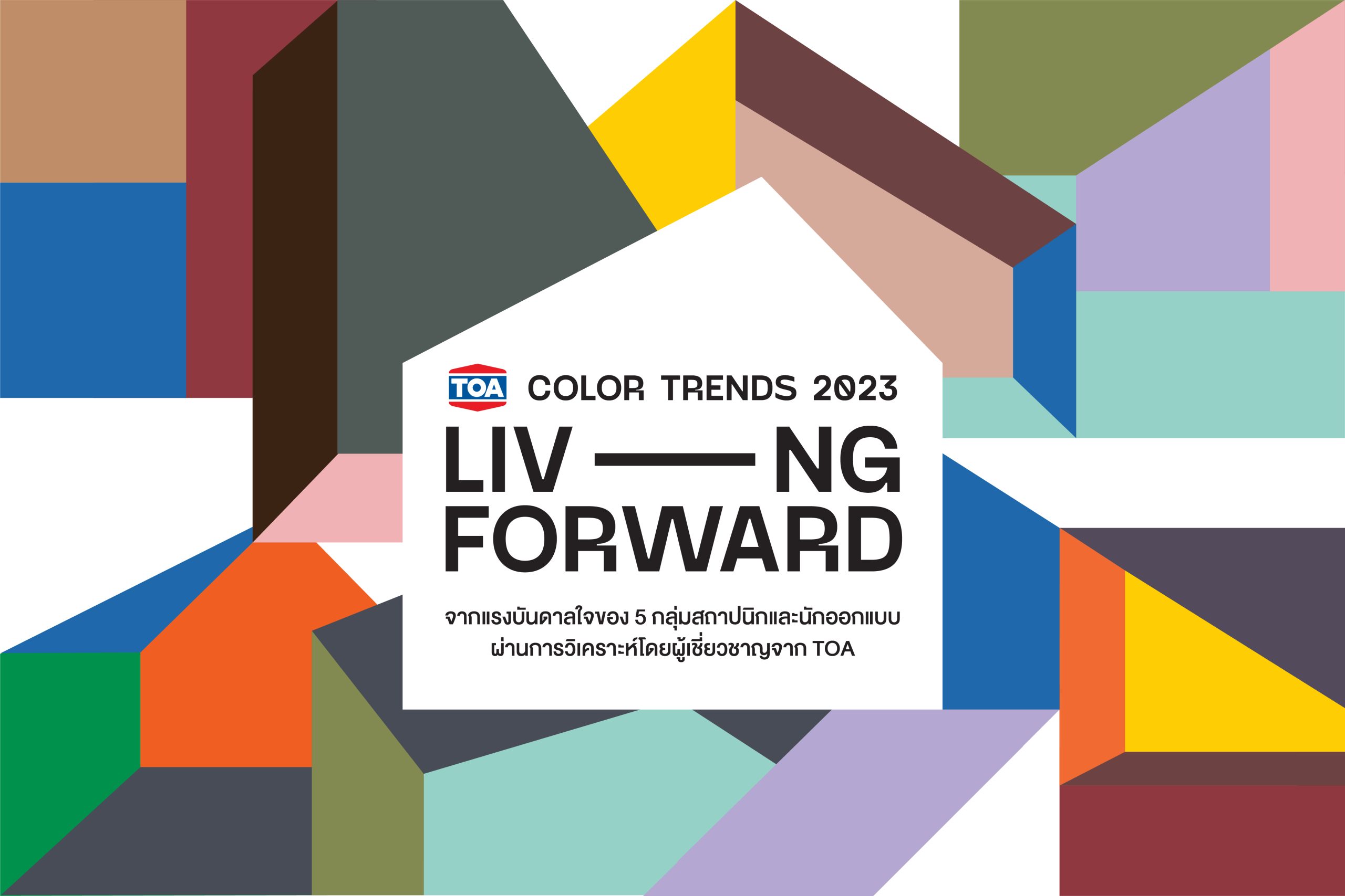
TOA’S COLLABORATION WITH THAILAND’S LEADING ARCHITECTS AND DESIGNERS IN THEIR SEARCH FOR COLOR TRENDS AND CONCEIVABLE WAYS OF LIVING IN THE YEAR 2023, DUBBED TOA COLOR TRENDS 2023: LIVING FORWARD
TEXT: KAWIN RONGKUNPIROM
IMAGE COURTESY OF TOA
(For Thai, press here)
Annual color trends are one way to encapsulate moods, sentiments, and memories from the previous year. These tendencies also provide an indirect indication of the trends and developments to watch in the coming years. This year marks the continuation of TOA’s collaboration with Thailand’s leading architects and designers in their search for color trends and conceivable ways of living in the year 2023, dubbed TOA Color Trends 2023: Living Forward.
The five studios invited to join the project include Jun Sekino (JUNSEKINO ARCHITECT AND DESIGN and JUNSEKINO INTERIOR DESIGN) Taj and Quan Phitakraxanti (Tandem Architects) Thawin Harnboonseth (WARchitect) Pin Jirarangsirat (DIN Studio) and Tachamapan Chanchamrassang AKA Pomme Chan (Happy People Studio).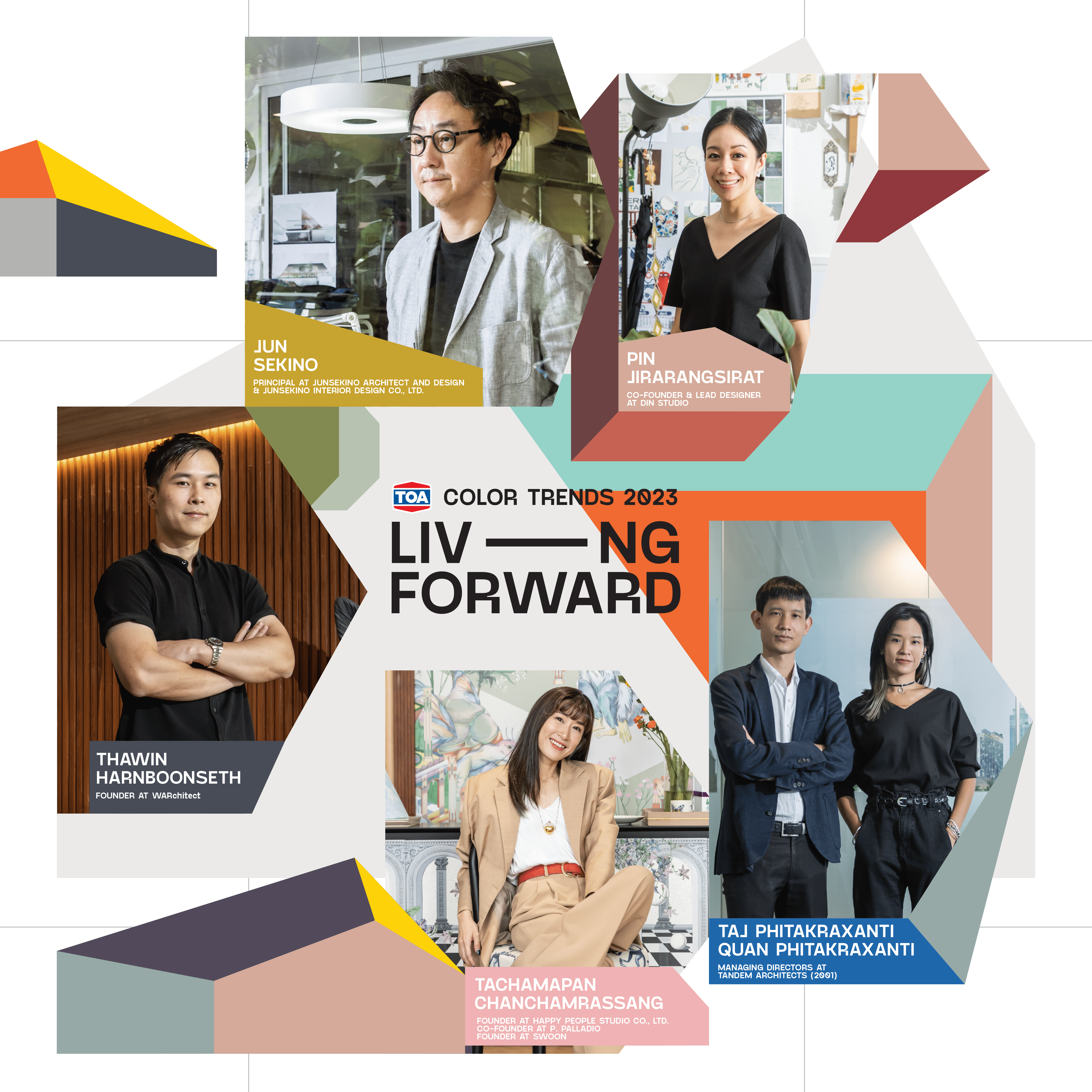
It’s always exciting to see professionals in virtually every facet of residential design, from architecture, interior design, furniture, to home decoration products, collaborate on a single project. The work process of TOA Color Trends is just as interesting because of the creative freedom given to the architects and designers to exchange their ideas and mindsets, as well as their unique perspectives, through each of their own mood boards. The mood board depicts inspirations behind the architects/designers’ creative process, adaptation of their own personal experiences to their design practices, and future trajectories, which each studio places special emphasis on.
The objective behind this year’s theme, “Living Forward,” is to employ colors as a driving force of design and inspire new possibilities in creating better living spaces and quality of life along with the environment and people’s well-being. Through the ability of colors and design, the project hopes to help heal people’s mental and physical well-being includes preparing everyone for the reality of the situation with problems and predicaments still remain if not worsen despite the start of a new year, from the pandemic to natural disasters, economic recession to war and societal and political conflicts.
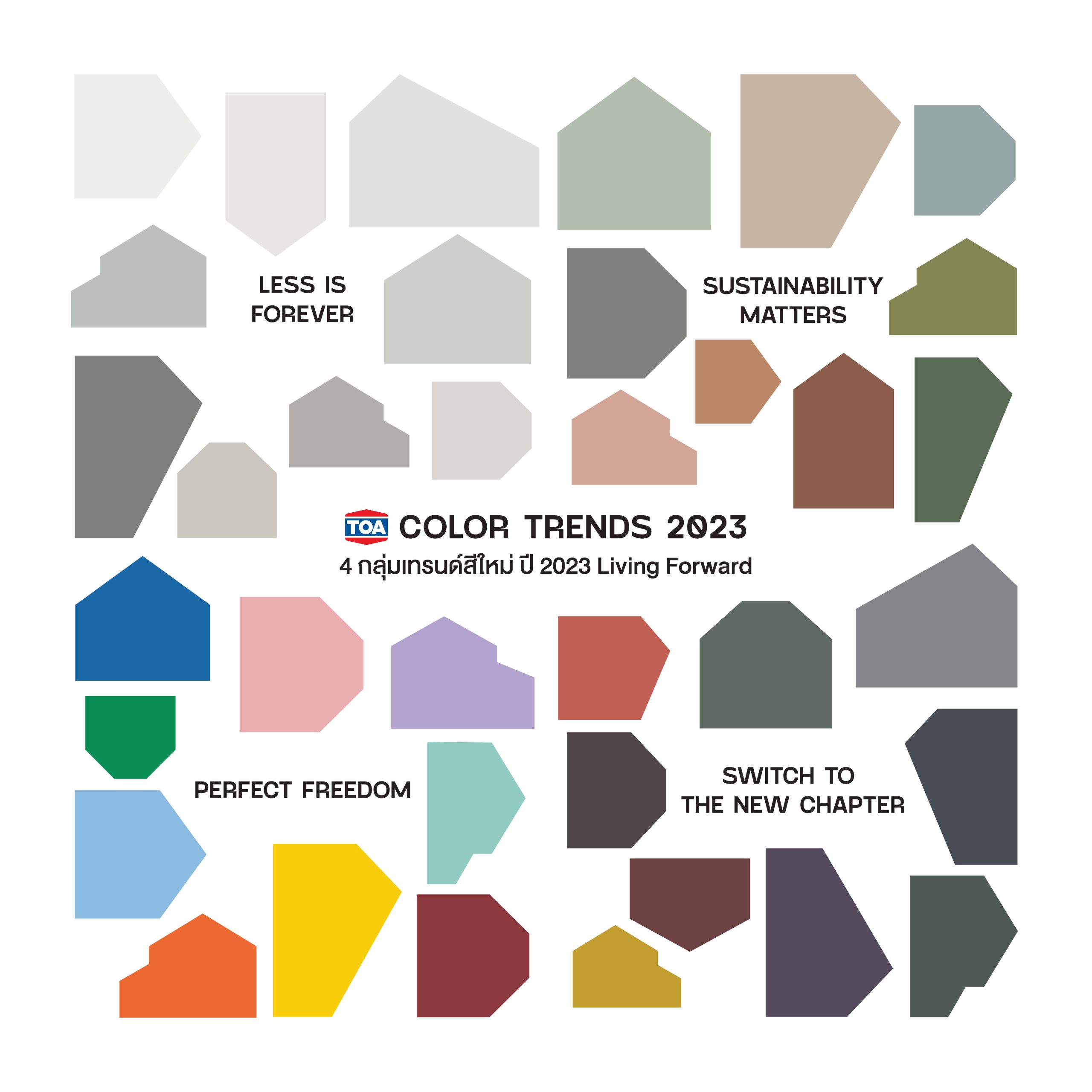
All of these issues are manifested in the four color trends of 2023, each with a meaningfully curated palette of 9 colors that reflect each designer’s vision and thoughts, accounting to a total of 36 colors in the color trends of 2023. TOA presents a number of simulations in which the colors are used in actual living spaces, proposing guidelines for ideas and possibilities of how the colors can be used, be it as exterior skins, walls of interior spaces of different residential typologies. Let’s take a look at Color Trends 2023 with some amazing palettes that reminisce about the past while inspiring an optimistic future alongside interesting possible applications with various elements and forms of design.
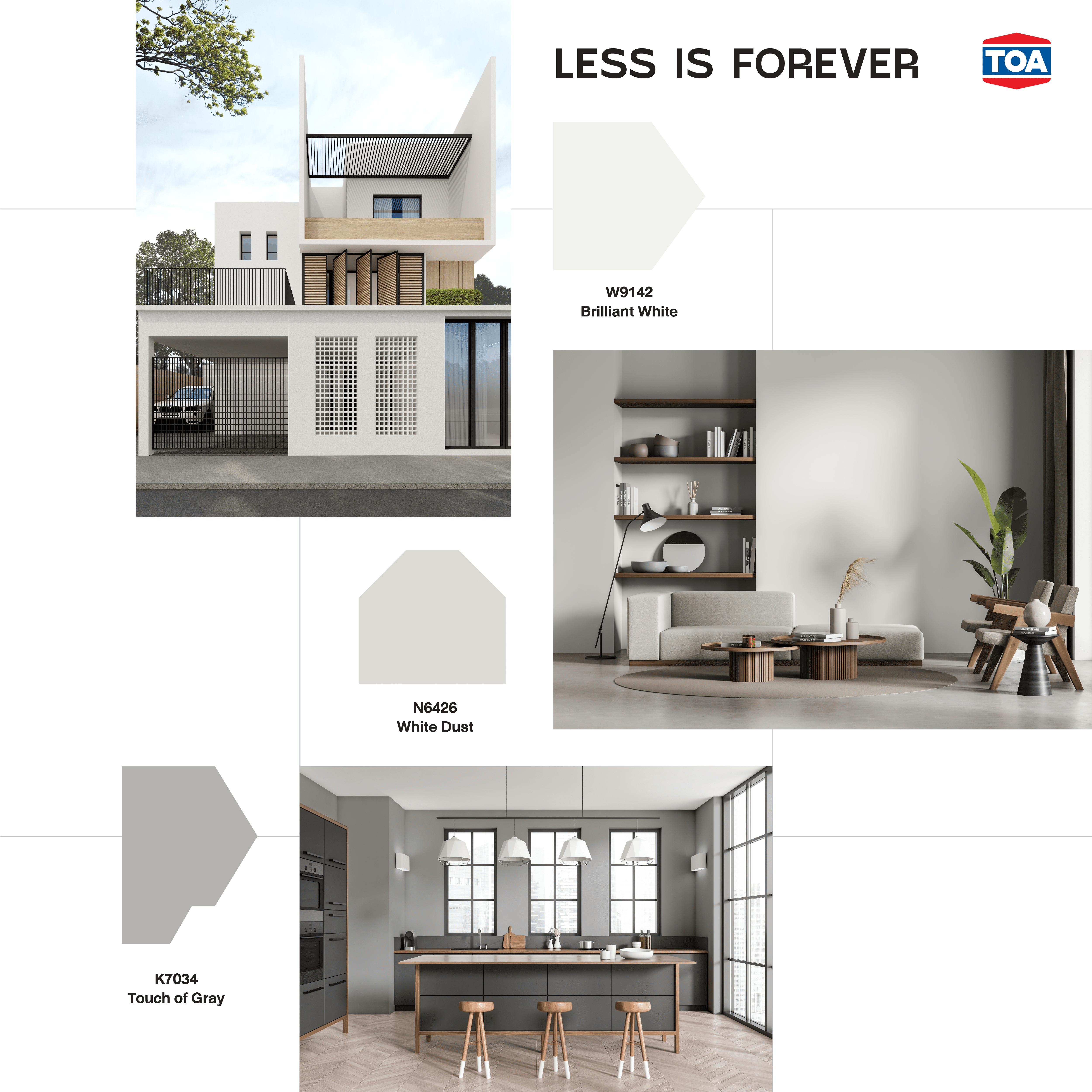
LESS IS FOREVER
Minimal simplicity is forever timeless. With crises ranging from pandemics to the ramifications of wars still seeing no end in sight, white and gray of varied shades become a sign of equilibrium, purity, and peace. When matched together, certain color shades such as W9142 Brilliant White, N6426 White Dust, and K7034 Touch of Gray can complement the other color as well as materials, effortlessly complementing their counterparts to look even more distinctive.
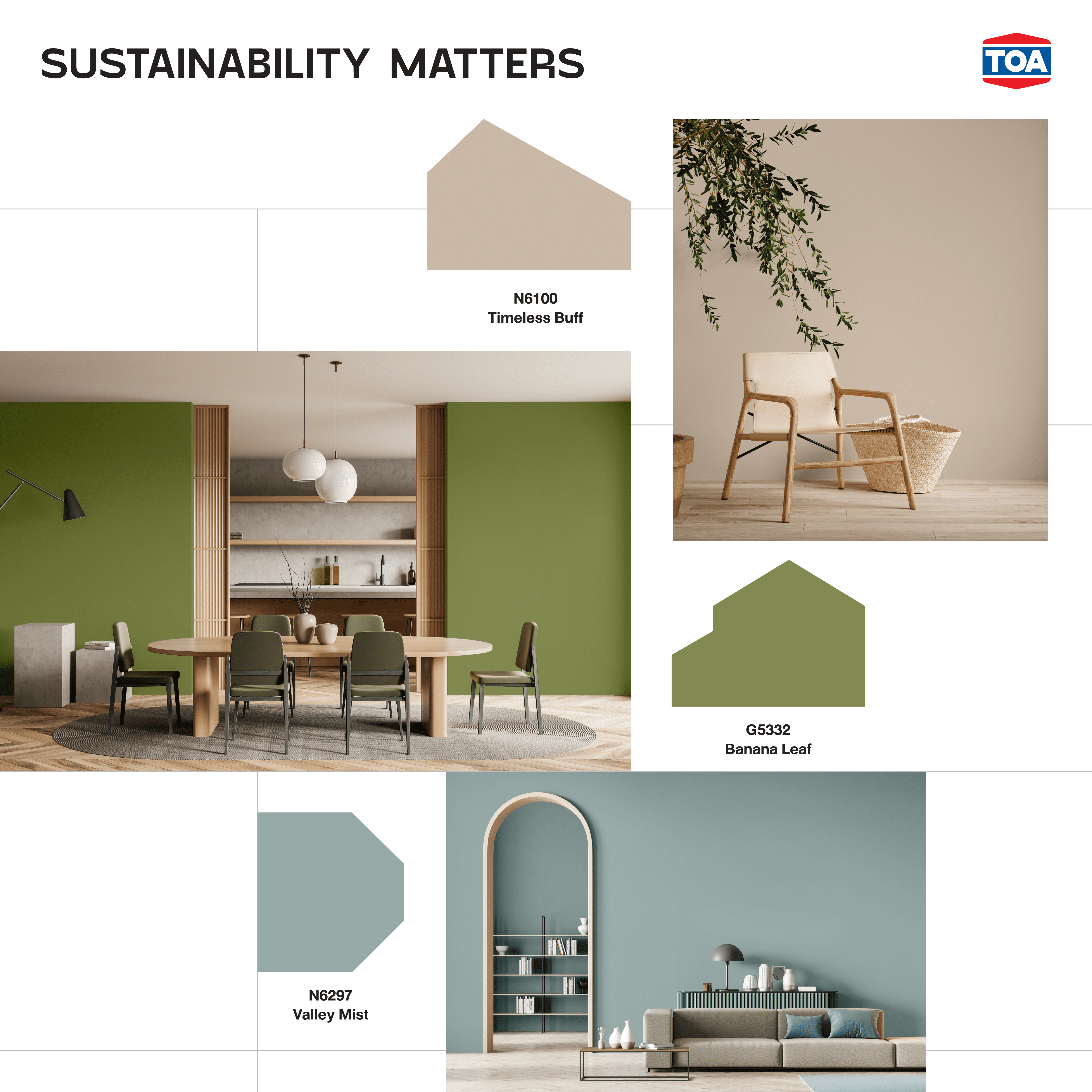
SUSTAINABILITY MATTERS
Environmental, nature, and sustainability issues have been addressed countless times, yet the world continues to face rising climate change while smog, and pollution become global crises. The palette that combines the colors of grass, sand, streams of water, and sky, such as N6100 Timeless Buff, G5332 Banana Leaf, and N6297 Valley Mist, doesn’t appear as vibrant as it should be. It is tinted with a hint of grey to reflect the current state of nature and remind us to always be aware of the ongoing and unresolved dilemmas.
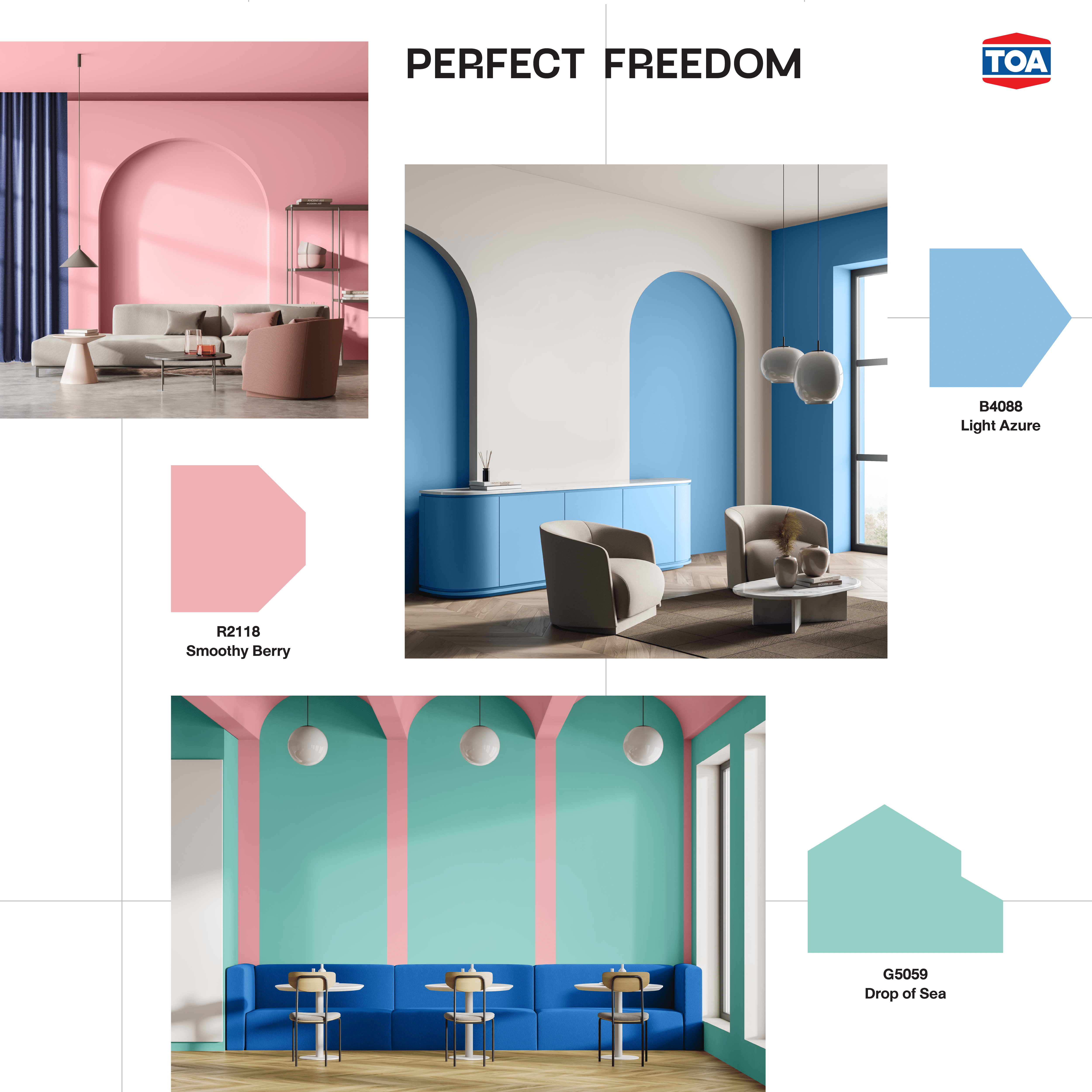
PERFECT FREEDOM
Vibrant colors have never really gone away and will always be a part of us. The freedom of expression, expressions of the diversity of humans, and attempts to transcend norms in order to achieve true equality in genders, skin colors, and races are shown using a palette of vivid hues such as B4088 Light Azure, R2118 Smoothy Berry, and G5059 Drop of Sea. It represents the courage to accept one’s own self and unleash the previously restrained energy during the lockdown, as well as the enthusiasm and zeal to travel and embrace new experiences while following one’s own spirit, desire, and freedom.
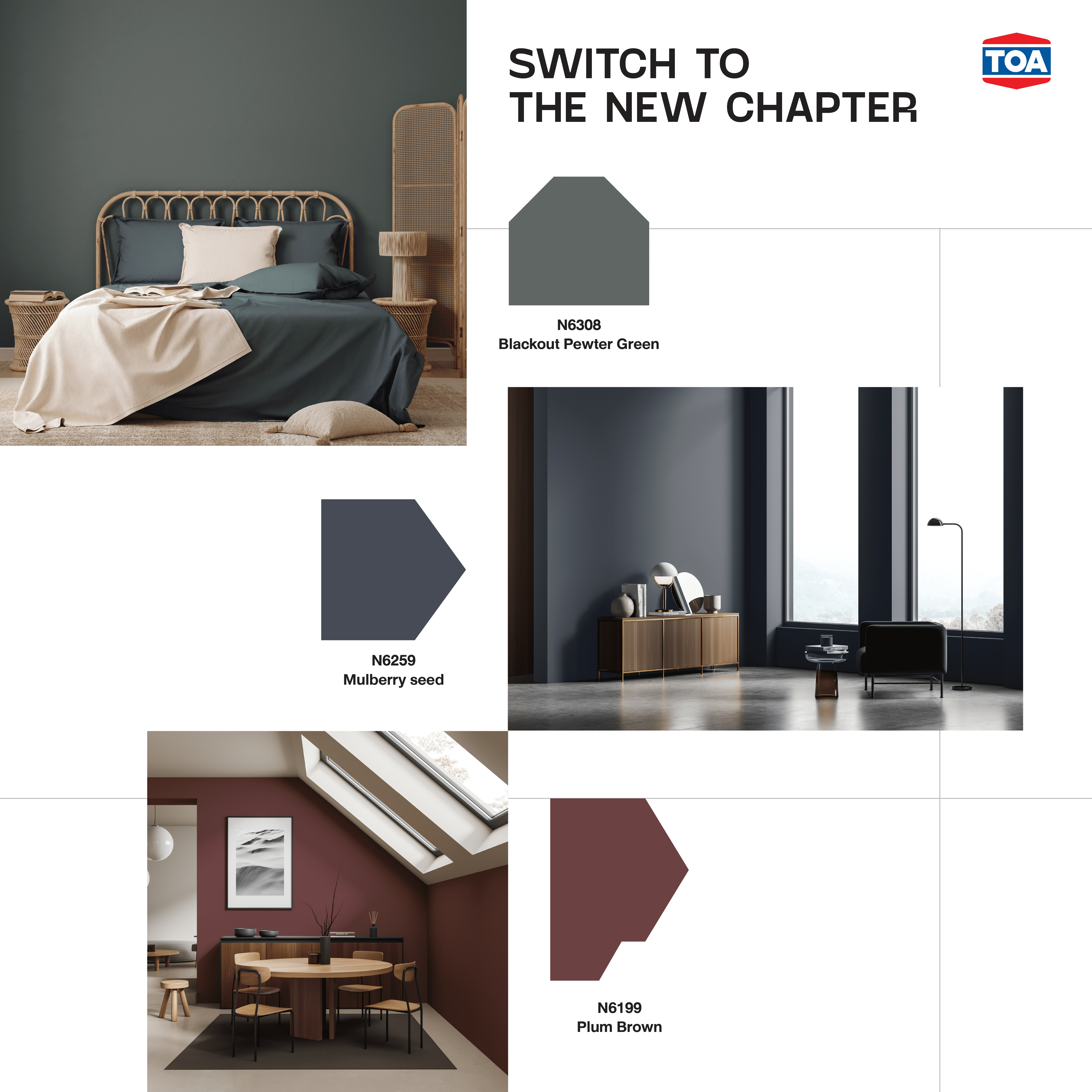
SWITCH TO THE NEW CHAPTER
Looking back over the years, it’s time to realize and perceive the world for what it is. With awareness and mindfulness, everyone should always be prepared to adjust to the new normal and unpredictability while still living a gratifying and meaningful life. Colors like N6308 Blackout Pewter Green, N6259 Mulberry Seed, and N6199 Plum Brown appear to be great hues for modern living spaces equipped with smart systems and technologies because of the way the palette emphasizes and embodies progress while implying an openness to new things.
The colors discussed in this article represent only a small portion of TOA Color Trends 2023. Download the catalogue to discover more and be inspired by some incredible color combinations for the year 2023, as well as extensive conversations with designers and architects from the featured five studios. The palettes curated for TOA Color Trends 2023: Living Forward hope to get the inspirations and sentiments behind works of design across to users at a more profound level, offering them new ideas and possibilities as they find ways to be happy with the lives they choose to lead in the present while building a better future for greater years to come